

Tooltip
A short label over a control on hover, focus or long press.
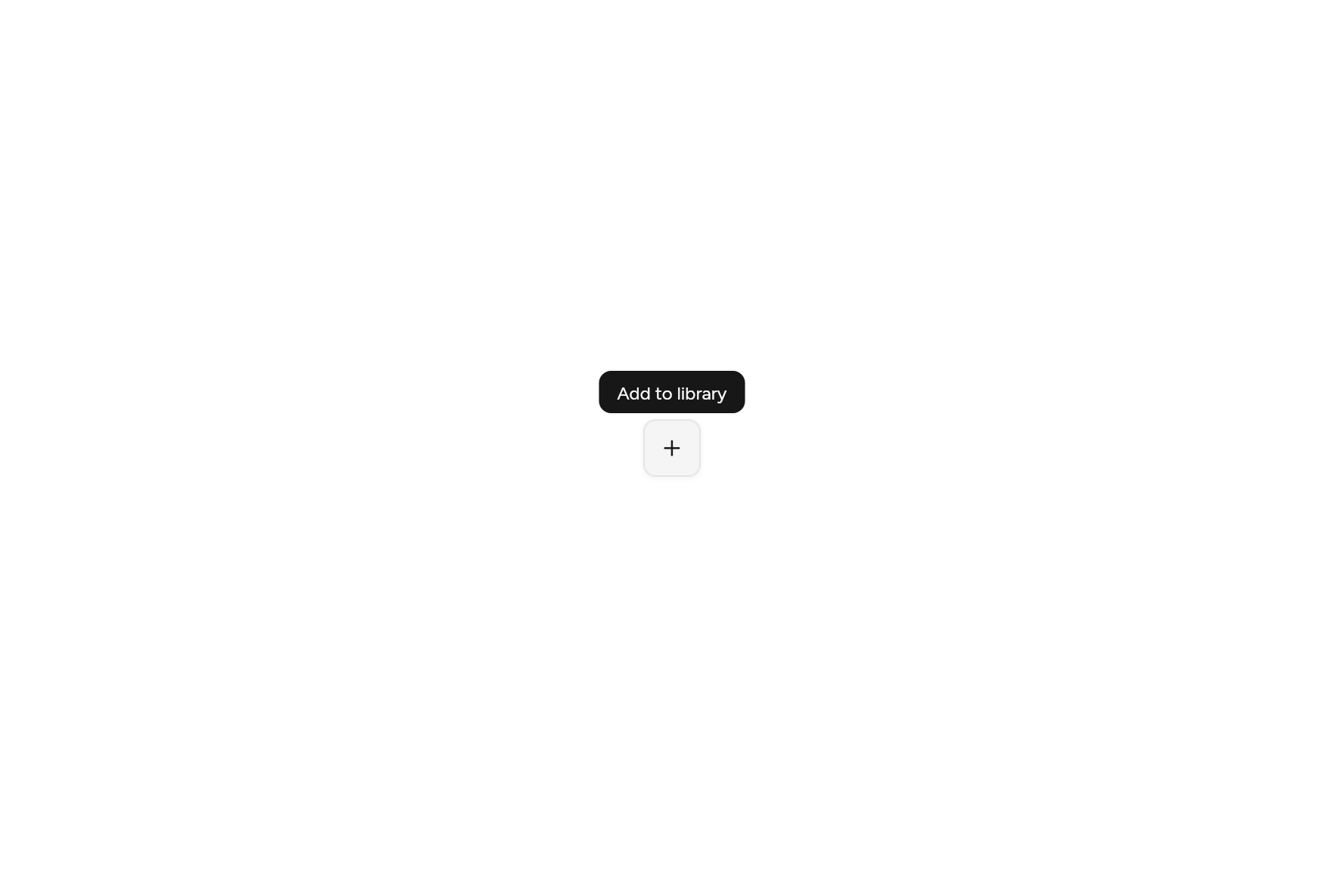
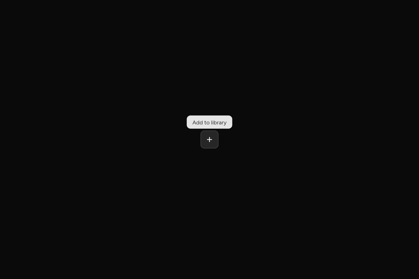
import 'package:ashlar_icons/ashlar_icons.dart';
import 'package:flutter/widgets.dart';

import 'ui/button.dart';
import 'ui/tooltip.dart';

class TooltipDemo extends StatelessWidget {
  const TooltipDemo({super.key});

  @override
  Widget build(BuildContext context) => Tooltip(
    message: 'Add to library',
    child: Button(
      size: ButtonSize.icon,
      variant: ButtonVariant.outline,
      semanticLabel: 'Add',
      onPressed: () {},
      child: const AshlarIcon(AshlarIconsRoundedStroke.plus),
    ),
  );
}
Try its options
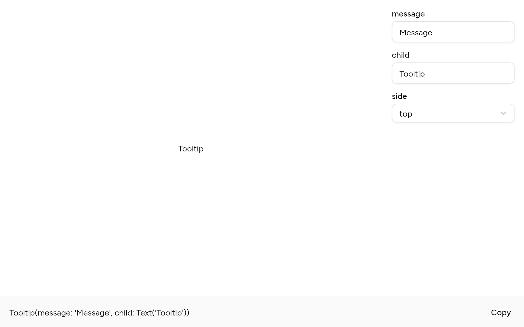
Each option its constructor takes, to change and see; the code below it is what you chose, to copy.
Add it
In your Flutter project:
ashlar add tooltip
It writes theme.dart, palette.dart and tooltip.dart into lib/ui, keeping any you already have.
Examples
Other ways to use it, each running live, with its code.
Sides
Top, bottom, left or right.
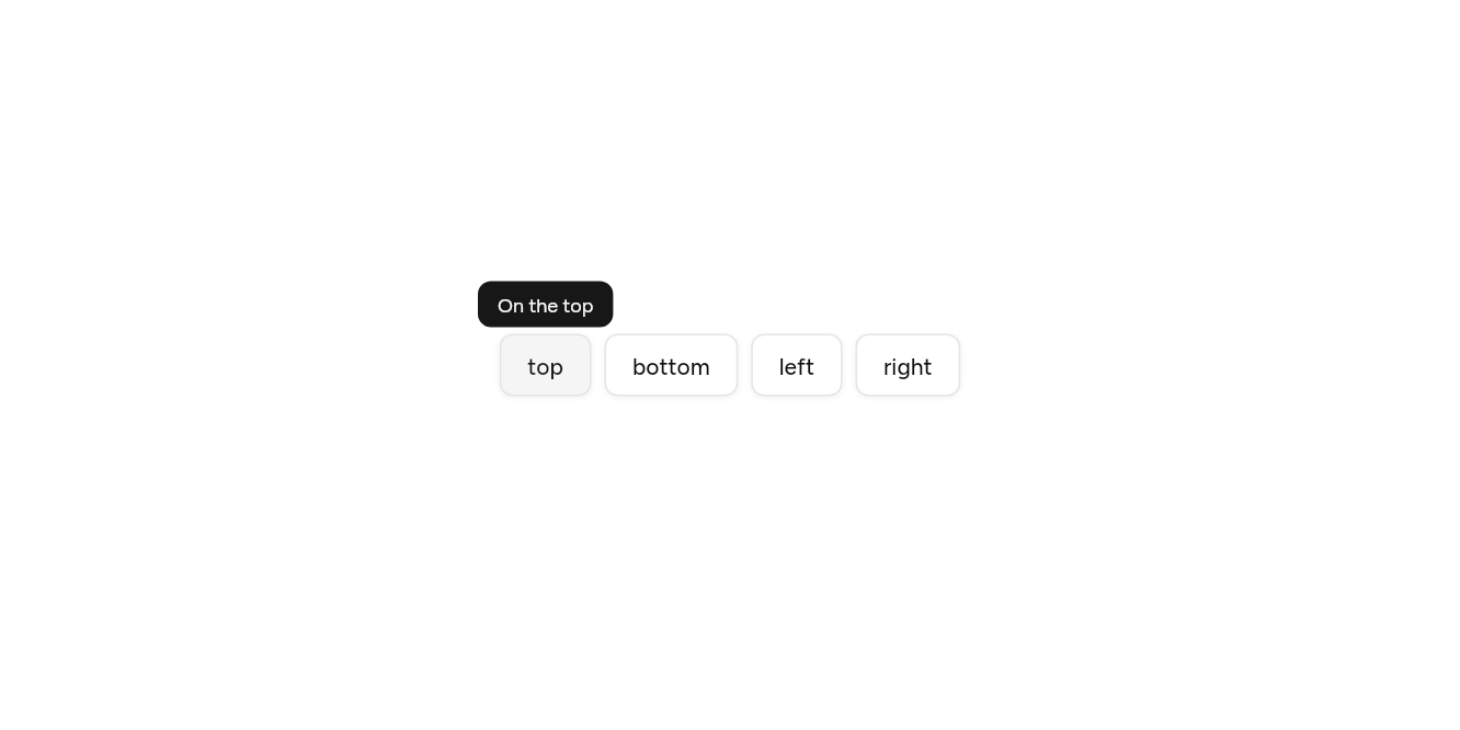
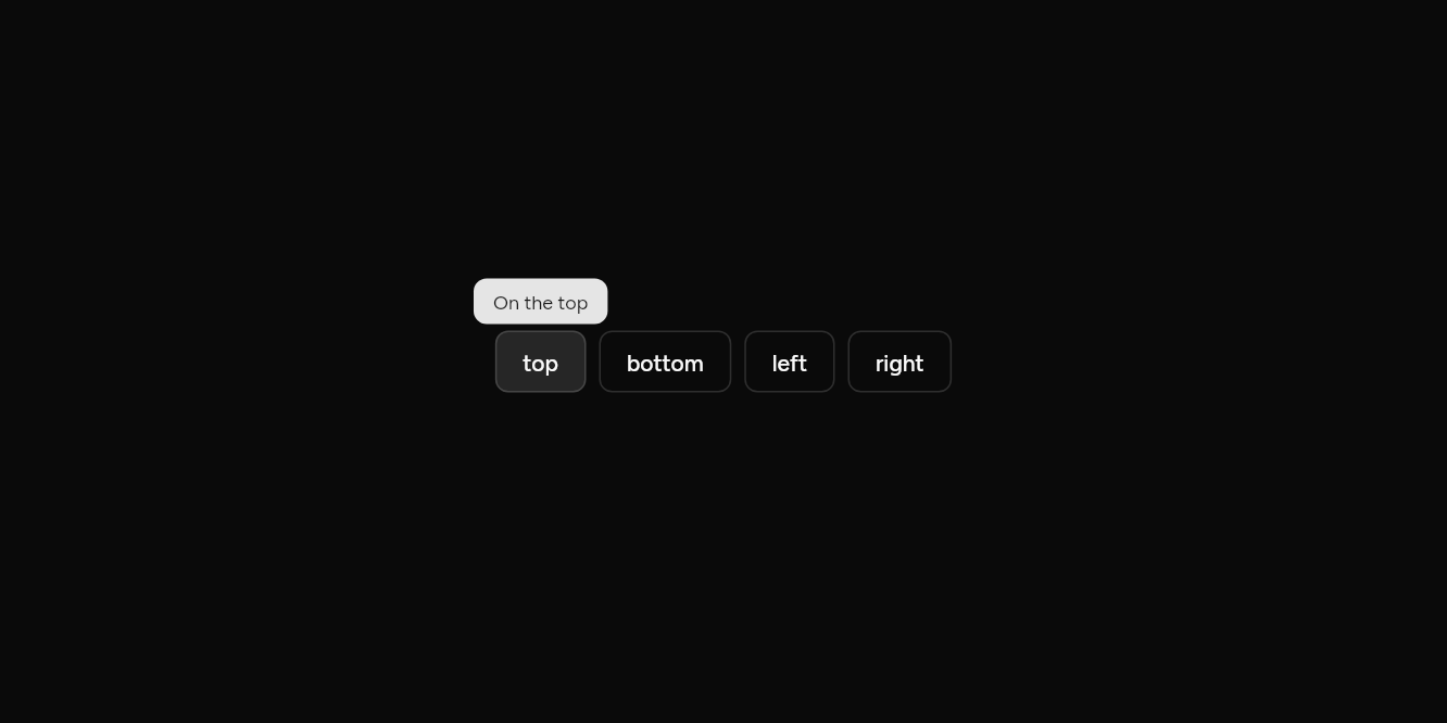
// Sides: Top, bottom, left or right.
import 'package:flutter/widgets.dart';

import 'ui/button.dart';
import 'ui/tooltip.dart';

class TooltipSidesExample extends StatelessWidget {
  const TooltipSidesExample({super.key});

  @override
  Widget build(BuildContext context) => Wrap(
    spacing: 8,
    children: [
      for (final side in TooltipSide.values)
        Tooltip(
          message: 'On the ${side.name}',
          side: side,
          child: Button(variant: ButtonVariant.outline, onPressed: () {}, child: Text(side.name)),
        ),
    ],
  );
}
With a shortcut
Words and keys together.
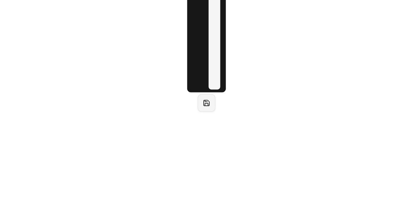
// With a shortcut: Words and keys together.
import 'package:ashlar_icons/ashlar_icons.dart';
import 'package:flutter/widgets.dart';

import 'ui/button.dart';
import 'ui/kbd.dart';
import 'ui/tooltip.dart';

class TooltipShortcutExample extends StatelessWidget {
  const TooltipShortcutExample({super.key});

  @override
  Widget build(BuildContext context) => Tooltip(
    message: 'Save, Command S',
    content: const Row(
      mainAxisSize: MainAxisSize.min,
      children: [
        Text('Save'),
        SizedBox(width: 8),
        Kbd(child: Text('⌘S')),
      ],
    ),
    child: Button(
      variant: ButtonVariant.outline,
      size: ButtonSize.icon,
      semanticLabel: 'Save',
      onPressed: () {},
      child: const AshlarIcon(AshlarIconsRoundedStroke.save),
    ),
  );
}
API
Read from the source above: each parameter with its type, its default, and what it is for.
TooltipSideenum
A short label that appears over child when it is hovered, focused from the keyboard or long pressed. Use it for what an icon button does, not for anything a person needs.
| Value | What it is for |
|---|---|
top | |
bottom | |
left | |
right |
Tooltipclass
| Parameter | Type | Default | What it is for |
|---|---|---|---|
messagerequired |
String |
What it says, and what a screen reader hears. | |
childrequired |
Widget |
What it describes: hovered, focused or long pressed to show it. | |
side |
TooltipSide |
TooltipSide.top |
Which side of the child it shows on. It flips when there is no room. |
content |
Widget? |
Shown in place of message when there is more to show: a shortcut in Kbd keys. |
Source
What lands in your app. It is yours from then on: change it as you would your own code, and ashlar add
will not write over it.
lib/ui/tooltip.dart 136 lines
// Ashlar UI: Tooltip. Copied into your app by `ashlar add tooltip`; it is yours to change.
//
// Built on RawTooltip from Flutter's widgets layer, which shows it on hover and on a long
// press. This file also shows it on keyboard focus and gives screen readers the message.

import 'package:flutter/widgets.dart';

import 'theme.dart';

/// A short label that appears over [child] when it is hovered, focused from the keyboard
/// or long pressed. Use it for what an icon button does, not for anything a person needs.
///
/// ```dart
/// Tooltip(message: 'Add to library', child: Button(size: ButtonSize.icon, semanticLabel: 'Add', onPressed: add, child: AshlarIcon(AshlarIconsRoundedStroke.plus)))
/// ```
/// The side of its child a [Tooltip] shows on.
enum TooltipSide { top, bottom, left, right }

class Tooltip extends StatefulWidget {
  const Tooltip({
    super.key,
    required this.message,
    required this.child,
    this.side = TooltipSide.top,
    this.content,
  });

  /// What it says, and what a screen reader hears.
  final String message;

  /// What it describes: hovered, focused or long pressed to show it.
  final Widget child;

  /// Which side of the child it shows on. It flips when there is no room.
  final TooltipSide side;

  /// Shown in place of [message] when there is more to show: a shortcut in Kbd keys.
  final Widget? content;

  @override
  State<Tooltip> createState() => _TooltipState();
}

class _TooltipState extends State<Tooltip> {
  final _tip = GlobalKey<RawTooltipState>();

  @override
  Widget build(BuildContext context) {
    final t = AshlarTheme.of(context);
    final c = t.colors;
    return Focus(
      canRequestFocus: false,
      skipTraversal: true,
      onFocusChange: (focused) {
        if (!focused) {
          RawTooltip.dismissAllToolTips();
        } else if (FocusManager.instance.highlightMode ==
            FocusHighlightMode.traditional) {
          _tip.currentState?.ensureTooltipVisible();
        }
      },
      child: RawTooltip(
        key: _tip,
        // The message goes on the control itself, so a screen reader hears it with the
        // control's name rather than as a separate item.
        semanticsTooltip: null,
        hoverDelay: Duration.zero,
        positionDelegate: (p) {
          const gap = 4.0, margin = 8.0;
          final t = p.target,
              ts = p.targetSize,
              size = p.tooltipSize,
              room = p.overlaySize;
          double clampX(double x) => x.clamp(
            margin,
            (room.width - size.width - margin).clamp(margin, double.infinity),
          );
          double clampY(double y) => y.clamp(
            margin,
            (room.height - size.height - margin).clamp(margin, double.infinity),
          );
          final above = t.dy - ts.height / 2 - gap - size.height,
              under = t.dy + ts.height / 2 + gap;
          final before = t.dx - ts.width / 2 - gap - size.width,
              after = t.dx + ts.width / 2 + gap;
          final fitsAbove = above >= margin,
              fitsUnder = under + size.height <= room.height - margin;
          final fitsBefore = before >= margin,
              fitsAfter = after + size.width <= room.width - margin;
          switch (widget.side) {
            case TooltipSide.top || TooltipSide.bottom:
              final down = widget.side == TooltipSide.bottom
                  ? (fitsUnder || !fitsAbove)
                  : !(fitsAbove || !fitsUnder);
              return Offset(
                clampX(t.dx - size.width / 2),
                down ? under : above,
              );
            case TooltipSide.left || TooltipSide.right:
              final right = widget.side == TooltipSide.right
                  ? (fitsAfter || !fitsBefore)
                  : !(fitsBefore || !fitsAfter);
              return Offset(
                right ? after : before,
                clampY(t.dy - size.height / 2),
              );
          }
        },
        tooltipBuilder: (context, animation) => FadeTransition(
          opacity: animation,
          child: ScaleTransition(
            scale: Tween(begin: .95, end: 1.0).animate(animation),
            child: Container(
              constraints: const BoxConstraints(maxWidth: 280),
              padding: const EdgeInsets.symmetric(horizontal: 12, vertical: 6),
              decoration: BoxDecoration(
                color: c.primary,
                borderRadius: BorderRadius.circular(t.radiusMd),
              ),
              child: DefaultTextStyle.merge(
                style: t.text.xs.copyWith(color: c.primaryForeground),
                child: IconTheme.merge(
                  data: IconThemeData(color: c.primaryForeground, size: 12),
                  child: widget.content ?? Text(widget.message),
                ),
              ),
            ),
          ),
        ),
        child: MergeSemantics(
          child: Semantics(tooltip: widget.message, child: widget.child),
        ),
      ),
    );
  }
}