

Time Picker
A button that shows a time and opens columns of hours and minutes, on a 12 or 24-hour clock.
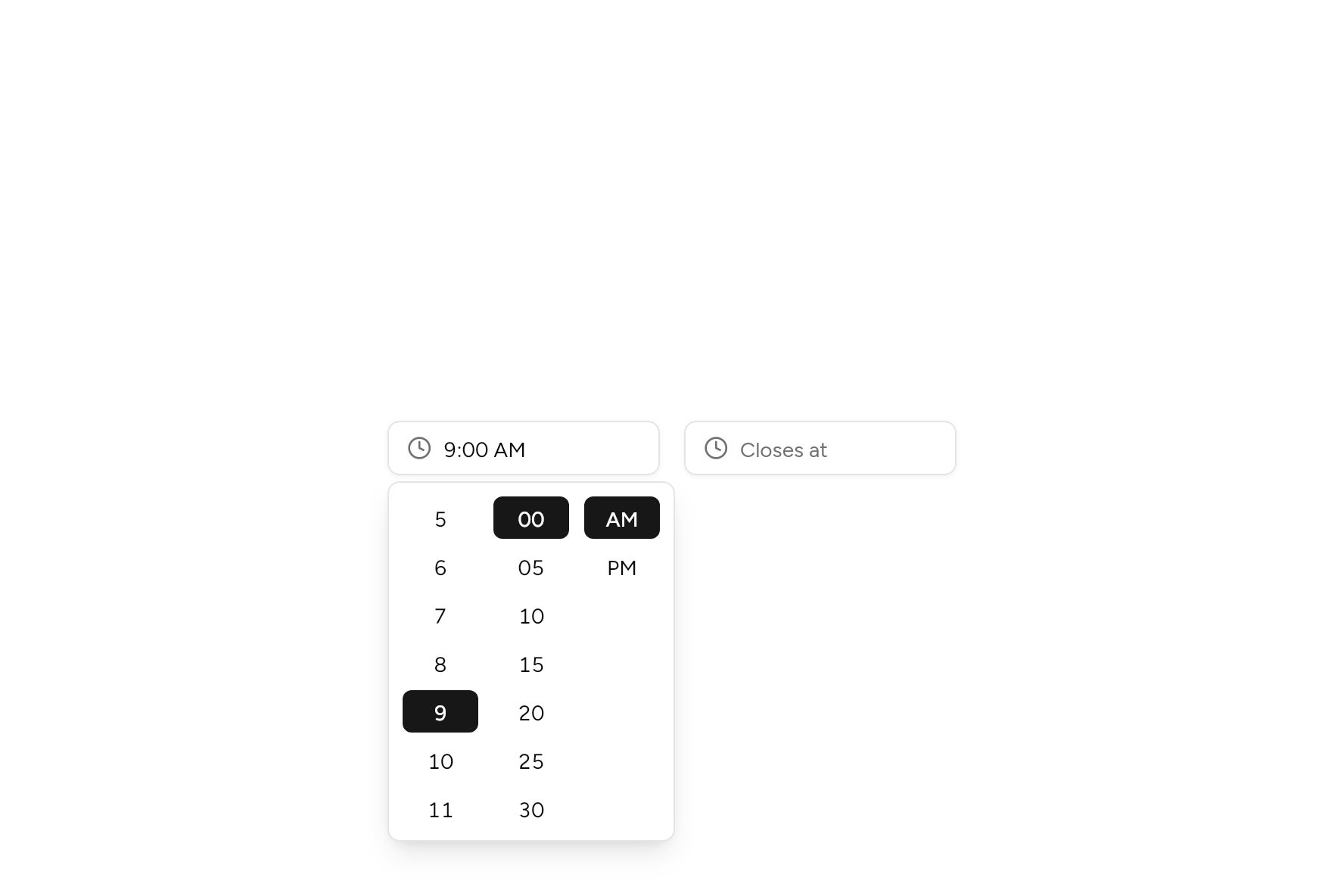
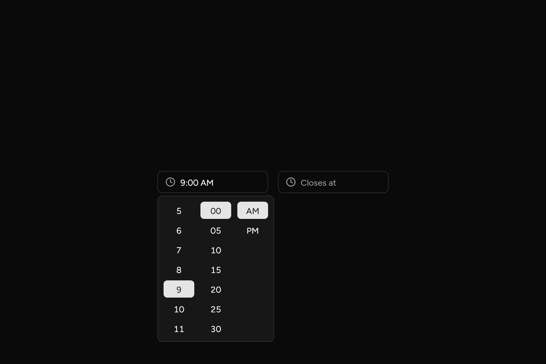
import 'package:flutter/widgets.dart';

import 'ui/time_picker.dart';

class TimePickerDemo extends StatefulWidget {
  const TimePickerDemo({super.key});

  @override
  State<TimePickerDemo> createState() => _TimePickerDemoState();
}

class _TimePickerDemoState extends State<TimePickerDemo> {
  ClockTime? opens = const ClockTime(9, 0), closes;

  @override
  Widget build(BuildContext context) => Row(
    mainAxisSize: MainAxisSize.min,
    crossAxisAlignment: CrossAxisAlignment.start,
    children: [
      // A 12-hour clock, with AM and PM.
      SizedBox(
        width: 180,
        child: TimePicker(
          value: opens,
          use24Hour: false,
          semanticLabel: 'Opens',
          onChanged: (t) => setState(() => opens = t),
        ),
      ),
      const SizedBox(width: 16),
      // A 24-hour clock, every 15 minutes.
      SizedBox(
        width: 180,
        child: TimePicker(
          value: closes,
          use24Hour: true,
          minuteStep: 15,
          placeholder: 'Closes at',
          semanticLabel: 'Closes',
          onChanged: (t) => setState(() => closes = t),
        ),
      ),
    ],
  );
}
Try its options
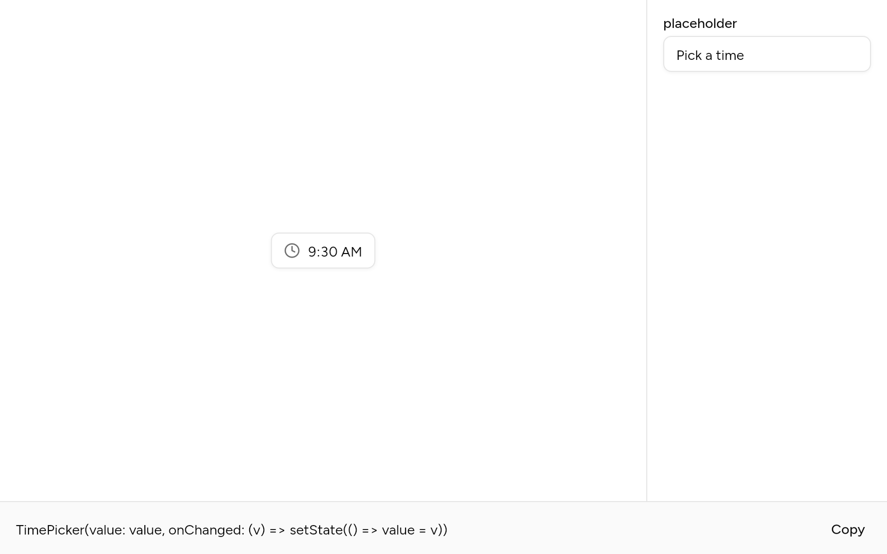
Each option its constructor takes, to change and see; the code below it is what you chose, to copy.
Add it
In your Flutter project:
ashlar add time-picker
It writes theme.dart, palette.dart, group.dart, pressable.dart, popover.dart and time_picker.dart into lib/ui, keeping any you already have, and adds ashlar_icons to pubspec.yaml. It needs pressable, popover and ashlar_icons, which come with it.
API
Read from the source above: each parameter with its type, its default, and what it is for.
ClockTimeclass
A time of day, to the minute: Flutter's own is in Material.
ClockTime(…)
| Parameter | Type | Default | What it is for |
|---|---|---|---|
hourpositional |
int |
0 to 23. | |
minutepositional |
int |
0 to 59. |
TimePickerclass
A button that shows a time and opens columns of hours and minutes (and AM and PM on a 12-hour clock) to change it. A pick changes the value at once; Enter, Escape or a click outside closes it.
From the keyboard the up and down arrows change the column in focus, and left and right move between the columns. A screen reader hears each column as a value to step up or down.
| Parameter | Type | Default | What it is for |
|---|---|---|---|
valuerequired |
ClockTime? |
The time picked, or null. | |
onChangedrequired |
ValueChanged<ClockTime>? |
Told each new time as it changes; null disables the picker. | |
placeholder |
String |
'Pick a time' |
Faint text shown while it is empty. |
use24Hour |
bool? |
A 24-hour clock, or 12 hours with AM and PM. Null follows the device's setting. | |
minuteStep |
int |
5 |
The minutes offered: every 5 unless set; 1 for every minute. |
semanticLabel |
String? |
What the time is for, read out before it: 'Start time'. |
Source
What lands in your app. It is yours from then on: change it as you would your own code, and ashlar add
will not write over it.
lib/ui/time_picker.dart 542 lines
// Ashlar UI: Time Picker. Copied into your app by `ashlar add time-picker`; it is yours to
// change.

import 'package:ashlar_icons/ashlar_icons.dart';
import 'package:flutter/services.dart';
import 'package:flutter/widgets.dart';

import 'popover.dart';
import 'pressable.dart';
import 'theme.dart';

/// A time of day, to the minute: Flutter's own is in Material.
@immutable
class ClockTime {
  const ClockTime(this.hour, this.minute)
    : assert(hour >= 0 && hour < 24),
      assert(minute >= 0 && minute < 60);

  /// Now, to the minute.
  factory ClockTime.now() {
    final n = DateTime.now();
    return ClockTime(n.hour, n.minute);
  }

  /// 0 to 23.
  final int hour;

  /// 0 to 59.
  final int minute;

  /// The minutes since midnight, for comparing times.
  int get inMinutes => hour * 60 + minute;

  /// As a 24-hour clock shows it: 09:05.
  String get as24Hour =>
      '${'$hour'.padLeft(2, '0')}:${'$minute'.padLeft(2, '0')}';

  /// As a 12-hour clock shows it: 9:05 AM.
  String get as12Hour =>
      '${hour % 12 == 0 ? 12 : hour % 12}:${'$minute'.padLeft(2, '0')} ${hour < 12 ? 'AM' : 'PM'}';

  @override
  bool operator ==(Object other) =>
      other is ClockTime && other.hour == hour && other.minute == minute;

  @override
  int get hashCode => Object.hash(hour, minute);

  @override
  String toString() => as24Hour;
}

/// A button that shows a time and opens columns of hours and minutes (and AM and PM on a
/// 12-hour clock) to change it. A pick changes the value at once; Enter, Escape or a
/// click outside closes it.
///
/// From the keyboard the up and down arrows change the column in focus, and left and right
/// move between the columns. A screen reader hears each column as a value to step up or
/// down.
///
/// ```dart
/// TimePicker(value: start, onChanged: (t) => setState(() => start = t))
/// ```
class TimePicker extends StatefulWidget {
  const TimePicker({
    super.key,
    required this.value,
    required this.onChanged,
    this.placeholder = 'Pick a time',
    this.use24Hour,
    this.minuteStep = 5,
    this.semanticLabel,
  }) : assert(minuteStep > 0 && 60 % minuteStep == 0);

  /// The time picked, or null.
  final ClockTime? value;

  /// Told each new time as it changes; null disables the picker.
  final ValueChanged<ClockTime>? onChanged;

  /// Faint text shown while it is empty.
  final String placeholder;

  /// A 24-hour clock, or 12 hours with AM and PM. Null follows the device's setting.
  final bool? use24Hour;

  /// The minutes offered: every 5 unless set; 1 for every minute.
  final int minuteStep;

  /// What the time is for, read out before it: 'Start time'.
  final String? semanticLabel;

  @override
  State<TimePicker> createState() => _TimePickerState();
}

class _TimePickerState extends State<TimePicker> {
  final _menu = MenuController();
  final _focus = FocusNode();

  @override
  void dispose() {
    _focus.dispose();
    super.dispose();
  }

  bool _twentyFour(BuildContext context) =>
      widget.use24Hour ?? MediaQuery.alwaysUse24HourFormatOf(context);

  /// What the columns start from before anything is picked: now, to the step.
  ClockTime get _shown {
    if (widget.value case final v?) return v;
    final now = ClockTime.now();
    final m = now.minute - now.minute % widget.minuteStep;
    return ClockTime(now.hour, m);
  }

  @override
  Widget build(BuildContext context) {
    final t = AshlarTheme.of(context);
    final c = t.colors;
    final h24 = _twentyFour(context);
    final v = widget.value;
    final shown = v == null ? null : (h24 ? v.as24Hour : v.as12Hour);
    return RawMenuAnchor(
      controller: _menu,
      childFocusNode: _focus,
      onClose: _focus.requestFocus,
      overlayBuilder: (context, info) => PopoverPanel(
        info: info,
        minWidth: 0,
        child: _Columns(
          value: _shown,
          use24Hour: h24,
          minuteStep: widget.minuteStep,
          onChanged: (time) {
            widget.onChanged?.call(time);
            setState(() {});
          },
          onDone: _menu.close,
        ),
      ),
      child: Pressable(
        focusNode: _focus,
        onPressed: widget.onChanged == null
            ? null
            : () => _menu.isOpen ? _menu.close() : _menu.open(),
        semanticLabel: widget.semanticLabel,
        semanticValue: widget.semanticLabel == null
            ? null
            : (shown ?? widget.placeholder),
        builder: (context, state) => Opacity(
          opacity: state.enabled ? 1 : .5,
          child: AnimatedContainer(
            duration: t.duration,
            // A height at least: larger text makes it taller rather than being cut off.
            constraints: BoxConstraints(minHeight: t.control(36)),
            padding: const EdgeInsets.symmetric(horizontal: 12),
            decoration: BoxDecoration(
              color: state.hovered ? c.accent : c.background,
              borderRadius: BorderRadius.circular(t.radiusMd),
              border: Border.all(color: state.focused ? c.ring : c.input),
              boxShadow: [if (state.focused) ...t.focusRing, ...t.shadowXs],
            ),
            child: Row(
              mainAxisSize: MainAxisSize.min,
              children: [
                AshlarIcon(
                  AshlarIconsRoundedStroke.clock,
                  size: 16,
                  color: c.mutedForeground,
                ),
                const SizedBox(width: 8),
                Flexible(
                  child: Text(
                    shown ?? widget.placeholder,
                    maxLines: 1,
                    overflow: TextOverflow.ellipsis,
                    style: t.text.sm.copyWith(
                      color: shown == null ? c.mutedForeground : c.foreground,
                      fontFeatures: const [FontFeature.tabularFigures()],
                    ),
                  ),
                ),
              ],
            ),
          ),
        ),
      ),
    );
  }
}

/// The hours, minutes and (on a 12-hour clock) AM and PM, side by side.
class _Columns extends StatefulWidget {
  const _Columns({
    required this.value,
    required this.use24Hour,
    required this.minuteStep,
    required this.onChanged,
    required this.onDone,
  });

  final ClockTime value;
  final bool use24Hour;
  final int minuteStep;
  final ValueChanged<ClockTime> onChanged;
  final VoidCallback onDone;

  @override
  State<_Columns> createState() => _ColumnsState();
}

class _ColumnsState extends State<_Columns> {
  late ClockTime _time = widget.value;

  /// Whether the keys are in use here: then the column in focus is outlined.
  bool _keys = false;

  void _usingKeys() {
    if (!_keys) setState(() => _keys = true);
  }

  void _set(ClockTime time) {
    setState(() => _time = time);
    widget.onChanged(time);
  }

  @override
  Widget build(BuildContext context) {
    final h24 = widget.use24Hour;
    final pm = _time.hour >= 12;
    // On a 12-hour clock the hours read 12, 1, 2 ... 11, and AM or PM says which half.
    final hours = h24
        ? [for (var h = 0; h < 24; h++) h]
        : [12, for (var h = 1; h < 12; h++) h];
    int hourOf(int shown) => h24 ? shown : (shown % 12) + (pm ? 12 : 0);
    final shownHour = h24
        ? _time.hour
        : (_time.hour % 12 == 0 ? 12 : _time.hour % 12);
    final minutes = [for (var m = 0; m < 60; m += widget.minuteStep) m];
    // A time between the steps, typed elsewhere, shows at the step before it.
    final shownMinute = _time.minute - _time.minute % widget.minuteStep;
    return Shortcuts(
      shortcuts: const {
        SingleActivator(LogicalKeyboardKey.enter): _DoneIntent(),
      },
      child: Actions(
        actions: {
          _DoneIntent: CallbackAction<_DoneIntent>(
            onInvoke: (_) {
              widget.onDone();
              return null;
            },
          ),
        },
        child: FocusTraversalGroup(
          policy: OrderedTraversalPolicy(),
          child: Padding(
            padding: const EdgeInsets.all(4),
            child: Row(
              mainAxisSize: MainAxisSize.min,
              children: [
                _Column(
                  label: 'Hour',
                  values: hours,
                  value: shownHour,
                  text: (h) => h24 ? '$h'.padLeft(2, '0') : '$h',
                  autofocus: true,
                  keyboard: _keys,
                  onKey: _usingKeys,
                  onChanged: (h) => _set(ClockTime(hourOf(h), _time.minute)),
                ),
                _Column(
                  label: 'Minute',
                  keyboard: _keys,
                  onKey: _usingKeys,
                  values: minutes,
                  value: shownMinute,
                  text: (m) => '$m'.padLeft(2, '0'),
                  onChanged: (m) => _set(ClockTime(_time.hour, m)),
                ),
                if (!h24)
                  _Column(
                    label: 'AM or PM',
                    keyboard: _keys,
                    onKey: _usingKeys,
                    values: const [0, 1],
                    value: pm ? 1 : 0,
                    text: (p) => p == 0 ? 'AM' : 'PM',
                    onChanged: (p) => _set(
                      ClockTime(
                        _time.hour % 12 + (p == 1 ? 12 : 0),
                        _time.minute,
                      ),
                    ),
                  ),
              ],
            ),
          ),
        ),
      ),
    );
  }
}

class _DoneIntent extends Intent {
  const _DoneIntent();
}

/// One column of values to pick from, scrolled to the one picked. To a screen reader it
/// is a value to step up or down; from the keyboard, the arrows step it.
class _Column extends StatefulWidget {
  const _Column({
    required this.label,
    required this.values,
    required this.value,
    required this.text,
    required this.onChanged,
    this.autofocus = false,
    required this.keyboard,
    required this.onKey,
  });

  final String label;
  final List<int> values;
  final int value;
  final String Function(int) text;
  final ValueChanged<int> onChanged;
  final bool autofocus;

  /// Whether the keys are in use: then this column is outlined while in focus.
  final bool keyboard;

  /// Told when a key is used here, or focus arrives by the keys.
  final VoidCallback onKey;

  @override
  State<_Column> createState() => _ColumnState();
}

class _ColumnState extends State<_Column> {
  static const _row = 32.0, _shown = 7;
  late final _scroll = ScrollController(
    initialScrollOffset: _offsetFor(widget.value),
  );
  late final _node = FocusNode(debugLabel: widget.label);
  bool _focused = false;

  /// Focus given by the picker itself (as it opens, or by a click) is not the keys'.
  bool _quiet = false;

  void _focusQuietly() {
    _quiet = true;
    _node.requestFocus();
    WidgetsBinding.instance.addPostFrameCallback((_) => _quiet = false);
  }

  @override
  void initState() {
    super.initState();
    // The menu that opens the panel takes focus itself; the first column then takes it, so
    // the first arrow pressed steps the hours.
    if (widget.autofocus) {
      WidgetsBinding.instance.addPostFrameCallback((_) {
        if (mounted) _focusQuietly();
      });
    }
  }

  int get _index =>
      widget.values.indexOf(widget.value).clamp(0, widget.values.length - 1);

  /// The offset that puts [value] in the middle of the column.
  double _offsetFor(int value) {
    final i = widget.values.indexOf(value).clamp(0, widget.values.length - 1);
    final most = (widget.values.length - _shown) * _row;
    return (i * _row - (_shown ~/ 2) * _row)
        .clamp(0, most < 0 ? 0 : most)
        .toDouble();
  }

  @override
  void didUpdateWidget(_Column old) {
    super.didUpdateWidget(old);
    if (old.value != widget.value && _scroll.hasClients) {
      // Keep the picked value in sight as the keys step it.
      final top = _scroll.offset, i = _index * _row;
      if (i < top || i + _row > top + _shown * _row) {
        _scroll.animateTo(
          _offsetFor(widget.value),
          duration: const Duration(milliseconds: 150),
          curve: Curves.easeOut,
        );
      }
    }
  }

  @override
  void dispose() {
    _scroll.dispose();
    _node.dispose();
    super.dispose();
  }

  void _step(int by) {
    final i = (_index + by) % widget.values.length;
    widget.onChanged(widget.values[i]);
  }

  @override
  Widget build(BuildContext context) {
    final t = AshlarTheme.of(context);
    final c = t.colors;
    final next = widget.values[(_index + 1) % widget.values.length];
    final previous = widget.values[(_index - 1) % widget.values.length];
    return Semantics(
      container: true,
      label: widget.label,
      value: widget.text(widget.value),
      increasedValue: widget.text(next),
      decreasedValue: widget.text(previous),
      onIncrease: () => _step(1),
      onDecrease: () => _step(-1),
      child: Focus(
        focusNode: _node,
        onFocusChange: (f) {
          setState(() => _focused = f);
          if (f &&
              !_quiet &&
              FocusManager.instance.highlightMode ==
                  FocusHighlightMode.traditional) {
            widget.onKey();
          }
        },
        onKeyEvent: (node, e) {
          if (e is! KeyDownEvent && e is! KeyRepeatEvent) {
            return KeyEventResult.ignored;
          }
          final k = e.logicalKey;
          if (k == LogicalKeyboardKey.arrowDown) {
            _step(1);
          } else if (k == LogicalKeyboardKey.arrowUp) {
            _step(-1);
          } else if (k == LogicalKeyboardKey.arrowRight) {
            isRtl(context) ? node.previousFocus() : node.nextFocus();
          } else if (k == LogicalKeyboardKey.arrowLeft) {
            isRtl(context) ? node.nextFocus() : node.previousFocus();
          } else {
            return KeyEventResult.ignored;
          }
          widget.onKey();
          return KeyEventResult.handled;
        },
        child: ExcludeSemantics(
          child: Container(
            width: 56,
            height: _row * _shown,
            margin: const EdgeInsets.all(2),
            decoration: BoxDecoration(
              borderRadius: BorderRadius.circular(t.radiusMd),
              // Outlined only for the keyboard: a click focuses the column too.
              border: Border.all(
                color: _focused && widget.keyboard
                    ? c.ring
                    : c.ring.withValues(alpha: 0),
              ),
            ),
            child: ScrollConfiguration(
              behavior: ScrollConfiguration.of(context)
                  .copyWith(scrollbars: false),
              child: ListView.builder(
                controller: _scroll,
                itemExtent: _row,
                itemCount: widget.values.length,
                itemBuilder: (context, i) {
                  final v = widget.values[i];
                  final on = v == widget.value;
                  // The column takes the keys; its rows take only the pointer.
                  return _Row(
                    onTap: () {
                      _focusQuietly();
                      widget.onChanged(v);
                    },
                    builder: (hovered) => AnimatedContainer(
                      duration: t.duration,
                      margin: const EdgeInsets.all(2),
                      alignment: Alignment.center,
                      decoration: BoxDecoration(
                        color: on
                            ? c.primary
                            : (hovered
                                  ? c.accent
                                  : c.accent.withValues(alpha: 0)),
                        borderRadius: BorderRadius.circular(t.radiusSm),
                      ),
                      child: Text(
                        widget.text(v),
                        style: t.text.sm.copyWith(
                          color: on ? c.primaryForeground : c.foreground,
                          fontWeight: on ? FontWeight.w500 : null,
                          fontFeatures: const [FontFeature.tabularFigures()],
                        ),
                      ),
                    ),
                  );
                },
              ),
            ),
          ),
        ),
      ),
    );
  }
}

/// A row that lights up under the pointer and is picked by a tap.
class _Row extends StatefulWidget {
  const _Row({required this.onTap, required this.builder});

  final VoidCallback onTap;
  final Widget Function(bool hovered) builder;

  @override
  State<_Row> createState() => _RowState();
}

class _RowState extends State<_Row> {
  bool _hovered = false;

  @override
  Widget build(BuildContext context) => MouseRegion(
    cursor: SystemMouseCursors.click,
    onEnter: (_) => setState(() => _hovered = true),
    onExit: (_) => setState(() => _hovered = false),
    child: GestureDetector(
      behavior: HitTestBehavior.opaque,
      onTap: widget.onTap,
      child: widget.builder(_hovered),
    ),
  );
}