

Alert
A notice, warning or error in the page, read out when it appears.
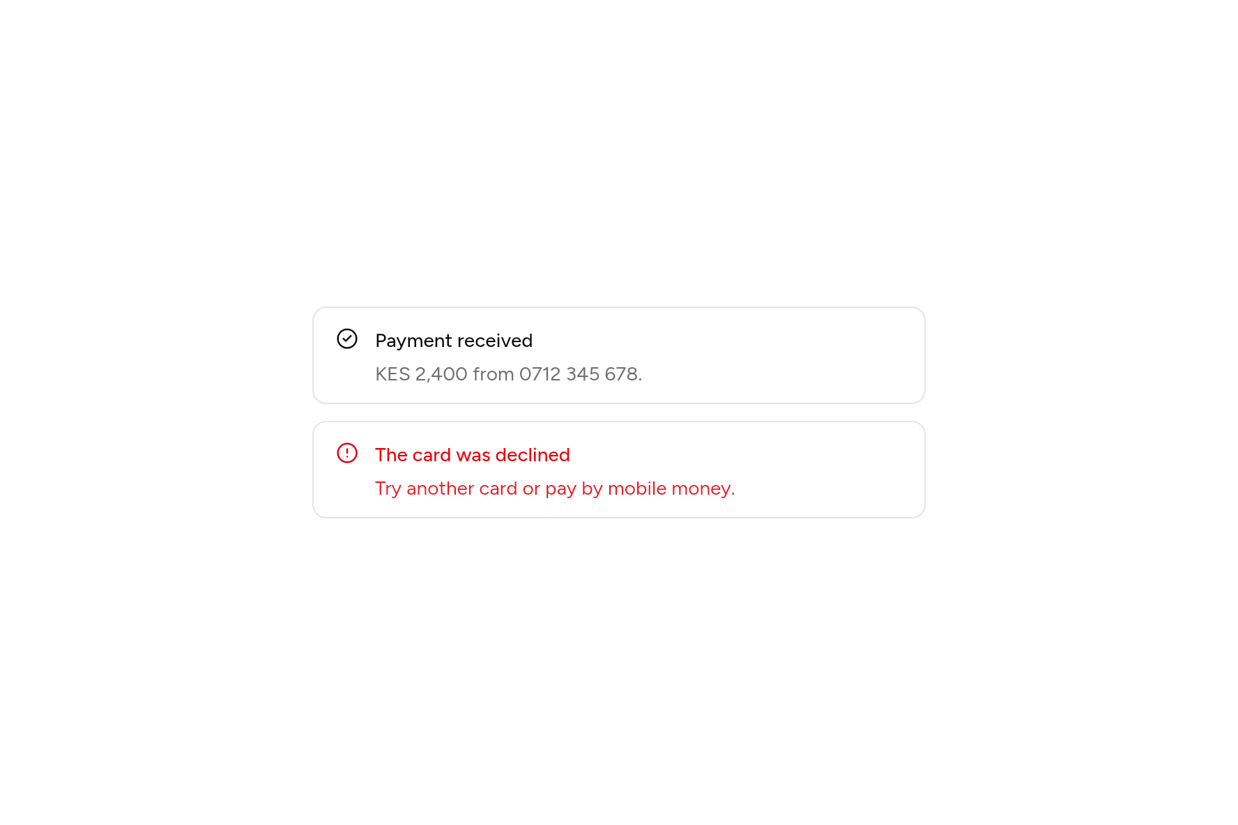
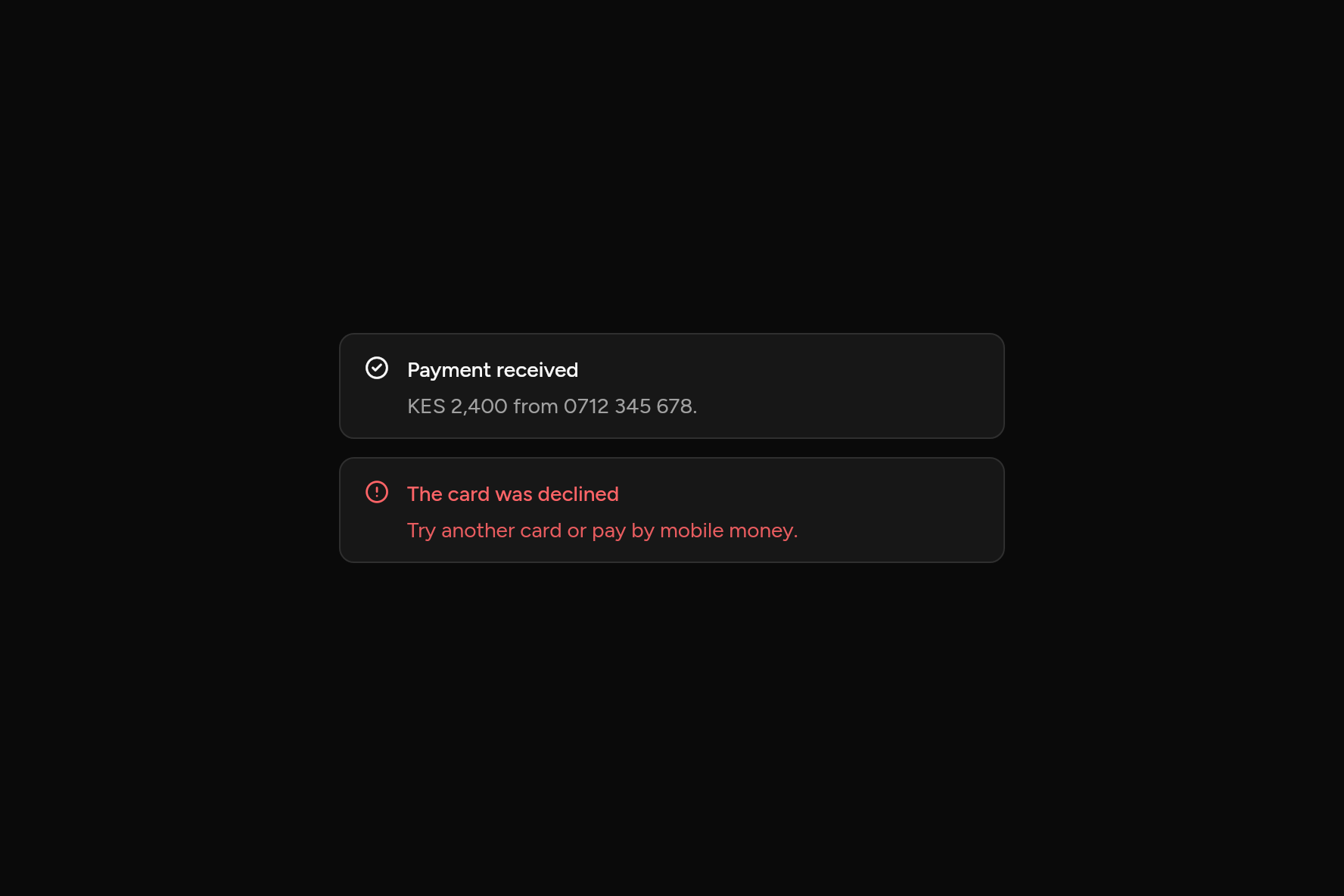
import 'package:ashlar_icons/ashlar_icons.dart';
import 'package:flutter/widgets.dart';

import 'ui/alert.dart';

class AlertDemo extends StatelessWidget {
  const AlertDemo({super.key});

  @override
  Widget build(BuildContext context) => const SizedBox(
    width: 440,
    child: Column(
      mainAxisSize: MainAxisSize.min,
      children: [
        Alert(
          icon: AshlarIcon(AshlarIconsRoundedStroke.circleCheck),
          title: Text('Payment received'),
          description: Text('KES 2,400 from 0712 345 678.'),
        ),
        SizedBox(height: 12),
        Alert(
          variant: AlertVariant.destructive,
          icon: AshlarIcon(AshlarIconsRoundedStroke.circleAlert),
          title: Text('The card was declined'),
          description: Text('Try another card or pay by mobile money.'),
        ),
      ],
    ),
  );
}
Try its options
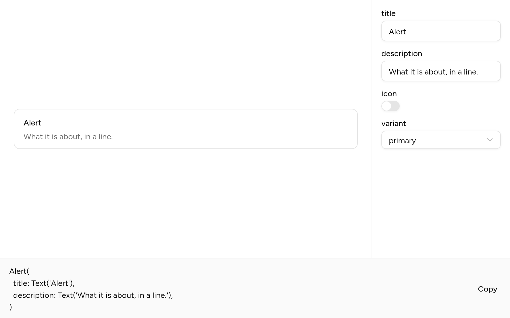
Each option its constructor takes, to change and see; the code below it is what you chose, to copy.
Add it
In your Flutter project:
ashlar add alert
It writes theme.dart, palette.dart and alert.dart into lib/ui, keeping any you already have.
Examples
Other ways to use it, each running live, with its code.
Something wrong
In the destructive colour, with an action.
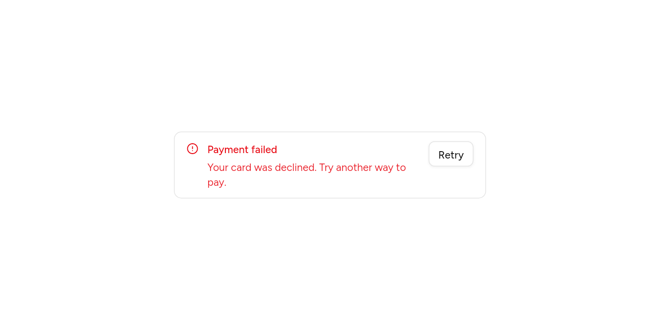
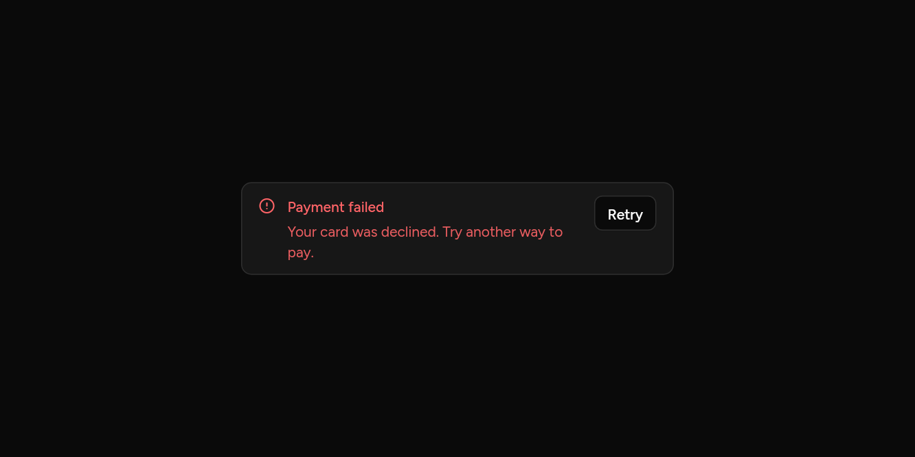
// Something wrong: In the destructive colour, with an action.
import 'package:ashlar_icons/ashlar_icons.dart';
import 'package:flutter/widgets.dart';

import 'ui/alert.dart';
import 'ui/button.dart';

class AlertDestructiveExample extends StatelessWidget {
  const AlertDestructiveExample({super.key});

  @override
  Widget build(BuildContext context) => SizedBox(
    width: 420,
    child: Alert(
      variant: AlertVariant.destructive,
      icon: const AshlarIcon(AshlarIconsRoundedStroke.circleAlert),
      title: const Text('Payment failed'),
      description: const Text('Your card was declined. Try another way to pay.'),
      action: Button(size: ButtonSize.sm, variant: ButtonVariant.outline, onPressed: () {}, child: const Text('Retry')),
    ),
  );
}
API
Read from the source above: each parameter with its type, its default, and what it is for.
AlertVariantenum
| Value | What it is for |
|---|---|
primary | Something to know. |
destructive | Something that went wrong or needs fixing. |
Alertclass
A message in the page that asks for attention: a notice, a warning, an error. A screen reader reads it out when it appears.
| Parameter | Type | Default | What it is for |
|---|---|---|---|
title | Widget? | The alert's title. | |
description |
Widget? |
A line under the title. | |
icon |
Widget? |
A 16px icon at the top left. | |
variant |
AlertVariant |
AlertVariant.primary |
Plain, or in the destructive colour for something wrong. |
action |
Widget? |
A button at the top right. |
Source
What lands in your app. It is yours from then on: change it as you would your own code, and ashlar add
will not write over it.
lib/ui/alert.dart 106 lines
// Ashlar UI: Alert. Copied into your app by `ashlar add alert`; it is yours to change.

import 'package:flutter/widgets.dart';

import 'theme.dart';

enum AlertVariant {
  /// Something to know.
  primary,

  /// Something that went wrong or needs fixing.
  destructive,
}

/// A message in the page that asks for attention: a notice, a warning, an error. A screen
/// reader reads it out when it appears.
///
/// ```dart
/// Alert(icon: AshlarIcon(AshlarIconsRoundedStroke.info), title: Text('Payment received'), description: Text('KES 2,400 from 0712 345 678.'))
/// Alert(variant: AlertVariant.destructive, icon: AshlarIcon(AshlarIconsRoundedStroke.circleAlert), title: Text('The card was declined'))
/// ```
class Alert extends StatelessWidget {
  const Alert({
    super.key,
    this.title,
    this.description,
    this.icon,
    this.variant = AlertVariant.primary,
    this.action,
  });

  /// The alert's title.
  final Widget? title;

  /// A line under the title.
  final Widget? description;

  /// A 16px icon at the top left.
  final Widget? icon;

  /// Plain, or in the destructive colour for something wrong.
  final AlertVariant variant;

  /// A button at the top right.
  final Widget? action;

  @override
  Widget build(BuildContext context) {
    final t = AshlarTheme.of(context);
    final c = t.colors;
    final destructive = variant == AlertVariant.destructive;
    final fg = destructive ? c.destructive : c.cardForeground;
    return Semantics(
      container: true,
      liveRegion: true,
      child: Container(
        padding: const EdgeInsets.symmetric(horizontal: 16, vertical: 12),
        decoration: BoxDecoration(
          color: c.card,
          borderRadius: BorderRadius.circular(t.radiusLg),
          border: Border.all(color: c.border),
        ),
        child: IconTheme.merge(
          data: IconThemeData(color: fg, size: 16),
          child: Row(
            crossAxisAlignment: CrossAxisAlignment.start,
            children: [
              if (icon != null) ...[
                Padding(padding: const EdgeInsets.only(top: 2), child: icon),
                const SizedBox(width: 12),
              ],
              Expanded(
                child: Column(
                  mainAxisSize: MainAxisSize.min,
                  crossAxisAlignment: CrossAxisAlignment.start,
                  children: [
                    if (title != null)
                      DefaultTextStyle.merge(
                        style: t.text.sm.copyWith(
                          color: fg,
                          fontWeight: FontWeight.w500,
                        ),
                        child: title!,
                      ),
                    if (title != null && description != null)
                      const SizedBox(height: 4),
                    if (description != null)
                      DefaultTextStyle.merge(
                        style: t.text.sm.copyWith(
                          color: destructive
                              ? c.destructive.withValues(alpha: .9)
                              : c.mutedForeground,
                        ),
                        child: description!,
                      ),
                  ],
                ),
              ),
              if (action != null) ...[const SizedBox(width: 12), action!],
            ],
          ),
        ),
      ),
    );
  }
}