

Calendar
Months of days to pick one, several or a range from, with week numbers and dropdowns.
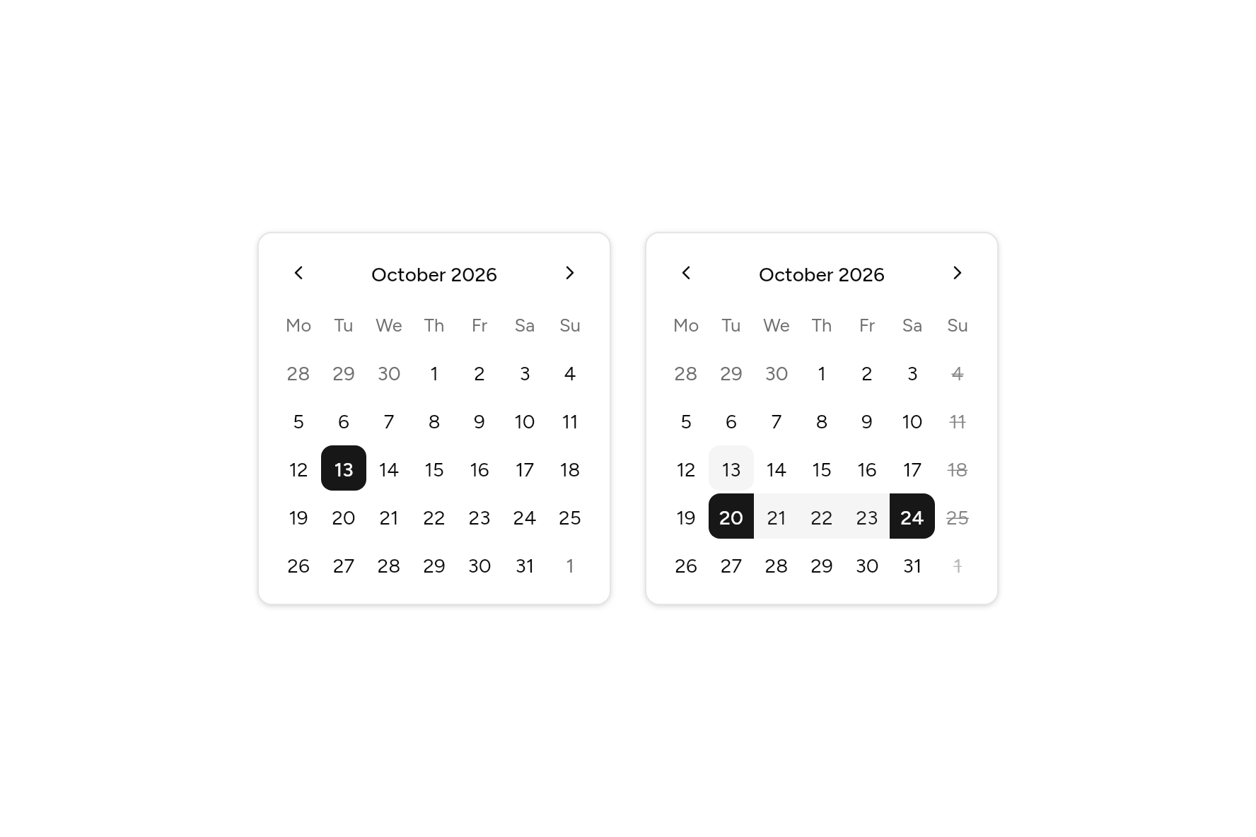
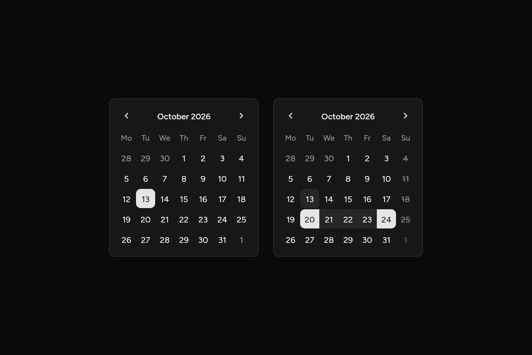
import 'package:flutter/widgets.dart';

import 'ui/calendar.dart';
import 'ui/theme.dart';

class CalendarDemo extends StatefulWidget {
  const CalendarDemo({super.key});

  @override
  State<CalendarDemo> createState() => _CalendarDemoState();
}

class _CalendarDemoState extends State<CalendarDemo> {
  DateTime? day = DateTime(2026, 10, 13);
  DateRange? stay = DateRange(DateTime(2026, 10, 20), DateTime(2026, 10, 24));

  @override
  Widget build(BuildContext context) {
    final t = AshlarTheme.of(context);
    BoxDecoration frame() => BoxDecoration(
      color: t.colors.card,
      border: Border.all(color: t.colors.border),
      borderRadius: BorderRadius.circular(t.radiusLg),
      boxShadow: t.shadowSm,
    );
    return Row(
      mainAxisSize: MainAxisSize.min,
      crossAxisAlignment: CrossAxisAlignment.start,
      children: [
        Container(
          padding: const EdgeInsets.all(12),
          decoration: frame(),
          child: Calendar(selected: day, onSelected: (d) => setState(() => day = d)),
        ),
        const SizedBox(width: 24),
        Container(
          padding: const EdgeInsets.all(12),
          decoration: frame(),
          child: Calendar.range(
            range: stay,
            isDisabled: (d) => d.weekday == DateTime.sunday,
            onRangeChanged: (r) => setState(() => stay = r),
          ),
        ),
      ],
    );
  }
}
Try its options
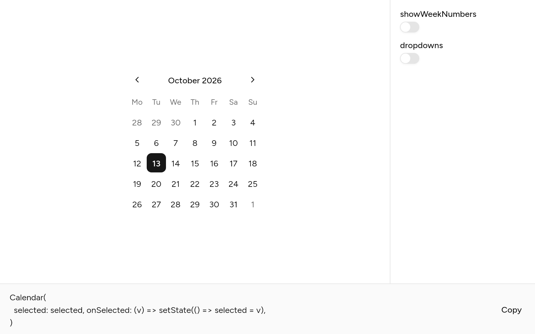
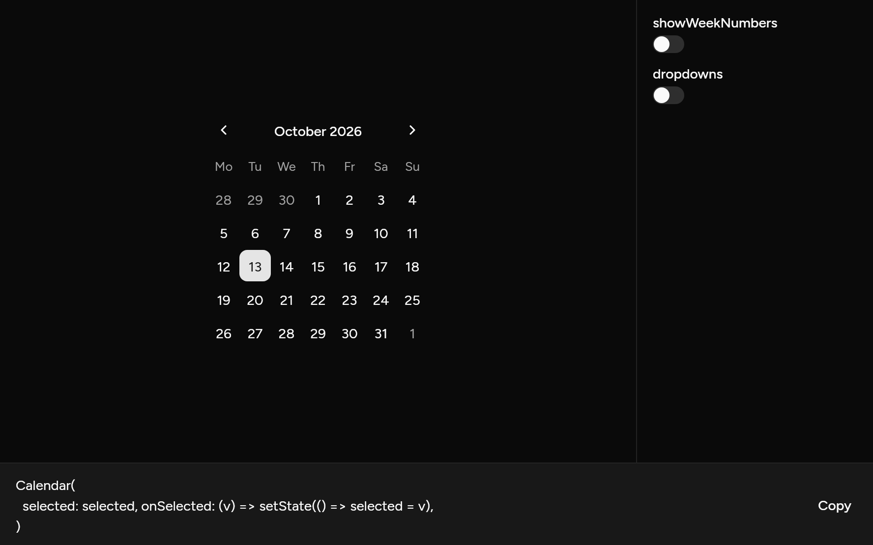
Each option its constructor takes, to change and see; the code below it is what you chose, to copy.
Add it
In your Flutter project:
ashlar add calendar
It writes theme.dart, palette.dart, group.dart, pressable.dart, button.dart, popover.dart, select.dart and calendar.dart into lib/ui, keeping any you already have, and adds ashlar_icons to pubspec.yaml. It needs button, select and ashlar_icons, which come with it.
Examples
Other ways to use it, each running live, with its code.
A span of days
Two months, a start and an end.
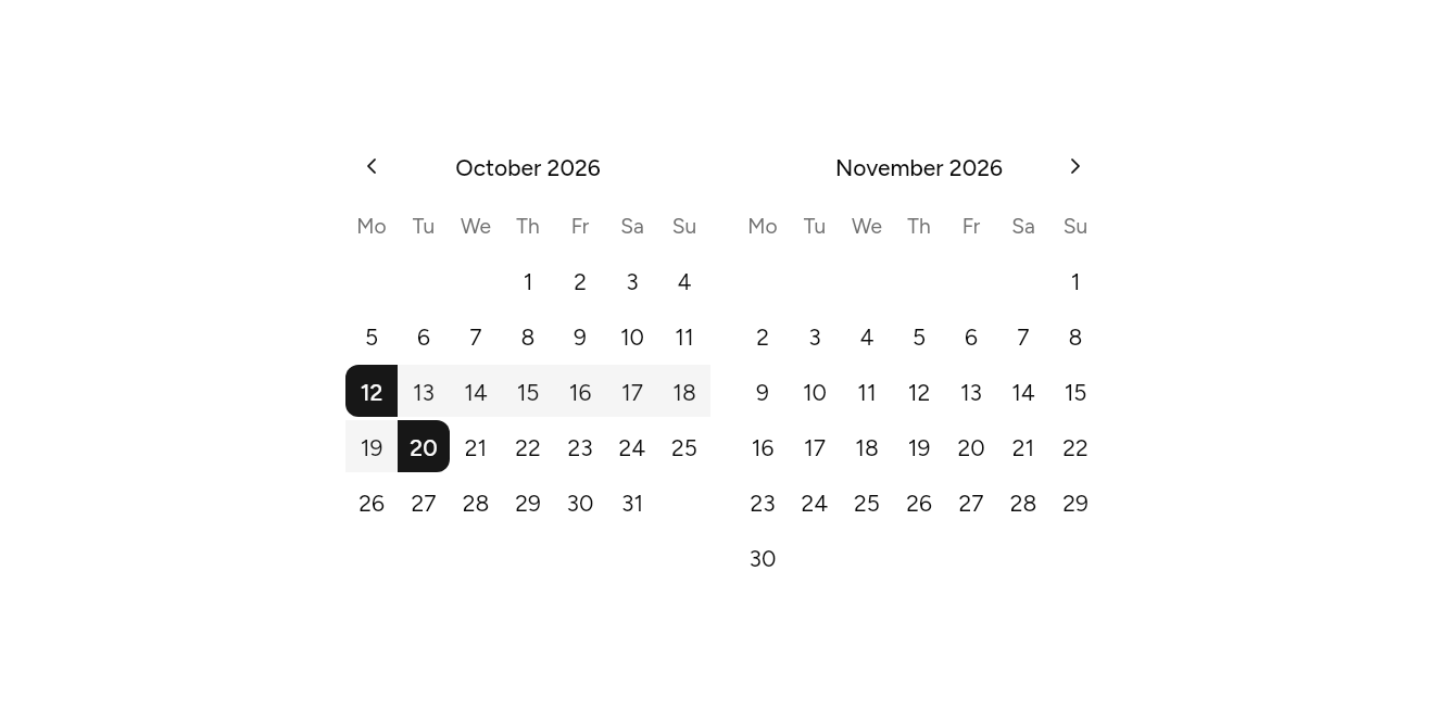
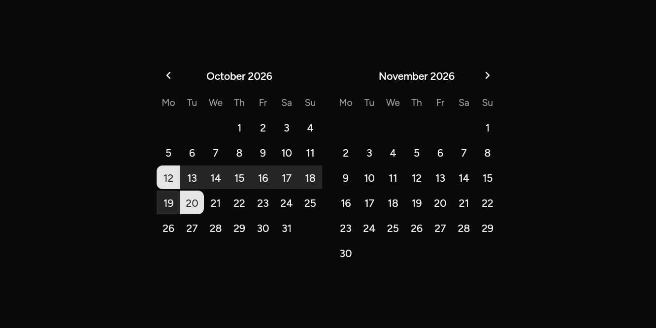
// A span of days: Two months, a start and an end.
import 'package:flutter/widgets.dart';

import 'ui/calendar.dart';

class CalendarRangeExample extends StatefulWidget {
  const CalendarRangeExample({super.key});

  @override
  State<CalendarRangeExample> createState() => _CalendarRangeExampleState();
}

class _CalendarRangeExampleState extends State<CalendarRangeExample> {
  DateRange? range = DateRange(DateTime(2026, 10, 12), DateTime(2026, 10, 20));

  @override
  Widget build(BuildContext context) => Calendar.range(
    months: 2,
    range: range,
    initialMonth: DateTime(2026, 10),
    onRangeChanged: (r) => setState(() => range = r),
  );
}
Several days
Pick any days.
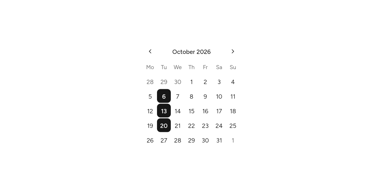
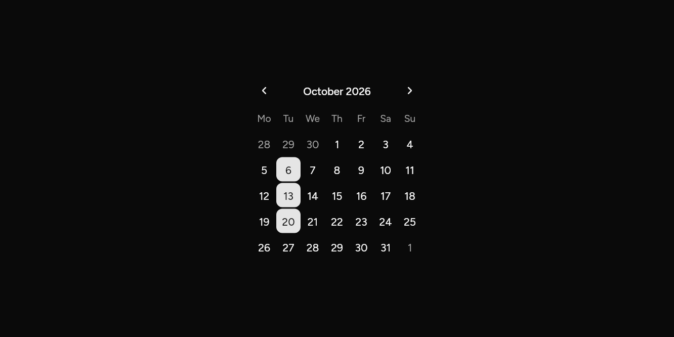
// Several days: Pick any days.
import 'package:flutter/widgets.dart';

import 'ui/calendar.dart';

class CalendarMultipleExample extends StatefulWidget {
  const CalendarMultipleExample({super.key});

  @override
  State<CalendarMultipleExample> createState() => _CalendarMultipleExampleState();
}

class _CalendarMultipleExampleState extends State<CalendarMultipleExample> {
  var days = {DateTime(2026, 10, 6), DateTime(2026, 10, 13), DateTime(2026, 10, 20)};

  @override
  Widget build(BuildContext context) => Calendar.multiple(
    days: days,
    initialMonth: DateTime(2026, 10),
    onDaysChanged: (d) => setState(() => days = d),
  );
}
Week numbers and dropdowns
Jump by month and year; the ISO week beside each row.
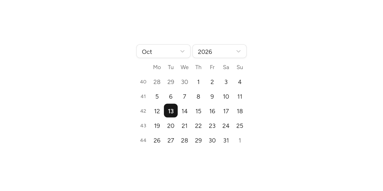
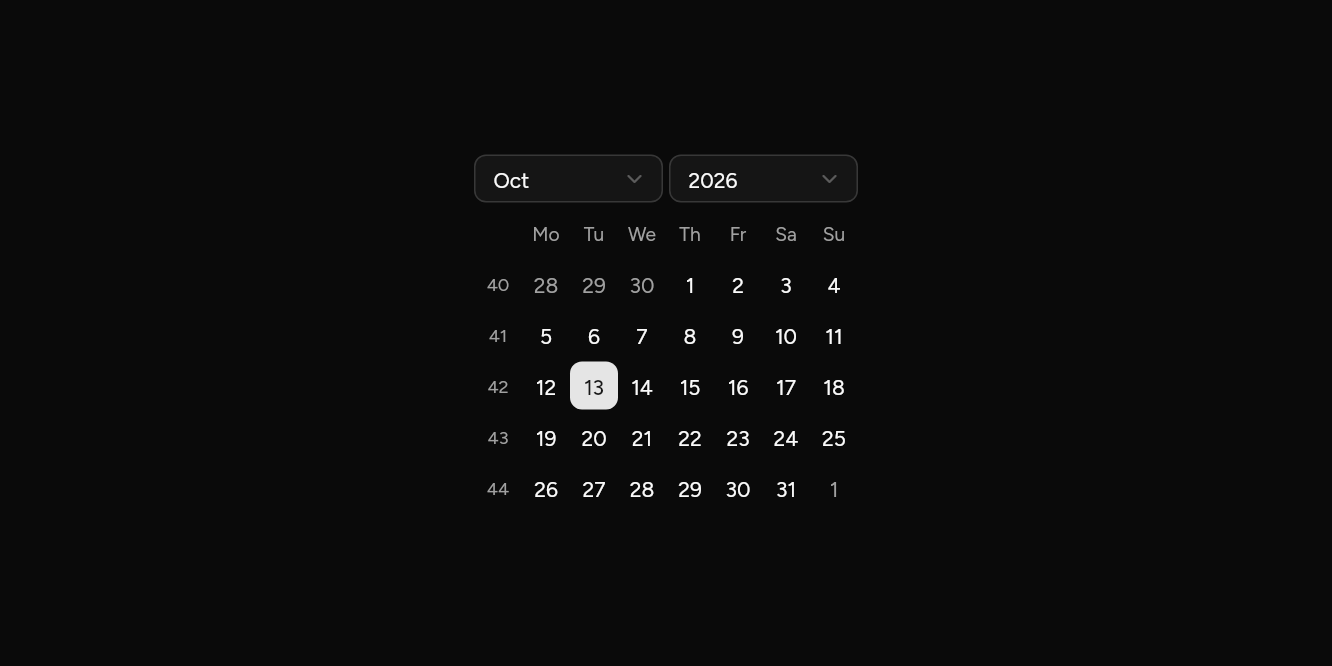
// Week numbers and dropdowns: Jump by month and year; the ISO week beside each row.
import 'package:flutter/widgets.dart';

import 'ui/calendar.dart';

class CalendarWeeksExample extends StatefulWidget {
  const CalendarWeeksExample({super.key});

  @override
  State<CalendarWeeksExample> createState() => _CalendarWeeksExampleState();
}

class _CalendarWeeksExampleState extends State<CalendarWeeksExample> {
  DateTime? day = DateTime(2026, 10, 13);

  @override
  Widget build(BuildContext context) => Calendar(
    selected: day,
    initialMonth: DateTime(2026, 10),
    showWeekNumbers: true,
    dropdowns: true,
    onSelected: (d) => setState(() => day = d),
  );
}
Days that cannot be picked
Weekends closed.
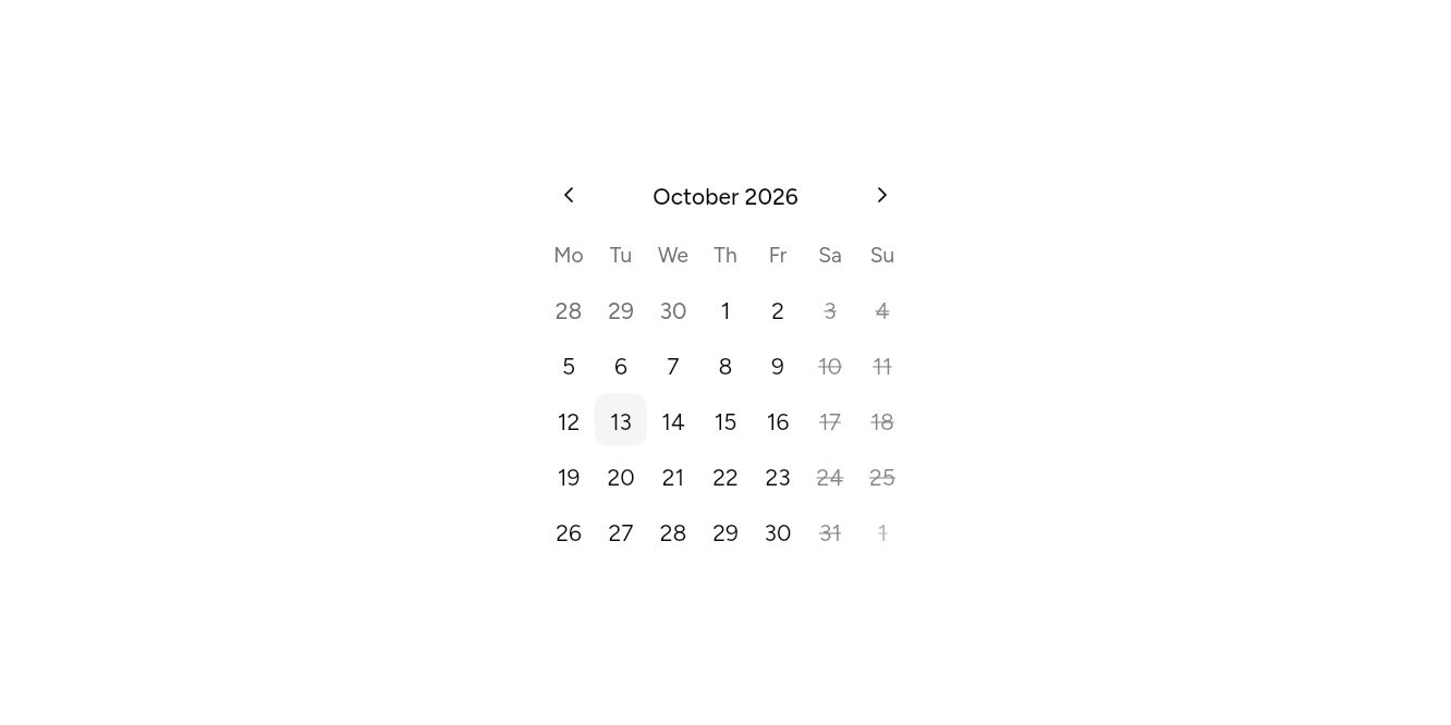
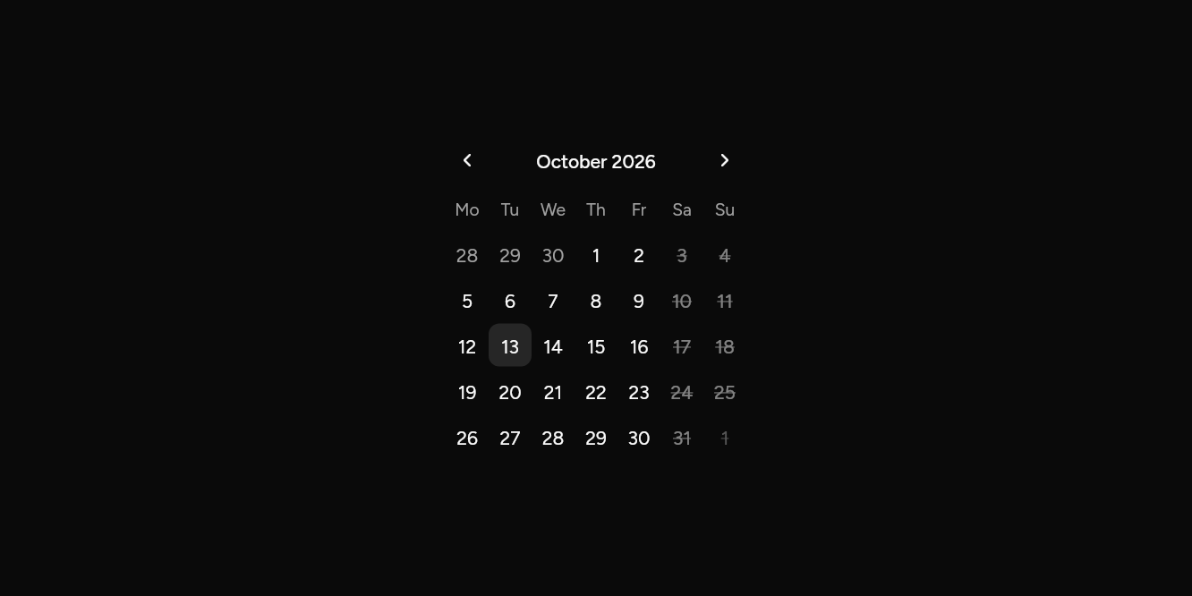
// Days that cannot be picked: Weekends closed.
import 'package:flutter/widgets.dart';

import 'ui/calendar.dart';

class CalendarBookedExample extends StatefulWidget {
  const CalendarBookedExample({super.key});

  @override
  State<CalendarBookedExample> createState() => _CalendarBookedExampleState();
}

class _CalendarBookedExampleState extends State<CalendarBookedExample> {
  DateTime? day;

  @override
  Widget build(BuildContext context) => Calendar(
    selected: day,
    initialMonth: DateTime(2026, 10),
    isDisabled: (d) => d.weekday >= DateTime.saturday,
    onSelected: (d) => setState(() => day = d),
  );
}
API
Read from the source above: each parameter with its type, its default, and what it is for.
DateNamesclass
The words dates are written in: month and weekday names, which day a week starts on, and how a date is written out. English unless an app puts others above it with DateNamesScope, for another language or another week.
| Parameter | Type | Default | What it is for |
|---|---|---|---|
monthsrequired |
List<String> |
January to December. | |
weekdaysrequired |
List<String> |
Monday to Sunday, in full, for screen readers. | |
weekdaysShortrequired |
List<String> |
Monday to Sunday, as short as a column heading takes. | |
firstWeekday |
int |
DateTime.monday |
DateTime.monday to DateTime.sunday. |
format |
String Function(DateNames names, DateTime date) |
_dayMonthYear |
A date written out: "13 October 2026". |
DateNamesScopeclass
Puts names above a part of the app, or the whole of it.
| Parameter | Type | Default | What it is for |
|---|---|---|---|
namesrequired |
DateNames |
Month and weekday names, and how a date is written. | |
childrequired |
|
The part of the app below it, which it applies to. |
DateRangeclass
From start to end, both days included. While a range is being chosen, end is null.
| Parameter | Type | Default | What it is for |
|---|---|---|---|
startpositional |
DateTime |
The first day. | |
endpositional, optional |
DateTime? |
The last day, or null while only the first is picked. |
isoWeekfunction
The ISO week of the year a day falls in: weeks start on Monday, and week 1 holds the year's first Thursday.
| Parameter | Type | Default | What it is for |
|---|---|---|---|
dpositional |
DateTime |
The day. |
Calendarclass
Months of days to pick from: one day, several with Calendar.multiple, or a start and an end with Calendar.range. The arrows either side change the month; the month's name opens the months of its year, and that year opens a choice of years. With dropdowns the month and year are picked from lists instead. From the keyboard the arrow keys move a day or a week, Page Up and Page Down a month, Home and End to the week's ends, and Enter or Space picks.
Calendar(…)
| Parameter | Type | Default | What it is for |
|---|---|---|---|
selectedrequired |
DateTime? |
The day picked, or null. | |
onSelectedrequired |
ValueChanged<DateTime> |
Told the day picked. | |
initialMonth |
DateTime? |
The month shown first: the selected one, else this month. | |
firstDate |
DateTime? |
The earliest and latest days that can be picked. | |
lastDate |
DateTime? |
The earliest and latest days that can be picked. | |
isDisabled |
bool Function(DateTime day)? |
Days that cannot be picked: weekends, booked days. | |
autofocus |
bool |
false |
Takes the keyboard's focus when it first appears, on the picked day. |
months |
int |
1 |
How many months show side by side. |
showWeekNumbers |
bool |
false |
The week of the year before each row. |
dropdowns |
bool |
false |
The month and year picked from lists, for going far quickly: a date of birth. |
Calendar.range(…)
| Parameter | Type | Default | What it is for |
|---|---|---|---|
rangerequired |
DateRange? |
The days picked, for a calendar that takes a span. | |
onRangeChangedrequired |
ValueChanged<DateRange> |
Told the new range whenever either end changes. | |
initialMonth |
DateTime? |
The month shown first: the selected one, else this month. | |
firstDate |
DateTime? |
The earliest and latest days that can be picked. | |
lastDate |
DateTime? |
The earliest and latest days that can be picked. | |
isDisabled |
bool Function(DateTime day)? |
Days that cannot be picked: weekends, booked days. | |
autofocus |
bool |
false |
Takes the keyboard's focus when it first appears, on the picked day. |
months |
int |
1 |
How many months show side by side. |
showWeekNumbers |
bool |
false |
The week of the year before each row. |
dropdowns |
bool |
false |
The month and year picked from lists, for going far quickly: a date of birth. |
Calendar.multiple(…)
| Parameter | Type | Default | What it is for |
|---|---|---|---|
daysrequired |
Set<DateTime> |
The days picked, each at midnight. | |
onDaysChangedrequired |
ValueChanged<Set<DateTime>> |
Told the days picked, for a calendar that takes several. | |
initialMonth |
DateTime? |
The month shown first: the selected one, else this month. | |
firstDate |
DateTime? |
The earliest and latest days that can be picked. | |
lastDate |
DateTime? |
The earliest and latest days that can be picked. | |
isDisabled |
bool Function(DateTime day)? |
Days that cannot be picked: weekends, booked days. | |
autofocus |
bool |
false |
Takes the keyboard's focus when it first appears, on the picked day. |
months |
int |
1 |
How many months show side by side. |
showWeekNumbers |
bool |
false |
The week of the year before each row. |
dropdowns |
bool |
false |
The month and year picked from lists, for going far quickly: a date of birth. |
Source
What lands in your app. It is yours from then on: change it as you would your own code, and ashlar add
will not write over it.
lib/ui/calendar.dart 913 lines
// Ashlar UI: Calendar. Copied into your app by `ashlar add calendar`; it is yours to change.
import 'dart:math' as math;
import 'package:ashlar_icons/ashlar_icons.dart';
import 'package:flutter/services.dart';
import 'package:flutter/widgets.dart';
import 'button.dart';
import 'select.dart';
import 'theme.dart';
/// The words dates are written in: month and weekday names, which day a week starts on,
/// and how a date is written out. English unless an app puts others above it with
/// [DateNamesScope], for another language or another week.
@immutable
class DateNames {
const DateNames({
required this.months,
required this.weekdays,
required this.weekdaysShort,
this.firstWeekday = DateTime.monday,
this.format = _dayMonthYear,
});
/// January to December.
final List<String> months;
/// Monday to Sunday, in full, for screen readers.
final List<String> weekdays;
/// Monday to Sunday, as short as a column heading takes.
final List<String> weekdaysShort;
/// [DateTime.monday] to [DateTime.sunday].
final int firstWeekday;
/// A date written out: "13 October 2026".
final String Function(DateNames names, DateTime date) format;
static String _dayMonthYear(DateNames n, DateTime d) =>
'${d.day} ${n.months[d.month - 1]} ${d.year}';
static const english = DateNames(
months: [
'January',
'February',
'March',
'April',
'May',
'June',
'July',
'August',
'September',
'October',
'November',
'December',
],
weekdays: [
'Monday',
'Tuesday',
'Wednesday',
'Thursday',
'Friday',
'Saturday',
'Sunday',
],
weekdaysShort: ['Mo', 'Tu', 'We', 'Th', 'Fr', 'Sa', 'Su'],
);
/// The names above [context], or English.
static DateNames of(BuildContext context) =>
context.dependOnInheritedWidgetOfExactType<DateNamesScope>()?.names ??
english;
String date(DateTime d) => format(this, d);
String monthYear(DateTime d) => '${months[d.month - 1]} ${d.year}';
}
/// Puts [names] above a part of the app, or the whole of it.
class DateNamesScope extends InheritedWidget {
const DateNamesScope({super.key, required this.names, required super.child});
/// Month and weekday names, and how a date is written.
final DateNames names;
@override
bool updateShouldNotify(DateNamesScope old) => old.names != names;
}
/// From [start] to [end], both days included. While a range is being chosen, [end] is null.
@immutable
class DateRange {
const DateRange(this.start, [this.end]);
/// The first day.
final DateTime start;
/// The last day, or null while only the first is picked.
final DateTime? end;
bool contains(DateTime d) =>
end != null && !d.isBefore(_day(start)) && !d.isAfter(_day(end!));
@override
bool operator ==(Object other) =>
other is DateRange && other.start == start && other.end == end;
@override
int get hashCode => Object.hash(start, end);
}
DateTime _day(DateTime d) => DateTime(d.year, d.month, d.day);
bool _same(DateTime? a, DateTime? b) =>
a != null &&
b != null &&
a.year == b.year &&
a.month == b.month &&
a.day == b.day;
/// The ISO week of the year a day falls in: weeks start on Monday, and week 1 holds the
/// year's first Thursday.
int isoWeek(DateTime d) {
final day = DateTime.utc(d.year, d.month, d.day);
final thursday = day.add(Duration(days: 4 - day.weekday));
final first = DateTime.utc(thursday.year, 1, 1);
return thursday.difference(first).inDays ~/ 7 + 1;
}
/// Months of days to pick from: one day, several with [Calendar.multiple], or a start and
/// an end with [Calendar.range]. The arrows either side change the month; the month's
/// name opens the months of its year, and that year opens a choice of years. With
/// [dropdowns] the month and year are picked from lists instead. From the keyboard the arrow keys
/// move a day or a week, Page Up and Page Down a month, Home and End to the week's ends,
/// and Enter or Space picks.
///
/// ```dart
/// Calendar(selected: day, onSelected: (d) => setState(() => day = d))
/// Calendar.range(range: stay, months: 2, onRangeChanged: (r) => setState(() => stay = r))
/// Calendar.multiple(days: picked, onDaysChanged: (d) => setState(() => picked = d))
/// ```
class Calendar extends StatefulWidget {
const Calendar({
super.key,
required this.selected,
required ValueChanged<DateTime> this.onSelected,
this.initialMonth,
this.firstDate,
this.lastDate,
this.isDisabled,
this.autofocus = false,
this.months = 1,
this.showWeekNumbers = false,
this.dropdowns = false,
}) : range = null,
onRangeChanged = null,
days = null,
onDaysChanged = null;
const Calendar.range({
super.key,
required this.range,
required ValueChanged<DateRange> this.onRangeChanged,
this.initialMonth,
this.firstDate,
this.lastDate,
this.isDisabled,
this.autofocus = false,
this.months = 1,
this.showWeekNumbers = false,
this.dropdowns = false,
}) : selected = null,
onSelected = null,
days = null,
onDaysChanged = null;
const Calendar.multiple({
super.key,
required Set<DateTime> this.days,
required ValueChanged<Set<DateTime>> this.onDaysChanged,
this.initialMonth,
this.firstDate,
this.lastDate,
this.isDisabled,
this.autofocus = false,
this.months = 1,
this.showWeekNumbers = false,
this.dropdowns = false,
}) : selected = null,
onSelected = null,
range = null,
onRangeChanged = null;
/// The day picked, or null.
final DateTime? selected;
/// Told the day picked.
final ValueChanged<DateTime>? onSelected;
/// The days picked, for a calendar that takes a span.
final DateRange? range;
/// Told the new range whenever either end changes.
final ValueChanged<DateRange>? onRangeChanged;
/// The days picked, each at midnight.
final Set<DateTime>? days;
/// Told the days picked, for a calendar that takes several.
final ValueChanged<Set<DateTime>>? onDaysChanged;
/// The month shown first: the selected one, else this month.
final DateTime? initialMonth;
/// The earliest and latest days that can be picked.
final DateTime? firstDate, lastDate;
/// Days that cannot be picked: weekends, booked days.
final bool Function(DateTime day)? isDisabled;
/// Takes the keyboard's focus when it first appears, on the picked day.
final bool autofocus;
/// How many months show side by side.
final int months;
/// The week of the year before each row.
final bool showWeekNumbers;
/// The month and year picked from lists, for going far quickly: a date of birth.
final bool dropdowns;
@override
State<Calendar> createState() => _CalendarState();
}
class _CalendarState extends State<Calendar> {
late DateTime _month = _monthOf(
widget.initialMonth ??
widget.selected ??
widget.range?.start ??
widget.days?.firstOrNull ??
DateTime.now(),
);
late DateTime _focus = _day(
widget.selected ??
widget.range?.start ??
widget.days?.firstOrNull ??
widget.initialMonth ??
DateTime.now(),
);
final _node = FocusNode(debugLabel: 'Calendar');
/// A day's square and the weekdays' row, grown with large text so a number is never
/// cut off: 32 and 24 at its usual size.
double _cell = 32, _head = 24, _header = 32;
void _measure(BuildContext context) {
final scaler = MediaQuery.textScalerOf(context);
_cell = math.max(32, scaler.scale(20));
_head = math.max(24, scaler.scale(16) + 8);
_header = grownHeight(context, 32);
}
bool _keyboard = false;
/// Focus the calendar gives itself (as it opens, or as its view changes) shows no ring:
/// a click brought it there. Focus reached with the keys does.
bool _quiet = false;
void _focusQuietly() {
_quiet = true;
_node.requestFocus();
WidgetsBinding.instance.addPostFrameCallback((_) => _quiet = false);
}
/// Days, or the months of [_year], or the twelve years from [_years].
_View _view = _View.days;
int _year = 0, _years = 0;
void _open(_View view, int year) => setState(() {
// The button pressed goes with the view: the calendar keeps the keyboard's focus.
_focusQuietly();
_view = view;
_year = year;
// The twelve years shown hold the year, a dozen to a page.
_years = year - (year % 12);
});
static DateTime _monthOf(DateTime d) => DateTime(d.year, d.month);
@override
void initState() {
super.initState();
// In a menu's panel (a date picker's) the menu takes focus itself; the calendar then
// takes it, so the first arrow pressed moves through the days.
if (widget.autofocus) {
WidgetsBinding.instance.addPostFrameCallback((_) {
if (mounted) _focusQuietly();
});
}
}
@override
void dispose() {
_node.dispose();
super.dispose();
}
bool _off(DateTime d) =>
(widget.firstDate != null && d.isBefore(_day(widget.firstDate!))) ||
(widget.lastDate != null && d.isAfter(_day(widget.lastDate!))) ||
(widget.isDisabled?.call(d) ?? false);
void _pick(DateTime d) {
if (_off(d)) return;
setState(() => _focus = d);
if (widget.onSelected != null) {
widget.onSelected!(d);
return;
}
if (widget.onDaysChanged != null) {
final next = {...widget.days!};
final had = next.where((x) => _same(x, d)).toList();
had.isEmpty ? next.add(d) : next.removeAll(had);
widget.onDaysChanged!(next);
return;
}
final r = widget.range;
// A finished range, or none: start again. A start only: this is the other end.
if (r == null || r.end != null) {
widget.onRangeChanged!(DateRange(d));
} else {
widget.onRangeChanged!(
d.isBefore(r.start) ? DateRange(d, r.start) : DateRange(r.start, d),
);
}
}
void _showMonth(int by) =>
setState(() => _month = DateTime(_month.year, _month.month + by));
void _moveFocus(DateTime to) {
setState(() {
_focus = to;
// Keep the focused day in view: move the months only when it leaves them.
final last = DateTime(_month.year, _month.month + widget.months - 1);
if (to.isBefore(_month)) _month = _monthOf(to);
if (to.isAfter(DateTime(last.year, last.month + 1, 0))) {
_month = DateTime(to.year, to.month - widget.months + 1);
}
});
}
KeyEventResult _key(FocusNode node, KeyEvent e, int first) {
if (e is! KeyDownEvent && e is! KeyRepeatEvent) {
return KeyEventResult.ignored;
}
final k = e.logicalKey;
final f = _focus;
final DateTime? to = switch (k) {
LogicalKeyboardKey.arrowLeft => DateTime(
f.year,
f.month,
f.day - (isRtl(context) ? -1 : 1),
),
LogicalKeyboardKey.arrowRight => DateTime(
f.year,
f.month,
f.day + (isRtl(context) ? -1 : 1),
),
LogicalKeyboardKey.arrowUp => DateTime(f.year, f.month, f.day - 7),
LogicalKeyboardKey.arrowDown => DateTime(f.year, f.month, f.day + 7),
LogicalKeyboardKey.pageUp => DateTime(f.year, f.month - 1, f.day),
LogicalKeyboardKey.pageDown => DateTime(f.year, f.month + 1, f.day),
LogicalKeyboardKey.home => DateTime(
f.year,
f.month,
f.day - (f.weekday - first + 7) % 7,
),
LogicalKeyboardKey.end => DateTime(
f.year,
f.month,
f.day + 6 - (f.weekday - first + 7) % 7,
),
_ => null,
};
if (to != null) {
setState(() => _keyboard = true);
_moveFocus(_day(to));
return KeyEventResult.handled;
}
if (k == LogicalKeyboardKey.enter || k == LogicalKeyboardKey.space) {
_pick(_focus);
return KeyEventResult.handled;
}
return KeyEventResult.ignored;
}
@override
Widget build(BuildContext context) {
_measure(context);
if (_view != _View.days) return _picker(context);
final names = DateNames.of(context);
final canBack =
widget.firstDate == null || _month.isAfter(_monthOf(widget.firstDate!));
final lastShown = DateTime(_month.year, _month.month + widget.months - 1);
final canOn =
widget.lastDate == null ||
lastShown.isBefore(_monthOf(widget.lastDate!));
return Focus(
focusNode: _node,
onFocusChange: (f) => setState(
() => _keyboard =
f &&
!_quiet &&
FocusManager.instance.highlightMode ==
FocusHighlightMode.traditional,
),
onKeyEvent: (node, e) => _key(node, e, names.firstWeekday),
child: Row(
mainAxisSize: MainAxisSize.min,
crossAxisAlignment: CrossAxisAlignment.start,
children: [
for (var m = 0; m < widget.months; m++) ...[
if (m > 0) const SizedBox(width: 16),
_grid(
context,
DateTime(_month.year, _month.month + m),
back: m == 0 ? (canBack ? () => _showMonth(-1) : null) : null,
on: m == widget.months - 1
? (canOn ? () => _showMonth(1) : null)
: null,
first: m == 0,
last: m == widget.months - 1,
),
],
],
),
);
}
Widget _caption(BuildContext context, DateTime month) {
final t = AshlarTheme.of(context);
final names = DateNames.of(context);
if (!widget.dropdowns) {
// The month's name opens its year's months.
return Button(
variant: ButtonVariant.ghost,
size: ButtonSize.sm,
semanticLabel: '${names.monthYear(month)}, choose a month and year',
onPressed: () => _open(_View.months, month.year),
child: Text(
names.monthYear(month),
style: t.text.sm.copyWith(
fontWeight: FontWeight.w500,
color: t.colors.foreground,
),
),
);
}
final from = widget.firstDate?.year ?? month.year - 100,
to = widget.lastDate?.year ?? month.year + 10;
return Row(
mainAxisSize: MainAxisSize.min,
children: [
Expanded(
child: Select<int>(
size: SelectSize.sm,
value: month.month,
semanticLabel: 'Month',
options: [
for (var i = 1; i <= 12; i++)
SelectOption(i, names.months[i - 1].substring(0, 3)),
],
onChanged: (v) => setState(() => _month = DateTime(_month.year, v)),
),
),
const SizedBox(width: 4),
Expanded(
child: Select<int>(
size: SelectSize.sm,
value: month.year,
semanticLabel: 'Year',
options: [for (var y = from; y <= to; y++) SelectOption(y, '$y')],
onChanged: (v) =>
setState(() => _month = DateTime(v, _month.month)),
),
),
],
);
}
/// The months of a year, or a dozen years, in the room the days take, so a popover
/// keeps its size as the view changes.
Widget _picker(BuildContext context) {
final t = AshlarTheme.of(context);
final names = DateNames.of(context);
final months = _view == _View.months;
final lead = (_month.weekday - names.firstWeekday + 7) % 7;
final count = DateTime(_month.year, _month.month + 1, 0).day;
final weeks = ((lead + count) / 7).ceil();
final width =
widget.months * ((widget.showWeekNumbers ? _cell : 0.0) + 7 * _cell) +
(widget.months - 1) * 16.0;
final height = _header + 8 + _head + 4 + weeks * (_cell + 2);
final first = widget.firstDate, last = widget.lastDate;
// A month or a year can be chosen when some of it lies between the first and last dates.
bool monthOff(int m) =>
(first != null &&
DateTime(
_year,
m + 1,
).isBefore(DateTime(first.year, first.month, 2))) ||
(last != null && DateTime(_year, m).isAfter(last));
bool yearOff(int y) =>
(first != null && y < first.year) || (last != null && y > last.year);
final VoidCallback? back = months
? (first == null || _year > first.year
? () => setState(() => _year--)
: null)
: (first == null || _years > first.year
? () => setState(() => _years -= 12)
: null);
final VoidCallback? on = months
? (last == null || _year < last.year
? () => setState(() => _year++)
: null)
: (last == null || _years + 11 < last.year
? () => setState(() => _years += 12)
: null);
Widget cell(
String label,
String spoken,
bool chosen,
bool off,
VoidCallback pick,
) => Padding(
padding: const EdgeInsets.all(3),
child: Button(
variant: chosen ? ButtonVariant.primary : ButtonVariant.ghost,
size: ButtonSize.sm,
semanticLabel: spoken,
onPressed: off ? null : pick,
child: Text(label),
),
);
return Focus(
focusNode: _node,
// Escape steps back towards the days, rather than closing what holds the calendar.
onKeyEvent: (node, e) {
if (e is KeyDownEvent && e.logicalKey == LogicalKeyboardKey.escape) {
setState(() => _view = months ? _View.days : _View.months);
return KeyEventResult.handled;
}
return KeyEventResult.ignored;
},
child: SizedBox(
width: width,
height: height,
child: Column(
children: [
SizedBox(
// Its own height, taller with large text: a finger's room around its
// buttons spills over rather than growing it.
height: _header,
child: Row(
children: [
_Nav(
icon: isRtl(context)
? AshlarIconsRoundedStroke.chevronRight
: AshlarIconsRoundedStroke.chevronLeft,
label: months ? 'Previous year' : 'Earlier years',
onPressed: back,
),
Expanded(
child: Center(
child: months
// The year opens a choice of years.
? Button(
variant: ButtonVariant.ghost,
size: ButtonSize.sm,
semanticLabel: '$_year, choose a year',
onPressed: () => _open(_View.years, _year),
child: Text('$_year'),
)
: Text(
'$_years to ${_years + 11}',
style: t.text.sm.copyWith(
fontWeight: FontWeight.w500,
),
),
),
),
_Nav(
icon: isRtl(context)
? AshlarIconsRoundedStroke.chevronLeft
: AshlarIconsRoundedStroke.chevronRight,
label: months ? 'Next year' : 'Later years',
onPressed: on,
),
],
),
),
const SizedBox(height: 8),
Expanded(
child: Column(
children: [
for (var row = 0; row < 4; row++)
Expanded(
child: Row(
crossAxisAlignment: CrossAxisAlignment.stretch,
children: [
for (var col = 0; col < 3; col++)
Expanded(
child: months
? cell(
names.months[row * 3 + col].substring(
0,
3,
),
'${names.months[row * 3 + col]} $_year',
_month.year == _year &&
_month.month == row * 3 + col + 1,
monthOff(row * 3 + col + 1),
() => setState(() {
_focusQuietly();
_month = DateTime(
_year,
row * 3 + col + 1,
);
_view = _View.days;
}),
)
: cell(
'${_years + row * 3 + col}',
'${_years + row * 3 + col}',
_year == _years + row * 3 + col,
yearOff(_years + row * 3 + col),
() => _open(
_View.months,
_years + row * 3 + col,
),
),
),
],
),
),
],
),
),
],
),
),
);
}
Widget _grid(
BuildContext context,
DateTime month, {
VoidCallback? back,
VoidCallback? on,
required bool first,
required bool last,
}) {
final t = AshlarTheme.of(context);
final c = t.colors;
final names = DateNames.of(context);
final firstDay = names.firstWeekday;
// The grid starts on the first weekday on or before the 1st, and runs whole weeks.
final lead = (month.weekday - firstDay + 7) % 7;
final start = DateTime(month.year, month.month, 1 - lead);
final count = DateTime(month.year, month.month + 1, 0).day;
final weeks = ((lead + count) / 7).ceil();
final today = _day(DateTime.now());
final weekCol = widget.showWeekNumbers ? _cell : 0.0;
Widget day(DateTime d) {
final outside = d.month != month.month;
// With two months, a day outside its month is left to the month it belongs to.
if (outside && widget.months > 1) return const SizedBox();
final off = _off(d);
final r = widget.range;
final isStart =
_same(d, r?.start) ||
_same(d, widget.selected) ||
(widget.days?.any((x) => _same(x, d)) ?? false);
final isEnd = _same(d, r?.end);
final middle = !isStart && !isEnd && (r?.contains(d) ?? false);
final picked = isStart || isEnd;
final focused = _keyboard && _node.hasFocus && _same(d, _focus);
final isToday = _same(d, today);
final fg = picked
? c.primaryForeground
: (middle
? c.accentForeground
: (outside ? c.mutedForeground : c.foreground));
// A range is one band: the ends round only on their outer side.
final radius = Radius.circular(t.radiusMd);
final inRange = r?.end != null && !_same(r!.start, r.end);
final band = BorderRadiusDirectional.horizontal(
start: middle || (isEnd && inRange) ? Radius.zero : radius,
end: middle || (isStart && inRange && r.end != null)
? Radius.zero
: radius,
);
return Semantics(
button: true,
enabled: !off,
selected: picked || middle,
label:
'${names.weekdays[d.weekday - 1]}, ${names.date(d)}${isToday ? ', today' : ''}',
onTap: off ? null : () => _pick(d),
child: ExcludeSemantics(
child: _Day(
onTap: off ? null : () => _pick(d),
builder: (hovered) => Container(
decoration: BoxDecoration(
color: picked
? c.primary
: (middle
? c.accent
: ((hovered || isToday) && !off
? c.accent
: c.accent.withValues(alpha: 0))),
borderRadius: middle || picked
? band
: BorderRadius.all(radius),
boxShadow: [if (focused) ...t.focusRing],
),
alignment: Alignment.center,
child: Opacity(
opacity: off ? .5 : 1,
child: Text(
'${d.day}',
style: t.text.sm.copyWith(
color: fg,
decoration: off ? TextDecoration.lineThrough : null,
decorationColor: fg,
fontWeight: picked ? FontWeight.w500 : null,
),
),
),
),
),
),
);
}
return Semantics(
container: true,
label: names.monthYear(month),
explicitChildNodes: true,
child: SizedBox(
width: weekCol + 7 * _cell,
child: Column(
mainAxisSize: MainAxisSize.min,
children: [
SizedBox(
// Its own height, taller with large text: a finger's room around its
// buttons spills over rather than growing it.
height: _header,
// With dropdowns the lists change the month, and take the arrows' room.
child: Row(
children: [
if (!widget.dropdowns)
SizedBox(
width: 32,
child: first
? _Nav(
icon: isRtl(context)
? AshlarIconsRoundedStroke.chevronRight
: AshlarIconsRoundedStroke.chevronLeft,
label: 'Previous month',
onPressed: back,
)
: null,
),
Expanded(child: Center(child: _caption(context, month))),
if (!widget.dropdowns)
SizedBox(
width: 32,
child: last
? _Nav(
icon: isRtl(context)
? AshlarIconsRoundedStroke.chevronLeft
: AshlarIconsRoundedStroke.chevronRight,
label: 'Next month',
onPressed: on,
)
: null,
),
],
),
),
const SizedBox(height: 8),
ExcludeSemantics(
child: Row(
children: [
if (widget.showWeekNumbers) SizedBox(width: weekCol),
for (var i = 0; i < 7; i++)
SizedBox(
width: _cell,
height: _head,
child: Center(
child: Text(
names.weekdaysShort[(firstDay - 1 + i) % 7],
style: t.text.xs.copyWith(
color: c.mutedForeground,
fontSize: 12.8,
),
),
),
),
],
),
),
const SizedBox(height: 4),
for (var w = 0; w < weeks; w++)
Padding(
padding: const EdgeInsets.only(top: 2),
child: Row(
children: [
if (widget.showWeekNumbers)
SizedBox(
width: weekCol,
height: _cell,
child: Center(
child: Text(
'${isoWeek(DateTime(start.year, start.month, start.day + w * 7 + (DateTime.thursday - firstDay + 7) % 7))}',
style: t.text.xs.copyWith(color: c.mutedForeground),
),
),
),
for (var i = 0; i < 7; i++)
SizedBox(
width: _cell,
height: _cell,
child: day(
DateTime(
start.year,
start.month,
start.day + w * 7 + i,
),
),
),
],
),
),
],
),
),
);
}
}
/// What a calendar shows: its days, the months of a year, or a choice of years.
enum _View { days, months, years }
/// A day that lights up under the pointer.
class _Day extends StatefulWidget {
const _Day({required this.onTap, required this.builder});
final VoidCallback? onTap;
final Widget Function(bool hovered) builder;
@override
State<_Day> createState() => _DayState();
}
class _DayState extends State<_Day> {
bool _hovered = false;
@override
Widget build(BuildContext context) => MouseRegion(
cursor: widget.onTap == null
? SystemMouseCursors.basic
: SystemMouseCursors.click,
onEnter: (_) => setState(() => _hovered = true),
onExit: (_) => setState(() => _hovered = false),
child: GestureDetector(
behavior: HitTestBehavior.opaque,
onTap: widget.onTap,
child: widget.builder(_hovered),
),
);
}
/// The previous and next month buttons.
class _Nav extends StatelessWidget {
const _Nav({
required this.icon,
required this.label,
required this.onPressed,
});
final IconData icon;
final String label;
final VoidCallback? onPressed;
@override
Widget build(BuildContext context) => SizedBox(
width: 32,
height: 32,
child: Button(
variant: ButtonVariant.ghost,
size: ButtonSize.icon,
semanticLabel: label,
onPressed: onPressed,
child: AshlarIcon(icon),
),
);
}