

Card
A panel with a header, content and a footer.
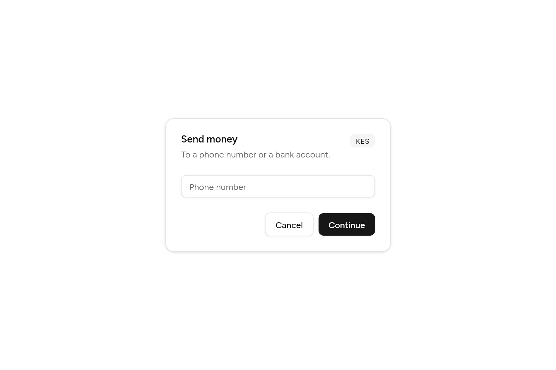
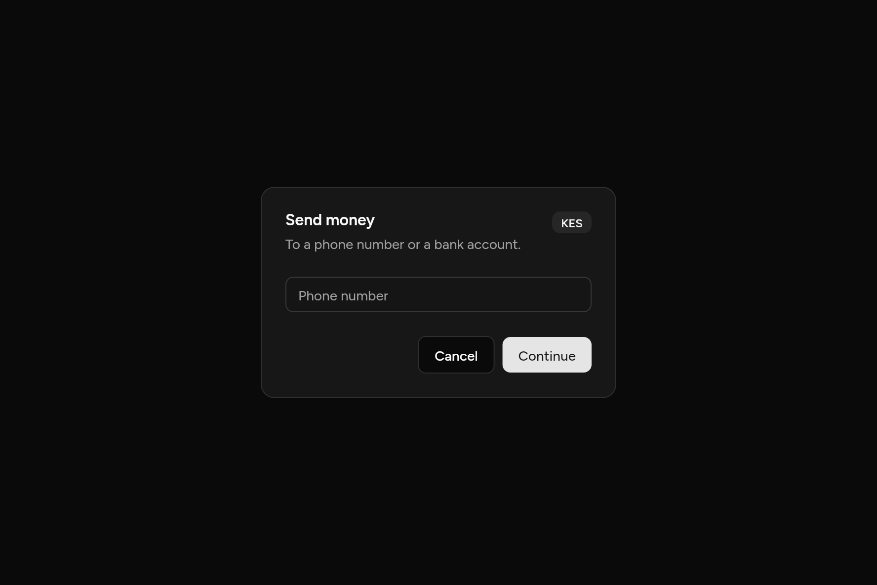
import 'package:flutter/widgets.dart';

import 'ui/badge.dart';
import 'ui/button.dart';
import 'ui/card.dart';
import 'ui/input.dart';

class CardDemo extends StatelessWidget {
  const CardDemo({super.key});

  @override
  Widget build(BuildContext context) => SizedBox(
    width: 360,
    child: Card(
      children: [
        const CardHeader(
          title: Text('Send money'),
          description: Text('To a phone number or a bank account.'),
          action: Badge(variant: BadgeVariant.secondary, child: Text('KES')),
        ),
        const CardContent(child: Input(placeholder: 'Phone number')),
        CardFooter(
          alignment: MainAxisAlignment.end,
          children: [
            Button(variant: ButtonVariant.outline, onPressed: () {}, child: const Text('Cancel')),
            Button(onPressed: () {}, child: const Text('Continue')),
          ],
        ),
      ],
    ),
  );
}
Try its options
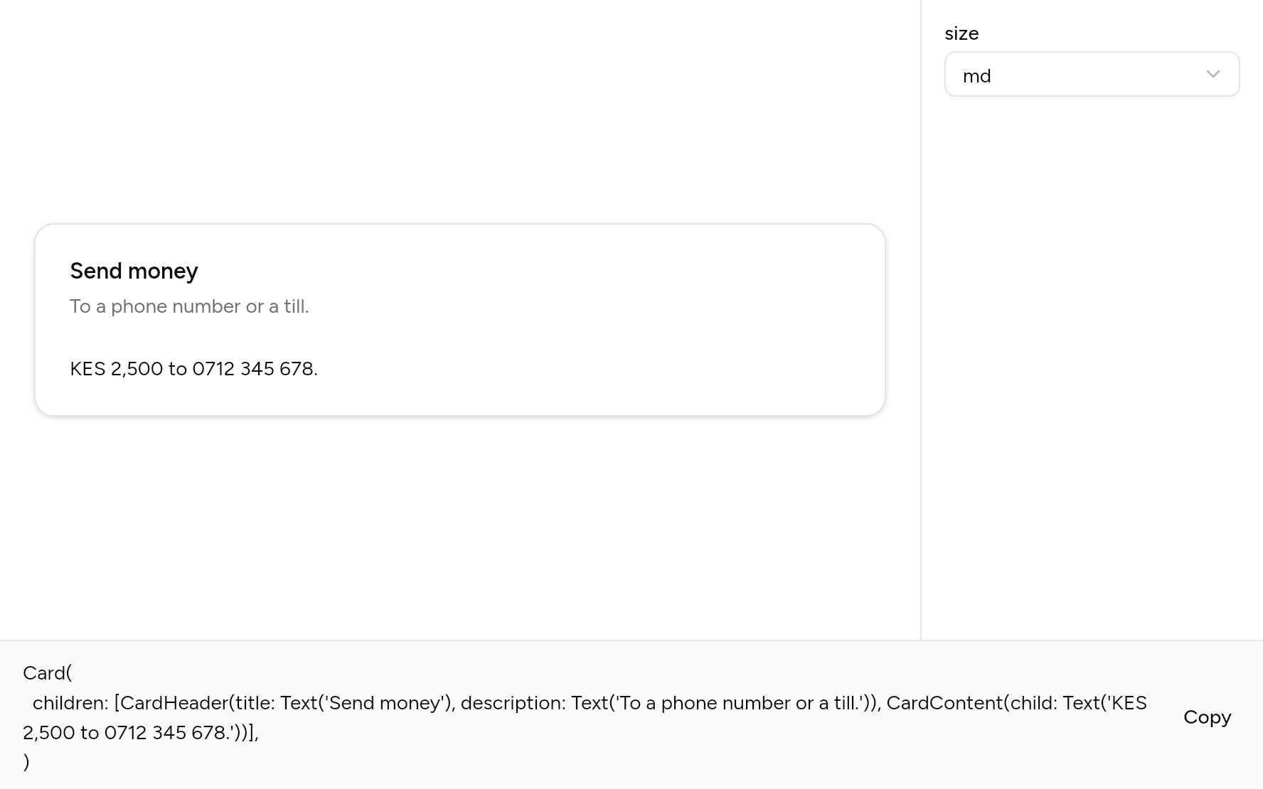
Each option its constructor takes, to change and see; the code below it is what you chose, to copy.
Add it
In your Flutter project:
ashlar add card
It writes theme.dart, palette.dart and card.dart into lib/ui, keeping any you already have.
Examples
Other ways to use it, each running live, with its code.
With a picture
A picture edge to edge, then the words.
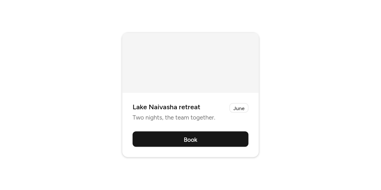
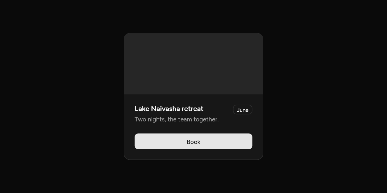
// With a picture: A picture edge to edge, then the words.
import 'package:flutter/widgets.dart';

import 'ui/badge.dart';
import 'ui/button.dart';
import 'ui/card.dart';
import 'ui/theme.dart';

class CardImageExample extends StatelessWidget {
  const CardImageExample({super.key});

  @override
  Widget build(BuildContext context) => SizedBox(
    width: 320,
    child: Card(
      children: [
        CardImage(
          height: 140,
          child: Builder(
            builder: (context) => ColoredBox(color: AshlarTheme.of(context).colors.muted),
          ),
        ),
        const CardHeader(
          title: Text('Lake Naivasha retreat'),
          description: Text('Two nights, the team together.'),
          action: Badge(variant: BadgeVariant.outline, child: Text('June')),
        ),
        CardFooter(
          children: [
            Expanded(
              child: Button(expand: true, onPressed: () {}, child: const Text('Book')),
            ),
          ],
        ),
      ],
    ),
  );
}
Small, with borders
Less room, lines under the header and over the footer.
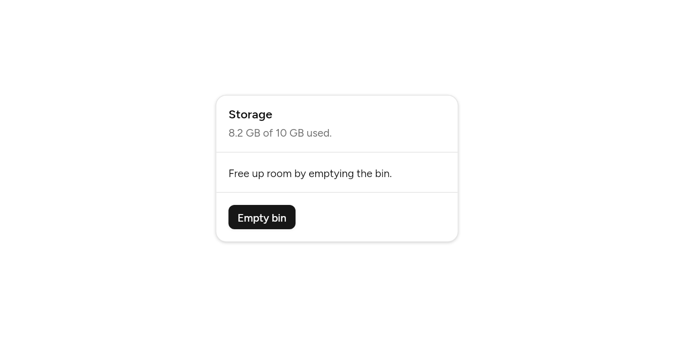
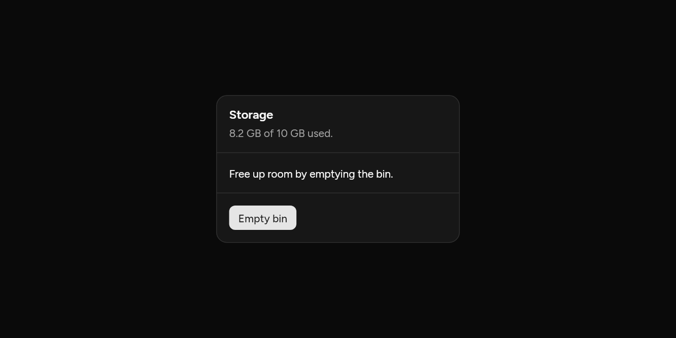
// Small, with borders: Less room, lines under the header and over the footer.
import 'package:flutter/widgets.dart';

import 'ui/button.dart';
import 'ui/card.dart';

class CardSmallExample extends StatelessWidget {
  const CardSmallExample({super.key});

  @override
  Widget build(BuildContext context) => SizedBox(
    width: 320,
    child: Card(
      size: CardSize.sm,
      children: [
        const CardHeader(border: true, title: Text('Storage'), description: Text('8.2 GB of 10 GB used.')),
        const CardContent(child: Text('Free up room by emptying the bin.')),
        CardFooter(
          border: true,
          children: [Button(size: ButtonSize.sm, onPressed: () {}, child: const Text('Empty bin'))],
        ),
      ],
    ),
  );
}
API
Read from the source above: each parameter with its type, its default, and what it is for.
CardSizeenum
How much room a card leaves round its parts.
| Value | What it is for |
|---|---|
md | 24 round the edges and between parts. |
sm | 16: for a dense grid of cards. |
Cardclass
A panel on the page, usually CardHeader, CardContent and CardFooter in order.
| Parameter | Type | Default | What it is for |
|---|---|---|---|
childrenrequired |
List<Widget> |
Its parts, top to bottom: CardImage, CardHeader, CardContent, CardFooter. | |
size |
CardSize |
CardSize.md |
Small cards have less room inside. |
CardImageclass
A picture across the card's full width: first, at the top edge; last, at the foot.
| Parameter | Type | Default | What it is for |
|---|---|---|---|
childrequired |
Widget |
Usually an Image with BoxFit.cover. | |
height |
double |
180 |
How tall the picture is. |
CardHeaderclass
A card's title and description, with an optional action at the top right. With border, a line runs under it.
| Parameter | Type | Default | What it is for |
|---|---|---|---|
title | Widget? | The card's title. | |
description |
Widget? |
A line under the title. | |
action |
Widget? |
At the end of the header: a button or a menu. | |
border |
bool |
false |
A line under the header. |
CardContentclass
A card's body.
| Parameter | Type | Default | What it is for |
|---|---|---|---|
childrequired |
Widget |
The card's body. |
CardFooterclass
A card's actions, in a row at its foot. With border, a line runs over it.
| Parameter | Type | Default | What it is for |
|---|---|---|---|
childrenrequired |
List<Widget> |
Along the bottom: usually buttons. | |
alignment |
MainAxisAlignment |
MainAxisAlignment.start |
How the footer's children line up along it. |
border |
bool |
false |
A line over the footer. |
Source
What lands in your app. It is yours from then on: change it as you would your own code, and ashlar add
will not write over it.
lib/ui/card.dart 226 lines
// Ashlar UI: Card. Copied into your app by `ashlar add card`; it is yours to change.

import 'package:flutter/widgets.dart';

import 'theme.dart';

/// How much room a card leaves round its parts.
enum CardSize {
  /// 24 round the edges and between parts.
  md,

  /// 16: for a dense grid of cards.
  sm,
}

/// A panel on the page, usually [CardHeader], [CardContent] and [CardFooter] in order.
///
/// ```dart
/// Card(children: [
///   CardHeader(title: Text('Payment'), description: Text('Pay by card or mobile money.')),
///   CardContent(child: ...),
///   CardFooter(children: [Button(onPressed: pay, child: Text('Pay'))]),
/// ])
/// ```
class Card extends StatelessWidget {
  const Card({super.key, required this.children, this.size = CardSize.md});

  /// Its parts, top to bottom: CardImage, CardHeader, CardContent, CardFooter.
  final List<Widget> children;

  /// Small cards have less room inside.
  final CardSize size;

  @override
  Widget build(BuildContext context) {
    final t = AshlarTheme.of(context);
    final pad = AshlarTheme.of(context).space(size == CardSize.sm ? 16 : 24);
    // An image at the top or the foot runs to the card's edges.
    final topImage = children.isNotEmpty && children.first is CardImage;
    final footImage = children.isNotEmpty && children.last is CardImage;
    return _CardScope(
      pad: pad,
      child: Container(
        clipBehavior: Clip.antiAlias,
        padding: EdgeInsets.only(
          top: topImage ? 0 : pad,
          bottom: footImage ? 0 : pad,
        ),
        decoration: BoxDecoration(
          color: t.colors.card,
          borderRadius: BorderRadius.circular(t.radiusXl),
          border: Border.all(color: t.colors.border),
          boxShadow: t.shadowSm,
        ),
        child: DefaultTextStyle.merge(
          style: TextStyle(color: t.colors.cardForeground),
          child: Column(
            mainAxisSize: MainAxisSize.min,
            crossAxisAlignment: CrossAxisAlignment.stretch,
            children: [
              for (final (i, child) in children.indexed) ...[
                if (i > 0) SizedBox(height: pad),
                child,
              ],
            ],
          ),
        ),
      ),
    );
  }
}

/// The spacing of the card around a part.
class _CardScope extends InheritedWidget {
  const _CardScope({required this.pad, required super.child});

  final double pad;

  static double of(BuildContext context) =>
      context.dependOnInheritedWidgetOfExactType<_CardScope>()?.pad ?? 24;

  @override
  bool updateShouldNotify(_CardScope old) => old.pad != pad;
}

/// A picture across the card's full width: first, at the top edge; last, at the foot.
class CardImage extends StatelessWidget {
  const CardImage({super.key, required this.child, this.height = 180});

  /// Usually an Image with BoxFit.cover.
  final Widget child;

  /// How tall the picture is.
  final double height;

  @override
  Widget build(BuildContext context) => SizedBox(height: height, child: child);
}

/// A card's title and description, with an optional [action] at the top right. With
/// [border], a line runs under it.
class CardHeader extends StatelessWidget {
  const CardHeader({
    super.key,
    this.title,
    this.description,
    this.action,
    this.border = false,
  });

  /// The card's title.
  final Widget? title;

  /// A line under the title.
  final Widget? description;

  /// At the end of the header: a button or a menu.
  final Widget? action;

  /// A line under the header.
  final bool border;

  @override
  Widget build(BuildContext context) {
    final t = AshlarTheme.of(context);
    final pad = _CardScope.of(context);
    return Container(
      padding: EdgeInsets.only(left: pad, right: pad, bottom: border ? pad : 0),
      decoration: border
          ? BoxDecoration(
              border: Border(bottom: BorderSide(color: t.colors.border)),
            )
          : null,
      child: Row(
        crossAxisAlignment: CrossAxisAlignment.start,
        children: [
          Expanded(
            child: Column(
              crossAxisAlignment: CrossAxisAlignment.start,
              children: [
                if (title != null)
                  Semantics(
                    header: true,
                    child: DefaultTextStyle.merge(
                      style: t.text.base.copyWith(
                        fontWeight: FontWeight.w600,
                        height: 1,
                        // The font's spare leading split above and below, so the text sits centred.
                        leadingDistribution: TextLeadingDistribution.even,
                      ),
                      child: title!,
                    ),
                  ),
                if (title != null && description != null)
                  const SizedBox(height: 6),
                if (description != null)
                  DefaultTextStyle.merge(
                    style: t.text.sm.copyWith(color: t.colors.mutedForeground),
                    child: description!,
                  ),
              ],
            ),
          ),
          if (action != null) ...[const SizedBox(width: 16), action!],
        ],
      ),
    );
  }
}

/// A card's body.
class CardContent extends StatelessWidget {
  const CardContent({super.key, required this.child});

  /// The card's body.
  final Widget child;

  @override
  Widget build(BuildContext context) => Padding(
    padding: EdgeInsets.symmetric(horizontal: _CardScope.of(context)),
    child: child,
  );
}

/// A card's actions, in a row at its foot. With [border], a line runs over it.
class CardFooter extends StatelessWidget {
  const CardFooter({
    super.key,
    required this.children,
    this.alignment = MainAxisAlignment.start,
    this.border = false,
  });

  /// Along the bottom: usually buttons.
  final List<Widget> children;

  /// How the footer's children line up along it.
  final MainAxisAlignment alignment;

  /// A line over the footer.
  final bool border;

  @override
  Widget build(BuildContext context) {
    final pad = _CardScope.of(context);
    return Container(
      padding: EdgeInsets.only(left: pad, right: pad, top: border ? pad : 0),
      decoration: border
          ? BoxDecoration(
              border: Border(
                top: BorderSide(color: AshlarTheme.of(context).colors.border),
              ),
            )
          : null,
      child: Row(
        mainAxisAlignment: alignment,
        children: [
          for (final (i, child) in children.indexed) ...[
            if (i > 0) const SizedBox(width: 8),
            child,
          ],
        ],
      ),
    );
  }
}