

Dialog
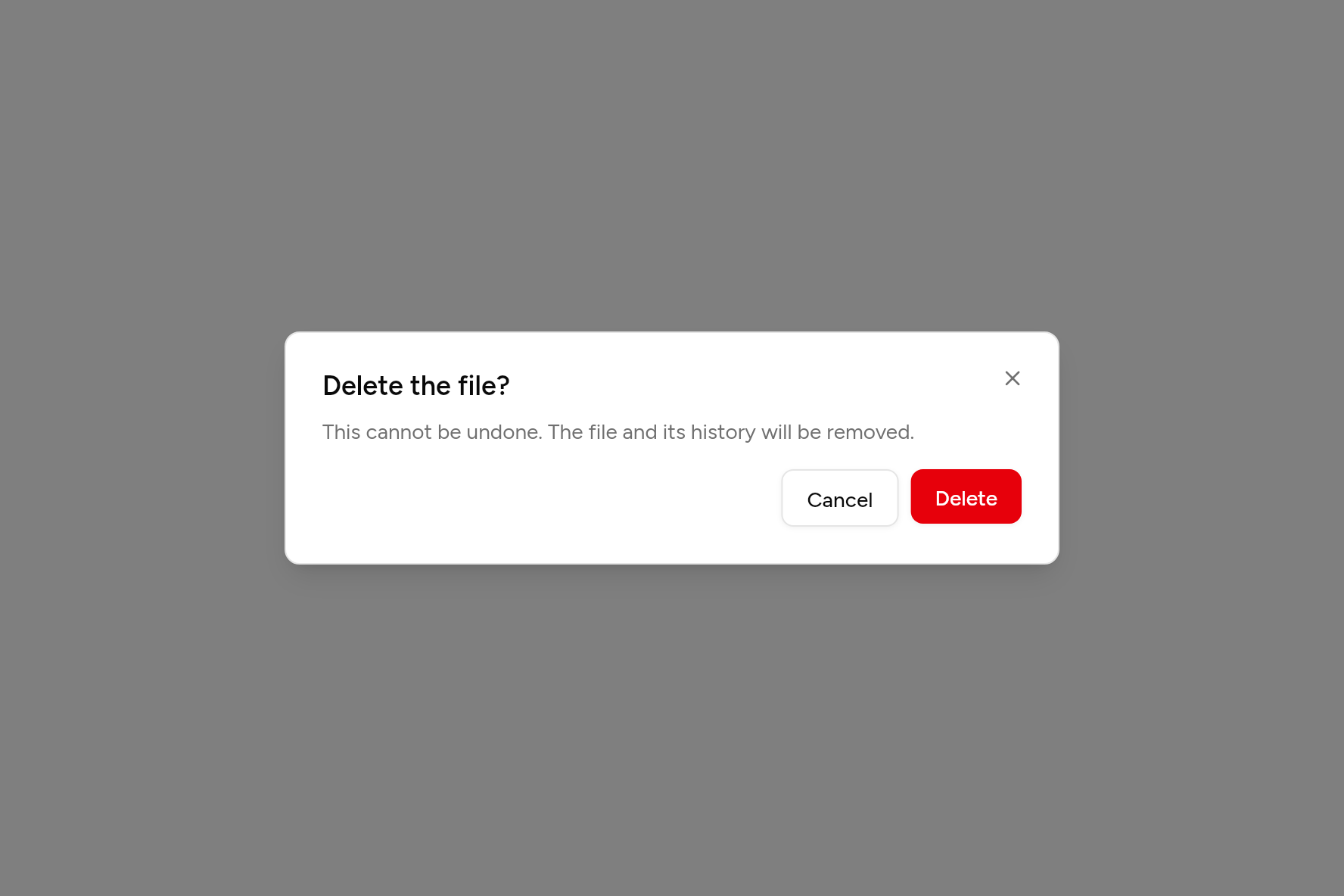
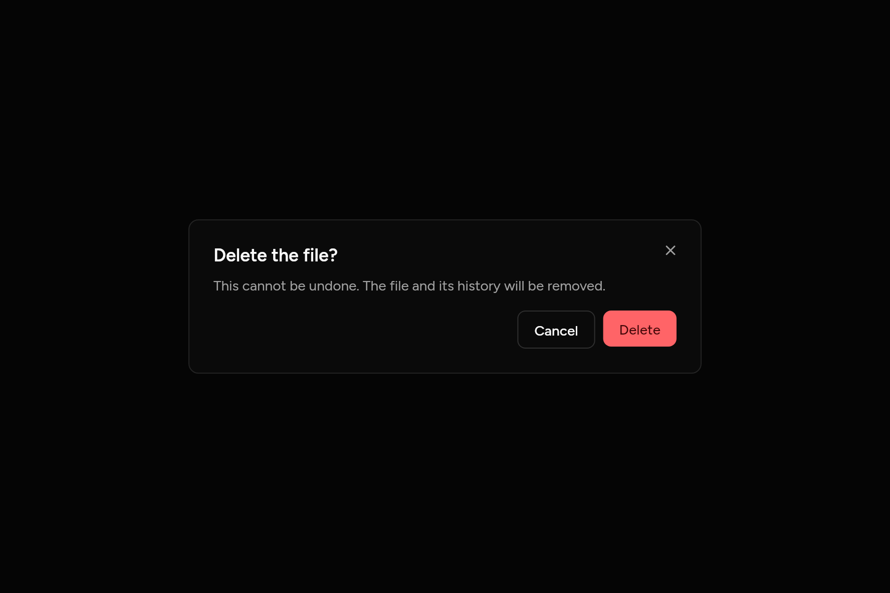
A modal panel over a dimmed page, with title, content and actions.
import 'package:flutter/widgets.dart';

import 'ui/button.dart';
import 'ui/dialog.dart';

class DialogDemo extends StatelessWidget {
  const DialogDemo({super.key});

  @override
  Widget build(BuildContext context) => Button(
    variant: ButtonVariant.outline,
    onPressed: () => showAshlarDialog<bool>(
      context: context,
      builder: (context) => Dialog(
        title: const Text('Delete the file?'),
        description: const Text('This cannot be undone. The file and its history will be removed.'),
        actions: [
          Button(
            variant: ButtonVariant.outline,
            onPressed: () => Navigator.pop(context, false),
            child: const Text('Cancel'),
          ),
          Button(
            variant: ButtonVariant.destructive,
            onPressed: () => Navigator.pop(context, true),
            child: const Text('Delete'),
          ),
        ],
      ),
    ),
    child: const Text('Delete file'),
  );
}
Try its options
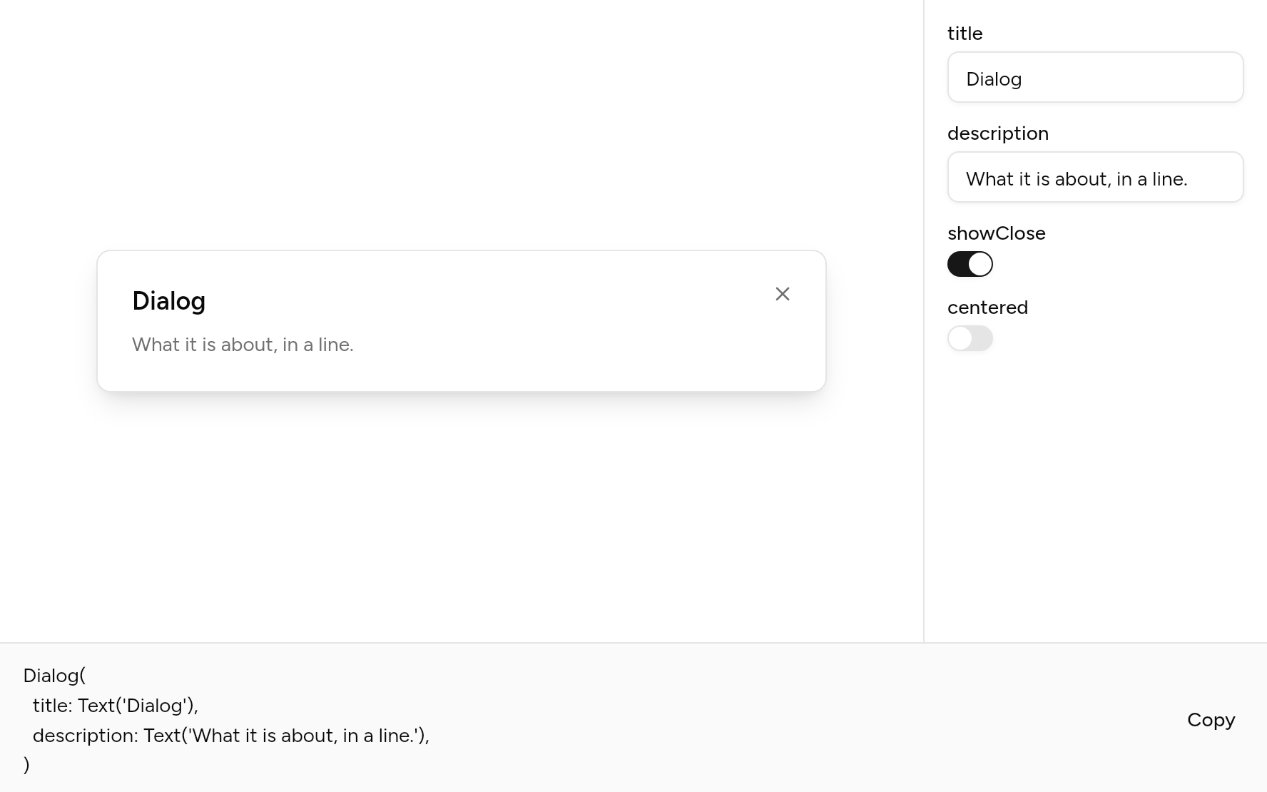
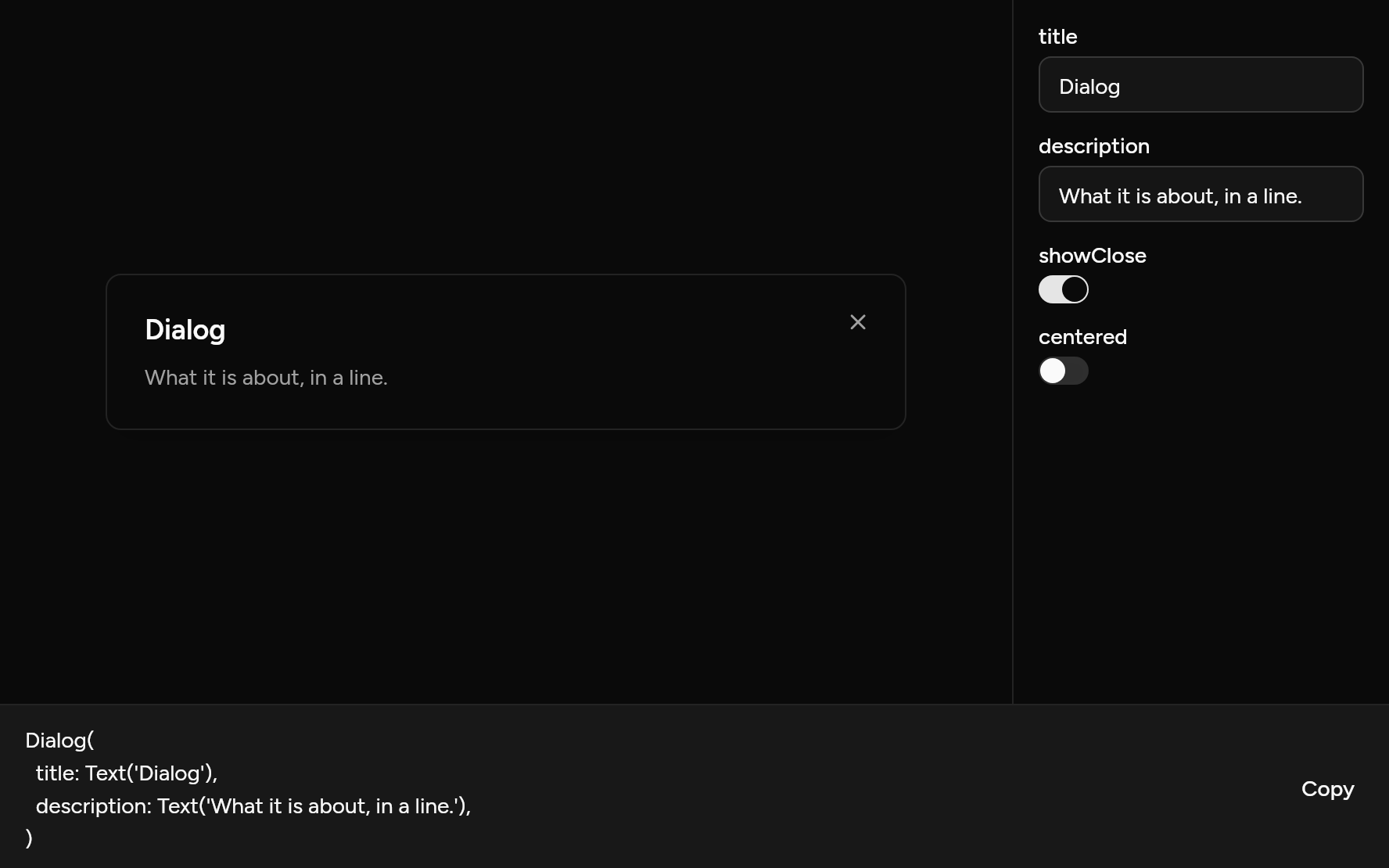
Each option its constructor takes, to change and see; the code below it is what you chose, to copy.
Add it
In your Flutter project:
ashlar add dialog
It writes theme.dart, palette.dart, group.dart, pressable.dart, button.dart and dialog.dart into lib/ui, keeping any you already have, and adds ashlar_icons to pubspec.yaml. It needs button and ashlar_icons, which come with it.
Examples
Other ways to use it, each running live, with its code.
With a form
Edit something without leaving the page.
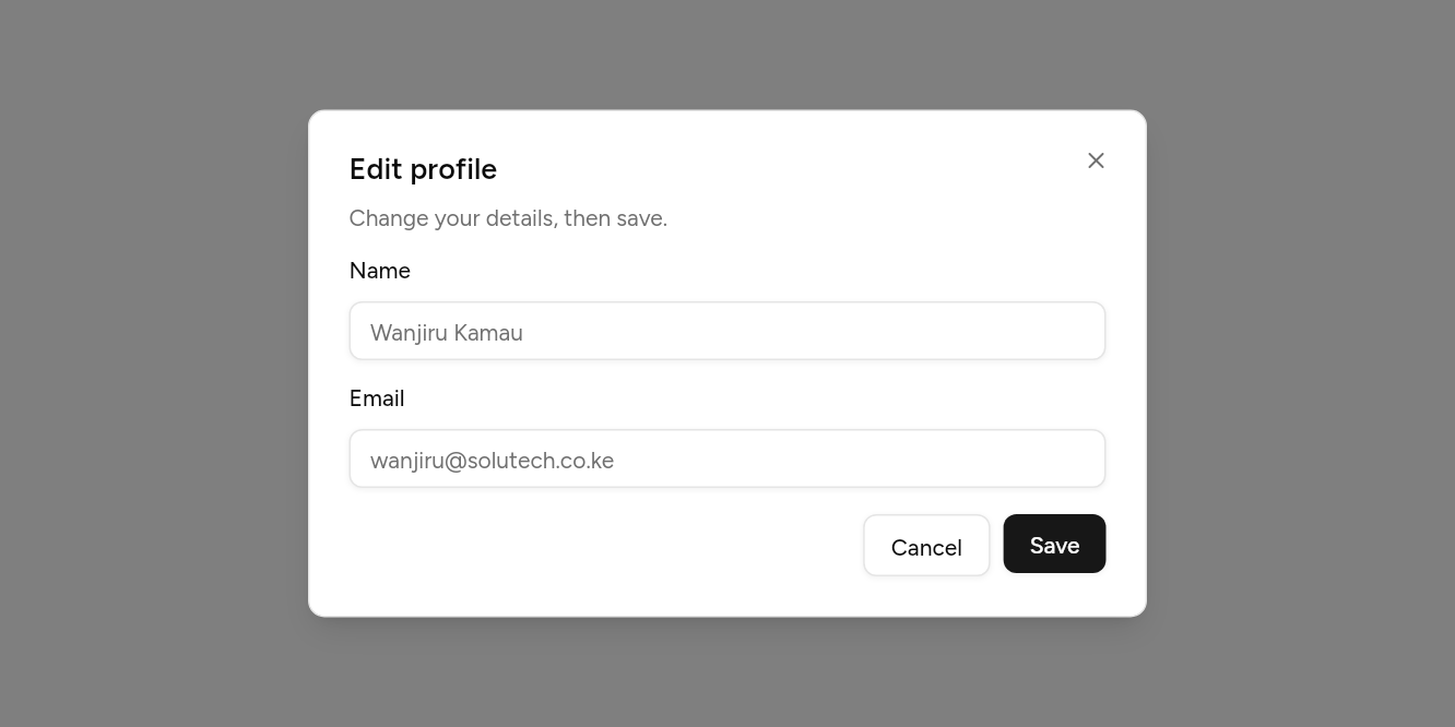
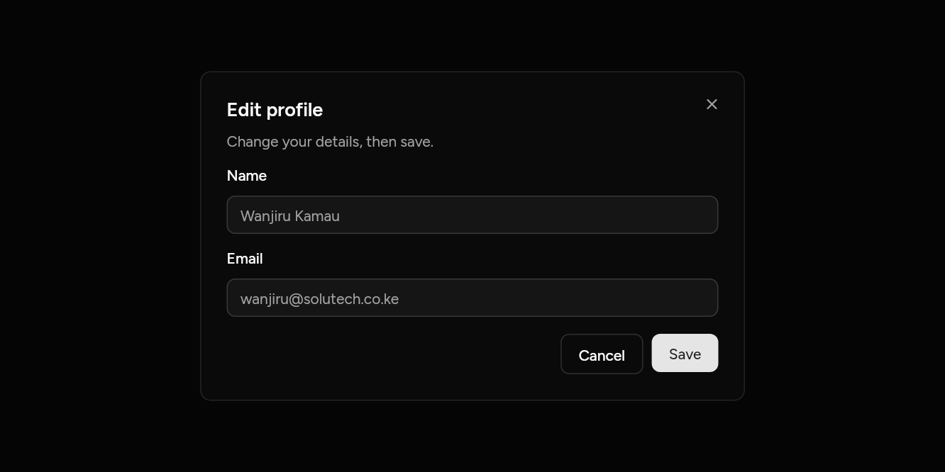
// With a form: Edit something without leaving the page.
import 'package:flutter/widgets.dart';

import 'ui/button.dart';
import 'ui/dialog.dart';
import 'ui/field.dart';
import 'ui/input.dart';

class DialogFormExample extends StatelessWidget {
  const DialogFormExample({super.key});

  @override
  Widget build(BuildContext context) => Builder(
    builder: (context) => Button(
      variant: ButtonVariant.outline,
      onPressed: () => showAshlarDialog<void>(
        context: context,
        builder: (context) => Dialog(
          title: const Text('Edit profile'),
          description: const Text('Change your details, then save.'),
          content: const Column(
            mainAxisSize: MainAxisSize.min,
            children: [
              Field(
                label: Text('Name'),
                child: Input(placeholder: 'Wanjiru Kamau'),
              ),
              SizedBox(height: 16),
              Field(
                label: Text('Email'),
                child: Input(placeholder: 'wanjiru@solutech.co.ke'),
              ),
            ],
          ),
          actions: [
            Button(
              variant: ButtonVariant.outline,
              onPressed: () => Navigator.pop(context),
              child: const Text('Cancel'),
            ),
            Button(onPressed: () => Navigator.pop(context), child: const Text('Save')),
          ],
        ),
      ),
      child: const Text('Edit profile'),
    ),
  );
}
Long content
The body scrolls; the actions stay.
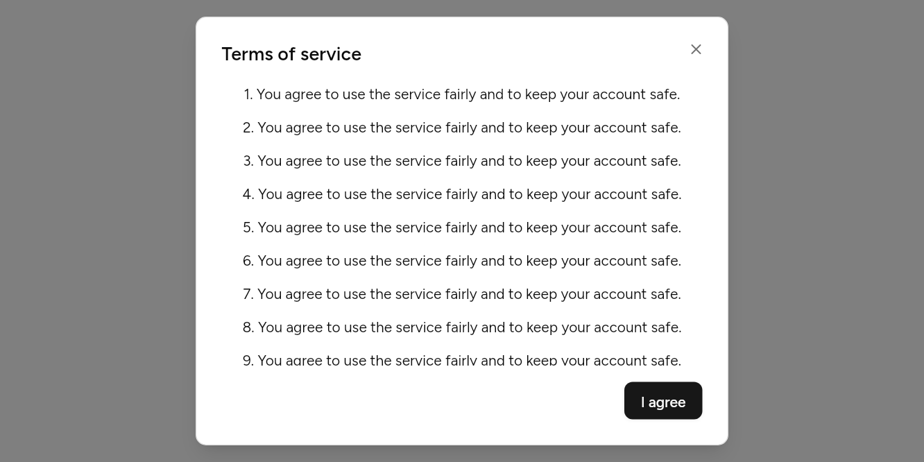
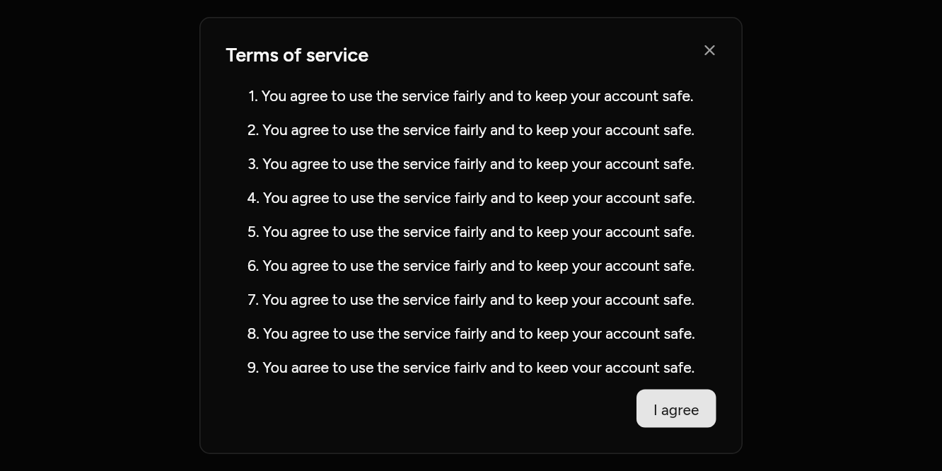
// Long content: The body scrolls; the actions stay.
import 'package:flutter/widgets.dart';

import 'ui/button.dart';
import 'ui/dialog.dart';

class DialogScrollExample extends StatelessWidget {
  const DialogScrollExample({super.key});

  @override
  Widget build(BuildContext context) => Builder(
    builder: (context) => Button(
      variant: ButtonVariant.outline,
      onPressed: () => showAshlarDialog<void>(
        context: context,
        builder: (context) => Dialog(
          title: const Text('Terms of service'),
          content: Column(
            children: [
              for (var i = 1; i <= 12; i++)
                Padding(
                  padding: const EdgeInsets.only(bottom: 12),
                  child: Text('$i. You agree to use the service fairly and to keep your account safe.'),
                ),
            ],
          ),
          actions: [Button(onPressed: () => Navigator.pop(context), child: const Text('I agree'))],
        ),
      ),
      child: const Text('Read the terms'),
    ),
  );
}
API
Read from the source above: each parameter with its type, its default, and what it is for.
showAshlarDialogfunction
Opens a dialog above the page and waits for it to close, with what it closed with. The page dims behind it; a tap outside or Escape closes it, unless dismissible is false.
| Parameter | Type | Default | What it is for |
|---|---|---|---|
contextrequired |
BuildContext |
Where it is opened from: its theme and navigator come from here. | |
builderrequired |
WidgetBuilder |
Builds what it shows. | |
dismissible |
bool |
true |
Whether a tap outside or Escape closes it. |
Dialogclass
The panel a dialog shows: title, description, any content, and actions at its foot, with a close button at the top right.
| Parameter | Type | Default | What it is for |
|---|---|---|---|
title |
Widget? |
The dialog's title, read first by a screen reader. | |
description |
Widget? |
A line under the title. | |
content |
Widget? |
Its body, which scrolls when it is too tall. | |
actions |
List<Widget> |
const [] |
Along the bottom, the main one last: usually buttons. |
showClose |
bool |
true |
A close button in the corner. |
maxWidth |
double |
512 |
The widest it grows. |
media |
Widget? |
Above the title: an icon on a muted circle, or an image. | |
centered |
bool |
false |
Title, description and media centred, and the actions sharing the width: for a short question in a small dialog. |
Source
What lands in your app. It is yours from then on: change it as you would your own code, and ashlar add
will not write over it.
lib/ui/dialog.dart 229 lines
// Ashlar UI: Dialog. Copied into your app by `ashlar add dialog`; it is yours to change.

import 'package:ashlar_icons/ashlar_icons.dart';
import 'package:flutter/widgets.dart';

import 'button.dart';
import 'theme.dart';

/// Opens a dialog above the page and waits for it to close, with what it closed with.
/// The page dims behind it; a tap outside or Escape closes it, unless [dismissible] is false.
///
/// ```dart
/// final ok = await showAshlarDialog<bool>(
///   context: context,
///   builder: (context) => Dialog(
///     title: Text('Delete the file?'),
///     description: Text('This cannot be undone.'),
///     actions: [
///       Button(variant: ButtonVariant.outline, onPressed: () => Navigator.pop(context, false), child: Text('Cancel')),
///       Button(variant: ButtonVariant.destructive, onPressed: () => Navigator.pop(context, true), child: Text('Delete')),
///     ],
///   ),
/// );
/// ```
Future<T?> showAshlarDialog<T>({
  required BuildContext context,
  required WidgetBuilder builder,
  bool dismissible = true,
}) {
  final theme = AshlarTheme.of(context);
  return Navigator.of(context).push<T>(
    RawDialogRoute<T>(
      barrierDismissible: dismissible,
      barrierLabel: 'Close',
      barrierColor: const Color(0x80000000),
      transitionDuration: const Duration(milliseconds: 200),
      // The route is above the app's AshlarTheme, so it carries the theme across.
      pageBuilder: (context, animation, secondary) => AshlarTheme(
        data: theme,
        child: AboveKeyboard(child: Builder(builder: builder)),
      ),
      transitionBuilder: (context, animation, secondary, child) {
        final curved = CurvedAnimation(
          parent: animation,
          curve: Curves.easeOutCubic,
        );
        return FadeTransition(
          opacity: curved,
          child: ScaleTransition(
            scale: Tween(begin: .95, end: 1.0).animate(curved),
            child: child,
          ),
        );
      },
    ),
  );
}

/// The panel a dialog shows: [title], [description], any [content], and [actions] at
/// its foot, with a close button at the top right.
class Dialog extends StatelessWidget {
  const Dialog({
    super.key,
    this.title,
    this.description,
    this.content,
    this.actions = const [],
    this.showClose = true,
    this.maxWidth = 512,
    this.media,
    this.centered = false,
  });

  /// The dialog's title, read first by a screen reader.
  final Widget? title;

  /// A line under the title.
  final Widget? description;

  /// Its body, which scrolls when it is too tall.
  final Widget? content;

  /// Along the bottom, the main one last: usually buttons.
  final List<Widget> actions;

  /// A close button in the corner.
  final bool showClose;

  /// The widest it grows.
  final double maxWidth;

  /// Above the title: an icon on a muted circle, or an image.
  final Widget? media;

  /// Title, description and media centred, and the actions sharing the width: for a short
  /// question in a small dialog.
  final bool centered;

  @override
  Widget build(BuildContext context) {
    final t = AshlarTheme.of(context);
    final c = t.colors;
    return SafeArea(
      child: Center(
        child: Padding(
          padding: const EdgeInsets.all(16),
          child: ConstrainedBox(
            constraints: BoxConstraints(maxWidth: maxWidth),
            child: Semantics(
              scopesRoute: true,
              namesRoute: true,
              explicitChildNodes: true,
              child: Container(
                padding: EdgeInsets.all(t.space(24)),
                decoration: BoxDecoration(
                  color: c.background,
                  borderRadius: BorderRadius.circular(t.radiusLg),
                  border: Border.all(color: c.border),
                  boxShadow: t.shadowLg,
                ),
                child: DefaultTextStyle(
                  style: t.text.sm.copyWith(color: c.foreground),
                  child: Stack(
                    clipBehavior: Clip.none,
                    children: [
                      Column(
                        mainAxisSize: MainAxisSize.min,
                        crossAxisAlignment: centered
                            ? CrossAxisAlignment.center
                            : CrossAxisAlignment.stretch,
                        children: [
                          if (media != null) ...[
                            IconTheme.merge(
                              data: IconThemeData(
                                color: c.foreground,
                                size: 24,
                              ),
                              child: Container(
                                width: 48,
                                height: 48,
                                alignment: Alignment.center,
                                decoration: BoxDecoration(
                                  color: c.muted,
                                  shape: BoxShape.circle,
                                ),
                                child: media,
                              ),
                            ),
                            const SizedBox(height: 16),
                          ],
                          if (title != null)
                            Padding(
                              padding: EdgeInsetsDirectional.only(
                                end: showClose && !centered ? 24 : 0,
                              ),
                              child: Semantics(
                                header: true,
                                child: DefaultTextStyle.merge(
                                  style: t.text.lg.copyWith(
                                    fontWeight: FontWeight.w600,
                                    height: 1.2,
                                  ),
                                  textAlign: centered ? TextAlign.center : null,
                                  child: title!,
                                ),
                              ),
                            ),
                          if (description != null) ...[
                            const SizedBox(height: 8),
                            DefaultTextStyle.merge(
                              style: TextStyle(color: c.mutedForeground),
                              textAlign: centered ? TextAlign.center : null,
                              child: description!,
                            ),
                          ],
                          // Long content scrolls; the title and the actions stay in view.
                          if (content != null) ...[
                            const SizedBox(height: 16),
                            Flexible(
                              child: SingleChildScrollView(child: content!),
                            ),
                          ],
                          if (actions.isNotEmpty) ...[
                            const SizedBox(height: 16),
                            if (centered)
                              Row(
                                children: [
                                  for (final (i, a) in actions.indexed) ...[
                                    if (i > 0) const SizedBox(width: 8),
                                    Expanded(child: a),
                                  ],
                                ],
                              )
                            else
                              Wrap(
                                alignment: WrapAlignment.end,
                                spacing: 8,
                                runSpacing: 8,
                                children: actions,
                              ),
                          ],
                        ],
                      ),
                      if (showClose)
                        PositionedDirectional(
                          top: -12,
                          end: -12,
                          child: Button(
                            variant: ButtonVariant.ghost,
                            size: ButtonSize.icon,
                            semanticLabel: 'Close',
                            onPressed: () => Navigator.maybePop(context),
                            child: AshlarIcon(
                              AshlarIconsRoundedStroke.x,
                              color: c.mutedForeground,
                            ),
                          ),
                        ),
                    ],
                  ),
                ),
              ),
            ),
          ),
        ),
      ),
    );
  }
}