

Field
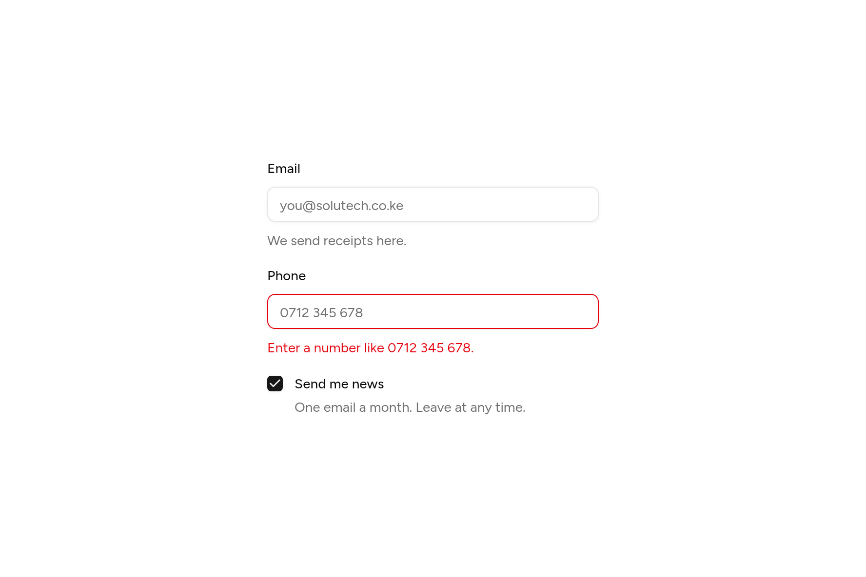
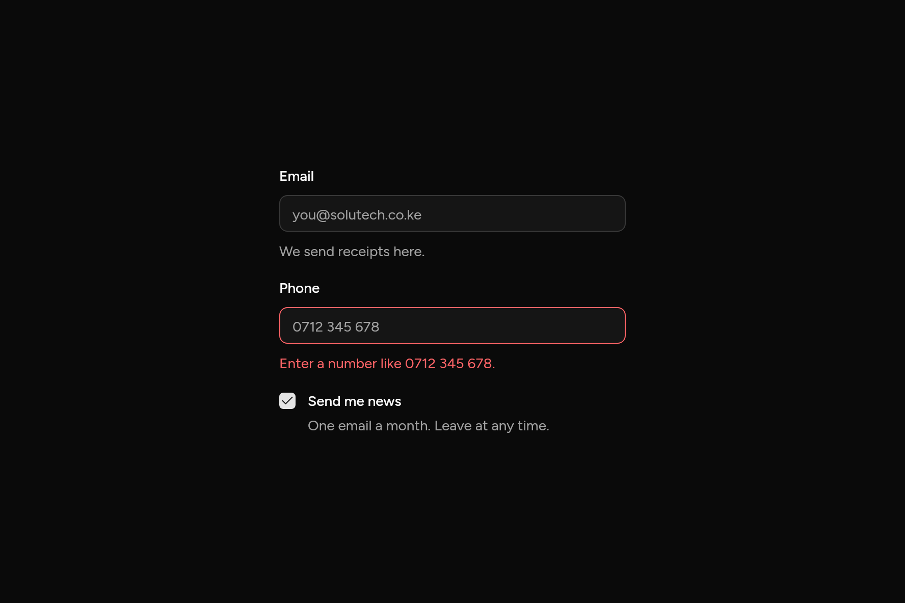
A control with its label, description and error, read out together.
import 'package:flutter/widgets.dart';

import 'ui/checkbox.dart';
import 'ui/field.dart';
import 'ui/input.dart';

class FieldDemo extends StatefulWidget {
  const FieldDemo({super.key});

  @override
  State<FieldDemo> createState() => _FieldDemoState();
}

class _FieldDemoState extends State<FieldDemo> {
  bool news = true;

  @override
  Widget build(BuildContext context) => SizedBox(
    width: 340,
    child: Column(
      mainAxisSize: MainAxisSize.min,
      children: [
        const Field(
          label: Text('Email'),
          description: Text('We send receipts here.'),
          child: Input(placeholder: 'you@solutech.co.ke'),
        ),
        const SizedBox(height: 20),
        const Field(
          label: Text('Phone'),
          error: Text('Enter a number like 0712 345 678.'),
          child: Input(placeholder: '0712 345 678', error: true),
        ),
        const SizedBox(height: 20),
        Field(
          axis: Axis.horizontal,
          label: const Text('Send me news'),
          description: const Text('One email a month. Leave at any time.'),
          child: Checkbox(value: news, onChanged: (v) => setState(() => news = v)),
        ),
      ],
    ),
  );
}
Try its options
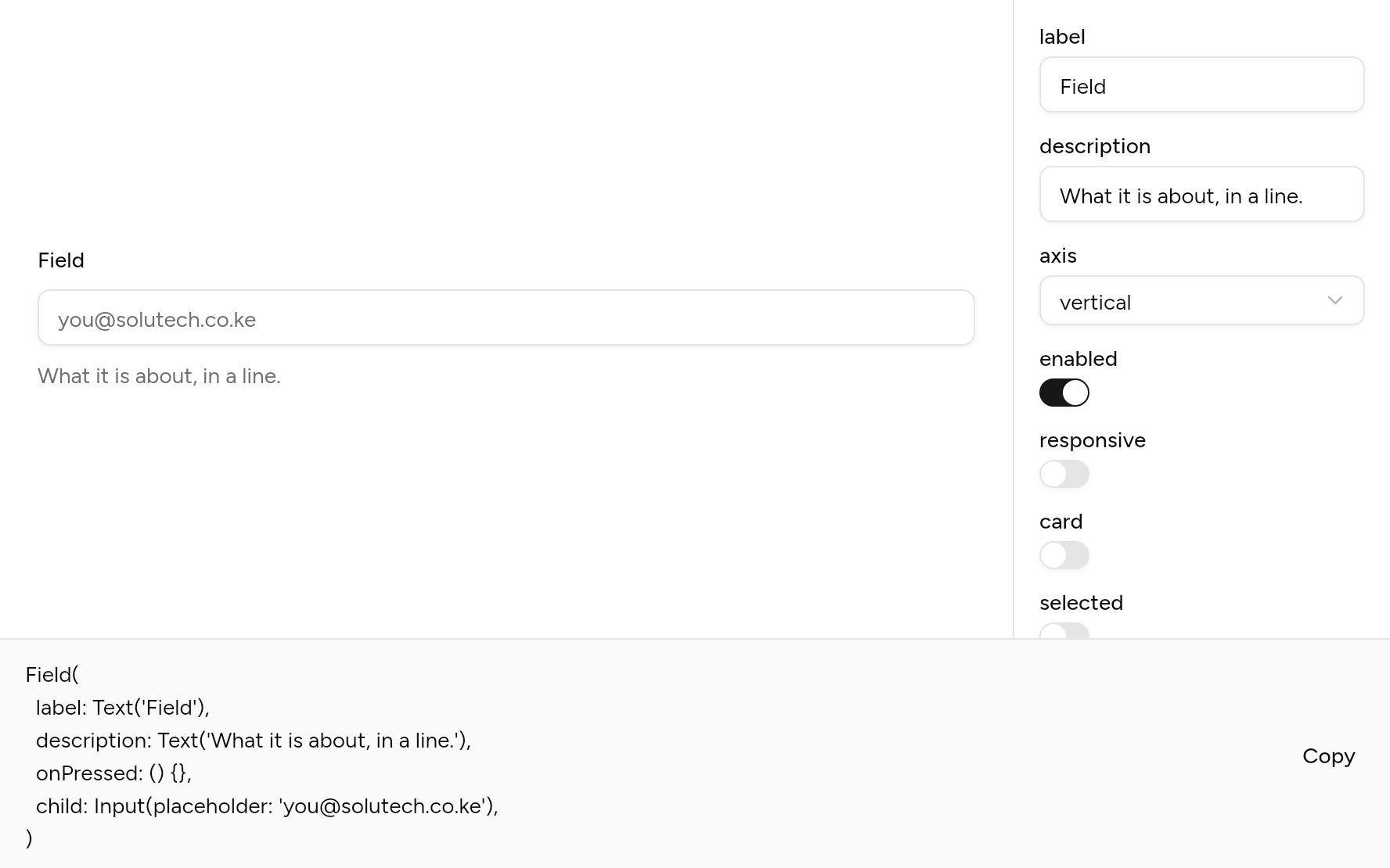
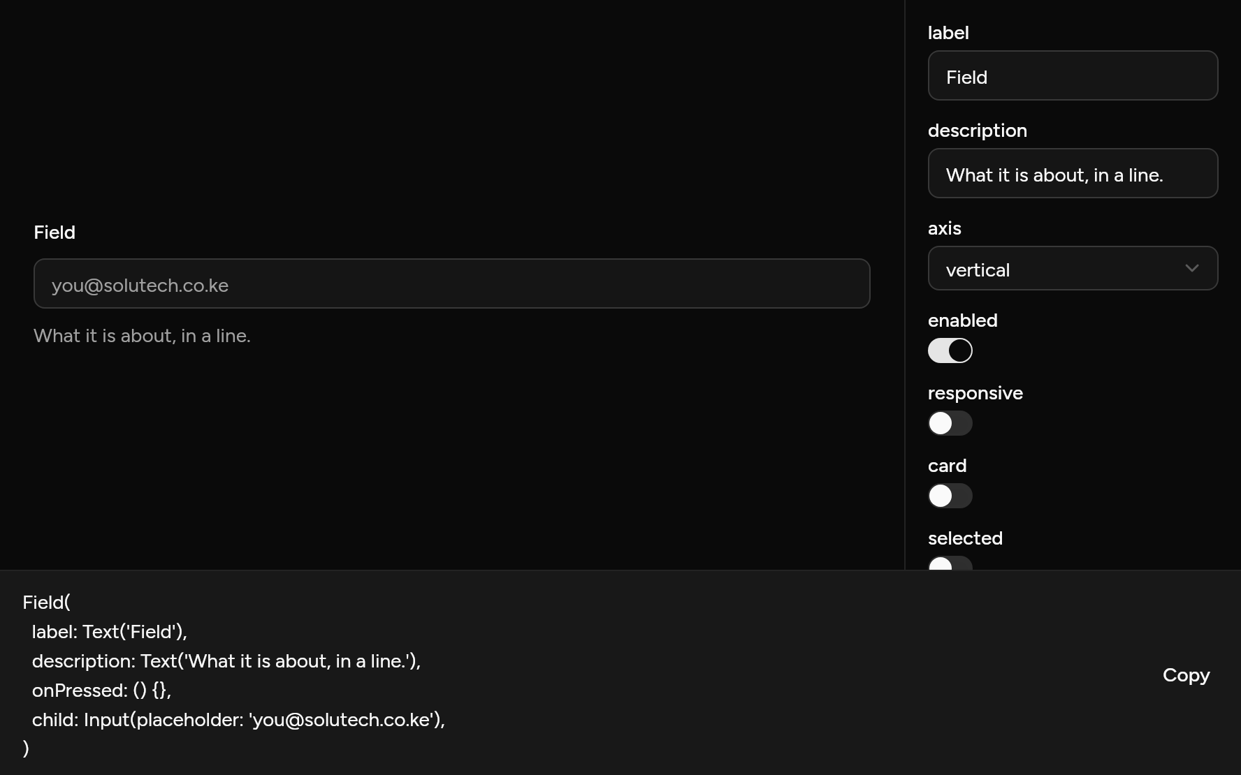
Each option its constructor takes, to change and see; the code below it is what you chose, to copy.
Add it
In your Flutter project:
ashlar add field
It writes theme.dart, palette.dart, label.dart and field.dart into lib/ui, keeping any you already have. It needs label, which come with it.
Examples
Other ways to use it, each running live, with its code.
Sets and groups
Fields under a legend, a line between groups.
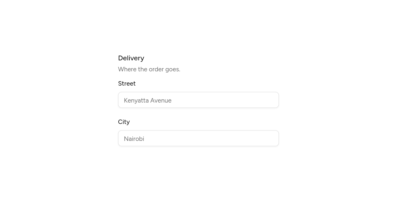
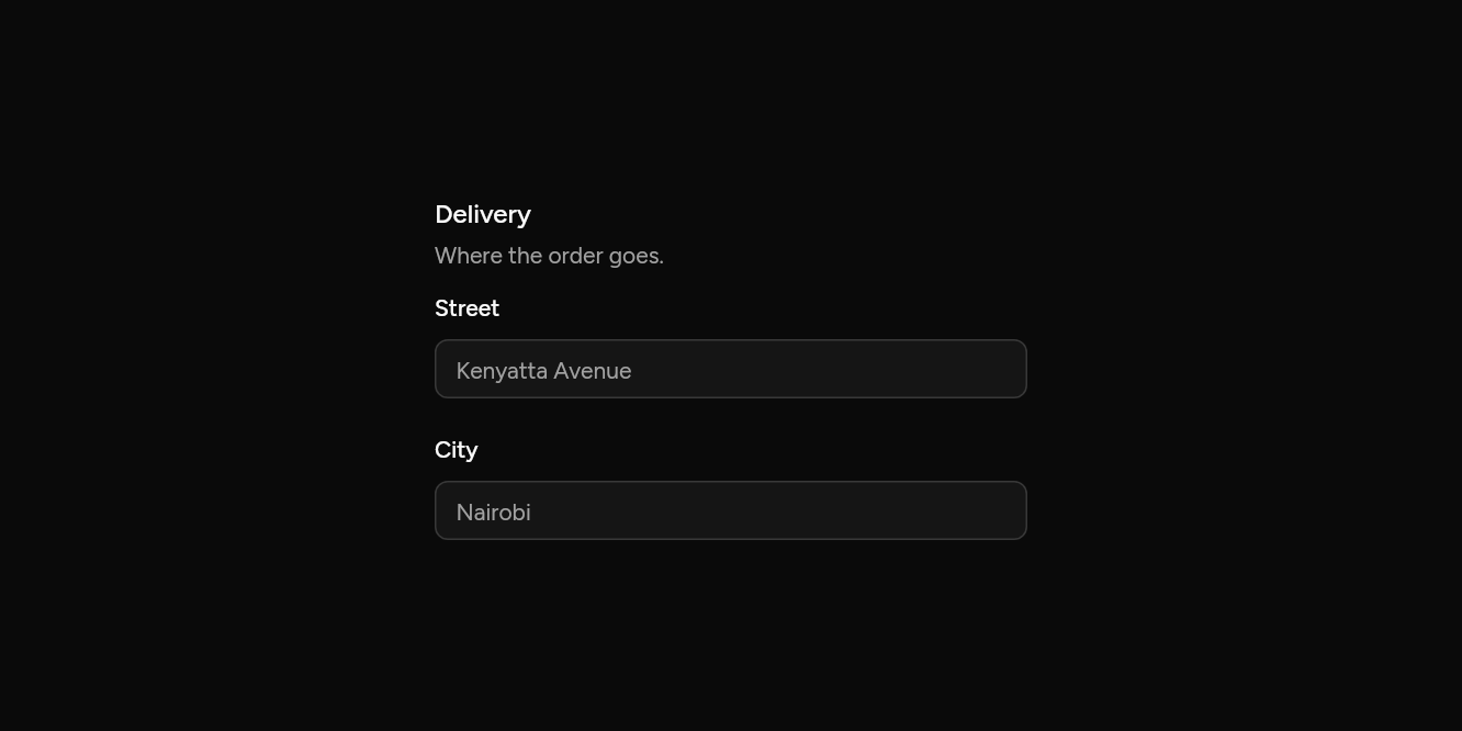
// Sets and groups: Fields under a legend, a line between groups.
import 'package:flutter/widgets.dart';

import 'ui/field.dart';
import 'ui/input.dart';

class FieldSetsExample extends StatelessWidget {
  const FieldSetsExample({super.key});

  @override
  Widget build(BuildContext context) => const SizedBox(
    width: 360,
    child: FieldSet(
      legend: Text('Delivery'),
      description: Text('Where the order goes.'),
      children: [
        FieldGroup(
          children: [
            Field(
              label: Text('Street'),
              child: Input(placeholder: 'Kenyatta Avenue'),
            ),
            Field(
              label: Text('City'),
              child: Input(placeholder: 'Nairobi'),
            ),
          ],
        ),
      ],
    ),
  );
}
Choice cards
The whole card picks the option.
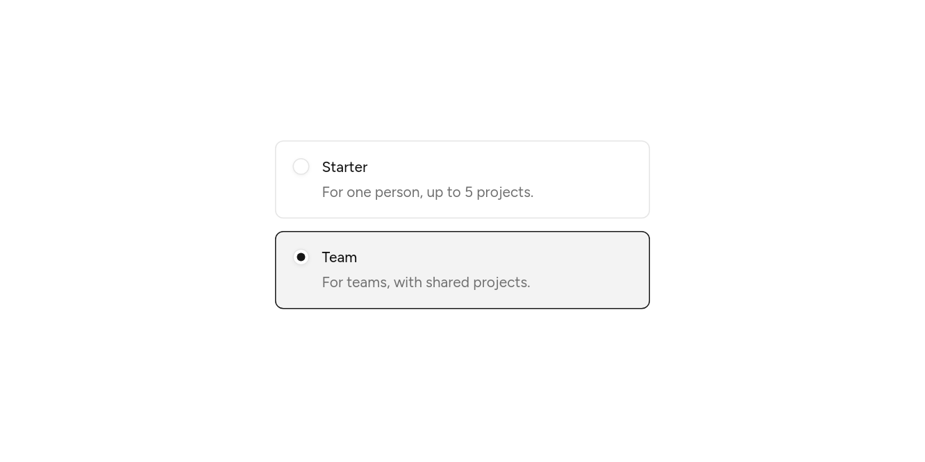
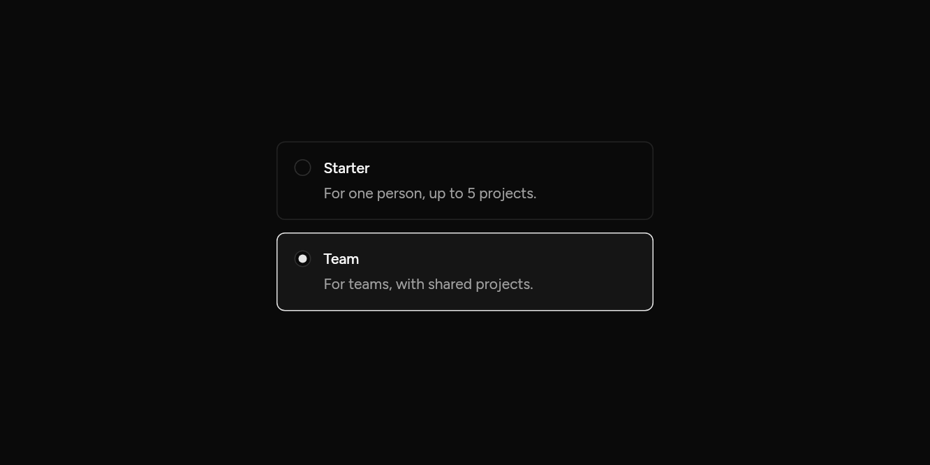
// Choice cards: The whole card picks the option.
import 'package:flutter/widgets.dart';

import 'ui/field.dart';
import 'ui/radio.dart';

class FieldCardsExample extends StatefulWidget {
  const FieldCardsExample({super.key});

  @override
  State<FieldCardsExample> createState() => _FieldCardsExampleState();
}

class _FieldCardsExampleState extends State<FieldCardsExample> {
  String? plan = 'team';

  @override
  Widget build(BuildContext context) => SizedBox(
    width: 360,
    child: RadioGroup<String>(
      groupValue: plan,
      onChanged: (v) => setState(() => plan = v),
      child: Column(
        mainAxisSize: MainAxisSize.min,
        children: [
          for (final (value, title, about) in const [
            ('starter', 'Starter', 'For one person, up to 5 projects.'),
            ('team', 'Team', 'For teams, with shared projects.'),
          ]) ...[
            Field(
              card: true,
              axis: Axis.horizontal,
              selected: plan == value,
              onPressed: () => setState(() => plan = value),
              label: Text(title),
              description: Text(about),
              child: Radio(value: value),
            ),
            const SizedBox(height: 12),
          ],
        ],
      ),
    ),
  );
}
Beside where there is room
The label beside the control when wide, above it when narrow.
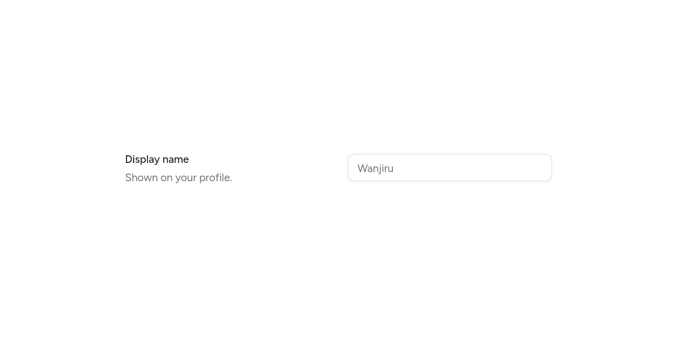
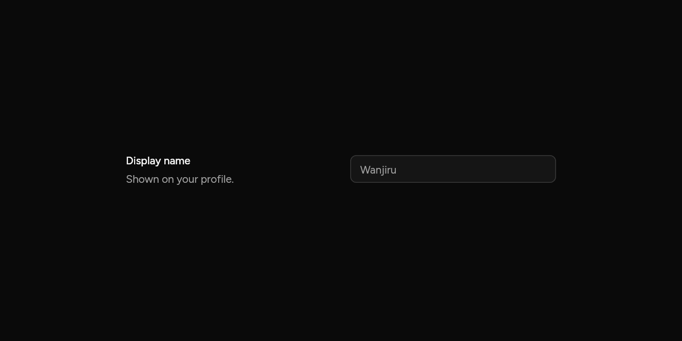
// Beside where there is room: The label beside the control when wide, above it when narrow.
import 'package:flutter/widgets.dart';

import 'ui/field.dart';
import 'ui/input.dart';

class FieldResponsiveExample extends StatelessWidget {
  const FieldResponsiveExample({super.key});

  @override
  Widget build(BuildContext context) => const SizedBox(
    width: 560,
    child: Field(
      responsive: true,
      label: Text('Display name'),
      description: Text('Shown on your profile.'),
      child: Input(placeholder: 'Wanjiru'),
    ),
  );
}
API
Read from the source above: each parameter with its type, its default, and what it is for.
Fieldclass
A control with its label, a description under it and an error when it is wrong. A screen reader hears the label and description as part of the control.
Vertical puts the label above (inputs, selects); horizontal puts the control first and the label beside it (checkboxes, switches, radios).
| Parameter | Type | Default | What it is for |
|---|---|---|---|
childrequired |
Widget |
The control: an Input, a Select, a Checkbox. | |
label |
Widget? |
Names the control: above it, or beside it when across. | |
description |
Widget? |
Under the control: what it is for. | |
error |
Widget? |
Shown under the description in the destructive colour, and read out with the field. | |
axis |
Axis |
Axis.vertical |
Vertical puts the label above; horizontal puts the control first and the label beside it. |
enabled |
bool |
true |
False fades the label and description with the control. |
responsive |
bool |
false |
The label beside the control where there is room (480 or more), above it where not. |
card |
bool |
false |
Drawn as a card to choose: a border round label and control, marked when selected. Give it onPressed to make the whole card a target, as the control is.
|
selected |
bool |
false |
Marks a card as chosen. |
onPressed |
VoidCallback? |
Makes the whole card a target, pressing the control, for a field drawn as a card. |
FieldSetclass
Fields that belong together, under a legend: an address, a set of notifications. A screen reader hears the legend with them.
| Parameter | Type | Default | What it is for |
|---|---|---|---|
childrenrequired |
List<Widget> |
What it holds, in order. | |
legend |
Widget? |
Its title, read before its fields. | |
description |
Widget? |
A line under the legend. |
FieldGroupclass
Fields one under the other, evenly spaced.
| Parameter | Type | Default | What it is for |
|---|---|---|---|
childrenrequired |
List<Widget> |
What it holds, in order. | |
spacing |
double |
24 |
Space between its fields. |
FieldSeparatorclass
A line between fields, with an optional word in its middle: "Or continue with".
| Parameter | Type | Default | What it is for |
|---|---|---|---|
child |
Widget? |
Words on the line, such as Text('Or'); a plain line when there are none. |
Source
What lands in your app. It is yours from then on: change it as you would your own code, and ashlar add
will not write over it.
lib/ui/field.dart 269 lines
// Ashlar UI: Field. Copied into your app by `ashlar add field`; it is yours to change.

import 'package:flutter/widgets.dart';

import 'label.dart';
import 'theme.dart';

/// A control with its label, a description under it and an error when it is wrong. A
/// screen reader hears the label and description as part of the control.
///
/// Vertical puts the label above (inputs, selects); horizontal puts the control first and
/// the label beside it (checkboxes, switches, radios).
///
/// ```dart
/// Field(label: Text('Email'), description: Text('We send receipts here.'), child: Input(placeholder: 'you@solutech.co.ke'))
/// Field(axis: Axis.horizontal, label: Text('Accept the terms'), child: Checkbox(value: agreed, onChanged: agree))
/// ```
class Field extends StatelessWidget {
  const Field({
    super.key,
    required this.child,
    this.label,
    this.description,
    this.error,
    this.axis = Axis.vertical,
    this.enabled = true,
    this.responsive = false,
    this.card = false,
    this.selected = false,
    this.onPressed,
  });

  /// The control: an Input, a Select, a Checkbox.
  final Widget child;

  /// Names the control: above it, or beside it when across.
  final Widget? label;

  /// Under the control: what it is for.
  final Widget? description;

  /// Shown under the description in the destructive colour, and read out with the field.
  final Widget? error;

  /// Vertical puts the label above; horizontal puts the control first and the label
  /// beside it.
  final Axis axis;

  /// False fades the label and description with the control.
  final bool enabled;

  /// The label beside the control where there is room (480 or more), above it where not.
  final bool responsive;

  /// Drawn as a card to choose: a border round label and control, marked when [selected].
  /// Give it [onPressed] to make the whole card a target, as the control is.
  final bool card;

  /// Marks a card as chosen.
  final bool selected;

  /// Makes the whole card a target, pressing the control, for a field drawn as a card.
  final VoidCallback? onPressed;

  @override
  Widget build(BuildContext context) {
    final t = AshlarTheme.of(context);
    final c = t.colors;
    final notes = [
      if (description != null)
        Opacity(
          opacity: enabled ? 1 : .5,
          child: DefaultTextStyle.merge(
            style: t.text.sm.copyWith(color: c.mutedForeground),
            child: description!,
          ),
        ),
      if (error != null)
        DefaultTextStyle.merge(
          style: t.text.sm.copyWith(color: c.destructive),
          child: error!,
        ),
    ];
    final label = this.label == null
        ? null
        : Label(enabled: enabled, child: this.label!);
    Widget beside() => Row(
      crossAxisAlignment: CrossAxisAlignment.start,
      children: [
        Expanded(
          child: Column(
            mainAxisSize: MainAxisSize.min,
            crossAxisAlignment: CrossAxisAlignment.start,
            children: [
              ?label,
              for (final n in notes) ...[const SizedBox(height: 6), n],
            ],
          ),
        ),
        const SizedBox(width: 24),
        Expanded(child: child),
      ],
    );
    Widget body = responsive
        ? LayoutBuilder(
            builder: (context, box) =>
                box.maxWidth >= 480 ? beside() : _stacked(label, notes),
          )
        : axis == Axis.vertical
        ? _stacked(label, notes)
        : _sideBySide(label, notes);
    if (card) {
      body = GestureDetector(
        behavior: HitTestBehavior.opaque,
        onTap: enabled ? onPressed : null,
        child: AnimatedContainer(
          duration: t.duration,
          padding: const EdgeInsets.all(16),
          decoration: BoxDecoration(
            color: selected
                ? c.primary.withValues(alpha: .05)
                : c.primary.withValues(alpha: 0),
            borderRadius: BorderRadius.circular(t.radiusMd),
            border: Border.all(color: selected ? c.primary : c.border),
          ),
          child: body,
        ),
      );
    }
    return MergeSemantics(child: body);
  }

  Widget _stacked(Widget? label, List<Widget> notes) => Column(
    mainAxisSize: MainAxisSize.min,
    crossAxisAlignment: CrossAxisAlignment.stretch,
    children: [
      if (label != null) ...[label, const SizedBox(height: 12)],
      child,
      for (final n in notes) ...[const SizedBox(height: 8), n],
    ],
  );

  Widget _sideBySide(Widget? label, List<Widget> notes) => Row(
    crossAxisAlignment: CrossAxisAlignment.start,
    children: [
      child,
      const SizedBox(width: 12),
      Expanded(
        child: Column(
          mainAxisSize: MainAxisSize.min,
          crossAxisAlignment: CrossAxisAlignment.start,
          children: [
            // Lines the label up with the middle of a 16 tall control.
            if (label != null)
              Padding(padding: const EdgeInsets.only(top: 1), child: label),
            for (final n in notes) ...[const SizedBox(height: 6), n],
          ],
        ),
      ),
    ],
  );
}

/// Fields that belong together, under a [legend]: an address, a set of notifications.
/// A screen reader hears the legend with them.
class FieldSet extends StatelessWidget {
  const FieldSet({
    super.key,
    required this.children,
    this.legend,
    this.description,
  });

  /// What it holds, in order.
  final List<Widget> children;

  /// Its title, read before its fields.
  final Widget? legend;

  /// A line under the legend.
  final Widget? description;

  @override
  Widget build(BuildContext context) {
    final t = AshlarTheme.of(context);
    final c = t.colors;
    return Semantics(
      container: true,
      explicitChildNodes: true,
      child: Column(
        mainAxisSize: MainAxisSize.min,
        crossAxisAlignment: CrossAxisAlignment.stretch,
        children: [
          if (legend != null)
            Semantics(
              header: true,
              child: DefaultTextStyle.merge(
                style: t.text.base.copyWith(
                  color: c.foreground,
                  fontWeight: FontWeight.w500,
                ),
                child: legend!,
              ),
            ),
          if (description != null) ...[
            const SizedBox(height: 4),
            DefaultTextStyle.merge(
              style: t.text.sm.copyWith(color: c.mutedForeground),
              child: description!,
            ),
          ],
          if (legend != null || description != null) const SizedBox(height: 16),
          FieldGroup(children: children),
        ],
      ),
    );
  }
}

/// Fields one under the other, evenly spaced.
class FieldGroup extends StatelessWidget {
  const FieldGroup({super.key, required this.children, this.spacing = 24});

  /// What it holds, in order.
  final List<Widget> children;

  /// Space between its fields.
  final double spacing;

  @override
  Widget build(BuildContext context) => Column(
    mainAxisSize: MainAxisSize.min,
    crossAxisAlignment: CrossAxisAlignment.stretch,
    children: [
      for (final (i, child) in children.indexed) ...[
        if (i > 0) SizedBox(height: spacing),
        child,
      ],
    ],
  );
}

/// A line between fields, with an optional word in its middle: "Or continue with".
class FieldSeparator extends StatelessWidget {
  const FieldSeparator({super.key, this.child});

  /// Words on the line, such as Text('Or'); a plain line when there are none.
  final Widget? child;

  @override
  Widget build(BuildContext context) {
    final t = AshlarTheme.of(context);
    final line = Expanded(child: Container(height: 1, color: t.colors.border));
    if (child == null) return Row(children: [line]);
    return Row(
      children: [
        line,
        Padding(
          padding: const EdgeInsets.symmetric(horizontal: 8),
          child: DefaultTextStyle.merge(
            style: t.text.sm.copyWith(color: t.colors.mutedForeground),
            child: child!,
          ),
        ),
        line,
      ],
    );
  }
}