

Bubble
What was said, in a rounded fill on the sender's side, with reactions.
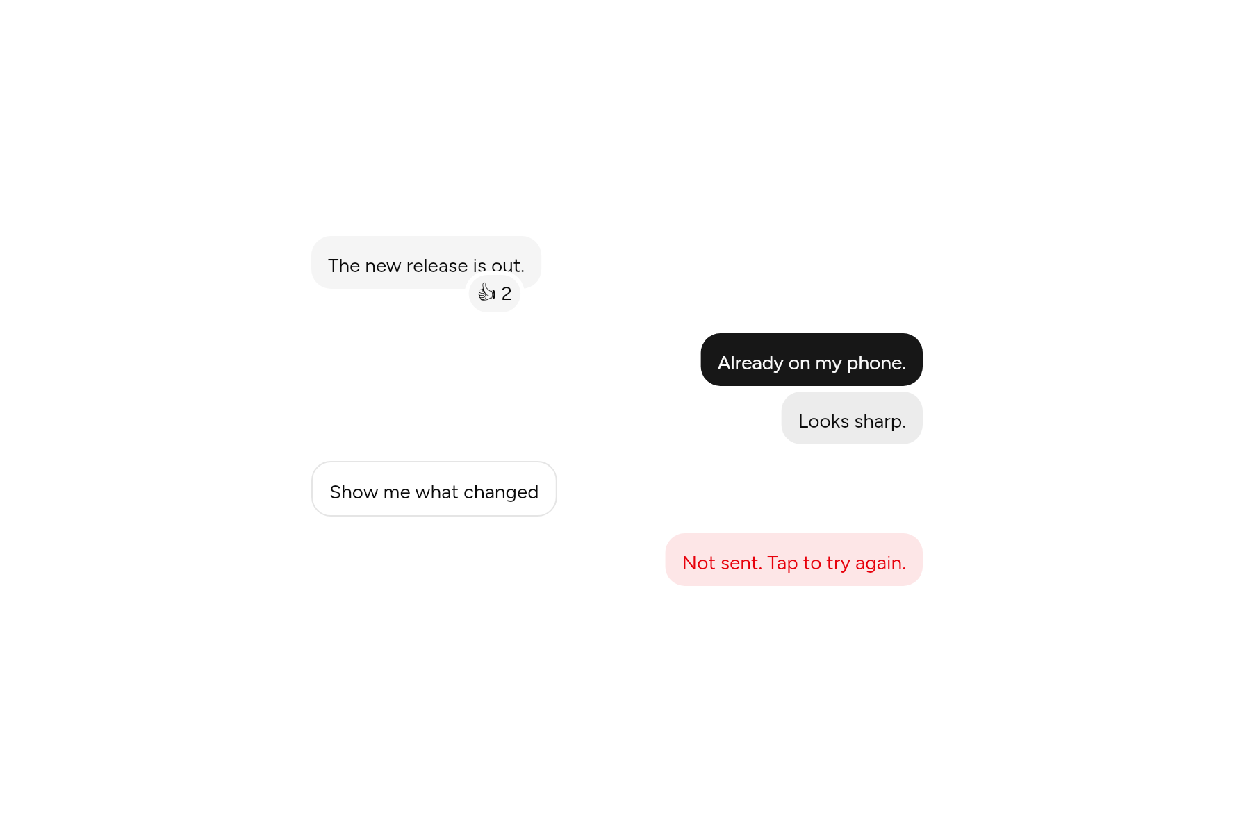
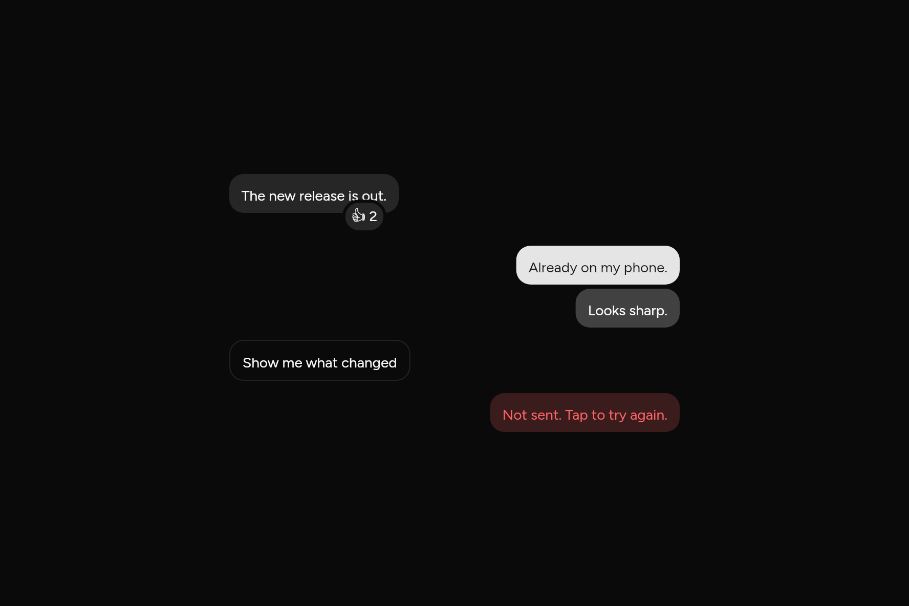
import 'package:flutter/widgets.dart';

import 'ui/bubble.dart';
import 'ui/message.dart';

class BubbleDemo extends StatelessWidget {
  const BubbleDemo({super.key});

  @override
  Widget build(BuildContext context) => SizedBox(
    width: 440,
    child: Column(
      mainAxisSize: MainAxisSize.min,
      children: [
        const Message(
          child: Bubble(
            variant: BubbleVariant.muted,
            reactions: Text('👍 2'),
            child: Text('The new release is out.'),
          ),
        ),
        const SizedBox(height: 12),
        const Message(
          align: MessageAlign.end,
          child: BubbleGroup(
            children: [
              Bubble(child: Text('Already on my phone.')),
              Bubble(variant: BubbleVariant.tinted, child: Text('Looks sharp.')),
            ],
          ),
        ),
        const SizedBox(height: 12),
        Message(
          child: Bubble(
            variant: BubbleVariant.outline,
            onPressed: () {},
            child: const Text('Show me what changed'),
          ),
        ),
        const SizedBox(height: 12),
        const Message(
          align: MessageAlign.end,
          child: Bubble(
            variant: BubbleVariant.destructive,
            child: Text('Not sent. Tap to try again.'),
          ),
        ),
      ],
    ),
  );
}
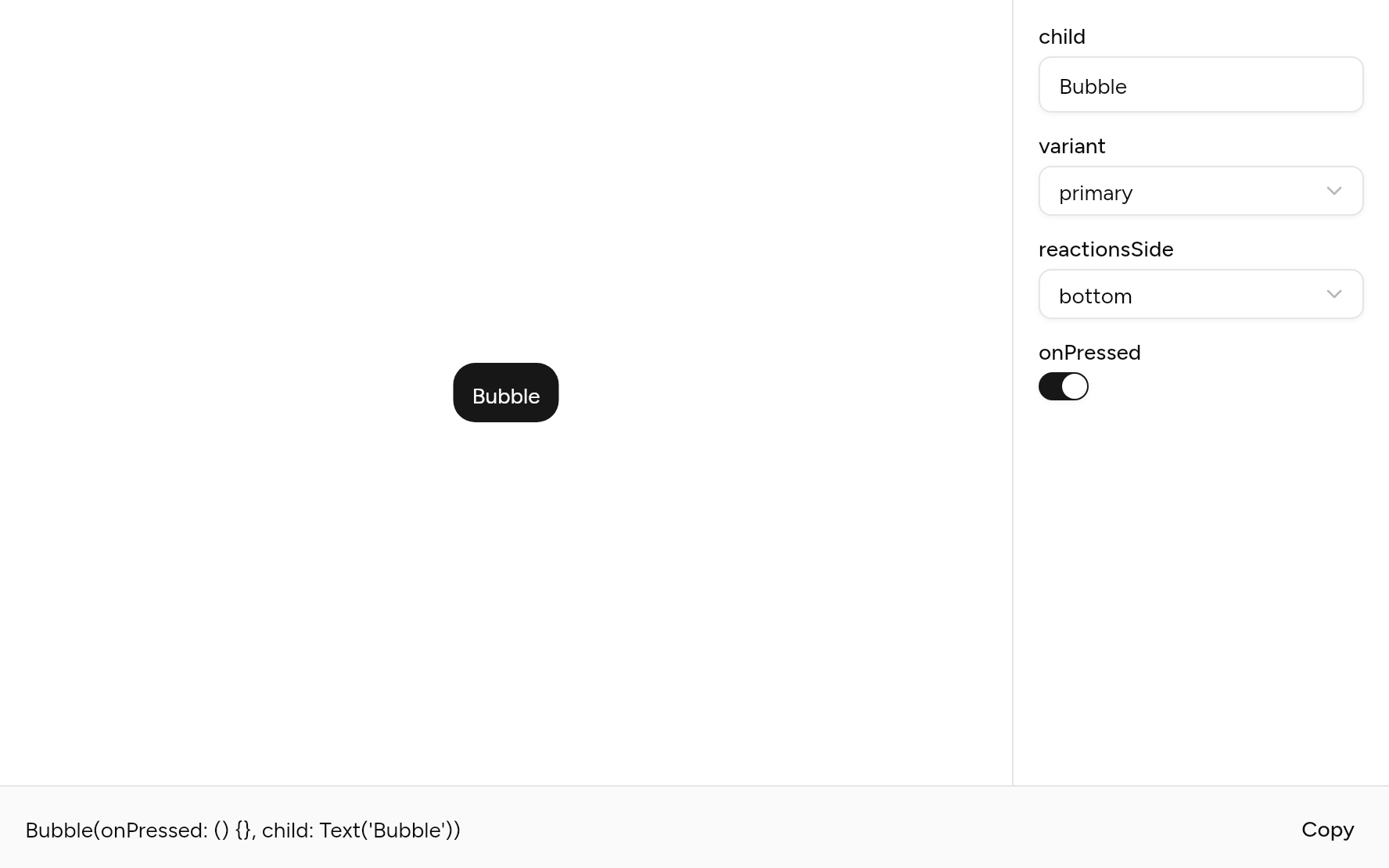
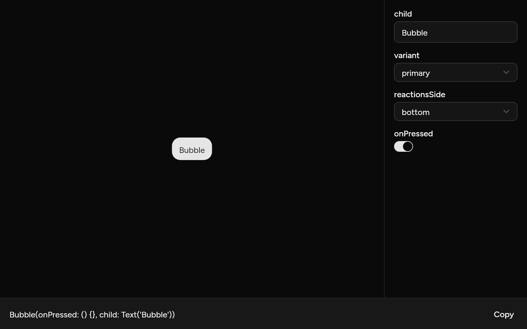
Try its options
Each option its constructor takes, to change and see; the code below it is what you chose, to copy.
Add it
In your Flutter project:
ashlar add bubble
It writes theme.dart, palette.dart, message.dart, group.dart, pressable.dart and bubble.dart into lib/ui, keeping any you already have. It needs message and pressable, which come with it.
Examples
Other ways to use it, each running live, with its code.
Suggested replies
Bubbles to press.
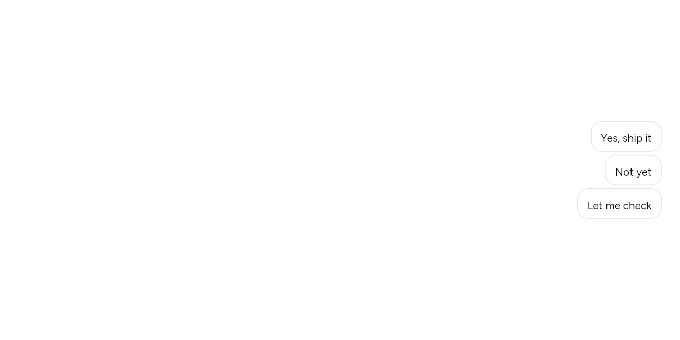
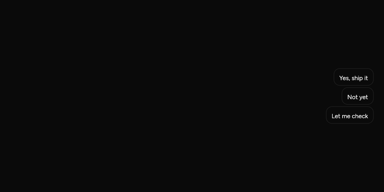
// Suggested replies: Bubbles to press.
import 'package:flutter/widgets.dart';

import 'ui/bubble.dart';
import 'ui/message.dart';

class BubbleSuggestionsExample extends StatelessWidget {
  const BubbleSuggestionsExample({super.key});

  @override
  Widget build(BuildContext context) => Message(
    align: MessageAlign.end,
    child: BubbleGroup(
      children: [
        for (final reply in ['Yes, ship it', 'Not yet', 'Let me check'])
          Bubble(variant: BubbleVariant.outline, onPressed: () {}, child: Text(reply)),
      ],
    ),
  );
}
API
Read from the source above: each parameter with its type, its default, and what it is for.
BubbleVariantenum
How a Bubble is filled.
| Value | What it is for |
|---|---|
primary | Solid in the primary colour: usually what you sent. |
secondary | |
muted | Grey: usually what the other side sent. |
tinted | A light wash of the primary colour. |
outline | |
ghost |
No fill and no padding: an assistant's long answer, read as a page. |
destructive | Something went wrong: it was not sent. |
BubbleReactionsSideenum
Where a Bubble's reactions sit.
| Value | What it is for |
|---|---|
top | |
bottom |
Bubbleclass
What was said, in a rounded fill, no wider than four fifths of the room. Inside a Message it sits on the message's side.
| Parameter | Type | Default | What it is for |
|---|---|---|---|
childrequired |
Widget |
What was said. | |
variant |
BubbleVariant |
BubbleVariant.primary |
Its fill: primary, secondary, muted, tinted, outline, ghost or destructive. |
reactions |
Widget? |
A small pill over the bubble's edge: emoji counts, or buttons to react with. | |
reactionsSide |
BubbleReactionsSide |
BubbleReactionsSide.bottom |
Whether the reactions sit over the top edge or the bottom. |
onPressed |
VoidCallback? |
Makes the whole bubble a button: a suggested reply, say. | |
semanticLabel |
String? |
What a screen reader calls it when it is a button and its text does not say. |
BubbleGroupclass
Bubbles sent one after another, close together on the same side.
| Parameter | Type | Default | What it is for |
|---|---|---|---|
childrenrequired |
List<Widget> |
The bubbles, in the order they were sent. |
Source
What lands in your app. It is yours from then on: change it as you would your own code, and ashlar add
will not write over it.
lib/ui/bubble.dart 182 lines
// Ashlar UI: Bubble. Copied into your app by `ashlar add bubble`; it is yours to change.

import 'package:flutter/widgets.dart';

import 'message.dart';
import 'pressable.dart';
import 'theme.dart';

/// How a [Bubble] is filled.
enum BubbleVariant {
  /// Solid in the primary colour: usually what you sent.
  primary,
  secondary,

  /// Grey: usually what the other side sent.
  muted,

  /// A light wash of the primary colour.
  tinted,
  outline,

  /// No fill and no padding: an assistant's long answer, read as a page.
  ghost,

  /// Something went wrong: it was not sent.
  destructive,
}

/// Where a [Bubble]'s reactions sit.
enum BubbleReactionsSide { top, bottom }

/// What was said, in a rounded fill, no wider than four fifths of the room. Inside a
/// [Message] it sits on the message's side.
///
/// ```dart
/// Bubble(variant: BubbleVariant.muted, child: Text('See you at ten.'))
/// Bubble(reactions: Text('👍 2'), child: Text('Shipped.'))
/// ```
class Bubble extends StatelessWidget {
  const Bubble({
    super.key,
    required this.child,
    this.variant = BubbleVariant.primary,
    this.reactions,
    this.reactionsSide = BubbleReactionsSide.bottom,
    this.onPressed,
    this.semanticLabel,
  });

  /// What was said.
  final Widget child;

  /// Its fill: primary, secondary, muted, tinted, outline, ghost or destructive.
  final BubbleVariant variant;

  /// A small pill over the bubble's edge: emoji counts, or buttons to react with.
  final Widget? reactions;

  /// Whether the reactions sit over the top edge or the bottom.
  final BubbleReactionsSide reactionsSide;

  /// Makes the whole bubble a button: a suggested reply, say.
  final VoidCallback? onPressed;

  /// What a screen reader calls it when it is a button and its text does not say.
  final String? semanticLabel;

  @override
  Widget build(BuildContext context) {
    final t = AshlarTheme.of(context);
    final c = t.colors;
    final dark = c.background.computeLuminance() < .5;
    final end = messageAlignOf(context) == MessageAlign.end;
    final (fill, ink, border) = switch (variant) {
      BubbleVariant.primary => (c.primary, c.primaryForeground, null),
      BubbleVariant.secondary => (c.secondary, c.secondaryForeground, null),
      BubbleVariant.muted => (c.muted, c.foreground, null),
      BubbleVariant.tinted => (
        Color.lerp(c.background, c.primary, dark ? .25 : .08)!,
        c.foreground,
        null,
      ),
      BubbleVariant.outline => (c.background, c.foreground, c.border),
      BubbleVariant.ghost => (const Color(0x00000000), c.foreground, null),
      BubbleVariant.destructive => (
        c.destructive.withValues(alpha: dark ? .2 : .1),
        c.destructive,
        null,
      ),
    };
    final ghost = variant == BubbleVariant.ghost;
    Widget content(bool hovered) => AnimatedContainer(
      duration: t.duration,
      padding: ghost
          ? EdgeInsets.zero
          : const EdgeInsets.symmetric(horizontal: 12, vertical: 8),
      decoration: BoxDecoration(
        color: hovered && onPressed != null ? Color.lerp(fill, ink, .08) : fill,
        borderRadius: ghost ? null : BorderRadius.circular(t.radiusXl),
        border: border == null ? null : Border.all(color: border),
      ),
      child: DefaultTextStyle.merge(
        style: t.text.sm.copyWith(color: ink, height: 1.6),
        child: IconTheme.merge(
          data: IconThemeData(color: ink),
          child: child,
        ),
      ),
    );
    Widget bubble = onPressed == null
        ? content(false)
        : Pressable(
            onPressed: onPressed,
            semanticLabel: semanticLabel,
            builder: (context, states) => content(states.hovered),
          );
    if (reactions != null) {
      final top = reactionsSide == BubbleReactionsSide.top;
      bubble = Padding(
        // Three quarters of the pill hangs past the edge, so it covers little of the text.
        padding: EdgeInsets.only(top: top ? 20 : 0, bottom: top ? 0 : 20),
        child: Stack(
          clipBehavior: Clip.none,
          children: [
            bubble,
            PositionedDirectional(
              top: top ? -20 : null,
              bottom: top ? null : -20,
              end: end ? null : 12,
              start: end ? 12 : null,
              child: Container(
                padding: const EdgeInsets.symmetric(horizontal: 6, vertical: 2),
                decoration: BoxDecoration(
                  color: c.muted,
                  borderRadius: BorderRadius.circular(999),
                  border: Border.all(color: c.background, width: 3),
                ),
                child: DefaultTextStyle.merge(
                  style: t.text.sm.copyWith(color: c.foreground),
                  child: reactions!,
                ),
              ),
            ),
          ],
        ),
      );
    }
    if (ghost) return bubble;
    return LayoutBuilder(
      builder: (context, box) => ConstrainedBox(
        constraints: BoxConstraints(
          maxWidth: box.maxWidth.isFinite ? box.maxWidth * .8 : double.infinity,
        ),
        child: bubble,
      ),
    );
  }
}

/// Bubbles sent one after another, close together on the same side.
class BubbleGroup extends StatelessWidget {
  const BubbleGroup({super.key, required this.children});

  /// The bubbles, in the order they were sent.
  final List<Widget> children;

  @override
  Widget build(BuildContext context) {
    final end = messageAlignOf(context) == MessageAlign.end;
    return Column(
      crossAxisAlignment: end
          ? CrossAxisAlignment.end
          : CrossAxisAlignment.start,
      children: [
        for (final (i, c) in children.indexed) ...[
          if (i > 0) const SizedBox(height: 4),
          c,
        ],
      ],
    );
  }
}