

Form
Fields of a form drawn with their labels and errors, checked when it is sent, focus on the first wrong one.
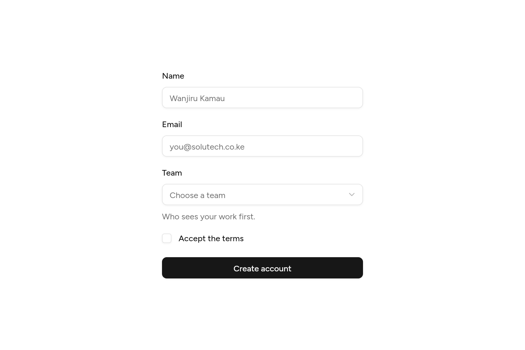
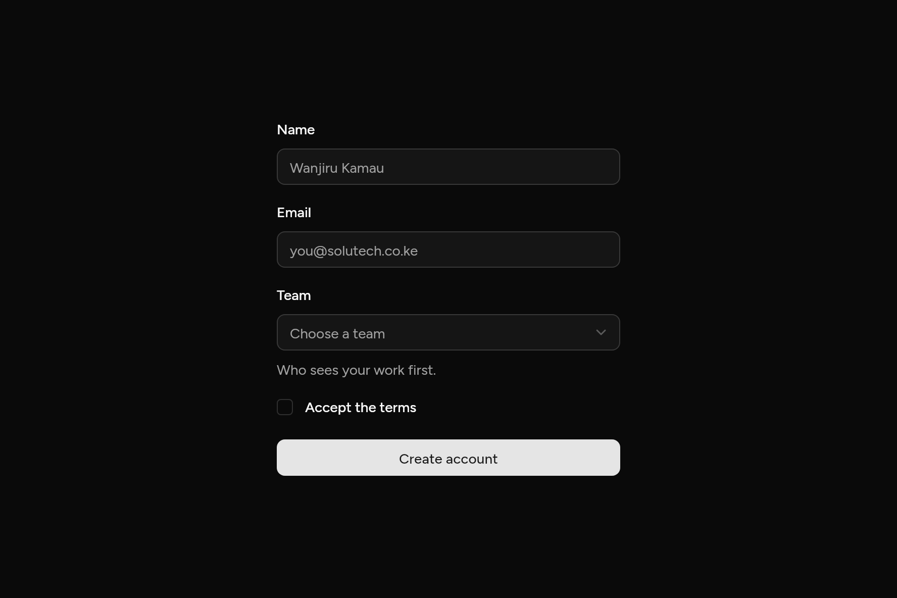
import 'package:flutter/widgets.dart';

import 'ui/button.dart';
import 'ui/checkbox.dart';
import 'ui/form.dart';
import 'ui/select.dart';

class FormDemo extends StatefulWidget {
  const FormDemo({super.key});

  @override
  State<FormDemo> createState() => _FormDemoState();
}

class _FormDemoState extends State<FormDemo> {
  final form = GlobalKey<FormState>();
  String? sent;

  void send() {
    if (form.currentState!.submit()) setState(() => sent = 'Account created.');
  }

  @override
  Widget build(BuildContext context) => SizedBox(
    width: 340,
    child: Form(
      key: form,
      child: Column(
        mainAxisSize: MainAxisSize.min,
        crossAxisAlignment: CrossAxisAlignment.stretch,
        children: [
          FormText(
            label: const Text('Name'),
            placeholder: 'Wanjiru Kamau',
            validator: Validate.required('Enter your name.'),
          ),
          const SizedBox(height: 20),
          FormText(
            label: const Text('Email'),
            placeholder: 'you@solutech.co.ke',
            keyboardType: TextInputType.emailAddress,
            validator: Validate.all([
              Validate.required('Enter your email.'),
              Validate.email(),
            ]),
          ),
          const SizedBox(height: 20),
          FormItem<String>(
            label: const Text('Team'),
            description: const Text('Who sees your work first.'),
            validator: Validate.required('Pick a team.'),
            builder: (field) => Select<String>(
              value: field.value,
              placeholder: 'Choose a team',
              error: field.hasError,
              options: const [
                SelectOption('design', 'Design'),
                SelectOption('engineering', 'Engineering'),
                SelectOption('sales', 'Sales'),
              ],
              onChanged: field.didChange,
            ),
          ),
          const SizedBox(height: 20),
          FormItem<bool>(
            initialValue: false,
            axis: Axis.horizontal,
            label: const Text('Accept the terms'),
            validator: Validate.required('Accept the terms to go on.'),
            builder: (field) => Checkbox(
              value: field.value!,
              error: field.hasError,
              onChanged: field.didChange,
            ),
          ),
          const SizedBox(height: 24),
          Button(onPressed: send, child: const Text('Create account')),
          if (sent != null) ...[const SizedBox(height: 12), Text(sent!)],
        ],
      ),
    ),
  );
}
Add it
In your Flutter project:
ashlar add form
It writes theme.dart, palette.dart, label.dart, field.dart, selection.dart, input.dart and form.dart into lib/ui, keeping any you already have. It needs field and input, which come with it.
Examples
Other ways to use it, each running live, with its code.
Sign in
Email and password, checked when sent.
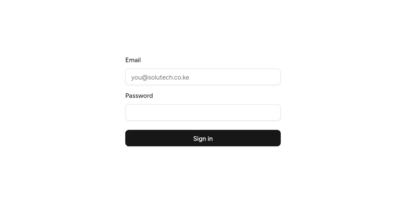
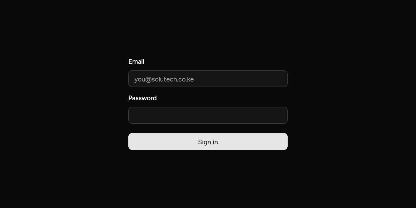
// Sign in: Email and password, checked when sent.
import 'package:flutter/widgets.dart';

import 'ui/button.dart';
import 'ui/form.dart';

class FormLoginExample extends StatefulWidget {
  const FormLoginExample({super.key});

  @override
  State<FormLoginExample> createState() => _FormLoginExampleState();
}

class _FormLoginExampleState extends State<FormLoginExample> {
  final form = GlobalKey<FormState>();

  @override
  Widget build(BuildContext context) => SizedBox(
    width: 340,
    child: Form(
      key: form,
      child: Column(
        mainAxisSize: MainAxisSize.min,
        crossAxisAlignment: CrossAxisAlignment.stretch,
        children: [
          FormText(
            label: const Text('Email'),
            placeholder: 'you@solutech.co.ke',
            validator: Validate.all([Validate.required('Enter your email.'), Validate.email()]),
          ),
          const SizedBox(height: 16),
          FormText(label: const Text('Password'), obscureText: true, validator: Validate.minLength(8)),
          const SizedBox(height: 20),
          Button(onPressed: () => form.currentState!.submit(), child: const Text('Sign in')),
        ],
      ),
    ),
  );
}
Choices
A switch and a radio group, each checked.
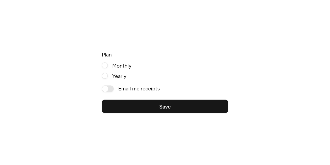
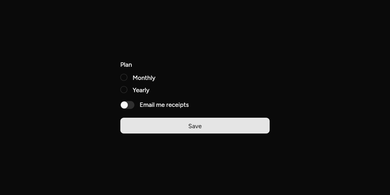
// Choices: A switch and a radio group, each checked.
import 'package:flutter/widgets.dart';

import 'ui/button.dart';
import 'ui/form.dart';
import 'ui/radio.dart';
import 'ui/switch.dart';

class FormChoicesExample extends StatefulWidget {
  const FormChoicesExample({super.key});

  @override
  State<FormChoicesExample> createState() => _FormChoicesExampleState();
}

class _FormChoicesExampleState extends State<FormChoicesExample> {
  final form = GlobalKey<FormState>();

  @override
  Widget build(BuildContext context) => SizedBox(
    width: 340,
    child: Form(
      key: form,
      child: Column(
        mainAxisSize: MainAxisSize.min,
        crossAxisAlignment: CrossAxisAlignment.stretch,
        children: [
          FormItem<String>(
            label: const Text('Plan'),
            validator: Validate.required('Choose a plan.'),
            builder: (field) => RadioGroup<String>(
              groupValue: field.value,
              onChanged: field.didChange,
              child: Column(
                crossAxisAlignment: CrossAxisAlignment.start,
                children: [
                  Radio(value: 'monthly', label: const Text('Monthly'), error: field.hasError),
                  const SizedBox(height: 8),
                  Radio(value: 'yearly', label: const Text('Yearly'), error: field.hasError),
                ],
              ),
            ),
          ),
          const SizedBox(height: 16),
          FormItem<bool>(
            initialValue: false,
            axis: Axis.horizontal,
            label: const Text('Email me receipts'),
            builder: (field) => Switch(value: field.value!, onChanged: field.didChange),
          ),
          const SizedBox(height: 20),
          Button(onPressed: () => form.currentState!.submit(), child: const Text('Save')),
        ],
      ),
    ),
  );
}
API
Read from the source above: each parameter with its type, its default, and what it is for.
Validateclass
Checks for a field's validator: each gives the message to show, or null when the value is right. The messages are English; pass your own in other languages.
FormItemclass
A field of a Form, drawn as a Field: its label, a description and, once it has been checked, its error. builder makes the control from the field's state: give it field.value, report changes with field.didChange, and mark it with field.hasError.
Errors appear when the form is sent (FormSend.submit) and, after that, clear as each one is put right.
| Parameter | Type | Default | What it is for |
|---|---|---|---|
builderrequired |
Widget Function(FormItemState<T> field) |
Builds the control from the field's state: its value, a way to change it, and whether it is wrong. | |
label |
Widget? |
Above the control, or beside it when across. | |
description |
Widget? |
Under the control: what the field is for. | |
axis |
Axis |
Axis.vertical |
Vertical puts the label above (inputs, selects); horizontal puts the control first (checkboxes, switches). |
initialValue |
|
The value it starts with, and goes back to when the form is reset. | |
validator |
|
Checks the value: gives the message to show, or null when it is right. | |
onSaved |
|
Told the value when the form is saved, after every field is right. | |
enabled |
|
False fades it and leaves it out of the form's checks. | |
forceErrorText |
|
An error to show whatever the value: one from a server, say. | |
restorationId |
|
Keeps its value when the app is restored after the system closed it. | |
autovalidateMode |
|
AutovalidateMode.onUserInteractionIfError |
When it checks itself: by default once it has an error, as each change is made. |
FormItemStateclass
The state of a FormItem: its value, its error, and focus to go to it.
FormTextclass
A text field of a Form: an Input drawn as a Field, kept in step with the form when it is reset.
| Parameter | Type | Default | What it is for |
|---|---|---|---|
controller |
TextEditingController? |
Its text, to read and set from outside; one is made when not given. | |
initialValue |
String? |
The text it starts with, and goes back to when the form is reset. | |
label | Widget? | Above the field. | |
description |
Widget? |
Under the field: what it is for. | |
placeholder |
String? |
Faint text shown while it is empty. | |
leading |
Widget? |
An icon or text before the text, inside the field. | |
trailing |
Widget? |
An icon or button after the text, inside the field. | |
obscureText |
bool |
false |
Hides what is typed, as for a password. |
keyboardType |
TextInputType? |
The on-screen keyboard to show: numbers, an email address, a phone number. | |
textInputAction |
TextInputAction? |
What the on-screen keyboard's action key says and does: next, done, search. | |
autofillHints |
Iterable<String>? |
What the platform may fill in here from saved details: an email, a password. | |
inputFormatters |
List<TextInputFormatter>? |
Rules for what can be typed, such as digits only. | |
maxLines |
int |
1 |
More than 1 makes a text area that grows to that many lines. |
minLines |
int? |
How tall a text area starts, in lines. Defaults to maxLines, up to 3. |
|
onChanged |
ValueChanged<String>? |
Told the text as it changes. | |
onSubmitted |
ValueChanged<String>? |
Told the text when the keyboard's action key is pressed. | |
validator |
|
Checks the value: gives the message to show, or null when it is right. | |
onSaved |
|
Told the value when the form is saved, after every field is right. | |
enabled |
|
False fades it and stops it taking focus or typing. | |
forceErrorText |
|
An error to show whatever the value: one from a server, say. | |
restorationId |
|
Keeps its value when the app is restored after the system closed it. | |
autovalidateMode |
|
AutovalidateMode.onUserInteractionIfError |
When it checks itself: by default once it has an error, as each change is made. |
FormSendextension
Sending a Form the way people expect.
| Method | What it is for |
|---|---|
submit() |
Checks every field. When any is wrong, each shows its error and focus goes to the first on screen, where a screen reader hears it. When all are right, each field's onSaved runs. Gives whether all were right.
|
Source
What lands in your app. It is yours from then on: change it as you would your own code, and ashlar add
will not write over it.
lib/ui/form.dart 313 lines
// Ashlar UI: Form. Copied into your app by `ashlar add form`; it is yours to change.
//
// Built on Form and FormField from Flutter's widgets layer, which keep each field's value
// and run its checks. This file draws each field as a Field with its error under it, and
// sends focus to the first field that is wrong when the form is sent.

import 'package:flutter/services.dart';
import 'package:flutter/widgets.dart';

import 'field.dart';
import 'input.dart';

/// Checks for a field's `validator`: each gives the message to show, or null when the
/// value is right. The messages are English; pass your own in other languages.
///
/// ```dart
/// validator: Validate.all([Validate.required(), Validate.email()])
/// ```
abstract final class Validate {
  /// Something must be given: not null, not blank, not an empty list, not false (for a
  /// box that must be ticked).
  static FormFieldValidator<T> required<T>([String message = 'Required.']) =>
      (v) => switch (v) {
        null || false => message,
        String s when s.trim().isEmpty => message,
        Iterable<Object?> i when i.isEmpty => message,
        _ => null,
      };

  static FormFieldValidator<String> minLength(int n, [String? message]) =>
      (v) => (v ?? '').length < n
      ? message ?? 'At least $n character${n == 1 ? '' : 's'}.'
      : null;

  static FormFieldValidator<String> maxLength(int n, [String? message]) =>
      (v) => (v ?? '').length > n
      ? message ?? 'At most $n character${n == 1 ? '' : 's'}.'
      : null;

  /// An email address, when one is given. Pair it with [required] when one must be.
  static FormFieldValidator<String> email([
    String message = 'Enter an email address.',
  ]) => pattern(_email, message);

  /// Text matching [re] in full, when any is given.
  static FormFieldValidator<String> pattern(RegExp re, String message) =>
      (v) => v == null || v.isEmpty || re.hasMatch(v) ? null : message;

  static FormFieldValidator<num> min(num least, [String? message]) =>
      (v) => v != null && v < least ? message ?? 'At least $least.' : null;

  static FormFieldValidator<num> max(num most, [String? message]) =>
      (v) => v != null && v > most ? message ?? 'At most $most.' : null;

  /// Each check in turn; the first message wins.
  static FormFieldValidator<T> all<T>(List<FormFieldValidator<T>> checks) =>
      (v) {
        for (final check in checks) {
          final message = check(v);
          if (message != null) return message;
        }
        return null;
      };

  static final _email = RegExp(r'^[^@\s]+@[^@\s]+\.[^@\s]+$');
}

/// A field of a [Form], drawn as a [Field]: its label, a description and, once it has
/// been checked, its error. [builder] makes the control from the field's state: give it
/// `field.value`, report changes with `field.didChange`, and mark it with
/// `field.hasError`.
///
/// Errors appear when the form is sent ([FormSend.submit]) and, after that, clear as each
/// one is put right.
///
/// ```dart
/// FormItem<bool>(
///   initialValue: false,
///   axis: Axis.horizontal,
///   label: Text('Accept the terms'),
///   validator: Validate.required('Accept the terms to go on.'),
///   builder: (field) => Checkbox(value: field.value!, error: field.hasError, onChanged: field.didChange),
/// )
/// ```
class FormItem<T> extends FormField<T> {
  FormItem({
    super.key,
    required Widget Function(FormItemState<T> field) builder,
    this.label,
    this.description,
    this.axis = Axis.vertical,
    super.initialValue,
    super.validator,
    super.onSaved,
    super.enabled,
    super.forceErrorText,
    super.restorationId,
    super.autovalidateMode = AutovalidateMode.onUserInteractionIfError,
  }) : super(
         builder: (state) {
           final field = state as FormItemState<T>;
           return Focus(
             focusNode: field._area,
             child: Field(
               axis: axis,
               enabled: field.widget.enabled,
               label: label,
               description: description,
               error: field.hasError ? Text(field.errorText ?? '') : null,
               child: builder(field),
             ),
           );
         },
       );

  /// Above the control, or beside it when across.
  final Widget? label;

  /// Under the control: what the field is for.
  final Widget? description;

  /// Vertical puts the label above (inputs, selects); horizontal puts the control first
  /// (checkboxes, switches).
  final Axis axis;

  @override
  FormItemState<T> createState() => FormItemState<T>();
}

/// The state of a [FormItem]: its value, its error, and [focus] to go to it.
class FormItemState<T> extends FormFieldState<T> {
  // Holds the control's focus without taking any itself, so [focus] can find it.
  final _area = FocusNode(
    canRequestFocus: false,
    skipTraversal: true,
    debugLabel: 'FormItem',
  );

  /// Moves focus to the field's control and scrolls it into view.
  void focus() {
    _area.traversalDescendants.firstOrNull?.requestFocus();
    Scrollable.ensureVisible(
      context,
      alignment: .2,
      duration: const Duration(milliseconds: 200),
    );
  }

  @override
  void dispose() {
    _area.dispose();
    super.dispose();
  }
}

/// A text field of a [Form]: an [Input] drawn as a [Field], kept in step with the form
/// when it is reset.
///
/// ```dart
/// FormText(
///   label: Text('Email'),
///   placeholder: 'you@solutech.co.ke',
///   keyboardType: TextInputType.emailAddress,
///   validator: Validate.all([Validate.required(), Validate.email()]),
///   onSaved: (v) => email = v!,
/// )
/// ```
class FormText extends FormItem<String> {
  FormText({
    super.key,
    this.controller,
    String? initialValue,
    super.label,
    super.description,
    String? placeholder,
    Widget? leading,
    Widget? trailing,
    bool obscureText = false,
    TextInputType? keyboardType,
    TextInputAction? textInputAction,
    Iterable<String>? autofillHints,
    List<TextInputFormatter>? inputFormatters,
    int maxLines = 1,
    int? minLines,
    ValueChanged<String>? onChanged,
    ValueChanged<String>? onSubmitted,
    super.validator,
    super.onSaved,
    super.enabled,
    super.forceErrorText,
    super.restorationId,
    super.autovalidateMode,
  }) : super(
         initialValue: controller?.text ?? initialValue ?? '',
         builder: (state) {
           final field = state as _FormTextState;
           return Input(
             controller: field._controller,
             placeholder: placeholder,
             leading: leading,
             trailing: trailing,
             obscureText: obscureText,
             enabled: field.widget.enabled,
             error: field.hasError,
             keyboardType: keyboardType,
             textInputAction: textInputAction,
             autofillHints: autofillHints,
             inputFormatters: inputFormatters,
             maxLines: maxLines,
             minLines: minLines,
             onChanged: (v) {
               field.didChange(v);
               onChanged?.call(v);
             },
             onSubmitted: onSubmitted,
           );
         },
       );

  /// Its text, when you want to read or set it from outside; the field makes one if not.
  final TextEditingController? controller;

  @override
  FormItemState<String> createState() => _FormTextState();
}

class _FormTextState extends FormItemState<String> {
  late final _own = widget.controller == null
      ? TextEditingController(text: widget.initialValue)
      : null;

  TextEditingController get _controller => widget.controller ?? _own!;

  @override
  FormText get widget => super.widget as FormText;

  @override
  void initState() {
    super.initState();
    _controller.addListener(_follow);
  }

  // Text set on the controller from outside becomes the field's value.
  void _follow() {
    if (_controller.text != value) super.didChange(_controller.text);
  }

  @override
  void didChange(String? value) {
    super.didChange(value);
    if (_controller.text != value) _controller.text = value ?? '';
  }

  @override
  void reset() {
    // The form's reset puts the first value back; the text follows it.
    _controller.text = widget.initialValue ?? '';
    super.reset();
  }

  @override
  void didUpdateWidget(FormText old) {
    super.didUpdateWidget(old);
    if (old.controller != widget.controller) {
      (old.controller ?? _own)?.removeListener(_follow);
      _controller.addListener(_follow);
    }
  }

  @override
  void dispose() {
    _controller.removeListener(_follow);
    _own?.dispose();
    super.dispose();
  }
}

/// Sending a [Form] the way people expect.
extension FormSend on FormState {
  /// Checks every field. When any is wrong, each shows its error and focus goes to the
  /// first on screen, where a screen reader hears it. When all are right, each field's
  /// `onSaved` runs. Gives whether all were right.
  ///
  /// ```dart
  /// Button(onPressed: () { if (form.currentState!.submit()) send(); }, child: Text('Create'))
  /// ```
  bool submit() {
    final wrong = validateGranularly();
    if (wrong.isEmpty) {
      save();
      return true;
    }
    Offset at(FormFieldState<Object?> f) {
      final box = f.context.findRenderObject() as RenderBox?;
      return box == null || !box.attached
          ? Offset.infinite
          : box.localToGlobal(Offset.zero);
    }

    // Top to bottom, then along the line: from the right in right-to-left text.
    final rtl = Directionality.maybeOf(context) == TextDirection.rtl;
    final first =
        (wrong.toList()..sort((a, b) {
              final p = at(a), q = at(b);
              if (p.dy != q.dy) return p.dy.compareTo(q.dy);
              return rtl ? q.dx.compareTo(p.dx) : p.dx.compareTo(q.dx);
            }))
            .whereType<FormItemState<Object?>>()
            .firstOrNull;
    first?.focus();
    return false;
  }
}