

Command
A search box over a list of things to do, picked with the keyboard.
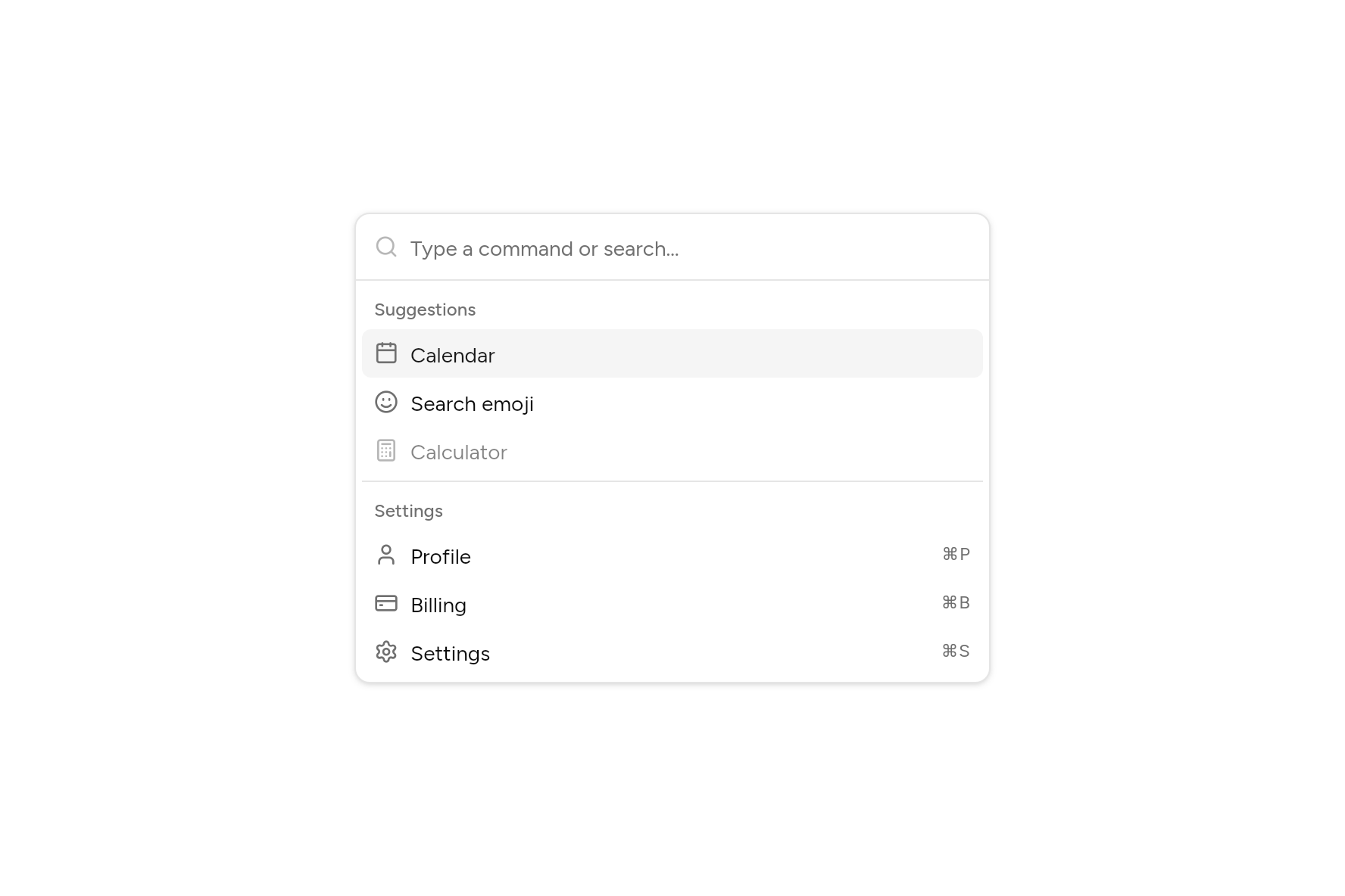
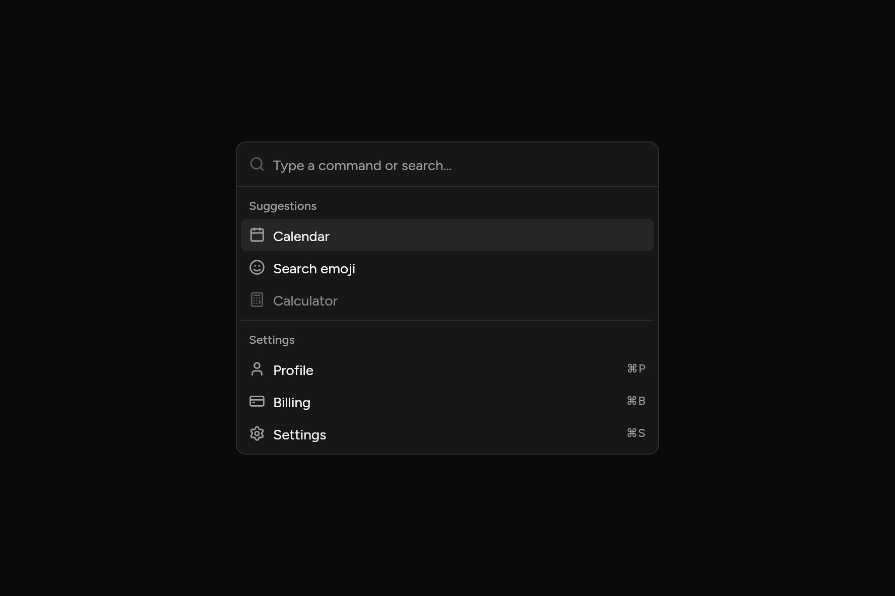
import 'package:ashlar_icons/ashlar_icons.dart';
import 'package:flutter/widgets.dart';

import 'ui/command.dart';
import 'ui/theme.dart';

class CommandDemo extends StatelessWidget {
  const CommandDemo({super.key});

  @override
  Widget build(BuildContext context) {
    final t = AshlarTheme.of(context);
    return Container(
      width: 420,
      clipBehavior: Clip.antiAlias,
      decoration: BoxDecoration(
        color: t.colors.popover,
        borderRadius: BorderRadius.circular(t.radiusLg),
        border: Border.all(color: t.colors.border),
        boxShadow: t.shadowSm,
      ),
      child: Command(
        autofocus: false,
        groups: [
          CommandGroup(heading: 'Suggestions', [
            CommandItem('Calendar', leading: const AshlarIcon(AshlarIconsRoundedStroke.calendar), onSelected: () {}),
            CommandItem(
              'Search emoji',
              leading: const AshlarIcon(AshlarIconsRoundedStroke.faceSlightlySmiling),
              onSelected: () {},
            ),
            CommandItem(
              'Calculator',
              leading: const AshlarIcon(AshlarIconsRoundedStroke.calculator),
              enabled: false,
              onSelected: () {},
            ),
          ]),
          CommandGroup(heading: 'Settings', [
            CommandItem(
              'Profile',
              leading: const AshlarIcon(AshlarIconsRoundedStroke.user),
              shortcut: '⌘P',
              onSelected: () {},
            ),
            CommandItem(
              'Billing',
              keywords: const ['invoice', 'payment'],
              leading: const AshlarIcon(AshlarIconsRoundedStroke.creditCard),
              shortcut: '⌘B',
              onSelected: () {},
            ),
            CommandItem(
              'Settings',
              leading: const AshlarIcon(AshlarIconsRoundedStroke.settings),
              shortcut: '⌘S',
              onSelected: () {},
            ),
          ]),
        ],
      ),
    );
  }
}
Add it
In your Flutter project:
ashlar add command
It writes theme.dart, palette.dart, selection.dart, input.dart, group.dart, pressable.dart, button.dart, dialog.dart and command.dart into lib/ui, keeping any you already have, and adds ashlar_icons to pubspec.yaml. It needs input, dialog and ashlar_icons, which come with it.
Examples
Other ways to use it, each running live, with its code.
Groups and shortcuts
Type to narrow; arrows and Enter to choose.
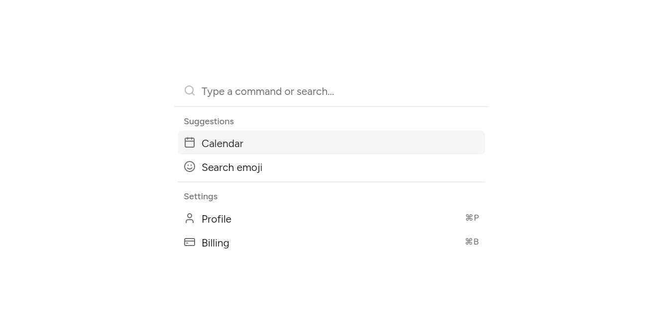
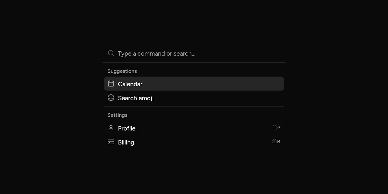
// Groups and shortcuts: Type to narrow; arrows and Enter to choose.
import 'package:ashlar_icons/ashlar_icons.dart';
import 'package:flutter/widgets.dart';

import 'ui/command.dart';

class CommandGroupsExample extends StatelessWidget {
  const CommandGroupsExample({super.key});

  @override
  Widget build(BuildContext context) => SizedBox(
    width: 420,
    child: Command(
      autofocus: false,
      groups: [
        CommandGroup(heading: 'Suggestions', [
          CommandItem('Calendar', leading: const AshlarIcon(AshlarIconsRoundedStroke.calendar), onSelected: () {}),
          CommandItem(
            'Search emoji',
            leading: const AshlarIcon(AshlarIconsRoundedStroke.faceSlightlySmiling),
            onSelected: () {},
          ),
        ]),
        CommandGroup(heading: 'Settings', [
          CommandItem(
            'Profile',
            shortcut: '⌘P',
            leading: const AshlarIcon(AshlarIconsRoundedStroke.user),
            onSelected: () {},
          ),
          CommandItem(
            'Billing',
            shortcut: '⌘B',
            leading: const AshlarIcon(AshlarIconsRoundedStroke.creditCard),
            onSelected: () {},
          ),
        ]),
      ],
    ),
  );
}
In a dialog
Opened from a button, as with ⌘K.
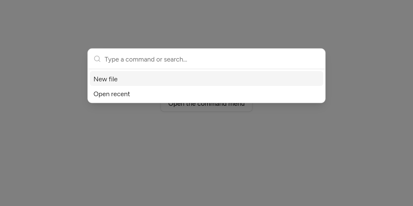
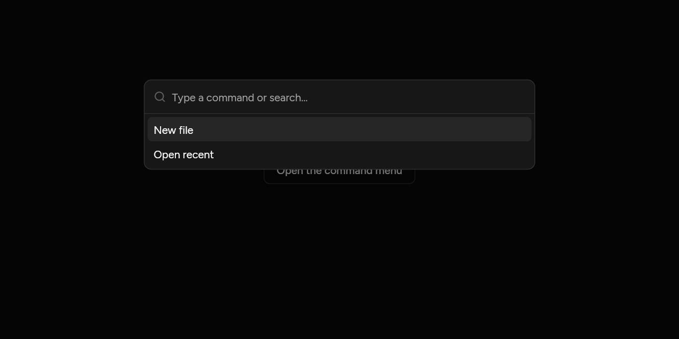
// In a dialog: Opened from a button, as with ⌘K.
import 'package:flutter/widgets.dart';

import 'ui/button.dart';
import 'ui/command.dart';

class CommandDialogExample extends StatelessWidget {
  const CommandDialogExample({super.key});

  @override
  Widget build(BuildContext context) => Builder(
    builder: (context) => Button(
      variant: ButtonVariant.outline,
      onPressed: () => showCommandDialog(
        context: context,
        groups: [
          CommandGroup([
            CommandItem('New file', onSelected: () {}),
            CommandItem('Open recent', onSelected: () {}),
          ]),
        ],
      ),
      child: const Text('Open the command menu'),
    ),
  );
}
API
Read from the source above: each parameter with its type, its default, and what it is for.
CommandItemclass
Something a Command can do or pick.
| Parameter | Type | Default | What it is for |
|---|---|---|---|
labelpositional |
String |
What the item says. | |
onSelectedrequired |
VoidCallback |
Called when it is chosen. | |
keywords |
List<String> |
const [] |
Other words it is found by: "invoice" for "Billing". |
leading |
Widget? |
Before the label: usually an icon. | |
shortcut |
String? |
A key combination, shown faint at the end: '⌘K'. | |
enabled |
bool |
true |
False fades it and stops it being chosen. |
CommandGroupclass
A titled run of items in a Command.
| Parameter | Type | Default | What it is for |
|---|---|---|---|
itemspositional |
List<CommandItem> |
The group's items. | |
heading | String? | The group's heading. |
Commandclass
A search box over a list of things to do: typing narrows the list, the arrow keys move the highlight while the typing stays in the box, and Enter picks. For a menu of many commands, or a picker over a long list; showCommandDialog opens one over the page, the way ⌘K does.
| Parameter | Type | Default | What it is for |
|---|---|---|---|
groupsrequired |
List<CommandGroup> |
The items, in titled groups. | |
placeholder |
String |
'Type a command or search…' |
Faint text shown while it is empty. |
emptyText |
String |
'No results found.' |
Shown when nothing matches what was typed. |
autofocus |
bool |
true |
Takes the keyboard's focus when it first appears. |
maxHeight |
double |
300 |
The tallest the list grows before it scrolls. |
showCommandDialogfunction
Opens a Command over the page, the way ⌘K does. Picking an item closes it first.
| Parameter | Type | Default | What it is for |
|---|---|---|---|
contextrequired |
BuildContext |
Where it is opened from: its theme and navigator come from here. | |
groupsrequired |
List<CommandGroup> |
The commands, in titled groups. | |
placeholder |
String |
'Type a command or search…' |
Faint text in the search field. |
Source
What lands in your app. It is yours from then on: change it as you would your own code, and ashlar add
will not write over it.
lib/ui/command.dart 481 lines
// Ashlar UI: Command. Copied into your app by `ashlar add command`; it is yours to change.

import 'dart:math' show max;

import 'package:ashlar_icons/ashlar_icons.dart';
import 'package:flutter/services.dart';
import 'package:flutter/widgets.dart';

import 'dialog.dart';
import 'input.dart';
import 'theme.dart';

/// Something a [Command] can do or pick.
@immutable
class CommandItem {
  const CommandItem(
    this.label, {
    required this.onSelected,
    this.keywords = const [],
    this.leading,
    this.shortcut,
    this.enabled = true,
  });

  /// What the item says.
  final String label;

  /// Called when it is chosen.
  final VoidCallback onSelected;

  /// Other words it is found by: "invoice" for "Billing".
  final List<String> keywords;

  /// Before the label: usually an icon.
  final Widget? leading;

  /// A key combination, shown faint at the end: '⌘K'.
  final String? shortcut;

  /// False fades it and stops it being chosen.
  final bool enabled;
}

/// A titled run of items in a [Command].
@immutable
class CommandGroup {
  const CommandGroup(this.items, {this.heading});

  /// The group's heading.
  final String? heading;

  /// The group's items.
  final List<CommandItem> items;
}

/// A search box over a list of things to do: typing narrows the list, the arrow keys
/// move the highlight while the typing stays in the box, and Enter picks. For a menu of
/// many commands, or a picker over a long list; [showCommandDialog] opens one over the
/// page, the way ⌘K does.
///
/// ```dart
/// Command(groups: [
///   CommandGroup(heading: 'Suggestions', [
///     CommandItem('Calendar', leading: AshlarIcon(AshlarIconsRoundedStroke.calendar), onSelected: openCalendar),
///     CommandItem('Search emoji', onSelected: openEmoji),
///   ]),
///   CommandGroup(heading: 'Settings', [CommandItem('Profile', shortcut: '⌘P', onSelected: openProfile)]),
/// ])
/// ```
class Command extends StatefulWidget {
  const Command({
    super.key,
    required this.groups,
    this.placeholder = 'Type a command or search…',
    this.emptyText = 'No results found.',
    this.autofocus = true,
    this.maxHeight = 300,
  });

  /// The items, in titled groups.
  final List<CommandGroup> groups;

  /// Faint text shown while it is empty.
  final String placeholder;

  /// Shown when nothing matches what was typed.
  final String emptyText;

  /// Takes the keyboard's focus when it first appears.
  final bool autofocus;

  /// The tallest the list grows before it scrolls.
  final double maxHeight;

  @override
  State<Command> createState() => _CommandState();
}

class _CommandState extends State<Command> {
  final _query = TextEditingController();
  final _scroll = ScrollController();
  int _at = 0;

  // The list as rows, worked out once per search rather than on every frame: headings,
  // lines between groups, and the items, with where each item sits.
  String? _for;
  List<_Line> _lines = const [];
  List<int> _items = const [];

  static const _itemHeight = 32.0,
      _headingHeight = 28.0,
      _gapHeight = 9.0,
      _pad = 4.0;

  @override
  void initState() {
    super.initState();
    _query.addListener(() => setState(() => _at = 0));
  }

  @override
  void dispose() {
    _query.dispose();
    _scroll.dispose();
    super.dispose();
  }

  void _layout() {
    if (_for == _query.text && _lines.isNotEmpty) return;
    _for = _query.text;
    final words = _query.text
        .toLowerCase()
        .split(RegExp(r'\s+'))
        .where((w) => w.isNotEmpty)
        .toList();
    // Every word typed is somewhere in the item's label or keywords.
    bool matches(CommandItem item) {
      final hay = [item.label, ...item.keywords].join(' ').toLowerCase();
      return words.every(hay.contains);
    }

    final lines = <_Line>[], items = <int>[];
    for (final g in widget.groups) {
      final hits = g.items.where(matches).toList();
      if (hits.isEmpty) continue;
      if (lines.isNotEmpty) lines.add(const _Line.gap());
      if (g.heading != null) lines.add(_Line.heading(g.heading!));
      for (final item in hits) {
        if (item.enabled) items.add(lines.length);
        lines.add(_Line.item(item));
      }
    }
    _lines = lines;
    _items = items;
  }

  /// Rows grow with large text: the font's scale, never below one.
  double _grow = 1;

  double _extent(_Line l) =>
      (l.item != null
          ? _itemHeight
          : (l.heading != null ? _headingHeight : _gapHeight)) *
      _grow;

  /// Where a row starts in the list, from the top of the list's padding.
  double _top(int line) {
    var y = _pad;
    for (var i = 0; i < line; i++) {
      y += _extent(_lines[i]);
    }
    return y;
  }

  void _move(int by) {
    final n = _items.length;
    if (n == 0) return;
    setState(() => _at = (_at + by).clamp(0, n - 1));
    if (!_scroll.hasClients) return;
    // Scroll just enough to bring the highlighted row into view.
    final top = _top(_items[_at]), bottom = top + _itemHeight;
    final view = _scroll.position;
    if (top - _pad < view.pixels) {
      _scroll.jumpTo((top - _pad).clamp(0, view.maxScrollExtent));
    } else if (bottom + _pad > view.pixels + view.viewportDimension) {
      _scroll.jumpTo(
        (bottom + _pad - view.viewportDimension).clamp(0, view.maxScrollExtent),
      );
    }
  }

  void _pick() {
    if (_at < _items.length) _lines[_items[_at]].item!.onSelected();
  }

  @override
  void didUpdateWidget(Command old) {
    super.didUpdateWidget(old);
    if (old.groups != widget.groups) _for = null;
  }

  @override
  Widget build(BuildContext context) {
    final t = AshlarTheme.of(context);
    final c = t.colors;
    _layout();
    final lit = _items.isEmpty
        ? null
        : _lines[_items[_at.clamp(0, _items.length - 1)]].item;
    _grow = max(1, MediaQuery.textScalerOf(context).scale(14) / 14);
    final height = _lines.fold<double>(_pad * 2, (h, l) => h + _extent(l));
    return LayoutBuilder(
      builder: (context, box) => DefaultTextStyle.merge(
        style: t.text.sm.copyWith(color: c.popoverForeground),
        child: Column(
          mainAxisSize: MainAxisSize.min,
          crossAxisAlignment: CrossAxisAlignment.stretch,
          children: [
            CallbackShortcuts(
              bindings: {
                const SingleActivator(LogicalKeyboardKey.arrowDown): () =>
                    _move(1),
                const SingleActivator(LogicalKeyboardKey.arrowUp): () =>
                    _move(-1),
                const SingleActivator(
                  LogicalKeyboardKey.home,
                  control: true,
                ): () =>
                    _move(-_items.length),
                const SingleActivator(
                  LogicalKeyboardKey.end,
                  control: true,
                ): () =>
                    _move(_items.length),
                const SingleActivator(LogicalKeyboardKey.enter): _pick,
              },
              child: Container(
                height: 44,
                padding: const EdgeInsets.symmetric(horizontal: 12),
                decoration: BoxDecoration(
                  border: Border(bottom: BorderSide(color: c.border)),
                ),
                child: Row(
                  children: [
                    AshlarIcon(
                      AshlarIconsRoundedStroke.search,
                      size: 16,
                      color: c.mutedForeground.withValues(alpha: .5),
                    ),
                    const SizedBox(width: 8),
                    Expanded(
                      child: Input(
                        decorated: false,
                        controller: _query,
                        autofocus: widget.autofocus,
                        placeholder: widget.placeholder,
                        textInputAction: TextInputAction.go,
                        onSubmitted: (_) => _pick(),
                      ),
                    ),
                  ],
                ),
              ),
            ),
            // The highlighted item, read out as it changes: the typing stays in the box.
            Semantics(
              liveRegion: true,
              label: lit?.label ?? (_lines.isEmpty ? widget.emptyText : ''),
              child: const SizedBox(),
            ),
            // In a bounded height (a popover near the screen's edge) the list gives way to
            // the search box; in a scrolling page it keeps its own height.
            _GiveWay(
              bounded: box.maxHeight.isFinite,
              child: _lines.isEmpty
                  ? Padding(
                      padding: const EdgeInsets.symmetric(vertical: 24),
                      child: Text(
                        widget.emptyText,
                        textAlign: TextAlign.center,
                        style: TextStyle(color: c.mutedForeground),
                      ),
                    )
                  // Only the rows on screen are built, however long the list.
                  : SizedBox(
                      height: height < widget.maxHeight
                          ? height
                          : widget.maxHeight,
                      child: ListView.builder(
                        controller: _scroll,
                        padding: const EdgeInsets.all(_pad),
                        itemCount: _lines.length,
                        itemExtentBuilder: (i, _) =>
                            i < _lines.length ? _extent(_lines[i]) : null,
                        itemBuilder: (context, i) {
                          final line = _lines[i];
                          if (line.item case final item?) {
                            return _Row(
                              item: item,
                              lit: identical(item, lit),
                              onHover: () {
                                final at = _items.indexOf(i);
                                if (at >= 0 && at != _at) {
                                  setState(() => _at = at);
                                }
                              },
                            );
                          }
                          if (line.heading case final heading?) {
                            return Padding(
                              padding: const EdgeInsets.fromLTRB(8, 6, 8, 6),
                              child: Semantics(
                                header: true,
                                child: Text(
                                  heading,
                                  style: t.text.xs.copyWith(
                                    color: c.mutedForeground,
                                    fontWeight: FontWeight.w500,
                                  ),
                                ),
                              ),
                            );
                          }
                          return Container(
                            height: 1,
                            margin: const EdgeInsets.symmetric(vertical: 4),
                            color: c.border,
                          );
                        },
                      ),
                    ),
            ),
          ],
        ),
      ),
    );
  }
}

/// A row of the list: a heading, a line between groups, or an item.
class _Line {
  const _Line.gap() : heading = null, item = null;
  const _Line.heading(String this.heading) : item = null;
  const _Line.item(CommandItem this.item) : heading = null;

  final String? heading;
  final CommandItem? item;
}

/// Flexible in a bounded column, as it is otherwise.
class _GiveWay extends StatelessWidget {
  const _GiveWay({required this.bounded, required this.child});

  final bool bounded;
  final Widget child;

  @override
  Widget build(BuildContext context) =>
      bounded ? Flexible(child: child) : child;
}

class _Row extends StatelessWidget {
  const _Row({required this.item, required this.lit, required this.onHover});

  final CommandItem item;
  final bool lit;
  final VoidCallback onHover;

  @override
  Widget build(BuildContext context) {
    final t = AshlarTheme.of(context);
    final c = t.colors;
    final fg = lit ? c.accentForeground : c.popoverForeground;
    return MouseRegion(
      cursor: item.enabled
          ? SystemMouseCursors.click
          : SystemMouseCursors.basic,
      onEnter: item.enabled ? (_) => onHover() : null,
      child: Semantics(
        button: true,
        selected: lit,
        enabled: item.enabled,
        onTap: item.enabled ? item.onSelected : null,
        child: GestureDetector(
          behavior: HitTestBehavior.opaque,
          onTap: item.enabled ? item.onSelected : null,
          child: Opacity(
            opacity: item.enabled ? 1 : .5,
            child: Container(
              padding: const EdgeInsets.symmetric(horizontal: 8, vertical: 6),
              decoration: BoxDecoration(
                color: lit ? c.accent : c.accent.withValues(alpha: 0),
                borderRadius: BorderRadius.circular(t.radiusSm),
              ),
              child: IconTheme.merge(
                data: IconThemeData(color: c.mutedForeground, size: 16),
                child: Row(
                  children: [
                    if (item.leading != null) ...[
                      item.leading!,
                      const SizedBox(width: 8),
                    ],
                    Expanded(
                      child: Text(
                        item.label,
                        style: TextStyle(color: fg),
                        maxLines: 1,
                        overflow: TextOverflow.ellipsis,
                      ),
                    ),
                    if (item.shortcut != null)
                      Text(
                        item.shortcut!,
                        style: t.text.xs.copyWith(
                          color: c.mutedForeground,
                          letterSpacing: 1.2,
                        ),
                      ),
                  ],
                ),
              ),
            ),
          ),
        ),
      ),
    );
  }
}

/// Opens a [Command] over the page, the way ⌘K does. Picking an item closes it first.
Future<void> showCommandDialog({
  required BuildContext context,
  required List<CommandGroup> groups,
  String placeholder = 'Type a command or search…',
}) => showAshlarDialog<void>(
  context: context,
  builder: (context) {
    final t = AshlarTheme.of(context);
    void close() => Navigator.pop(context);
    return SafeArea(
      child: Align(
        alignment: const Alignment(0, -.4),
        child: Padding(
          padding: const EdgeInsets.all(16),
          child: ConstrainedBox(
            constraints: const BoxConstraints(maxWidth: 512),
            child: Container(
              clipBehavior: Clip.antiAlias,
              decoration: BoxDecoration(
                color: t.colors.popover,
                borderRadius: BorderRadius.circular(t.radiusLg),
                border: Border.all(color: t.colors.border),
                boxShadow: t.shadowLg,
              ),
              child: Command(
                placeholder: placeholder,
                groups: [
                  for (final g in groups)
                    CommandGroup(heading: g.heading, [
                      for (final i in g.items)
                        CommandItem(
                          i.label,
                          keywords: i.keywords,
                          leading: i.leading,
                          shortcut: i.shortcut,
                          enabled: i.enabled,
                          onSelected: () {
                            close();
                            i.onSelected();
                          },
                        ),
                    ]),
                ],
              ),
            ),
          ),
        ),
      ),
    );
  },
);