

Sidebar
An app's navigation down the side: variants, submenus, actions, a rail.
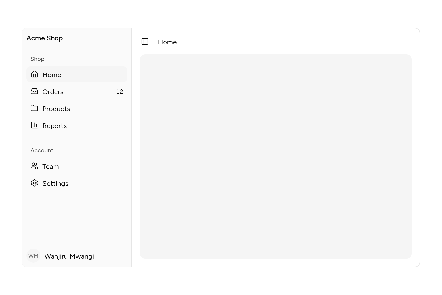
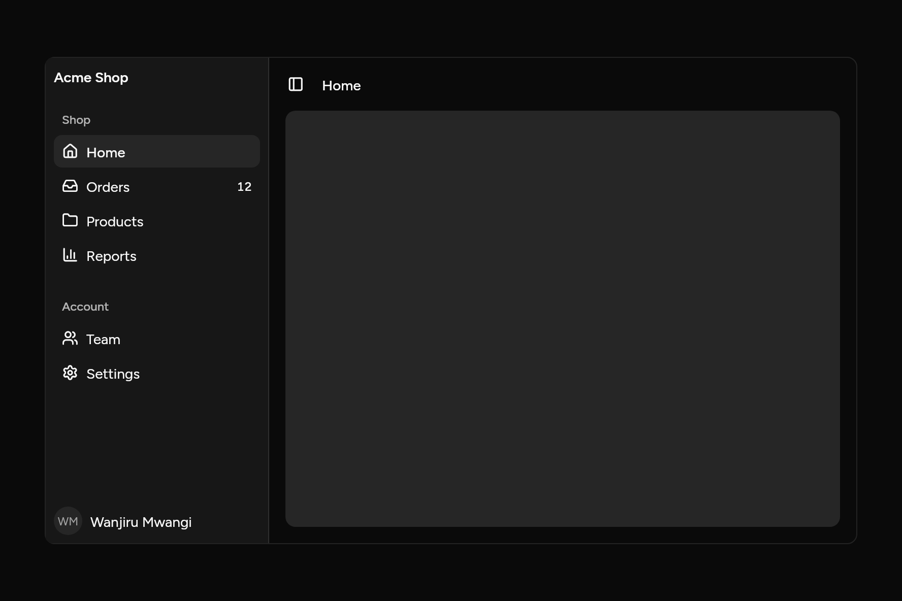
import 'package:ashlar_icons/ashlar_icons.dart';
import 'package:flutter/widgets.dart';

import 'ui/avatar.dart';
import 'ui/sidebar.dart';
import 'ui/theme.dart';

class SidebarDemo extends StatefulWidget {
  const SidebarDemo({super.key});

  @override
  State<SidebarDemo> createState() => _SidebarDemoState();
}

class _SidebarDemoState extends State<SidebarDemo> {
  String page = 'Home';

  @override
  Widget build(BuildContext context) {
    final t = AshlarTheme.of(context);
    SidebarItem item(String label, IconData icon, {String? badge}) => SidebarItem(
      label,
      icon: icon,
      badge: badge,
      active: page == label,
      onPressed: () => setState(() => page = label),
    );
    return Container(
      width: 800,
      height: 480,
      clipBehavior: Clip.antiAlias,
      decoration: BoxDecoration(
        border: Border.all(color: t.colors.border),
        borderRadius: BorderRadius.circular(t.radiusLg),
      ),
      child: SidebarLayout(
        width: 220,
        narrow: 500,
        header: Text('Acme Shop', style: t.text.sm.copyWith(fontWeight: FontWeight.w600)),
        footer: const Row(
          children: [
            Avatar(fallback: 'WM', size: 28),
            SizedBox(width: 8),
            Expanded(child: Text('Wanjiru Mwangi', maxLines: 1, overflow: TextOverflow.ellipsis)),
          ],
        ),
        groups: [
          SidebarGroup(label: 'Shop', [
            item('Home', AshlarIconsRoundedStroke.house),
            item('Orders', AshlarIconsRoundedStroke.inbox, badge: '12'),
            item('Products', AshlarIconsRoundedStroke.folder),
            item('Reports', AshlarIconsRoundedStroke.chartColumn),
          ]),
          SidebarGroup(label: 'Account', [
            item('Team', AshlarIconsRoundedStroke.users),
            item('Settings', AshlarIconsRoundedStroke.settings),
          ]),
        ],
        child: Column(
          crossAxisAlignment: CrossAxisAlignment.start,
          children: [
            Padding(
              padding: const EdgeInsets.all(8),
              child: Row(
                children: [
                  const SidebarTrigger(),
                  const SizedBox(width: 8),
                  Text(page, style: t.text.sm.copyWith(fontWeight: FontWeight.w500)),
                ],
              ),
            ),
            Expanded(
              child: Padding(
                padding: const EdgeInsets.fromLTRB(16, 0, 16, 16),
                child: Container(
                  decoration: BoxDecoration(color: t.colors.muted, borderRadius: BorderRadius.circular(t.radiusLg)),
                ),
              ),
            ),
          ],
        ),
      ),
    );
  }
}
Add it
In your Flutter project:
ashlar add sidebar
It writes theme.dart, palette.dart, group.dart, pressable.dart, button.dart, sheet.dart, tooltip.dart, skeleton.dart and sidebar.dart into lib/ui, keeping any you already have, and adds ashlar_icons to pubspec.yaml. It needs pressable, button, sheet, tooltip, skeleton and ashlar_icons, which come with it.
API
Read from the source above: each parameter with its type, its default, and what it is for.
SidebarActionclass
A small button at the end of an item or a group's label: "more", "add".
| Parameter | Type | Default | What it is for |
|---|---|---|---|
iconrequired |
IconData |
Its icon. | |
labelrequired |
String |
What it does, for screen readers and its tooltip. | |
onPressedrequired |
VoidCallback |
Called when it is pressed. |
SidebarItemclass
A place in the app, on the sidebar. With children it opens a list of its own.
| Parameter | Type | Default | What it is for |
|---|---|---|---|
labelpositional |
String |
Its name; shown in a tooltip when the sidebar is collapsed to icons. | |
iconrequired |
IconData? |
Its icon, shown alone when the sidebar is collapsed. | |
onPressed |
VoidCallback? |
Called when it is chosen. | |
active |
bool |
false |
The page being shown. |
badge |
String? |
A count or a word at the end of the row: '12'. | |
action |
SidebarAction? |
A button at the end of the row, shown under the pointer or keyboard. | |
children |
List<SidebarItem> |
const [] |
Pages under this one, shown when it is opened. |
initiallyOpen |
bool |
false |
Whether its list starts open. |
SidebarGroupclass
A titled run of SidebarItems.
SidebarGroup(…)
| Parameter | Type | Default | What it is for |
|---|---|---|---|
itemspositional |
List<SidebarItem> |
The group's items. | |
label | String? | The group's title. | |
action |
SidebarAction? |
A small button at the end of the group's label: add, more. | |
atEnd |
bool |
false |
Kept at the bottom of the sidebar, above the footer, where help and settings go. |
SidebarGroup.loading(…)
| Parameter | Type | Default | What it is for |
|---|---|---|---|
label | String? | The group's title. | |
rows |
int |
5 |
How many placeholder rows to show while it loads. |
SidebarGroup.custom(…)
| Parameter | Type | Default | What it is for |
|---|---|---|---|
childpositional |
Widget |
Anything else the sidebar holds: a calendar, a file tree, a card. | |
label | String? | The group's title. | |
action |
SidebarAction? |
A small button at the end of the group's label: add, more. | |
atEnd |
bool |
false |
Kept at the bottom of the sidebar, above the footer, where help and settings go. |
SidebarCollapseenum
How a sidebar gets out of the way.
| Value | What it is for |
|---|---|
icons | Down to a strip of icons, each with its label in a tooltip. |
offcanvas | Off the side of the screen entirely. |
none |
It stays where it is beside the page: no rail, no shortcut. On a narrow screen it is still hidden, and a SidebarTrigger slides it in.
|
SidebarVariantenum
How a sidebar sits beside the page.
| Value | What it is for |
|---|---|
sidebar | Edge to edge, with a line between it and the page. |
floating | A rounded panel floating a little in from the edge. |
inset | The page as a rounded card set into the sidebar's colour. |
SidebarSideenum
Which side of the screen the sidebar is on; it follows the reading direction.
| Value | What it is for |
|---|---|
start | |
end |
SidebarLayoutclass
An app's main navigation down one side, beside child. It collapses with a SidebarTrigger, its rail, or ⌘B (Ctrl+B), to icons or out of sight; on a narrow screen it is hidden, and the trigger slides it in over the page. Give open and onOpenChanged to hold its state yourself.
| Parameter | Type | Default | What it is for |
|---|---|---|---|
groupsrequired |
List<SidebarGroup> |
The navigation, in titled groups. | |
childrequired |
Widget |
The page beside the sidebar. | |
header |
Widget? |
Above the groups: the app's name, a team switcher, a search field. | |
footer |
Widget? |
Below the groups: who is signed in. | |
collapse |
SidebarCollapse |
SidebarCollapse.icons |
How it gets out of the way: to icons, out of sight, or not at all. |
variant |
SidebarVariant |
SidebarVariant.sidebar |
Edge to edge, floating, or with the page inset as a card. |
side |
SidebarSide |
SidebarSide.start |
Which side of the screen it is on; it follows the reading direction. |
initiallyOpen |
bool |
true |
Whether it starts open, when nothing holds its state. |
open |
bool? |
Held by the app when given, with onOpenChanged told of each toggle. |
|
onOpenChanged |
ValueChanged<bool>? |
Told when it opens or closes. | |
rail |
bool |
true |
A thin strip along the sidebar's inner edge that toggles it on a click. |
width |
double |
256 |
How wide it is when open. |
narrow |
double |
768 |
Below this width the sidebar is hidden, and slides in over the page. |
SidebarLayoutStateclass
SidebarTriggerclass
The button that opens and closes the SidebarLayout above it.
Source
What lands in your app. It is yours from then on: change it as you would your own code, and ashlar add
will not write over it.
lib/ui/sidebar.dart 820 lines
// Ashlar UI: Sidebar. Copied into your app by `ashlar add sidebar`; it is yours to change.
import 'package:ashlar_icons/ashlar_icons.dart';
import 'package:flutter/services.dart';
import 'package:flutter/widgets.dart';
import 'button.dart';
import 'pressable.dart';
import 'sheet.dart';
import 'skeleton.dart';
import 'theme.dart';
import 'tooltip.dart';
/// A small button at the end of an item or a group's label: "more", "add".
@immutable
class SidebarAction {
const SidebarAction({
required this.icon,
required this.label,
required this.onPressed,
});
/// Its icon.
final IconData icon;
/// What it does, for screen readers and its tooltip.
final String label;
/// Called when it is pressed.
final VoidCallback onPressed;
}
/// A place in the app, on the sidebar. With [children] it opens a list of its own.
@immutable
class SidebarItem {
const SidebarItem(
this.label, {
required this.icon,
this.onPressed,
this.active = false,
this.badge,
this.action,
this.children = const [],
this.initiallyOpen = false,
});
/// Its name; shown in a tooltip when the sidebar is collapsed to icons.
final String label;
/// Its icon, shown alone when the sidebar is collapsed.
final IconData? icon;
/// Called when it is chosen.
final VoidCallback? onPressed;
/// The page being shown.
final bool active;
/// A count or a word at the end of the row: '12'.
final String? badge;
/// A button at the end of the row, shown under the pointer or keyboard.
final SidebarAction? action;
/// Pages under this one, shown when it is opened.
final List<SidebarItem> children;
/// Whether its list starts open.
final bool initiallyOpen;
}
/// A titled run of [SidebarItem]s.
@immutable
class SidebarGroup {
const SidebarGroup(this.items, {this.label, this.action, this.atEnd = false})
: loading = 0,
child = null;
/// Rows still loading: [rows] placeholders in their place.
const SidebarGroup.loading({this.label, int rows = 5})
: items = const [],
action = null,
atEnd = false,
child = null,
loading = rows;
/// Anything else the sidebar holds: a calendar, a file tree, a card. Hidden while the
/// sidebar is collapsed to icons.
const SidebarGroup.custom(
Widget this.child, {
this.label,
this.action,
this.atEnd = false,
}) : items = const [],
loading = 0;
/// The group's title.
final String? label;
/// The group's items.
final List<SidebarItem> items;
/// A small button at the end of the group's label: add, more.
final SidebarAction? action;
final int loading;
/// Anything else the sidebar holds: a calendar, a file tree, a card.
final Widget? child;
/// Kept at the bottom of the sidebar, above the footer, where help and settings go.
final bool atEnd;
}
/// How a sidebar gets out of the way.
enum SidebarCollapse {
/// Down to a strip of icons, each with its label in a tooltip.
icons,
/// Off the side of the screen entirely.
offcanvas,
/// It stays where it is beside the page: no rail, no shortcut. On a narrow screen it
/// is still hidden, and a [SidebarTrigger] slides it in.
none,
}
/// How a sidebar sits beside the page.
enum SidebarVariant {
/// Edge to edge, with a line between it and the page.
sidebar,
/// A rounded panel floating a little in from the edge.
floating,
/// The page as a rounded card set into the sidebar's colour.
inset,
}
/// Which side of the screen the sidebar is on; it follows the reading direction.
enum SidebarSide { start, end }
/// An app's main navigation down one side, beside [child]. It collapses with a
/// [SidebarTrigger], its rail, or ⌘B (Ctrl+B), to icons or out of sight; on a narrow screen
/// it is hidden, and the trigger slides it in over the page. Give [open] and
/// [onOpenChanged] to hold its state yourself.
///
/// ```dart
/// SidebarLayout(
/// header: Text('Acme'),
/// groups: [SidebarGroup(label: 'App', [
/// SidebarItem('Home', icon: AshlarIconsRoundedStroke.house, active: true, onPressed: () => go('/')),
/// SidebarItem('Projects', icon: AshlarIconsRoundedStroke.folder, children: [SidebarItem('Ashlar', icon: null, onPressed: open)]),
/// ])],
/// child: Column(children: [Row(children: [SidebarTrigger()]), Expanded(child: page)]),
/// )
/// ```
class SidebarLayout extends StatefulWidget {
const SidebarLayout({
super.key,
required this.groups,
required this.child,
this.header,
this.footer,
this.collapse = SidebarCollapse.icons,
this.variant = SidebarVariant.sidebar,
this.side = SidebarSide.start,
this.initiallyOpen = true,
this.open,
this.onOpenChanged,
this.rail = true,
this.width = 256,
this.narrow = 768,
});
/// The navigation, in titled groups.
final List<SidebarGroup> groups;
/// The page beside the sidebar.
final Widget child;
/// Above the groups: the app's name, a team switcher, a search field.
final Widget? header;
/// Below the groups: who is signed in.
final Widget? footer;
/// How it gets out of the way: to icons, out of sight, or not at all.
final SidebarCollapse collapse;
/// Edge to edge, floating, or with the page inset as a card.
final SidebarVariant variant;
/// Which side of the screen it is on; it follows the reading direction.
final SidebarSide side;
/// Whether it starts open, when nothing holds its state.
final bool initiallyOpen;
/// Held by the app when given, with [onOpenChanged] told of each toggle.
final bool? open;
/// Told when it opens or closes.
final ValueChanged<bool>? onOpenChanged;
/// A thin strip along the sidebar's inner edge that toggles it on a click.
final bool rail;
/// How wide it is when open.
final double width;
/// Below this width the sidebar is hidden, and slides in over the page.
final double narrow;
/// The layout above [context]: whether it is open, and the way to toggle it. Past one
/// that stays put ([SidebarCollapse.none]) to one that moves, when there is one, so a
/// trigger beside a fixed sidebar works the one that moves.
static SidebarLayoutState of(BuildContext context) {
SidebarLayoutState? first, movable;
context.visitAncestorElements((e) {
if (e is StatefulElement && e.state is SidebarLayoutState) {
final s = e.state as SidebarLayoutState;
first ??= s;
if (s.widget.collapse != SidebarCollapse.none) {
movable = s;
return false;
}
}
return true;
});
return (movable ?? first)!;
}
@override
State<SidebarLayout> createState() => SidebarLayoutState();
}
class SidebarLayoutState extends State<SidebarLayout> {
late bool _own = widget.initiallyOpen;
bool _narrow = false;
bool get open =>
widget.collapse == SidebarCollapse.none || (widget.open ?? _own);
/// Opens or closes it; on a narrow screen, slides it in over the page.
void toggle() {
if (_narrow) {
final theme = AshlarTheme.of(context);
final end = widget.side == SidebarSide.end;
showSheet<void>(
context: context,
side: (Directionality.of(context) == TextDirection.rtl) != end
? SheetSide.right
: SheetSide.left,
builder: (context) => Align(
alignment: end
? AlignmentDirectional.centerEnd
: AlignmentDirectional.centerStart,
child: AshlarTheme(
data: theme,
child: SizedBox(
width: 288,
child: _Panel(
layout: widget,
collapsed: false,
onPicked: () => Navigator.pop(context),
),
),
),
),
);
return;
}
if (widget.collapse == SidebarCollapse.none) return;
if (widget.open == null) setState(() => _own = !_own);
widget.onOpenChanged?.call(!open);
}
@override
Widget build(BuildContext context) => LayoutBuilder(
builder: (context, box) {
_narrow = box.maxWidth < widget.narrow;
final t = AshlarTheme.of(context);
final c = t.colors;
final collapsed = !open && widget.collapse == SidebarCollapse.icons;
final floating = widget.variant != SidebarVariant.sidebar;
// Floating and inset sidebars sit 8 in from the edge; their icon strip is wider by
// the same.
final strip = floating ? 64.0 : 48.0;
final width = _narrow
? 0.0
: (open ? widget.width : (collapsed ? strip : 0.0));
final panel = AnimatedContainer(
duration: t.duration * 1.5,
curve: Curves.easeOutCubic,
width: width,
child: ClipRect(
child: OverflowBox(
alignment: widget.side == SidebarSide.start
? AlignmentDirectional.centerStart
: AlignmentDirectional.centerEnd,
minWidth: collapsed ? strip : widget.width,
maxWidth: collapsed ? strip : widget.width,
// Out of sight is out of the Tab order and of what screen readers read.
child: width == 0
? const SizedBox()
: _Panel(layout: widget, collapsed: collapsed),
),
),
);
final page = widget.variant == SidebarVariant.inset && !_narrow
? Container(
margin: EdgeInsetsDirectional.only(
top: 8,
bottom: 8,
start: widget.side == SidebarSide.start ? 0 : 8,
end: widget.side == SidebarSide.end ? 0 : 8,
),
clipBehavior: Clip.antiAlias,
decoration: BoxDecoration(
color: c.background,
borderRadius: BorderRadius.circular(t.radiusXl),
boxShadow: t.shadowSm,
),
child: widget.child,
)
: widget.child;
final fixed = widget.collapse == SidebarCollapse.none;
final rail = widget.rail && !_narrow && !fixed
? _Rail(onPressed: toggle, start: widget.side == SidebarSide.start)
: null;
final row = [
Stack(clipBehavior: Clip.none, children: [panel, ?rail]),
Expanded(child: page),
];
return CallbackShortcuts(
bindings: {
if (!fixed) ...{
const SingleActivator(LogicalKeyboardKey.keyB, meta: true): toggle,
const SingleActivator(LogicalKeyboardKey.keyB, control: true):
toggle,
},
},
child: ColoredBox(
color: widget.variant == SidebarVariant.inset
? c.sidebar
: c.sidebar.withValues(alpha: 0),
child: Row(
crossAxisAlignment: CrossAxisAlignment.stretch,
children: widget.side == SidebarSide.start
? row
: row.reversed.toList(),
),
),
);
},
);
}
/// The strip along the inner edge: a line under the pointer, and a click toggles.
class _Rail extends StatefulWidget {
const _Rail({required this.onPressed, required this.start});
final VoidCallback onPressed;
final bool start;
@override
State<_Rail> createState() => _RailState();
}
class _RailState extends State<_Rail> {
bool _hovered = false;
@override
Widget build(BuildContext context) {
final c = AshlarTheme.of(context).colors;
return PositionedDirectional(
top: 0,
bottom: 0,
end: widget.start ? -8 : null,
start: widget.start ? null : -8,
width: 16,
child: Semantics(
container: true,
button: true,
label: 'Toggle sidebar',
onTap: widget.onPressed,
child: MouseRegion(
cursor: SystemMouseCursors.resizeColumn,
onEnter: (_) => setState(() => _hovered = true),
onExit: (_) => setState(() => _hovered = false),
child: GestureDetector(
behavior: HitTestBehavior.opaque,
onTap: widget.onPressed,
child: Center(
child: Container(
width: 2,
color: _hovered
? c.sidebarBorder
: c.sidebarBorder.withValues(alpha: 0),
),
),
),
),
),
);
}
}
class _Panel extends StatelessWidget {
const _Panel({required this.layout, required this.collapsed, this.onPicked});
final SidebarLayout layout;
final bool collapsed;
/// On a narrow screen the panel closes once something is picked.
final VoidCallback? onPicked;
@override
Widget build(BuildContext context) {
final t = AshlarTheme.of(context);
final c = t.colors;
final start = layout.side == SidebarSide.start;
final floating =
layout.variant == SidebarVariant.floating && onPicked == null;
final inset = layout.variant == SidebarVariant.inset && onPicked == null;
final line = BorderSide(color: c.sidebarBorder);
return Semantics(
container: true,
label: 'Sidebar',
explicitChildNodes: true,
child: Container(
margin: floating ? const EdgeInsets.all(8) : EdgeInsets.zero,
decoration: BoxDecoration(
color: c.sidebar,
borderRadius: floating ? BorderRadius.circular(t.radiusLg) : null,
border: floating
? Border.all(color: c.sidebarBorder)
: (inset || onPicked != null
? null
: BorderDirectional(
end: start ? line : BorderSide.none,
start: start ? BorderSide.none : line,
)),
boxShadow: floating ? t.shadowSm : null,
),
child: SafeArea(
child: DefaultTextStyle.merge(
style: t.text.sm.copyWith(color: c.sidebarForeground),
child: Column(
crossAxisAlignment: CrossAxisAlignment.stretch,
children: [
if (layout.header != null && !collapsed)
Padding(
padding: const EdgeInsets.all(8),
child: layout.header,
),
Expanded(
child: SingleChildScrollView(
padding: const EdgeInsets.all(8),
child: _groups(
layout.groups.where((g) => !g.atEnd),
collapsed,
),
),
),
if (layout.groups.any((g) => g.atEnd))
Padding(
padding: const EdgeInsets.all(8),
child: _groups(
layout.groups.where((g) => g.atEnd),
collapsed,
),
),
if (layout.footer != null && !collapsed)
Padding(
padding: const EdgeInsets.all(8),
child: layout.footer,
),
],
),
),
),
),
);
}
}
extension on _Panel {
Widget _groups(Iterable<SidebarGroup> groups, bool collapsed) => Column(
crossAxisAlignment: CrossAxisAlignment.stretch,
children: [
for (final (gi, g) in groups.indexed)
if (g.child == null || !collapsed) ...[
if (gi > 0) const SizedBox(height: 16),
if (g.label != null && !collapsed) _GroupLabel(group: g),
if (g.child case final child?)
child
else if (g.loading > 0)
for (var i = 0; i < g.loading; i++)
_SkeletonRow(index: i, collapsed: collapsed)
else
for (final item in g.items)
_Item(item: item, collapsed: collapsed, onPicked: onPicked),
],
],
);
}
class _GroupLabel extends StatelessWidget {
const _GroupLabel({required this.group});
final SidebarGroup group;
@override
Widget build(BuildContext context) {
final t = AshlarTheme.of(context);
final c = t.colors;
// A height at least: larger text makes it taller rather than being cut off.
return ConstrainedBox(
constraints: const BoxConstraints(minHeight: 32),
child: Padding(
padding: const EdgeInsetsDirectional.only(start: 8),
child: Row(
children: [
Expanded(
child: Semantics(
header: true,
child: Text(
group.label!,
style: t.text.xs.copyWith(
color: c.sidebarForeground.withValues(alpha: .7),
fontWeight: FontWeight.w500,
),
),
),
),
if (group.action case final a?) _ActionButton(action: a),
],
),
),
);
}
}
/// A grey row where an item will be, while the group loads.
class _SkeletonRow extends StatelessWidget {
const _SkeletonRow({required this.index, required this.collapsed});
final int index;
final bool collapsed;
@override
Widget build(BuildContext context) => SizedBox(
// As tall as it is drawn, or taller when larger text needs it.
height: grownHeight(context, 32),
child: Padding(
padding: const EdgeInsets.symmetric(horizontal: 8),
child: Row(
children: [
const Skeleton(width: 16, height: 16),
if (!collapsed) ...[
const SizedBox(width: 8),
// Varied lengths, so it reads as a list of names.
Skeleton(width: 80.0 + (index * 37) % 70, height: 14),
],
],
),
),
);
}
class _Item extends StatefulWidget {
const _Item({
required this.item,
required this.collapsed,
this.onPicked,
this.sub = false,
});
final SidebarItem item;
final bool collapsed, sub;
final VoidCallback? onPicked;
@override
State<_Item> createState() => _ItemState();
}
class _ItemState extends State<_Item> {
late bool _open =
widget.item.initiallyOpen || widget.item.children.any((c) => c.active);
bool _hovered = false, _focused = false;
@override
Widget build(BuildContext context) {
final t = AshlarTheme.of(context);
final c = t.colors;
final item = widget.item;
final parent = item.children.isNotEmpty;
final row = Pressable(
selected: item.active,
expanded: parent ? _open : null,
semanticLabel: widget.collapsed ? item.label : null,
onPressed: () {
if (parent) {
// Collapsed, a parent opens the sidebar to show what is under it.
if (widget.collapsed) return SidebarLayout.of(context).toggle();
setState(() => _open = !_open);
return;
}
widget.onPicked?.call();
item.onPressed?.call();
},
builder: (context, state) {
final lit = item.active || state.hovered;
final fg = lit ? c.sidebarAccentForeground : c.sidebarForeground;
return AnimatedContainer(
duration: t.duration,
// As tall as it is drawn, or taller when larger text needs it.
height: grownHeight(context, widget.sub ? 28 : 32),
margin: const EdgeInsets.only(bottom: 2),
padding: EdgeInsets.symmetric(horizontal: widget.collapsed ? 0 : 8),
alignment: widget.collapsed
? Alignment.center
: AlignmentDirectional.centerStart,
decoration: BoxDecoration(
color: lit ? c.sidebarAccent : c.sidebarAccent.withValues(alpha: 0),
borderRadius: BorderRadius.circular(t.radiusMd),
boxShadow: [
if (state.focused)
BoxShadow(color: c.sidebarRing, spreadRadius: 2),
],
),
child: widget.collapsed
? AshlarIcon(
item.icon ?? AshlarIconsRoundedStroke.dot,
size: 16,
color: fg,
)
: Row(
children: [
if (item.icon != null) ...[
AshlarIcon(item.icon!, size: 16, color: fg),
const SizedBox(width: 8),
],
Expanded(
child: Text(
item.label,
maxLines: 1,
overflow: TextOverflow.ellipsis,
style:
(widget.sub
? t.text.xs.copyWith(fontSize: 13)
: t.text.sm)
.copyWith(
color: fg,
fontWeight: item.active
? FontWeight.w500
: null,
),
),
),
if (item.badge != null &&
!(item.action != null && (_hovered || state.focused)))
Text(
item.badge!,
style: t.text.xs.copyWith(
color: fg,
fontWeight: FontWeight.w500,
fontFeatures: const [FontFeature.tabularFigures()],
),
),
if (parent)
AnimatedRotation(
turns: _open ? .25 : 0,
duration: t.duration,
child: AshlarIcon(
isRtl(context)
? AshlarIconsRoundedStroke.chevronLeft
: AshlarIconsRoundedStroke.chevronRight,
size: 16,
color: fg,
),
),
],
),
);
},
);
final withAction = item.action == null || widget.collapsed
? row
: MouseRegion(
onEnter: (_) => setState(() => _hovered = true),
onExit: (_) => setState(() => _hovered = false),
child: Stack(
alignment: AlignmentDirectional.centerEnd,
children: [
row,
// Shown under the pointer, and always reachable from the keyboard.
Padding(
padding: const EdgeInsetsDirectional.only(end: 4, bottom: 2),
child: Focus(
canRequestFocus: false,
skipTraversal: true,
onFocusChange: (f) => setState(() => _focused = f),
child: Opacity(
opacity: _hovered || _focused ? 1 : 0,
// Unseen until hovered or focused, but always there for screen
// readers and Tab.
alwaysIncludeSemantics: true,
child: _ActionButton(action: item.action!),
),
),
),
],
),
);
final shown = widget.collapsed
? Tooltip(
message: item.label,
side: TooltipSide.right,
child: withAction,
)
: withAction;
if (!parent || widget.collapsed) return shown;
final c2 = c;
return Column(
crossAxisAlignment: CrossAxisAlignment.stretch,
children: [
shown,
AnimatedSize(
duration: t.duration,
alignment: Alignment.topCenter,
child: _open
? Container(
margin: const EdgeInsetsDirectional.only(
start: 15,
bottom: 4,
),
padding: const EdgeInsetsDirectional.only(start: 8),
decoration: BoxDecoration(
border: BorderDirectional(
start: BorderSide(color: c2.sidebarBorder),
),
),
child: Column(
crossAxisAlignment: CrossAxisAlignment.stretch,
children: [
for (final child in item.children)
_Item(
item: child,
collapsed: false,
onPicked: widget.onPicked,
sub: true,
),
],
),
)
: const SizedBox(width: double.infinity),
),
],
);
}
}
class _ActionButton extends StatelessWidget {
const _ActionButton({required this.action});
final SidebarAction action;
@override
Widget build(BuildContext context) {
final t = AshlarTheme.of(context);
final c = t.colors;
return Tooltip(
message: action.label,
child: Pressable(
onPressed: action.onPressed,
semanticLabel: action.label,
builder: (context, state) => Container(
width: 20,
height: 20,
alignment: Alignment.center,
decoration: BoxDecoration(
color: state.hovered
? c.sidebarAccent
: c.sidebarAccent.withValues(alpha: 0),
borderRadius: BorderRadius.circular(t.radiusSm),
boxShadow: [
if (state.focused)
BoxShadow(color: c.sidebarRing, spreadRadius: 2),
],
),
child: AshlarIcon(action.icon, size: 14, color: c.sidebarForeground),
),
),
);
}
}
/// The button that opens and closes the [SidebarLayout] above it.
class SidebarTrigger extends StatelessWidget {
const SidebarTrigger({super.key});
@override
Widget build(BuildContext context) {
// The panel icon points to the side the sidebar is on.
final end = SidebarLayout.of(context).widget.side == SidebarSide.end;
return Button(
variant: ButtonVariant.ghost,
size: ButtonSize.icon,
semanticLabel: 'Toggle sidebar',
onPressed: () => SidebarLayout.of(context).toggle(),
child: AshlarIcon(
end != isRtl(context)
? AshlarIconsRoundedStroke.panelRight
: AshlarIconsRoundedStroke.panelLeft,
),
);
}
}