

Progress
How far along something is, as a bar.
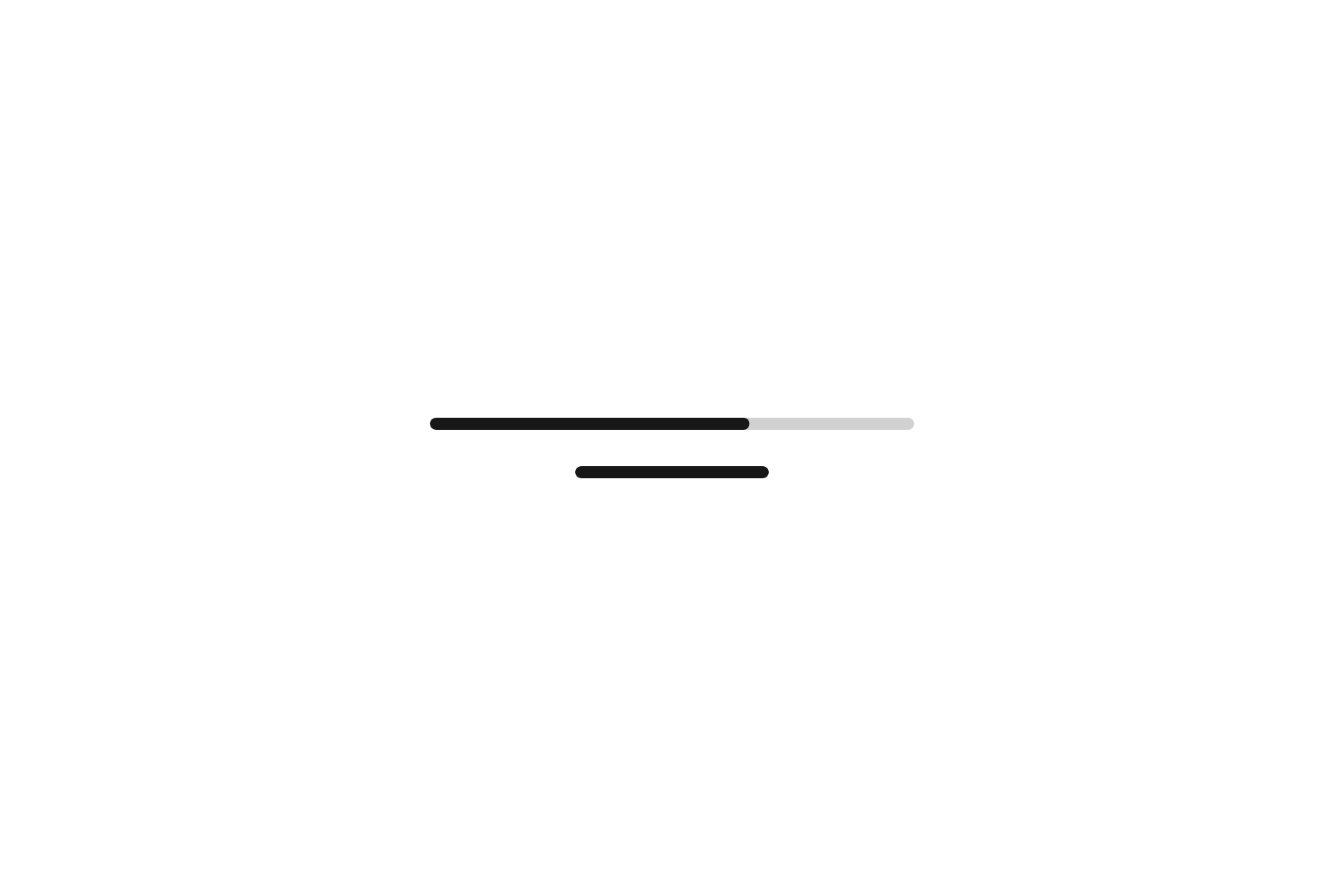
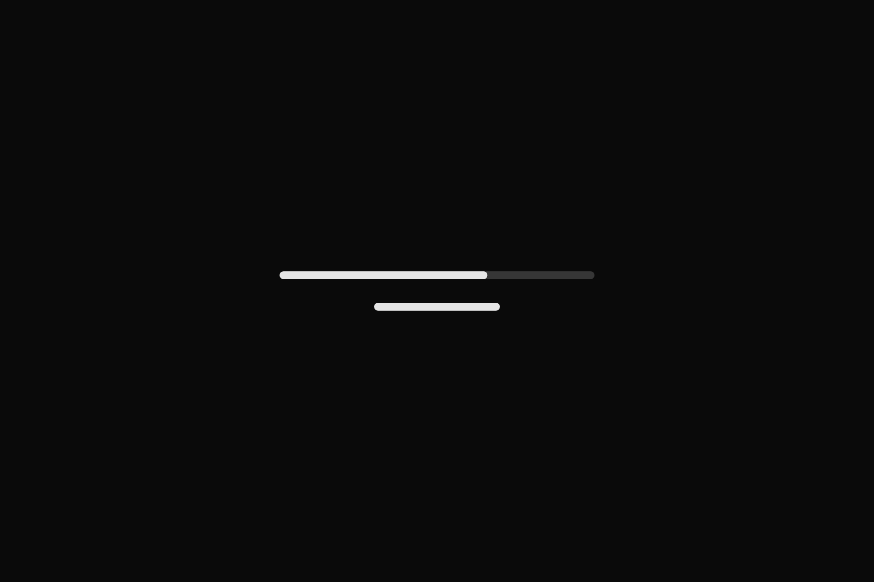
import 'package:flutter/widgets.dart';

import 'ui/progress.dart';

class ProgressDemo extends StatelessWidget {
  const ProgressDemo({super.key});

  @override
  Widget build(BuildContext context) => const SizedBox(
    width: 320,
    child: Column(
      mainAxisSize: MainAxisSize.min,
      children: [
        Progress(value: .66, semanticLabel: 'Upload'),
        SizedBox(height: 24),
        Progress(semanticLabel: 'Loading'),
      ],
    ),
  );
}
Add it
In your Flutter project:
$
ashlar add progress
It writes theme.dart, palette.dart and progress.dart into lib/ui, keeping any you already have.
Examples
Other ways to use it, each running live, with its code.
Not known yet
Moving, with no value.
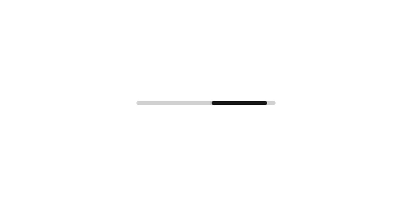
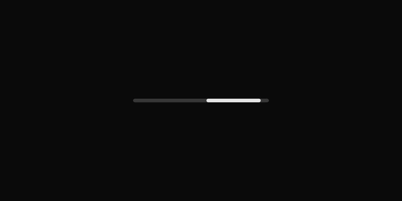
// Not known yet: Moving, with no value.
import 'package:flutter/widgets.dart';

import 'ui/progress.dart';

class ProgressUnknownExample extends StatelessWidget {
  const ProgressUnknownExample({super.key});

  @override
  Widget build(BuildContext context) => const SizedBox(width: 300, child: Progress(semanticLabel: 'Loading'));
}
API
Read from the source above: each parameter with its type, its default, and what it is for.
Progressclass
How far along something is, as a bar. A null value means not known yet: the bar then sweeps across, unless the device asks for less motion.
| Parameter | Type | Default | What it is for |
|---|---|---|---|
value |
double? |
From 0 to 1, or null when it is not known. | |
semanticLabel |
String? |
What a screen reader calls it when its visible text does not say, as for an icon alone. |
Source
What lands in your app. It is yours from then on: change it as you would your own code, and ashlar add
will not write over it.
lib/ui/progress.dart 110 lines
// Ashlar UI: Progress. Copied into your app by `ashlar add progress`; it is yours to change.

import 'package:flutter/widgets.dart';

import 'theme.dart';

/// How far along something is, as a bar. A null [value] means not known yet: the bar
/// then sweeps across, unless the device asks for less motion.
///
/// ```dart
/// Progress(value: uploaded / total, semanticLabel: 'Upload')
/// ```
class Progress extends StatefulWidget {
  const Progress({super.key, this.value, this.semanticLabel});

  /// From 0 to 1, or null when it is not known.
  final double? value;

  /// What a screen reader calls it when its visible text does not say, as for an icon
  /// alone.
  final String? semanticLabel;

  @override
  State<Progress> createState() => _ProgressState();
}

class _ProgressState extends State<Progress>
    with SingleTickerProviderStateMixin {
  late final _sweep = AnimationController(
    vsync: this,
    duration: const Duration(milliseconds: 1500),
  );

  @override
  void didChangeDependencies() {
    super.didChangeDependencies();
    _update();
  }

  @override
  void didUpdateWidget(Progress old) {
    super.didUpdateWidget(old);
    _update();
  }

  void _update() {
    final still = MediaQuery.maybeDisableAnimationsOf(context) ?? false;
    if (widget.value == null && !still) {
      if (!_sweep.isAnimating) _sweep.repeat();
    } else {
      _sweep.stop();
    }
  }

  @override
  void dispose() {
    _sweep.dispose();
    super.dispose();
  }

  @override
  Widget build(BuildContext context) {
    final t = AshlarTheme.of(context);
    final c = t.colors;
    final value = widget.value?.clamp(0.0, 1.0);
    final fill = DecoratedBox(
      decoration: BoxDecoration(
        color: c.primary,
        borderRadius: BorderRadius.circular(4),
      ),
    );
    return Semantics(
      label: widget.semanticLabel,
      value: value == null ? null : '${(value * 100).round()}%',
      child: Container(
        height: 8,
        clipBehavior: Clip.antiAlias,
        decoration: BoxDecoration(
          color: c.primary.withValues(alpha: c.primary.a * .2),
          borderRadius: BorderRadius.circular(4),
        ),
        child: value != null
            ? Align(
                alignment: AlignmentDirectional.centerStart,
                child: TweenAnimationBuilder<double>(
                  tween: Tween(end: value),
                  duration: t.duration * 2,
                  builder: (context, v, child) => FractionallySizedBox(
                    widthFactor: v,
                    heightFactor: 1,
                    child: child,
                  ),
                  child: fill,
                ),
              )
            : AnimatedBuilder(
                animation: _sweep,
                builder: (context, child) => FractionallySizedBox(
                  widthFactor: .4,
                  heightFactor: 1,
                  // From off the left edge to off the right.
                  alignment: Alignment(-2.4 + _sweep.value * 4.8, 0),
                  child: child,
                ),
                child: fill,
              ),
      ),
    );
  }
}