

Carousel
Slides moved by swiping, buttons, keys, a controller or by themselves.
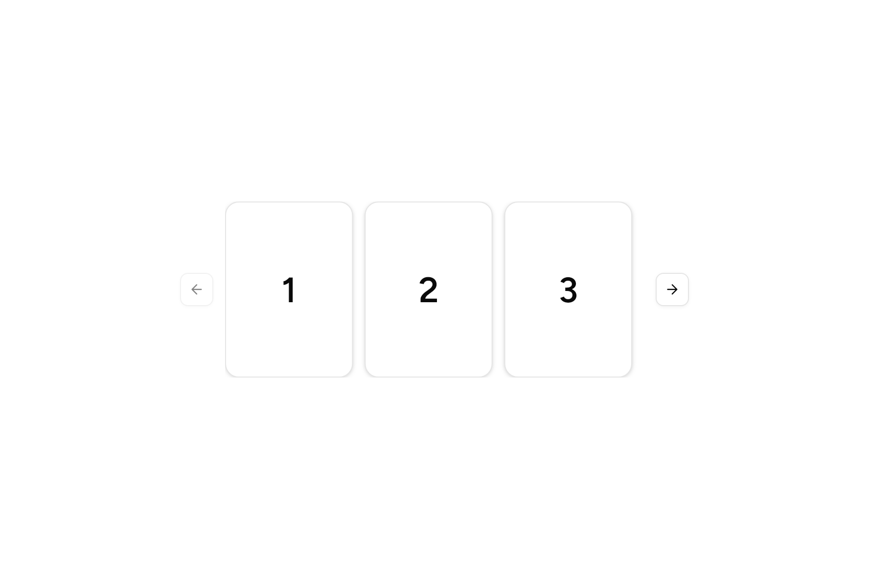
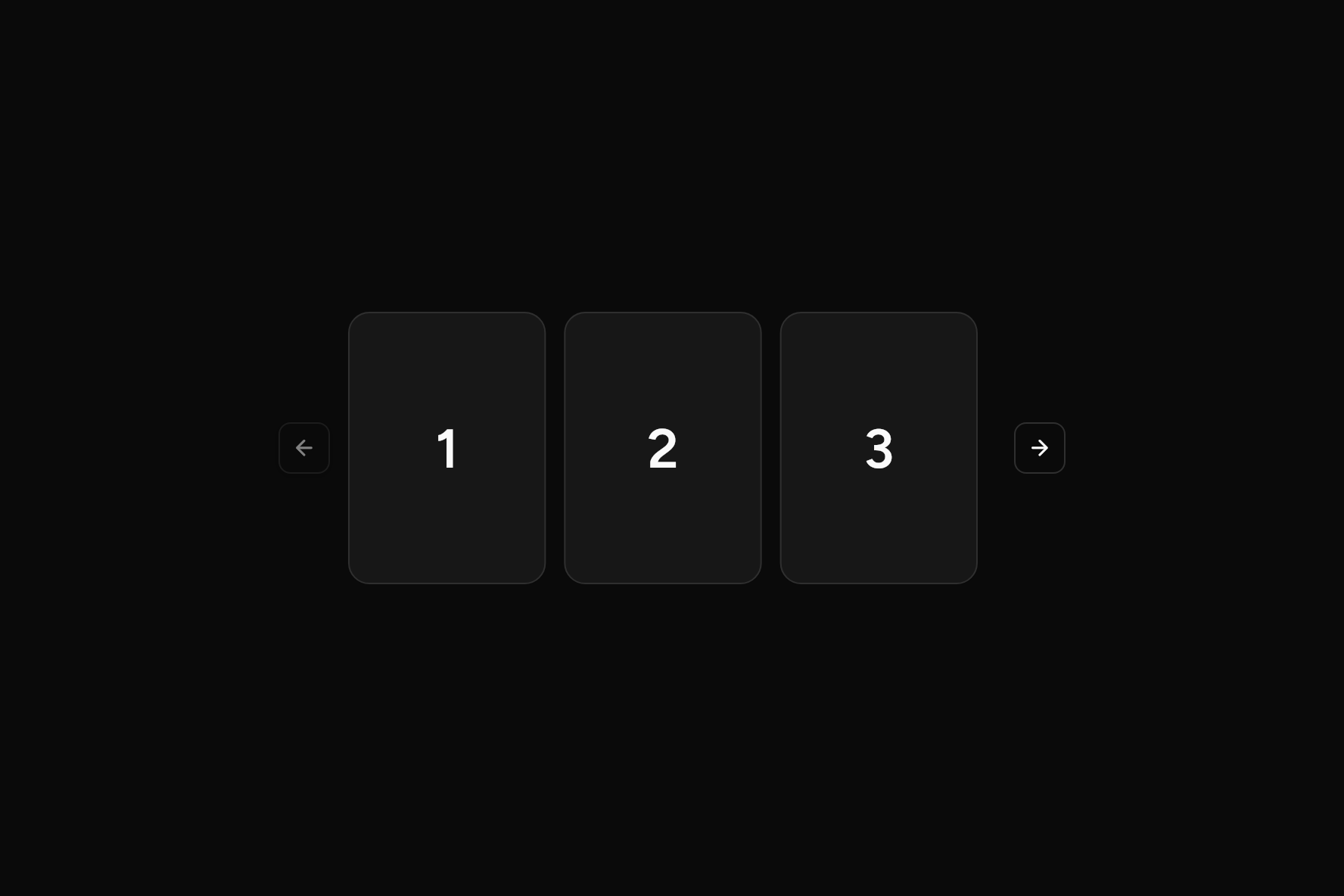
import 'package:flutter/widgets.dart';

import 'ui/card.dart';
import 'ui/carousel.dart';
import 'ui/theme.dart';

class CarouselDemo extends StatelessWidget {
  const CarouselDemo({super.key});

  @override
  Widget build(BuildContext context) {
    final t = AshlarTheme.of(context);
    return SizedBox(
      width: 520,
      height: 180,
      child: Carousel(
        viewportFraction: 1 / 3,
        spacing: 12,
        children: [
          for (var i = 1; i <= 6; i++)
            Card(
              children: [
                SizedBox(
                  height: 128,
                  child: Center(child: Text('$i', style: t.text.xxl.copyWith(fontSize: 36))),
                ),
              ],
            ),
        ],
      ),
    );
  }
}
Add it
In your Flutter project:
ashlar add carousel
It writes theme.dart, palette.dart, group.dart, pressable.dart, button.dart and carousel.dart into lib/ui, keeping any you already have, and adds ashlar_icons to pubspec.yaml. It needs button and ashlar_icons, which come with it.
Examples
Other ways to use it, each running live, with its code.
Several at once
A third of the width each.
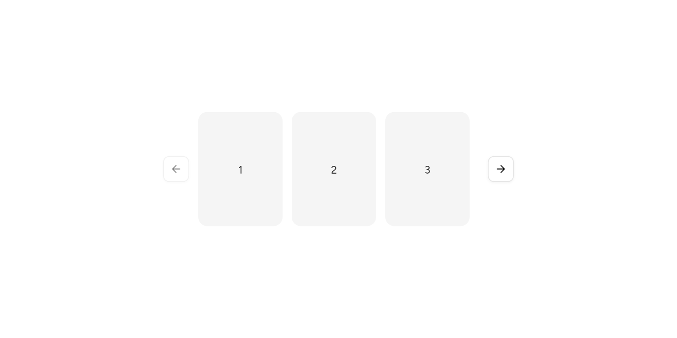
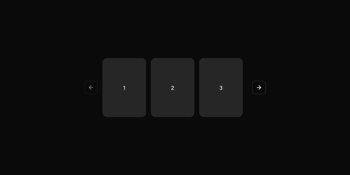
// Several at once: A third of the width each.
import 'package:flutter/widgets.dart';

import 'ui/carousel.dart';
import 'ui/theme.dart';

class CarouselSeveralExample extends StatelessWidget {
  const CarouselSeveralExample({super.key});

  @override
  Widget build(BuildContext context) => SizedBox(
    width: 460,
    height: 150,
    child: Builder(
      builder: (context) => Carousel(
        viewportFraction: 1 / 3,
        spacing: 12,
        semanticLabel: 'Photos',
        children: [
          for (var i = 1; i <= 9; i++)
            AspectRatio(
              aspectRatio: 1,
              child: Container(
                alignment: Alignment.center,
                decoration: BoxDecoration(
                  color: AshlarTheme.of(context).colors.muted,
                  borderRadius: BorderRadius.circular(12),
                ),
                child: Text('$i'),
              ),
            ),
        ],
      ),
    ),
  );
}
Turning by itself
Every three seconds, round and round.
// Turning by itself: Every three seconds, round and round.
import 'package:flutter/widgets.dart';

import 'ui/carousel.dart';
import 'ui/theme.dart';

class CarouselAutoplayExample extends StatelessWidget {
  const CarouselAutoplayExample({super.key});

  @override
  Widget build(BuildContext context) => SizedBox(
    width: 380,
    height: 180,
    child: Builder(
      builder: (context) => Carousel(
        autoplay: const Duration(seconds: 3),
        loop: true,
        semanticLabel: 'Offers',
        children: [
          for (final offer in ['Free delivery', 'Two for one', 'New in store'])
            AspectRatio(
              aspectRatio: 16 / 9,
              child: Container(
                alignment: Alignment.center,
                decoration: BoxDecoration(
                  color: AshlarTheme.of(context).colors.muted,
                  borderRadius: BorderRadius.circular(12),
                ),
                child: Text(offer),
              ),
            ),
        ],
      ),
    ),
  );
}
API
Read from the source above: each parameter with its type, its default, and what it is for.
CarouselControllerclass
Moves a Carousel from outside it, and tells which slide leads.
Carouselclass
Slides in a row (or a column), one or several in view, moved by swiping, by the buttons either side, by the arrow keys while it has focus, by a controller, or by itself with autoplay, which waits while the pointer or the keyboard is on it. A screen reader hears which slide is showing.
| Parameter | Type | Default | What it is for |
|---|---|---|---|
childrenrequired |
List<Widget> |
The slides, in order. | |
viewportFraction |
double |
1 |
How much of the way across one slide takes: 1 shows one, 1 / 3 shows three. |
spacing |
double |
16 |
The gap between slides. |
controls |
bool |
true |
Previous and Next buttons either side of the slides. |
onChanged |
ValueChanged<int>? |
Told the slide that shows. | |
controller |
CarouselController? |
Moves it from outside, and tells which slide shows. | |
axis |
Axis |
Axis.horizontal |
Horizontal lays it out across; vertical, down. |
autoplay |
Duration? |
Moves on by itself this often. | |
loop |
bool |
false |
After the last slide comes the first again. |
semanticLabel |
String |
'Carousel' |
What a screen reader calls it: 'Featured products'. |
Source
What lands in your app. It is yours from then on: change it as you would your own code, and ashlar add
will not write over it.
lib/ui/carousel.dart 248 lines
// Ashlar UI: Carousel. Copied into your app by `ashlar add carousel`; it is yours to change.

import 'dart:async';

import 'package:ashlar_icons/ashlar_icons.dart';
import 'package:flutter/services.dart';
import 'package:flutter/widgets.dart';

import 'button.dart';
import 'theme.dart';

/// Moves a [Carousel] from outside it, and tells which slide leads.
class CarouselController extends ChangeNotifier {
  _CarouselState? _state;
  int _index = 0;

  /// The slide at the start of the view.
  int get index => _index;

  /// How many slides there are.
  int get count => _state?.widget.children.length ?? 0;

  void next() => _state?._go(_index + 1);
  void previous() => _state?._go(_index - 1);
  void animateTo(int index) => _state?._go(index);

  void _set(int i) {
    if (i == _index) return;
    _index = i;
    notifyListeners();
  }
}

/// Slides in a row (or a column), one or several in view, moved by swiping, by the buttons
/// either side, by the arrow keys while it has focus, by a [controller], or by itself with
/// [autoplay], which waits while the pointer or the keyboard is on it. A screen reader
/// hears which slide is showing.
///
/// ```dart
/// Carousel(viewportFraction: 1 / 3, children: [for (final p in products) ProductCard(p)])
/// Carousel(axis: Axis.vertical, autoplay: Duration(seconds: 4), children: banners)
/// ```
class Carousel extends StatefulWidget {
  const Carousel({
    super.key,
    required this.children,
    this.viewportFraction = 1,
    this.spacing = 16,
    this.controls = true,
    this.onChanged,
    this.controller,
    this.axis = Axis.horizontal,
    this.autoplay,
    this.loop = false,
    this.semanticLabel = 'Carousel',
  });

  /// The slides, in order.
  final List<Widget> children;

  /// How much of the way across one slide takes: 1 shows one, 1 / 3 shows three.
  final double viewportFraction;

  /// The gap between slides.
  final double spacing;

  /// Previous and Next buttons either side of the slides.
  final bool controls;

  /// Told the slide that shows.
  final ValueChanged<int>? onChanged;

  /// Moves it from outside, and tells which slide shows.
  final CarouselController? controller;

  /// Horizontal lays it out across; vertical, down.
  final Axis axis;

  /// Moves on by itself this often.
  final Duration? autoplay;

  /// After the last slide comes the first again.
  final bool loop;

  /// What a screen reader calls it: 'Featured products'.
  final String semanticLabel;

  @override
  State<Carousel> createState() => _CarouselState();
}

class _CarouselState extends State<Carousel> {
  late final _pages = PageController(viewportFraction: widget.viewportFraction);
  int _at = 0;
  Timer? _timer;
  bool _held = false;

  /// The last slide that can lead: with several in view, the end comes sooner.
  int get _last =>
      (widget.children.length - (1 / widget.viewportFraction).floor()).clamp(
        0,
        widget.children.length - 1,
      );

  @override
  void initState() {
    super.initState();
    widget.controller?._state = this;
    _play();
  }

  @override
  void didUpdateWidget(Carousel old) {
    super.didUpdateWidget(old);
    if (old.controller != widget.controller) {
      old.controller?._state = null;
      widget.controller?._state = this;
    }
    if (old.autoplay != widget.autoplay) _play();
  }

  void _play() {
    _timer?.cancel();
    final every = widget.autoplay;
    if (every == null) return;
    _timer = Timer.periodic(every, (_) {
      if (_held || !mounted) return;
      _go(_at >= _last ? 0 : _at + 1, wrap: true);
    });
  }

  void _go(int i, {bool wrap = false}) {
    if (widget.loop || wrap) {
      if (i > _last) i = 0;
      if (i < 0) i = _last;
    }
    _pages.animateToPage(
      i.clamp(0, _last),
      duration: const Duration(milliseconds: 300),
      curve: Curves.easeOutCubic,
    );
  }

  @override
  void dispose() {
    _timer?.cancel();
    widget.controller?._state = null;
    _pages.dispose();
    super.dispose();
  }

  @override
  Widget build(BuildContext context) {
    final across = widget.axis == Axis.horizontal;
    final rtl = isRtl(context);
    final track = Semantics(
      container: true,
      label: widget.semanticLabel,
      value: 'Slide ${_at + 1} of ${widget.children.length}',
      // The keys go to what has focus and up from it, so the bindings sit outside the Focus.
      child: CallbackShortcuts(
        bindings: {
          SingleActivator(
            across
                ? (rtl
                      ? LogicalKeyboardKey.arrowLeft
                      : LogicalKeyboardKey.arrowRight)
                : LogicalKeyboardKey.arrowDown,
          ): () =>
              _go(_at + 1),
          SingleActivator(
            across
                ? (rtl
                      ? LogicalKeyboardKey.arrowRight
                      : LogicalKeyboardKey.arrowLeft)
                : LogicalKeyboardKey.arrowUp,
          ): () =>
              _go(_at - 1),
        },
        child: Focus(
          onFocusChange: (f) => _held = f,
          child: MouseRegion(
            onEnter: (_) => _held = true,
            onExit: (_) => _held = false,
            child: PageView.builder(
              controller: _pages,
              scrollDirection: widget.axis,
              padEnds: false,
              itemCount: widget.children.length,
              onPageChanged: (i) {
                setState(() => _at = i);
                widget.controller?._set(i);
                widget.onChanged?.call(i);
              },
              itemBuilder: (context, i) => Padding(
                padding: across
                    ? EdgeInsetsDirectional.only(end: widget.spacing)
                    : EdgeInsets.only(bottom: widget.spacing),
                child: Semantics(
                  label: 'Slide ${i + 1} of ${widget.children.length}',
                  container: true,
                  child: widget.children[i],
                ),
              ),
            ),
          ),
        ),
      ),
    );
    if (!widget.controls) return track;
    Widget arrow(IconData icon, String label, VoidCallback? onPressed) =>
        Button(
          variant: ButtonVariant.outline,
          size: ButtonSize.iconSm,
          semanticLabel: label,
          onPressed: onPressed,
          child: AshlarIcon(icon),
        );
    final back = arrow(
      across
          ? (rtl
                ? AshlarIconsRoundedStroke.arrowRight
                : AshlarIconsRoundedStroke.arrowLeft)
          : AshlarIconsRoundedStroke.arrowUp,
      'Previous slide',
      _at > 0 || widget.loop ? () => _go(_at - 1) : null,
    );
    final on = arrow(
      across
          ? (rtl
                ? AshlarIconsRoundedStroke.arrowLeft
                : AshlarIconsRoundedStroke.arrowRight)
          : AshlarIconsRoundedStroke.arrowDown,
      'Next slide',
      _at < _last || widget.loop ? () => _go(_at + 1) : null,
    );
    return Flex(
      direction: widget.axis,
      children: [
        back,
        const SizedBox(width: 12, height: 12),
        Expanded(child: track),
        const SizedBox(width: 12, height: 12),
        on,
      ],
    );
  }
}