

Date Picker
A button that shows a date and opens a calendar, with presets.
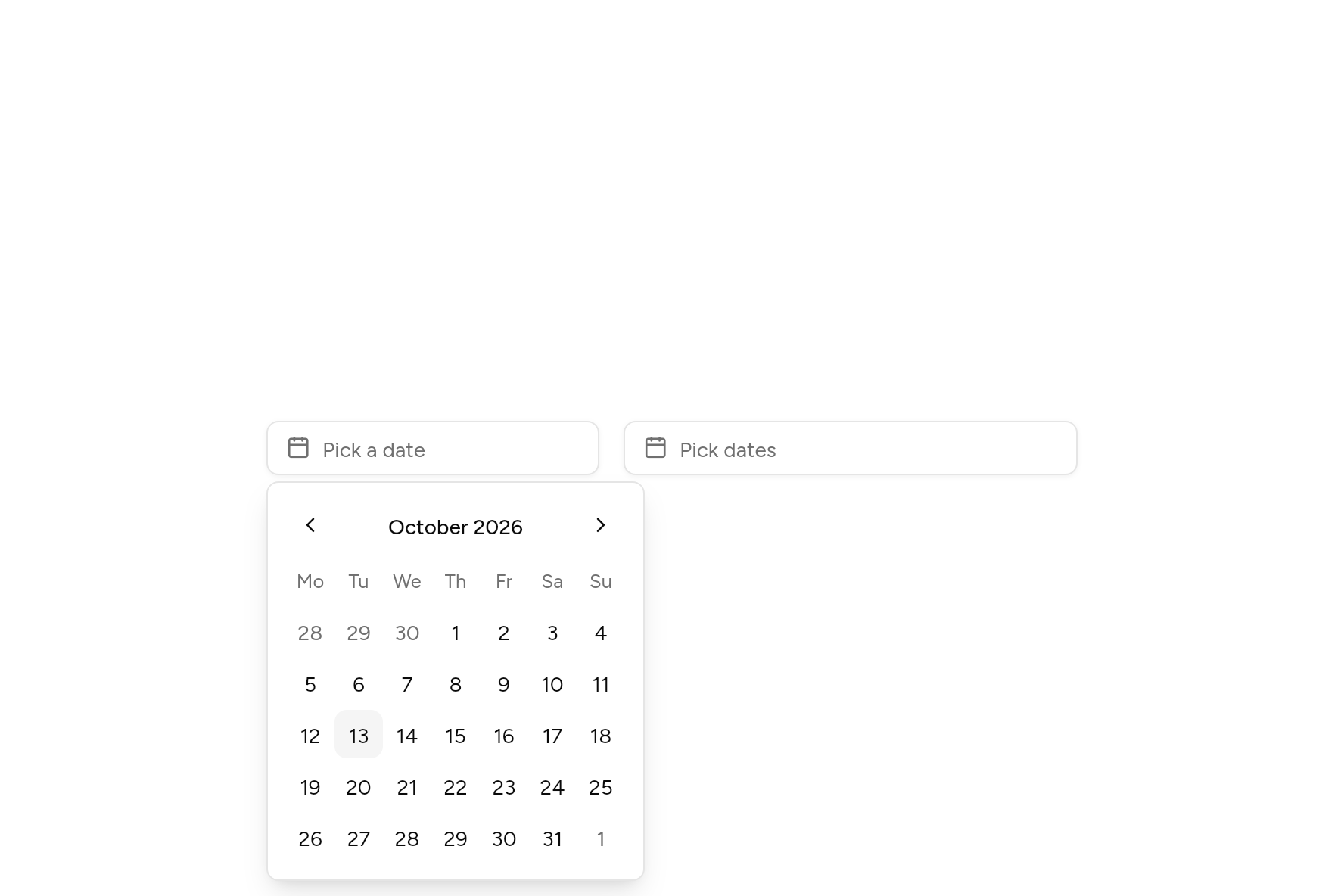
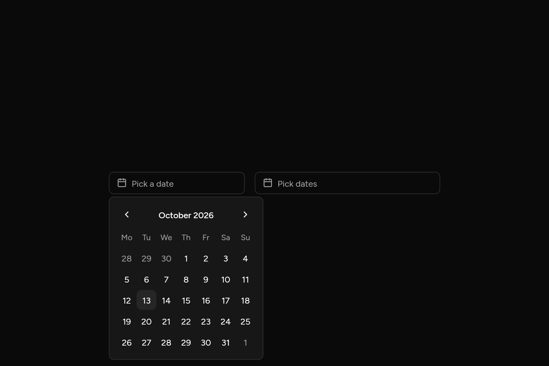
import 'package:flutter/widgets.dart';

import 'ui/calendar.dart';
import 'ui/date_picker.dart';

class DatePickerDemo extends StatefulWidget {
  const DatePickerDemo({super.key});

  @override
  State<DatePickerDemo> createState() => _DatePickerDemoState();
}

class _DatePickerDemoState extends State<DatePickerDemo> {
  DateTime? due;
  DateRange? stay;

  @override
  Widget build(BuildContext context) => Row(
    mainAxisSize: MainAxisSize.min,
    crossAxisAlignment: CrossAxisAlignment.start,
    children: [
      SizedBox(
        width: 220,
        child: DatePicker(value: due, semanticLabel: 'Due date', onChanged: (d) => setState(() => due = d)),
      ),
      const SizedBox(width: 16),
      SizedBox(
        width: 300,
        child: DatePicker.range(range: stay, semanticLabel: 'Stay', onRangeChanged: (r) => setState(() => stay = r)),
      ),
    ],
  );
}
Try its options
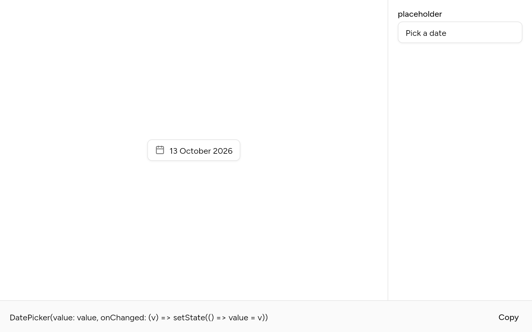
Each option its constructor takes, to change and see; the code below it is what you chose, to copy.
Add it
In your Flutter project:
ashlar add date-picker
It writes theme.dart, palette.dart, group.dart, pressable.dart, popover.dart, button.dart, select.dart, calendar.dart and date_picker.dart into lib/ui, keeping any you already have, and adds ashlar_icons to pubspec.yaml. It needs pressable, popover, calendar, select and ashlar_icons, which come with it.
Examples
Other ways to use it, each running live, with its code.
A span
Check-in and check-out.
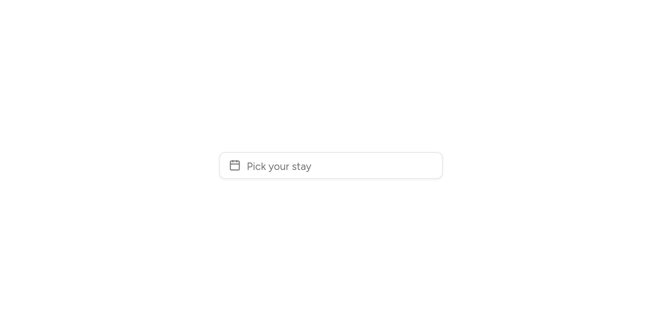

// A span: Check-in and check-out.
import 'package:flutter/widgets.dart';

import 'ui/calendar.dart';
import 'ui/date_picker.dart';

class DatePickerRangeExample extends StatefulWidget {
  const DatePickerRangeExample({super.key});

  @override
  State<DatePickerRangeExample> createState() => _DatePickerRangeExampleState();
}

class _DatePickerRangeExampleState extends State<DatePickerRangeExample> {
  DateRange? range;

  @override
  Widget build(BuildContext context) => SizedBox(
    width: 300,
    child: DatePicker.range(
      range: range,
      placeholder: 'Pick your stay',
      onRangeChanged: (r) => setState(() => range = r),
    ),
  );
}
With presets
Today, tomorrow, in a week.
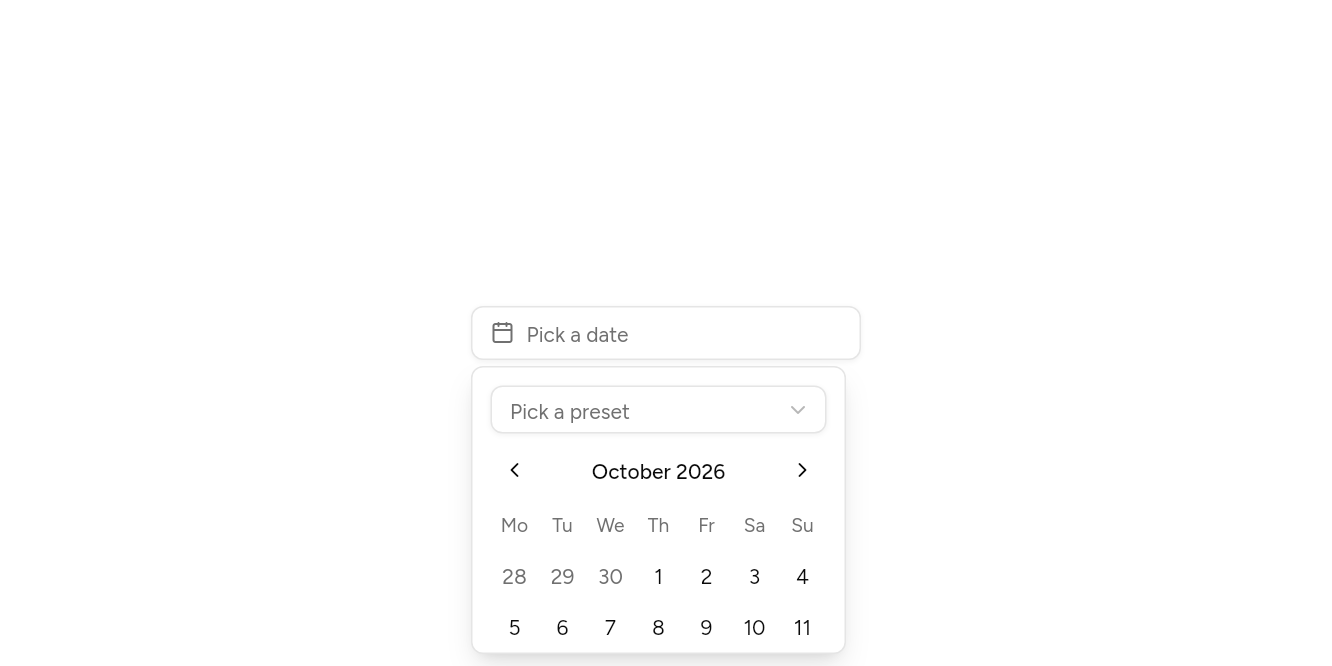
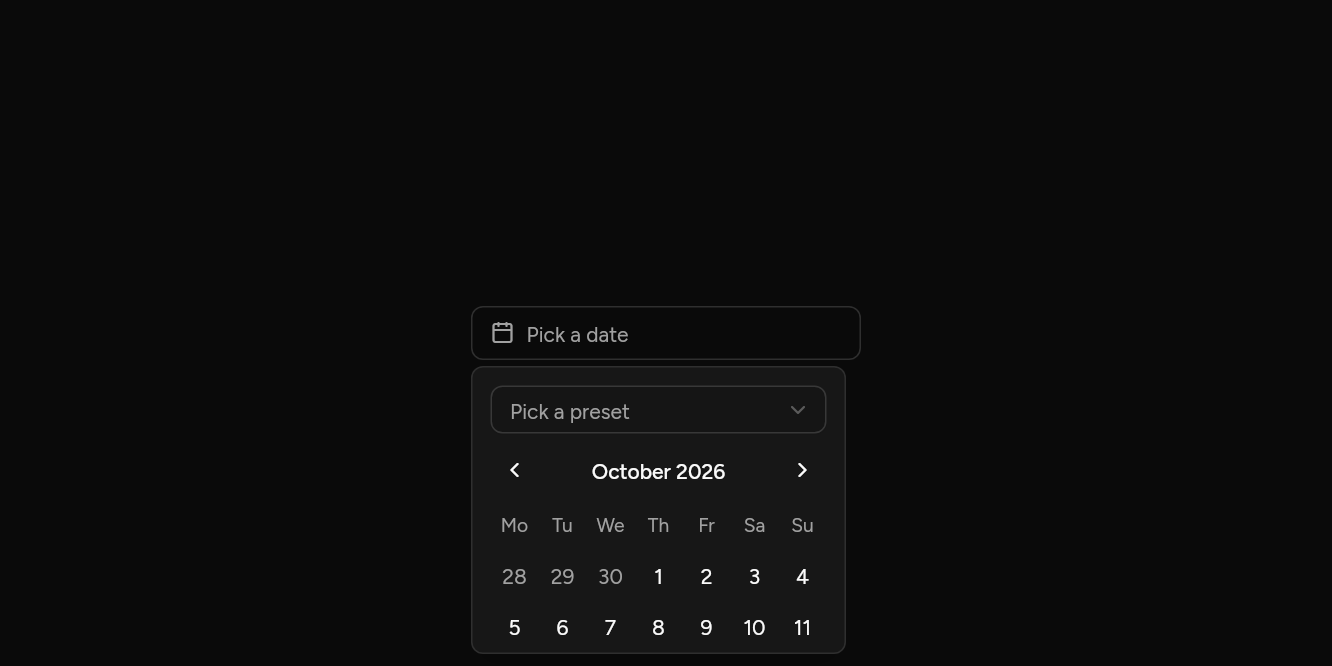
// With presets: Today, tomorrow, in a week.
import 'package:flutter/widgets.dart';

import 'ui/date_picker.dart';

class DatePickerPresetsExample extends StatefulWidget {
  const DatePickerPresetsExample({super.key});

  @override
  State<DatePickerPresetsExample> createState() => _DatePickerPresetsExampleState();
}

class _DatePickerPresetsExampleState extends State<DatePickerPresetsExample> {
  DateTime? day;

  @override
  Widget build(BuildContext context) => SizedBox(
    width: 260,
    child: DatePicker(
      value: day,
      onChanged: (d) => setState(() => day = d),
      presets: [
        ('Today', DateTime(2026, 10, 13)),
        ('Tomorrow', DateTime(2026, 10, 14)),
        ('In a week', DateTime(2026, 10, 20)),
      ],
    ),
  );
}
API
Read from the source above: each parameter with its type, its default, and what it is for.
DatePickerclass
A button that shows a date and opens a Calendar to change it. DatePicker.range picks a start and an end, and closes once both are chosen.
DatePicker(…)
| Parameter | Type | Default | What it is for |
|---|---|---|---|
valuerequired |
DateTime? |
The day picked, or null. | |
onChangedrequired |
ValueChanged<DateTime>? |
Told each new value as it changes. | |
placeholder |
String |
'Pick a date' |
Faint text shown while it is empty. |
firstDate |
DateTime? |
The earliest day that can be picked. | |
lastDate |
DateTime? |
The latest day that can be picked. | |
isDisabled |
bool Function(DateTime day)? |
Days that cannot be picked: weekends, booked days. | |
semanticLabel |
String? |
What the date is for, read out before it: 'Due date'. | |
presets |
List<(String, DateTime)> |
const [] |
Dates a tap away, offered above the calendar: ('Tomorrow', tomorrow). |
DatePicker.range(…)
| Parameter | Type | Default | What it is for |
|---|---|---|---|
rangerequired |
DateRange? |
The days picked, for a picker that takes a span. | |
onRangeChangedrequired |
ValueChanged<DateRange>? |
Told the new range whenever either end changes. | |
placeholder |
String |
'Pick dates' |
Faint text shown while it is empty. |
firstDate |
DateTime? |
The earliest day that can be picked. | |
lastDate |
DateTime? |
The latest day that can be picked. | |
isDisabled |
bool Function(DateTime day)? |
Days that cannot be picked: weekends, booked days. | |
semanticLabel |
String? |
What the date is for, read out before it: 'Due date'. |
Source
What lands in your app. It is yours from then on: change it as you would your own code, and ashlar add
will not write over it.
lib/ui/date_picker.dart 217 lines
// Ashlar UI: Date Picker. Copied into your app by `ashlar add date-picker`; it is yours to
// change.

import 'package:ashlar_icons/ashlar_icons.dart';
import 'package:flutter/widgets.dart';

import 'calendar.dart';
import 'popover.dart';
import 'pressable.dart';
import 'select.dart';
import 'theme.dart';

/// A button that shows a date and opens a Calendar to change it. [DatePicker.range] picks
/// a start and an end, and closes once both are chosen.
///
/// ```dart
/// DatePicker(value: due, onChanged: (d) => setState(() => due = d))
/// DatePicker.range(range: stay, onRangeChanged: (r) => setState(() => stay = r))
/// ```
class DatePicker extends StatefulWidget {
  const DatePicker({
    super.key,
    required this.value,
    required this.onChanged,
    this.placeholder = 'Pick a date',
    this.firstDate,
    this.lastDate,
    this.isDisabled,
    this.semanticLabel,
    this.presets = const [],
  }) : range = null,
       onRangeChanged = null;

  const DatePicker.range({
    super.key,
    required this.range,
    required this.onRangeChanged,
    this.placeholder = 'Pick dates',
    this.firstDate,
    this.lastDate,
    this.isDisabled,
    this.semanticLabel,
  }) : presets = const [],
       value = null,
       onChanged = null;

  /// The day picked, or null.
  final DateTime? value;

  /// Told each new value as it changes.
  final ValueChanged<DateTime>? onChanged;

  /// The days picked, for a picker that takes a span.
  final DateRange? range;

  /// Told the new range whenever either end changes.
  final ValueChanged<DateRange>? onRangeChanged;

  /// Faint text shown while it is empty.
  final String placeholder;

  /// The earliest day that can be picked.
  final DateTime? firstDate;

  /// The latest day that can be picked.
  final DateTime? lastDate;

  /// Days that cannot be picked: weekends, booked days.
  final bool Function(DateTime day)? isDisabled;

  /// What the date is for, read out before it: 'Due date'.
  final String? semanticLabel;

  /// Dates a tap away, offered above the calendar: ('Tomorrow', tomorrow).
  final List<(String, DateTime)> presets;

  @override
  State<DatePicker> createState() => _DatePickerState();
}

class _DatePickerState extends State<DatePicker> {
  final _menu = MenuController();
  final _focus = FocusNode();

  @override
  void dispose() {
    _focus.dispose();
    super.dispose();
  }

  bool get _isRange =>
      widget.onRangeChanged != null ||
      (widget.onChanged == null && widget.range != null);
  bool get _enabled =>
      widget.onChanged != null || widget.onRangeChanged != null;

  @override
  Widget build(BuildContext context) {
    final t = AshlarTheme.of(context);
    final c = t.colors;
    final names = DateNames.of(context);
    final r = widget.range;
    final shown = _isRange
        ? (r == null
              ? null
              : (r.end == null
                    ? names.date(r.start)
                    : '${names.date(r.start)} to ${names.date(r.end!)}'))
        : (widget.value == null ? null : names.date(widget.value!));
    return RawMenuAnchor(
      controller: _menu,
      childFocusNode: _focus,
      onClose: _focus.requestFocus,
      overlayBuilder: (context, info) => PopoverPanel(
        info: info,
        // Scrolls when the room by the trigger is shorter than the calendar, and is as wide
        // as the calendar: a scroll view alone takes all the width it is given.
        child: IntrinsicWidth(
          child: SingleChildScrollView(
            padding: const EdgeInsets.all(12),
            child: _isRange
                ? Calendar.range(
                    autofocus: true,
                    range: widget.range,
                    firstDate: widget.firstDate,
                    lastDate: widget.lastDate,
                    isDisabled: widget.isDisabled,
                    onRangeChanged: (v) {
                      widget.onRangeChanged?.call(v);
                      if (v.end != null) _menu.close();
                    },
                  )
                : Column(
                    mainAxisSize: MainAxisSize.min,
                    crossAxisAlignment: CrossAxisAlignment.stretch,
                    children: [
                      if (widget.presets.isNotEmpty) ...[
                        Select<int>(
                          value: null,
                          size: SelectSize.sm,
                          placeholder: 'Pick a preset',
                          options: [
                            for (final (i, p) in widget.presets.indexed)
                              SelectOption(i, p.$1),
                          ],
                          onChanged: (i) {
                            widget.onChanged?.call(widget.presets[i].$2);
                            _menu.close();
                          },
                        ),
                        const SizedBox(height: 8),
                      ],
                      Calendar(
                        autofocus: widget.presets.isEmpty,
                        selected: widget.value,
                        firstDate: widget.firstDate,
                        lastDate: widget.lastDate,
                        isDisabled: widget.isDisabled,
                        onSelected: (d) {
                          widget.onChanged?.call(d);
                          _menu.close();
                        },
                      ),
                    ],
                  ),
          ),
        ),
      ),
      child: Pressable(
        focusNode: _focus,
        onPressed: _enabled
            ? () => _menu.isOpen ? _menu.close() : _menu.open()
            : null,
        semanticLabel: widget.semanticLabel,
        semanticValue: widget.semanticLabel == null
            ? null
            : (shown ?? widget.placeholder),
        builder: (context, state) => Opacity(
          opacity: state.enabled ? 1 : .5,
          child: AnimatedContainer(
            duration: t.duration,
            // A height at least: larger text makes it taller rather than being cut off.
            constraints: BoxConstraints(minHeight: t.control(36)),
            padding: const EdgeInsets.symmetric(horizontal: 12),
            decoration: BoxDecoration(
              color: state.hovered ? c.accent : c.background,
              borderRadius: BorderRadius.circular(t.radiusMd),
              border: Border.all(color: state.focused ? c.ring : c.input),
              boxShadow: [if (state.focused) ...t.focusRing, ...t.shadowXs],
            ),
            child: Row(
              mainAxisSize: MainAxisSize.min,
              children: [
                AshlarIcon(
                  AshlarIconsRoundedStroke.calendar,
                  size: 16,
                  color: c.mutedForeground,
                ),
                const SizedBox(width: 8),
                Flexible(
                  child: Text(
                    shown ?? widget.placeholder,
                    maxLines: 1,
                    overflow: TextOverflow.ellipsis,
                    style: t.text.sm.copyWith(
                      color: shown == null ? c.mutedForeground : c.foreground,
                    ),
                  ),
                ),
              ],
            ),
          ),
        ),
      ),
    );
  }
}