

Label
The name of a control, above it or beside it.
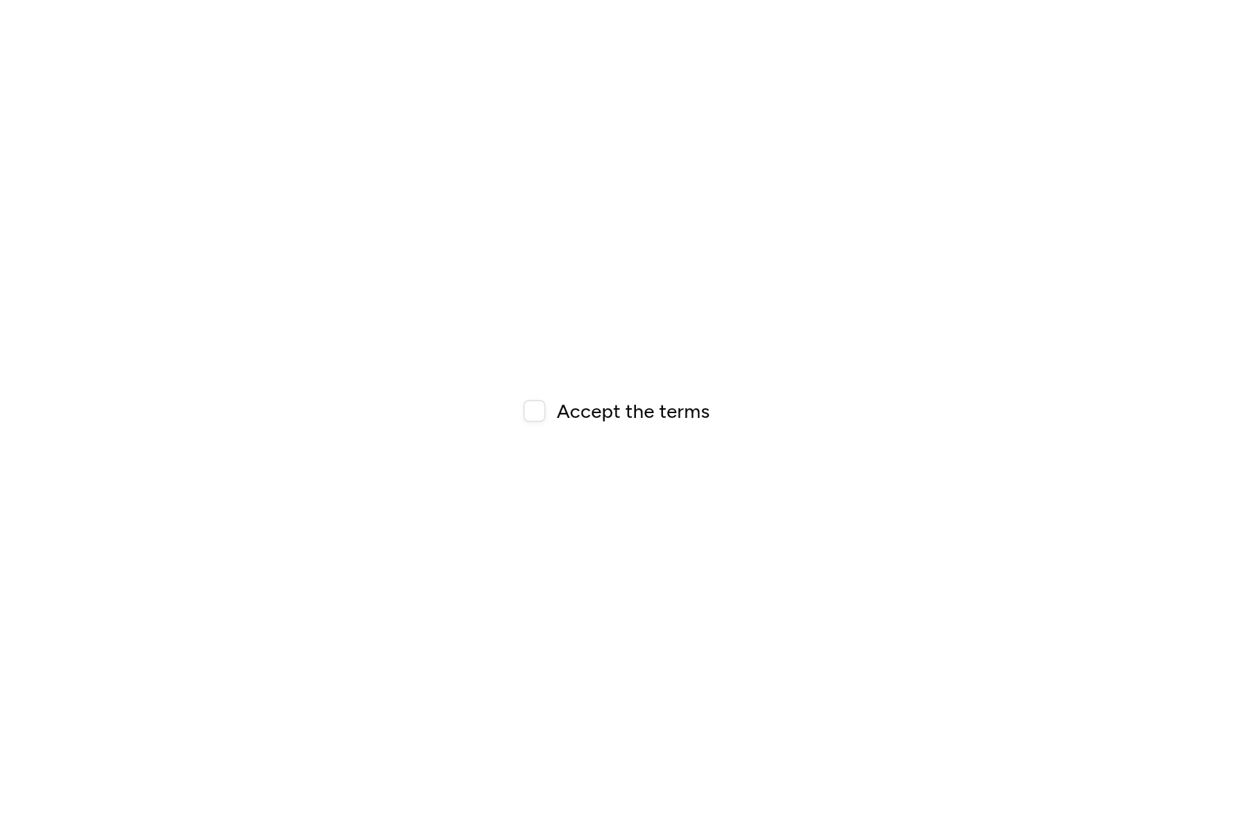
import 'package:flutter/widgets.dart';

import 'ui/checkbox.dart';
import 'ui/label.dart';

class LabelDemo extends StatefulWidget {
  const LabelDemo({super.key});

  @override
  State<LabelDemo> createState() => _LabelDemoState();
}

class _LabelDemoState extends State<LabelDemo> {
  bool agreed = false;

  @override
  Widget build(BuildContext context) => Row(
    mainAxisSize: MainAxisSize.min,
    children: [
      Checkbox(value: agreed, onChanged: (v) => setState(() => agreed = v), semanticLabel: 'Accept the terms'),
      const SizedBox(width: 8),
      const Label(child: Text('Accept the terms')),
    ],
  );
}
Add it
In your Flutter project:
$
ashlar add label
It writes theme.dart, palette.dart and label.dart into lib/ui, keeping any you already have.
Examples
Other ways to use it, each running live, with its code.
With a control
A label beside a checkbox, pressing it too.
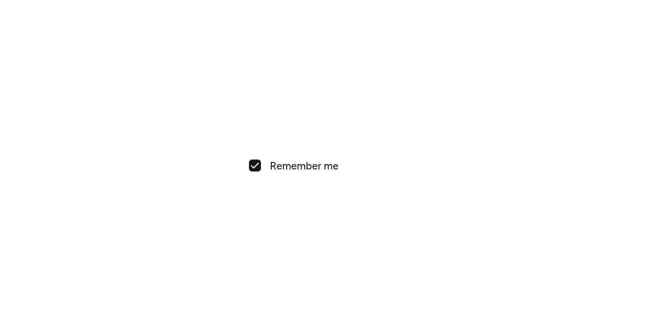
// With a control: A label beside a checkbox, pressing it too.
import 'package:flutter/widgets.dart';

import 'ui/checkbox.dart';
import 'ui/field.dart';

class LabelWithExample extends StatefulWidget {
  const LabelWithExample({super.key});

  @override
  State<LabelWithExample> createState() => _LabelWithExampleState();
}

class _LabelWithExampleState extends State<LabelWithExample> {
  var on = true;

  @override
  Widget build(BuildContext context) => SizedBox(
    width: 220,
    child: Field(
      axis: Axis.horizontal,
      label: const Text('Remember me'),
      child: Checkbox(value: on, onChanged: (v) => setState(() => on = v)),
    ),
  );
}
API
Read from the source above: each parameter with its type, its default, and what it is for.
Labelclass
The name of a control, set above it or beside it. Field places one for you.
| Parameter | Type | Default | What it is for |
|---|---|---|---|
childrequired |
Widget |
The words. | |
enabled |
bool |
true |
False fades it with the control it names. |
Source
What lands in your app. It is yours from then on: change it as you would your own code, and ashlar add
will not write over it.
lib/ui/label.dart 38 lines
// Ashlar UI: Label. Copied into your app by `ashlar add label`; it is yours to change.

import 'package:flutter/widgets.dart';

import 'theme.dart';

/// The name of a control, set above it or beside it. [Field] places one for you.
///
/// ```dart
/// Label(child: Text('Email'))
/// ```
class Label extends StatelessWidget {
  const Label({super.key, required this.child, this.enabled = true});

  /// The words.
  final Widget child;

  /// False fades it with the control it names.
  final bool enabled;

  @override
  Widget build(BuildContext context) {
    final t = AshlarTheme.of(context);
    return Opacity(
      opacity: enabled ? 1 : .5,
      child: DefaultTextStyle.merge(
        style: t.text.sm.copyWith(
          color: t.colors.foreground,
          fontWeight: FontWeight.w500,
          height: 1,
          // The font's spare leading split above and below, so the text sits centred.
          leadingDistribution: TextLeadingDistribution.even,
        ),
        child: child,
      ),
    );
  }
}