

Toast
Short messages that go by themselves: types, promises and a stack.
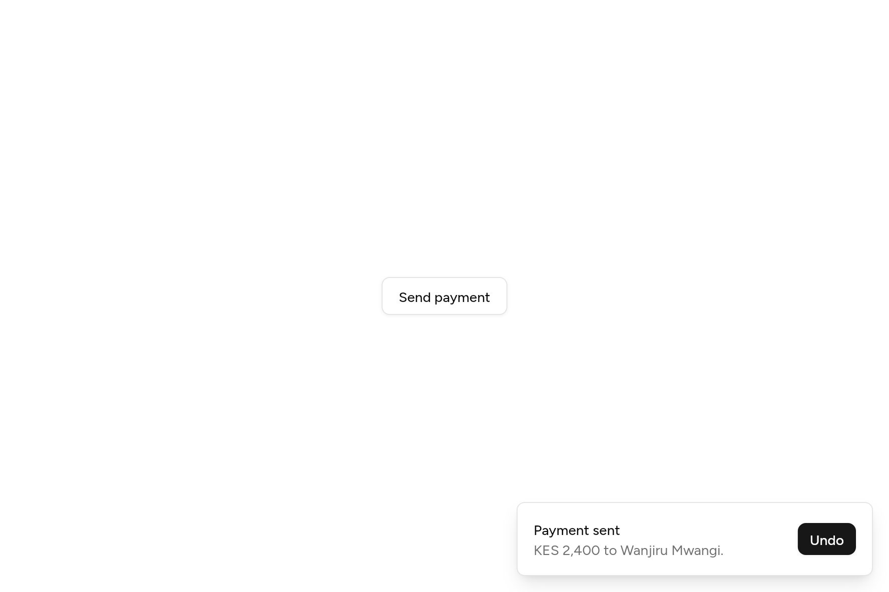
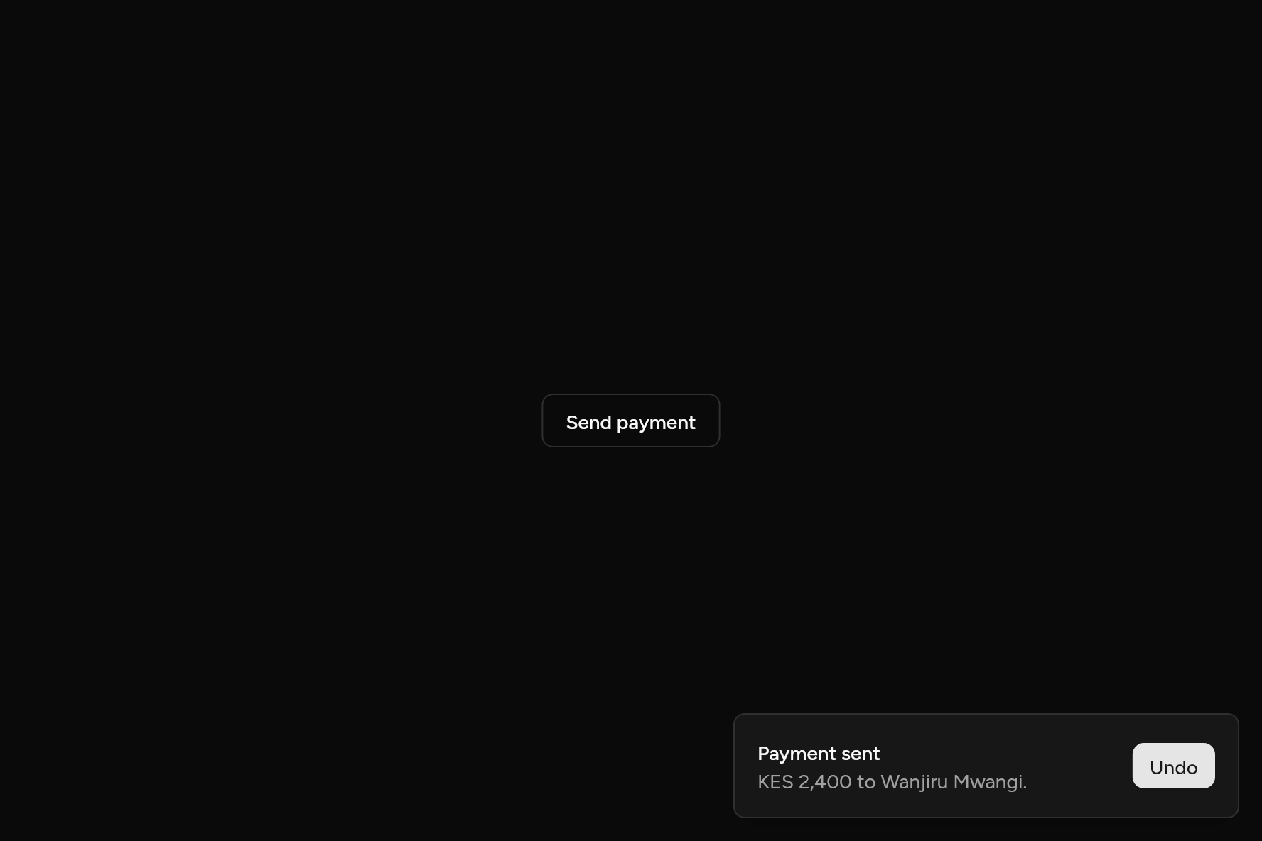
import 'package:flutter/widgets.dart';

import 'ui/button.dart';
import 'ui/toast.dart';

class ToastDemo extends StatelessWidget {
  const ToastDemo({super.key});

  @override
  Widget build(BuildContext context) => Button(
    variant: ButtonVariant.outline,
    onPressed: () => showToast(
      context,
      title: 'Payment sent',
      description: 'KES 2,400 to Wanjiru Mwangi.',
      action: Button(size: ButtonSize.sm, onPressed: () {}, child: const Text('Undo')),
    ),
    child: const Text('Send payment'),
  );
}
Add it
In your Flutter project:
ashlar add toast
It writes theme.dart, palette.dart and toast.dart into lib/ui, keeping any you already have, and adds ashlar_icons to pubspec.yaml. It needs ashlar_icons, which come with it.
Examples
Other ways to use it, each running live, with its code.
Types
Success, info, warning and error.
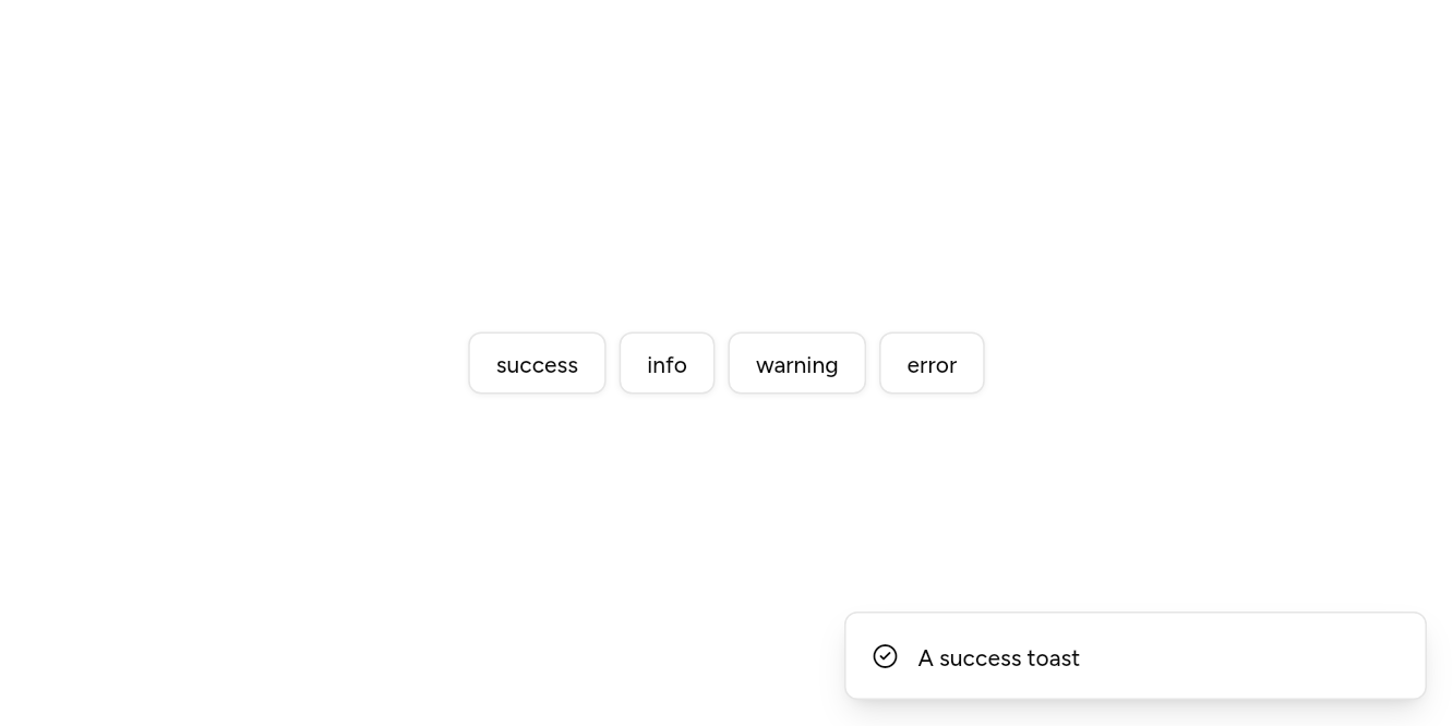
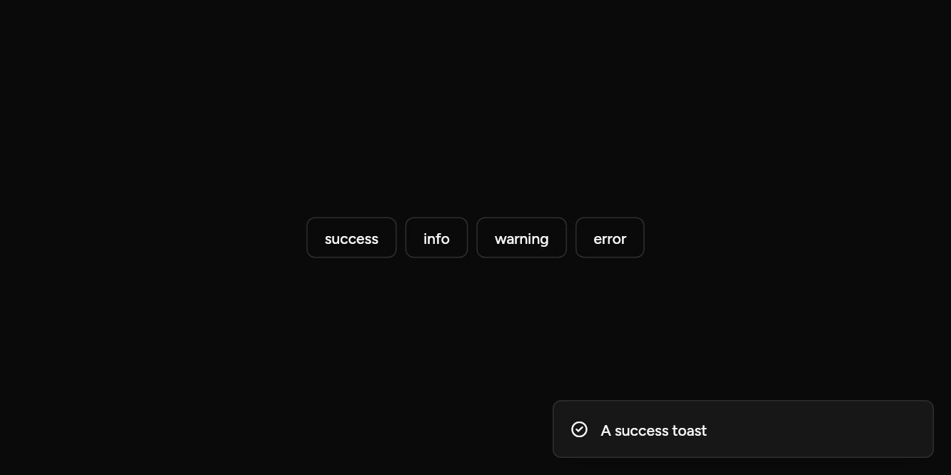
// Types: Success, info, warning and error.
import 'package:flutter/widgets.dart';

import 'ui/button.dart';
import 'ui/toast.dart';

class ToastTypesExample extends StatelessWidget {
  const ToastTypesExample({super.key});

  @override
  Widget build(BuildContext context) => Builder(
    builder: (context) => Wrap(
      spacing: 8,
      children: [
        for (final type in [ToastType.success, ToastType.info, ToastType.warning, ToastType.error])
          Button(
            variant: ButtonVariant.outline,
            onPressed: () => showToast(context, title: 'A ${type.name} toast', type: type),
            child: Text(type.name),
          ),
      ],
    ),
  );
}
Following work
Loading, then done or failed.
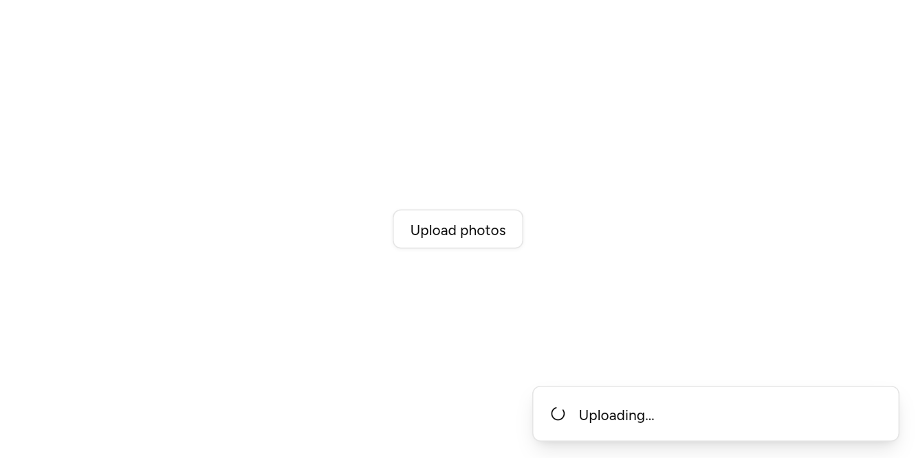
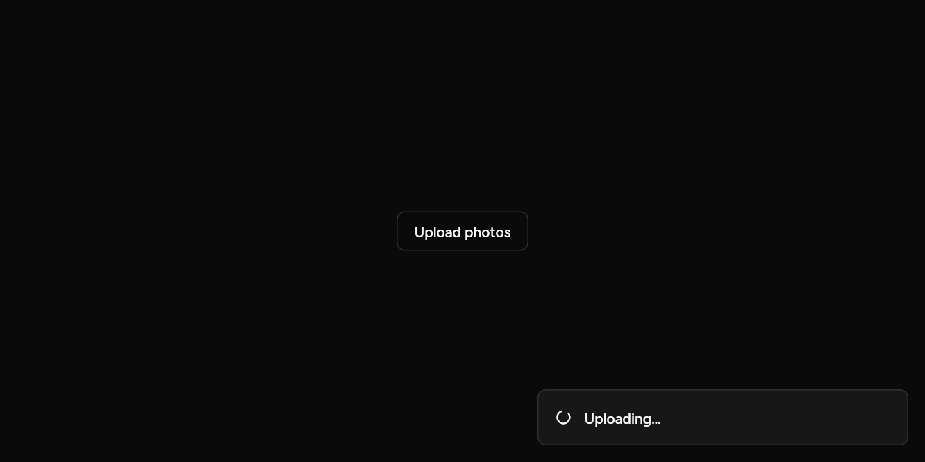
// Following work: Loading, then done or failed.
import 'package:flutter/widgets.dart';

import 'ui/button.dart';
import 'ui/toast.dart';

class ToastPromiseExample extends StatelessWidget {
  const ToastPromiseExample({super.key});

  @override
  Widget build(BuildContext context) => Builder(
    builder: (context) => Button(
      variant: ButtonVariant.outline,
      onPressed: () => showToastPromise<int>(
        context,
        Future.delayed(const Duration(seconds: 2), () => 12),
        loading: 'Uploading…',
        success: (n) => '$n photos uploaded.',
        error: (e) => 'The upload failed.',
      ),
      child: const Text('Upload photos'),
    ),
  );
}
With an action
Undo, at the top of the screen.
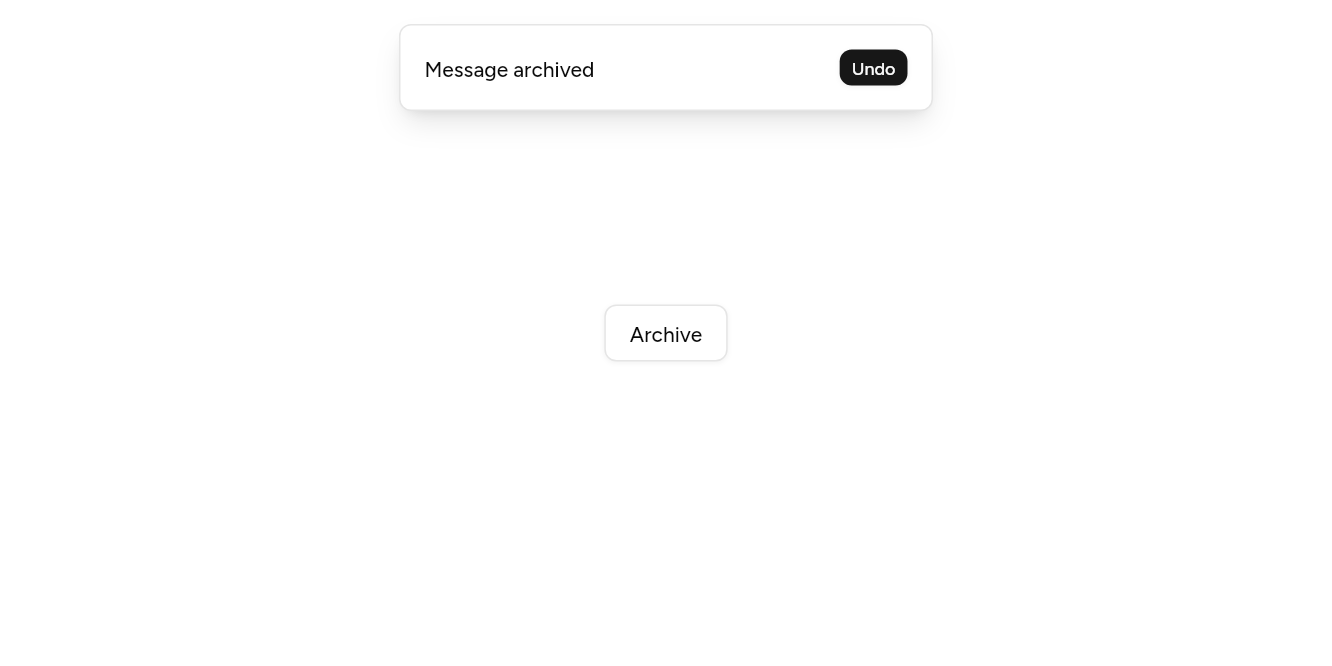
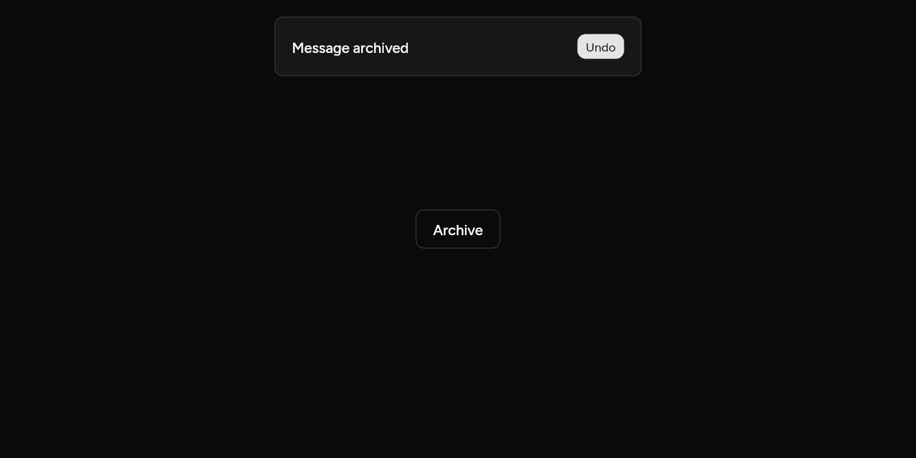
// With an action: Undo, at the top of the screen.
import 'package:flutter/widgets.dart';

import 'ui/button.dart';
import 'ui/toast.dart';

class ToastActionExample extends StatelessWidget {
  const ToastActionExample({super.key});

  @override
  Widget build(BuildContext context) => Builder(
    builder: (context) => Button(
      variant: ButtonVariant.outline,
      onPressed: () => showToast(
        context,
        title: 'Message archived',
        position: ToastPosition.topCenter,
        action: Button(size: ButtonSize.xs, onPressed: () {}, child: const Text('Undo')),
      ),
      child: const Text('Archive'),
    ),
  );
}
API
Read from the source above: each parameter with its type, its default, and what it is for.
ToastTypeenum
What kind of news a toast brings; all but normal show an icon.
| Value | What it is for |
|---|---|
normal | |
success | |
info | |
warning | |
error | |
loading |
ToastPositionenum
Where toasts gather on the screen.
| Value | What it is for |
|---|---|
topLeft | |
topCenter | |
topRight | |
bottomLeft | |
bottomCenter | |
bottomRight |
ToastHandleclass
A toast on screen: change it or send it away.
showToastfunction
Shows a short message that goes by itself after duration (a loading one waits until it is updated). Recent toasts stack at position; the pointer over them fans them out and holds them. A swipe sends one away, and a screen reader reads each out.
| Parameter | Type | Default | What it is for |
|---|---|---|---|
contextpositional |
BuildContext |
Where it is opened from: its theme and navigator come from here. | |
titlerequired |
String |
What happened. | |
description |
String? |
A line under the title. | |
type |
ToastType |
ToastType.normal |
Plain, success, info, warning, error or loading: its icon and colour. |
icon |
Widget? |
Its own icon, in place of the type's. | |
action |
Widget? |
A button to act on it: Undo. | |
cancel | Widget? | A button to dismiss it. | |
closeButton |
bool |
false |
A close button in the corner. |
duration |
Duration |
const Duration(seconds: 4) |
How long it stays, while the pointer is not over it. |
position |
ToastPosition |
ToastPosition.bottomRight |
The corner or edge it appears at. |
showToastPromisefunction
A toast that follows future: loading while it runs, then success with its value or error with what went wrong. Returns the future, to await as before.
| Parameter | Type | Default | What it is for |
|---|---|---|---|
contextpositional |
BuildContext |
Where it is opened from: its theme and navigator come from here. | |
futurepositional |
Future<T> |
The work it follows. | |
loadingrequired |
String |
Shown while the work runs. | |
successrequired |
String Function(T value) |
Writes what to show when it succeeds, from its result. | |
errorrequired |
String Function(Object error) |
Writes what to show when it fails, from the error. | |
position |
ToastPosition |
ToastPosition.bottomRight |
The corner or edge it appears at. |
Source
What lands in your app. It is yours from then on: change it as you would your own code, and ashlar add
will not write over it.
lib/ui/toast.dart 539 lines
// Ashlar UI: Toast. Copied into your app by `ashlar add toast`; it is yours to change.

import 'dart:async';

import 'package:ashlar_icons/ashlar_icons.dart';
import 'package:flutter/widgets.dart';

import 'theme.dart';

/// What kind of news a toast brings; all but [normal] show an icon.
enum ToastType { normal, success, info, warning, error, loading }

/// Where toasts gather on the screen.
enum ToastPosition {
  topLeft,
  topCenter,
  topRight,
  bottomLeft,
  bottomCenter,
  bottomRight,
}

/// A toast on screen: change it or send it away.
class ToastHandle {
  ToastHandle._(this._toast, this._host);

  final _Toast _toast;
  final _ToastHost _host;

  void dismiss() => _host.remove(_toast);

  /// Changes what it says. A [type] other than loading starts its timer again.
  void update({
    String? title,
    String? description,
    ToastType? type,
    Duration? duration,
  }) {
    _toast
      ..title = title ?? _toast.title
      ..description = description ?? _toast.description
      ..type = type ?? _toast.type
      ..duration = duration ?? _toast.duration
      ..version += 1;
    _host.changed();
  }
}

/// Shows a short message that goes by itself after [duration] (a loading one waits until
/// it is updated). Recent toasts stack at [position]; the pointer over them fans them out
/// and holds them. A swipe sends one away, and a screen reader reads each out.
///
/// ```dart
/// showToast(context, title: 'Payment sent', description: 'KES 2,400 to Wanjiru.', type: ToastType.success)
/// showToast(context, title: 'Event deleted', action: Button(size: ButtonSize.sm, onPressed: undo, child: Text('Undo')))
/// ```
ToastHandle showToast(
  BuildContext context, {
  required String title,
  String? description,
  ToastType type = ToastType.normal,
  Widget? icon,
  Widget? action,
  Widget? cancel,
  bool closeButton = false,
  Duration duration = const Duration(seconds: 4),
  ToastPosition position = ToastPosition.bottomRight,
}) {
  final overlay = Overlay.of(context, rootOverlay: true);
  final hosts = _hosts[overlay] ??= {};
  final host = hosts[position] ??= _ToastHost(
    overlay,
    AshlarTheme.of(context),
    position,
  );
  final toast = _Toast(
    title: title,
    description: description,
    type: type,
    icon: icon,
    action: action,
    cancel: cancel,
    closeButton: closeButton,
    duration: duration,
  );
  host.add(toast);
  return ToastHandle._(toast, host);
}

/// A toast that follows [future]: [loading] while it runs, then [success] with its value
/// or [error] with what went wrong. Returns the future, to await as before.
Future<T> showToastPromise<T>(
  BuildContext context,
  Future<T> future, {
  required String loading,
  required String Function(T value) success,
  required String Function(Object error) error,
  ToastPosition position = ToastPosition.bottomRight,
}) {
  final handle = showToast(
    context,
    title: loading,
    type: ToastType.loading,
    position: position,
  );
  future.then(
    (v) => handle.update(title: success(v), type: ToastType.success),
    onError: (Object e) =>
        handle.update(title: error(e), type: ToastType.error),
  );
  return future;
}

final _hosts = Expando<Map<ToastPosition, _ToastHost>>();

class _Toast {
  _Toast({
    required this.title,
    this.description,
    required this.type,
    this.icon,
    this.action,
    this.cancel,
    required this.closeButton,
    required this.duration,
  });

  String title;
  String? description;
  ToastType type;
  final Widget? icon, action, cancel;
  final bool closeButton;
  Duration duration;

  /// Counts changes, so a card knows to start its timer again.
  int version = 0;
  final key = UniqueKey();
}

/// The toasts at one position, in one entry on the root overlay.
class _ToastHost {
  _ToastHost(this.overlay, this.theme, this.position) {
    entry = OverlayEntry(
      builder: (_) => AshlarTheme(
        data: theme,
        child: _ToastStack(host: this),
      ),
    );
    overlay.insert(entry);
  }

  final OverlayState overlay;
  final AshlarThemeData theme;
  final ToastPosition position;
  late final OverlayEntry entry;
  final toasts = ValueNotifier<List<_Toast>>([]);

  /// The pointer is over the stack: it is fanned out, and the timers wait.
  final hovered = ValueNotifier(false);

  static const visible = 3;

  void add(_Toast toast) {
    final list = [...toasts.value, toast];
    toasts.value = list.length > visible + 2
        ? list.sublist(list.length - visible - 2)
        : list;
  }

  void remove(_Toast toast) => toasts.value = [...toasts.value]..remove(toast);

  void changed() => toasts.value = [...toasts.value];
}

class _ToastStack extends StatefulWidget {
  const _ToastStack({required this.host});

  final _ToastHost host;

  @override
  State<_ToastStack> createState() => _ToastStackState();
}

class _ToastStackState extends State<_ToastStack> {
  final _heights = <Key, double>{};

  @override
  Widget build(BuildContext context) {
    final padding = MediaQuery.paddingOf(context);
    final p = widget.host.position;
    final top =
        p == ToastPosition.topLeft ||
        p == ToastPosition.topCenter ||
        p == ToastPosition.topRight;
    final alignment = switch (p) {
      ToastPosition.topLeft => Alignment.topLeft,
      ToastPosition.topCenter => Alignment.topCenter,
      ToastPosition.topRight => Alignment.topRight,
      ToastPosition.bottomLeft => Alignment.bottomLeft,
      ToastPosition.bottomCenter => Alignment.bottomCenter,
      ToastPosition.bottomRight => Alignment.bottomRight,
    };
    return ValueListenableBuilder(
      valueListenable: widget.host.toasts,
      builder: (context, toasts, _) {
        if (toasts.isEmpty) return const SizedBox.shrink();
        return ValueListenableBuilder(
          valueListenable: widget.host.hovered,
          builder: (context, open, _) {
            // Newest first; only a few show, the rest wait behind.
            final shown = toasts.reversed.take(_ToastHost.visible).toList();
            final front = _heights[shown.first.key] ?? 64;
            var run = 0.0;
            final cards = <Widget>[];
            for (final (i, toast) in shown.indexed) {
              final height = _heights[toast.key] ?? 64;
              // Fanned out: one above the other. Stacked: each behind the last, a little
              // smaller, and as tall as the front one so only its edge shows.
              final offset = open ? run : i * 14.0;
              run += height + 8;
              cards.add(
                AnimatedPositioned(
                  key: toast.key,
                  duration: const Duration(milliseconds: 250),
                  curve: Curves.easeOutCubic,
                  left: 0,
                  right: 0,
                  top: top ? offset : null,
                  bottom: top ? null : offset,
                  child: AnimatedScale(
                    duration: const Duration(milliseconds: 250),
                    scale: open ? 1 : 1 - i * .05,
                    alignment: top
                        ? Alignment.bottomCenter
                        : Alignment.topCenter,
                    child: _Measured(
                      onHeight: (h) {
                        if (_heights[toast.key] != h) {
                          setState(() => _heights[toast.key] = h);
                        }
                      },
                      child: _ToastCard(
                        toast: toast,
                        host: widget.host,
                        behind: !open && i > 0,
                        frontHeight: front,
                      ),
                    ),
                  ),
                ),
              );
            }
            final height = open ? run : front + (shown.length - 1) * 14.0;
            return Positioned(
              left: 16 + padding.left,
              right: 16 + padding.right,
              top: top ? 16 + padding.top : null,
              bottom: top ? null : 16 + padding.bottom,
              child: Align(
                alignment: alignment,
                child: MouseRegion(
                  onEnter: (_) => widget.host.hovered.value = true,
                  onExit: (_) => widget.host.hovered.value = false,
                  child: AnimatedContainer(
                    duration: const Duration(milliseconds: 250),
                    width: 356,
                    height: height,
                    child: Stack(
                      clipBehavior: Clip.none,
                      children: cards.reversed.toList(),
                    ),
                  ),
                ),
              ),
            );
          },
        );
      },
    );
  }
}

/// Reports its child's height after layout, for the stack to place the cards.
class _Measured extends StatefulWidget {
  const _Measured({required this.onHeight, required this.child});

  final ValueChanged<double> onHeight;
  final Widget child;

  @override
  State<_Measured> createState() => _MeasuredState();
}

class _MeasuredState extends State<_Measured> {
  @override
  Widget build(BuildContext context) {
    WidgetsBinding.instance.addPostFrameCallback((_) {
      final size = mounted ? context.size : null;
      if (size != null) widget.onHeight(size.height);
    });
    return widget.child;
  }
}

class _ToastCard extends StatefulWidget {
  const _ToastCard({
    required this.toast,
    required this.host,
    required this.behind,
    required this.frontHeight,
  });

  final _Toast toast;
  final _ToastHost host;

  /// Behind the front card in the stack: only its edge shows.
  final bool behind;
  final double frontHeight;

  @override
  State<_ToastCard> createState() => _ToastCardState();
}

class _ToastCardState extends State<_ToastCard>
    with SingleTickerProviderStateMixin {
  late final _enter = AnimationController(
    vsync: this,
    duration: const Duration(milliseconds: 200),
  )..forward();
  Timer? _timer;
  late int _version = widget.toast.version;

  @override
  void initState() {
    super.initState();
    widget.host.hovered.addListener(_hover);
    _start();
  }

  void _hover() => widget.host.hovered.value ? _timer?.cancel() : _start();

  void _start() {
    _timer?.cancel();
    if (widget.toast.type == ToastType.loading || widget.host.hovered.value) {
      return;
    }
    _timer = Timer(widget.toast.duration, _leave);
  }

  Future<void> _leave() async {
    _timer?.cancel();
    if (!mounted) return;
    await _enter.reverse();
    widget.host.remove(widget.toast);
  }

  @override
  void didUpdateWidget(_ToastCard old) {
    super.didUpdateWidget(old);
    if (widget.toast.version != _version) {
      _version = widget.toast.version;
      _start();
    }
  }

  @override
  void dispose() {
    widget.host.hovered.removeListener(_hover);
    _timer?.cancel();
    _enter.dispose();
    super.dispose();
  }

  @override
  Widget build(BuildContext context) {
    final t = AshlarTheme.of(context);
    final c = t.colors;
    final toast = widget.toast;
    final icon =
        toast.icon ??
        switch (toast.type) {
          ToastType.normal => null,
          ToastType.success => const AshlarIcon(
            AshlarIconsRoundedStroke.circleCheck,
          ),
          ToastType.info => const AshlarIcon(AshlarIconsRoundedStroke.info),
          ToastType.warning => const AshlarIcon(
            AshlarIconsRoundedStroke.triangleAlert,
          ),
          ToastType.error => const AshlarIcon(AshlarIconsRoundedStroke.circleX),
          ToastType.loading => const _Turning(),
        };
    final content = Row(
      crossAxisAlignment: CrossAxisAlignment.center,
      children: [
        if (icon != null) ...[icon, const SizedBox(width: 12)],
        Expanded(
          child: Column(
            crossAxisAlignment: CrossAxisAlignment.start,
            mainAxisSize: MainAxisSize.min,
            children: [
              Text(
                toast.title,
                style: t.text.sm.copyWith(
                  color: c.popoverForeground,
                  fontWeight: FontWeight.w500,
                ),
              ),
              if (toast.description != null)
                Text(
                  toast.description!,
                  style: t.text.sm.copyWith(color: c.mutedForeground),
                ),
            ],
          ),
        ),
        if (toast.cancel != null) ...[const SizedBox(width: 8), toast.cancel!],
        if (toast.action != null) ...[const SizedBox(width: 8), toast.action!],
      ],
    );
    final card = Container(
      height: widget.behind ? widget.frontHeight : null,
      padding: const EdgeInsets.all(16),
      decoration: BoxDecoration(
        color: c.popover,
        borderRadius: BorderRadius.circular(t.radiusMd),
        border: Border.all(color: c.border),
        boxShadow: t.shadowLg,
      ),
      child: IconTheme.merge(
        data: IconThemeData(color: c.popoverForeground, size: 16),
        // Behind the front card, the content would only peek out: it waits, unseen.
        child: widget.behind ? const SizedBox() : content,
      ),
    );
    final framed = toast.closeButton && !widget.behind
        ? Stack(
            clipBehavior: Clip.none,
            children: [
              card,
              PositionedDirectional(
                top: -6,
                start: -6,
                child: _Close(onPressed: _leave),
              ),
            ],
          )
        : card;
    final still = MediaQuery.maybeDisableAnimationsOf(context) ?? false;
    final curve = CurvedAnimation(parent: _enter, curve: Curves.easeOut);
    final top = widget.host.position.name.startsWith('top');
    return Semantics(
      liveRegion: !widget.behind,
      container: true,
      excludeSemantics: widget.behind,
      child: Dismissible(
        key: toast.key,
        direction: DismissDirection.horizontal,
        onDismissed: (_) => widget.host.remove(toast),
        child: still
            ? framed
            : FadeTransition(
                opacity: curve,
                child: SlideTransition(
                  position: Tween(
                    begin: Offset(0, top ? -.5 : .5),
                    end: Offset.zero,
                  ).animate(curve),
                  child: framed,
                ),
              ),
      ),
    );
  }
}

class _Close extends StatelessWidget {
  const _Close({required this.onPressed});

  final VoidCallback onPressed;

  @override
  Widget build(BuildContext context) {
    final t = AshlarTheme.of(context);
    final c = t.colors;
    return Semantics(
      container: true,
      button: true,
      label: 'Close',
      onTap: onPressed,
      child: GestureDetector(
        onTap: onPressed,
        child: Container(
          width: 20,
          height: 20,
          alignment: Alignment.center,
          decoration: BoxDecoration(
            color: c.popover,
            shape: BoxShape.circle,
            border: Border.all(color: c.border),
          ),
          child: AshlarIcon(
            AshlarIconsRoundedStroke.x,
            size: 12,
            color: c.foreground,
          ),
        ),
      ),
    );
  }
}

/// The loading icon, turning.
class _Turning extends StatefulWidget {
  const _Turning();

  @override
  State<_Turning> createState() => _TurningState();
}

class _TurningState extends State<_Turning>
    with SingleTickerProviderStateMixin {
  late final _turn = AnimationController(
    vsync: this,
    duration: const Duration(seconds: 1),
  )..repeat();

  @override
  void dispose() {
    _turn.dispose();
    super.dispose();
  }

  @override
  Widget build(BuildContext context) => RotationTransition(
    turns: _turn,
    child: const AshlarIcon(AshlarIconsRoundedStroke.loaderCircle),
  );
}