

Button Group
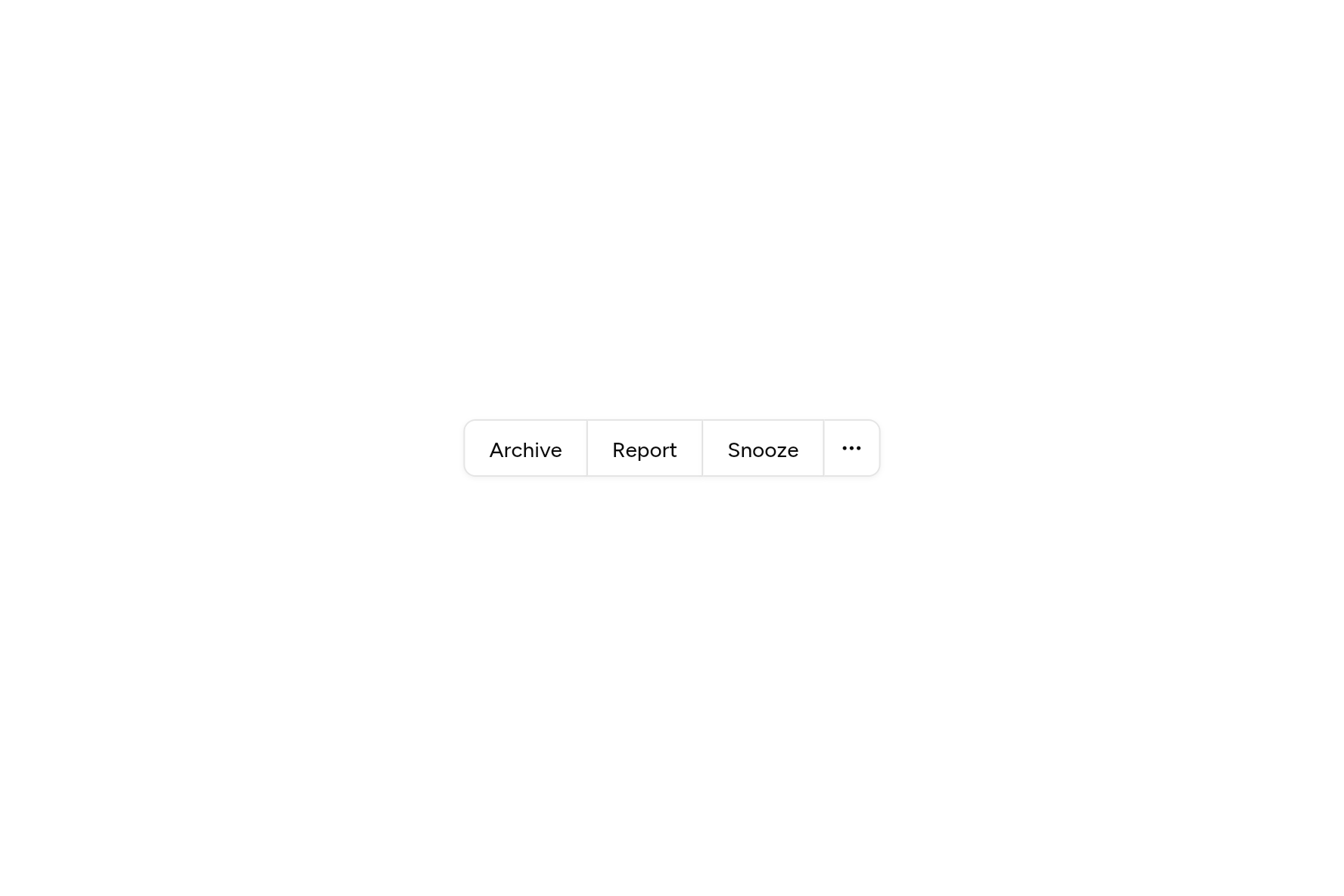
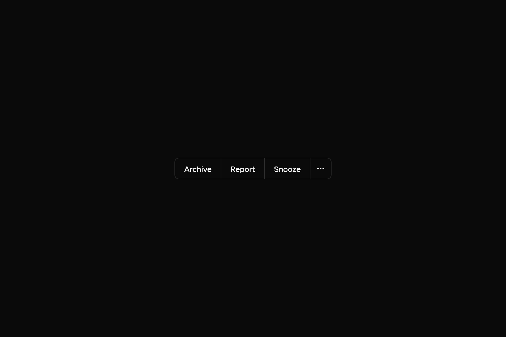
Buttons joined into one piece, for actions that belong together.
import 'package:ashlar_icons/ashlar_icons.dart';
import 'package:flutter/widgets.dart';

import 'ui/button.dart';
import 'ui/button_group.dart';

class ButtonGroupDemo extends StatelessWidget {
  const ButtonGroupDemo({super.key});

  @override
  Widget build(BuildContext context) => ButtonGroup(
    children: [
      Button(variant: ButtonVariant.outline, onPressed: () {}, child: const Text('Archive')),
      Button(variant: ButtonVariant.outline, onPressed: () {}, child: const Text('Report')),
      Button(variant: ButtonVariant.outline, onPressed: () {}, child: const Text('Snooze')),
      Button(
        variant: ButtonVariant.outline,
        size: ButtonSize.icon,
        semanticLabel: 'More',
        onPressed: () {},
        child: const AshlarIcon(AshlarIconsRoundedStroke.ellipsis),
      ),
    ],
  );
}
Try its options
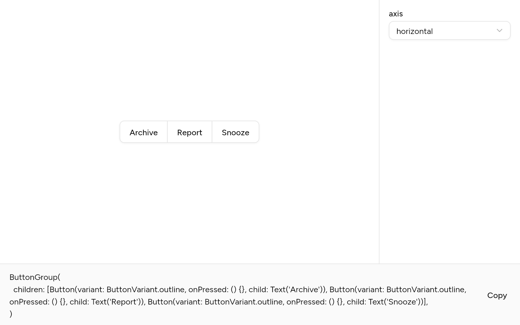
Each option its constructor takes, to change and see; the code below it is what you chose, to copy.
Add it
In your Flutter project:
ashlar add button-group
It writes group.dart and button_group.dart into lib/ui, keeping any you already have. It needs group, which come with it.
Examples
Other ways to use it, each running live, with its code.
Split button
A main action with a menu of others beside it.
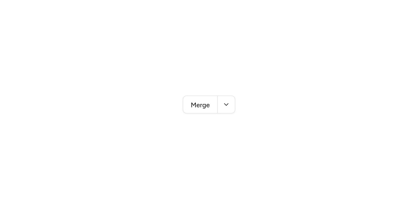

// Split button: A main action with a menu of others beside it.
import 'package:ashlar_icons/ashlar_icons.dart';
import 'package:flutter/widgets.dart';

import 'ui/button.dart';
import 'ui/button_group.dart';
import 'ui/dropdown_menu.dart';
import 'ui/popover.dart';

class ButtonGroupSplitExample extends StatelessWidget {
  const ButtonGroupSplitExample({super.key});

  @override
  Widget build(BuildContext context) => ButtonGroup(
    children: [
      Button(variant: ButtonVariant.outline, onPressed: () {}, child: const Text('Merge')),
      DropdownMenu(
        align: PopoverAlign.end,
        builder: (context, menu) => Button(
          variant: ButtonVariant.outline,
          size: ButtonSize.icon,
          semanticLabel: 'More ways to merge',
          onPressed: menu.open,
          child: const AshlarIcon(AshlarIconsRoundedStroke.chevronDown),
        ),
        items: [
          MenuItem(onPressed: () {}, child: const Text('Squash and merge')),
          MenuItem(onPressed: () {}, child: const Text('Rebase and merge')),
        ],
      ),
    ],
  );
}
Upright
Joined top to bottom.
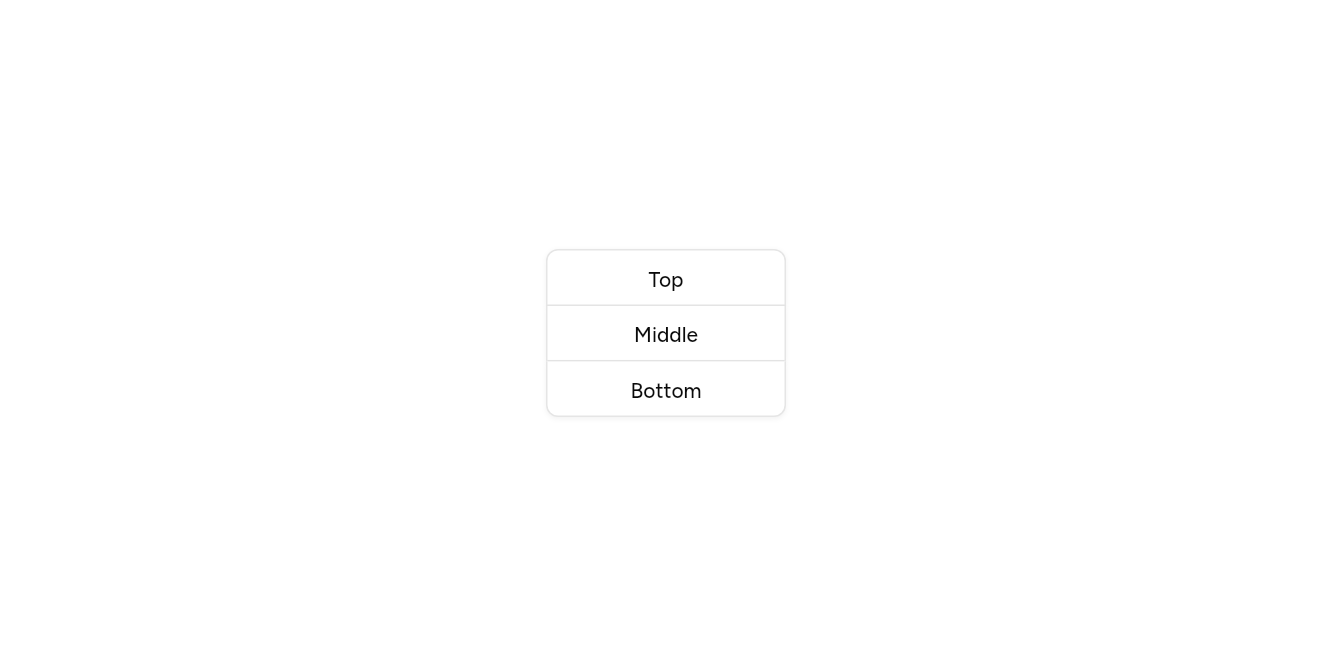
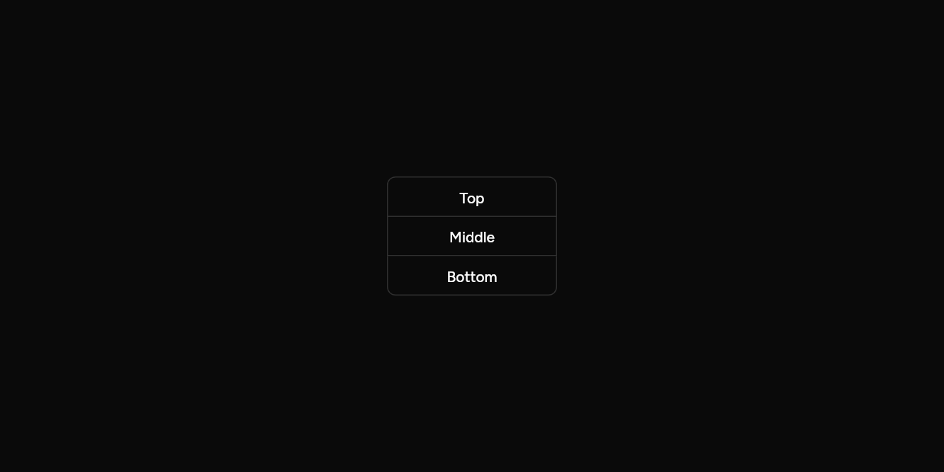
// Upright: Joined top to bottom.
import 'package:flutter/widgets.dart';

import 'ui/button.dart';
import 'ui/button_group.dart';

class ButtonGroupVerticalExample extends StatelessWidget {
  const ButtonGroupVerticalExample({super.key});

  @override
  Widget build(BuildContext context) => SizedBox(
    width: 160,
    child: ButtonGroup(
      axis: Axis.vertical,
      children: [
        for (final label in ['Top', 'Middle', 'Bottom'])
          Button(variant: ButtonVariant.outline, onPressed: () {}, child: Text(label)),
      ],
    ),
  );
}
Back and next
Two icons as one control.

// Back and next: Two icons as one control.
import 'package:ashlar_icons/ashlar_icons.dart';
import 'package:flutter/widgets.dart';

import 'ui/button.dart';
import 'ui/button_group.dart';

class ButtonGroupPagerExample extends StatelessWidget {
  const ButtonGroupPagerExample({super.key});

  @override
  Widget build(BuildContext context) => ButtonGroup(
    semanticLabel: 'Pages',
    children: [
      Button(
        variant: ButtonVariant.outline,
        size: ButtonSize.icon,
        semanticLabel: 'Back',
        onPressed: () {},
        child: const AshlarIcon(AshlarIconsRoundedStroke.chevronLeft),
      ),
      Button(
        variant: ButtonVariant.outline,
        size: ButtonSize.icon,
        semanticLabel: 'Next',
        onPressed: () {},
        child: const AshlarIcon(AshlarIconsRoundedStroke.chevronRight),
      ),
    ],
  );
}
API
Read from the source above: each parameter with its type, its default, and what it is for.
ButtonGroupclass
Buttons joined into one piece, for actions that belong together.
| Parameter | Type | Default | What it is for |
|---|---|---|---|
childrenrequired |
List<Widget> |
What it holds, in order. | |
axis |
Axis |
Axis.horizontal |
Horizontal lays it out across; vertical, down. |
semanticLabel |
String? |
What the buttons are for, read before them: 'Text alignment'. |
Source
What lands in your app. It is yours from then on: change it as you would your own code, and ashlar add
will not write over it.
lib/ui/button_group.dart 42 lines
// Ashlar UI: Button Group. Copied into your app by `ashlar add button-group`; it is yours
// to change.

import 'package:flutter/widgets.dart';

import 'group.dart';

/// Buttons joined into one piece, for actions that belong together.
///
/// ```dart
/// ButtonGroup(children: [
///   Button(variant: ButtonVariant.outline, onPressed: archive, child: Text('Archive')),
///   Button(variant: ButtonVariant.outline, onPressed: report, child: Text('Report')),
///   Button(variant: ButtonVariant.outline, onPressed: snooze, child: Text('Snooze')),
/// ])
/// ```
class ButtonGroup extends StatelessWidget {
  const ButtonGroup({
    super.key,
    required this.children,
    this.axis = Axis.horizontal,
    this.semanticLabel,
  });

  /// What it holds, in order.
  final List<Widget> children;

  /// Horizontal lays it out across; vertical, down.
  final Axis axis;

  /// What the buttons are for, read before them: 'Text alignment'.
  final String? semanticLabel;

  @override
  Widget build(BuildContext context) => Semantics(
    container: true,
    label: semanticLabel,
    child: IntrinsicHeight(
      child: JoinedGroup(axis: axis, children: children),
    ),
  );
}