

Checkbox
A box that is ticked or not.
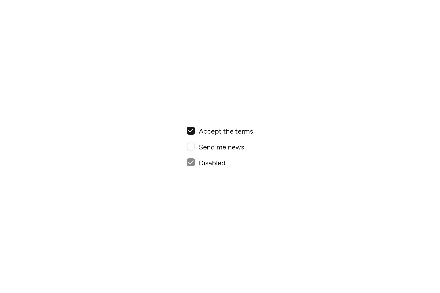
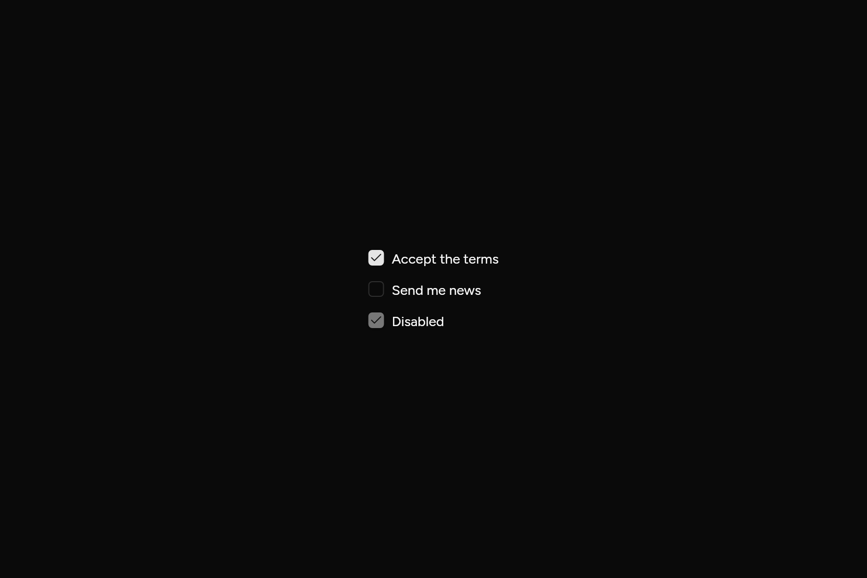
import 'package:flutter/widgets.dart';

import 'ui/checkbox.dart';

class CheckboxDemo extends StatefulWidget {
  const CheckboxDemo({super.key});

  @override
  State<CheckboxDemo> createState() => _CheckboxDemoState();
}

class _CheckboxDemoState extends State<CheckboxDemo> {
  bool terms = true, news = false;

  @override
  Widget build(BuildContext context) => Column(
    mainAxisSize: MainAxisSize.min,
    crossAxisAlignment: CrossAxisAlignment.start,
    children: [
      Row(
        mainAxisSize: MainAxisSize.min,
        children: [
          Checkbox(value: terms, onChanged: (v) => setState(() => terms = v), semanticLabel: 'Accept the terms'),
          const SizedBox(width: 8),
          const Text('Accept the terms'),
        ],
      ),
      const SizedBox(height: 12),
      Row(
        mainAxisSize: MainAxisSize.min,
        children: [
          Checkbox(value: news, onChanged: (v) => setState(() => news = v), semanticLabel: 'Send me news'),
          const SizedBox(width: 8),
          const Text('Send me news'),
        ],
      ),
      const SizedBox(height: 12),
      const Row(
        mainAxisSize: MainAxisSize.min,
        children: [
          Checkbox(value: true, onChanged: null),
          SizedBox(width: 8),
          Text('Disabled'),
        ],
      ),
    ],
  );
}
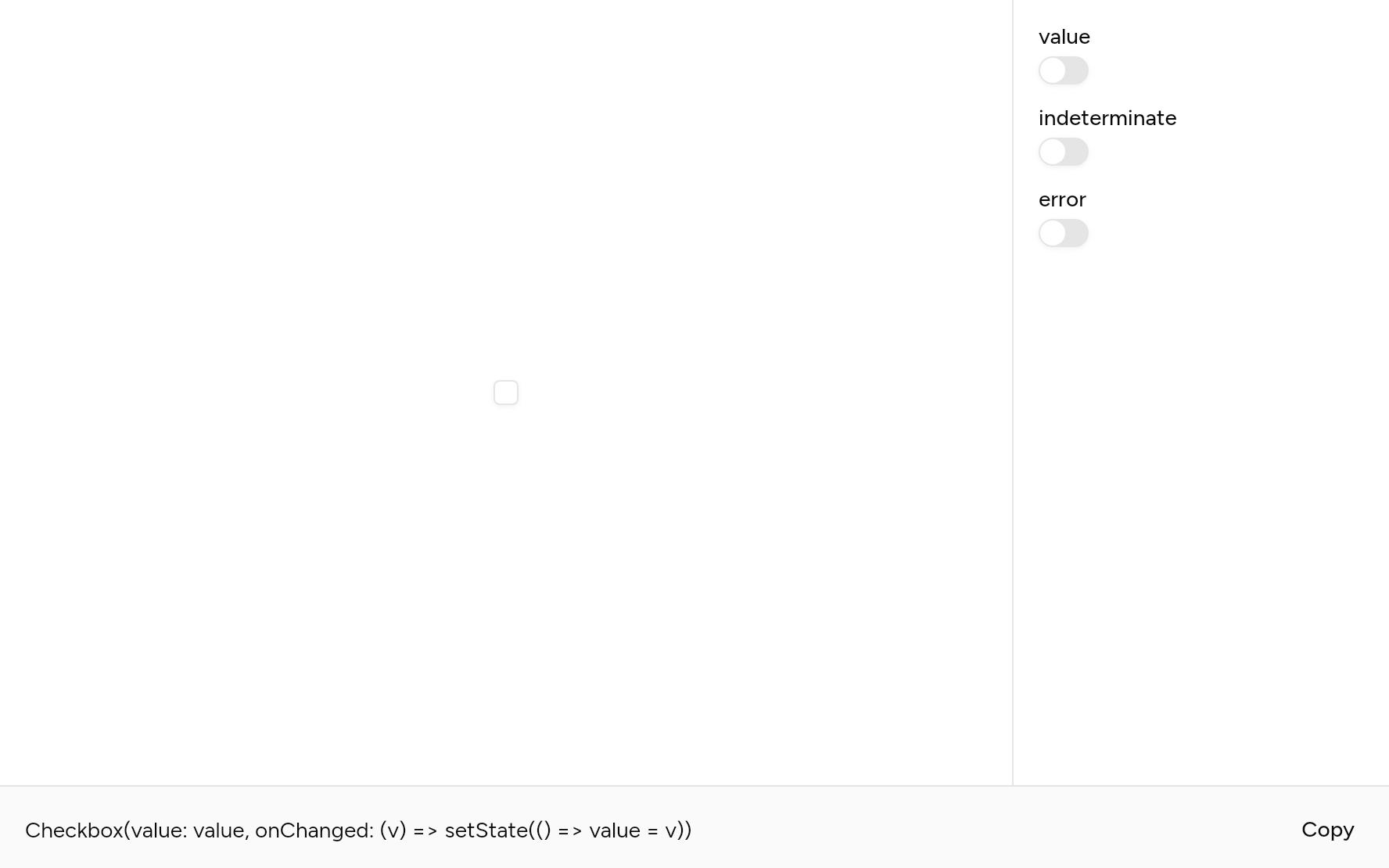
Try its options
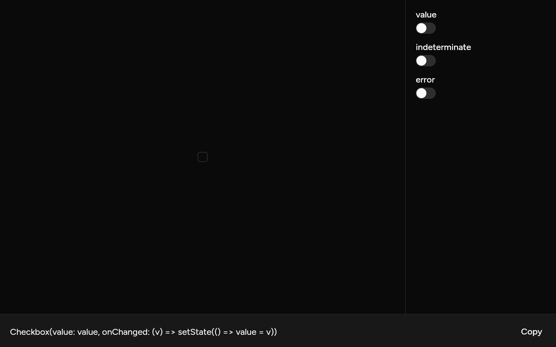
Each option its constructor takes, to change and see; the code below it is what you chose, to copy.
Add it
In your Flutter project:
ashlar add checkbox
It writes theme.dart, palette.dart, group.dart, pressable.dart and checkbox.dart into lib/ui, keeping any you already have, and adds ashlar_icons to pubspec.yaml. It needs pressable and ashlar_icons, which come with it.
Examples
Other ways to use it, each running live, with its code.
Some of them
A parent box for some but not all.
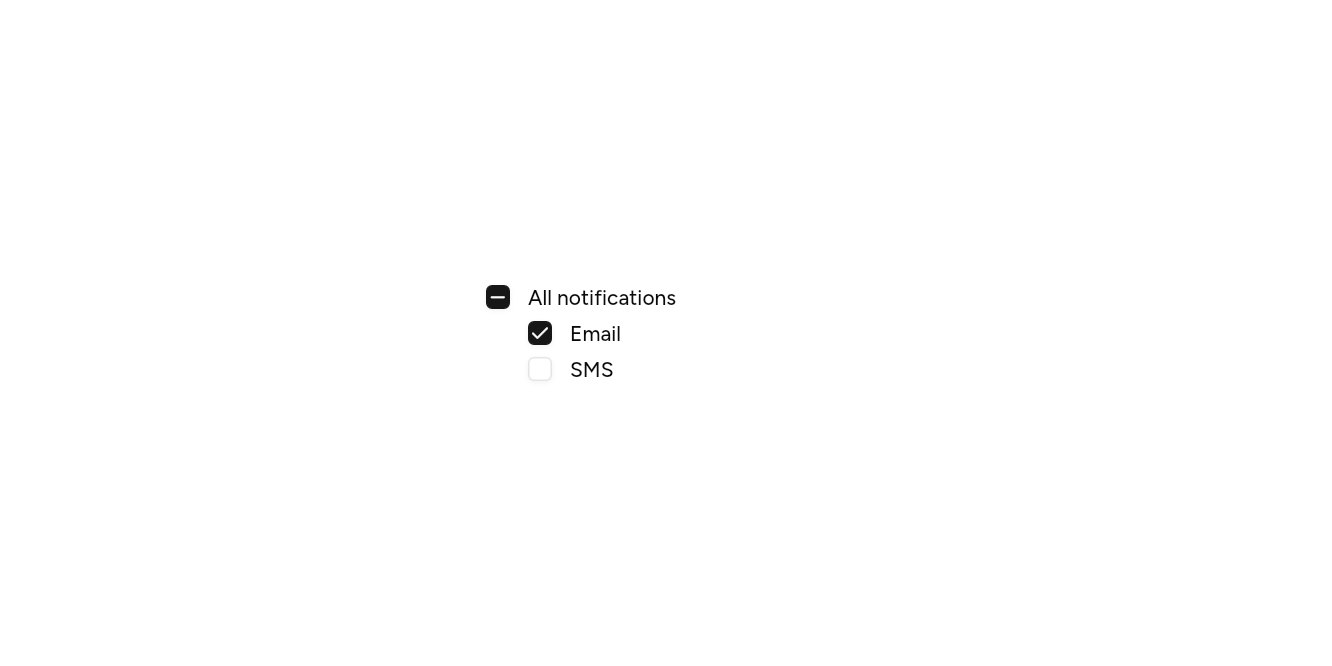
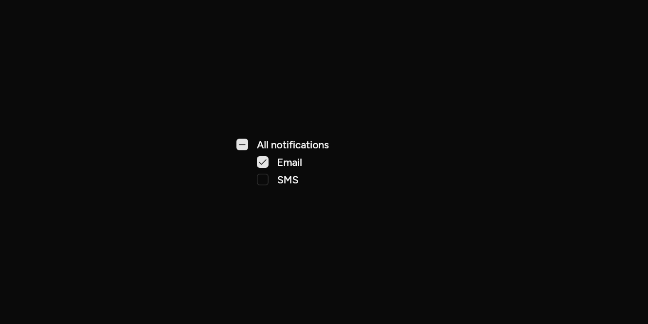
// Some of them: A parent box for some but not all.
import 'package:flutter/widgets.dart';

import 'ui/checkbox.dart';
import 'ui/field.dart';

class CheckboxIndeterminateExample extends StatefulWidget {
  const CheckboxIndeterminateExample({super.key});

  @override
  State<CheckboxIndeterminateExample> createState() => _CheckboxIndeterminateExampleState();
}

class _CheckboxIndeterminateExampleState extends State<CheckboxIndeterminateExample> {
  final on = {'email'};

  @override
  Widget build(BuildContext context) => SizedBox(
    width: 240,
    child: Column(
      mainAxisSize: MainAxisSize.min,
      crossAxisAlignment: CrossAxisAlignment.start,
      children: [
        Field(
          axis: Axis.horizontal,
          label: const Text('All notifications'),
          child: Checkbox(
            value: on.length == 2,
            indeterminate: on.length == 1,
            onChanged: (v) => setState(() => v ? on.addAll(['email', 'sms']) : on.clear()),
          ),
        ),
        for (final kind in ['email', 'sms'])
          Padding(
            padding: const EdgeInsetsDirectional.only(start: 28, top: 8),
            child: Field(
              axis: Axis.horizontal,
              label: Text(kind == 'email' ? 'Email' : 'SMS'),
              child: Checkbox(
                value: on.contains(kind),
                onChanged: (v) => setState(() => v ? on.add(kind) : on.remove(kind)),
              ),
            ),
          ),
      ],
    ),
  );
}
With a description
A line under the label.
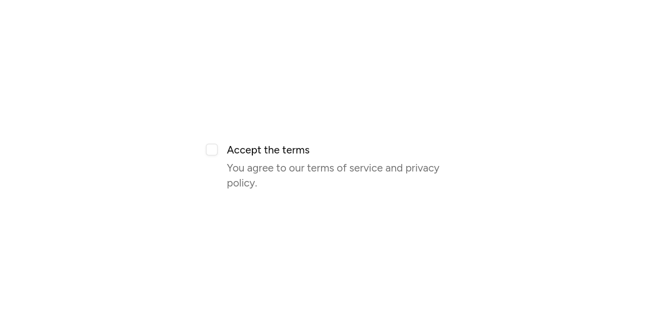
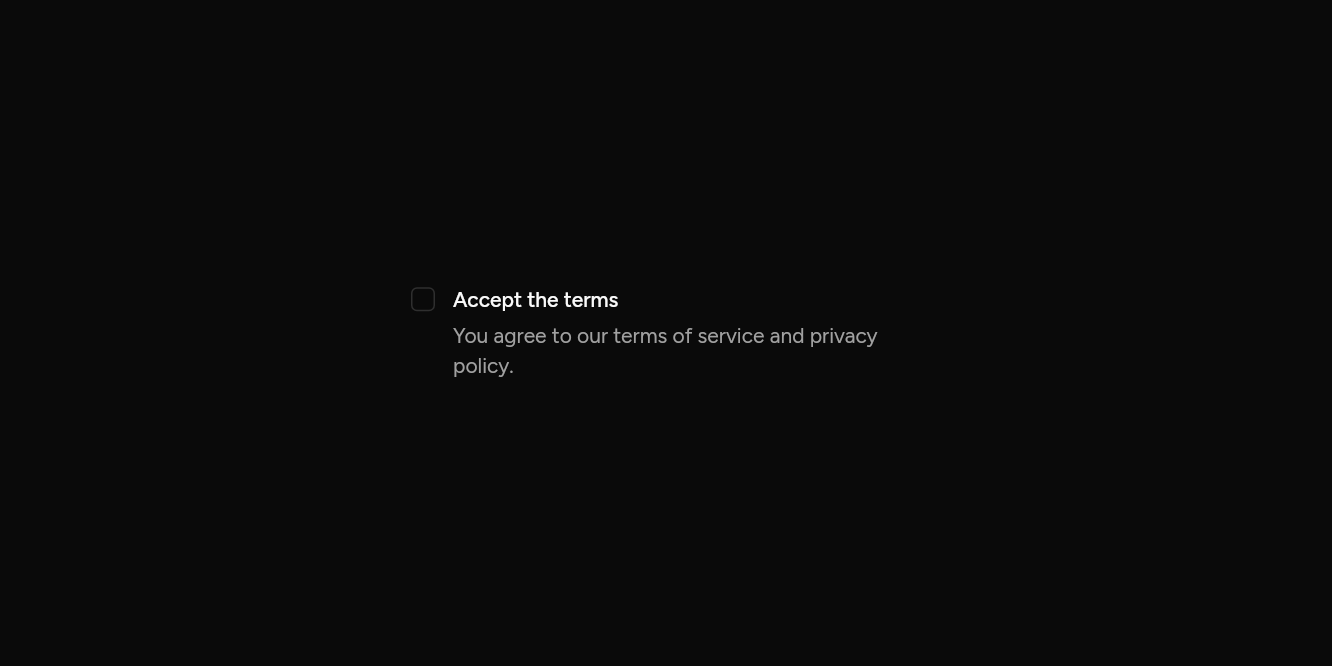
// With a description: A line under the label.
import 'package:flutter/widgets.dart';

import 'ui/checkbox.dart';
import 'ui/field.dart';

class CheckboxDescriptionExample extends StatefulWidget {
  const CheckboxDescriptionExample({super.key});

  @override
  State<CheckboxDescriptionExample> createState() => _CheckboxDescriptionExampleState();
}

class _CheckboxDescriptionExampleState extends State<CheckboxDescriptionExample> {
  var on = false;

  @override
  Widget build(BuildContext context) => SizedBox(
    width: 340,
    child: Field(
      axis: Axis.horizontal,
      label: const Text('Accept the terms'),
      description: const Text('You agree to our terms of service and privacy policy.'),
      child: Checkbox(value: on, onChanged: (v) => setState(() => on = v)),
    ),
  );
}
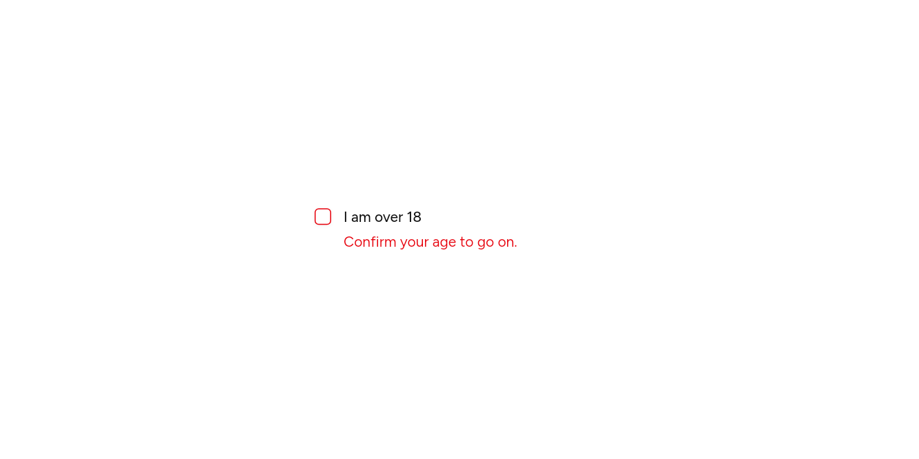
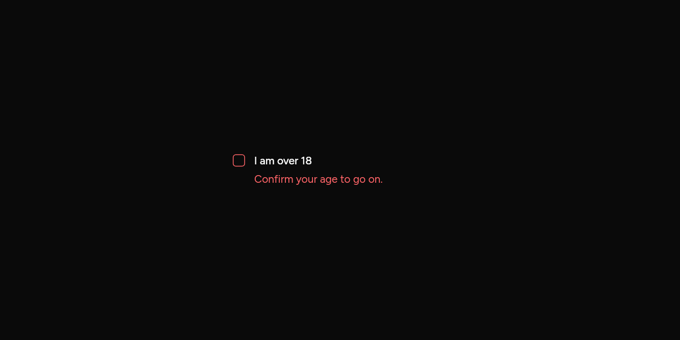
Wrong
Marked until it is ticked.
// Wrong: Marked until it is ticked.
import 'package:flutter/widgets.dart';

import 'ui/checkbox.dart';
import 'ui/field.dart';

class CheckboxErrorExample extends StatefulWidget {
  const CheckboxErrorExample({super.key});

  @override
  State<CheckboxErrorExample> createState() => _CheckboxErrorExampleState();
}

class _CheckboxErrorExampleState extends State<CheckboxErrorExample> {
  var on = false;

  @override
  Widget build(BuildContext context) => SizedBox(
    width: 280,
    child: Field(
      axis: Axis.horizontal,
      label: const Text('I am over 18'),
      error: on ? null : const Text('Confirm your age to go on.'),
      child: Checkbox(value: on, error: !on, onChanged: (v) => setState(() => on = v)),
    ),
  );
}
API
Read from the source above: each parameter with its type, its default, and what it is for.
Checkboxclass
A box that is ticked or not. Give it a semanticLabel, or put it in a row with a Text.
| Parameter | Type | Default | What it is for |
|---|---|---|---|
valuerequired |
bool |
Whether it is ticked. | |
onChangedrequired |
ValueChanged<bool>? |
Null disables the checkbox. | |
semanticLabel |
String? |
What a screen reader calls it when its visible text does not say, as for an icon alone. | |
indeterminate |
bool |
false |
Neither ticked nor not, as over a list where some are: a dash. A tap ticks it. |
error |
bool |
false |
Draws it as invalid. |
focusNode |
FocusNode? |
Its focus node, to move focus to it or follow it from outside; one is made when not given. | |
autofocus |
bool |
false |
Takes the keyboard's focus when it first appears. |
Source
What lands in your app. It is yours from then on: change it as you would your own code, and ashlar add
will not write over it.
lib/ui/checkbox.dart 116 lines
// Ashlar UI: Checkbox. Copied into your app by `ashlar add checkbox`; it is yours to change.

import 'package:ashlar_icons/ashlar_icons.dart';
import 'package:flutter/widgets.dart';

import 'pressable.dart';
import 'theme.dart';

/// A box that is ticked or not. Give it a [semanticLabel], or put it in a row with a Text.
///
/// ```dart
/// Checkbox(value: agreed, onChanged: (v) => setState(() => agreed = v), semanticLabel: 'Accept terms')
/// ```
class Checkbox extends StatelessWidget {
  const Checkbox({
    super.key,
    required this.value,
    required this.onChanged,
    this.semanticLabel,
    this.indeterminate = false,
    this.error = false,
    this.focusNode,
    this.autofocus = false,
  });

  /// Whether it is ticked.
  final bool value;

  /// Null disables the checkbox.
  final ValueChanged<bool>? onChanged;

  /// What a screen reader calls it when its visible text does not say, as for an icon
  /// alone.
  final String? semanticLabel;

  /// Neither ticked nor not, as over a list where some are: a dash. A tap ticks it.
  final bool indeterminate;

  /// Draws it as invalid.
  final bool error;

  /// Its focus node, to move focus to it or follow it from outside; one is made when not
  /// given.
  final FocusNode? focusNode;

  /// Takes the keyboard's focus when it first appears.
  final bool autofocus;

  // Its own size, at the start, even where its parent stretches what it holds: a
  // stacked Field, a column that fills its width.
  @override
  Widget build(BuildContext context) => Align(
    alignment: AlignmentDirectional.centerStart,
    widthFactor: 1,
    heightFactor: 1,
    child: _control(context),
  );

  Widget _control(BuildContext context) {
    final t = AshlarTheme.of(context);
    final c = t.colors;
    return Pressable(
      onPressed: onChanged == null
          ? null
          : () => onChanged!(indeterminate || !value),
      checked: value,
      mixed: indeterminate,
      semanticLabel: semanticLabel,
      focusNode: focusNode,
      autofocus: autofocus,
      builder: (context, state) => Opacity(
        opacity: state.enabled ? 1 : .5,
        child: AnimatedContainer(
          duration: t.duration,
          width: 16,
          height: 16,
          decoration: BoxDecoration(
            // Opaque, so the shadow beneath does not show through.
            color: value || indeterminate ? c.primary : c.background,
            borderRadius: BorderRadius.circular(4),
            border: Border.all(
              color: error
                  ? c.destructive
                  : (value || indeterminate
                        ? c.primary
                        : (state.focused ? c.ring : c.input)),
            ),
            boxShadow: [
              if (state.focused)
                error
                    ? BoxShadow(
                        color: c.destructive.withValues(alpha: .2),
                        spreadRadius: 3,
                      )
                    : t.focusRing.first,
              ...t.shadowXs,
            ],
          ),
          child: indeterminate
              ? AshlarIcon(
                  AshlarIconsRoundedStroke.minus,
                  size: 14,
                  color: c.primaryForeground,
                )
              : value
              ? AshlarIcon(
                  AshlarIconsRoundedStroke.check,
                  size: 14,
                  color: c.primaryForeground,
                )
              : null,
        ),
      ),
    );
  }
}