

Accordion
Sections that open one at a time under their headings.
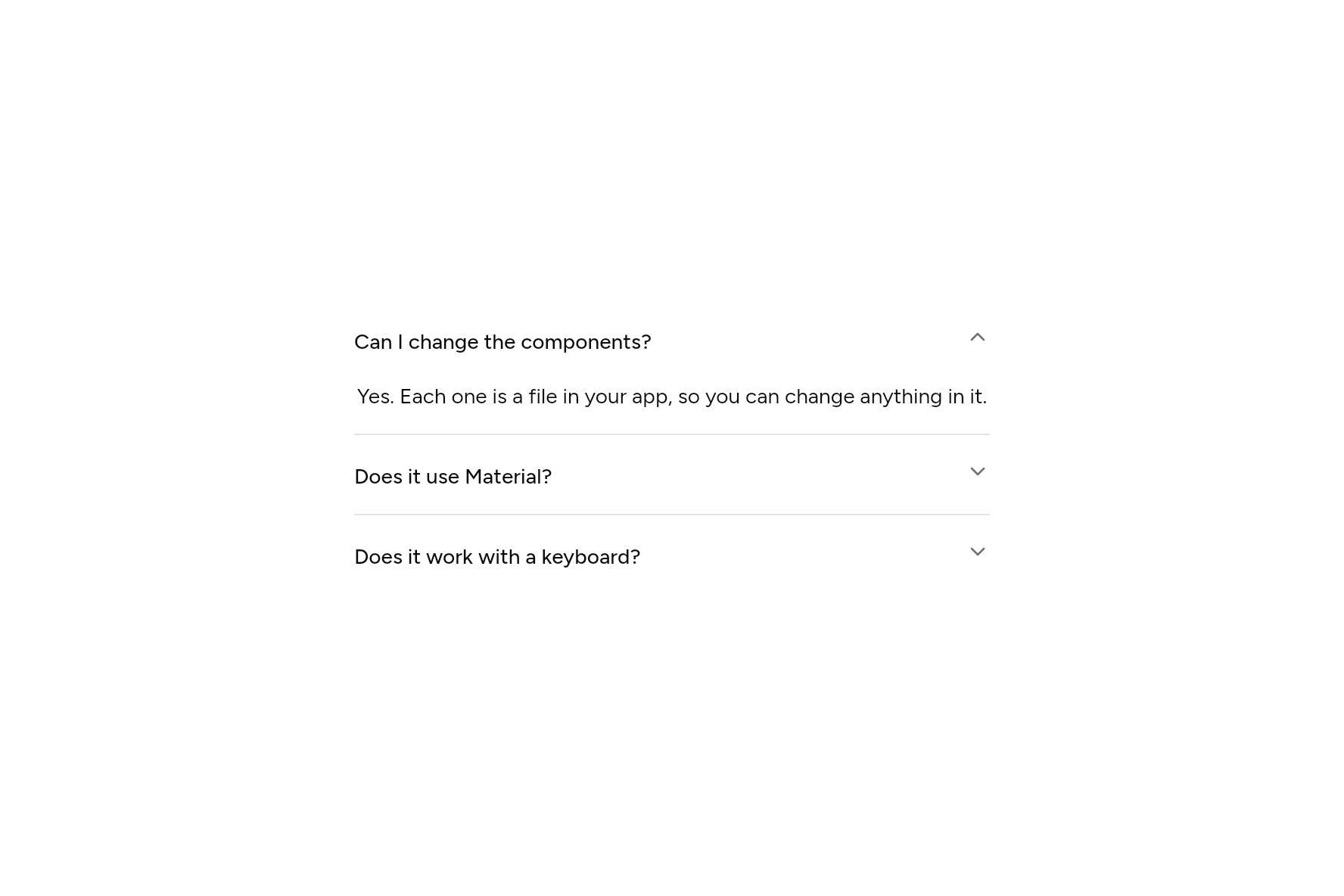
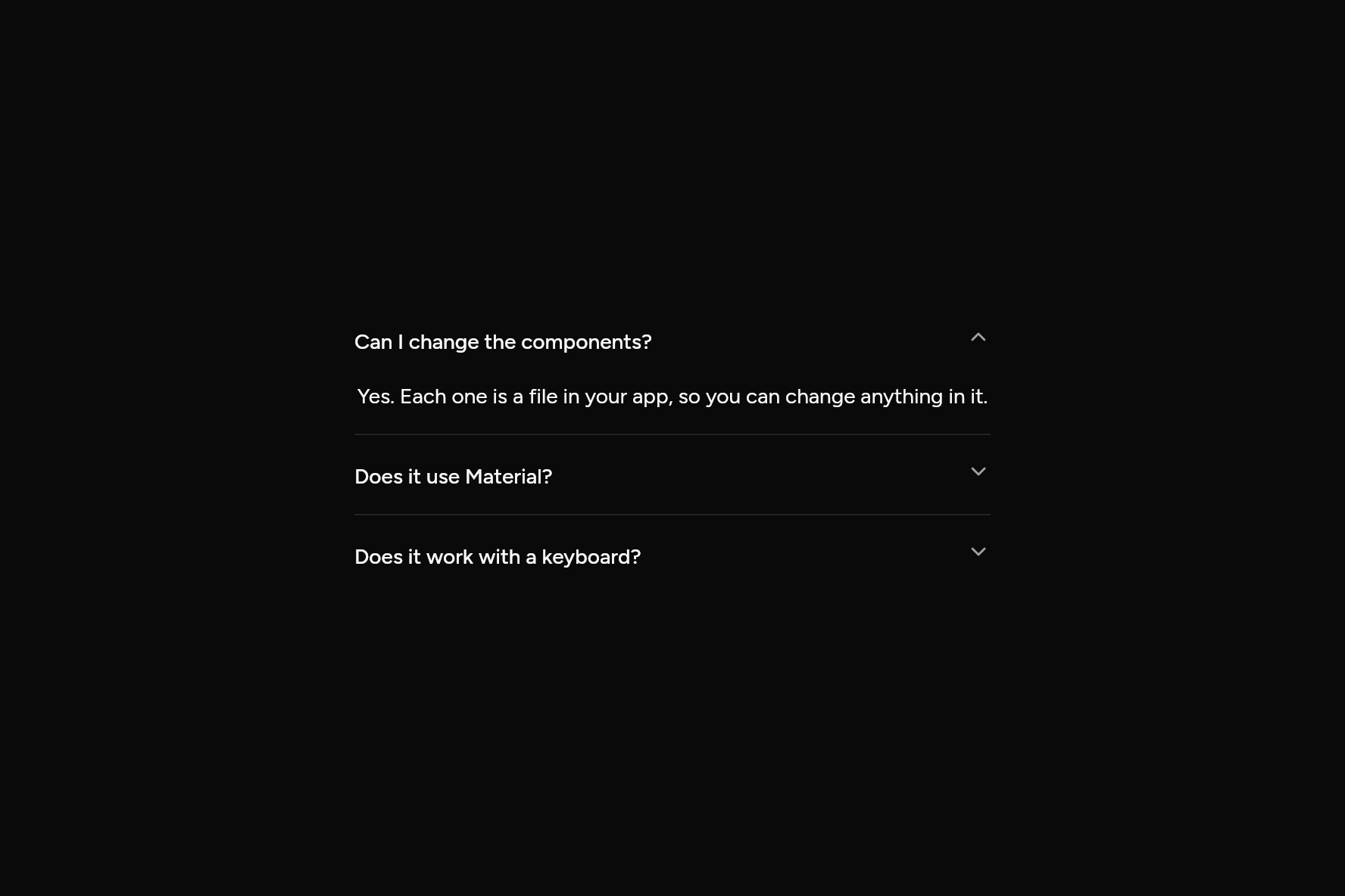
import 'package:flutter/widgets.dart';

import 'ui/accordion.dart';

class AccordionDemo extends StatelessWidget {
  const AccordionDemo({super.key});

  @override
  Widget build(BuildContext context) => const SizedBox(
    width: 420,
    child: Accordion(
      initiallyOpen: {0},
      items: [
        AccordionItem(
          title: Text('Can I change the components?'),
          content: Text('Yes. Each one is a file in your app, so you can change anything in it.'),
        ),
        AccordionItem(
          title: Text('Does it use Material?'),
          content: Text('No. Only Flutter\'s widgets layer, so nothing of Material comes along.'),
        ),
        AccordionItem(
          title: Text('Does it work with a keyboard?'),
          content: Text('Yes. Tab to a heading, then Enter or Space to open it.'),
        ),
      ],
    ),
  );
}
Try its options
Each option its constructor takes, to change and see; the code below it is what you chose, to copy.
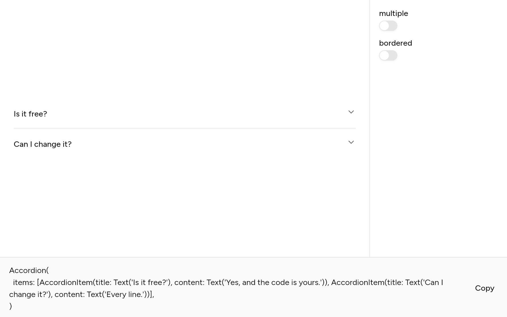
Add it
In your Flutter project:
ashlar add accordion
It writes theme.dart, palette.dart, group.dart, pressable.dart, collapsible.dart and accordion.dart into lib/ui, keeping any you already have, and adds ashlar_icons to pubspec.yaml. It needs pressable, collapsible and ashlar_icons, which come with it.
Examples
Other ways to use it, each running live, with its code.
Bordered, several open
Each in a box; any may be open.
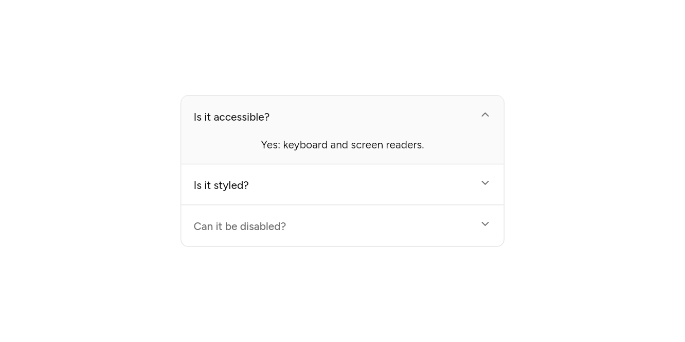
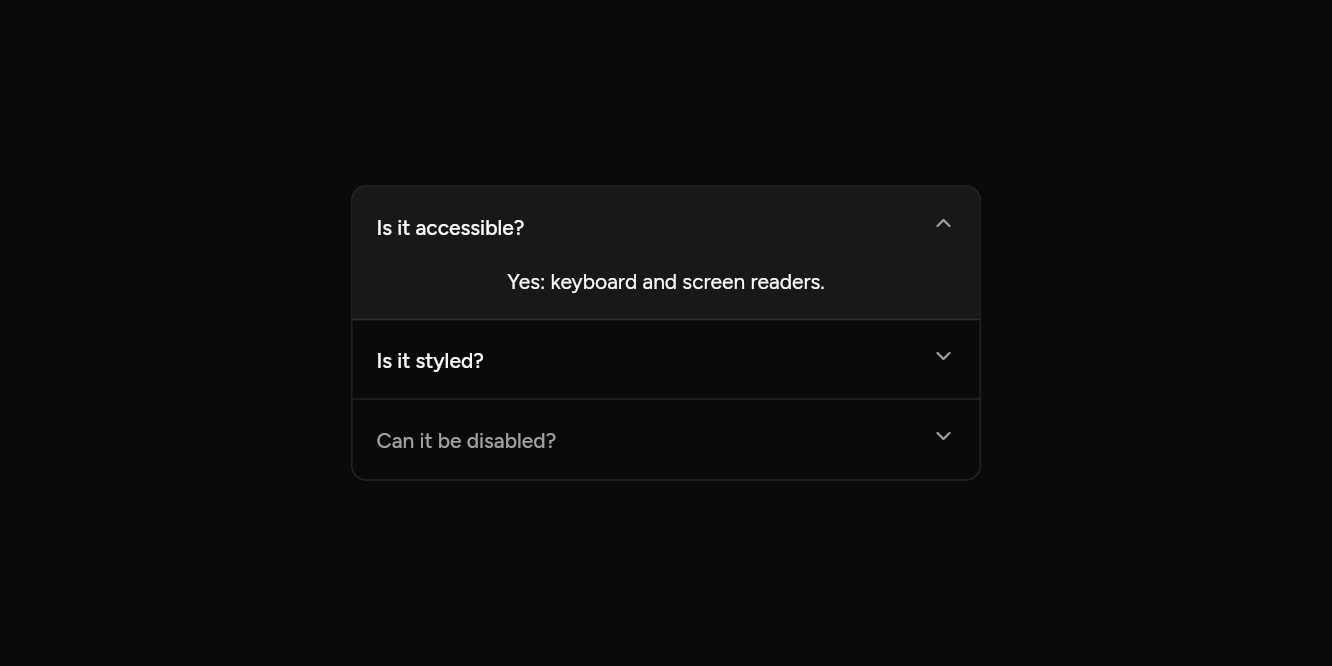
// Bordered, several open: Each in a box; any may be open.
import 'package:flutter/widgets.dart';

import 'ui/accordion.dart';

class AccordionBorderedExample extends StatelessWidget {
  const AccordionBorderedExample({super.key});

  @override
  Widget build(BuildContext context) => const SizedBox(
    width: 420,
    child: Accordion(
      bordered: true,
      multiple: true,
      initiallyOpen: {0},
      items: [
        AccordionItem(title: Text('Is it accessible?'), content: Text('Yes: keyboard and screen readers.')),
        AccordionItem(title: Text('Is it styled?'), content: Text('Yes, and the code is yours to change.')),
        AccordionItem(title: Text('Can it be disabled?'), content: Text('An item can be.'), enabled: false),
      ],
    ),
  );
}
API
Read from the source above: each parameter with its type, its default, and what it is for.
AccordionItemclass
One section of an Accordion: its heading and what opens under it.
| Parameter | Type | Default | What it is for |
|---|---|---|---|
titlerequired |
Widget |
The heading that opens and closes it. | |
contentrequired |
Widget |
What shows when it is open. | |
enabled |
bool |
true |
False keeps it shut, its heading faded. |
Accordionclass
Sections stacked one above the other, each opening under its heading. One open at a time, or any number with multiple. A screen reader hears each heading as a button that is expanded or collapsed.
| Parameter | Type | Default | What it is for |
|---|---|---|---|
itemsrequired |
List<AccordionItem> |
The items, top to bottom. | |
multiple |
bool |
false |
Several may be open at once, not one. |
initiallyOpen |
Set<int> |
const {} |
The sections open at first, by index. |
bordered |
bool |
false |
In a box with rounded corners, the open section on a muted ground. |
Source
What lands in your app. It is yours from then on: change it as you would your own code, and ashlar add
will not write over it.
lib/ui/accordion.dart 166 lines
// Ashlar UI: Accordion. Copied into your app by `ashlar add accordion`; it is yours to change.

import 'package:ashlar_icons/ashlar_icons.dart';
import 'package:flutter/widgets.dart';

import 'collapsible.dart';
import 'pressable.dart';
import 'theme.dart';

/// One section of an [Accordion]: its heading and what opens under it.
@immutable
class AccordionItem {
  const AccordionItem({
    required this.title,
    required this.content,
    this.enabled = true,
  });

  /// The heading that opens and closes it.
  final Widget title;

  /// What shows when it is open.
  final Widget content;

  /// False keeps it shut, its heading faded.
  final bool enabled;
}

/// Sections stacked one above the other, each opening under its heading. One open at a
/// time, or any number with [multiple]. A screen reader hears each heading as a button
/// that is expanded or collapsed.
///
/// ```dart
/// Accordion(items: [
///   AccordionItem(title: Text('Can I change the components?'), content: Text('Yes. They are files in your app.')),
///   AccordionItem(title: Text('Does it use Material?'), content: Text('No. Only Flutter\'s widgets layer.')),
/// ])
/// ```
class Accordion extends StatefulWidget {
  const Accordion({
    super.key,
    required this.items,
    this.multiple = false,
    this.initiallyOpen = const {},
    this.bordered = false,
  });

  /// The items, top to bottom.
  final List<AccordionItem> items;

  /// Several may be open at once, not one.
  final bool multiple;

  /// The sections open at first, by index.
  final Set<int> initiallyOpen;

  /// In a box with rounded corners, the open section on a muted ground.
  final bool bordered;

  @override
  State<Accordion> createState() => _AccordionState();
}

class _AccordionState extends State<Accordion> {
  late final Set<int> _open = {...widget.initiallyOpen};

  void _toggle(int i) => setState(() {
    if (_open.contains(i)) {
      _open.remove(i);
    } else {
      if (!widget.multiple) _open.clear();
      _open.add(i);
    }
  });

  @override
  Widget build(BuildContext context) {
    final t = AshlarTheme.of(context);
    final c = t.colors;
    final pad = widget.bordered ? 16.0 : 0.0;
    final column = Column(
      mainAxisSize: MainAxisSize.min,
      crossAxisAlignment: CrossAxisAlignment.stretch,
      children: [
        for (final (i, item) in widget.items.indexed)
          AnimatedContainer(
            duration: t.duration,
            padding: EdgeInsets.symmetric(horizontal: pad),
            decoration: BoxDecoration(
              color: widget.bordered && _open.contains(i)
                  ? c.muted.withValues(alpha: c.muted.a * .5)
                  : c.muted.withValues(alpha: 0),
              border: Border(
                bottom: BorderSide(
                  color: i == widget.items.length - 1
                      ? const Color(0x00000000)
                      : c.border,
                ),
              ),
            ),
            child: Collapsible(
              open: _open.contains(i),
              builder: (context, open, _) => Pressable(
                onPressed: item.enabled ? () => _toggle(i) : null,
                expanded: open,
                builder: (context, state) => AnimatedContainer(
                  duration: t.duration,
                  padding: const EdgeInsets.symmetric(vertical: 16),
                  decoration: BoxDecoration(
                    borderRadius: BorderRadius.circular(t.radiusMd),
                    boxShadow: [if (state.focused) ...t.focusRing],
                  ),
                  child: Row(
                    crossAxisAlignment: CrossAxisAlignment.start,
                    children: [
                      Expanded(
                        child: DefaultTextStyle.merge(
                          style: t.text.sm.copyWith(
                            color: item.enabled
                                ? c.foreground
                                : c.mutedForeground,
                            fontWeight: FontWeight.w500,
                            decoration: state.hovered && item.enabled
                                ? TextDecoration.underline
                                : null,
                            decorationColor: c.foreground,
                          ),
                          child: item.title,
                        ),
                      ),
                      const SizedBox(width: 16),
                      AnimatedRotation(
                        turns: open ? .5 : 0,
                        duration: t.duration,
                        child: AshlarIcon(
                          AshlarIconsRoundedStroke.chevronDown,
                          size: 16,
                          color: c.mutedForeground,
                        ),
                      ),
                    ],
                  ),
                ),
              ),
              child: Padding(
                padding: const EdgeInsets.only(bottom: 16),
                child: DefaultTextStyle.merge(
                  style: TextStyle(color: c.foreground),
                  child: item.content,
                ),
              ),
            ),
          ),
      ],
    );
    if (!widget.bordered) return column;
    return Container(
      clipBehavior: Clip.antiAlias,
      decoration: BoxDecoration(
        borderRadius: BorderRadius.circular(t.radiusLg),
        border: Border.all(color: c.border),
      ),
      child: column,
    );
  }
}