

Popover
A panel that opens from a trigger and floats over the page.
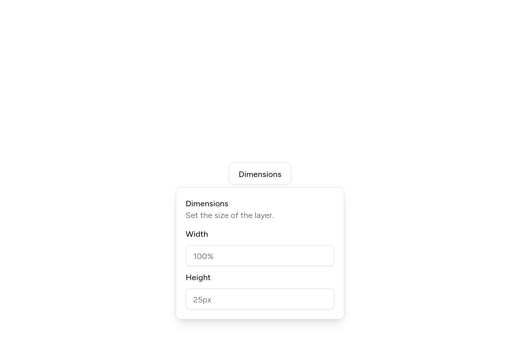
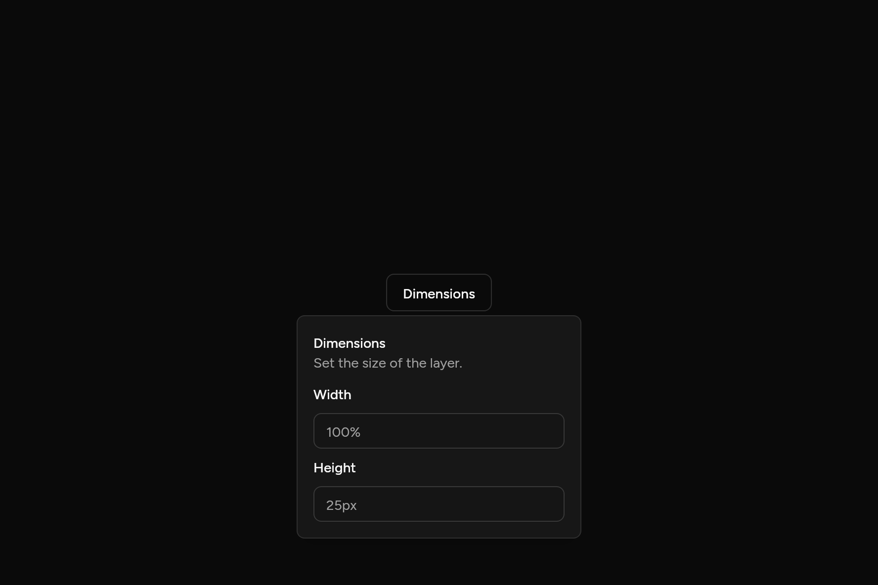
import 'package:flutter/widgets.dart';

import 'ui/button.dart';
import 'ui/field.dart';
import 'ui/input.dart';
import 'ui/popover.dart';
import 'ui/theme.dart';

class PopoverDemo extends StatelessWidget {
  const PopoverDemo({super.key});

  @override
  Widget build(BuildContext context) => Popover(
    builder: (context, menu) => Button(
      variant: ButtonVariant.outline,
      onPressed: () => menu.isOpen ? menu.close() : menu.open(),
      child: const Text('Dimensions'),
    ),
    content: (context) {
      final t = AshlarTheme.of(context);
      return Column(
        mainAxisSize: MainAxisSize.min,
        crossAxisAlignment: CrossAxisAlignment.stretch,
        children: [
          Text('Dimensions', style: t.text.sm.copyWith(fontWeight: FontWeight.w500)),
          Text('Set the size of the layer.', style: TextStyle(color: t.colors.mutedForeground)),
          const SizedBox(height: 16),
          const Field(
            label: Text('Width'),
            child: Input(placeholder: '100%'),
          ),
          const SizedBox(height: 12),
          const Field(
            label: Text('Height'),
            child: Input(placeholder: '25px'),
          ),
        ],
      );
    },
  );
}
Add it
In your Flutter project:
ashlar add popover
It writes theme.dart, palette.dart and popover.dart into lib/ui, keeping any you already have.
Examples
Other ways to use it, each running live, with its code.
Sides
Open on any side; it moves when there is no room.
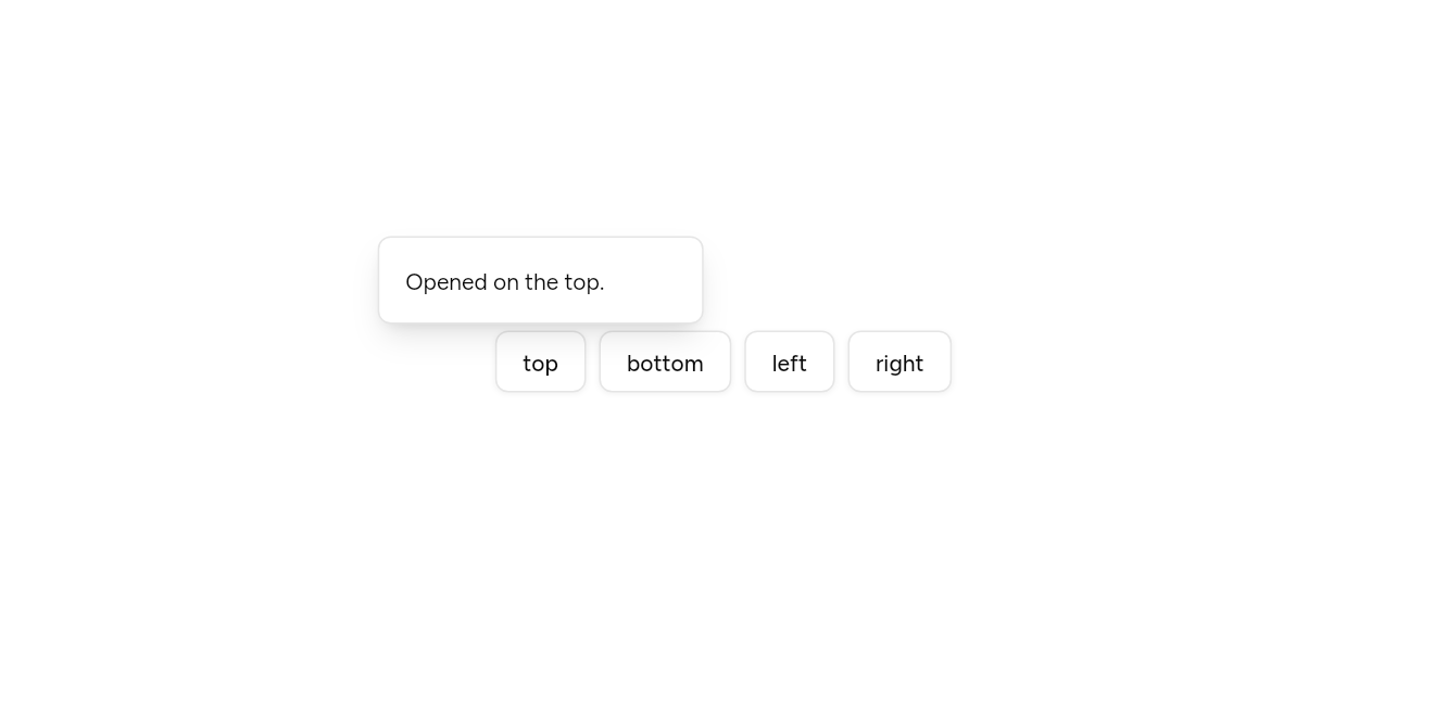
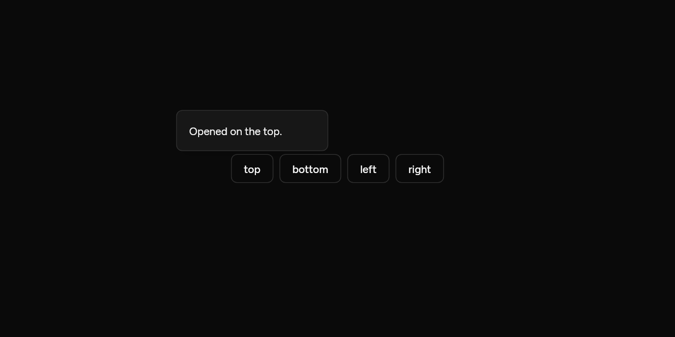
// Sides: Open on any side; it moves when there is no room.
import 'package:flutter/widgets.dart';

import 'ui/button.dart';
import 'ui/popover.dart';

class PopoverSidesExample extends StatelessWidget {
  const PopoverSidesExample({super.key});

  @override
  Widget build(BuildContext context) => Wrap(
    spacing: 8,
    children: [
      for (final side in PopoverSide.values)
        Popover(
          side: side,
          width: 200,
          builder: (context, menu) =>
              Button(variant: ButtonVariant.outline, onPressed: menu.open, child: Text(side.name)),
          content: (context) => Text('Opened on the ${side.name}.'),
        ),
    ],
  );
}
With a header
A title and a line under it, then fields.
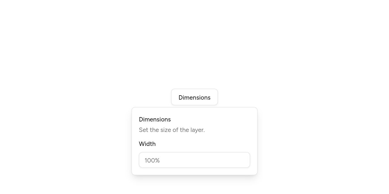
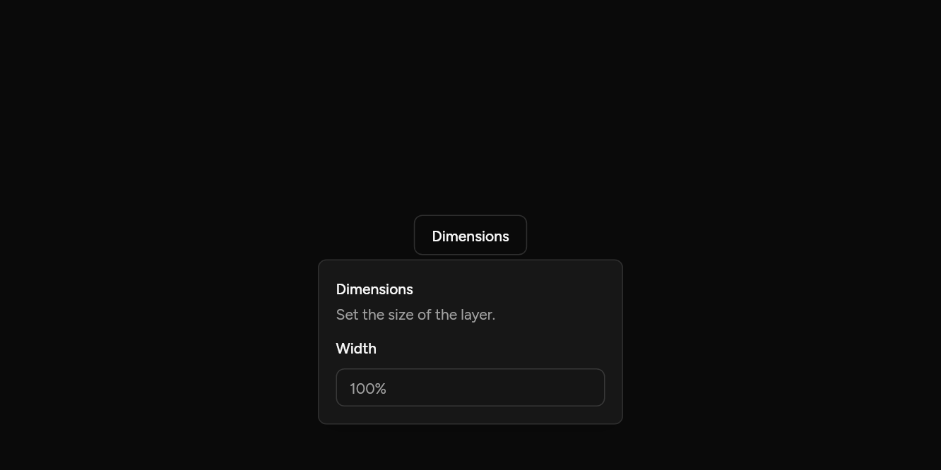
// With a header: A title and a line under it, then fields.
import 'package:flutter/widgets.dart';

import 'ui/button.dart';
import 'ui/field.dart';
import 'ui/input.dart';
import 'ui/popover.dart';

class PopoverHeaderExample extends StatelessWidget {
  const PopoverHeaderExample({super.key});

  @override
  Widget build(BuildContext context) => Popover(
    builder: (context, menu) =>
        Button(variant: ButtonVariant.outline, onPressed: menu.open, child: const Text('Dimensions')),
    content: (context) => const Column(
      mainAxisSize: MainAxisSize.min,
      crossAxisAlignment: CrossAxisAlignment.stretch,
      children: [
        PopoverHeader(title: Text('Dimensions'), description: Text('Set the size of the layer.')),
        SizedBox(height: 16),
        Field(
          label: Text('Width'),
          child: Input(placeholder: '100%'),
        ),
      ],
    ),
  );
}
API
Read from the source above: each parameter with its type, its default, and what it is for.
PopoverSideenum
Which side of its trigger a panel opens on. It flips when there is no room.
| Value | What it is for |
|---|---|
top | |
bottom | |
left | |
right |
PopoverAlignenum
How a panel lines up with its trigger.
| Value | What it is for |
|---|---|
start | |
center | |
end |
Popoverclass
A panel that opens from a trigger and floats over the page: extra settings, a short form, details. builder draws the trigger and gets the controller that opens it.
| Parameter | Type | Default | What it is for |
|---|---|---|---|
builderrequired |
Widget Function(BuildContext context, MenuController controller) |
Builds what opens it, given a controller to open and close it with. | |
contentrequired |
WidgetBuilder |
Builds what the panel shows. | |
controller |
MenuController? |
Opens and closes it from outside; one is made when not given. | |
side |
PopoverSide |
PopoverSide.bottom |
Which side it opens on. It moves to the other side when there is no room. |
align |
PopoverAlign |
PopoverAlign.center |
How it lines up along that side: at the start, the centre or the end. |
width |
double |
288 |
How wide the panel is. |
PopoverPanelclass
The floating panel a Popover, Dropdown Menu or Select opens: placed against the trigger in info, flipped and kept on screen, and drawn with the popover colours.
| Parameter | Type | Default | What it is for |
|---|---|---|---|
inforequired |
RawMenuOverlayInfo |
Where it opens: the rectangle of what opened it, and the room around. | |
childrequired |
Widget |
What the panel shows. | |
side |
PopoverSide |
PopoverSide.bottom |
Which side it opens on. It moves to the other side when there is no room. |
align |
PopoverAlign |
PopoverAlign.start |
How it lines up along that side: at the start, the centre or the end. |
width |
double? |
Null sizes the panel to its content. | |
minWidth |
double |
128 |
The narrowest it is. |
matchWidth |
bool |
false |
As wide as the trigger, unless width says wider: a select's list under its field. |
gap |
double |
4 |
The space between the trigger and the panel; a submenu overlaps its row with a little less than none. |
PopoverHeaderclass
The top of a popover's content: a title and a line about it.
| Parameter | Type | Default | What it is for |
|---|---|---|---|
titlerequired |
Widget |
The panel's title. | |
description |
Widget? |
A line under the title. |
Source
What lands in your app. It is yours from then on: change it as you would your own code, and ashlar add
will not write over it.
lib/ui/popover.dart 377 lines
// Ashlar UI: Popover. Copied into your app by `ashlar add popover`; it is yours to change.
//
// Built on RawMenuAnchor from Flutter's widgets layer, which opens and closes the panel,
// closes it on Escape, and closes it when the page scrolls. This
// file closes the panel on a tap outside, places it and draws it. Dropdown Menu and Select use the same panel.

import 'package:flutter/services.dart';
import 'package:flutter/widgets.dart';

import 'theme.dart';

/// Which side of its trigger a panel opens on. It flips when there is no room.
enum PopoverSide { top, bottom, left, right }

/// How a panel lines up with its trigger.
enum PopoverAlign { start, center, end }

/// A panel that opens from a trigger and floats over the page: extra settings, a short
/// form, details. [builder] draws the trigger and gets the controller that opens it.
///
/// ```dart
/// Popover(
///   builder: (context, menu) => Button(onPressed: menu.open, child: Text('Dimensions')),
///   content: (context) => Column(children: [...]),
/// )
/// ```
class Popover extends StatefulWidget {
  const Popover({
    super.key,
    required this.builder,
    required this.content,
    this.controller,
    this.side = PopoverSide.bottom,
    this.align = PopoverAlign.center,
    this.width = 288,
  });

  /// Builds what opens it, given a controller to open and close it with.
  final Widget Function(BuildContext context, MenuController controller)
  builder;

  /// Builds what the panel shows.
  final WidgetBuilder content;

  /// Opens and closes it from outside; one is made when not given.
  final MenuController? controller;

  /// Which side it opens on. It moves to the other side when there is no room.
  final PopoverSide side;

  /// How it lines up along that side: at the start, the centre or the end.
  final PopoverAlign align;

  /// How wide the panel is.
  final double width;

  @override
  State<Popover> createState() => _PopoverState();
}

class _PopoverState extends State<Popover> {
  final _own = MenuController();

  @override
  Widget build(BuildContext context) {
    final t = AshlarTheme.of(context);
    return RawMenuAnchor(
      controller: widget.controller ?? _own,
      builder: (context, controller, _) => widget.builder(context, controller),
      overlayBuilder: (context, info) => PopoverPanel(
        info: info,
        side: widget.side,
        align: widget.align,
        width: widget.width,
        child: FocusScope(
          autofocus: true,
          // Scrolls when the room beside the trigger is shorter than the content.
          child: SingleChildScrollView(
            padding: EdgeInsets.all(t.space(16)),
            child: DefaultTextStyle.merge(
              style: t.text.sm,
              child: Builder(builder: widget.content),
            ),
          ),
        ),
      ),
    );
  }
}

/// The floating panel a Popover, Dropdown Menu or Select opens: placed against the
/// trigger in [info], flipped and kept on screen, and drawn with the popover colours.
class PopoverPanel extends StatelessWidget {
  const PopoverPanel({
    super.key,
    required this.info,
    required this.child,
    this.side = PopoverSide.bottom,
    this.align = PopoverAlign.start,
    this.width,
    this.minWidth = 128,
    this.matchWidth = false,
    this.gap = 4,
  });

  /// Where it opens: the rectangle of what opened it, and the room around.
  final RawMenuOverlayInfo info;

  /// What the panel shows.
  final Widget child;

  /// Which side it opens on. It moves to the other side when there is no room.
  final PopoverSide side;

  /// How it lines up along that side: at the start, the centre or the end.
  final PopoverAlign align;

  /// Null sizes the panel to its content.
  final double? width;

  /// The narrowest it is.
  final double minWidth;

  /// As wide as the trigger, unless [width] says wider: a select's list under its field.
  final bool matchWidth;

  /// The space between the trigger and the panel; a submenu overlaps its row with a
  /// little less than none.
  final double gap;

  @override
  Widget build(BuildContext context) {
    final t = AshlarTheme.of(context);
    final c = t.colors;
    final min = matchWidth ? info.anchorRect.width : minWidth;
    return CustomSingleChildLayout(
      // Opened at a point (a right-click), it is placed against that point instead.
      delegate: _Place(
        info.position == null
            ? info.anchorRect
            : Rect.fromLTWH(
                info.anchorRect.left + info.position!.dx,
                info.anchorRect.top + info.position!.dy,
                0,
                0,
              ),
        side,
        align,
        gap,
        isRtl(context),
      ),
      child: TapRegion(
        groupId: info.tapRegionGroupId,
        // RawMenuAnchor closes only submenus on a tap outside; the panel closes itself.
        onTapOutside: (_) => MenuController.maybeOf(context)?.close(),
        // RawMenuAnchor closes on DismissIntent; Escape inside the panel sends it.
        child: Shortcuts(
          includeSemantics: false,
          shortcuts: const {
            SingleActivator(LogicalKeyboardKey.escape): DismissIntent(),
          },
          child: _Entrance(
            side: side,
            duration: t.duration,
            child: Container(
              width: width != null
                  ? (width! < min ? min : width)
                  : (matchWidth ? min : null),
              constraints: BoxConstraints(minWidth: min),
              decoration: BoxDecoration(
                color: c.popover,
                borderRadius: BorderRadius.circular(t.radiusMd),
                border: Border.all(color: c.border),
                boxShadow: t.shadowLg,
              ),
              child: DefaultTextStyle.merge(
                style: TextStyle(color: c.popoverForeground),
                child: IconTheme.merge(
                  data: IconThemeData(color: c.popoverForeground, size: 16),
                  child: child,
                ),
              ),
            ),
          ),
        ),
      ),
    );
  }
}

class _Place extends SingleChildLayoutDelegate {
  _Place(this.anchor, this.side, this.align, this.gap, this.rtl);

  final Rect anchor;
  final PopoverSide side;
  final PopoverAlign align;
  final double gap;

  /// Start and end swap in right-to-left text.
  final bool rtl;
  static const margin = 8.0;

  bool get _across => side == PopoverSide.left || side == PopoverSide.right;

  @override
  BoxConstraints getConstraintsForChild(BoxConstraints constraints) {
    final room = constraints.biggest;
    if (_across) {
      // Beside the trigger: the whole height, and the wider side's width.
      final right = room.width - anchor.right - gap - margin,
          left = anchor.left - gap - margin;
      final width = side == PopoverSide.right
          ? (right >= 200 || right >= left ? right : left)
          : (left >= 200 || left >= right ? left : right);
      return BoxConstraints.loose(
        Size(width.clamp(0, room.width), room.height - margin * 2),
      );
    }
    final below = room.height - anchor.bottom - gap - margin,
        above = anchor.top - gap - margin;
    final height = side == PopoverSide.bottom
        ? (below >= 200 || below >= above ? below : above)
        : (above >= 200 || above >= below ? above : below);
    return BoxConstraints.loose(
      Size(room.width - margin * 2, height.clamp(0, room.height)),
    );
  }

  @override
  Offset getPositionForChild(Size size, Size child) {
    double along(
      double start,
      double centre,
      double end,
      double length,
      double room,
    ) {
      // Along the line, start is the right in right-to-left text.
      final flip = rtl && !_across;
      final v = switch (align) {
        PopoverAlign.start => flip ? end - length : start,
        PopoverAlign.center => centre - length / 2,
        PopoverAlign.end => flip ? start : end - length,
      };
      return v.clamp(
        margin,
        (room - length - margin).clamp(margin, double.infinity),
      );
    }

    if (_across) {
      final y = along(
        anchor.top,
        anchor.center.dy,
        anchor.bottom,
        child.height,
        size.height,
      );
      final fitsRight = anchor.right + gap + child.width <= size.width - margin;
      final fitsLeft = anchor.left - gap - child.width >= margin;
      // The side asked for, unless it does not fit and the other does.
      final right = side == PopoverSide.right
          ? (fitsRight || !fitsLeft)
          : !(fitsLeft || !fitsRight);
      return Offset(
        right ? anchor.right + gap : anchor.left - gap - child.width,
        y,
      );
    }
    final x = along(
      anchor.left,
      anchor.center.dx,
      anchor.right,
      child.width,
      size.width,
    );
    final fitsBelow =
        anchor.bottom + gap + child.height <= size.height - margin;
    final fitsAbove = anchor.top - gap - child.height >= margin;
    final down = side == PopoverSide.bottom
        ? (fitsBelow || !fitsAbove)
        : !(fitsAbove || !fitsBelow);
    return Offset(
      x,
      down ? anchor.bottom + gap : anchor.top - gap - child.height,
    );
  }

  @override
  bool shouldRelayout(_Place old) =>
      old.anchor != anchor ||
      old.side != side ||
      old.align != align ||
      old.gap != gap ||
      old.rtl != rtl;
}

/// Fades the panel in, grown from 95%, sliding a little from the trigger's side.
class _Entrance extends StatelessWidget {
  const _Entrance({
    required this.child,
    required this.side,
    required this.duration,
  });

  final Widget child;
  final PopoverSide side;
  final Duration duration;

  @override
  Widget build(BuildContext context) {
    if (MediaQuery.maybeDisableAnimationsOf(context) ?? false) return child;
    // It comes a little way out of the trigger, growing from the edge nearest it.
    final (Offset from, Alignment origin) = switch (side) {
      PopoverSide.bottom => (const Offset(0, -8), Alignment.topCenter),
      PopoverSide.top => (const Offset(0, 8), Alignment.bottomCenter),
      PopoverSide.right => (const Offset(-8, 0), Alignment.centerLeft),
      PopoverSide.left => (const Offset(8, 0), Alignment.centerRight),
    };
    return TweenAnimationBuilder<double>(
      tween: Tween(begin: 0, end: 1),
      duration: duration,
      curve: Curves.easeOut,
      child: child,
      builder: (context, v, child) => Opacity(
        opacity: v,
        child: Transform.translate(
          offset: from * (1 - v),
          child: Transform.scale(
            scale: .95 + .05 * v,
            alignment: origin,
            child: child,
          ),
        ),
      ),
    );
  }
}

/// The top of a popover's content: a title and a line about it.
class PopoverHeader extends StatelessWidget {
  const PopoverHeader({super.key, required this.title, this.description});

  /// The panel's title.
  final Widget title;

  /// A line under the title.
  final Widget? description;

  @override
  Widget build(BuildContext context) {
    final t = AshlarTheme.of(context);
    return Column(
      mainAxisSize: MainAxisSize.min,
      crossAxisAlignment: CrossAxisAlignment.start,
      children: [
        Semantics(
          header: true,
          child: DefaultTextStyle.merge(
            style: t.text.sm.copyWith(
              color: t.colors.popoverForeground,
              fontWeight: FontWeight.w500,
            ),
            child: title,
          ),
        ),
        if (description != null) ...[
          const SizedBox(height: 4),
          DefaultTextStyle.merge(
            style: t.text.sm.copyWith(color: t.colors.mutedForeground),
            child: description!,
          ),
        ],
      ],
    );
  }
}