

Bottom Bar
An app's main places along the bottom of a phone screen, an icon and a name each.
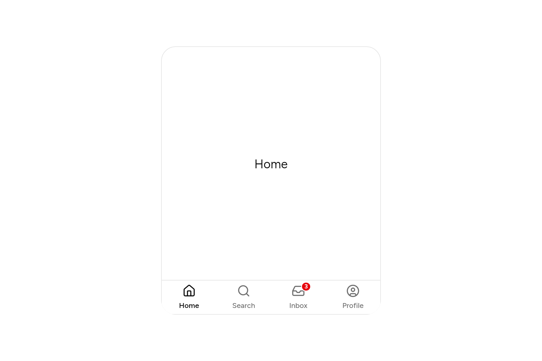
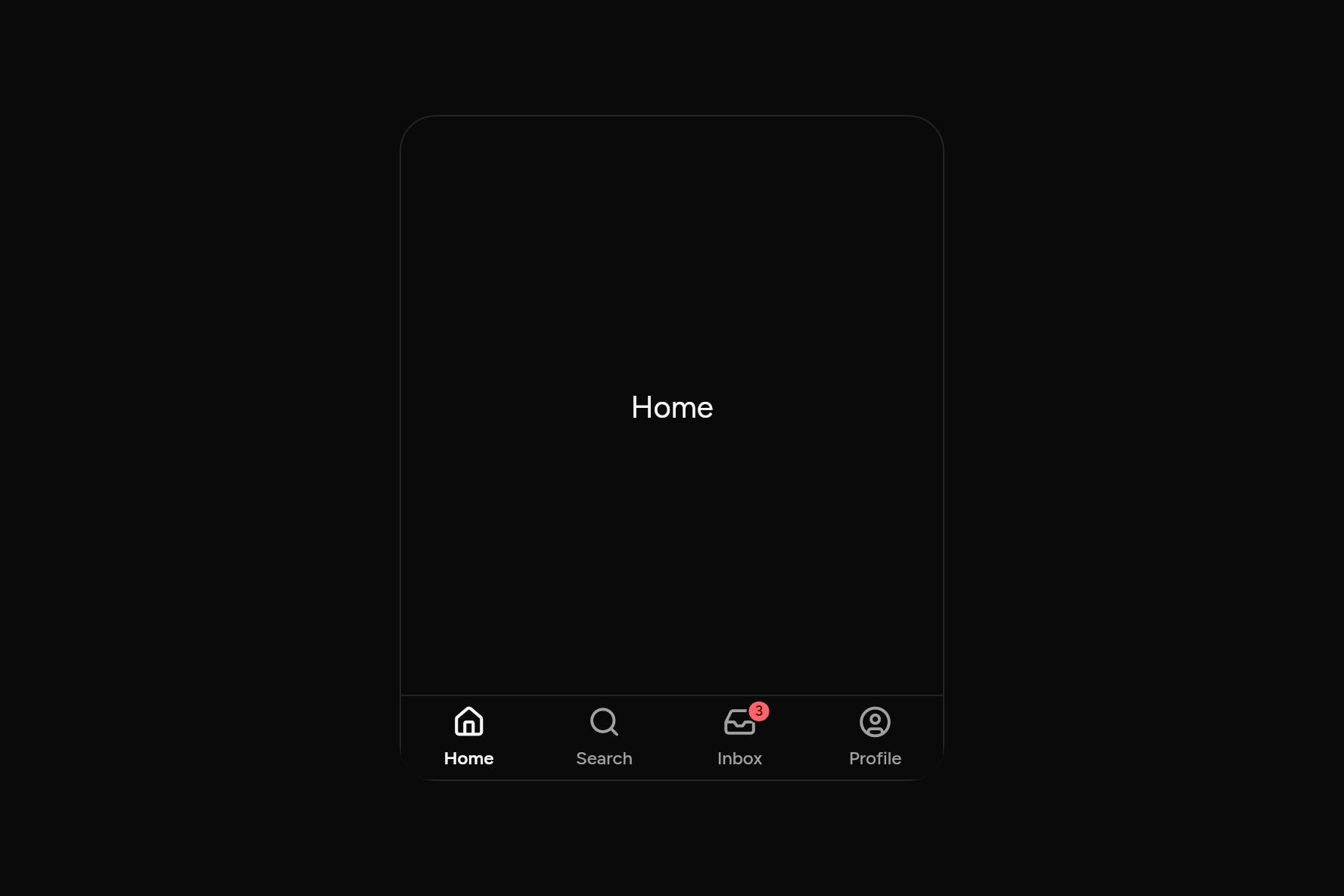
import 'package:ashlar_icons/ashlar_icons.dart';
import 'package:flutter/widgets.dart';

import 'ui/bottom_bar.dart';
import 'ui/theme.dart';

class BottomBarDemo extends StatefulWidget {
  const BottomBarDemo({super.key});

  @override
  State<BottomBarDemo> createState() => _BottomBarDemoState();
}

class _BottomBarDemoState extends State<BottomBarDemo> {
  var page = 0;
  static const pages = ['Home', 'Search', 'Inbox', 'Profile'];

  @override
  Widget build(BuildContext context) {
    final t = AshlarTheme.of(context);
    // A phone's screen, the bar along its foot.
    return Container(
      width: 360,
      height: 440,
      clipBehavior: Clip.antiAlias,
      decoration: BoxDecoration(
        border: Border.all(color: t.colors.border),
        borderRadius: BorderRadius.circular(24),
      ),
      child: Column(
        children: [
          Expanded(
            child: Center(child: Text(pages[page], style: t.text.xl)),
          ),
          BottomBar(
            index: page,
            onChanged: (i) => setState(() => page = i),
            items: const [
              BottomBarItem(label: 'Home', icon: AshlarIcon(AshlarIconsRoundedStroke.house)),
              BottomBarItem(label: 'Search', icon: AshlarIcon(AshlarIconsRoundedStroke.search)),
              BottomBarItem(label: 'Inbox', icon: AshlarIcon(AshlarIconsRoundedStroke.inbox), badge: '3'),
              BottomBarItem(label: 'Profile', icon: AshlarIcon(AshlarIconsRoundedStroke.circleUser)),
            ],
          ),
        ],
      ),
    );
  }
}
Try its options
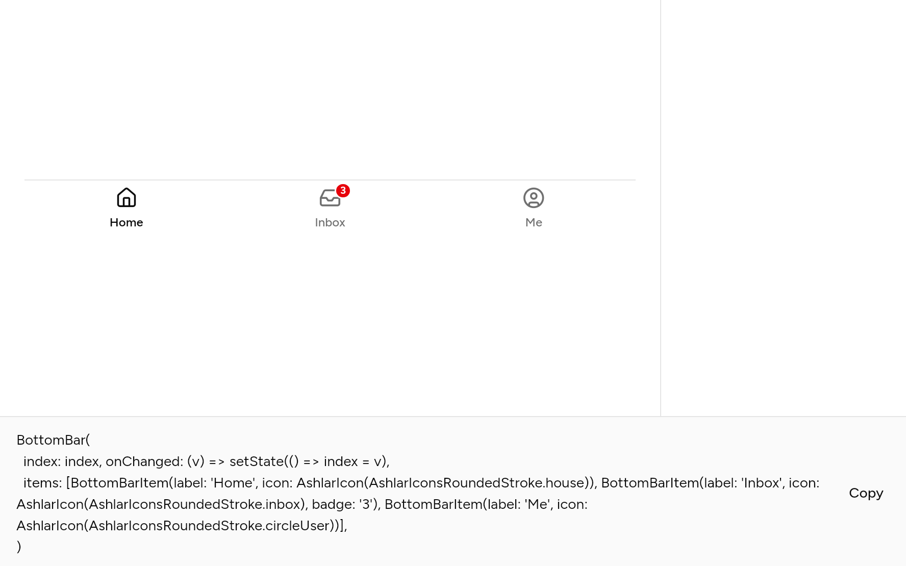
Each option its constructor takes, to change and see; the code below it is what you chose, to copy.
Add it
In your Flutter project:
ashlar add bottom-bar
It writes theme.dart, palette.dart, group.dart, pressable.dart and bottom_bar.dart into lib/ui, keeping any you already have. It needs pressable, which come with it.
API
Read from the source above: each parameter with its type, its default, and what it is for.
BottomBarItemclass
One place in a BottomBar.
| Parameter | Type | Default | What it is for |
|---|---|---|---|
labelrequired |
String |
Its name, under the icon. | |
iconrequired |
Widget |
||
activeIcon |
Widget? |
Shown instead of icon while it is the place you are: a filled icon, say. |
|
badge |
String? |
A count to show on the icon: unread messages. Null shows none. |
BottomBarclass
An app's main places along the bottom of a phone screen, an icon and a name each, above the home indicator. Two to five places; the one you are in stands out.
To a screen reader it is a tab bar; from a keyboard, the arrow keys move along it.
| Parameter | Type | Default | What it is for |
|---|---|---|---|
itemsrequired |
List<BottomBarItem> |
||
indexrequired |
int |
The place you are in. | |
onChangedrequired |
ValueChanged<int> |
Told the place chosen. |
Source
What lands in your app. It is yours from then on: change it as you would your own code, and ashlar add
will not write over it.
lib/ui/bottom_bar.dart 193 lines
// Ashlar UI: Bottom Bar. Copied into your app by `ashlar add bottom-bar`; it is yours to
// change.

import 'dart:ui' show SemanticsRole;

import 'package:flutter/services.dart';
import 'package:flutter/widgets.dart';

import 'pressable.dart';
import 'theme.dart';

/// One place in a [BottomBar].
@immutable
class BottomBarItem {
  const BottomBarItem({
    required this.label,
    required this.icon,
    this.activeIcon,
    this.badge,
  });

  /// Its name, under the icon.
  final String label;
  final Widget icon;

  /// Shown instead of [icon] while it is the place you are: a filled icon, say.
  final Widget? activeIcon;

  /// A count to show on the icon: unread messages. Null shows none.
  final String? badge;
}

/// An app's main places along the bottom of a phone screen, an icon and a name each,
/// above the home indicator. Two to five places; the one you are in stands out.
///
/// To a screen reader it is a tab bar; from a keyboard, the arrow keys move along it.
///
/// ```dart
/// BottomBar(
///   index: page,
///   onChanged: (i) => setState(() => page = i),
///   items: [
///     BottomBarItem(label: 'Home', icon: AshlarIcon(AshlarIconsRoundedStroke.house)),
///     BottomBarItem(label: 'Inbox', icon: AshlarIcon(AshlarIconsRoundedStroke.inbox), badge: '3'),
///   ],
/// )
/// ```
class BottomBar extends StatelessWidget {
  const BottomBar({
    super.key,
    required this.items,
    required this.index,
    required this.onChanged,
  }) : assert(items.length >= 2 && items.length <= 5);

  final List<BottomBarItem> items;

  /// The place you are in.
  final int index;

  /// Told the place chosen.
  final ValueChanged<int> onChanged;

  @override
  Widget build(BuildContext context) {
    final t = AshlarTheme.of(context);
    final c = t.colors;
    final rtl = isRtl(context);
    void step(int by) => onChanged((index + (rtl ? -by : by)) % items.length);
    return DecoratedBox(
      decoration: BoxDecoration(
        color: c.background,
        border: Border(top: BorderSide(color: c.border)),
      ),
      child: SafeArea(
        top: false,
        child: CallbackShortcuts(
          bindings: {
            const SingleActivator(LogicalKeyboardKey.arrowRight): () => step(1),
            const SingleActivator(LogicalKeyboardKey.arrowLeft): () => step(-1),
          },
          child: Semantics(
            role: SemanticsRole.tabBar,
            container: true,
            explicitChildNodes: true,
            child: SizedBox(
              height: 56,
              child: Row(
                children: [
                  for (final (i, item) in items.indexed)
                    Expanded(
                      child: Pressable(
                        role: SemanticsRole.tab,
                        selected: i == index,
                        semanticLabel: item.badge == null
                            ? item.label
                            : '${item.label}, ${item.badge}',
                        onPressed: () => onChanged(i),
                        builder: (context, state) {
                          final on = i == index;
                          final ink = on ? c.foreground : c.mutedForeground;
                          return AnimatedContainer(
                            duration: t.duration,
                            margin: const EdgeInsets.all(4),
                            decoration: BoxDecoration(
                              color: state.hovered
                                  ? c.muted
                                  : c.muted.withValues(alpha: 0),
                              borderRadius: BorderRadius.circular(t.radiusMd),
                              border: state.focused
                                  ? Border.all(color: c.ring, width: 2)
                                  : null,
                            ),
                            child: Column(
                              mainAxisAlignment: MainAxisAlignment.center,
                              children: [
                                Stack(
                                  clipBehavior: Clip.none,
                                  children: [
                                    IconTheme.merge(
                                      data: IconThemeData(color: ink, size: 22),
                                      child: on
                                          ? item.activeIcon ?? item.icon
                                          : item.icon,
                                    ),
                                    if (item.badge != null)
                                      PositionedDirectional(
                                        top: -4,
                                        end: -10,
                                        child: Container(
                                          constraints: const BoxConstraints(
                                            minWidth: 16,
                                          ),
                                          // As tall as it is drawn, or taller when larger text needs it.
                                          height: grownHeight(
                                            context,
                                            16,
                                            line: 10,
                                          ),
                                          padding: const EdgeInsets.symmetric(
                                            horizontal: 4,
                                          ),
                                          alignment: Alignment.center,
                                          decoration: BoxDecoration(
                                            color: c.destructive,
                                            borderRadius: BorderRadius.circular(
                                              8,
                                            ),
                                            border: Border.all(
                                              color: c.background,
                                              width: 1.5,
                                            ),
                                          ),
                                          child: Text(
                                            item.badge!,
                                            style: t.text.xs.copyWith(
                                              fontSize: 10,
                                              height: 1,
                                              color: c.destructiveForeground,
                                              fontWeight: FontWeight.w600,
                                            ),
                                          ),
                                        ),
                                      ),
                                  ],
                                ),
                                const SizedBox(height: 4),
                                Text(
                                  item.label,
                                  maxLines: 1,
                                  overflow: TextOverflow.ellipsis,
                                  style: t.text.xs.copyWith(
                                    color: ink,
                                    fontWeight: on
                                        ? FontWeight.w600
                                        : FontWeight.w500,
                                  ),
                                ),
                              ],
                            ),
                          );
                        },
                      ),
                    ),
                ],
              ),
            ),
          ),
        ),
      ),
    );
  }
}