

Radio
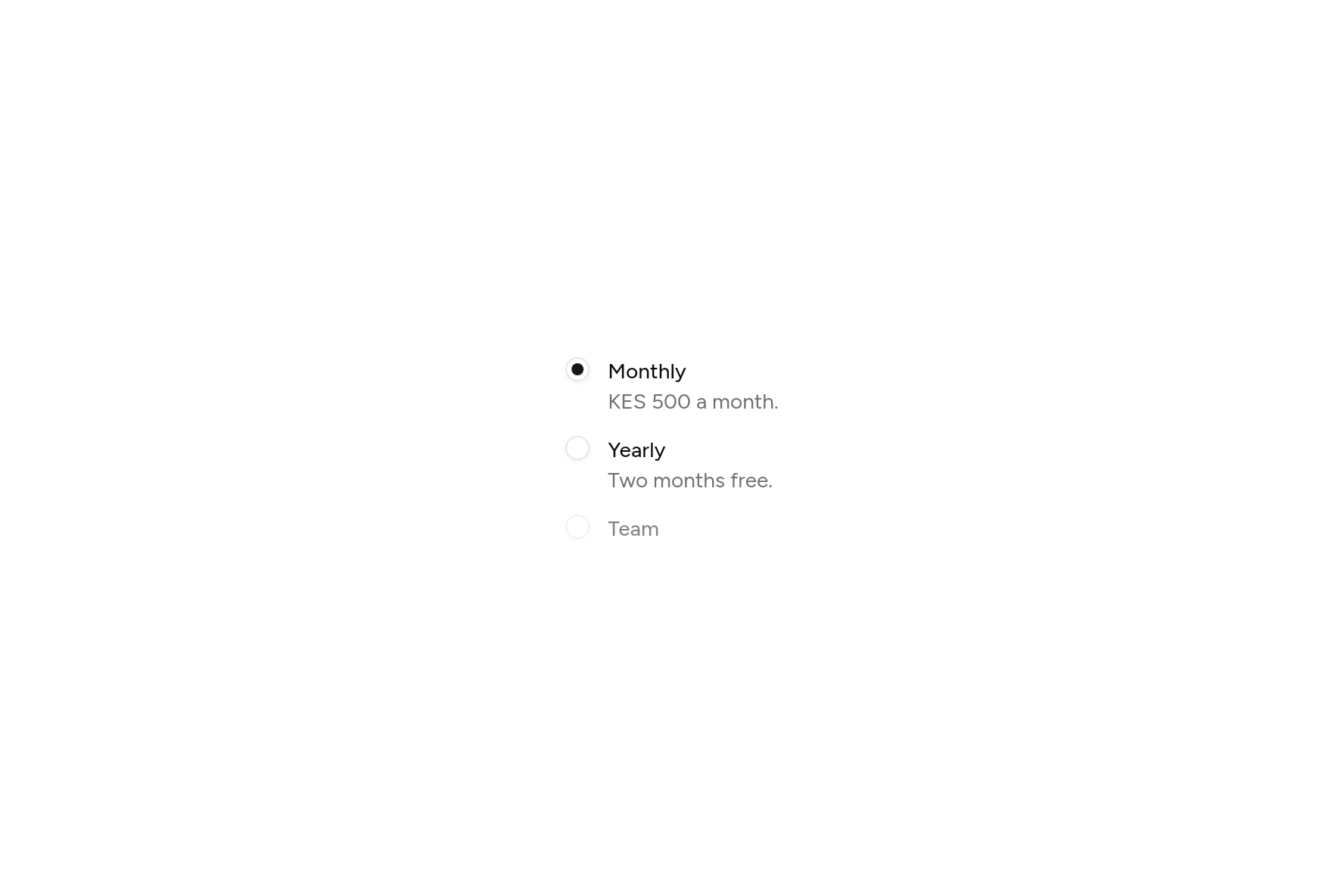
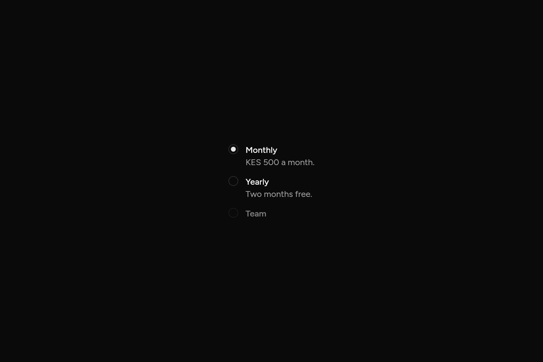
A choice of one, in Flutter's RadioGroup, with labels.
import 'package:flutter/widgets.dart';

import 'ui/radio.dart';

class RadioDemo extends StatefulWidget {
  const RadioDemo({super.key});

  @override
  State<RadioDemo> createState() => _RadioDemoState();
}

class _RadioDemoState extends State<RadioDemo> {
  String? plan = 'monthly';

  @override
  Widget build(BuildContext context) => RadioGroup<String>(
    groupValue: plan,
    onChanged: (v) => setState(() => plan = v),
    child: const Column(
      mainAxisSize: MainAxisSize.min,
      crossAxisAlignment: CrossAxisAlignment.start,
      children: [
        Radio(value: 'monthly', label: Text('Monthly'), description: Text('KES 500 a month.')),
        SizedBox(height: 12),
        Radio(value: 'yearly', label: Text('Yearly'), description: Text('Two months free.')),
        SizedBox(height: 12),
        Radio(value: 'team', label: Text('Team'), enabled: false),
      ],
    ),
  );
}
Add it
In your Flutter project:
$
ashlar add radio
It writes theme.dart, palette.dart and radio.dart into lib/ui, keeping any you already have.
Examples
Other ways to use it, each running live, with its code.
As cards
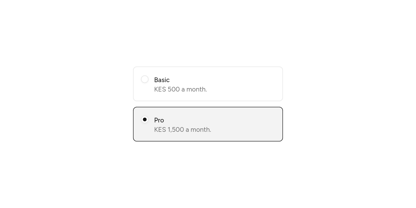
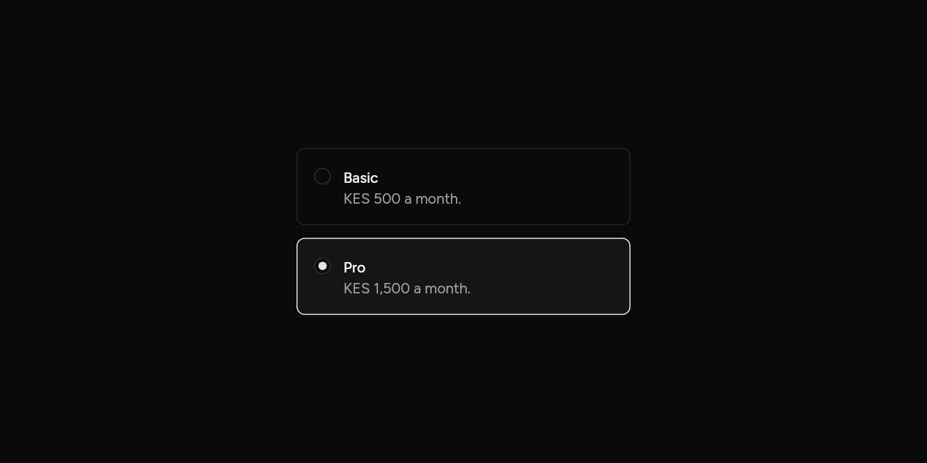
Each option a card to pick.
// As cards: Each option a card to pick.
import 'package:flutter/widgets.dart';

import 'ui/radio.dart';

class RadioCardsExample extends StatefulWidget {
  const RadioCardsExample({super.key});

  @override
  State<RadioCardsExample> createState() => _RadioCardsExampleState();
}

class _RadioCardsExampleState extends State<RadioCardsExample> {
  String? plan = 'pro';

  @override
  Widget build(BuildContext context) => SizedBox(
    width: 320,
    child: RadioGroup<String>(
      groupValue: plan,
      onChanged: (v) => setState(() => plan = v),
      child: const Column(
        mainAxisSize: MainAxisSize.min,
        crossAxisAlignment: CrossAxisAlignment.stretch,
        children: [
          Radio(value: 'basic', card: true, label: Text('Basic'), description: Text('KES 500 a month.')),
          SizedBox(height: 12),
          Radio(value: 'pro', card: true, label: Text('Pro'), description: Text('KES 1,500 a month.')),
        ],
      ),
    ),
  );
}
Wrong
Marked until one is chosen.
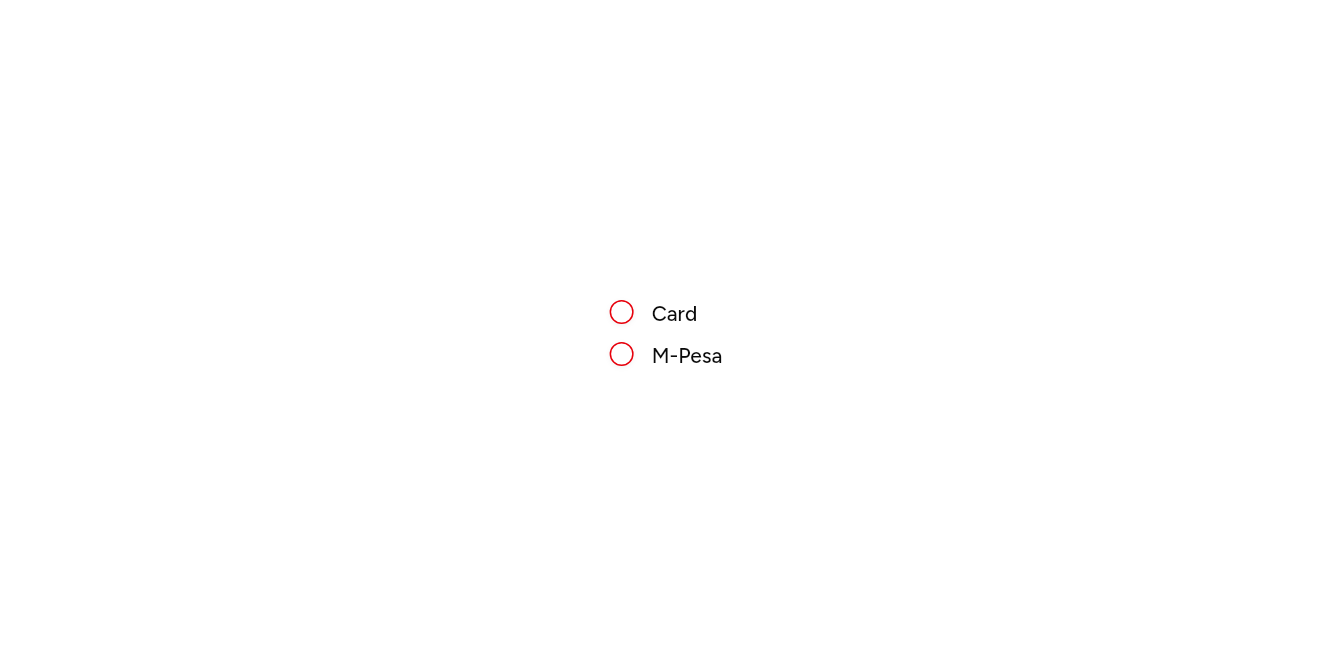
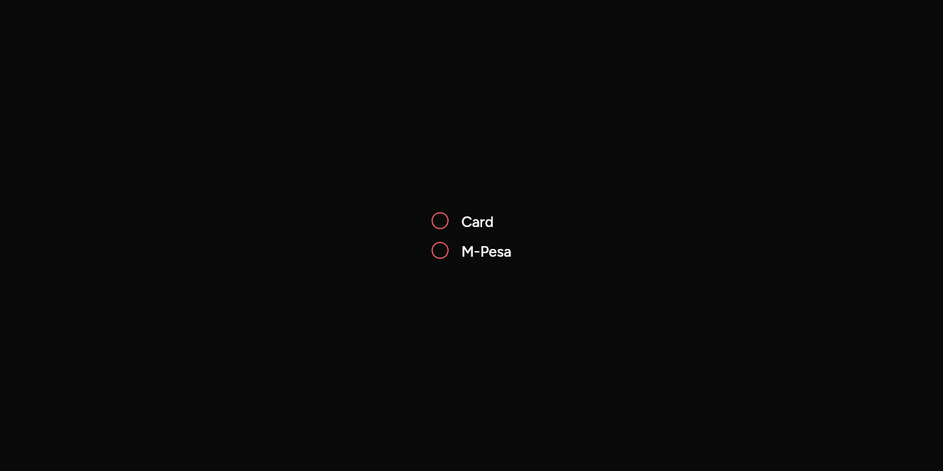
// Wrong: Marked until one is chosen.
import 'package:flutter/widgets.dart';

import 'ui/radio.dart';

class RadioErrorExample extends StatelessWidget {
  const RadioErrorExample({super.key});

  @override
  Widget build(BuildContext context) => RadioGroup<String>(
    groupValue: null,
    onChanged: (_) {},
    child: const Column(
      mainAxisSize: MainAxisSize.min,
      crossAxisAlignment: CrossAxisAlignment.start,
      children: [
        Radio(value: 'a', label: Text('Card'), error: true),
        SizedBox(height: 8),
        Radio(value: 'b', label: Text('M-Pesa'), error: true),
      ],
    ),
  );
}
API
Read from the source above: each parameter with its type, its default, and what it is for.
Radioclass
One choice in a RadioGroup. With a label the whole row picks it, and a screen reader hears the label.
| Parameter | Type | Default | What it is for |
|---|---|---|---|
valuerequired |
T |
The value it stands for, given back when it is chosen. | |
label | Widget? | Beside the radio button. | |
description |
Widget? |
A line under the label. | |
enabled |
bool |
true |
False fades it and stops it taking presses and focus. |
focusNode |
FocusNode? |
Its focus node, to move focus to it or follow it from outside; one is made when not given. | |
autofocus |
bool |
false |
Takes the keyboard's focus when it first appears. |
card |
bool |
false |
Drawn as a card to choose: a border round it, marked when chosen. |
error |
bool |
false |
Draws it as invalid. |
Source
What lands in your app. It is yours from then on: change it as you would your own code, and ashlar add
will not write over it.
lib/ui/radio.dart 186 lines
// Ashlar UI: Radio. Copied into your app by `ashlar add radio`; it is yours to change.
//
// Flutter's widgets layer has the group: RadioGroup holds the chosen value, and moves the
// choice with the arrow keys. This file draws the radios inside it.

import 'package:flutter/widgets.dart';

import 'theme.dart';

/// One choice in a [RadioGroup]. With a [label] the whole row picks it, and a screen
/// reader hears the label.
///
/// ```dart
/// RadioGroup<String>(
///   groupValue: plan,
///   onChanged: (v) => setState(() => plan = v),
///   child: Column(children: [
///     Radio(value: 'monthly', label: Text('Monthly')),
///     Radio(value: 'yearly', label: Text('Yearly'), description: Text('Two months free.')),
///   ]),
/// )
/// ```
class Radio<T> extends StatefulWidget {
  const Radio({
    super.key,
    required this.value,
    this.label,
    this.description,
    this.enabled = true,
    this.focusNode,
    this.autofocus = false,
    this.card = false,
    this.error = false,
  });

  /// The value it stands for, given back when it is chosen.
  final T value;

  /// Beside the radio button.
  final Widget? label;

  /// A line under the label.
  final Widget? description;

  /// False fades it and stops it taking presses and focus.
  final bool enabled;

  /// Its focus node, to move focus to it or follow it from outside; one is made when not
  /// given.
  final FocusNode? focusNode;

  /// Takes the keyboard's focus when it first appears.
  final bool autofocus;

  /// Drawn as a card to choose: a border round it, marked when chosen.
  final bool card;

  /// Draws it as invalid.
  final bool error;

  @override
  State<Radio<T>> createState() => _RadioState<T>();
}

class _RadioState<T> extends State<Radio<T>> {
  FocusNode? _ownFocus;
  FocusNode get _focus => widget.focusNode ?? (_ownFocus ??= FocusNode());

  @override
  void dispose() {
    _ownFocus?.dispose();
    super.dispose();
  }

  // Its own size, at the start, even where its parent stretches what it holds; a card
  // fills the width it is given.
  @override
  Widget build(BuildContext context) => widget.card
      ? _control(context)
      : Align(
          alignment: AlignmentDirectional.centerStart,
          widthFactor: 1,
          heightFactor: 1,
          child: _control(context),
        );

  Widget _control(BuildContext context) {
    final t = AshlarTheme.of(context);
    final c = t.colors;
    final registry = RadioGroup.maybeOf<T>(context);
    return RawRadio<T>(
      value: widget.value,
      mouseCursor: WidgetStateProperty.resolveWith(
        (s) => s.contains(WidgetState.disabled)
            ? SystemMouseCursors.basic
            : SystemMouseCursors.click,
      ),
      toggleable: false,
      focusNode: _focus,
      autofocus: widget.autofocus,
      groupRegistry: registry,
      enabled: widget.enabled && registry != null,
      builder: (context, state) {
        final chosen = state.value ?? false;
        final focused = state.states.contains(WidgetState.focused);
        final enabled = !state.states.contains(WidgetState.disabled);
        final dot = AnimatedContainer(
          duration: t.duration,
          width: 16,
          height: 16,
          decoration: BoxDecoration(
            // Opaque, so the shadow beneath does not show through.
            color: c.background,
            shape: BoxShape.circle,
            border: Border.all(
              color: widget.error
                  ? c.destructive
                  : (focused ? c.ring : c.input),
            ),
            boxShadow: [if (focused) ...t.focusRing, ...t.shadowXs],
          ),
          alignment: Alignment.center,
          child: AnimatedScale(
            duration: t.duration,
            scale: chosen ? 1 : 0,
            child: Container(
              width: 8,
              height: 8,
              decoration: BoxDecoration(
                color: c.primary,
                shape: BoxShape.circle,
              ),
            ),
          ),
        );
        final body = widget.label == null && widget.description == null
            ? dot
            : Row(
                mainAxisSize: MainAxisSize.min,
                crossAxisAlignment: CrossAxisAlignment.start,
                children: [
                  Padding(padding: const EdgeInsets.only(top: 2), child: dot),
                  const SizedBox(width: 12),
                  Flexible(
                    child: Column(
                      crossAxisAlignment: CrossAxisAlignment.start,
                      children: [
                        if (widget.label != null)
                          DefaultTextStyle.merge(
                            style: t.text.sm.copyWith(
                              color: c.foreground,
                              fontWeight: FontWeight.w500,
                            ),
                            child: widget.label!,
                          ),
                        if (widget.description != null)
                          DefaultTextStyle.merge(
                            style: t.text.sm.copyWith(color: c.mutedForeground),
                            child: widget.description!,
                          ),
                      ],
                    ),
                  ),
                ],
              );
        return Opacity(
          opacity: enabled ? 1 : .5,
          child: widget.card
              ? AnimatedContainer(
                  duration: t.duration,
                  padding: const EdgeInsets.all(16),
                  decoration: BoxDecoration(
                    color: chosen
                        ? c.primary.withValues(alpha: .05)
                        : c.primary.withValues(alpha: 0),
                    borderRadius: BorderRadius.circular(t.radiusMd),
                    border: Border.all(color: chosen ? c.primary : c.border),
                  ),
                  child: body,
                )
              : body,
        );
      },
    );
  }
}