

Textarea
A text field for several lines that grows with its text and drags taller.
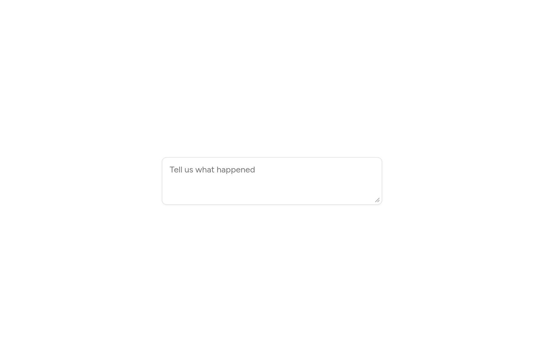
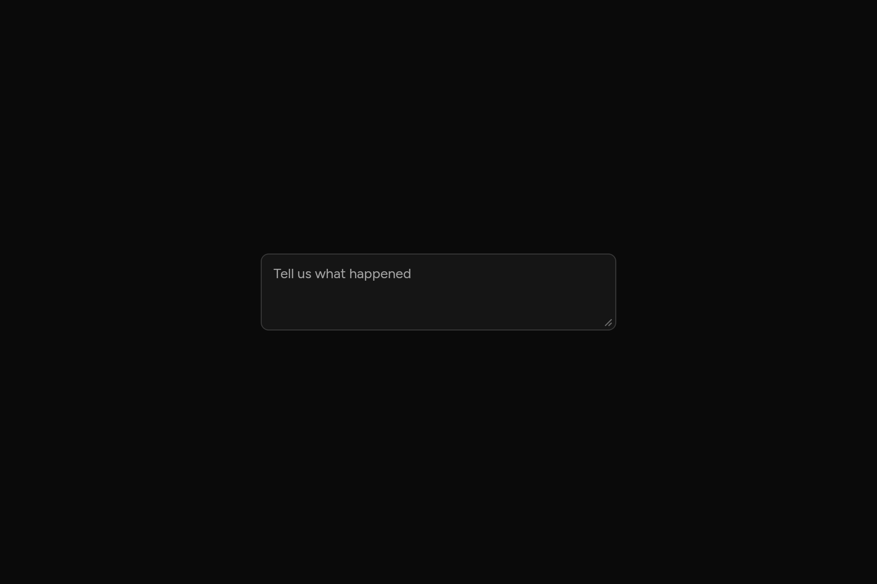
import 'package:flutter/widgets.dart';

import 'ui/textarea.dart';

class TextareaDemo extends StatelessWidget {
  const TextareaDemo({super.key});

  @override
  Widget build(BuildContext context) => const SizedBox(
    width: 360,
    child: Textarea(placeholder: 'Tell us what happened'),
  );
}
Try its options
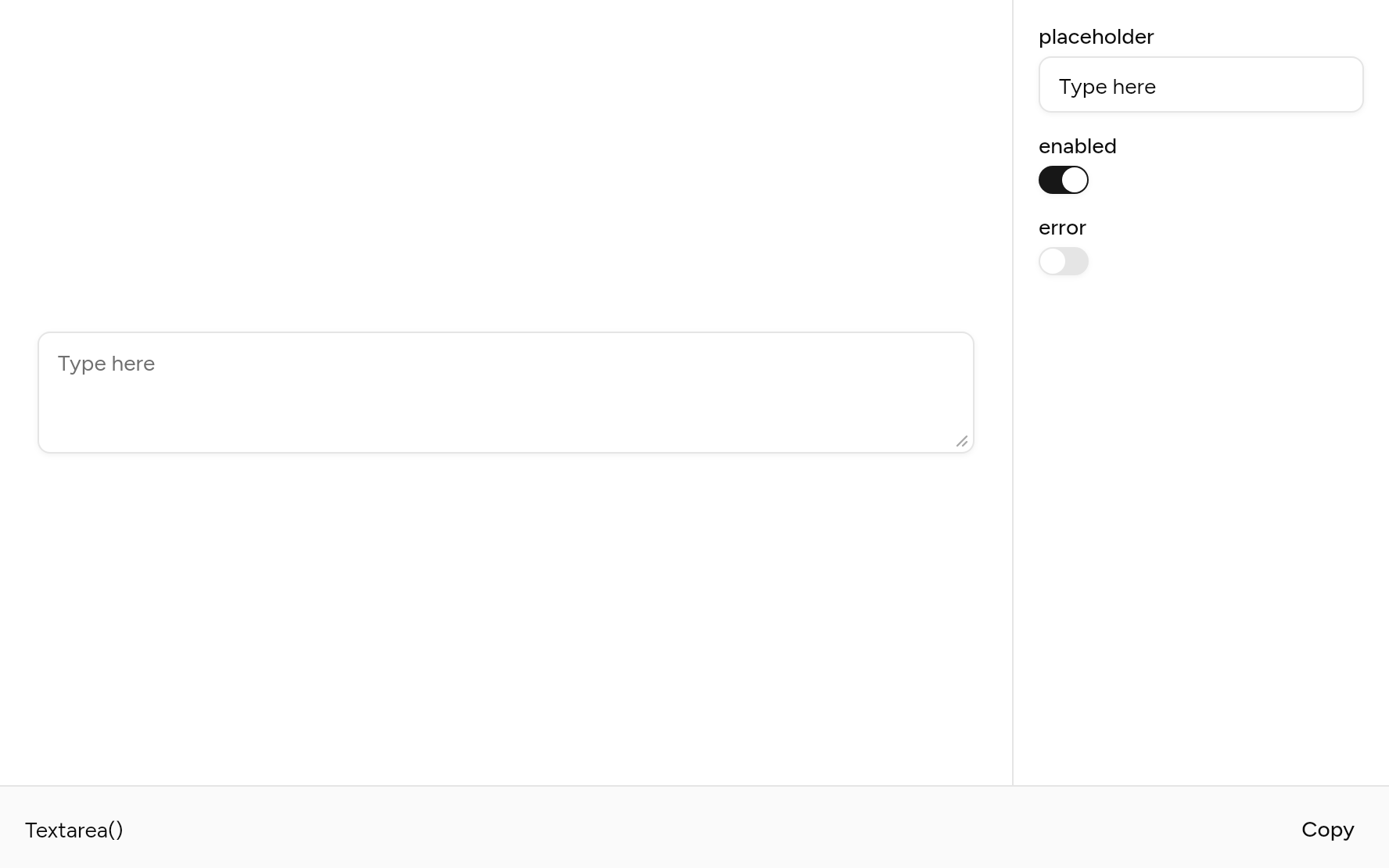
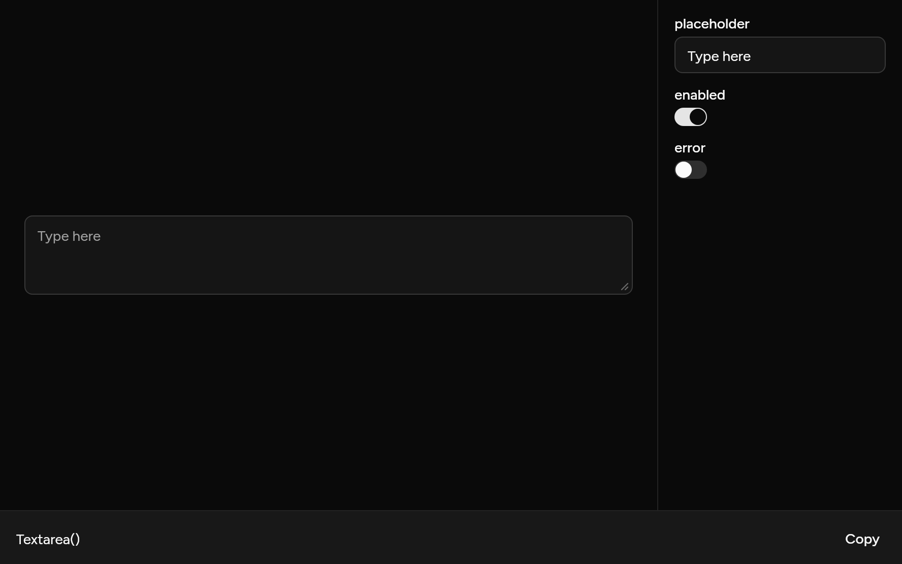
Each option its constructor takes, to change and see; the code below it is what you chose, to copy.
Add it
In your Flutter project:
ashlar add textarea
It writes theme.dart, palette.dart, selection.dart, input.dart and textarea.dart into lib/ui, keeping any you already have. It needs input, which come with it.
Examples
Other ways to use it, each running live, with its code.
Fixed height
No grip to drag it taller.
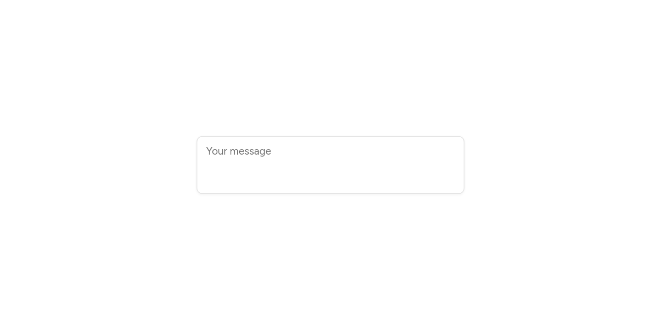
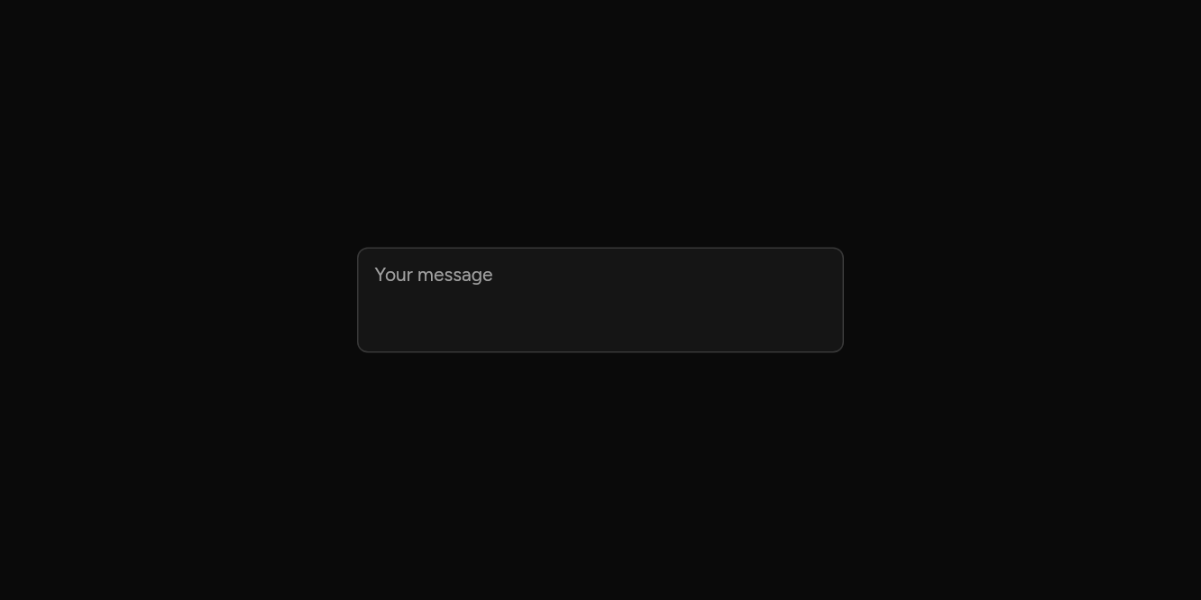
// Fixed height: No grip to drag it taller.
import 'package:flutter/widgets.dart';

import 'ui/textarea.dart';

class TextareaFixedExample extends StatelessWidget {
  const TextareaFixedExample({super.key});

  @override
  Widget build(BuildContext context) => const SizedBox(
    width: 360,
    child: Textarea(placeholder: 'Your message', resizable: false, semanticLabel: 'Message'),
  );
}
Wrong
Marked in the destructive colour.
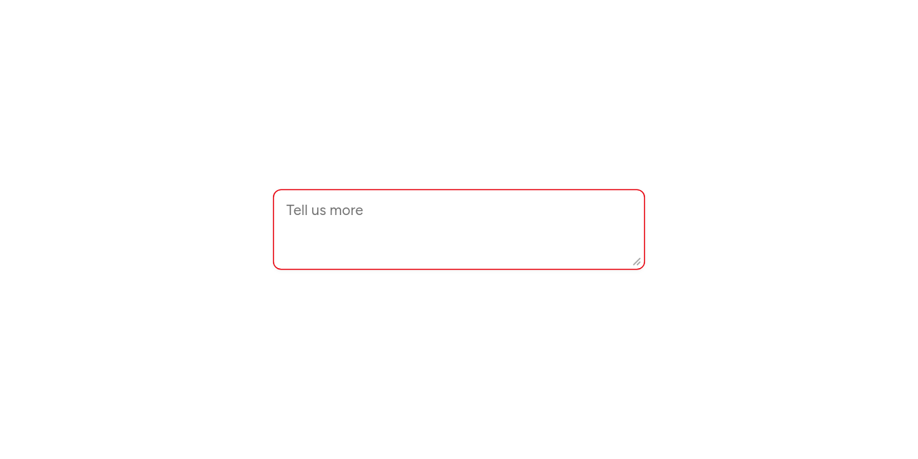
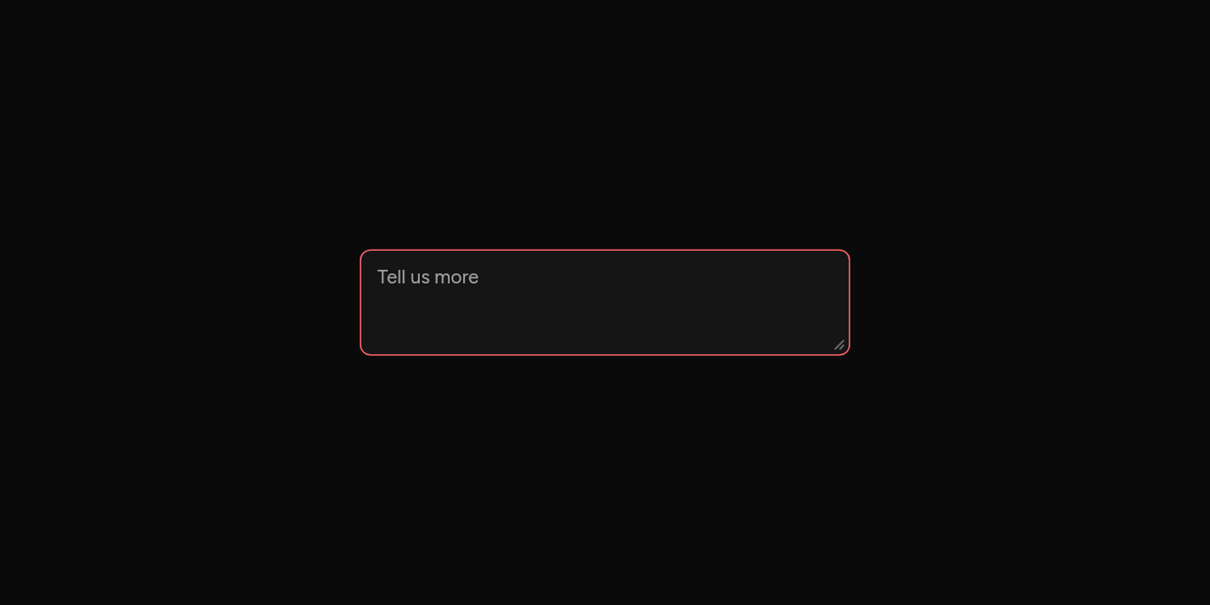
// Wrong: Marked in the destructive colour.
import 'package:flutter/widgets.dart';

import 'ui/textarea.dart';

class TextareaErrorExample extends StatelessWidget {
  const TextareaErrorExample({super.key});

  @override
  Widget build(BuildContext context) => const SizedBox(
    width: 360,
    child: Textarea(placeholder: 'Tell us more', error: true, semanticLabel: 'Details'),
  );
}
API
Read from the source above: each parameter with its type, its default, and what it is for.
Textareaclass
A text field for more than one line. It starts minLines tall and grows to maxLines as the text does, then scrolls. With resizable, a grip at the bottom right drags it taller or shorter, a line at a time; the text then scrolls inside the height chosen.
| Parameter | Type | Default | What it is for |
|---|---|---|---|
controller |
TextEditingController? |
Its text, to read and set from outside; one is made when not given. | |
focusNode |
FocusNode? |
Its focus node, to move focus to it or follow it from outside; one is made when not given. | |
placeholder |
String? |
Faint text shown while it is empty. | |
enabled |
bool |
true |
False fades it and stops it taking focus or typing. |
readOnly |
bool |
false |
Shows its text, selectable, but takes no typing. |
error |
bool |
false |
Marks it as wrong, in the destructive colour. Inside a FormItem, a screen reader also hears that it is invalid. |
autofocus |
bool |
false |
Takes the keyboard's focus when it first appears. |
minLines |
int |
3 |
The fewest lines it shows, even when empty. |
maxLines |
int |
8 |
The most lines it grows to before scrolling. |
resizable |
bool |
true |
Shows the grip that drags it taller or shorter. |
inputFormatters |
List<TextInputFormatter>? |
Rules for what can be typed, such as digits only. | |
onChanged |
ValueChanged<String>? |
Told the text as it changes. | |
semanticLabel |
String? |
What a screen reader calls it when its visible text does not say, as for an icon alone. | |
decorated |
bool |
true |
False draws the bare text, for an InputGroup. |
Source
What lands in your app. It is yours from then on: change it as you would your own code, and ashlar add
will not write over it.
lib/ui/textarea.dart 178 lines
// Ashlar UI: Textarea. Copied into your app by `ashlar add textarea`; it is yours to change.

import 'package:flutter/services.dart';
import 'package:flutter/widgets.dart';

import 'input.dart';
import 'theme.dart';

/// A text field for more than one line. It starts [minLines] tall and grows to [maxLines]
/// as the text does, then scrolls. With [resizable], a grip at the bottom right drags it
/// taller or shorter, a line at a time; the text then scrolls inside the height chosen.
///
/// ```dart
/// Textarea(placeholder: 'Tell us what happened', onChanged: (v) => note = v)
/// ```
class Textarea extends StatefulWidget {
  const Textarea({
    super.key,
    this.controller,
    this.focusNode,
    this.placeholder,
    this.enabled = true,
    this.readOnly = false,
    this.error = false,
    this.autofocus = false,
    this.minLines = 3,
    this.maxLines = 8,
    this.resizable = true,
    this.inputFormatters,
    this.onChanged,
    this.semanticLabel,
    this.decorated = true,
  });

  /// Its text, to read and set from outside; one is made when not given.
  final TextEditingController? controller;

  /// Its focus node, to move focus to it or follow it from outside; one is made when not
  /// given.
  final FocusNode? focusNode;

  /// Faint text shown while it is empty.
  final String? placeholder;

  /// False fades it and stops it taking focus or typing.
  final bool enabled;

  /// Shows its text, selectable, but takes no typing.
  final bool readOnly;

  /// Marks it as wrong, in the destructive colour. Inside a FormItem, a screen reader
  /// also hears that it is invalid.
  final bool error;

  /// Takes the keyboard's focus when it first appears.
  final bool autofocus;

  /// The fewest lines it shows, even when empty.
  final int minLines;

  /// The most lines it grows to before scrolling.
  final int maxLines;

  /// Shows the grip that drags it taller or shorter.
  final bool resizable;

  /// Rules for what can be typed, such as digits only.
  final List<TextInputFormatter>? inputFormatters;

  /// Told the text as it changes.
  final ValueChanged<String>? onChanged;

  /// What a screen reader calls it when its visible text does not say, as for an icon
  /// alone.
  final String? semanticLabel;

  /// False draws the bare text, for an InputGroup.
  final bool decorated;

  @override
  State<Textarea> createState() => _TextareaState();
}

class _TextareaState extends State<Textarea> {
  /// The height dragged to, in lines; null until the grip is used.
  int? _lines;
  double _dragged = 0;
  final _box = GlobalKey();

  static const _fewest = 2;

  void _start(DragStartDetails _) =>
      _dragged = _box.currentContext?.size?.height ?? 0;

  void _drag(DragUpdateDetails d, double lineHeight, double chrome) {
    _dragged += d.delta.dy;
    final lines = ((_dragged - chrome) / lineHeight).round().clamp(_fewest, 50);
    if (lines != _lines) setState(() => _lines = lines);
  }

  @override
  Widget build(BuildContext context) {
    final t = AshlarTheme.of(context);
    final c = t.colors;
    final lines = _lines;
    final field = Input(
      key: _box,
      controller: widget.controller,
      focusNode: widget.focusNode,
      placeholder: widget.placeholder,
      enabled: widget.enabled,
      readOnly: widget.readOnly,
      error: widget.error,
      autofocus: widget.autofocus,
      minLines: lines ?? widget.minLines,
      maxLines: lines ?? widget.maxLines,
      keyboardType: TextInputType.multiline,
      textInputAction: TextInputAction.newline,
      inputFormatters: widget.inputFormatters,
      onChanged: widget.onChanged,
      semanticLabel: widget.semanticLabel,
      decorated: widget.decorated,
    );
    if (!widget.resizable || !widget.enabled) return field;
    final style = t.text.sm;
    final lineHeight = style.fontSize! * (style.height ?? 1.2);
    // Padding and border round the text: 8 above and below, and a pixel of border each side.
    final chrome = widget.decorated ? 18.0 : 16.0;
    return Stack(
      children: [
        field,
        PositionedDirectional(
          end: 2,
          bottom: 2,
          // A mouse and touch handle, as in a browser; the text itself needs no keyboard way.
          child: ExcludeSemantics(
            child: MouseRegion(
              cursor: SystemMouseCursors.resizeUpDown,
              child: GestureDetector(
                behavior: HitTestBehavior.opaque,
                onVerticalDragStart: _start,
                onVerticalDragUpdate: (d) => _drag(d, lineHeight, chrome),
                child: SizedBox(
                  width: 14,
                  height: 14,
                  child: CustomPaint(
                    painter: _Grip(c.mutedForeground.withValues(alpha: .6)),
                  ),
                ),
              ),
            ),
          ),
        ),
      ],
    );
  }
}

/// Two short diagonal strokes in the corner.
class _Grip extends CustomPainter {
  _Grip(this.color);

  final Color color;

  @override
  void paint(Canvas canvas, Size size) {
    final p = Paint()
      ..color = color
      ..strokeWidth = 1.2
      ..strokeCap = StrokeCap.round;
    final w = size.width, h = size.height;
    canvas.drawLine(Offset(w - 3, h - 9), Offset(w - 9, h - 3), p);
    canvas.drawLine(Offset(w - 3, h - 5.5), Offset(w - 5.5, h - 3), p);
  }

  @override
  bool shouldRepaint(_Grip old) => old.color != color;
}