

Tabs
Views of one thing, one at a time, chosen from a row of tabs.
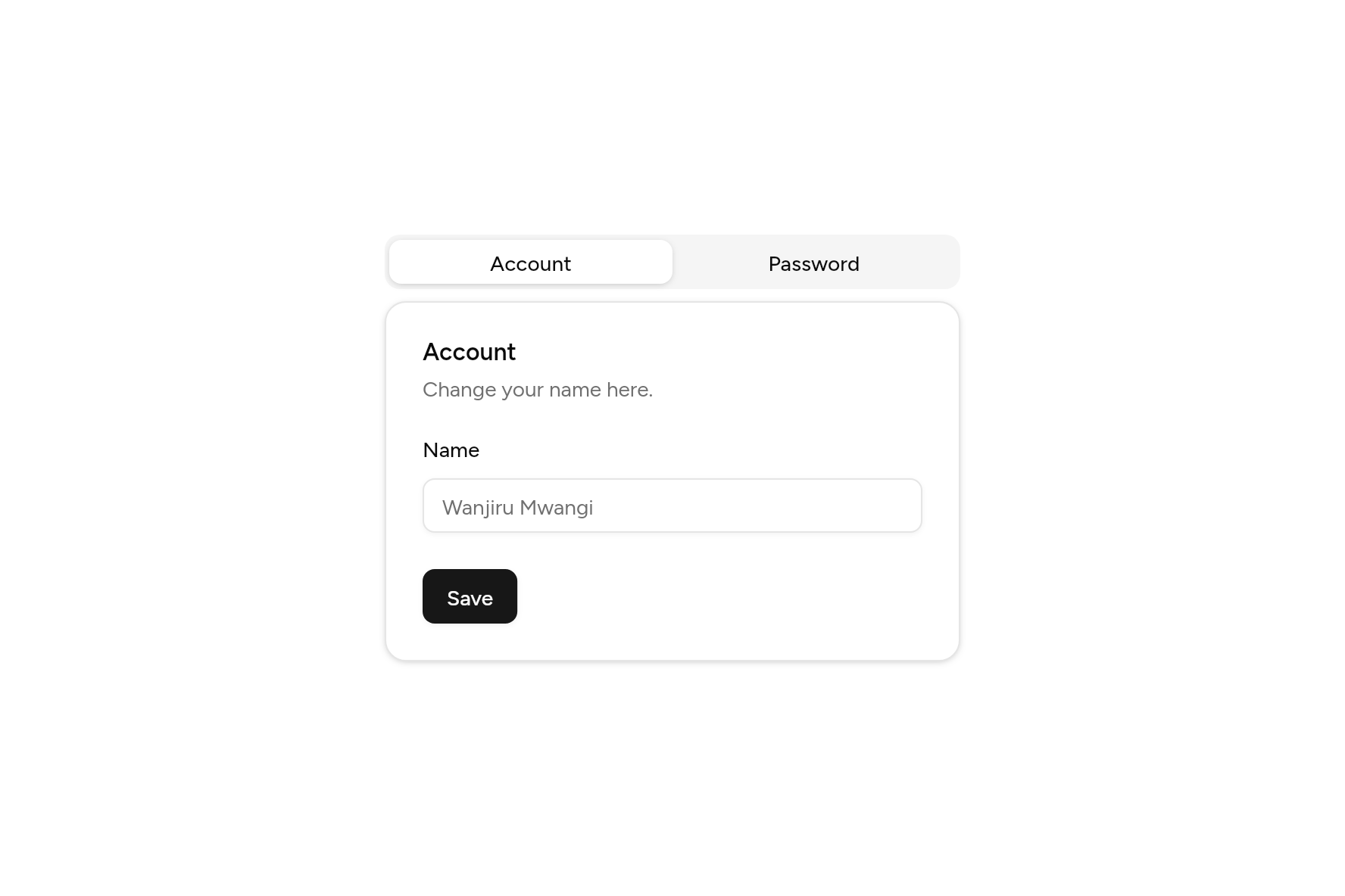
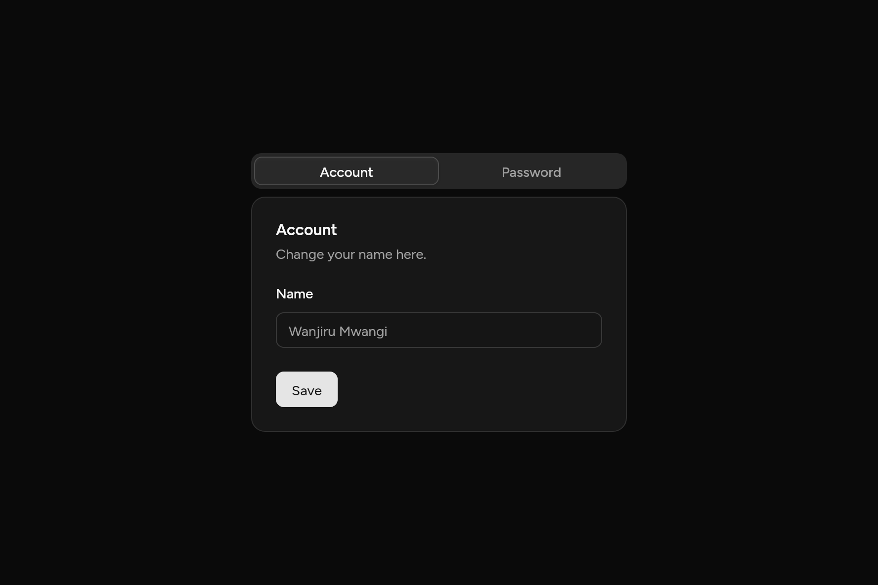
import 'package:flutter/widgets.dart';

import 'ui/button.dart';
import 'ui/card.dart';
import 'ui/field.dart';
import 'ui/input.dart';
import 'ui/tabs.dart';

class TabsDemo extends StatelessWidget {
  const TabsDemo({super.key});

  @override
  Widget build(BuildContext context) => SizedBox(
    width: 380,
    child: Tabs(
      expand: true,
      tabs: [
        TabItem(
          label: const Text('Account'),
          content: _form(
            'Account',
            'Change your name here.',
            const Field(
              label: Text('Name'),
              child: Input(placeholder: 'Wanjiru Mwangi'),
            ),
          ),
        ),
        TabItem(
          label: const Text('Password'),
          content: _form(
            'Password',
            'Change your password here.',
            const Field(label: Text('New password'), child: Input(obscureText: true)),
          ),
        ),
      ],
    ),
  );

  Widget _form(String title, String description, Widget field) => Card(
    children: [
      CardHeader(title: Text(title), description: Text(description)),
      CardContent(child: field),
      CardFooter(
        children: [Button(onPressed: () {}, child: const Text('Save'))],
      ),
    ],
  );
}
Try its options
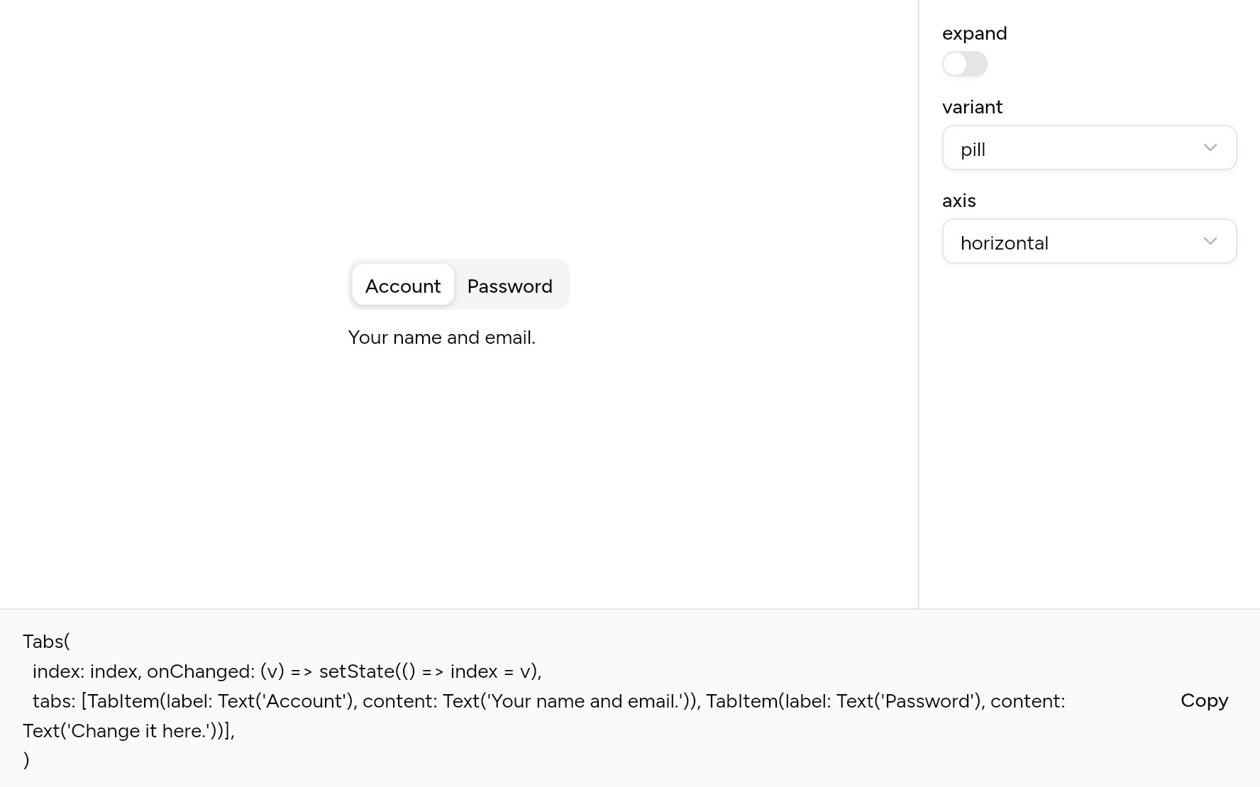
Each option its constructor takes, to change and see; the code below it is what you chose, to copy.
Add it
In your Flutter project:
ashlar add tabs
It writes theme.dart, palette.dart, group.dart, pressable.dart and tabs.dart into lib/ui, keeping any you already have. It needs pressable, which come with it.
Examples
Other ways to use it, each running live, with its code.
Underlined
A line under the chosen tab.
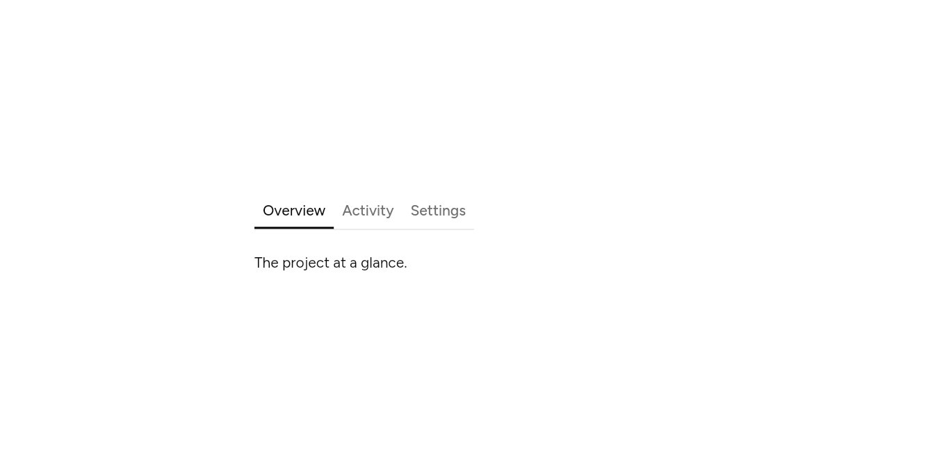
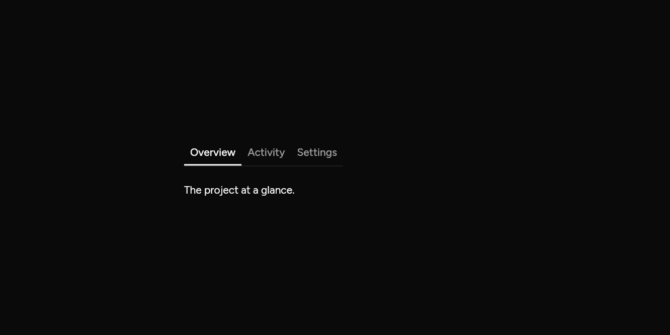
// Underlined: A line under the chosen tab.
import 'package:flutter/widgets.dart';

import 'ui/tabs.dart';

class TabsLineExample extends StatelessWidget {
  const TabsLineExample({super.key});

  @override
  Widget build(BuildContext context) => const SizedBox(
    width: 400,
    child: Tabs(
      variant: TabsVariant.line,
      tabs: [
        TabItem(
          label: Text('Overview'),
          content: Padding(padding: EdgeInsets.only(top: 12), child: Text('The project at a glance.')),
        ),
        TabItem(
          label: Text('Activity'),
          content: Padding(padding: EdgeInsets.only(top: 12), child: Text('What changed, and who changed it.')),
        ),
        TabItem(
          label: Text('Settings'),
          content: Padding(padding: EdgeInsets.only(top: 12), child: Text('Who can see it.')),
        ),
      ],
    ),
  );
}
Upright
Tabs down the side.
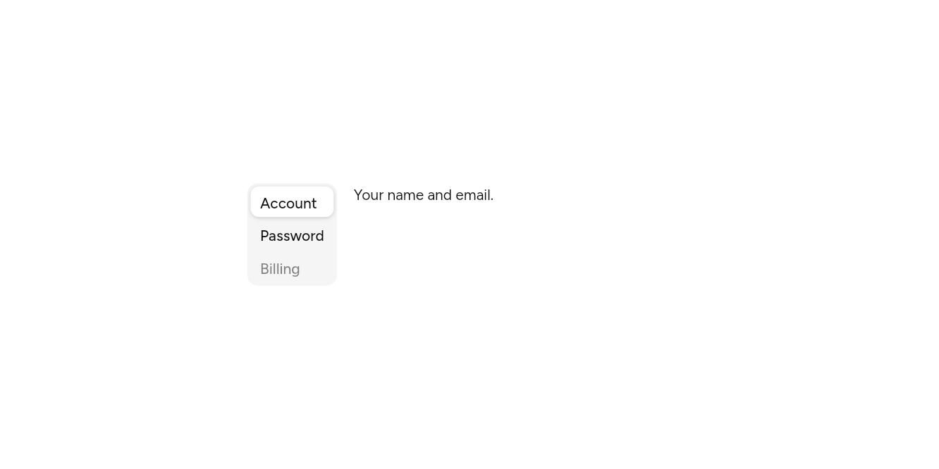
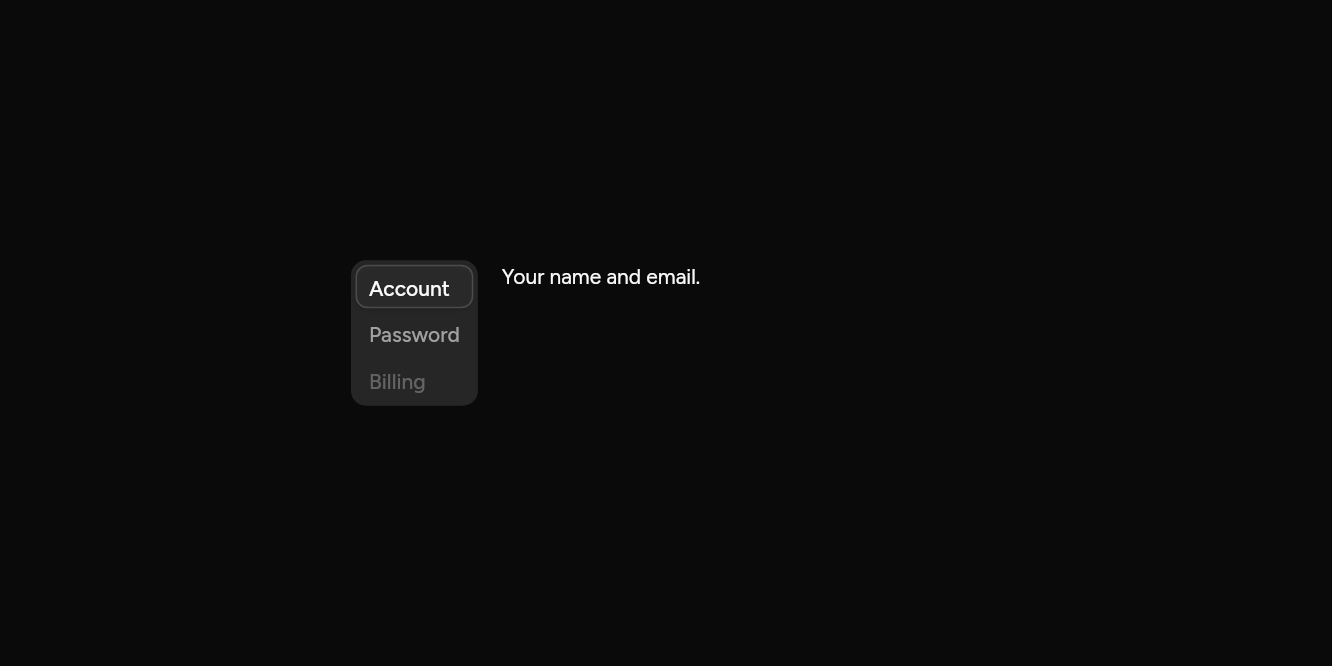
// Upright: Tabs down the side.
import 'package:flutter/widgets.dart';

import 'ui/tabs.dart';

class TabsVerticalExample extends StatelessWidget {
  const TabsVerticalExample({super.key});

  @override
  Widget build(BuildContext context) => const SizedBox(
    width: 420,
    child: Tabs(
      axis: Axis.vertical,
      tabs: [
        TabItem(label: Text('Account'), content: Text('Your name and email.')),
        TabItem(label: Text('Password'), content: Text('Change your password.')),
        TabItem(label: Text('Billing'), content: Text('Your plan and invoices.'), enabled: false),
      ],
    ),
  );
}
API
Read from the source above: each parameter with its type, its default, and what it is for.
TabItemclass
One tab: its label in the list and the content shown when it is chosen.
| Parameter | Type | Default | What it is for |
|---|---|---|---|
labelrequired |
Widget |
The tab's name. | |
contentrequired |
Widget |
What shows when the tab is chosen. | |
icon |
Widget? |
A 16px icon before the label. | |
enabled |
bool |
true |
False fades the tab and stops it being chosen. |
TabsVariantenum
How the tabs look: on a muted bar with the chosen one raised, or as a line of words with the chosen one underlined.
| Value | What it is for |
|---|---|
pill | |
line |
Tabsclass
Views of one thing, one at a time, chosen from a row of tabs. Tab moves into the row and out again; the arrow keys move along it, choosing as they go.
Give index and onChanged to hold the choice yourself; leave them out and the tabs hold it, starting at initialIndex.
| Parameter | Type | Default | What it is for |
|---|---|---|---|
tabsrequired |
List<TabItem> |
The tabs, in order. | |
index |
int? |
Which tab is chosen, when you hold its state. | |
onChanged |
ValueChanged<int>? |
Told the tab chosen. | |
initialIndex |
int |
0 |
Which tab is chosen first, when nothing holds its state. |
expand |
bool |
false |
Stretches the row of tabs across the width it is given. |
variant |
TabsVariant |
TabsVariant.pill |
A pill on a muted track, or a line under the chosen tab. |
axis |
Axis |
Axis.horizontal |
Vertical sets the tabs in a column beside the panel; the up and down arrows move. |
Source
What lands in your app. It is yours from then on: change it as you would your own code, and ashlar add
will not write over it.
lib/ui/tabs.dart 347 lines
// Ashlar UI: Tabs. Copied into your app by `ashlar add tabs`; it is yours to change.

import 'dart:ui' show SemanticsRole;

import 'package:flutter/services.dart';
import 'package:flutter/widgets.dart';

import 'pressable.dart';
import 'theme.dart';

/// One tab: its [label] in the list and the [content] shown when it is chosen.
@immutable
class TabItem {
  const TabItem({
    required this.label,
    required this.content,
    this.icon,
    this.enabled = true,
  });

  /// The tab's name.
  final Widget label;

  /// What shows when the tab is chosen.
  final Widget content;

  /// A 16px icon before the label.
  final Widget? icon;

  /// False fades the tab and stops it being chosen.
  final bool enabled;
}

/// How the tabs look: on a muted bar with the chosen one raised, or as a line of words
/// with the chosen one underlined.
enum TabsVariant { pill, line }

/// Views of one thing, one at a time, chosen from a row of tabs. Tab moves into the row
/// and out again; the arrow keys move along it, choosing as they go.
///
/// Give [index] and [onChanged] to hold the choice yourself; leave them out and the tabs
/// hold it, starting at [initialIndex].
///
/// ```dart
/// Tabs(tabs: [
///   TabItem(label: Text('Account'), content: AccountForm()),
///   TabItem(label: Text('Password'), content: PasswordForm()),
/// ])
/// ```
class Tabs extends StatefulWidget {
  const Tabs({
    super.key,
    required this.tabs,
    this.index,
    this.onChanged,
    this.initialIndex = 0,
    this.expand = false,
    this.variant = TabsVariant.pill,
    this.axis = Axis.horizontal,
  });

  /// The tabs, in order.
  final List<TabItem> tabs;

  /// Which tab is chosen, when you hold its state.
  final int? index;

  /// Told the tab chosen.
  final ValueChanged<int>? onChanged;

  /// Which tab is chosen first, when nothing holds its state.
  final int initialIndex;

  /// Stretches the row of tabs across the width it is given.
  final bool expand;

  /// A pill on a muted track, or a line under the chosen tab.
  final TabsVariant variant;

  /// Vertical sets the tabs in a column beside the panel; the up and down arrows move.
  final Axis axis;

  @override
  State<Tabs> createState() => _TabsState();
}

class _TabsState extends State<Tabs> {
  late int _own = widget.initialIndex;
  final List<FocusNode> _nodes = [];

  int get _index => widget.index ?? _own;

  void _choose(int i, {bool focus = false}) {
    if (!widget.tabs[i].enabled) return;
    if (widget.index == null) setState(() => _own = i);
    widget.onChanged?.call(i);
    if (focus) _nodes[i].requestFocus();
  }

  /// The next enabled tab from the chosen one, [step] along, wrapping round.
  void _move(int step) {
    // Across, the arrows follow the reading direction.
    if (widget.axis == Axis.horizontal && isRtl(context)) step = -step;
    final n = widget.tabs.length;
    for (var k = 1; k <= n; k++) {
      final i = ((_index + step * k) % n + n) % n;
      if (widget.tabs[i].enabled) return _choose(i, focus: true);
    }
  }

  @override
  void dispose() {
    for (final n in _nodes) {
      n.dispose();
    }
    super.dispose();
  }

  @override
  Widget build(BuildContext context) {
    final t = AshlarTheme.of(context);
    final c = t.colors;
    final dark = t.brightness == Brightness.dark;
    while (_nodes.length < widget.tabs.length) {
      _nodes.add(FocusNode());
    }
    // Only the chosen tab is in the Tab order; the arrow keys reach the rest.
    for (final (i, n) in _nodes.indexed) {
      n.skipTraversal = i != _index;
    }
    final triggers = [
      for (final (i, tab) in widget.tabs.indexed)
        Pressable(
          onPressed: tab.enabled ? () => _choose(i) : null,
          focusNode: _nodes[i],
          role: SemanticsRole.tab,
          selected: i == _index,
          builder: (context, state) {
            final active = i == _index;
            final line = widget.variant == TabsVariant.line;
            final across = widget.axis == Axis.horizontal;
            final fg = active || (!dark && !line)
                ? c.foreground
                : c.mutedForeground;
            if (line) {
              // A word, underlined when chosen: along the bottom, or down the start side.
              final mark = BorderSide(
                color: active
                    ? c.foreground
                    : c.foreground.withValues(alpha: 0),
                width: 2,
              );
              return Opacity(
                opacity: state.enabled ? 1 : .5,
                child: AnimatedContainer(
                  duration: t.duration,
                  // As tall as it is drawn, or taller when larger text needs it.
                  height: grownHeight(context, t.control(36)),
                  padding: const EdgeInsets.symmetric(horizontal: 8),
                  alignment: across
                      ? Alignment.center
                      : AlignmentDirectional.centerStart,
                  decoration: BoxDecoration(
                    border: across
                        ? Border(bottom: mark)
                        : BorderDirectional(start: mark),
                    boxShadow: [if (state.focused) ...t.focusRing],
                  ),
                  child: DefaultTextStyle.merge(
                    style: t.text.sm.copyWith(
                      color: state.hovered && !active ? c.foreground : fg,
                      fontWeight: FontWeight.w500,
                    ),
                    maxLines: 1,
                    child: IconTheme.merge(
                      data: IconThemeData(color: fg, size: 16),
                      child: Row(
                        mainAxisSize: MainAxisSize.min,
                        children: [
                          if (tab.icon != null) ...[
                            tab.icon!,
                            const SizedBox(width: 6),
                          ],
                          Flexible(child: tab.label),
                        ],
                      ),
                    ),
                  ),
                ),
              );
            }
            return Opacity(
              opacity: state.enabled ? 1 : .5,
              child: AnimatedContainer(
                duration: t.duration,
                // As tall as it is drawn, or taller when larger text needs it.
                height: grownHeight(context, 29),
                padding: const EdgeInsets.symmetric(horizontal: 8),
                alignment: across
                    ? Alignment.center
                    : AlignmentDirectional.centerStart,
                decoration: BoxDecoration(
                  color: active
                      ? (dark
                            ? c.input.withValues(alpha: c.input.a * .3)
                            : c.background)
                      : (dark ? c.input : c.background).withValues(alpha: 0),
                  borderRadius: BorderRadius.circular(t.radiusMd),
                  border: Border.all(
                    color: active && dark
                        ? c.input
                        : c.input.withValues(alpha: 0),
                  ),
                  boxShadow: [
                    if (state.focused) ...t.focusRing,
                    if (active) ...t.shadowSm,
                  ],
                ),
                child: DefaultTextStyle.merge(
                  style: t.text.sm.copyWith(
                    color: fg,
                    fontWeight: FontWeight.w500,
                  ),
                  maxLines: 1,
                  child: IconTheme.merge(
                    data: IconThemeData(color: fg, size: 16),
                    child: Row(
                      mainAxisSize: MainAxisSize.min,
                      children: [
                        if (tab.icon != null) ...[
                          tab.icon!,
                          const SizedBox(width: 6),
                        ],
                        Flexible(child: tab.label),
                      ],
                    ),
                  ),
                ),
              ),
            );
          },
        ),
    ];
    final across = widget.axis == Axis.horizontal,
        line = widget.variant == TabsVariant.line;
    Widget bar(Widget child) => Semantics(
      role: SemanticsRole.tabBar,
      container: true,
      explicitChildNodes: true,
      child: child,
    );
    final list = Shortcuts(
      includeSemantics: false,
      shortcuts: widget.axis == Axis.horizontal
          ? const {
              SingleActivator(LogicalKeyboardKey.arrowRight): _MoveIntent(1),
              SingleActivator(LogicalKeyboardKey.arrowLeft): _MoveIntent(-1),
            }
          : const {
              SingleActivator(LogicalKeyboardKey.arrowDown): _MoveIntent(1),
              SingleActivator(LogicalKeyboardKey.arrowUp): _MoveIntent(-1),
            },
      child: Actions(
        actions: {
          _MoveIntent: CallbackAction<_MoveIntent>(
            onInvoke: (i) => _move(i.step),
          ),
        },
        child: Container(
          constraints: across ? BoxConstraints(minHeight: t.control(36)) : null,
          padding: line ? EdgeInsets.zero : const EdgeInsets.all(3),
          decoration: line
              ? BoxDecoration(
                  border: across
                      ? Border(bottom: BorderSide(color: c.border))
                      : BorderDirectional(start: BorderSide(color: c.border)),
                )
              : BoxDecoration(
                  color: c.muted,
                  borderRadius: BorderRadius.circular(t.radiusLg),
                ),
          // Tabs wider than the room scroll sideways, on a phone say; the tab bar sits
          // inside the scrolling, so its tabs stay its own children.
          child: across && !widget.expand
              ? SingleChildScrollView(
                  scrollDirection: Axis.horizontal,
                  child: bar(
                    Row(mainAxisSize: MainAxisSize.min, children: triggers),
                  ),
                )
              : bar(
                  across
                      ? Row(
                          children: [
                            for (final trigger in triggers)
                              Expanded(child: trigger),
                          ],
                        )
                      : IntrinsicWidth(
                          child: Column(
                            mainAxisSize: MainAxisSize.min,
                            crossAxisAlignment: CrossAxisAlignment.stretch,
                            children: [
                              for (final (i, trigger) in triggers.indexed) ...[
                                if (i > 0 && !line) const SizedBox(height: 2),
                                trigger,
                              ],
                            ],
                          ),
                        ),
                ),
        ),
      ),
    );
    final panel = Semantics(
      role: SemanticsRole.tabPanel,
      container: true,
      child: KeyedSubtree(
        key: ValueKey(_index),
        child: widget.tabs[_index].content,
      ),
    );
    if (!across) {
      return Row(
        crossAxisAlignment: CrossAxisAlignment.start,
        children: [
          list,
          const SizedBox(width: 16),
          Expanded(child: panel),
        ],
      );
    }
    return Column(
      mainAxisSize: MainAxisSize.min,
      crossAxisAlignment: widget.expand
          ? CrossAxisAlignment.stretch
          : CrossAxisAlignment.start,
      children: [list, const SizedBox(height: 8), panel],
    );
  }
}

class _MoveIntent extends Intent {
  const _MoveIntent(this.step);

  final int step;
}