

Hover Card
A card that appears when the pointer rests on something.
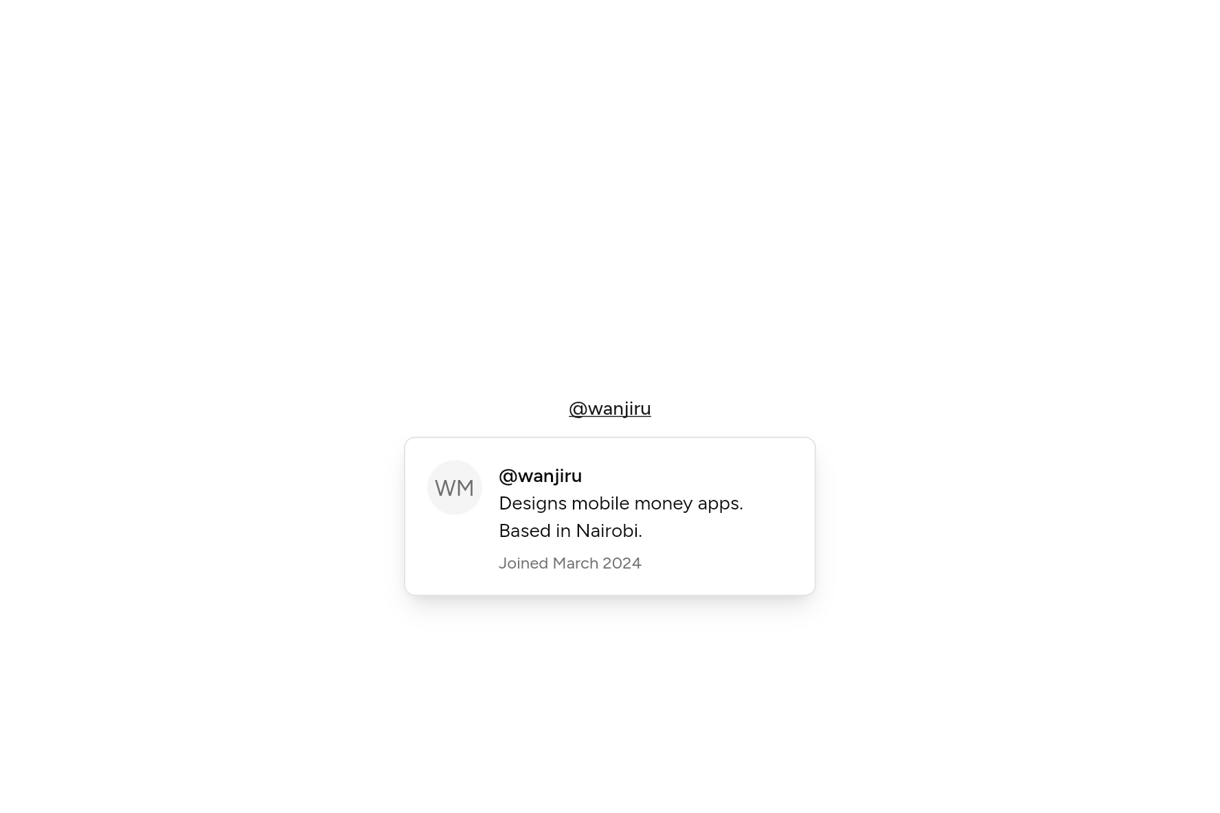
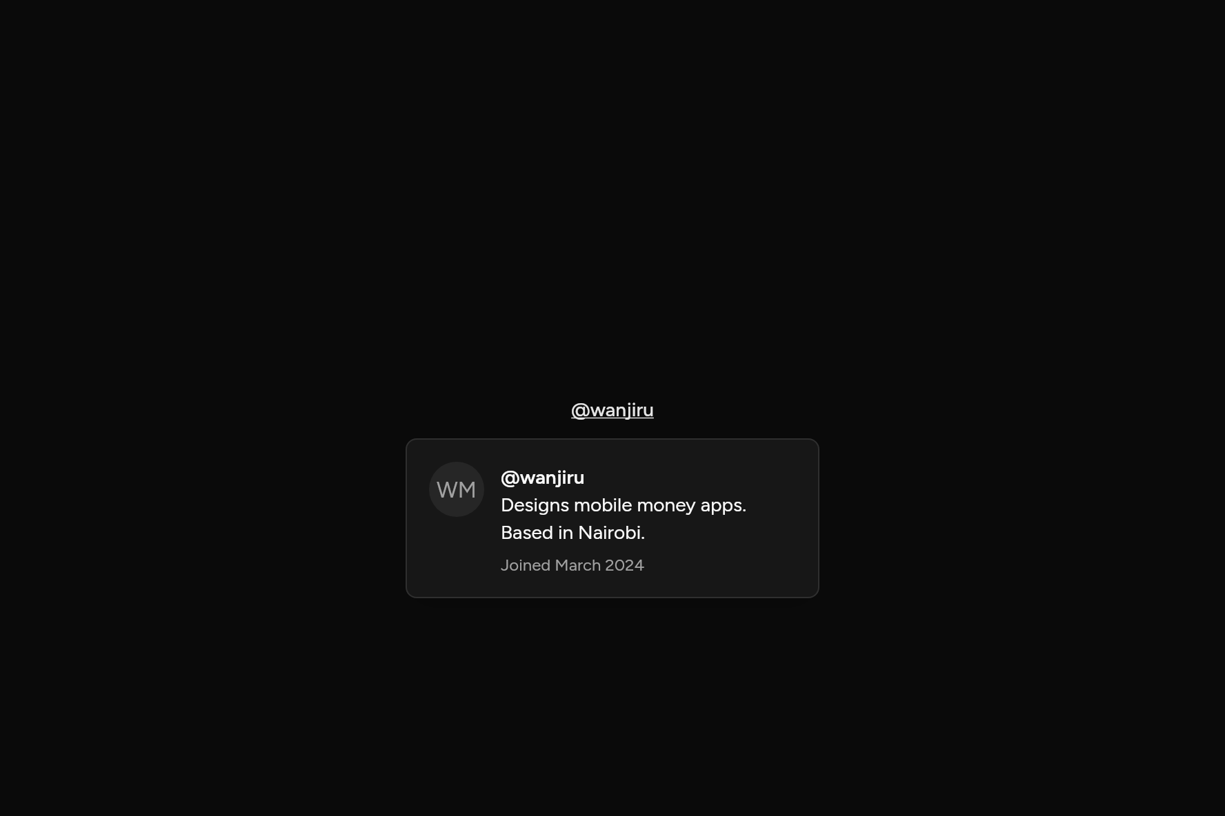
import 'package:flutter/widgets.dart';

import 'ui/avatar.dart';
import 'ui/button.dart';
import 'ui/hover_card.dart';
import 'ui/theme.dart';

class HoverCardDemo extends StatelessWidget {
  const HoverCardDemo({super.key});

  @override
  Widget build(BuildContext context) => HoverCard(
    width: 300,
    content: (context) {
      final t = AshlarTheme.of(context);
      return Row(
        crossAxisAlignment: CrossAxisAlignment.start,
        children: [
          const Avatar(fallback: 'WM', size: 40),
          const SizedBox(width: 12),
          Expanded(
            child: Column(
              crossAxisAlignment: CrossAxisAlignment.start,
              children: [
                Text('@wanjiru', style: t.text.sm.copyWith(fontWeight: FontWeight.w600)),
                const Text('Designs mobile money apps. Based in Nairobi.'),
                const SizedBox(height: 6),
                Text('Joined March 2024', style: t.text.xs.copyWith(color: t.colors.mutedForeground)),
              ],
            ),
          ),
        ],
      );
    },
    child: Button(variant: ButtonVariant.link, onPressed: () {}, child: const Text('@wanjiru')),
  );
}
Add it
In your Flutter project:
ashlar add hover-card
It writes theme.dart, palette.dart, popover.dart and hover_card.dart into lib/ui, keeping any you already have. It needs popover, which come with it.
Examples
Other ways to use it, each running live, with its code.
A profile
Hover the name; focus it from the keyboard too.
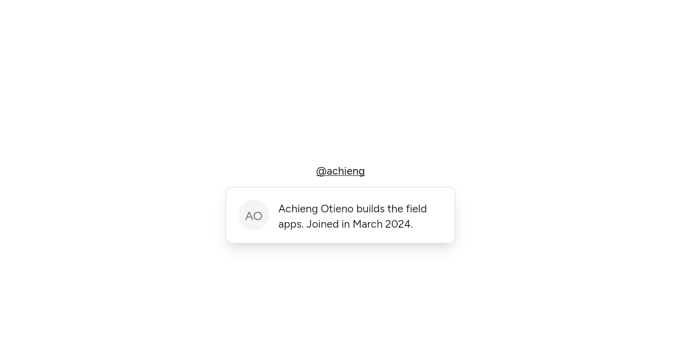
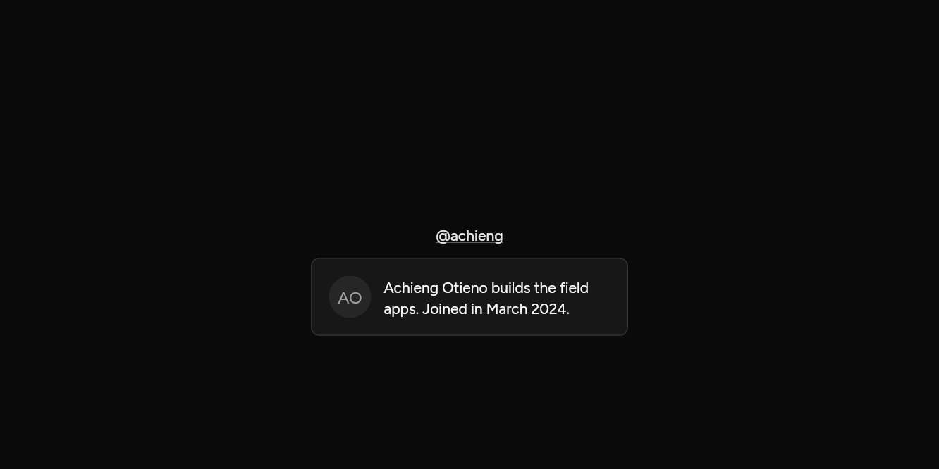
// A profile: Hover the name; focus it from the keyboard too.
import 'package:flutter/widgets.dart';

import 'ui/avatar.dart';
import 'ui/button.dart';
import 'ui/hover_card.dart';

class HoverCardProfileExample extends StatelessWidget {
  const HoverCardProfileExample({super.key});

  @override
  Widget build(BuildContext context) => HoverCard(
    width: 300,
    content: (context) => const Row(
      crossAxisAlignment: CrossAxisAlignment.start,
      children: [
        Avatar(fallback: 'AO', size: 40),
        SizedBox(width: 12),
        Expanded(child: Text('Achieng Otieno builds the field apps. Joined in March 2024.')),
      ],
    ),
    child: Button(variant: ButtonVariant.link, onPressed: () {}, child: const Text('@achieng')),
  );
}
API
Read from the source above: each parameter with its type, its default, and what it is for.
HoverCardclass
A card that appears when the pointer rests on child, the keyboard focuses it, or a finger long presses it: a preview of a profile or a link. It is extra: anything a person needs should be reachable without it.
| Parameter | Type | Default | What it is for |
|---|---|---|---|
childrequired |
Widget |
What is hovered or focused to open it. | |
contentrequired |
WidgetBuilder |
What the card shows. | |
openDelay |
Duration |
const Duration(milliseconds: 700) |
How long the pointer rests before it opens. |
closeDelay |
Duration |
const Duration(milliseconds: 300) |
How long it stays after the pointer leaves, so the pointer can reach it. |
side |
PopoverSide |
PopoverSide.bottom |
Which side it opens on. It moves to the other side when there is no room. |
align |
PopoverAlign |
PopoverAlign.center |
How it lines up along that side: at the start, the centre or the end. |
width |
double |
256 |
Its width, in logical pixels. |
Source
What lands in your app. It is yours from then on: change it as you would your own code, and ashlar add
will not write over it.
lib/ui/hover_card.dart 129 lines
// Ashlar UI: Hover Card. Copied into your app by `ashlar add hover-card`; it is yours to
// change.

import 'dart:async';

import 'package:flutter/widgets.dart';

import 'popover.dart';
import 'theme.dart';

/// A card that appears when the pointer rests on [child], the keyboard focuses it, or a
/// finger long presses it: a preview of a profile or a link. It is extra: anything a
/// person needs should be reachable without it.
///
/// ```dart
/// HoverCard(
///   content: (context) => Text('Wanjiru Mwangi. Designer at Mittolabs.'),
///   child: Button(variant: ButtonVariant.link, onPressed: openProfile, child: Text('@wanjiru')),
/// )
/// ```
class HoverCard extends StatefulWidget {
  const HoverCard({
    super.key,
    required this.child,
    required this.content,
    this.openDelay = const Duration(milliseconds: 700),
    this.closeDelay = const Duration(milliseconds: 300),
    this.side = PopoverSide.bottom,
    this.align = PopoverAlign.center,
    this.width = 256,
  });

  /// What is hovered or focused to open it.
  final Widget child;

  /// What the card shows.
  final WidgetBuilder content;

  /// How long the pointer rests before it opens.
  final Duration openDelay;

  /// How long it stays after the pointer leaves, so the pointer can reach it.
  final Duration closeDelay;

  /// Which side it opens on. It moves to the other side when there is no room.
  final PopoverSide side;

  /// How it lines up along that side: at the start, the centre or the end.
  final PopoverAlign align;

  /// Its width, in logical pixels.
  final double width;

  @override
  State<HoverCard> createState() => _HoverCardState();
}

class _HoverCardState extends State<HoverCard> {
  final _menu = MenuController();
  Timer? _timer;

  void _later(Duration delay, VoidCallback then) {
    _timer?.cancel();
    _timer = Timer(delay, () {
      if (mounted) then();
    });
  }

  void _show() => _later(widget.openDelay, _menu.open);
  void _hide() => _later(widget.closeDelay, _menu.close);
  void _stay() => _timer?.cancel();

  @override
  void dispose() {
    _timer?.cancel();
    super.dispose();
  }

  @override
  Widget build(BuildContext context) {
    final t = AshlarTheme.of(context);
    return RawMenuAnchor(
      controller: _menu,
      overlayBuilder: (context, info) => PopoverPanel(
        info: info,
        side: widget.side,
        align: widget.align,
        width: widget.width,
        child: MouseRegion(
          onEnter: (_) => _stay(),
          onExit: (_) => _hide(),
          // Sized to its content, scrolling if the room is shorter than that.
          child: SingleChildScrollView(
            padding: EdgeInsets.all(t.space(16)),
            child: DefaultTextStyle.merge(
              style: t.text.sm,
              child: Builder(builder: widget.content),
            ),
          ),
        ),
      ),
      child: MouseRegion(
        onEnter: (_) => _show(),
        onExit: (_) => _hide(),
        child: Focus(
          canRequestFocus: false,
          skipTraversal: true,
          onFocusChange: (focused) {
            if (!focused) {
              _hide();
            } else if (FocusManager.instance.highlightMode ==
                FocusHighlightMode.traditional) {
              _show();
            }
          },
          // Where there is no hover, as on a touch screen, a long press opens it; a tap
          // stays with what it is on. Screen readers get the long press as an action.
          child: GestureDetector(
            onLongPress: () {
              _timer?.cancel();
              _menu.open();
            },
            child: widget.child,
          ),
        ),
      ),
    );
  }
}