

Alert Dialog
A question that needs an answer before going on.
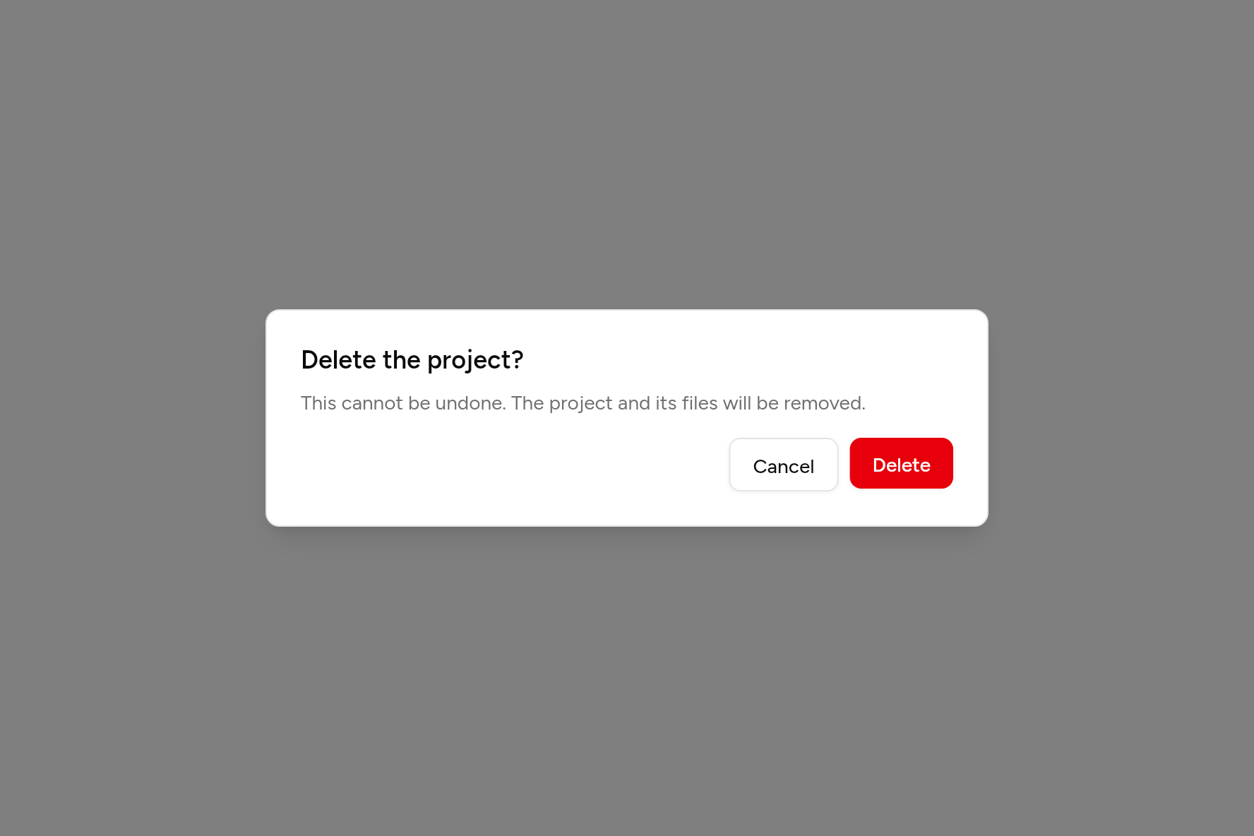
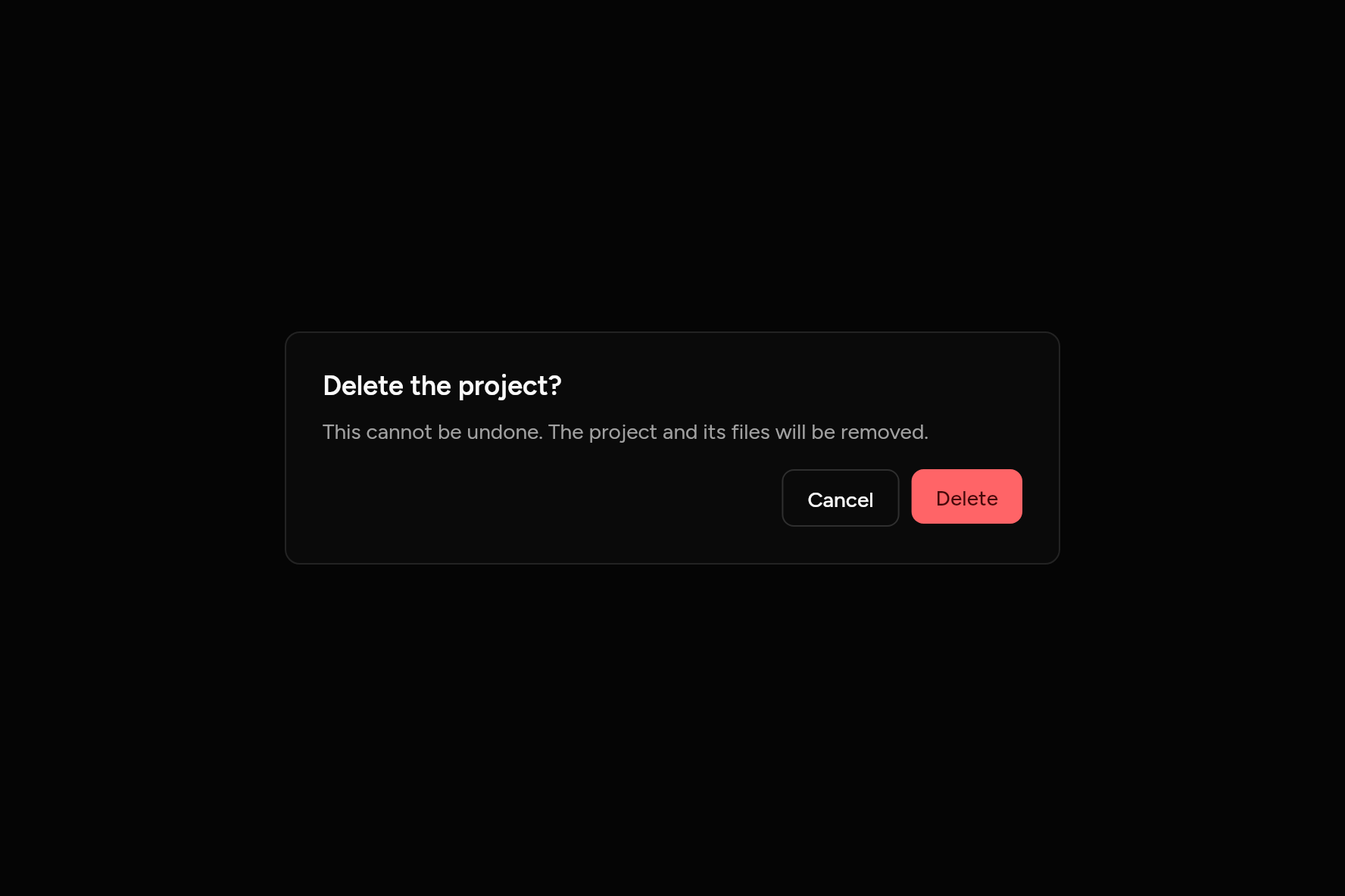
import 'package:flutter/widgets.dart';

import 'ui/alert_dialog.dart';
import 'ui/button.dart';

class AlertDialogDemo extends StatelessWidget {
  const AlertDialogDemo({super.key});

  @override
  Widget build(BuildContext context) => Button(
    variant: ButtonVariant.outline,
    onPressed: () async {
      final delete = await showAlertDialog(
        context,
        title: 'Delete the project?',
        description: 'This cannot be undone. The project and its files will be removed.',
        action: 'Delete',
        destructive: true,
      );
      if (delete) {
        // Delete it.
      }
    },
    child: const Text('Delete project'),
  );
}
Try its options
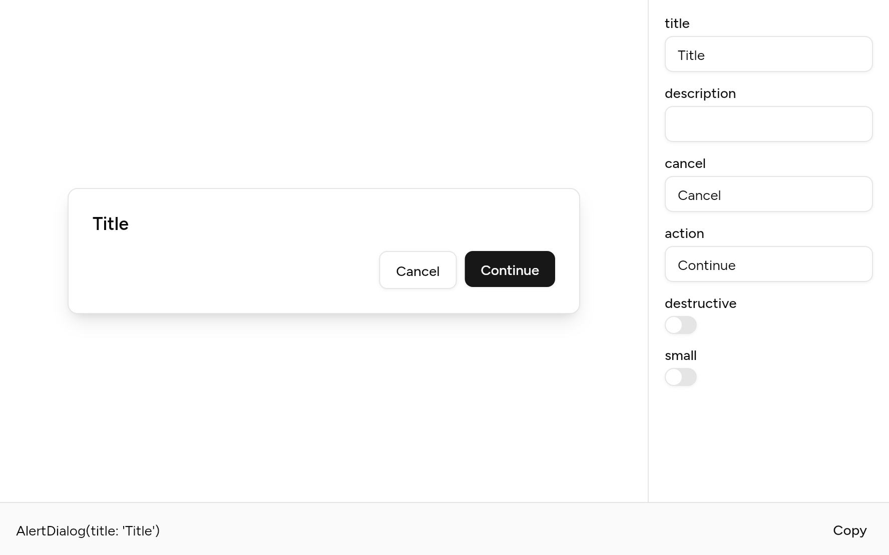
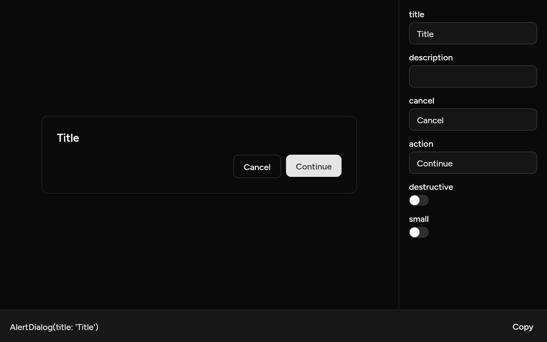
Each option its constructor takes, to change and see; the code below it is what you chose, to copy.
Add it
In your Flutter project:
ashlar add alert-dialog
It writes theme.dart, palette.dart, group.dart, pressable.dart, button.dart, dialog.dart and alert_dialog.dart into lib/ui, keeping any you already have. It needs dialog and button, which come with it.
Examples
Other ways to use it, each running live, with its code.
Destructive
For what cannot be undone.
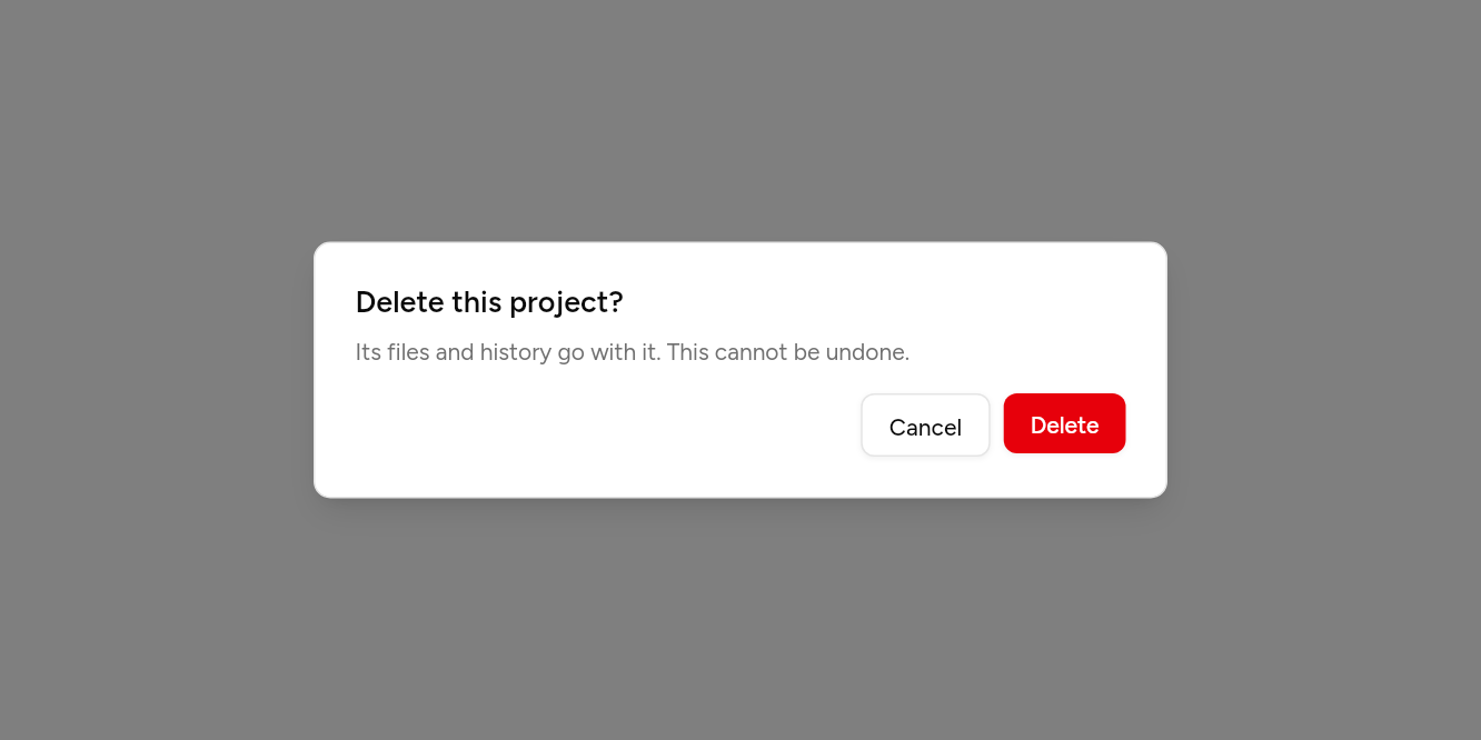
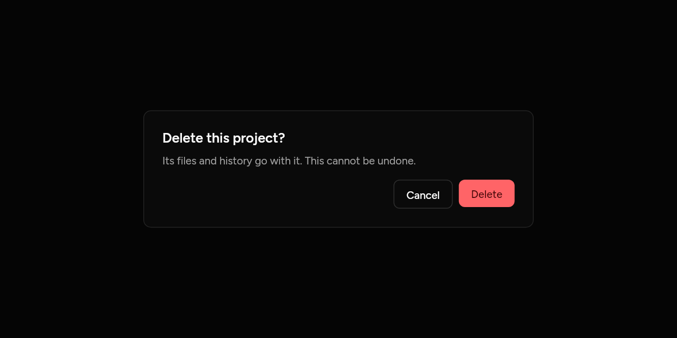
// Destructive: For what cannot be undone.
import 'package:flutter/widgets.dart';

import 'ui/alert_dialog.dart';
import 'ui/button.dart';

class AlertDialogDestructiveExample extends StatelessWidget {
  const AlertDialogDestructiveExample({super.key});

  @override
  Widget build(BuildContext context) => Builder(
    builder: (context) => Button(
      variant: ButtonVariant.destructive,
      onPressed: () => showAlertDialog(
        context,
        title: 'Delete this project?',
        description: 'Its files and history go with it. This cannot be undone.',
        action: 'Delete',
        destructive: true,
      ),
      child: const Text('Delete project'),
    ),
  );
}
Small, with media
Narrow, an icon above.
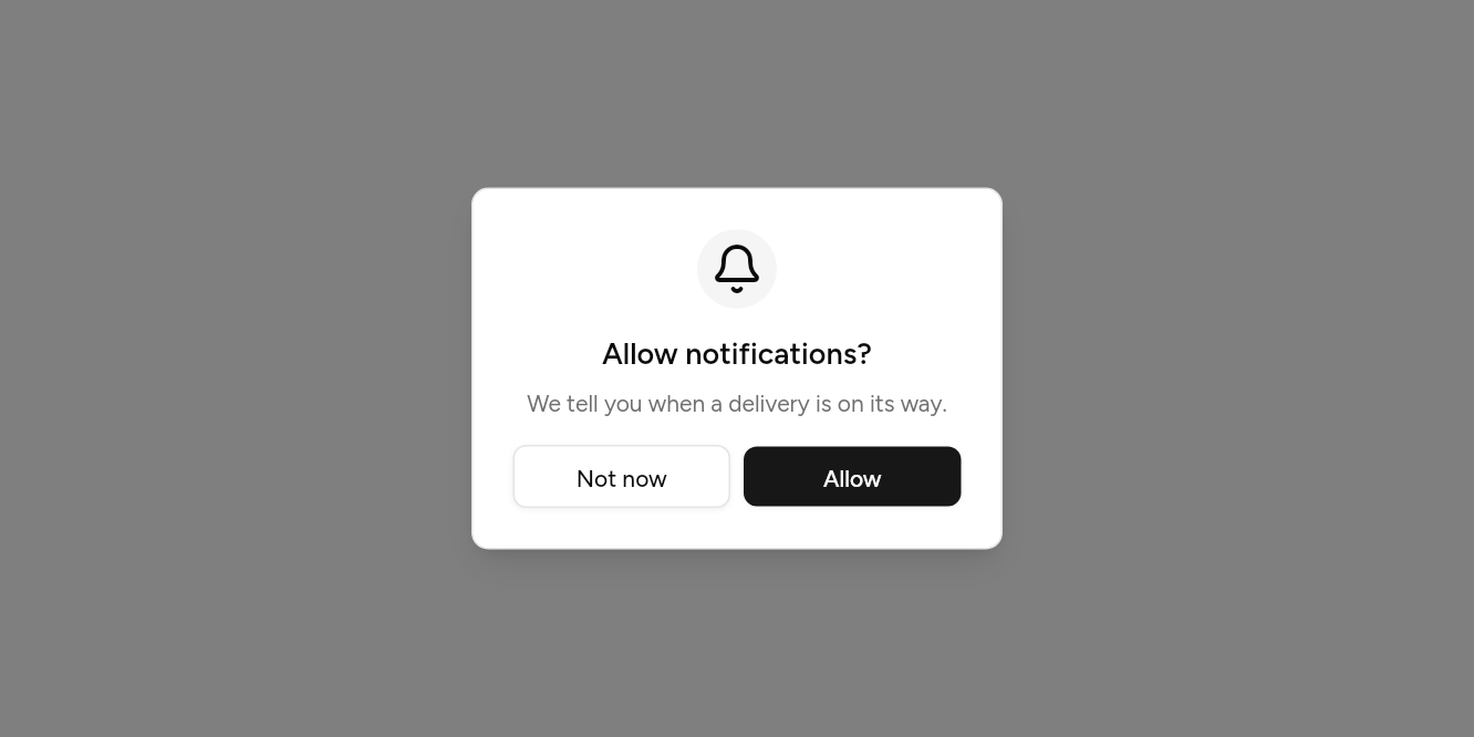
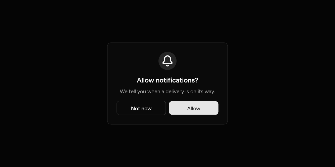
// Small, with media: Narrow, an icon above.
import 'package:ashlar_icons/ashlar_icons.dart';
import 'package:flutter/widgets.dart';

import 'ui/alert_dialog.dart';
import 'ui/button.dart';

class AlertDialogSmallExample extends StatelessWidget {
  const AlertDialogSmallExample({super.key});

  @override
  Widget build(BuildContext context) => Builder(
    builder: (context) => Button(
      variant: ButtonVariant.outline,
      onPressed: () => showAlertDialog(
        context,
        title: 'Allow notifications?',
        description: 'We tell you when a delivery is on its way.',
        action: 'Allow',
        cancel: 'Not now',
        small: true,
        media: const AshlarIcon(AshlarIconsRoundedStroke.bell, size: 32),
      ),
      child: const Text('Turn on notifications'),
    ),
  );
}
API
Read from the source above: each parameter with its type, its default, and what it is for.
showAlertDialogfunction
Asks a question that needs an answer before going on: deleting, leaving with unsaved work. Unlike a Dialog it has no close button and a tap outside does nothing; Escape counts as cancel. Returns true for action, false for anything else.
| Parameter | Type | Default | What it is for |
|---|---|---|---|
contextpositional |
BuildContext |
Where it is opened from: its theme and navigator come from here. | |
titlerequired |
String |
The question or warning. | |
description |
String? |
What happens next, in a line or two. | |
cancel |
String |
'Cancel' |
The button that does not do it. |
action |
String |
'Continue' |
The button that does it. |
destructive |
bool |
false |
Draws the action in the destructive colour, for what cannot be undone. |
media |
Widget? |
An icon or picture above the title. | |
small |
bool |
false |
A narrow dialog, its buttons side by side. |
AlertDialogclass
The panel showAlertDialog shows.
| Parameter | Type | Default | What it is for |
|---|---|---|---|
titlerequired |
String |
The question or warning. | |
description |
String? |
What happens next, in a line or two. | |
cancel |
String |
'Cancel' |
The button that does not. |
action |
String |
'Continue' |
The button that does it. |
destructive |
bool |
false |
Draws the action in the destructive colour, for what cannot be undone. |
media |
Widget? |
An icon above the title, on a muted circle. | |
small |
bool |
false |
Narrow and centred, the two buttons sharing the width. |
Source
What lands in your app. It is yours from then on: change it as you would your own code, and ashlar add
will not write over it.
lib/ui/alert_dialog.dart 110 lines
// Ashlar UI: Alert Dialog. Copied into your app by `ashlar add alert-dialog`; it is yours to
// change.

import 'package:flutter/services.dart';
import 'package:flutter/widgets.dart';

import 'button.dart';
import 'dialog.dart';

/// Asks a question that needs an answer before going on: deleting, leaving with unsaved
/// work. Unlike a Dialog it has no close button and a tap outside does nothing; Escape
/// counts as [cancel]. Returns true for [action], false for anything else.
///
/// ```dart
/// if (await showAlertDialog(context, title: 'Delete the project?', description: 'This cannot be undone.', action: 'Delete', destructive: true)) {
///   delete();
/// }
/// ```
Future<bool> showAlertDialog(
  BuildContext context, {
  required String title,
  String? description,
  String cancel = 'Cancel',
  String action = 'Continue',
  bool destructive = false,
  Widget? media,
  bool small = false,
}) async =>
    await showAshlarDialog<bool>(
      context: context,
      dismissible: false,
      builder: (context) => AlertDialog(
        title: title,
        description: description,
        cancel: cancel,
        action: action,
        destructive: destructive,
        media: media,
        small: small,
      ),
    ) ??
    false;

/// The panel [showAlertDialog] shows.
class AlertDialog extends StatelessWidget {
  const AlertDialog({
    super.key,
    required this.title,
    this.description,
    this.cancel = 'Cancel',
    this.action = 'Continue',
    this.destructive = false,
    this.media,
    this.small = false,
  });

  /// The question or warning.
  final String title;

  /// What happens next, in a line or two.
  final String? description;

  /// The button that does not.
  final String cancel;

  /// The button that does it.
  final String action;

  /// Draws the action in the destructive colour, for what cannot be undone.
  final bool destructive;

  /// An icon above the title, on a muted circle.
  final Widget? media;

  /// Narrow and centred, the two buttons sharing the width.
  final bool small;

  @override
  Widget build(BuildContext context) => CallbackShortcuts(
    bindings: {
      const SingleActivator(LogicalKeyboardKey.escape): () =>
          Navigator.pop(context, false),
    },
    child: Focus(
      autofocus: true,
      child: Dialog(
        showClose: false,
        media: media,
        centered: small,
        maxWidth: small ? 320 : 512,
        title: Text(title),
        description: description == null ? null : Text(description!),
        actions: [
          Button(
            variant: ButtonVariant.outline,
            onPressed: () => Navigator.pop(context, false),
            child: Text(cancel),
          ),
          Button(
            variant: destructive
                ? ButtonVariant.destructive
                : ButtonVariant.primary,
            onPressed: () => Navigator.pop(context, true),
            child: Text(action),
          ),
        ],
      ),
    ),
  );
}