

Drawer
A panel that comes up from the bottom and drags away.
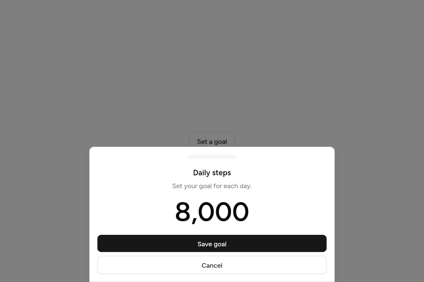
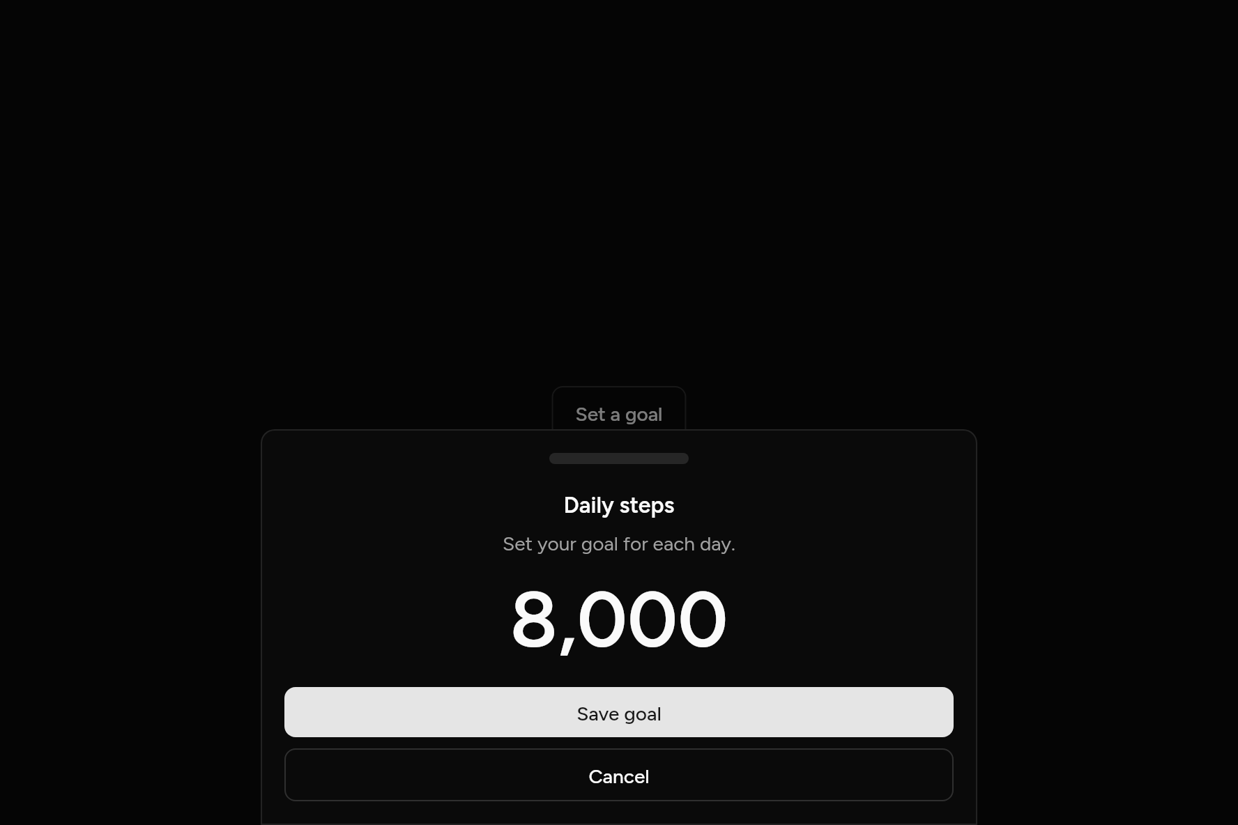
import 'package:flutter/widgets.dart';

import 'ui/button.dart';
import 'ui/drawer.dart';
import 'ui/theme.dart';

class DrawerDemo extends StatelessWidget {
  const DrawerDemo({super.key});

  @override
  Widget build(BuildContext context) => Button(
    variant: ButtonVariant.outline,
    onPressed: () => showDrawer(
      context: context,
      builder: (context) {
        final t = AshlarTheme.of(context);
        return Drawer(
          title: const Text('Daily steps'),
          description: const Text('Set your goal for each day.'),
          content: Center(
            child: Text('8,000', style: t.text.xxl.copyWith(fontSize: 56, height: 1.1)),
          ),
          footer: [
            Button(onPressed: () => Navigator.pop(context), child: const Text('Save goal')),
            Button(
              variant: ButtonVariant.outline,
              onPressed: () => Navigator.pop(context),
              child: const Text('Cancel'),
            ),
          ],
        );
      },
    ),
    child: const Text('Set a goal'),
  );
}
Try its options
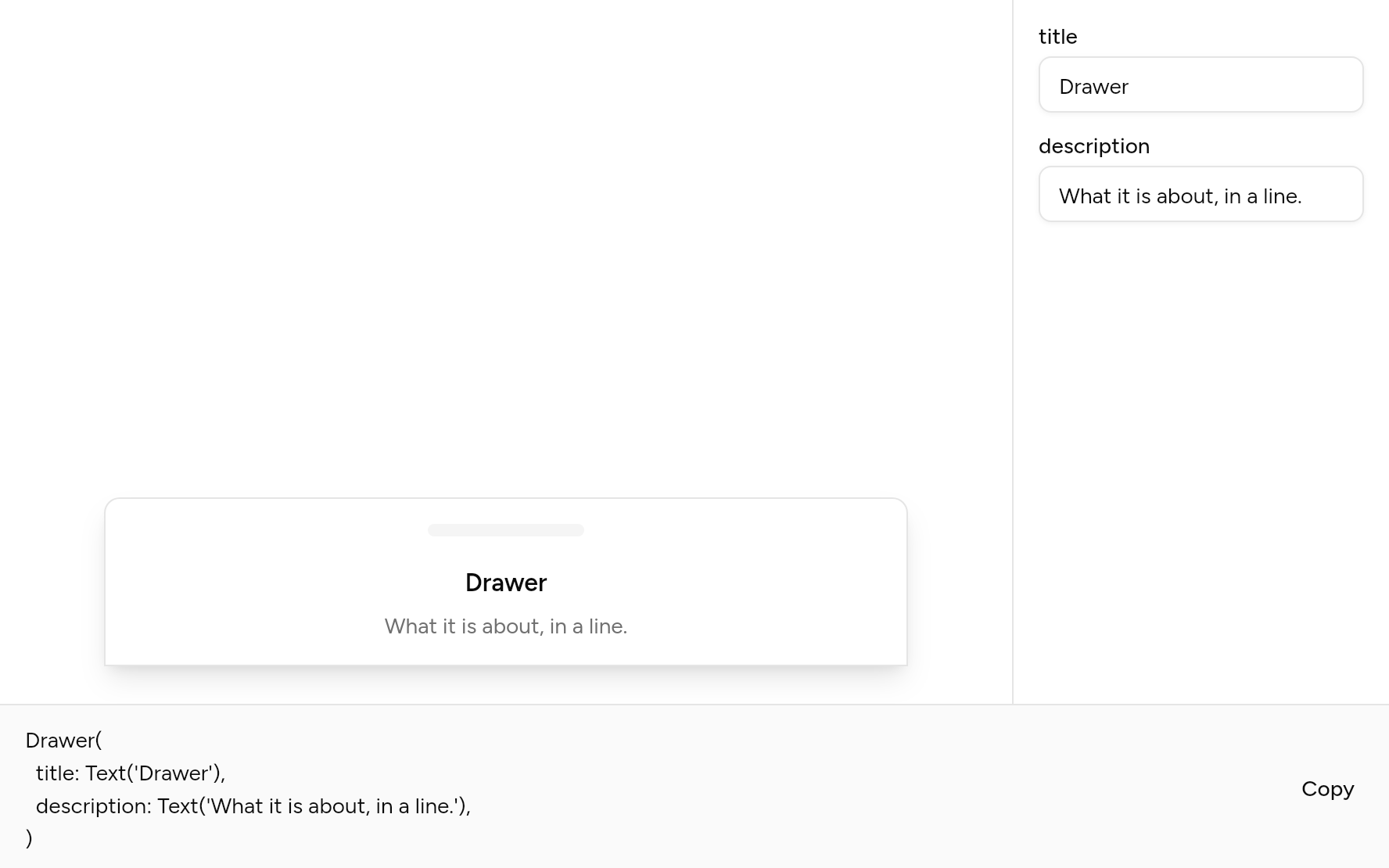
Each option its constructor takes, to change and see; the code below it is what you chose, to copy.
Add it
In your Flutter project:
ashlar add drawer
It writes theme.dart, palette.dart and drawer.dart into lib/ui, keeping any you already have.
Examples
Other ways to use it, each running live, with its code.
From any edge
Up from the bottom, or from the other edges.
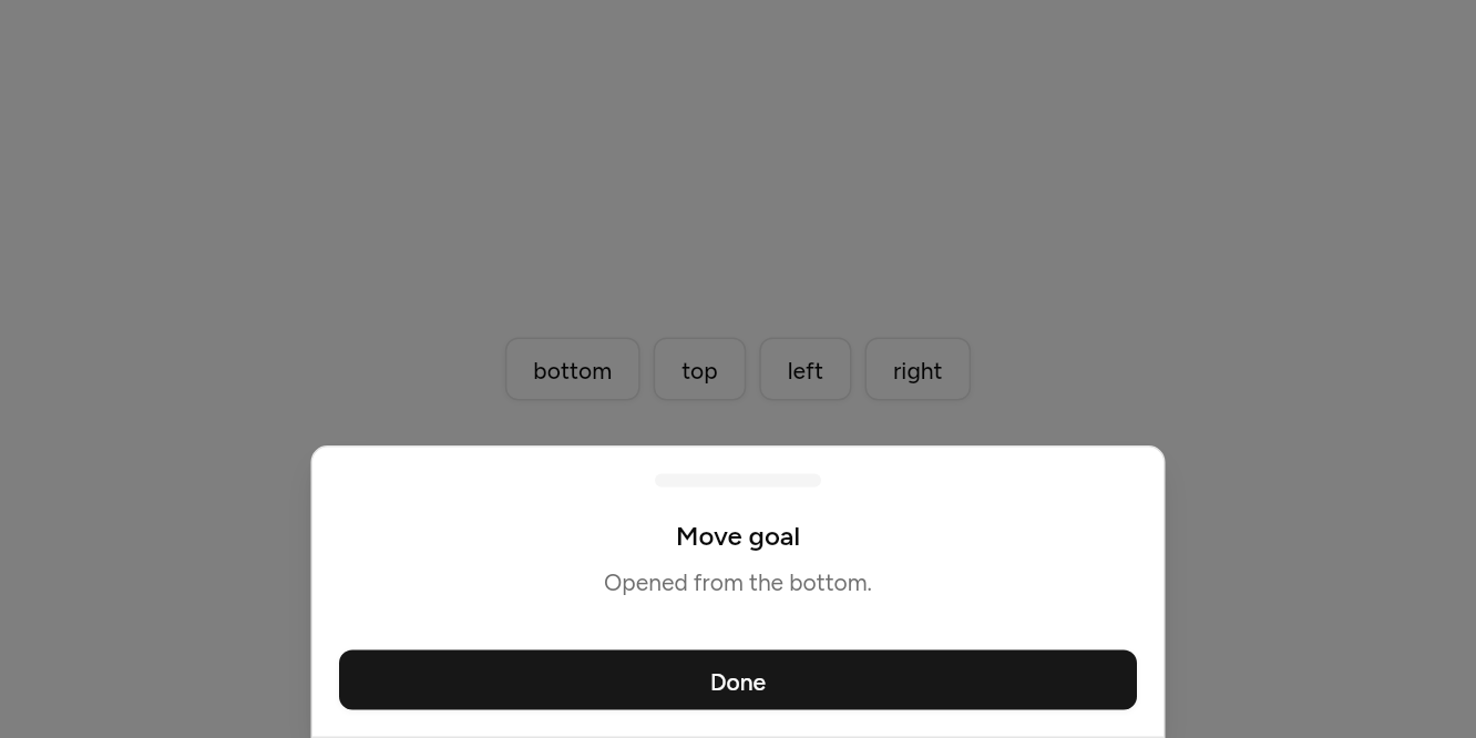
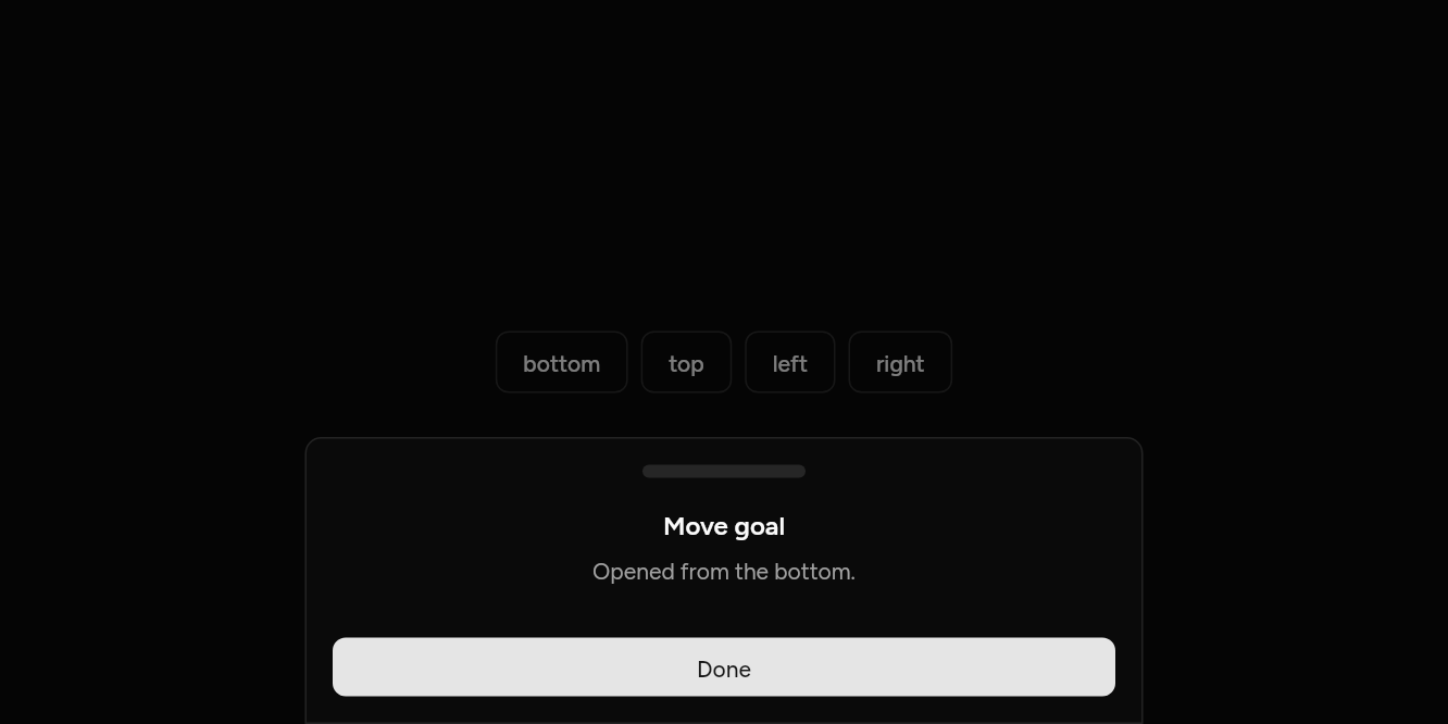
// From any edge: Up from the bottom, or from the other edges.
import 'package:flutter/widgets.dart';

import 'ui/button.dart';
import 'ui/drawer.dart';

class DrawerSidesExample extends StatelessWidget {
  const DrawerSidesExample({super.key});

  @override
  Widget build(BuildContext context) => Builder(
    builder: (context) => Wrap(
      spacing: 8,
      children: [
        for (final side in DrawerSide.values)
          Button(
            variant: ButtonVariant.outline,
            onPressed: () => showDrawer<void>(
              context: context,
              side: side,
              builder: (context) => Drawer(
                title: const Text('Move goal'),
                description: Text('Opened from the ${side.name}.'),
                footer: [Button(onPressed: () => Navigator.pop(context), child: const Text('Done'))],
              ),
            ),
            child: Text(side.name),
          ),
      ],
    ),
  );
}
API
Read from the source above: each parameter with its type, its default, and what it is for.
DrawerSideenum
The edge a drawer comes from.
| Value | What it is for |
|---|---|
bottom | |
top | |
left | |
right |
showDrawerfunction
Brings a panel in from an edge of the screen, the bottom by default, the way phones show choices and short forms. Drag it back to its edge, tap outside or press Escape to close it.
| Parameter | Type | Default | What it is for |
|---|---|---|---|
contextrequired |
BuildContext |
Where it is opened from: its theme and navigator come from here. | |
builderrequired |
WidgetBuilder |
Builds what it shows. | |
side |
DrawerSide |
DrawerSide.bottom |
The edge it slides in from. |
Drawerclass
The panel showDrawer brings in: a handle to drag (at the top and bottom), a header, content and a footer.
| Parameter | Type | Default | What it is for |
|---|---|---|---|
title | Widget? | The drawer's title. | |
description |
Widget? |
A line under the title. | |
content |
Widget? |
Its body, which scrolls when it is too tall. | |
footer |
List<Widget> |
const [] |
Along the bottom: usually buttons. |
maxWidth |
double |
512 |
From the top or the bottom of a wide screen, the content is kept to this width, centred; from a side, the panel is this wide at most. |
Source
What lands in your app. It is yours from then on: change it as you would your own code, and ashlar add
will not write over it.
lib/ui/drawer.dart 301 lines
// Ashlar UI: Drawer. Copied into your app by `ashlar add drawer`; it is yours to change.

import 'package:flutter/widgets.dart';

import 'theme.dart';

/// The edge a drawer comes from.
enum DrawerSide { bottom, top, left, right }

/// Brings a panel in from an edge of the screen, the bottom by default, the way phones
/// show choices and short forms. Drag it back to its edge, tap outside or press Escape to
/// close it.
///
/// ```dart
/// showDrawer(
///   context: context,
///   builder: (context) => Drawer(
///     title: Text('Move goal'),
///     description: Text('Set your daily steps.'),
///     content: StepsPicker(),
///     footer: [Button(onPressed: () => Navigator.pop(context), child: Text('Done'))],
///   ),
/// );
/// ```
Future<T?> showDrawer<T>({
  required BuildContext context,
  required WidgetBuilder builder,
  DrawerSide side = DrawerSide.bottom,
}) {
  final theme = AshlarTheme.of(context);
  return Navigator.of(context).push<T>(
    RawDialogRoute<T>(
      barrierDismissible: true,
      barrierLabel: 'Close',
      barrierColor: const Color(0x80000000),
      transitionDuration: const Duration(milliseconds: 300),
      pageBuilder: (context, animation, secondary) => AshlarTheme(
        data: theme,
        child: _DrawerSide(
          side: side,
          child: AboveKeyboard(child: Builder(builder: builder)),
        ),
      ),
      transitionBuilder: (context, animation, secondary, child) {
        final curved = CurvedAnimation(
          parent: animation,
          curve: Curves.easeOutCubic,
          reverseCurve: Curves.easeInCubic,
        );
        final from = switch (side) {
          DrawerSide.bottom => const Offset(0, 1),
          DrawerSide.top => const Offset(0, -1),
          DrawerSide.left => const Offset(-1, 0),
          DrawerSide.right => const Offset(1, 0),
        };
        return SlideTransition(
          position: Tween(begin: from, end: Offset.zero).animate(curved),
          child: child,
        );
      },
    ),
  );
}

class _DrawerSide extends InheritedWidget {
  const _DrawerSide({required this.side, required super.child});

  final DrawerSide side;

  @override
  bool updateShouldNotify(_DrawerSide old) => old.side != side;
}

/// The panel [showDrawer] brings in: a handle to drag (at the top and bottom), a header,
/// [content] and a [footer].
class Drawer extends StatefulWidget {
  const Drawer({
    super.key,
    this.title,
    this.description,
    this.content,
    this.footer = const [],
    this.maxWidth = 512,
  });

  /// The drawer's title.
  final Widget? title;

  /// A line under the title.
  final Widget? description;

  /// Its body, which scrolls when it is too tall.
  final Widget? content;

  /// Along the bottom: usually buttons.
  final List<Widget> footer;

  /// From the top or the bottom of a wide screen, the content is kept to this width,
  /// centred; from a side, the panel is this wide at most.
  final double maxWidth;

  @override
  State<Drawer> createState() => _DrawerState();
}

class _DrawerState extends State<Drawer> {
  /// How far it has been dragged back towards its edge.
  double _drag = 0;

  DrawerSide get _side =>
      context.dependOnInheritedWidgetOfExactType<_DrawerSide>()?.side ??
      DrawerSide.bottom;
  bool get _vertical => _side == DrawerSide.bottom || _side == DrawerSide.top;

  /// Positive is towards the drawer's own edge.
  double _towardsEdge(Offset delta) => switch (_side) {
    DrawerSide.bottom => delta.dy,
    DrawerSide.top => -delta.dy,
    DrawerSide.left => -delta.dx,
    DrawerSide.right => delta.dx,
  };

  void _end(double velocity, double extent) {
    // Back far enough, or flicked towards its edge: close. Otherwise it springs back.
    if (_drag > extent * .3 || velocity > 700) {
      Navigator.maybePop(context);
    } else {
      setState(() => _drag = 0);
    }
  }

  @override
  Widget build(BuildContext context) {
    final t = AshlarTheme.of(context);
    final c = t.colors;
    final side = _side, vertical = _vertical;
    final radius = Radius.circular(t.radiusLg);
    final screen = MediaQuery.sizeOf(context);
    final shift = switch (side) {
      DrawerSide.bottom => Offset(0, _drag),
      DrawerSide.top => Offset(0, -_drag),
      DrawerSide.left => Offset(-_drag, 0),
      DrawerSide.right => Offset(_drag, 0),
    };
    final handle = Container(
      margin: EdgeInsets.only(
        top: side == DrawerSide.bottom ? 16 : 0,
        bottom: side == DrawerSide.top ? 16 : 0,
      ),
      width: 100,
      height: 8,
      decoration: BoxDecoration(
        color: c.muted,
        borderRadius: BorderRadius.circular(4),
      ),
    );
    final body = Column(
      mainAxisSize: vertical ? MainAxisSize.min : MainAxisSize.max,
      crossAxisAlignment: CrossAxisAlignment.stretch,
      children: [
        Padding(
          padding: const EdgeInsets.all(16),
          child: Column(
            crossAxisAlignment: vertical
                ? CrossAxisAlignment.center
                : CrossAxisAlignment.start,
            children: [
              if (widget.title != null)
                Semantics(
                  header: true,
                  child: DefaultTextStyle.merge(
                    style: t.text.base.copyWith(fontWeight: FontWeight.w600),
                    textAlign: vertical ? TextAlign.center : null,
                    child: widget.title!,
                  ),
                ),
              if (widget.description != null) ...[
                const SizedBox(height: 6),
                DefaultTextStyle.merge(
                  style: TextStyle(color: c.mutedForeground),
                  textAlign: vertical ? TextAlign.center : null,
                  child: widget.description!,
                ),
              ],
            ],
          ),
        ),
        if (widget.content != null)
          Flexible(
            child: SingleChildScrollView(
              padding: const EdgeInsets.symmetric(horizontal: 16),
              child: widget.content,
            ),
          ),
        if (!vertical) const Spacer(),
        if (widget.footer.isNotEmpty)
          Padding(
            padding: const EdgeInsets.all(16),
            child: Column(
              crossAxisAlignment: CrossAxisAlignment.stretch,
              children: [
                for (final (i, f) in widget.footer.indexed) ...[
                  if (i > 0) const SizedBox(height: 8),
                  f,
                ],
              ],
            ),
          ),
      ],
    );
    return Align(
      alignment: switch (side) {
        DrawerSide.bottom => Alignment.bottomCenter,
        DrawerSide.top => Alignment.topCenter,
        DrawerSide.left => Alignment.centerLeft,
        DrawerSide.right => Alignment.centerRight,
      },
      child: LayoutBuilder(
        builder: (context, box) {
          final extent = vertical
              ? screen.height * .8
              : (widget.maxWidth < screen.width * .8
                    ? widget.maxWidth
                    : screen.width * .8);
          void update(Offset delta) => setState(
            () =>
                _drag = (_drag + _towardsEdge(delta)).clamp(0, double.infinity),
          );
          return GestureDetector(
            onVerticalDragUpdate: vertical ? (d) => update(d.delta) : null,
            onVerticalDragEnd: vertical
                ? (d) => _end(
                    side == DrawerSide.bottom
                        ? d.primaryVelocity ?? 0
                        : -(d.primaryVelocity ?? 0),
                    extent,
                  )
                : null,
            onHorizontalDragUpdate: vertical ? null : (d) => update(d.delta),
            onHorizontalDragEnd: vertical
                ? null
                : (d) => _end(
                    side == DrawerSide.right
                        ? d.primaryVelocity ?? 0
                        : -(d.primaryVelocity ?? 0),
                    extent,
                  ),
            child: AnimatedContainer(
              duration: _drag == 0 ? t.duration : Duration.zero,
              transform: Matrix4.translationValues(shift.dx, shift.dy, 0),
              width: vertical ? null : extent,
              height: vertical ? null : double.infinity,
              constraints: vertical ? BoxConstraints(maxHeight: extent) : null,
              decoration: BoxDecoration(
                color: c.background,
                borderRadius: switch (side) {
                  DrawerSide.bottom => BorderRadius.vertical(top: radius),
                  DrawerSide.top => BorderRadius.vertical(bottom: radius),
                  DrawerSide.left => BorderRadius.horizontal(right: radius),
                  DrawerSide.right => BorderRadius.horizontal(left: radius),
                },
                border: Border.all(color: c.border),
                boxShadow: t.shadowLg,
              ),
              child: SafeArea(
                top: side != DrawerSide.bottom,
                bottom: side != DrawerSide.top,
                child: Semantics(
                  scopesRoute: true,
                  namesRoute: true,
                  explicitChildNodes: true,
                  child: DefaultTextStyle(
                    style: t.text.sm.copyWith(color: c.foreground),
                    child: vertical
                        ? Column(
                            mainAxisSize: MainAxisSize.min,
                            children: [
                              // The handle: a reminder it can be dragged, not a control.
                              if (side == DrawerSide.bottom) handle,
                              Flexible(
                                child: ConstrainedBox(
                                  constraints: BoxConstraints(
                                    maxWidth: widget.maxWidth,
                                  ),
                                  child: body,
                                ),
                              ),
                              if (side == DrawerSide.top) handle,
                            ],
                          )
                        : body,
                  ),
                ),
              ),
            ),
          );
        },
      ),
    );
  }
}