

Avatar
A picture in a circle, with initials while it loads or when it fails.
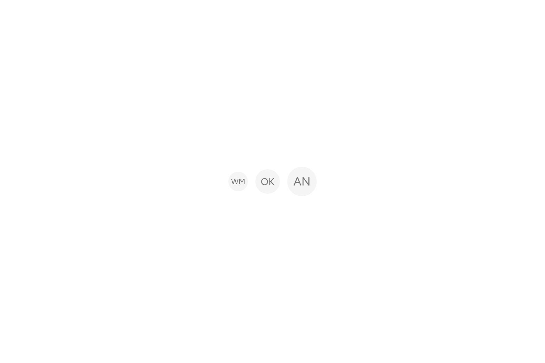
import 'package:flutter/widgets.dart';

import 'ui/avatar.dart';

class AvatarDemo extends StatelessWidget {
  const AvatarDemo({super.key});

  @override
  Widget build(BuildContext context) => const Row(
    mainAxisSize: MainAxisSize.min,
    children: [
      Avatar(fallback: 'WM', semanticLabel: 'Wanjiru Mwangi'),
      SizedBox(width: 12),
      Avatar(fallback: 'OK', size: 40, semanticLabel: 'Otieno Kamau'),
      SizedBox(width: 12),
      Avatar(fallback: 'AN', size: 48, semanticLabel: 'Achieng Njeri'),
    ],
  );
}
Try its options
Each option its constructor takes, to change and see; the code below it is what you chose, to copy.
Add it
In your Flutter project:
ashlar add avatar
It writes theme.dart, palette.dart and avatar.dart into lib/ui, keeping any you already have.
Examples
Other ways to use it, each running live, with its code.
A group
Overlapping, the rest counted.
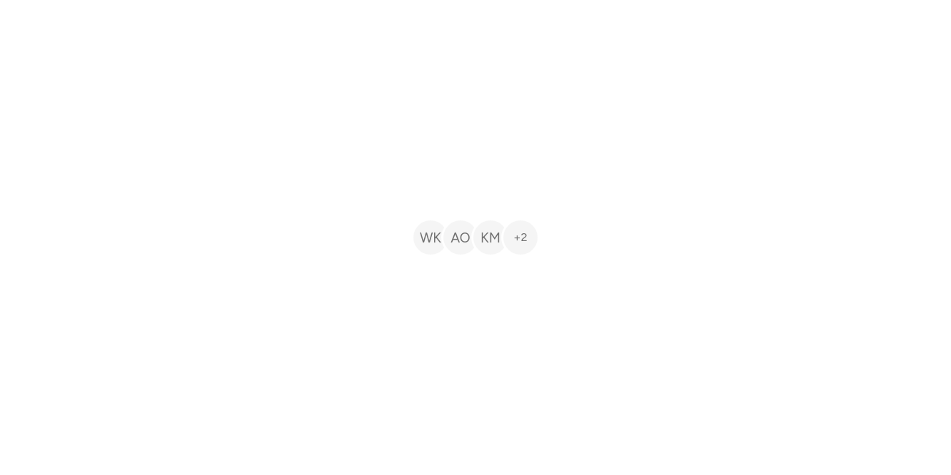

// A group: Overlapping, the rest counted.
import 'package:flutter/widgets.dart';

import 'ui/avatar.dart';

class AvatarGroupExample extends StatelessWidget {
  const AvatarGroupExample({super.key});

  @override
  Widget build(BuildContext context) => const AvatarGroup(
    max: 3,
    semanticLabel: 'Five people',
    children: [
      Avatar(fallback: 'WK'),
      Avatar(fallback: 'AO'),
      Avatar(fallback: 'KM'),
      Avatar(fallback: 'TM'),
      Avatar(fallback: 'LD'),
    ],
  );
}
With a badge
A dot for online, or an icon.
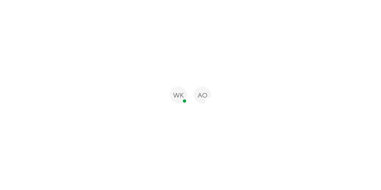

// With a badge: A dot for online, or an icon.
import 'package:ashlar_icons/ashlar_icons.dart';
import 'package:flutter/widgets.dart';

import 'ui/avatar.dart';

class AvatarBadgeExample extends StatelessWidget {
  const AvatarBadgeExample({super.key});

  @override
  Widget build(BuildContext context) => const Row(
    mainAxisSize: MainAxisSize.min,
    children: [
      Avatar(fallback: 'WK', size: 40, badge: AvatarDot()),
      SizedBox(width: 16),
      Avatar(fallback: 'AO', size: 40, badge: AshlarIcon(AshlarIconsRoundedStroke.check, size: 10)),
    ],
  );
}
API
Read from the source above: each parameter with its type, its default, and what it is for.
Avatarclass
A person's picture in a circle, or their initials while it loads or when it fails.
| Parameter | Type | Default | What it is for |
|---|---|---|---|
image |
ImageProvider? |
The picture. The fallback shows until it loads, or when it fails. | |
fallbackrequired |
String |
Usually initials: one or two letters. | |
size |
double |
32 |
Its width and height. |
semanticLabel |
String? |
Who it is, for screen readers. Without it the avatar is left out of what they read. | |
badge |
Widget? |
A small mark at the bottom right: a dot for online, or a 12px icon in a circle. |
AvatarDotclass
A dot for an Avatar's badge: green for online, or any colour.
| Parameter | Type | Default | What it is for |
|---|---|---|---|
color |
Color |
const Color(0xFF16A34A) |
Its colour: green, for online, unless you say. |
size |
double |
8 |
Its width and height. |
AvatarGroupclass
Avatars overlapping in a row, each ringed in the page colour; past max, a count of the rest.
| Parameter | Type | Default | What it is for |
|---|---|---|---|
childrenrequired |
List<Avatar> |
The avatars, first in front. | |
max | int? | How many to show before "+n". | |
size |
double |
32 |
Each avatar's width and height. |
semanticLabel |
String? |
Who they are, together: 'Design team, 5 people'. |
Source
What lands in your app. It is yours from then on: change it as you would your own code, and ashlar add
will not write over it.
lib/ui/avatar.dart 226 lines
// Ashlar UI: Avatar. Copied into your app by `ashlar add avatar`; it is yours to change.

import 'package:flutter/widgets.dart';

import 'theme.dart';

/// A person's picture in a circle, or their initials while it loads or when it fails.
///
/// ```dart
/// Avatar(image: NetworkImage(user.photoUrl), fallback: 'WM', semanticLabel: 'Wanjiru Mwangi')
/// Avatar(fallback: 'WM', size: 40)
/// ```
class Avatar extends StatelessWidget {
  const Avatar({
    super.key,
    this.image,
    required this.fallback,
    this.size = 32,
    this.semanticLabel,
    this.badge,
  });

  /// A small mark at the bottom right: a dot for online, or a 12px icon in a circle.
  final Widget? badge;

  /// The picture. The fallback shows until it loads, or when it fails.
  final ImageProvider? image;

  /// Usually initials: one or two letters.
  final String fallback;

  /// Its width and height.
  final double size;

  /// Who it is, for screen readers. Without it the avatar is left out of what they read.
  final String? semanticLabel;

  @override
  Widget build(BuildContext context) {
    final t = AshlarTheme.of(context);
    final initials = Container(
      color: t.colors.muted,
      alignment: Alignment.center,
      child: Text(
        fallback,
        style: t.text.sm.copyWith(
          color: t.colors.mutedForeground,
          fontSize: size * .4,
          height: 1,
          // The font's spare leading split above and below, so the text sits centred.
          leadingDistribution: TextLeadingDistribution.even,
        ),
        maxLines: 1,
      ),
    );
    final body = SizedBox.square(
      dimension: size,
      child: ClipOval(
        child: image == null
            ? initials
            : Image(
                image: image!,
                fit: BoxFit.cover,
                frameBuilder: (context, child, frame, sync) =>
                    frame == null && !sync ? initials : child,
                errorBuilder: (context, error, stack) => initials,
              ),
      ),
    );
    final marked = badge == null
        ? body
        : Stack(
            clipBehavior: Clip.none,
            children: [
              body,
              PositionedDirectional(
                end: 0,
                bottom: 0,
                child: Container(
                  // A ring of the page round the badge sets it off the picture.
                  padding: const EdgeInsets.all(2),
                  decoration: BoxDecoration(
                    color: t.colors.background,
                    shape: BoxShape.circle,
                  ),
                  child: IconTheme.merge(
                    data: IconThemeData(
                      color: t.colors.primaryForeground,
                      size: size * .25,
                    ),
                    child: badge!,
                  ),
                ),
              ),
            ],
          );
    return semanticLabel == null
        ? ExcludeSemantics(child: marked)
        : Semantics(
            label: semanticLabel,
            image: true,
            child: ExcludeSemantics(child: marked),
          );
  }
}

/// A dot for an [Avatar]'s badge: green for online, or any colour.
class AvatarDot extends StatelessWidget {
  const AvatarDot({
    super.key,
    this.color = const Color(0xFF16A34A),
    this.size = 8,
  });

  /// Its colour: green, for online, unless you say.
  final Color color;

  /// Its width and height.
  final double size;

  @override
  Widget build(BuildContext context) => Container(
    width: size,
    height: size,
    decoration: BoxDecoration(color: color, shape: BoxShape.circle),
  );
}

/// Avatars overlapping in a row, each ringed in the page colour; past [max], a count of
/// the rest.
///
/// ```dart
/// AvatarGroup(max: 3, children: [for (final p in team) Avatar(fallback: p.initials, semanticLabel: p.name)])
/// ```
class AvatarGroup extends StatelessWidget {
  const AvatarGroup({
    super.key,
    required this.children,
    this.max,
    this.size = 32,
    this.semanticLabel,
  });

  /// The avatars, first in front.
  final List<Avatar> children;

  /// How many to show before "+n".
  final int? max;

  /// Each avatar's width and height.
  final double size;

  /// Who they are, together: 'Design team, 5 people'.
  final String? semanticLabel;

  @override
  Widget build(BuildContext context) {
    final t = AshlarTheme.of(context);
    final shown = max == null || children.length <= max!
        ? children
        : children.take(max!).toList();
    final rest = children.length - shown.length;
    Widget ringed(Widget child) => Container(
      padding: const EdgeInsets.all(2),
      decoration: BoxDecoration(
        color: t.colors.background,
        shape: BoxShape.circle,
      ),
      child: child,
    );
    final overlap = size * .25;
    final items = [
      for (final a in shown)
        ringed(
          Avatar(
            image: a.image,
            fallback: a.fallback,
            size: size,
            badge: a.badge,
          ),
        ),
      if (rest > 0)
        ringed(
          Container(
            width: size,
            height: size,
            alignment: Alignment.center,
            decoration: BoxDecoration(
              color: t.colors.muted,
              shape: BoxShape.circle,
            ),
            child: Text(
              '+$rest',
              style: t.text.xs.copyWith(
                color: t.colors.mutedForeground,
                fontSize: size * .34,
              ),
            ),
          ),
        ),
    ];
    return Semantics(
      container: true,
      label:
          semanticLabel ??
          [for (final a in children) a.semanticLabel]
              .whereType<String>()
              .join(', '),
      child: ExcludeSemantics(
        child: SizedBox(
          height: size + 4,
          width: items.length * (size + 4) - (items.length - 1) * overlap,
          child: Stack(
            children: [
              for (final (i, item) in items.indexed)
                PositionedDirectional(
                  start: i * (size + 4 - overlap),
                  child: item,
                ),
            ],
          ),
        ),
      ),
    );
  }
}