

Slider
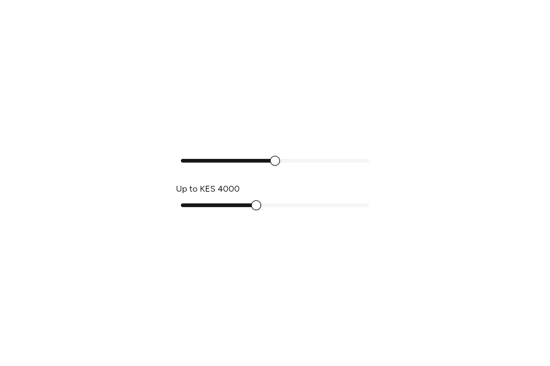
A value picked by dragging along a track, or with the arrow keys.
import 'package:flutter/widgets.dart';

import 'ui/slider.dart';

class SliderDemo extends StatefulWidget {
  const SliderDemo({super.key});

  @override
  State<SliderDemo> createState() => _SliderDemoState();
}

class _SliderDemoState extends State<SliderDemo> {
  double volume = .5, price = 4000;

  @override
  Widget build(BuildContext context) => SizedBox(
    width: 320,
    child: Column(
      mainAxisSize: MainAxisSize.min,
      crossAxisAlignment: CrossAxisAlignment.start,
      children: [
        Slider(value: volume, onChanged: (v) => setState(() => volume = v), semanticLabel: 'Volume'),
        const SizedBox(height: 24),
        Text('Up to KES ${price.round()}'),
        const SizedBox(height: 8),
        Slider(
          value: price,
          min: 0,
          max: 10000,
          step: 500,
          onChanged: (v) => setState(() => price = v),
          semanticLabel: 'Highest price',
          semanticFormat: (v) => 'KES ${v.round()}',
        ),
      ],
    ),
  );
}
Try its options
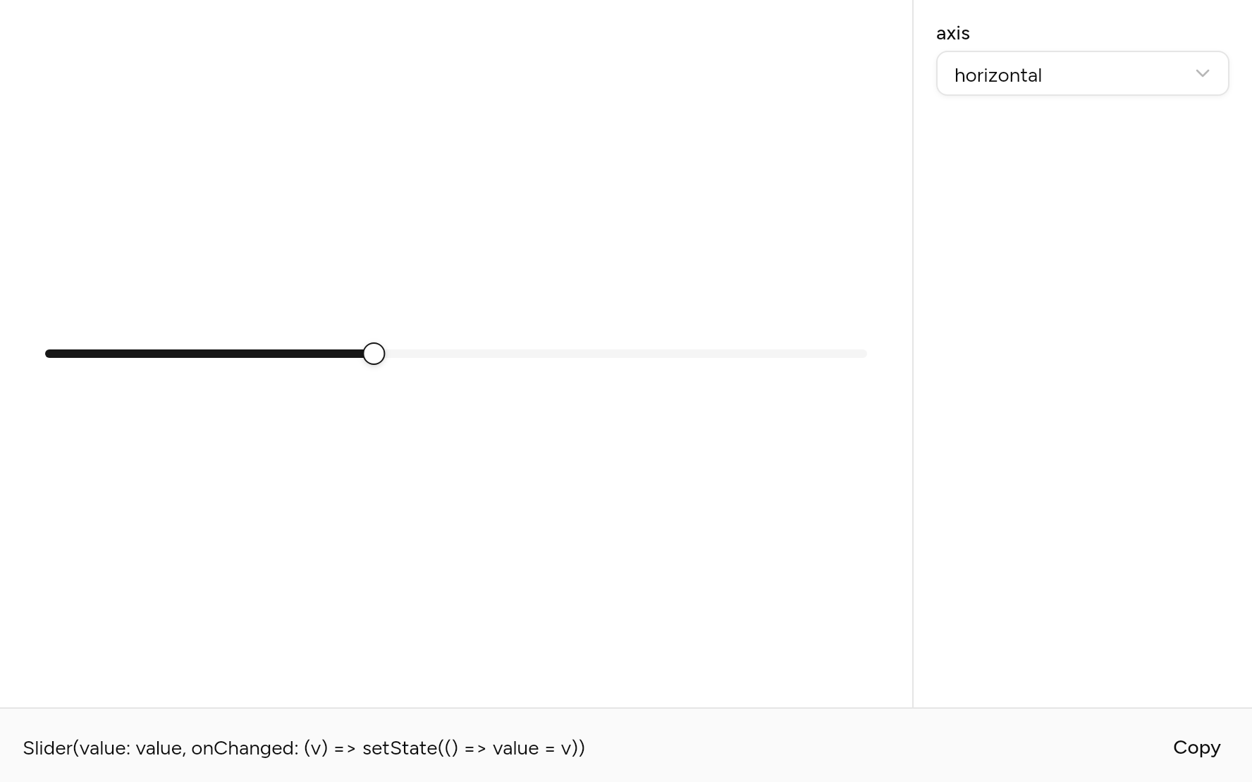
Each option its constructor takes, to change and see; the code below it is what you chose, to copy.
Add it
In your Flutter project:
ashlar add slider
It writes theme.dart, palette.dart and slider.dart into lib/ui, keeping any you already have.
Examples
Other ways to use it, each running live, with its code.
A range
Two thumbs for a span.
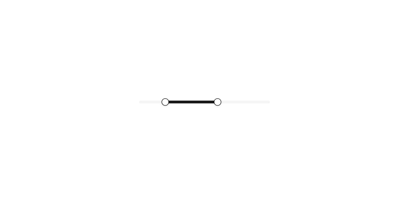
// A range: Two thumbs for a span.
import 'package:flutter/widgets.dart';

import 'ui/slider.dart';

class SliderRangeExample extends StatefulWidget {
  const SliderRangeExample({super.key});

  @override
  State<SliderRangeExample> createState() => _SliderRangeExampleState();
}

class _SliderRangeExampleState extends State<SliderRangeExample> {
  var price = (20000.0, 60000.0);

  @override
  Widget build(BuildContext context) => SizedBox(
    width: 300,
    child: Slider.range(
      values: price,
      max: 100000,
      step: 1000,
      semanticLabel: 'Price',
      onRangeChanged: (v) => setState(() => price = v),
    ),
  );
}
Several thumbs
Thumbs that never pass each other.
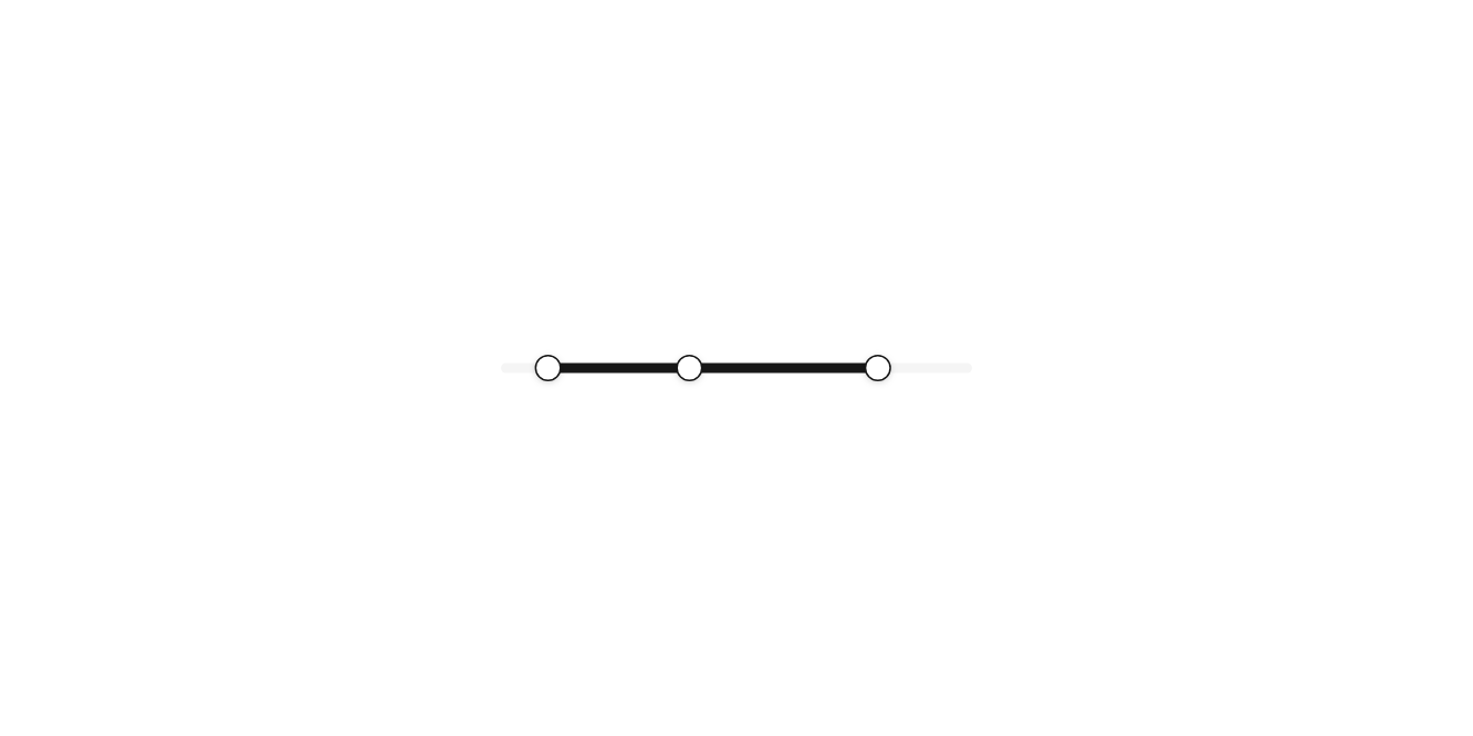
// Several thumbs: Thumbs that never pass each other.
import 'package:flutter/widgets.dart';

import 'ui/slider.dart';

class SliderMultipleExample extends StatefulWidget {
  const SliderMultipleExample({super.key});

  @override
  State<SliderMultipleExample> createState() => _SliderMultipleExampleState();
}

class _SliderMultipleExampleState extends State<SliderMultipleExample> {
  var stops = [.1, .4, .8];

  @override
  Widget build(BuildContext context) => SizedBox(
    width: 300,
    child: Slider.multiple(
      values: stops,
      onValuesChanged: (v) => setState(() => stops = v),
    ),
  );
}
Upright
The lowest at the bottom.
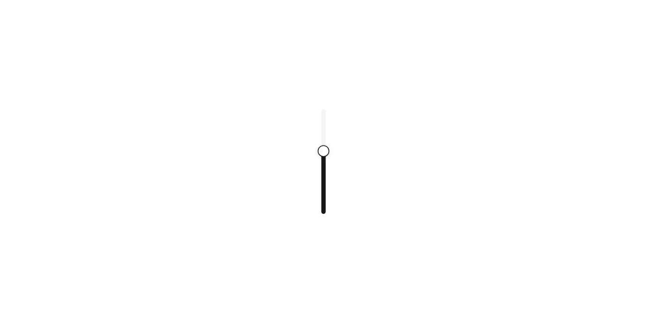
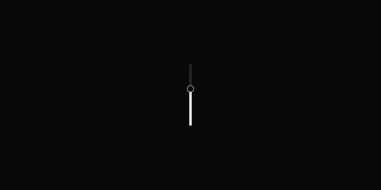
// Upright: The lowest at the bottom.
import 'package:flutter/widgets.dart';

import 'ui/slider.dart';

class SliderVerticalExample extends StatefulWidget {
  const SliderVerticalExample({super.key});

  @override
  State<SliderVerticalExample> createState() => _SliderVerticalExampleState();
}

class _SliderVerticalExampleState extends State<SliderVerticalExample> {
  var volume = .6;

  @override
  Widget build(BuildContext context) => Slider(
    axis: Axis.vertical,
    length: 160,
    value: volume,
    semanticLabel: 'Volume',
    onChanged: (v) => setState(() => volume = v),
  );
}
API
Read from the source above: each parameter with its type, its default, and what it is for.
Sliderclass
A value between min and max, picked by dragging or tapping along a track, or with the arrow keys (Page Up and Page Down move ten steps, Home and End to the ends). Slider.range has a thumb at each end of a span, and Slider.multiple any number; a thumb never passes the ones beside it. axis lays it upright, the lowest at the bottom.
Slider(…)
| Parameter | Type | Default | What it is for |
|---|---|---|---|
valuerequired |
double |
The value, between min and max. | |
onChangedrequired |
ValueChanged<double>? |
Null disables it. | |
min |
double |
0 |
The value at the start. |
max |
double |
1 |
The value at the end. |
step |
double? |
What the value snaps to. Null moves freely; the keys then move a hundredth. | |
onChangeEnd |
ValueChanged<double>? |
Told the value when a drag or a key press ends: for saving. | |
semanticLabel |
String? |
What a screen reader calls it when its visible text does not say, as for an icon alone. | |
semanticFormat |
String Function(double value)? |
How a screen reader reads a value. Defaults to a percentage of the way along. | |
axis |
Axis |
Axis.horizontal |
Horizontal lays it out across; vertical, down. |
length |
double |
200 |
Upright, how tall it is; across, it fills the width it is given. |
Slider.range(…)
| Parameter | Type | Default | What it is for |
|---|---|---|---|
valuesrequired |
(double, double) |
The values of a slider with several thumbs, in order. | |
onRangeChangedrequired |
ValueChanged<(double, double)>? |
Told the new range whenever either end changes. | |
min |
double |
0 |
The value at the start. |
max |
double |
1 |
The value at the end. |
step |
double? |
What the value snaps to. Null moves freely; the keys then move a hundredth. | |
semanticLabel |
String? |
What a screen reader calls it when its visible text does not say, as for an icon alone. | |
semanticFormat |
String Function(double value)? |
How a screen reader reads a value. Defaults to a percentage of the way along. | |
axis |
Axis |
Axis.horizontal |
Horizontal lays it out across; vertical, down. |
length |
double |
200 |
Upright, how tall it is; across, it fills the width it is given. |
Slider.multiple(…)
| Parameter | Type | Default | What it is for |
|---|---|---|---|
valuesrequired |
List<double> |
The values of a slider with several thumbs, in order. | |
onValuesChangedrequired |
ValueChanged<List<double>>? |
Told the new values whenever one changes. | |
min |
double |
0 |
The value at the start. |
max |
double |
1 |
The value at the end. |
step |
double? |
What the value snaps to. Null moves freely; the keys then move a hundredth. | |
semanticLabel |
String? |
What a screen reader calls it when its visible text does not say, as for an icon alone. | |
semanticFormat |
String Function(double value)? |
How a screen reader reads a value. Defaults to a percentage of the way along. | |
axis |
Axis |
Axis.horizontal |
Horizontal lays it out across; vertical, down. |
length |
double |
200 |
Upright, how tall it is; across, it fills the width it is given. |
Source
What lands in your app. It is yours from then on: change it as you would your own code, and ashlar add
will not write over it.
lib/ui/slider.dart 419 lines
// Ashlar UI: Slider. Copied into your app by `ashlar add slider`; it is yours to change.

import 'package:flutter/services.dart';
import 'package:flutter/widgets.dart';

import 'theme.dart';

/// A value between [min] and [max], picked by dragging or tapping along a track, or with
/// the arrow keys (Page Up and Page Down move ten steps, Home and End to the ends).
/// [Slider.range] has a thumb at each end of a span, and [Slider.multiple] any number; a
/// thumb never passes the ones beside it. [axis] lays it upright, the lowest at the bottom.
///
/// ```dart
/// Slider(value: volume, onChanged: (v) => setState(() => volume = v), semanticLabel: 'Volume')
/// Slider.range(values: (200, 800), min: 0, max: 1000, step: 50, onRangeChanged: (r) => setState(() => price = r))
/// ```
class Slider extends StatefulWidget {
  const Slider({
    super.key,
    required double this.value,
    required this.onChanged,
    this.min = 0,
    this.max = 1,
    this.step,
    this.onChangeEnd,
    this.semanticLabel,
    this.semanticFormat,
    this.axis = Axis.horizontal,
    this.length = 200,
  }) : values = null,
       range = null,
       onRangeChanged = null,
       onValuesChanged = null;

  const Slider.range({
    super.key,
    required (double, double) values,
    required this.onRangeChanged,
    this.min = 0,
    this.max = 1,
    this.step,
    this.semanticLabel,
    this.semanticFormat,
    this.axis = Axis.horizontal,
    this.length = 200,
  }) : range = values,
       value = null,
       values = null,
       onChanged = null,
       onChangeEnd = null,
       onValuesChanged = null;

  const Slider.multiple({
    super.key,
    required List<double> this.values,
    required this.onValuesChanged,
    this.min = 0,
    this.max = 1,
    this.step,
    this.semanticLabel,
    this.semanticFormat,
    this.axis = Axis.horizontal,
    this.length = 200,
  }) : value = null,
       range = null,
       onChanged = null,
       onChangeEnd = null,
       onRangeChanged = null;

  /// The value, between min and max.
  final double? value;
  final (double, double)? range;

  /// The values of a slider with several thumbs, in order.
  final List<double>? values;

  /// Null disables it.
  final ValueChanged<double>? onChanged;

  /// Told the new range whenever either end changes.
  final ValueChanged<(double, double)>? onRangeChanged;

  /// Told the new values whenever one changes.
  final ValueChanged<List<double>>? onValuesChanged;

  /// Told the value when a drag or a key press ends: for saving.
  final ValueChanged<double>? onChangeEnd;

  /// The value at the start.
  final double min;

  /// The value at the end.
  final double max;

  /// What the value snaps to. Null moves freely; the keys then move a hundredth.
  final double? step;

  /// What a screen reader calls it when its visible text does not say, as for an icon
  /// alone.
  final String? semanticLabel;

  /// How a screen reader reads a value. Defaults to a percentage of the way along.
  final String Function(double value)? semanticFormat;

  /// Horizontal lays it out across; vertical, down.
  final Axis axis;

  /// Upright, how tall it is; across, it fills the width it is given.
  final double length;

  @override
  State<Slider> createState() => _SliderState();
}

class _SliderState extends State<Slider> {
  int? _dragging;

  List<double> get _values =>
      widget.values ??
      (widget.range != null
          ? [widget.range!.$1, widget.range!.$2]
          : [widget.value!]);
  bool get _enabled =>
      widget.onChanged != null ||
      widget.onRangeChanged != null ||
      widget.onValuesChanged != null;
  double get _keyStep => widget.step ?? (widget.max - widget.min) / 100;
  double _fraction(double v) =>
      ((v - widget.min) / (widget.max - widget.min)).clamp(0.0, 1.0);

  double _snap(double v) {
    v = v.clamp(widget.min, widget.max);
    final s = widget.step;
    return s == null
        ? v
        : (widget.min + ((v - widget.min) / s).round() * s).clamp(
            widget.min,
            widget.max,
          );
  }

  /// Moves thumb [i] to [v], kept between the thumbs either side of it.
  void _set(int i, double v) {
    final values = [..._values];
    final low = i > 0 ? values[i - 1] : widget.min,
        high = i < values.length - 1 ? values[i + 1] : widget.max;
    v = _snap(v).clamp(low, high);
    if (v == values[i]) return;
    values[i] = v;
    if (widget.onChanged != null) {
      widget.onChanged!(v);
    } else if (widget.onRangeChanged != null) {
      widget.onRangeChanged!((values[0], values[1]));
    } else {
      widget.onValuesChanged?.call(values);
    }
  }

  String _read(double v) =>
      widget.semanticFormat?.call(v) ??
      '${((v - widget.min) / (widget.max - widget.min) * 100).round()}%';

  String? _labelFor(int i, int n) {
    if (n == 1) return widget.semanticLabel;
    final which = n == 2 ? (i == 0 ? 'lowest' : 'highest') : 'thumb ${i + 1}';
    return widget.semanticLabel == null
        ? which
        : '${widget.semanticLabel}, $which';
  }

  @override
  Widget build(BuildContext context) {
    final t = AshlarTheme.of(context);
    final c = t.colors;
    const thumb = 16.0;
    final across = widget.axis == Axis.horizontal;
    final rtl = isRtl(context);
    final values = _values;
    return LayoutBuilder(
      builder: (context, box) {
        final length = across
            ? (box.maxWidth.isFinite ? box.maxWidth : 200.0)
            : widget.length;
        final usable = length - thumb;
        // Along the track from its start; upright, the start is the bottom, and in
        // right-to-left text it is the right.
        double at(double v) => _fraction(v) * usable;
        double valueAt(Offset p) {
          final d = across
              ? (rtl ? (length - thumb / 2) - p.dx : p.dx - thumb / 2)
              : (length - thumb / 2) - p.dy;
          return widget.min +
              (d / usable).clamp(0.0, 1.0) * (widget.max - widget.min);
        }

        int nearest(double v) {
          var best = 0;
          for (var i = 1; i < values.length; i++) {
            if ((values[i] - v).abs() < (values[best] - v).abs() ||
                (values[i] == values[best] && v > values[i])) {
              best = i;
            }
          }
          return best;
        }

        final from = values.length == 1 ? 0.0 : at(values.first),
            to = at(values.last);
        Widget along(double start, double extent, Widget child) => across
            ? PositionedDirectional(
                start: start,
                width: extent,
                top: 0,
                bottom: 0,
                child: child,
              )
            : Positioned(
                bottom: start,
                height: extent,
                left: 0,
                right: 0,
                child: child,
              );

        return GestureDetector(
          behavior: HitTestBehavior.opaque,
          onTapDown: _enabled
              ? (d) {
                  final v = valueAt(d.localPosition);
                  _set(nearest(v), v);
                }
              : null,
          onPanStart: _enabled
              ? (d) => setState(
                  () => _dragging = nearest(valueAt(d.localPosition)),
                )
              : null,
          onPanUpdate: _enabled && _dragging != null
              ? (d) => _set(_dragging!, valueAt(d.localPosition))
              : null,
          onPanEnd: _enabled
              ? (_) {
                  final i = _dragging;
                  setState(() => _dragging = null);
                  if (i != null) widget.onChangeEnd?.call(_values[i]);
                }
              : null,
          child: Opacity(
            opacity: _enabled ? 1 : .5,
            child: SizedBox(
              width: across ? length : 20,
              height: across ? 20 : length,
              child: Stack(
                children: [
                  // The track, and the part of it chosen.
                  along(
                    thumb / 2,
                    usable,
                    Center(
                      child: Container(
                        width: across ? double.infinity : 6,
                        height: across ? 6 : double.infinity,
                        decoration: BoxDecoration(
                          color: c.muted,
                          borderRadius: BorderRadius.circular(3),
                        ),
                      ),
                    ),
                  ),
                  along(
                    thumb / 2 + from,
                    to - from,
                    Center(
                      child: Container(
                        width: across ? double.infinity : 6,
                        height: across ? 6 : double.infinity,
                        decoration: BoxDecoration(
                          color: c.primary,
                          borderRadius: BorderRadius.circular(3),
                        ),
                      ),
                    ),
                  ),
                  for (final (i, v) in values.indexed)
                    along(
                      at(v),
                      thumb,
                      Center(
                        child: _Thumb(
                          enabled: _enabled,
                          dragging: _dragging == i,
                          label: _labelFor(i, values.length),
                          value: _read(v),
                          increased: _read(_snap(v + _keyStep)),
                          decreased: _read(_snap(v - _keyStep)),
                          onStep: (steps) => _set(i, v + steps * _keyStep),
                          onEnd: (top) =>
                              _set(i, top ? widget.max : widget.min),
                        ),
                      ),
                    ),
                ],
              ),
            ),
          ),
        );
      },
    );
  }
}

/// A thumb: its own focus, keys and what a screen reader hears.
class _Thumb extends StatefulWidget {
  const _Thumb({
    required this.enabled,
    required this.dragging,
    required this.label,
    required this.value,
    required this.increased,
    required this.decreased,
    required this.onStep,
    required this.onEnd,
  });

  final bool enabled, dragging;
  final String? label;
  final String value, increased, decreased;
  final ValueChanged<int> onStep;
  final ValueChanged<bool> onEnd;

  @override
  State<_Thumb> createState() => _ThumbState();
}

class _ThumbState extends State<_Thumb> {
  bool _hovered = false, _focused = false;

  @override
  Widget build(BuildContext context) {
    final t = AshlarTheme.of(context);
    final c = t.colors;
    return Semantics(
      slider: true,
      label: widget.label,
      enabled: widget.enabled,
      value: widget.value,
      increasedValue: widget.increased,
      decreasedValue: widget.decreased,
      onIncrease: widget.enabled ? () => widget.onStep(1) : null,
      onDecrease: widget.enabled ? () => widget.onStep(-1) : null,
      child: FocusableActionDetector(
        enabled: widget.enabled,
        mouseCursor: widget.enabled
            ? SystemMouseCursors.click
            : SystemMouseCursors.basic,
        onShowFocusHighlight: (v) => setState(() => _focused = v),
        onShowHoverHighlight: (v) => setState(() => _hovered = v),
        shortcuts: {
          SingleActivator(LogicalKeyboardKey.arrowRight): _StepIntent(
            isRtl(context) ? -1 : 1,
          ),
          const SingleActivator(LogicalKeyboardKey.arrowUp): const _StepIntent(
            1,
          ),
          SingleActivator(LogicalKeyboardKey.arrowLeft): _StepIntent(
            isRtl(context) ? 1 : -1,
          ),
          const SingleActivator(LogicalKeyboardKey.arrowDown):
              const _StepIntent(-1),
          const SingleActivator(LogicalKeyboardKey.pageUp): const _StepIntent(
            10,
          ),
          const SingleActivator(LogicalKeyboardKey.pageDown): const _StepIntent(
            -10,
          ),
          const SingleActivator(LogicalKeyboardKey.home): const _EndIntent(
            false,
          ),
          const SingleActivator(LogicalKeyboardKey.end): const _EndIntent(true),
        },
        actions: {
          _StepIntent: CallbackAction<_StepIntent>(
            onInvoke: (i) => widget.onStep(i.steps),
          ),
          _EndIntent: CallbackAction<_EndIntent>(
            onInvoke: (i) => widget.onEnd(i.top),
          ),
        },
        child: AnimatedContainer(
          duration: t.duration,
          width: 16,
          height: 16,
          decoration: BoxDecoration(
            color: c.background,
            shape: BoxShape.circle,
            border: Border.all(color: c.primary),
            boxShadow: [
              if (_focused || ((_hovered || widget.dragging) && widget.enabled))
                BoxShadow(color: c.ring.withValues(alpha: .5), spreadRadius: 4),
              ...t.shadowSm,
            ],
          ),
        ),
      ),
    );
  }
}

class _StepIntent extends Intent {
  const _StepIntent(this.steps);

  final int steps;
}

class _EndIntent extends Intent {
  const _EndIntent(this.top);

  final bool top;
}