

Separator
A one-pixel line, across or down.
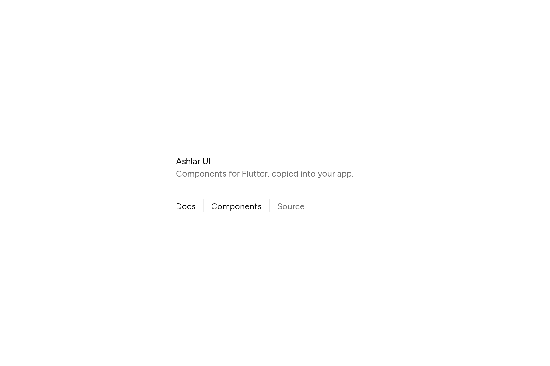
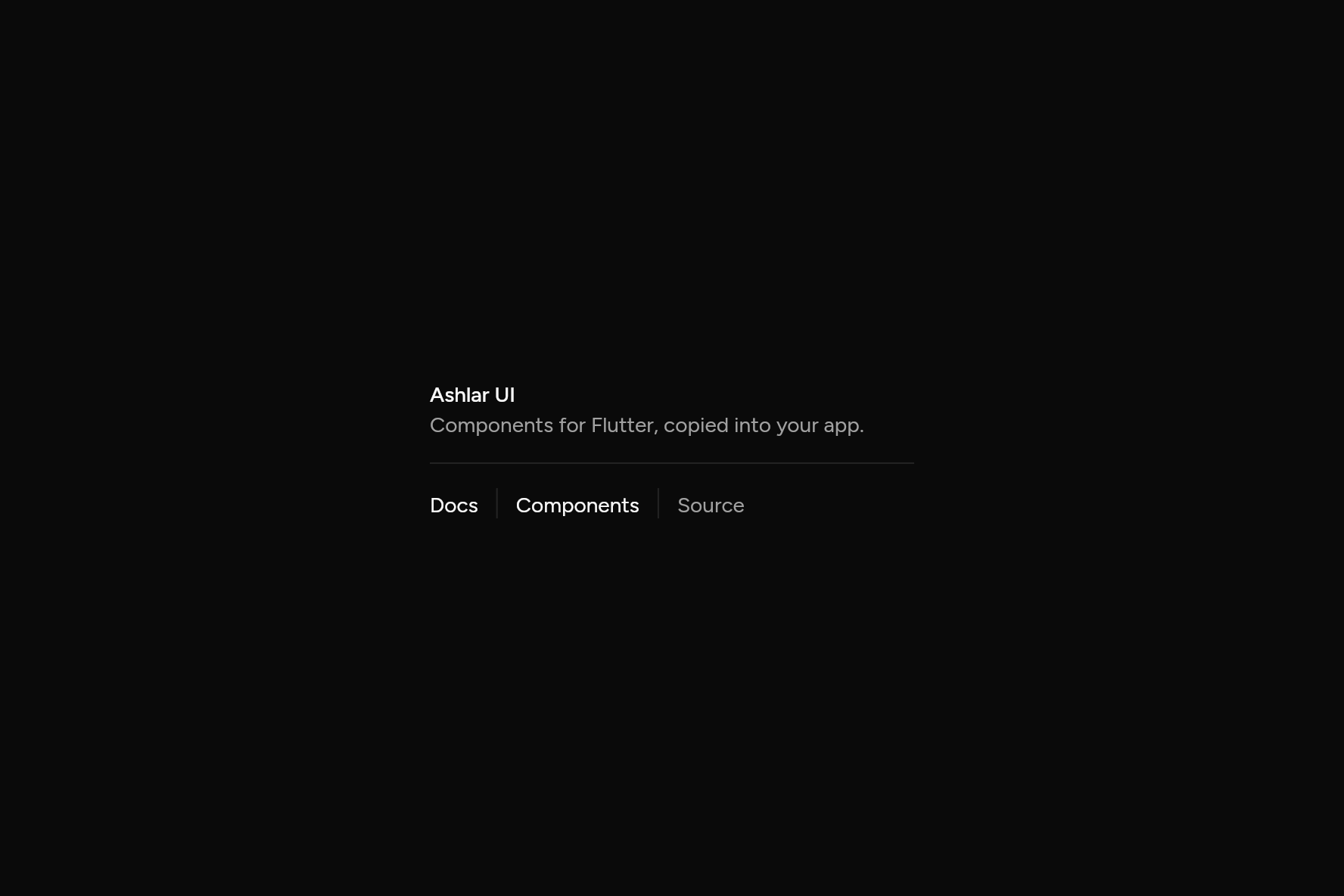
import 'package:flutter/widgets.dart';

import 'ui/separator.dart';
import 'ui/theme.dart';

class SeparatorDemo extends StatelessWidget {
  const SeparatorDemo({super.key});

  @override
  Widget build(BuildContext context) {
    final t = AshlarTheme.of(context);
    final muted = TextStyle(color: t.colors.mutedForeground);
    return SizedBox(
      width: 320,
      child: Column(
        mainAxisSize: MainAxisSize.min,
        crossAxisAlignment: CrossAxisAlignment.start,
        children: [
          Text('Ashlar UI', style: t.text.sm.copyWith(fontWeight: FontWeight.w500)),
          Text('Components for Flutter, copied into your app.', style: muted),
          const Padding(padding: EdgeInsets.symmetric(vertical: 16), child: Separator()),
          // As tall as the words: the lines between them follow the text, at any size.
          IntrinsicHeight(
            child: Row(
              children: [
                const Text('Docs'),
                const SizedBox(width: 12),
                const Separator(axis: Axis.vertical),
                const SizedBox(width: 12),
                const Text('Components'),
                const SizedBox(width: 12),
                const Separator(axis: Axis.vertical),
                const SizedBox(width: 12),
                Text('Source', style: muted),
              ],
            ),
          ),
        ],
      ),
    );
  }
}
Add it
In your Flutter project:
$
ashlar add separator
It writes theme.dart, palette.dart and separator.dart into lib/ui, keeping any you already have.
Examples
Other ways to use it, each running live, with its code.
Between items
Upright, between links in a row.
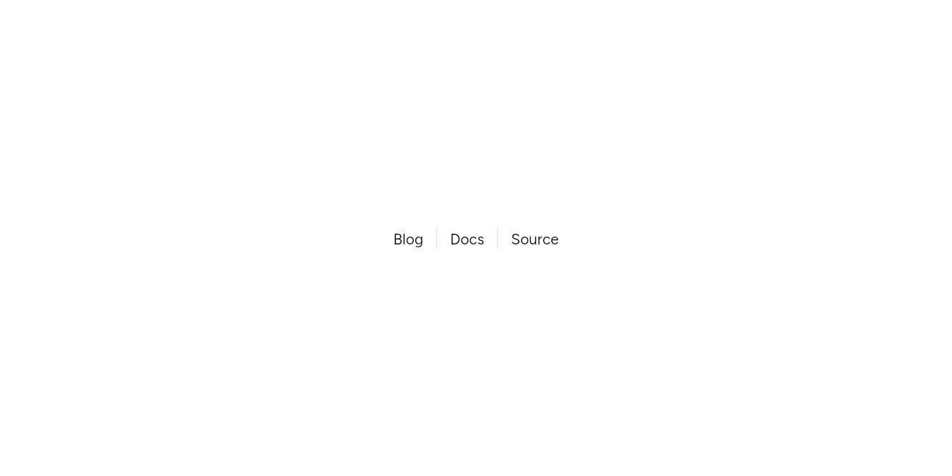

// Between items: Upright, between links in a row.
import 'package:flutter/widgets.dart';

import 'ui/separator.dart';

class SeparatorVerticalExample extends StatelessWidget {
  const SeparatorVerticalExample({super.key});

  @override
  // As tall as the words: the lines between them follow the text, at any size.
  Widget build(BuildContext context) => const IntrinsicHeight(
    child: Row(
      mainAxisSize: MainAxisSize.min,
      children: [
        Text('Blog'),
        SizedBox(width: 12),
        Separator(axis: Axis.vertical),
        SizedBox(width: 12),
        Text('Docs'),
        SizedBox(width: 12),
        Separator(axis: Axis.vertical),
        SizedBox(width: 12),
        Text('Source'),
      ],
    ),
  );
}
API
Read from the source above: each parameter with its type, its default, and what it is for.
Separatorclass
A one-pixel line between things, across (Axis.horizontal) or down (Axis.vertical).
| Parameter | Type | Default | What it is for |
|---|---|---|---|
axis |
Axis |
Axis.horizontal |
Horizontal draws a line across; vertical, down. |
Source
What lands in your app. It is yours from then on: change it as you would your own code, and ashlar add
will not write over it.
lib/ui/separator.dart 29 lines
// Ashlar UI: Separator. Copied into your app by `ashlar add separator`; it is yours to change.

import 'package:flutter/widgets.dart';

import 'theme.dart';

/// A one-pixel line between things, across ([Axis.horizontal]) or down ([Axis.vertical]).
class Separator extends StatelessWidget {
  const Separator({super.key, this.axis = Axis.horizontal});

  /// Horizontal draws a line across; vertical, down.
  final Axis axis;

  @override
  Widget build(BuildContext context) {
    final color = AshlarTheme.of(context).colors.border;
    return axis == Axis.horizontal
        ? SizedBox(
            height: 1,
            width: double.infinity,
            child: ColoredBox(color: color),
          )
        : SizedBox(
            width: 1,
            height: double.infinity,
            child: ColoredBox(color: color),
          );
  }
}