

Resizable
Panels with handles between them that drag to resize.
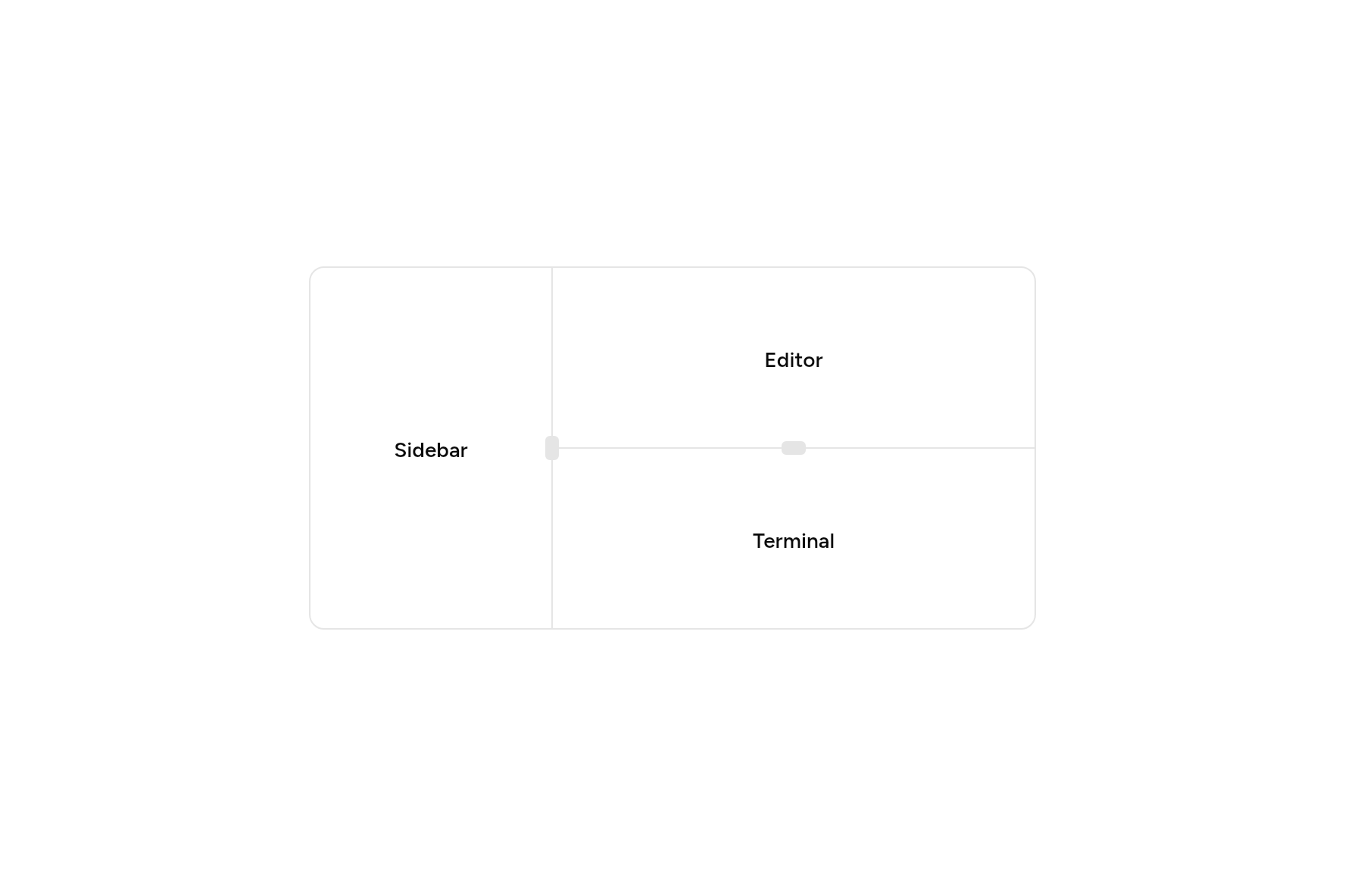
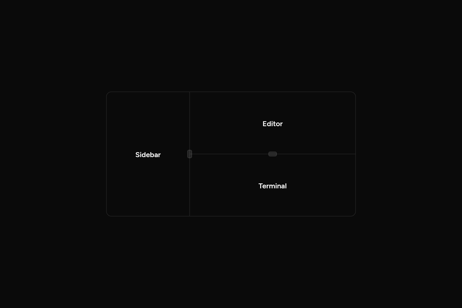
import 'package:flutter/widgets.dart';

import 'ui/resizable.dart';
import 'ui/theme.dart';

class ResizableDemo extends StatelessWidget {
  const ResizableDemo({super.key});

  @override
  Widget build(BuildContext context) {
    final t = AshlarTheme.of(context);
    Widget pane(String label) => Center(
      child: Text(label, style: t.text.sm.copyWith(fontWeight: FontWeight.w600)),
    );
    return Container(
      width: 480,
      height: 240,
      clipBehavior: Clip.antiAlias,
      decoration: BoxDecoration(
        border: Border.all(color: t.colors.border),
        borderRadius: BorderRadius.circular(t.radiusLg),
      ),
      child: Resizable(
        withHandle: true,
        panels: [
          ResizablePanel(size: 1, minSize: .2, child: pane('Sidebar')),
          ResizablePanel(
            size: 2,
            minSize: .3,
            child: Resizable(
              axis: Axis.vertical,
              withHandle: true,
              panels: [
                ResizablePanel(size: 1, minSize: .2, child: pane('Editor')),
                ResizablePanel(size: 1, minSize: .2, child: pane('Terminal')),
              ],
            ),
          ),
        ],
      ),
    );
  }
}
Add it
In your Flutter project:
ashlar add resizable
It writes theme.dart, palette.dart and resizable.dart into lib/ui, keeping any you already have.
Examples
Other ways to use it, each running live, with its code.
Upright, with a grip
Panels top to bottom, a grip on the handle.
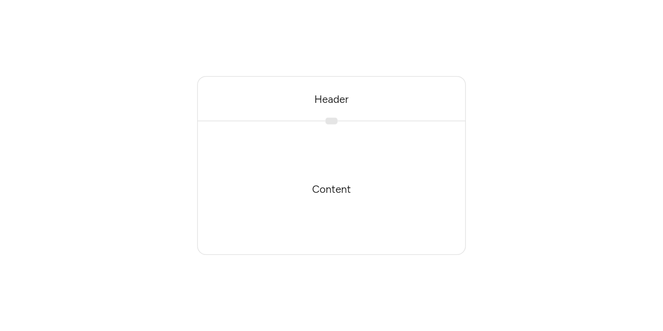
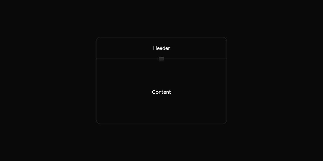
// Upright, with a grip: Panels top to bottom, a grip on the handle.
import 'package:flutter/widgets.dart';

import 'ui/resizable.dart';
import 'ui/theme.dart';

class ResizableVerticalExample extends StatelessWidget {
  const ResizableVerticalExample({super.key});

  @override
  Widget build(BuildContext context) => SizedBox(
    width: 360,
    height: 240,
    child: Builder(
      builder: (context) => DecoratedBox(
        decoration: BoxDecoration(
          border: Border.all(color: AshlarTheme.of(context).colors.border),
          borderRadius: BorderRadius.circular(12),
        ),
        child: const Resizable(
          axis: Axis.vertical,
          withHandle: true,
          panels: [
            ResizablePanel(child: Center(child: Text('Header'))),
            ResizablePanel(size: 3, child: Center(child: Text('Content'))),
          ],
        ),
      ),
    ),
  );
}
API
Read from the source above: each parameter with its type, its default, and what it is for.
ResizablePanelclass
One panel of a Resizable: what it shows, the share of the room it starts with, and the least it may shrink to.
| Parameter | Type | Default | What it is for |
|---|---|---|---|
childrequired |
Widget |
What the panel shows. | |
size |
double |
1 |
A share of the room, compared with the other panels' shares. |
minSize |
double |
.1 |
A fraction of the room, from 0 to 1. |
Resizableclass
Panels side by side, or one above the other, with handles between them that drag to share the room differently. Each handle also takes focus: the arrow keys move it.
| Parameter | Type | Default | What it is for |
|---|---|---|---|
panelsrequired |
List<ResizablePanel> |
The panels, in order. | |
axis |
Axis |
Axis.horizontal |
Horizontal lays it out across; vertical, down. |
withHandle |
bool |
false |
Draws a grip on each handle, to show it can be dragged. |
onResize |
ValueChanged<List<double>>? |
Told each panel's share of the room, from 0 to 1, after every move: to keep it. |
Source
What lands in your app. It is yours from then on: change it as you would your own code, and ashlar add
will not write over it.
lib/ui/resizable.dart 236 lines
// Ashlar UI: Resizable. Copied into your app by `ashlar add resizable`; it is yours to change.

import 'package:flutter/services.dart';
import 'package:flutter/widgets.dart';

import 'theme.dart';

/// One panel of a [Resizable]: what it shows, the share of the room it starts with, and
/// the least it may shrink to.
@immutable
class ResizablePanel {
  const ResizablePanel({required this.child, this.size = 1, this.minSize = .1});

  /// What the panel shows.
  final Widget child;

  /// A share of the room, compared with the other panels' shares.
  final double size;

  /// A fraction of the room, from 0 to 1.
  final double minSize;
}

/// Panels side by side, or one above the other, with handles between them that drag to
/// share the room differently. Each handle also takes focus: the arrow keys move it.
///
/// ```dart
/// Resizable(panels: [
///   ResizablePanel(size: 1, child: Sidebar()),
///   ResizablePanel(size: 3, child: Editor()),
/// ])
/// ```
class Resizable extends StatefulWidget {
  const Resizable({
    super.key,
    required this.panels,
    this.axis = Axis.horizontal,
    this.withHandle = false,
    this.onResize,
  });

  /// The panels, in order.
  final List<ResizablePanel> panels;

  /// Horizontal lays it out across; vertical, down.
  final Axis axis;

  /// Draws a grip on each handle, to show it can be dragged.
  final bool withHandle;

  /// Told each panel's share of the room, from 0 to 1, after every move: to keep it.
  final ValueChanged<List<double>>? onResize;

  @override
  State<Resizable> createState() => _ResizableState();
}

class _ResizableState extends State<Resizable> {
  late List<double> _sizes = _initial();

  List<double> _initial() {
    final total = widget.panels.fold<double>(0, (s, p) => s + p.size);
    return [for (final p in widget.panels) p.size / total];
  }

  @override
  void didUpdateWidget(Resizable old) {
    super.didUpdateWidget(old);
    if (old.panels.length != widget.panels.length) _sizes = _initial();
  }

  /// Moves the line after panel [i] by [delta], a fraction of the room.
  void _move(int i, double delta) {
    final a = widget.panels[i], b = widget.panels[i + 1];
    final pair = _sizes[i] + _sizes[i + 1];
    final next = (_sizes[i] + delta).clamp(a.minSize, pair - b.minSize);
    setState(() {
      _sizes[i] = next;
      _sizes[i + 1] = pair - next;
    });
    widget.onResize?.call(List.unmodifiable(_sizes));
  }

  @override
  Widget build(BuildContext context) => LayoutBuilder(
    builder: (context, box) {
      final horizontal = widget.axis == Axis.horizontal;
      final room =
          (horizontal ? box.maxWidth : box.maxHeight) -
          (widget.panels.length - 1);
      final children = <Widget>[];
      for (var i = 0; i < widget.panels.length; i++) {
        if (i > 0) {
          children.add(
            _Handle(
              axis: widget.axis,
              grip: widget.withHandle,
              share: _sizes[i - 1],
              room: room,
              onDrag: (px) => _move(i - 1, px / room),
            ),
          );
        }
        final extent = _sizes[i] * room;
        children.add(
          SizedBox(
            width: horizontal ? extent : null,
            height: horizontal ? null : extent,
            child: ClipRect(child: widget.panels[i].child),
          ),
        );
      }
      return Flex(
        direction: widget.axis,
        crossAxisAlignment: CrossAxisAlignment.stretch,
        children: children,
      );
    },
  );
}

class _Handle extends StatefulWidget {
  const _Handle({
    required this.axis,
    required this.grip,
    required this.share,
    required this.room,
    required this.onDrag,
  });

  final Axis axis;
  final bool grip;

  /// The share of the panel before it, read out as the handle's value.
  final double share;

  /// The room the panels share, in pixels.
  final double room;
  final ValueChanged<double> onDrag;

  @override
  State<_Handle> createState() => _HandleState();
}

class _HandleState extends State<_Handle> {
  bool _focused = false;

  @override
  Widget build(BuildContext context) {
    final t = AshlarTheme.of(context);
    final c = t.colors;
    final horizontal = widget.axis == Axis.horizontal;
    // Across, the panels run from the start of the line, which is the right in
    // right-to-left text: a move to the right shrinks the first panel there.
    final sign = horizontal && isRtl(context) ? -1.0 : 1.0;
    const step = 16.0;
    return Semantics(
      slider: true,
      label: 'Resize',
      value: '${(widget.share * 100).round()}%',
      increasedValue:
          '${((widget.share + step / widget.room).clamp(0, 1) * 100).round()}%',
      decreasedValue:
          '${((widget.share - step / widget.room).clamp(0, 1) * 100).round()}%',
      onIncrease: () => widget.onDrag(step),
      onDecrease: () => widget.onDrag(-step),
      child: FocusableActionDetector(
        mouseCursor: horizontal
            ? SystemMouseCursors.resizeColumn
            : SystemMouseCursors.resizeRow,
        onShowFocusHighlight: (v) => setState(() => _focused = v),
        shortcuts: {
          SingleActivator(
            horizontal
                ? LogicalKeyboardKey.arrowRight
                : LogicalKeyboardKey.arrowDown,
          ): _NudgeIntent(
            step * sign,
          ),
          SingleActivator(
            horizontal
                ? LogicalKeyboardKey.arrowLeft
                : LogicalKeyboardKey.arrowUp,
          ): _NudgeIntent(
            -step * sign,
          ),
        },
        actions: {
          _NudgeIntent: CallbackAction<_NudgeIntent>(
            onInvoke: (i) => widget.onDrag(i.px),
          ),
        },
        child: GestureDetector(
          behavior: HitTestBehavior.translucent,
          onHorizontalDragUpdate: horizontal
              ? (d) => widget.onDrag(d.delta.dx * sign)
              : null,
          onVerticalDragUpdate: horizontal
              ? null
              : (d) => widget.onDrag(d.delta.dy),
          child: Container(
            width: horizontal ? 1 : null,
            height: horizontal ? null : 1,
            color: _focused ? c.ring : c.border,
            child: OverflowBox(
              // A wider strip than the line, so it is easy to grab.
              minWidth: horizontal ? 9 : null,
              maxWidth: horizontal ? 9 : null,
              minHeight: horizontal ? null : 9,
              maxHeight: horizontal ? null : 9,
              child: Center(
                child: widget.grip
                    ? Container(
                        width: horizontal ? 12 : 16,
                        height: horizontal ? 16 : 12,
                        decoration: BoxDecoration(
                          color: c.border,
                          borderRadius: BorderRadius.circular(t.radiusSm / 2),
                          border: Border.all(color: c.border),
                        ),
                      )
                    : const SizedBox.expand(),
              ),
            ),
          ),
        ),
      ),
    );
  }
}

class _NudgeIntent extends Intent {
  const _NudgeIntent(this.px);

  final double px;
}