

Navigation Menu
A site's main links, with panels that open from headings.
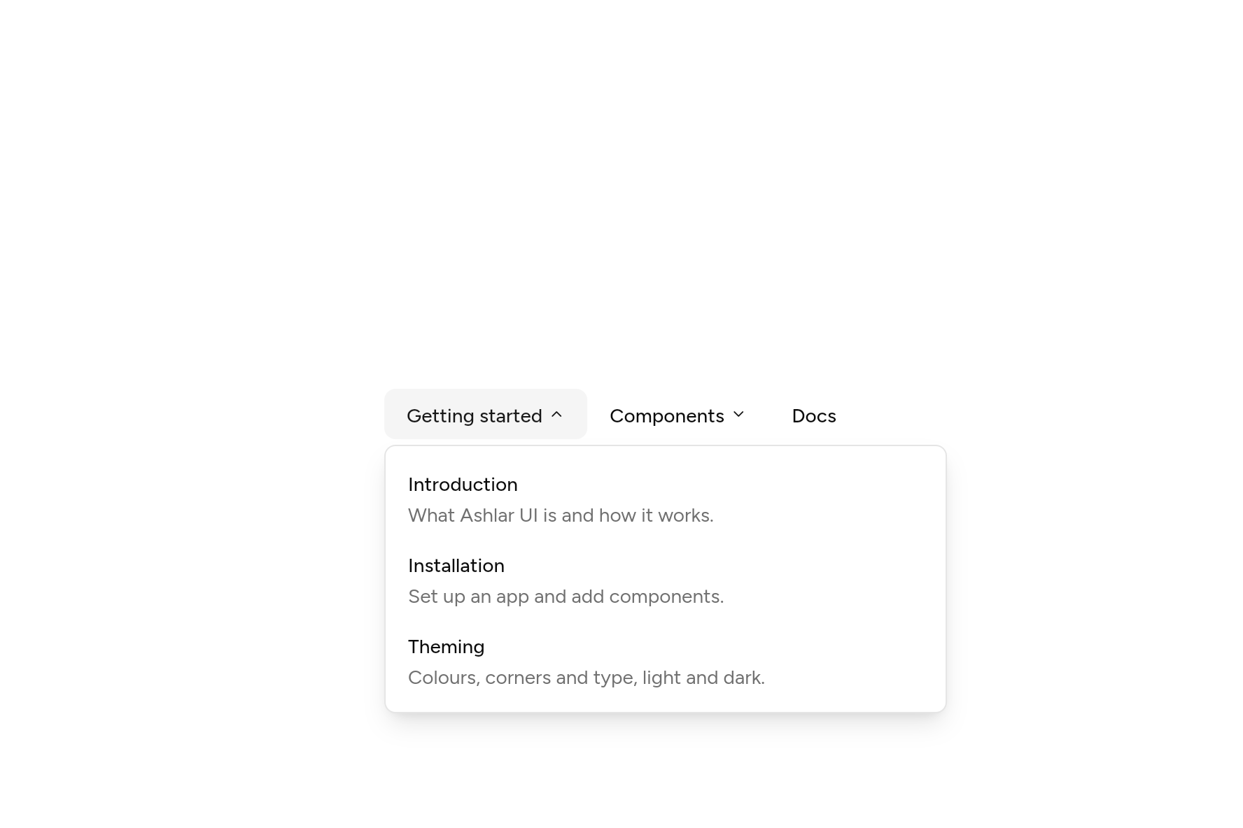
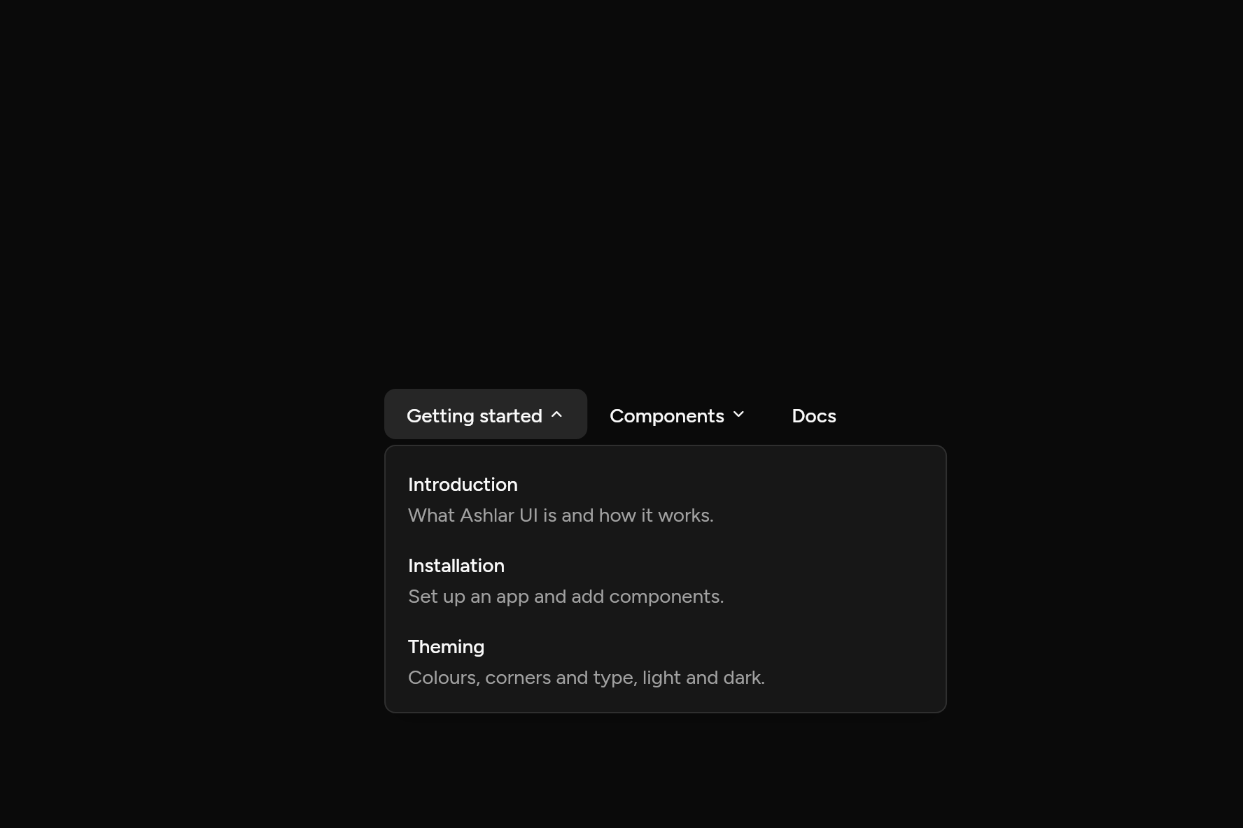
import 'package:flutter/widgets.dart';

import 'ui/navigation_menu.dart';

class NavigationMenuDemo extends StatelessWidget {
  const NavigationMenuDemo({super.key});

  @override
  Widget build(BuildContext context) => NavigationMenu(
    items: [
      NavigationMenuItem(
        'Getting started',
        content: (context) => Column(
          mainAxisSize: MainAxisSize.min,
          crossAxisAlignment: CrossAxisAlignment.stretch,
          children: [
            NavigationMenuLink(
              title: 'Introduction',
              description: 'What Ashlar UI is and how it works.',
              onPressed: () {},
            ),
            NavigationMenuLink(
              title: 'Installation',
              description: 'Set up an app and add components.',
              onPressed: () {},
            ),
            NavigationMenuLink(
              title: 'Theming',
              description: 'Colours, corners and type, light and dark.',
              onPressed: () {},
            ),
          ],
        ),
      ),
      NavigationMenuItem(
        'Components',
        content: (context) => Column(
          mainAxisSize: MainAxisSize.min,
          crossAxisAlignment: CrossAxisAlignment.stretch,
          children: [
            NavigationMenuLink(title: 'Button', description: 'Six variants and four sizes.', onPressed: () {}),
            NavigationMenuLink(title: 'Dialog', description: 'A panel over a dimmed page.', onPressed: () {}),
          ],
        ),
      ),
      NavigationMenuItem.link('Docs', onPressed: () {}),
    ],
  );
}
Add it
In your Flutter project:
ashlar add navigation-menu
It writes theme.dart, palette.dart, group.dart, pressable.dart, popover.dart and navigation_menu.dart into lib/ui, keeping any you already have, and adds ashlar_icons to pubspec.yaml. It needs pressable, popover and ashlar_icons, which come with it.
Examples
Other ways to use it, each running live, with its code.
Links with descriptions
A panel of links under a heading.
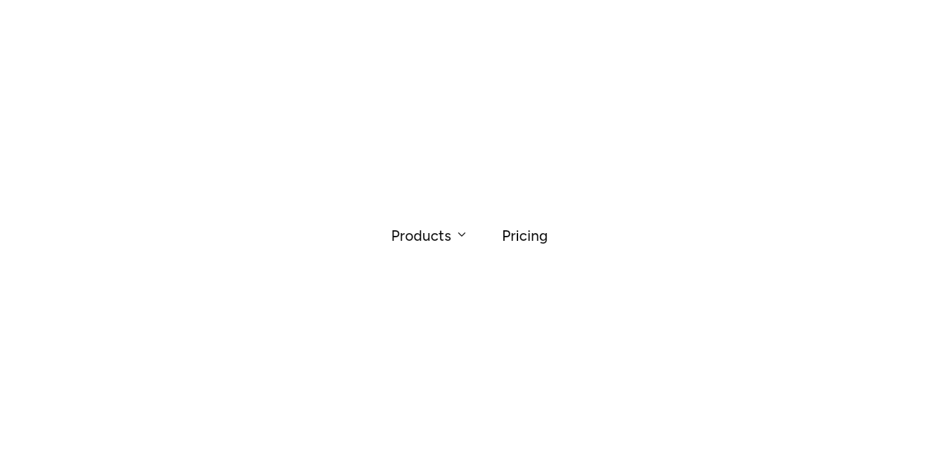
// Links with descriptions: A panel of links under a heading.
import 'package:flutter/widgets.dart';

import 'ui/navigation_menu.dart';

class NavigationMenuLinksExample extends StatelessWidget {
  const NavigationMenuLinksExample({super.key});

  @override
  Widget build(BuildContext context) => NavigationMenu(
    items: [
      NavigationMenuItem(
        'Products',
        content: (context) => Column(
          mainAxisSize: MainAxisSize.min,
          crossAxisAlignment: CrossAxisAlignment.stretch,
          children: [
            NavigationMenuLink(title: 'Components', description: 'Buttons, forms, menus and more.', onPressed: () {}),
            NavigationMenuLink(title: 'Blocks', description: 'Whole screens to start from.', onPressed: () {}),
          ],
        ),
      ),
      NavigationMenuItem.link('Pricing', onPressed: () {}),
    ],
  );
}
API
Read from the source above: each parameter with its type, its default, and what it is for.
NavigationMenuItemclass
One entry of a NavigationMenu: a link, or a heading that opens a panel of content.
NavigationMenuItem.link(…)
| Parameter | Type | Default | What it is for |
|---|---|---|---|
labelpositional |
String |
Its name in the bar. | |
onPressedrequired |
VoidCallback |
Called when it is chosen, for an item without a panel. |
NavigationMenuItem(…)
| Parameter | Type | Default | What it is for |
|---|---|---|---|
labelpositional |
String |
Its name in the bar. | |
contentrequired |
WidgetBuilder |
What its panel shows, usually links; null makes it a link itself. | |
width |
double |
400 |
The panel's width. |
NavigationMenuclass
A site's main navigation: links, and headings whose panels open on hover, on a click or from the keyboard, with links and a line about each inside. Moving to another heading while one is open moves the one panel across to it, its content sliding in.
| Parameter | Type | Default | What it is for |
|---|---|---|---|
itemsrequired |
List<NavigationMenuItem> |
The items along the bar. |
NavigationMenuLinkclass
A link in a navigation panel, with a line about where it goes. Picking it closes the panel.
| Parameter | Type | Default | What it is for |
|---|---|---|---|
titlerequired |
String |
The link's name. | |
description |
String? |
A line under the name: where it goes. | |
onPressedrequired |
VoidCallback |
Called when it is chosen. |
Source
What lands in your app. It is yours from then on: change it as you would your own code, and ashlar add
will not write over it.
lib/ui/navigation_menu.dart 337 lines
// Ashlar UI: Navigation Menu. Copied into your app by `ashlar add navigation-menu`; it is
// yours to change.

import 'dart:async';

import 'package:ashlar_icons/ashlar_icons.dart';
import 'package:flutter/widgets.dart';

import 'popover.dart';
import 'pressable.dart';
import 'theme.dart';

/// One entry of a [NavigationMenu]: a link, or a heading that opens a panel of [content].
@immutable
class NavigationMenuItem {
  const NavigationMenuItem.link(
    this.label, {
    required VoidCallback this.onPressed,
  }) : content = null,
       width = 0;
  const NavigationMenuItem(
    this.label, {
    required WidgetBuilder this.content,
    this.width = 400,
  }) : onPressed = null;

  /// Its name in the bar.
  final String label;

  /// Called when it is chosen, for an item without a panel.
  final VoidCallback? onPressed;

  /// What its panel shows, usually links; null makes it a link itself.
  final WidgetBuilder? content;

  /// The panel's width.
  final double width;
}

/// A site's main navigation: links, and headings whose panels open on hover, on a click
/// or from the keyboard, with links and a line about each inside. Moving to another
/// heading while one is open moves the one panel across to it, its content sliding in.
///
/// ```dart
/// NavigationMenu(items: [
///   NavigationMenuItem('Components', content: (context) => Column(children: [
///     NavigationMenuLink(title: 'Button', description: 'Six variants and four sizes.', onPressed: () => go('/button')),
///   ])),
///   NavigationMenuItem.link('Docs', onPressed: () => go('/docs')),
/// ])
/// ```
class NavigationMenu extends StatefulWidget {
  const NavigationMenu({super.key, required this.items});

  /// The items along the bar.
  final List<NavigationMenuItem> items;

  @override
  State<NavigationMenu> createState() => _NavigationMenuState();
}

class _NavigationMenuState extends State<NavigationMenu> {
  // One panel for the whole bar: it moves to the heading being shown, and its content
  // slides across, rather than one panel closing and another opening.
  final _menu = MenuController();
  final _bar = GlobalKey();
  late final _keys = [for (final _ in widget.items) GlobalKey()];
  int? _open;

  /// Which way the content slides: towards the heading moved to.
  var _direction = 0;
  Timer? _timer;

  void _show(int i) {
    _timer?.cancel();
    setState(() {
      _direction = _open == null ? 0 : (i - _open!).sign;
      _open = i;
    });
    if (!_menu.isOpen) _menu.open();
  }

  /// Opens after a moment on hover, straight away if one is already open.
  void _hoverIn(int i) {
    _timer?.cancel();
    if (_open != null) return _show(i);
    _timer = Timer(
      const Duration(milliseconds: 200),
      () => mounted ? _show(i) : null,
    );
  }

  void _hoverOut() {
    _timer?.cancel();
    _timer = Timer(const Duration(milliseconds: 300), () {
      if (mounted) _menu.close();
    });
  }

  /// Heading [i]'s rectangle, from the bar's rectangle [bar] in the overlay.
  Rect _heading(Rect bar, int i) {
    final barBox = _bar.currentContext?.findRenderObject() as RenderBox?;
    final box = _keys[i].currentContext?.findRenderObject() as RenderBox?;
    if (barBox == null || box == null || !box.attached) return bar;
    return (bar.topLeft + box.localToGlobal(Offset.zero, ancestor: barBox)) &
        box.size;
  }

  @override
  void dispose() {
    _timer?.cancel();
    super.dispose();
  }

  @override
  Widget build(BuildContext context) {
    final t = AshlarTheme.of(context);
    final c = t.colors;
    Widget trigger(int i, NavigationMenuItem item, {required bool open}) =>
        Pressable(
          link: item.onPressed != null,
          expanded: item.content == null ? null : open,
          onPressed: item.onPressed ?? () => open ? _menu.close() : _show(i),
          builder: (context, state) => AnimatedContainer(
            duration: t.duration,
            // As tall as it is drawn, or taller when larger text needs it.
            height: grownHeight(context, t.control(36)),
            padding: const EdgeInsets.symmetric(horizontal: 16),
            alignment: Alignment.center,
            decoration: BoxDecoration(
              color: open || state.hovered
                  ? c.accent
                  : c.accent.withValues(alpha: 0),
              borderRadius: BorderRadius.circular(t.radiusMd),
              boxShadow: [if (state.focused) ...t.focusRing],
            ),
            child: Row(
              mainAxisSize: MainAxisSize.min,
              children: [
                Text(
                  item.label,
                  style: t.text.sm.copyWith(
                    fontWeight: FontWeight.w500,
                    color: open || state.hovered
                        ? c.accentForeground
                        : c.foreground,
                  ),
                ),
                if (item.content != null) ...[
                  const SizedBox(width: 4),
                  AnimatedRotation(
                    turns: open ? .5 : 0,
                    duration: t.duration,
                    child: AshlarIcon(
                      AshlarIconsRoundedStroke.chevronDown,
                      size: 12,
                      color: c.foreground,
                    ),
                  ),
                ],
              ],
            ),
          ),
        );
    return Semantics(
      container: true,
      label: 'Main',
      explicitChildNodes: true,
      child: RawMenuAnchor(
        controller: _menu,
        onClose: () => setState(() => _open = null),
        overlayBuilder: (context, info) {
          final i = _open;
          if (i == null) return const SizedBox.shrink();
          final item = widget.items[i];
          final still = MediaQuery.maybeDisableAnimationsOf(context) ?? false;
          final move = still ? Duration.zero : t.duration * 1.5;
          // The panel follows the heading: its place, width and height move together.
          return TweenAnimationBuilder<Rect?>(
            tween: RectTween(end: _heading(info.anchorRect, i)),
            duration: move,
            curve: Curves.easeOutCubic,
            builder: (context, at, child) => PopoverPanel(
              info: RawMenuOverlayInfo(
                anchorRect: at!,
                overlaySize: info.overlaySize,
                tapRegionGroupId: info.tapRegionGroupId,
                position: info.position,
              ),
              child: child!,
            ),
            child: MouseRegion(
              onEnter: (_) => _timer?.cancel(),
              onExit: (_) => _hoverOut(),
              child: FocusTraversalGroup(
                child: AnimatedContainer(
                  duration: move,
                  curve: Curves.easeOutCubic,
                  width: item.width,
                  // What leaves stays inside the panel as it changes size.
                  child: ClipRect(
                    child: AnimatedSize(
                      duration: move,
                      curve: Curves.easeOutCubic,
                      alignment: AlignmentDirectional.topStart,
                      child: AnimatedSwitcher(
                        duration: move,
                        // The new panel's content comes in from the side it was moved
                        // towards; the old goes the other way.
                        transitionBuilder: (child, animation) => FadeTransition(
                          opacity: animation,
                          child: SlideTransition(
                            position: Tween(
                              begin: Offset(
                                child.key == ValueKey(i)
                                    ? _direction * .15
                                    : -_direction * .15,
                                0,
                              ),
                              end: Offset.zero,
                            ).animate(animation),
                            child: child,
                          ),
                        ),
                        layoutBuilder: (current, previous) => Stack(
                          alignment: AlignmentDirectional.topStart,
                          children: [
                            for (final p in previous)
                              Positioned.fill(
                                child: IgnorePointer(
                                  child: ExcludeSemantics(child: p),
                                ),
                              ),
                            ?current,
                          ],
                        ),
                        child: KeyedSubtree(
                          key: ValueKey(i),
                          child: Padding(
                            padding: const EdgeInsets.all(8),
                            child: Builder(builder: item.content!),
                          ),
                        ),
                      ),
                    ),
                  ),
                ),
              ),
            ),
          );
        },
        child: Row(
          key: _bar,
          mainAxisSize: MainAxisSize.min,
          children: [
            for (final (i, item) in widget.items.indexed)
              KeyedSubtree(
                key: _keys[i],
                child: item.content == null
                    ? trigger(i, item, open: false)
                    : MouseRegion(
                        onEnter: (_) => _hoverIn(i),
                        onExit: (_) => _hoverOut(),
                        child: trigger(i, item, open: _open == i),
                      ),
              ),
          ],
        ),
      ),
    );
  }
}

/// A link in a navigation panel, with a line about where it goes. Picking it closes the
/// panel.
class NavigationMenuLink extends StatelessWidget {
  const NavigationMenuLink({
    super.key,
    required this.title,
    this.description,
    required this.onPressed,
  });

  /// The link's name.
  final String title;

  /// A line under the name: where it goes.
  final String? description;

  /// Called when it is chosen.
  final VoidCallback onPressed;

  @override
  Widget build(BuildContext context) {
    final t = AshlarTheme.of(context);
    final c = t.colors;
    return Pressable(
      link: true,
      onPressed: () {
        MenuController.maybeOf(context)?.close();
        onPressed();
      },
      builder: (context, state) => AnimatedContainer(
        duration: t.duration,
        padding: const EdgeInsets.all(8),
        decoration: BoxDecoration(
          color: state.hovered || state.focused
              ? c.accent
              : c.accent.withValues(alpha: 0),
          borderRadius: BorderRadius.circular(t.radiusSm),
        ),
        child: Column(
          crossAxisAlignment: CrossAxisAlignment.start,
          mainAxisSize: MainAxisSize.min,
          children: [
            Text(
              title,
              style: t.text.sm.copyWith(
                fontWeight: FontWeight.w500,
                color: c.popoverForeground,
              ),
            ),
            if (description != null) ...[
              const SizedBox(height: 2),
              Text(
                description!,
                style: t.text.sm.copyWith(color: c.mutedForeground),
                maxLines: 2,
                overflow: TextOverflow.ellipsis,
              ),
            ],
          ],
        ),
      ),
    );
  }
}