

Attachment
A file or picture in a conversation: what it is and how its upload is going.
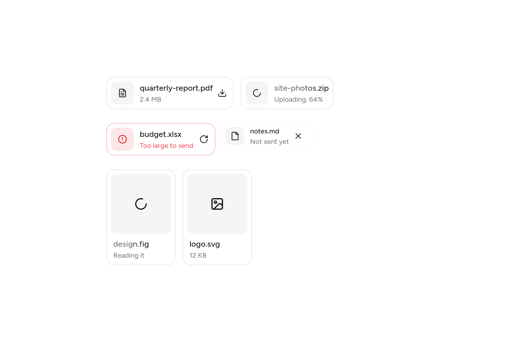
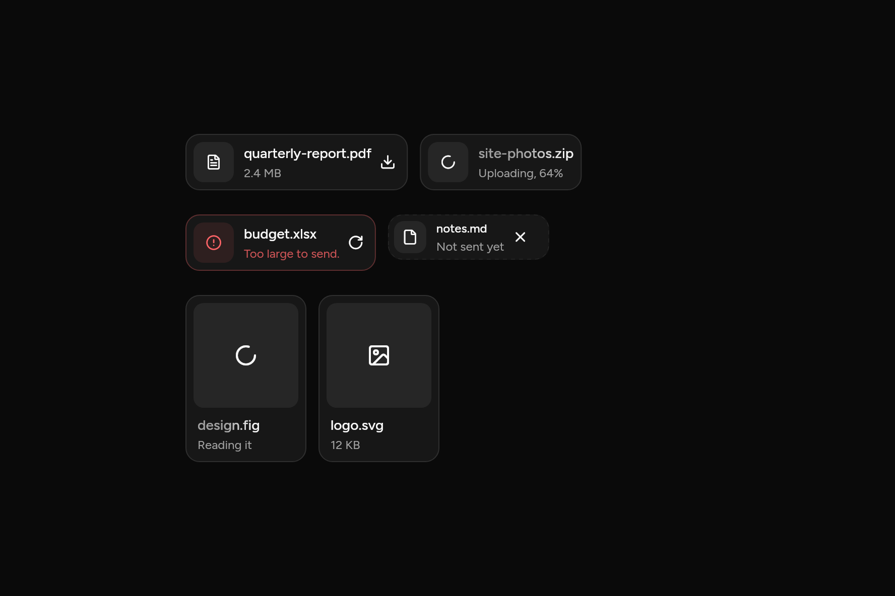
import 'package:ashlar_icons/ashlar_icons.dart';
import 'package:flutter/widgets.dart';

import 'ui/attachment.dart';

class AttachmentDemo extends StatelessWidget {
  const AttachmentDemo({super.key});

  @override
  Widget build(BuildContext context) => SizedBox(
    width: 520,
    child: Column(
      mainAxisSize: MainAxisSize.min,
      crossAxisAlignment: CrossAxisAlignment.start,
      children: [
        AttachmentGroup(
          children: [
            Attachment(
              title: 'quarterly-report.pdf',
              description: '2.4 MB',
              icon: AshlarIconsRoundedStroke.fileText,
              onPressed: () {},
              actions: [
                AttachmentAction(
                  icon: AshlarIconsRoundedStroke.download,
                  label: 'Download',
                  onPressed: () {},
                ),
              ],
            ),
            const Attachment(
              title: 'site-photos.zip',
              description: 'Uploading, 64%',
              state: AttachmentState.uploading,
            ),
          ],
        ),
        const SizedBox(height: 16),
        AttachmentGroup(
          children: [
            Attachment(
              title: 'budget.xlsx',
              description: 'Too large to send.',
              state: AttachmentState.error,
              actions: [
                AttachmentAction(
                  icon: AshlarIconsRoundedStroke.rotateCw,
                  label: 'Try again',
                  onPressed: () {},
                ),
              ],
            ),
            Attachment(
              title: 'notes.md',
              description: 'Not sent yet',
              state: AttachmentState.idle,
              size: AttachmentSize.sm,
              actions: [
                AttachmentAction(
                  icon: AshlarIconsRoundedStroke.x,
                  label: 'Remove',
                  onPressed: () {},
                ),
              ],
            ),
          ],
        ),
        const SizedBox(height: 16),
        const AttachmentGroup(
          children: [
            Attachment(
              title: 'design.fig',
              description: 'Reading it',
              axis: Axis.vertical,
              icon: AshlarIconsRoundedStroke.frame,
              state: AttachmentState.processing,
            ),
            Attachment(
              title: 'logo.svg',
              description: '12 KB',
              axis: Axis.vertical,
              icon: AshlarIconsRoundedStroke.image,
            ),
          ],
        ),
      ],
    ),
  );
}
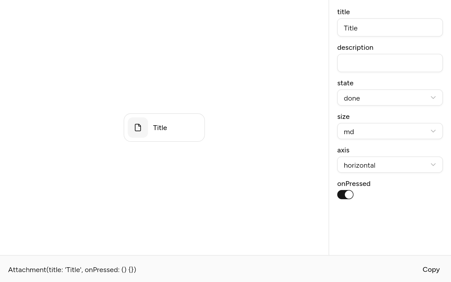
Try its options
Each option its constructor takes, to change and see; the code below it is what you chose, to copy.
Add it
In your Flutter project:
ashlar add attachment
It writes theme.dart, palette.dart, group.dart, pressable.dart, button.dart, spinner.dart and attachment.dart into lib/ui, keeping any you already have, and adds ashlar_icons to pubspec.yaml. It needs button, pressable, spinner and ashlar_icons, which come with it.
Examples
Other ways to use it, each running live, with its code.
Sizes
Medium, small and extra small.
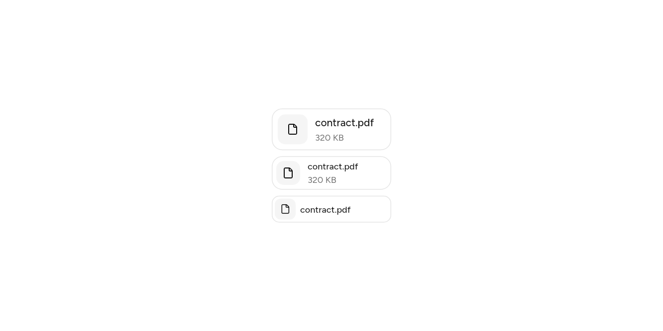
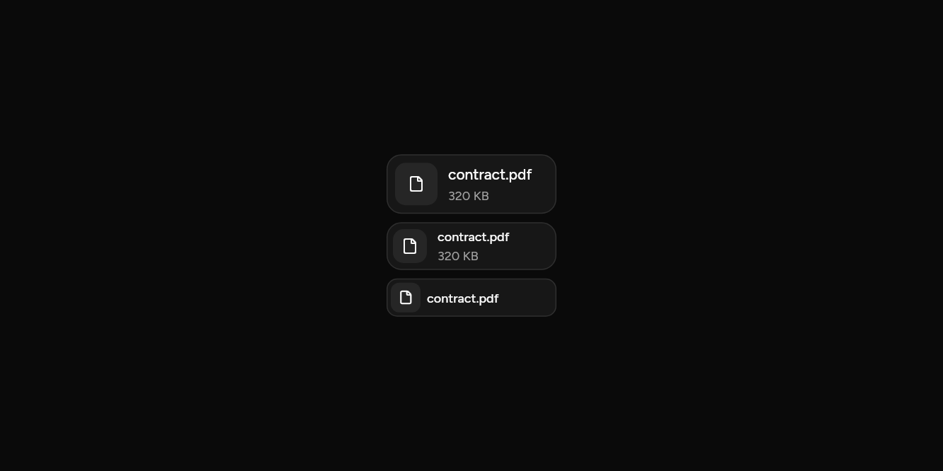
// Sizes: Medium, small and extra small.
import 'package:flutter/widgets.dart';

import 'ui/attachment.dart';

class AttachmentSizesExample extends StatelessWidget {
  const AttachmentSizesExample({super.key});

  @override
  Widget build(BuildContext context) => const Column(
    mainAxisSize: MainAxisSize.min,
    crossAxisAlignment: CrossAxisAlignment.start,
    children: [
      Attachment(title: 'contract.pdf', description: '320 KB'),
      SizedBox(height: 8),
      Attachment(title: 'contract.pdf', description: '320 KB', size: AttachmentSize.sm),
      SizedBox(height: 8),
      Attachment(title: 'contract.pdf', size: AttachmentSize.xs),
    ],
  );
}
API
Read from the source above: each parameter with its type, its default, and what it is for.
AttachmentStateenum
Where an Attachment is on its way.
| Value | What it is for |
|---|---|
idle | Chosen but not sent: a dashed border. |
uploading | On its way up: a spinner, and the name shimmers. |
processing | Up, and being read: a spinner, and the name shimmers. |
error |
It failed: the destructive colour, and the reason under the name. |
done |
AttachmentSizeenum
| Value | What it is for |
|---|---|
md | |
sm | |
xs |
Attachmentclass
A file or a picture in a conversation or a message being written: what it is, how it is getting on, and what can be done with it.
| Parameter | Type | Default | What it is for |
|---|---|---|---|
titlerequired |
String |
Its name. | |
description |
String? |
Its size or type, or, in AttachmentState.error, what went wrong. |
|
icon |
IconData |
AshlarIconsRoundedStroke.file |
Shown when there is no image. |
image |
ImageProvider? |
A picture of it: the image itself, or a preview. | |
state |
AttachmentState |
AttachmentState.done |
Where it is on its way: idle, uploading, processing, failed or done. |
size |
AttachmentSize |
AttachmentSize.md |
Medium, small or extra small. |
axis |
Axis |
Axis.horizontal |
Across: the picture beside the name. Upright: a tile, the picture above. |
actions |
List<Widget> |
const [] |
Small buttons at the end, or over the corner of a tile: remove, retry, download. |
onPressed | VoidCallback? | Opens it. |
AttachmentActionclass
A small icon button on an Attachment: remove, retry, download.
| Parameter | Type | Default | What it is for |
|---|---|---|---|
iconrequired |
IconData |
Its icon. | |
labelrequired |
String |
What it does, for screen readers and the tooltip. | |
onPressedrequired |
VoidCallback? |
Called when it is pressed. Null disables it. |
AttachmentGroupclass
Attachments in a row that scrolls sideways when they do not fit.
| Parameter | Type | Default | What it is for |
|---|---|---|---|
childrenrequired |
List<Widget> |
The attachments, in order. |
Source
What lands in your app. It is yours from then on: change it as you would your own code, and ashlar add
will not write over it.
lib/ui/attachment.dart 420 lines
// Ashlar UI: Attachment. Copied into your app by `ashlar add attachment`; it is yours to
// change.

import 'package:ashlar_icons/ashlar_icons.dart';
import 'package:flutter/widgets.dart';

import 'button.dart';
import 'pressable.dart';
import 'spinner.dart';
import 'theme.dart';

/// Where an [Attachment] is on its way.
enum AttachmentState {
  /// Chosen but not sent: a dashed border.
  idle,

  /// On its way up: a spinner, and the name shimmers.
  uploading,

  /// Up, and being read: a spinner, and the name shimmers.
  processing,

  /// It failed: the destructive colour, and the reason under the name.
  error,
  done,
}

enum AttachmentSize { md, sm, xs }

/// A file or a picture in a conversation or a message being written: what it is, how it
/// is getting on, and what can be done with it.
///
/// ```dart
/// Attachment(
///   title: 'quarterly-report.pdf',
///   description: '2.4 MB',
///   state: AttachmentState.uploading,
///   actions: [AttachmentAction(icon: AshlarIconsRoundedStroke.x, label: 'Remove', onPressed: remove)],
/// )
/// ```
class Attachment extends StatelessWidget {
  const Attachment({
    super.key,
    required this.title,
    this.description,
    this.icon = AshlarIconsRoundedStroke.file,
    this.image,
    this.state = AttachmentState.done,
    this.size = AttachmentSize.md,
    this.axis = Axis.horizontal,
    this.actions = const [],
    this.onPressed,
  });

  /// Its name.
  final String title;

  /// Its size or type, or, in [AttachmentState.error], what went wrong.
  final String? description;

  /// Shown when there is no [image].
  final IconData icon;

  /// A picture of it: the image itself, or a preview.
  final ImageProvider? image;

  /// Where it is on its way: idle, uploading, processing, failed or done.
  final AttachmentState state;

  /// Medium, small or extra small.
  final AttachmentSize size;

  /// Across: the picture beside the name. Upright: a tile, the picture above.
  final Axis axis;

  /// Small buttons at the end, or over the corner of a tile: remove, retry, download.
  final List<Widget> actions;

  /// Opens it.
  final VoidCallback? onPressed;

  @override
  Widget build(BuildContext context) {
    final t = AshlarTheme.of(context);
    final c = t.colors;
    final upright = axis == Axis.vertical;
    final busy =
        state == AttachmentState.uploading ||
        state == AttachmentState.processing;
    final error = state == AttachmentState.error;
    final media = switch (size) {
      AttachmentSize.md => 40.0,
      AttachmentSize.sm => 32.0,
      AttachmentSize.xs => 28.0,
    };
    final pad = switch (size) {
      AttachmentSize.md => 8.0,
      AttachmentSize.sm => 6.0,
      AttachmentSize.xs => 4.0,
    };
    final radius = size == AttachmentSize.xs ? t.radiusLg : t.radiusXl;
    final picture = Container(
      width: upright ? null : media,
      height: upright ? null : media,
      clipBehavior: Clip.antiAlias,
      decoration: BoxDecoration(
        color: error ? c.destructive.withValues(alpha: .1) : c.muted,
        borderRadius: BorderRadius.circular(
          size == AttachmentSize.xs ? t.radiusMd : t.radiusLg,
        ),
      ),
      child: AspectRatio(
        aspectRatio: 1,
        child: Stack(
          fit: StackFit.expand,
          children: [
            if (image != null)
              Opacity(
                opacity: busy || error ? .6 : 1,
                child: Image(image: image!, fit: BoxFit.cover),
              )
            else if (!busy)
              Center(
                child: AshlarIcon(
                  error ? AshlarIconsRoundedStroke.circleAlert : icon,
                  size: upright ? 24 : (size == AttachmentSize.xs ? 14 : 16),
                  color: error ? c.destructive : c.foreground,
                ),
              ),
            if (busy)
              Center(
                child: Spinner(size: upright ? 24 : 16, semanticLabel: ''),
              ),
          ],
        ),
      ),
    );
    final text = t.text.xs;
    final words = Column(
      crossAxisAlignment: CrossAxisAlignment.start,
      mainAxisSize: MainAxisSize.min,
      children: [
        _Shimmer(
          on: busy,
          child: Text(
            title,
            maxLines: 1,
            overflow: TextOverflow.ellipsis,
            style: (size == AttachmentSize.md ? t.text.sm : text).copyWith(
              fontWeight: FontWeight.w500,
              height: 1.25,
            ),
          ),
        ),
        if (description != null) ...[
          const SizedBox(height: 2),
          Text(
            description!,
            maxLines: 1,
            overflow: TextOverflow.ellipsis,
            style: text.copyWith(
              color: error
                  ? c.destructive.withValues(alpha: .8)
                  : c.mutedForeground,
            ),
          ),
        ],
      ],
    );
    final status = switch (state) {
      AttachmentState.idle => 'not sent',
      AttachmentState.uploading => 'uploading',
      AttachmentState.processing => 'processing',
      AttachmentState.error => 'failed',
      AttachmentState.done => null,
    };
    final label = [title, ?description, ?status].join(', ');
    // The card's fill and border: under everything, and the button when it opens.
    Widget surface(bool hovered, bool focused) => AnimatedContainer(
      duration: t.duration,
      decoration: BoxDecoration(
        color: hovered ? Color.lerp(c.card, c.muted, .5) : c.card,
        borderRadius: BorderRadius.circular(radius),
        border: state == AttachmentState.idle
            ? null
            : Border.all(
                color: focused
                    ? c.ring
                    : (error ? c.destructive.withValues(alpha: .3) : c.border),
              ),
      ),
    );
    // The name and picture are said by the label and let presses through to the card;
    // the actions are buttons of their own, on top.
    Widget quiet(Widget w) => IgnorePointer(child: ExcludeSemantics(child: w));
    final content = Container(
      width: upright ? (size == AttachmentSize.md ? 120 : 96) : null,
      constraints: upright ? null : const BoxConstraints(minWidth: 160),
      padding: EdgeInsets.all(pad),
      child: upright
          ? Stack(
              children: [
                quiet(
                  Column(
                    crossAxisAlignment: CrossAxisAlignment.stretch,
                    mainAxisSize: MainAxisSize.min,
                    children: [
                      picture,
                      Padding(
                        padding: const EdgeInsets.fromLTRB(4, 8, 4, 2),
                        child: words,
                      ),
                    ],
                  ),
                ),
                if (actions.isNotEmpty)
                  PositionedDirectional(
                    top: 4,
                    end: 4,
                    child: Row(
                      mainAxisSize: MainAxisSize.min,
                      children: actions,
                    ),
                  ),
              ],
            )
          : Row(
              mainAxisSize: MainAxisSize.min,
              children: [
                quiet(picture),
                SizedBox(width: size == AttachmentSize.xs ? 6 : 10),
                Flexible(child: quiet(words)),
                if (actions.isNotEmpty) ...[
                  const SizedBox(width: 4),
                  ...actions,
                ],
              ],
            ),
    );
    return Semantics(
      container: true,
      explicitChildNodes: true,
      child: CustomPaint(
        // Dashed while it has not been sent.
        foregroundPainter: state == AttachmentState.idle
            ? _Dashes(color: c.border, radius: radius)
            : null,
        child: Stack(
          children: [
            Positioned.fill(
              child: onPressed == null
                  ? Semantics(label: label, child: surface(false, false))
                  : Pressable(
                      onPressed: onPressed,
                      semanticLabel: label,
                      builder: (context, states) =>
                          surface(states.hovered, states.focused),
                    ),
            ),
            content,
          ],
        ),
      ),
    );
  }
}

/// A small icon button on an [Attachment]: remove, retry, download.
class AttachmentAction extends StatelessWidget {
  const AttachmentAction({
    super.key,
    required this.icon,
    required this.label,
    required this.onPressed,
  });

  /// Its icon.
  final IconData icon;

  /// What it does, for screen readers and the tooltip.
  final String label;

  /// Called when it is pressed. Null disables it.
  final VoidCallback? onPressed;

  @override
  Widget build(BuildContext context) => Button(
    variant: ButtonVariant.ghost,
    size: ButtonSize.iconXs,
    semanticLabel: label,
    onPressed: onPressed,
    child: AshlarIcon(icon),
  );
}

/// Attachments in a row that scrolls sideways when they do not fit.
class AttachmentGroup extends StatelessWidget {
  const AttachmentGroup({super.key, required this.children});

  /// The attachments, in order.
  final List<Widget> children;

  @override
  Widget build(BuildContext context) => SingleChildScrollView(
    scrollDirection: Axis.horizontal,
    padding: const EdgeInsets.symmetric(vertical: 4),
    child: Row(
      crossAxisAlignment: CrossAxisAlignment.start,
      children: [
        for (final (i, a) in children.indexed) ...[
          if (i > 0) const SizedBox(width: 12),
          a,
        ],
      ],
    ),
  );
}

/// A light passing over its child while it works.
class _Shimmer extends StatefulWidget {
  const _Shimmer({required this.on, required this.child});

  final bool on;
  final Widget child;

  @override
  State<_Shimmer> createState() => _ShimmerState();
}

class _ShimmerState extends State<_Shimmer>
    with SingleTickerProviderStateMixin {
  late final _run = AnimationController(
    vsync: this,
    duration: const Duration(milliseconds: 1600),
  );

  @override
  void initState() {
    super.initState();
    _sync();
  }

  @override
  void didUpdateWidget(_Shimmer old) {
    super.didUpdateWidget(old);
    _sync();
  }

  void _sync() {
    // Still for people who ask for less motion.
    final still = WidgetsBinding
        .instance
        .platformDispatcher
        .accessibilityFeatures
        .disableAnimations;
    if (widget.on && !still) {
      if (!_run.isAnimating) _run.repeat();
    } else {
      _run.stop();
    }
  }

  @override
  void dispose() {
    _run.dispose();
    super.dispose();
  }

  @override
  Widget build(BuildContext context) {
    if (!widget.on) return widget.child;
    final c = AshlarTheme.of(context).colors;
    return AnimatedBuilder(
      animation: _run,
      builder: (context, child) => ShaderMask(
        blendMode: BlendMode.srcIn,
        shaderCallback: (rect) {
          final x = -1 + _run.value * 3;
          return LinearGradient(
            begin: Alignment(x - 1, 0),
            end: Alignment(x + 1, 0),
            colors: [c.mutedForeground, c.foreground, c.mutedForeground],
          ).createShader(rect);
        },
        child: child,
      ),
      child: widget.child,
    );
  }
}

/// A dashed rounded border.
class _Dashes extends CustomPainter {
  const _Dashes({required this.color, required this.radius});

  final Color color;
  final double radius;

  @override
  void paint(Canvas canvas, Size size) {
    final outline = Path()
      ..addRRect(
        RRect.fromRectAndRadius(
          (Offset.zero & size).deflate(.5),
          Radius.circular(radius),
        ),
      );
    final paint = Paint()
      ..color = color
      ..style = PaintingStyle.stroke;
    for (final metric in outline.computeMetrics()) {
      for (var d = 0.0; d < metric.length; d += 8) {
        canvas.drawPath(metric.extractPath(d, d + 4), paint);
      }
    }
  }

  @override
  bool shouldRepaint(_Dashes old) => old.color != color || old.radius != radius;
}