

Collapsible
Content that opens and closes under a trigger.
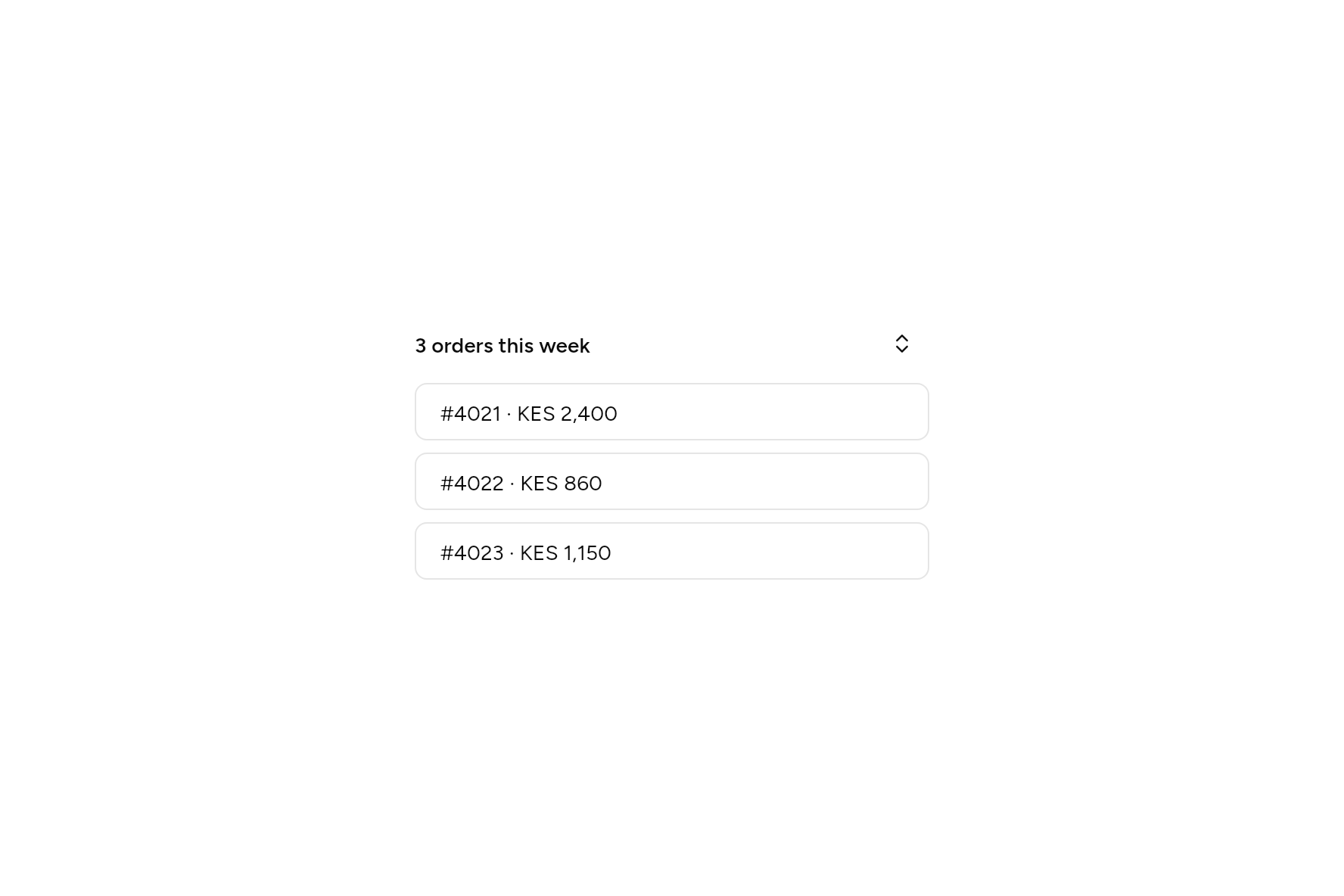

import 'package:ashlar_icons/ashlar_icons.dart';
import 'package:flutter/widgets.dart';

import 'ui/button.dart';
import 'ui/collapsible.dart';
import 'ui/theme.dart';

class CollapsibleDemo extends StatelessWidget {
  const CollapsibleDemo({super.key});

  @override
  Widget build(BuildContext context) {
    final t = AshlarTheme.of(context);
    Widget row(String text) => Container(
      margin: const EdgeInsets.only(top: 8),
      padding: const EdgeInsets.symmetric(horizontal: 16, vertical: 8),
      decoration: BoxDecoration(
        border: Border.all(color: t.colors.border),
        borderRadius: BorderRadius.circular(t.radiusMd),
      ),
      child: Text(text),
    );
    return SizedBox(
      width: 340,
      child: Collapsible(
        initiallyOpen: true,
        builder: (context, open, toggle) => Row(
          children: [
            Expanded(
              child: Text('3 orders this week', style: t.text.sm.copyWith(fontWeight: FontWeight.w600)),
            ),
            Button(
              variant: ButtonVariant.ghost,
              size: ButtonSize.icon,
              semanticLabel: open ? 'Hide orders' : 'Show orders',
              onPressed: toggle,
              child: const AshlarIcon(AshlarIconsRoundedStroke.chevronsUpDown),
            ),
          ],
        ),
        child: Column(
          crossAxisAlignment: CrossAxisAlignment.stretch,
          children: [row('#4021 · KES 2,400'), row('#4022 · KES 860'), row('#4023 · KES 1,150')],
        ),
      ),
    );
  }
}
Add it
In your Flutter project:
ashlar add collapsible
It writes theme.dart, palette.dart and collapsible.dart into lib/ui, keeping any you already have.
Examples
Other ways to use it, each running live, with its code.
A list that opens
Three shown, the rest on request.


// A list that opens: Three shown, the rest on request.
import 'package:ashlar_icons/ashlar_icons.dart';
import 'package:flutter/widgets.dart';

import 'ui/button.dart';
import 'ui/collapsible.dart';

class CollapsibleListExample extends StatelessWidget {
  const CollapsibleListExample({super.key});

  @override
  Widget build(BuildContext context) => SizedBox(
    width: 320,
    child: Collapsible(
      builder: (context, open, toggle) => Row(
        children: [
          const Expanded(child: Text('3 starred repositories')),
          Button(
            variant: ButtonVariant.ghost,
            size: ButtonSize.iconSm,
            semanticLabel: open ? 'Show fewer' : 'Show all',
            onPressed: toggle,
            child: AshlarIcon(open ? AshlarIconsRoundedStroke.chevronUp : AshlarIconsRoundedStroke.chevronDown),
          ),
        ],
      ),
      child: const Column(
        crossAxisAlignment: CrossAxisAlignment.start,
        children: [Text('ashlar/ui'), Text('ashlar/icons'), Text('ashlar/site')],
      ),
    ),
  );
}
API
Read from the source above: each parameter with its type, its default, and what it is for.
Collapsibleclass
Content that opens and closes under a trigger. builder draws the trigger and gets whether it is open and a function that opens or closes it; give that to a Button. Closed, the content is out of the Tab order and out of what screen readers read.
Give open and onChanged to hold the state yourself; leave them out and it holds its own, starting at initiallyOpen.
| Parameter | Type | Default | What it is for |
|---|---|---|---|
builderrequired |
Widget Function(BuildContext context, bool open, VoidCallback toggle) |
Builds what opens and closes it, given whether it is open and a way to toggle it. | |
childrequired |
Widget |
What shows when it is open. | |
open |
bool? |
Whether it is open, when you hold its state. | |
onChanged |
ValueChanged<bool>? |
Told when it opens or closes. | |
initiallyOpen |
bool |
false |
Whether it starts open, when nothing holds its state from outside. |
Source
What lands in your app. It is yours from then on: change it as you would your own code, and ashlar add
will not write over it.
lib/ui/collapsible.dart 122 lines
// Ashlar UI: Collapsible. Copied into your app by `ashlar add collapsible`; it is yours to
// change.

import 'package:flutter/widgets.dart';

import 'theme.dart';

/// Content that opens and closes under a trigger. [builder] draws the trigger and gets
/// whether it is open and a function that opens or closes it; give that to a Button.
/// Closed, the content is out of the Tab order and out of what screen readers read.
///
/// Give [open] and [onChanged] to hold the state yourself; leave them out and it holds
/// its own, starting at [initiallyOpen].
///
/// ```dart
/// Collapsible(
///   builder: (context, open, toggle) => Button(variant: ButtonVariant.ghost, onPressed: toggle, child: Text(open ? 'Hide' : 'Show')),
///   child: Text('The details.'),
/// )
/// ```
class Collapsible extends StatefulWidget {
  const Collapsible({
    super.key,
    required this.builder,
    required this.child,
    this.open,
    this.onChanged,
    this.initiallyOpen = false,
  });

  /// Builds what opens and closes it, given whether it is open and a way to toggle it.
  final Widget Function(BuildContext context, bool open, VoidCallback toggle)
  builder;

  /// What shows when it is open.
  final Widget child;

  /// Whether it is open, when you hold its state.
  final bool? open;

  /// Told when it opens or closes.
  final ValueChanged<bool>? onChanged;

  /// Whether it starts open, when nothing holds its state from outside.
  final bool initiallyOpen;

  @override
  State<Collapsible> createState() => _CollapsibleState();
}

class _CollapsibleState extends State<Collapsible>
    with SingleTickerProviderStateMixin {
  late bool _own = widget.initiallyOpen;
  bool get _open => widget.open ?? _own;
  late final _c = AnimationController(
    vsync: this,
    duration: const Duration(milliseconds: 200),
    value: _open ? 1 : 0,
  )..addStatusListener((_) => setState(() {}));
  late final _size = CurvedAnimation(
    parent: _c,
    curve: Curves.easeOutCubic,
    reverseCurve: Curves.easeInCubic,
  );

  void _toggle() {
    if (widget.open == null) setState(() => _own = !_own);
    widget.onChanged?.call(!_open);
    _run();
  }

  void _run() {
    final still = MediaQuery.maybeDisableAnimationsOf(context) ?? false;
    if (still) {
      _c.value = _open ? 1 : 0;
    } else if (_open) {
      _c.forward();
    } else {
      _c.reverse();
    }
  }

  @override
  void didUpdateWidget(Collapsible old) {
    super.didUpdateWidget(old);
    if (old.open != widget.open) _run();
  }

  @override
  void dispose() {
    _c.dispose();
    super.dispose();
  }

  @override
  Widget build(BuildContext context) {
    final t = AshlarTheme.of(context);
    return Column(
      mainAxisSize: MainAxisSize.min,
      crossAxisAlignment: CrossAxisAlignment.stretch,
      children: [
        widget.builder(context, _open, _toggle),
        SizeTransition(
          sizeFactor: _size,
          alignment: Alignment.topCenter,
          child: Visibility(
            // Fully closed: kept, but not drawn, focused or read.
            visible: !_c.isDismissed,
            maintainState: true,
            child: ExcludeFocus(
              excluding: !_open,
              child: DefaultTextStyle.merge(
                style: t.text.sm,
                child: widget.child,
              ),
            ),
          ),
        ),
      ],
    );
  }
}