

Item
A row in a list: media, a title and description, and actions.
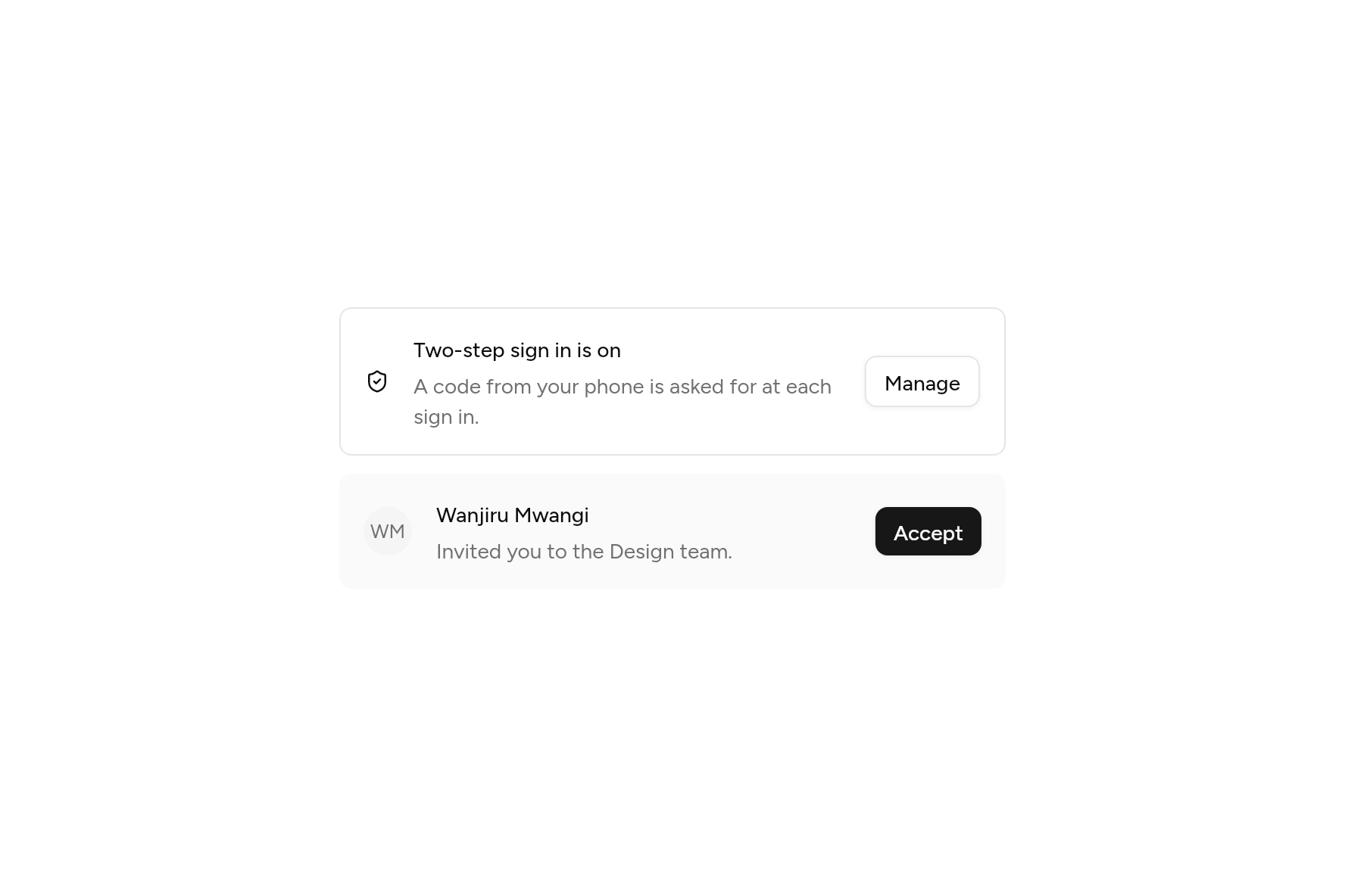
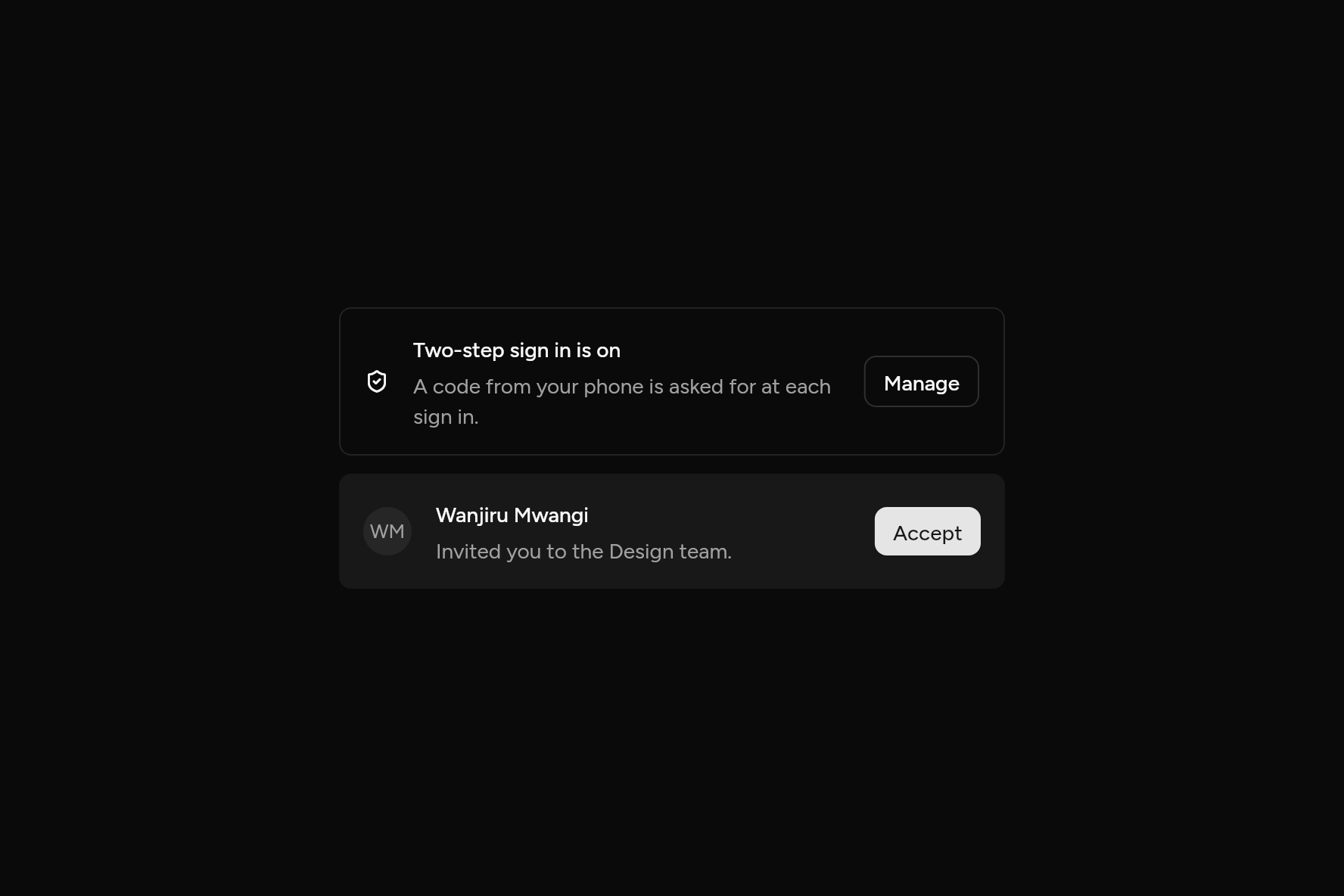
import 'package:ashlar_icons/ashlar_icons.dart';
import 'package:flutter/widgets.dart';

import 'ui/avatar.dart';
import 'ui/button.dart';
import 'ui/item.dart';

class ItemDemo extends StatelessWidget {
  const ItemDemo({super.key});

  @override
  Widget build(BuildContext context) => SizedBox(
    width: 440,
    child: Column(
      mainAxisSize: MainAxisSize.min,
      children: [
        Item(
          variant: ItemVariant.outline,
          leading: const AshlarIcon(AshlarIconsRoundedStroke.shieldCheck),
          title: const Text('Two-step sign in is on'),
          description: const Text('A code from your phone is asked for at each sign in.'),
          trailing: Button(
            size: ButtonSize.sm,
            variant: ButtonVariant.outline,
            onPressed: () {},
            child: const Text('Manage'),
          ),
        ),
        const SizedBox(height: 12),
        Item(
          variant: ItemVariant.muted,
          leading: const Avatar(fallback: 'WM'),
          title: const Text('Wanjiru Mwangi'),
          description: const Text('Invited you to the Design team.'),
          trailing: Button(size: ButtonSize.sm, onPressed: () {}, child: const Text('Accept')),
        ),
      ],
    ),
  );
}
Try its options
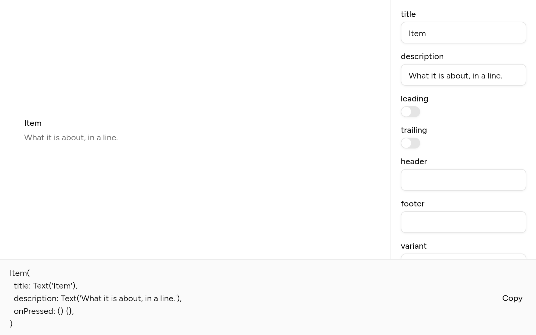
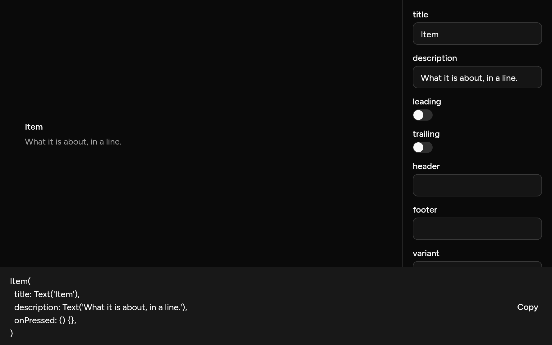
Each option its constructor takes, to change and see; the code below it is what you chose, to copy.
Add it
In your Flutter project:
ashlar add item
It writes theme.dart, palette.dart, group.dart, pressable.dart and item.dart into lib/ui, keeping any you already have. It needs pressable, which come with it.
Examples
Other ways to use it, each running live, with its code.
With media
An icon or an avatar before the words.
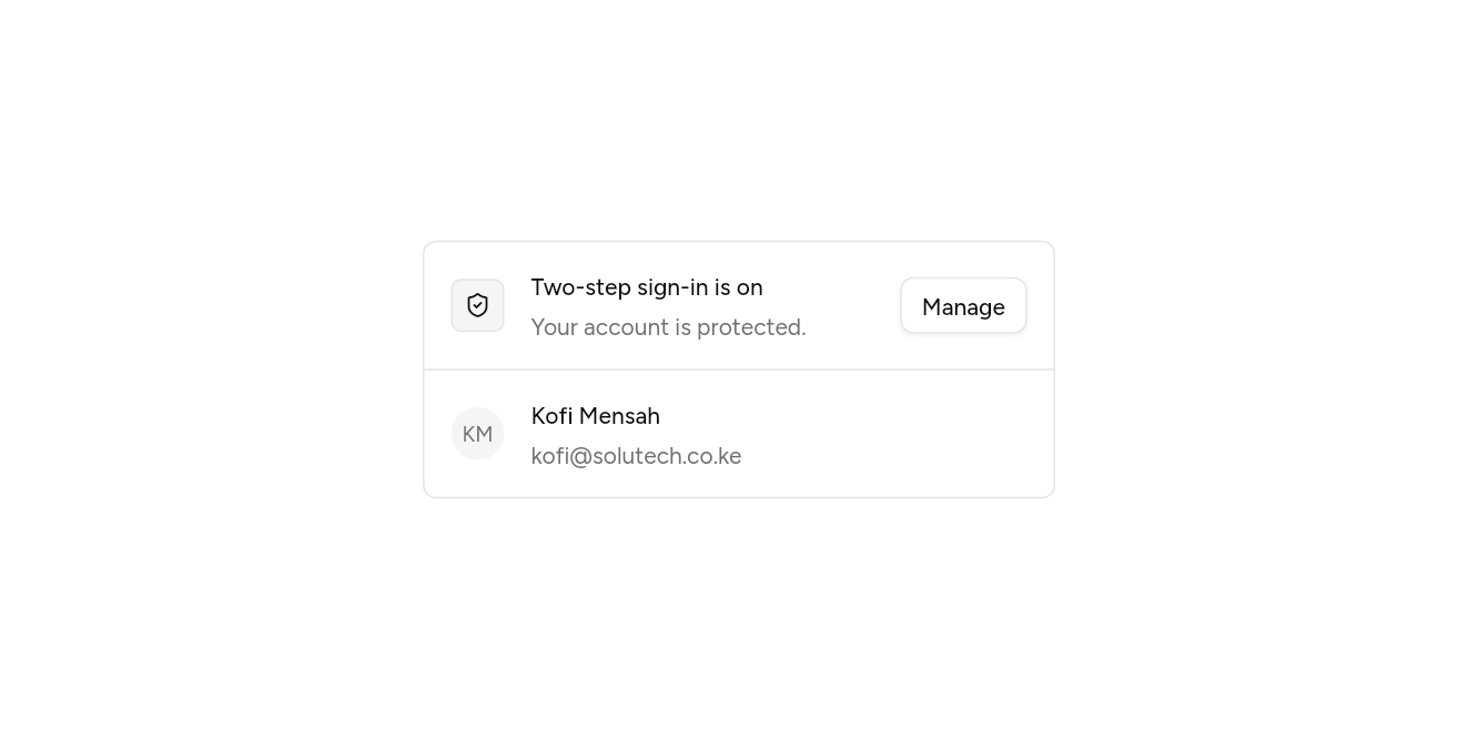
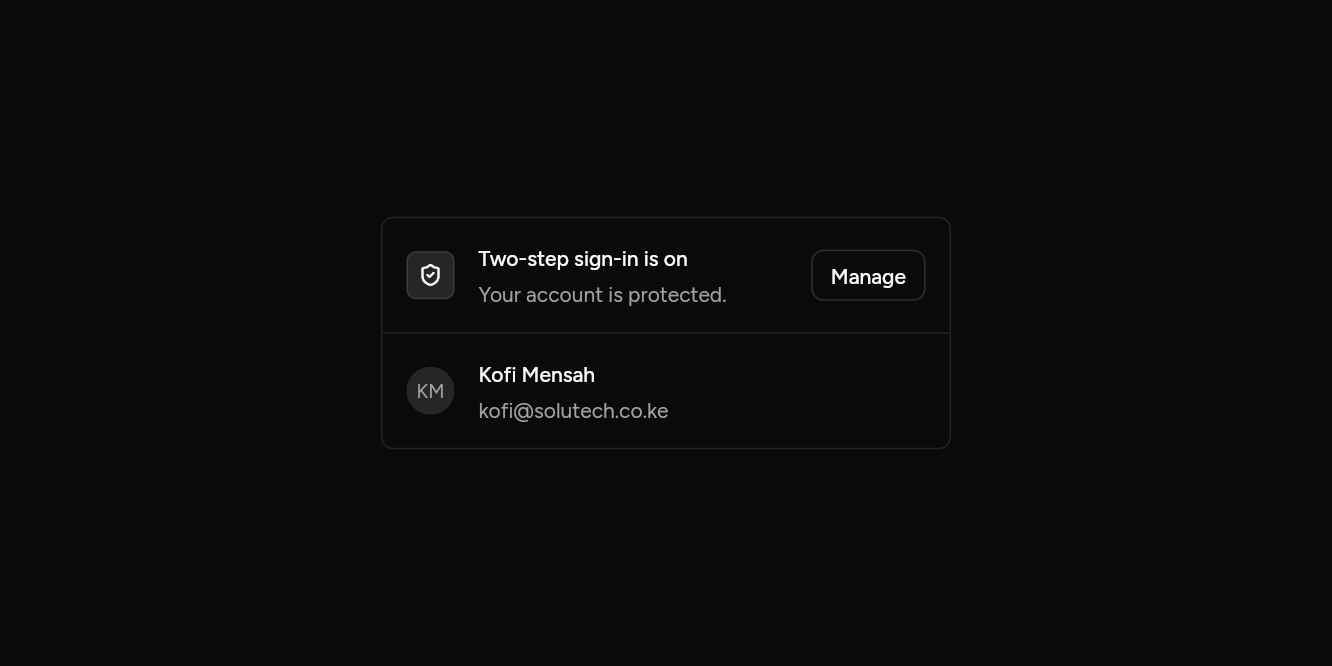
// With media: An icon or an avatar before the words.
import 'package:ashlar_icons/ashlar_icons.dart';
import 'package:flutter/widgets.dart';

import 'ui/avatar.dart';
import 'ui/button.dart';
import 'ui/item.dart';

class ItemMediaExample extends StatelessWidget {
  const ItemMediaExample({super.key});

  @override
  Widget build(BuildContext context) => SizedBox(
    width: 380,
    child: ItemGroup(
      children: [
        Item(
          leading: const ItemMedia.icon(AshlarIcon(AshlarIconsRoundedStroke.shieldCheck)),
          title: const Text('Two-step sign-in is on'),
          description: const Text('Your account is protected.'),
          trailing: Button(
            size: ButtonSize.sm,
            variant: ButtonVariant.outline,
            onPressed: () {},
            child: const Text('Manage'),
          ),
        ),
        const Item(
          leading: ItemMedia(child: Avatar(fallback: 'KM')),
          title: Text('Kofi Mensah'),
          description: Text('kofi@solutech.co.ke'),
        ),
      ],
    ),
  );
}
Sizes and fills
Small and extra small, outlined or muted.
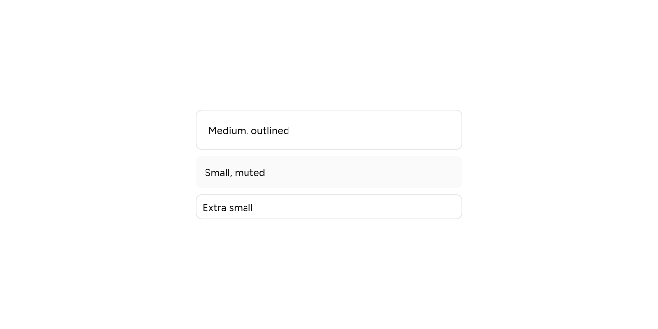
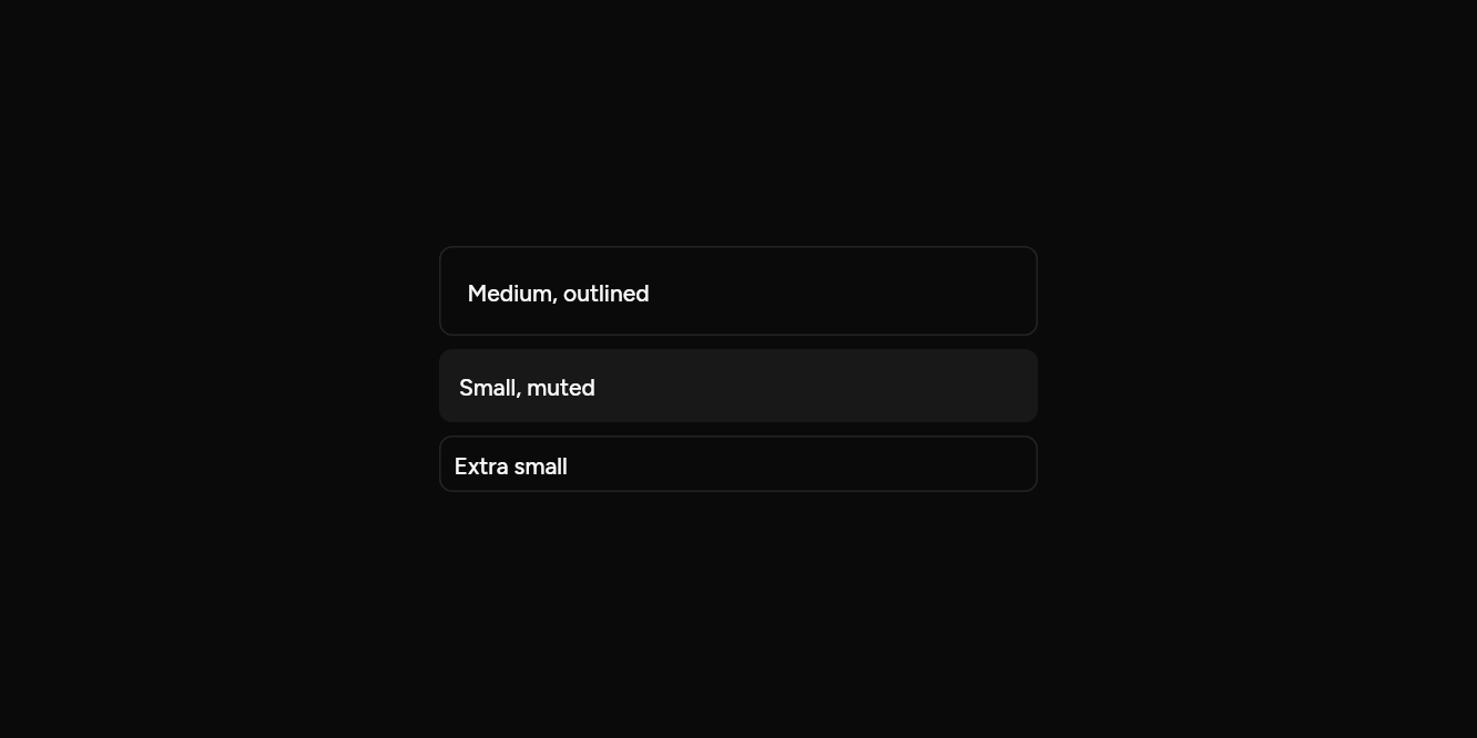
// Sizes and fills: Small and extra small, outlined or muted.
import 'package:flutter/widgets.dart';

import 'ui/item.dart';

class ItemSizesExample extends StatelessWidget {
  const ItemSizesExample({super.key});

  @override
  Widget build(BuildContext context) => const SizedBox(
    width: 360,
    child: Column(
      mainAxisSize: MainAxisSize.min,
      children: [
        Item(variant: ItemVariant.outline, title: Text('Medium, outlined')),
        SizedBox(height: 8),
        Item(variant: ItemVariant.muted, size: ItemSize.sm, title: Text('Small, muted')),
        SizedBox(height: 8),
        Item(variant: ItemVariant.outline, size: ItemSize.xs, title: Text('Extra small')),
      ],
    ),
  );
}
API
Read from the source above: each parameter with its type, its default, and what it is for.
ItemVariantenum
| Value | What it is for |
|---|---|
plain | No border or fill. |
outline | A border round it. |
muted | A muted fill. |
ItemSizeenum
| Value | What it is for |
|---|---|
md | 16 of padding. |
sm | 12, tighter. |
xs | 8, for dense lists. |
Itemclass
A row in a list: media at the start (an icon, an avatar, an image), a title and a description, and actions at the end. header and footer run across the whole item, above and below. With onPressed the whole row is a button.
| Parameter | Type | Default | What it is for |
|---|---|---|---|
titlerequired |
Widget |
The item's name. | |
description |
Widget? |
A line under the title. | |
leading |
Widget? |
Usually an ItemMedia. |
|
trailing |
Widget? |
After the label: usually an icon. | |
header |
Widget? |
Across the top and the foot of the item: an image, a row of tags. | |
footer |
Widget? |
Across the top and the foot of the item: an image, a row of tags. | |
variant |
ItemVariant |
ItemVariant.plain |
How it is set apart: plainly, with a border, or on a muted fill. |
size |
ItemSize |
ItemSize.md |
Medium, small or extra small: how much room it has. |
onPressed |
VoidCallback? |
Called when it is pressed. Null disables it. |
ItemMediaclass
What sits at the start of an Item: an icon on a muted square, an image, or anything.
ItemMedia(…)
| Parameter | Type | Default | What it is for |
|---|---|---|---|
childrequired |
Widget |
The icon, picture or avatar. |
ItemMedia.icon(…)
| Parameter | Type | Default | What it is for |
|---|---|---|---|
childpositional |
Widget |
The icon, picture or avatar. |
ItemMedia.image(…)
| Parameter | Type | Default | What it is for |
|---|---|---|---|
childpositional |
Widget |
The icon, picture or avatar. |
ItemGroupclass
Items in one block, as a list: one border round them all, and a line between each.
| Parameter | Type | Default | What it is for |
|---|---|---|---|
childrenrequired |
List<Widget> |
What it holds, in order. | |
variant |
ItemVariant |
ItemVariant.outline |
How its items are set apart. |
separated |
bool |
true |
A line between items. |
ItemSeparatorclass
A line between items.
Source
What lands in your app. It is yours from then on: change it as you would your own code, and ashlar add
will not write over it.
lib/ui/item.dart 266 lines
// Ashlar UI: Item. Copied into your app by `ashlar add item`; it is yours to change.

import 'package:flutter/widgets.dart';

import 'pressable.dart';
import 'theme.dart';

enum ItemVariant {
  /// No border or fill.
  plain,

  /// A border round it.
  outline,

  /// A muted fill.
  muted,
}

enum ItemSize {
  /// 16 of padding.
  md,

  /// 12, tighter.
  sm,

  /// 8, for dense lists.
  xs,
}

/// A row in a list: media at the start (an icon, an avatar, an image), a title and a
/// description, and actions at the end. [header] and [footer] run across the whole item,
/// above and below. With [onPressed] the whole row is a button.
///
/// ```dart
/// Item(
///   variant: ItemVariant.outline,
///   leading: ItemMedia.icon(AshlarIcon(AshlarIconsRoundedStroke.shieldCheck)),
///   title: Text('Two-step sign in is on'),
///   description: Text('A code from your phone is asked for at each sign in.'),
///   trailing: Button(size: ButtonSize.sm, variant: ButtonVariant.outline, onPressed: manage, child: Text('Manage')),
/// )
/// ```
class Item extends StatelessWidget {
  const Item({
    super.key,
    required this.title,
    this.description,
    this.leading,
    this.trailing,
    this.header,
    this.footer,
    this.variant = ItemVariant.plain,
    this.size = ItemSize.md,
    this.onPressed,
  });

  /// The item's name.
  final Widget title;

  /// A line under the title.
  final Widget? description;

  /// Usually an [ItemMedia].
  final Widget? leading;

  /// After the label: usually an icon.
  final Widget? trailing;

  /// Across the top and the foot of the item: an image, a row of tags.
  final Widget? header, footer;

  /// How it is set apart: plainly, with a border, or on a muted fill.
  final ItemVariant variant;

  /// Medium, small or extra small: how much room it has.
  final ItemSize size;

  /// Called when it is pressed. Null disables it.
  final VoidCallback? onPressed;

  @override
  Widget build(BuildContext context) {
    final t = AshlarTheme.of(context);
    final c = t.colors;
    final pad = switch (size) {
      ItemSize.md => 16.0,
      ItemSize.sm => 12.0,
      ItemSize.xs => 8.0,
    };
    final grouped = _ItemGroupScope.of(context);
    Widget body(bool lit) => AnimatedContainer(
      duration: t.duration,
      padding: EdgeInsets.symmetric(
        horizontal: pad,
        vertical: size == ItemSize.xs ? 6 : pad,
      ),
      decoration: BoxDecoration(
        color: lit
            ? c.accent.withValues(alpha: c.accent.a * .5)
            : (variant == ItemVariant.muted
                  ? c.muted.withValues(alpha: c.muted.a * .5)
                  : c.muted.withValues(alpha: 0)),
        borderRadius: grouped ? null : BorderRadius.circular(t.radiusMd),
        border: variant == ItemVariant.outline && !grouped
            ? Border.all(color: c.border)
            : null,
      ),
      child: IconTheme.merge(
        data: IconThemeData(color: c.foreground, size: 16),
        child: Column(
          mainAxisSize: MainAxisSize.min,
          crossAxisAlignment: CrossAxisAlignment.stretch,
          children: [
            if (header != null) ...[header!, SizedBox(height: pad * .75)],
            Row(
              children: [
                if (leading != null) ...[leading!, SizedBox(width: pad)],
                Expanded(
                  child: Column(
                    crossAxisAlignment: CrossAxisAlignment.start,
                    mainAxisSize: MainAxisSize.min,
                    children: [
                      DefaultTextStyle.merge(
                        style: t.text.sm.copyWith(
                          color: c.foreground,
                          fontWeight: FontWeight.w500,
                        ),
                        child: title,
                      ),
                      if (description != null) ...[
                        const SizedBox(height: 4),
                        DefaultTextStyle.merge(
                          style: t.text.sm.copyWith(color: c.mutedForeground),
                          maxLines: 2,
                          overflow: TextOverflow.ellipsis,
                          child: description!,
                        ),
                      ],
                    ],
                  ),
                ),
                if (trailing != null) ...[SizedBox(width: pad), trailing!],
              ],
            ),
            if (footer != null) ...[SizedBox(height: pad * .75), footer!],
          ],
        ),
      ),
    );
    if (onPressed == null) return body(false);
    return Pressable(
      onPressed: onPressed,
      builder: (context, state) => body(state.hovered || state.focused),
    );
  }
}

/// What sits at the start of an [Item]: an icon on a muted square, an image, or anything.
class ItemMedia extends StatelessWidget {
  const ItemMedia({super.key, required this.child}) : _kind = 0;

  /// An icon on a small muted square.
  const ItemMedia.icon(this.child, {super.key}) : _kind = 1;

  /// A picture, cropped to a rounded square.
  const ItemMedia.image(this.child, {super.key}) : _kind = 2;

  /// The icon, picture or avatar.
  final Widget child;
  final int _kind;

  @override
  Widget build(BuildContext context) {
    final t = AshlarTheme.of(context);
    return switch (_kind) {
      1 => Container(
        width: 32,
        height: 32,
        alignment: Alignment.center,
        decoration: BoxDecoration(
          color: t.colors.muted,
          borderRadius: BorderRadius.circular(t.radiusSm),
          border: Border.all(color: t.colors.border),
        ),
        child: child,
      ),
      2 => ClipRRect(
        borderRadius: BorderRadius.circular(t.radiusSm),
        child: SizedBox.square(dimension: 40, child: child),
      ),
      _ => child,
    };
  }
}

/// Items in one block, as a list: one border round them all, and a line between each.
class ItemGroup extends StatelessWidget {
  const ItemGroup({
    super.key,
    required this.children,
    this.variant = ItemVariant.outline,
    this.separated = true,
  });

  /// What it holds, in order.
  final List<Widget> children;

  /// How its items are set apart.
  final ItemVariant variant;

  /// A line between items.
  final bool separated;

  @override
  Widget build(BuildContext context) {
    final t = AshlarTheme.of(context);
    final c = t.colors;
    return Semantics(
      container: true,
      explicitChildNodes: true,
      child: Container(
        clipBehavior: Clip.antiAlias,
        decoration: BoxDecoration(
          color: variant == ItemVariant.muted
              ? c.muted.withValues(alpha: c.muted.a * .5)
              : null,
          borderRadius: BorderRadius.circular(t.radiusMd),
          border: variant == ItemVariant.outline
              ? Border.all(color: c.border)
              : null,
        ),
        child: _ItemGroupScope(
          child: Column(
            mainAxisSize: MainAxisSize.min,
            crossAxisAlignment: CrossAxisAlignment.stretch,
            children: [
              for (final (i, item) in children.indexed) ...[
                if (i > 0 && separated) const ItemSeparator(),
                item,
              ],
            ],
          ),
        ),
      ),
    );
  }
}

class _ItemGroupScope extends InheritedWidget {
  const _ItemGroupScope({required super.child});

  static bool of(BuildContext context) =>
      context.dependOnInheritedWidgetOfExactType<_ItemGroupScope>() != null;

  @override
  bool updateShouldNotify(_ItemGroupScope old) => false;
}

/// A line between items.
class ItemSeparator extends StatelessWidget {
  const ItemSeparator({super.key});

  @override
  Widget build(BuildContext context) =>
      Container(height: 1, color: AshlarTheme.of(context).colors.border);
}