

Button
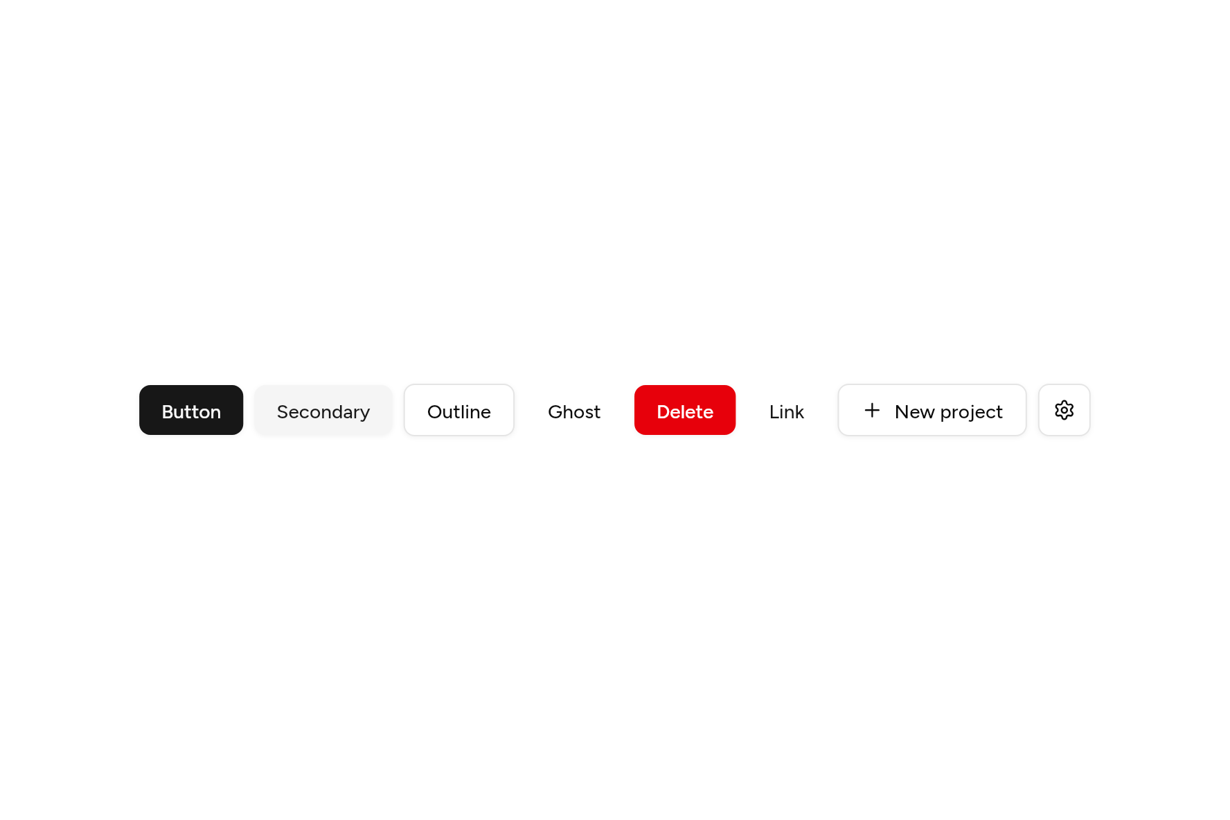
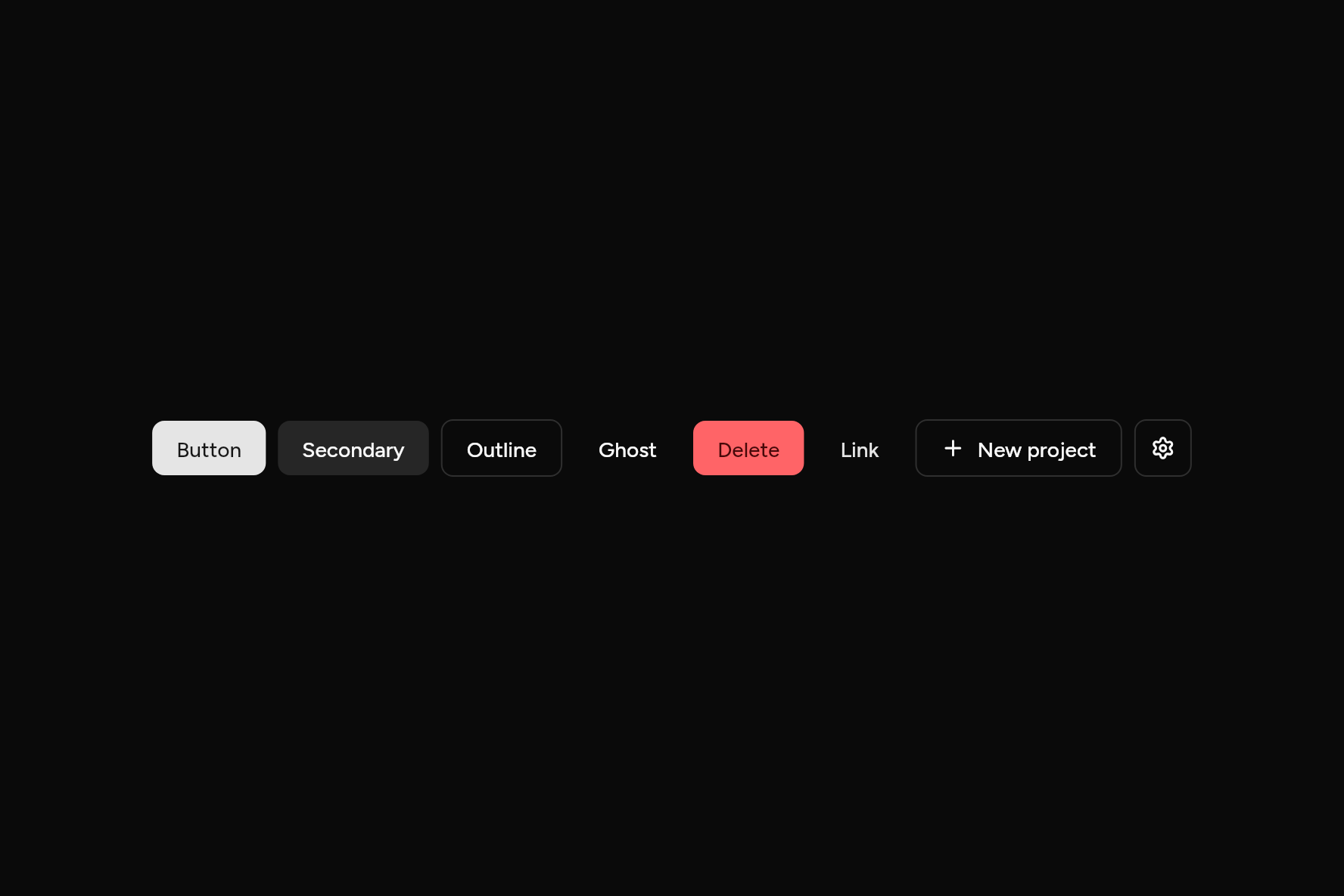
Six variants and four sizes, with leading and trailing icons.
import 'package:ashlar_icons/ashlar_icons.dart';
import 'package:flutter/widgets.dart';

import 'ui/button.dart';

class ButtonDemo extends StatelessWidget {
  const ButtonDemo({super.key});

  @override
  Widget build(BuildContext context) => Wrap(
    spacing: 8,
    runSpacing: 8,
    alignment: WrapAlignment.center,
    crossAxisAlignment: WrapCrossAlignment.center,
    children: [
      Button(onPressed: () {}, child: const Text('Button')),
      Button(variant: ButtonVariant.secondary, onPressed: () {}, child: const Text('Secondary')),
      Button(variant: ButtonVariant.outline, onPressed: () {}, child: const Text('Outline')),
      Button(variant: ButtonVariant.ghost, onPressed: () {}, child: const Text('Ghost')),
      Button(variant: ButtonVariant.destructive, onPressed: () {}, child: const Text('Delete')),
      Button(variant: ButtonVariant.link, onPressed: () {}, child: const Text('Link')),
      Button(
        variant: ButtonVariant.outline,
        leading: const AshlarIcon(AshlarIconsRoundedStroke.plus),
        onPressed: () {},
        child: const Text('New project'),
      ),
      Button(
        size: ButtonSize.icon,
        variant: ButtonVariant.outline,
        semanticLabel: 'Settings',
        onPressed: () {},
        child: const AshlarIcon(AshlarIconsRoundedStroke.settings),
      ),
    ],
  );
}
Try its options
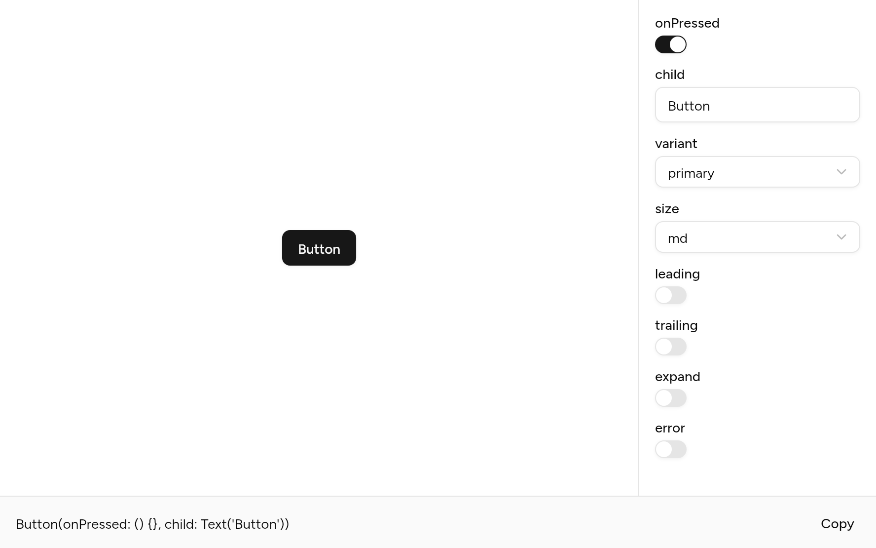
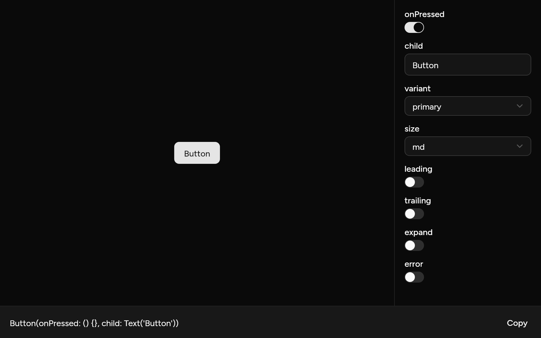
Each option its constructor takes, to change and see; the code below it is what you chose, to copy.
Add it
In your Flutter project:
ashlar add button
It writes theme.dart, palette.dart, group.dart, pressable.dart and button.dart into lib/ui, keeping any you already have. It needs pressable and group, which come with it.
Examples
Other ways to use it, each running live, with its code.
Variants
Primary for the main action, then the rest in order of weight.
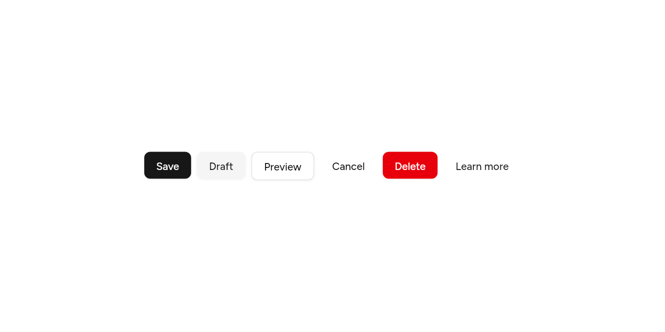
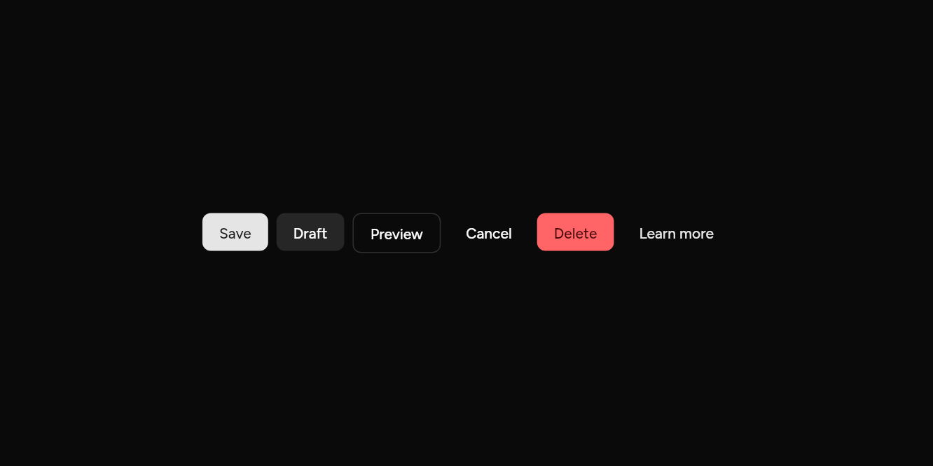
// Variants: Primary for the main action, then the rest in order of weight.
import 'package:flutter/widgets.dart';

import 'ui/button.dart';

class ButtonVariantsExample extends StatelessWidget {
  const ButtonVariantsExample({super.key});

  @override
  Widget build(BuildContext context) => Wrap(
    spacing: 8,
    runSpacing: 8,
    children: [
      Button(onPressed: () {}, child: const Text('Save')),
      Button(variant: ButtonVariant.secondary, onPressed: () {}, child: const Text('Draft')),
      Button(variant: ButtonVariant.outline, onPressed: () {}, child: const Text('Preview')),
      Button(variant: ButtonVariant.ghost, onPressed: () {}, child: const Text('Cancel')),
      Button(variant: ButtonVariant.destructive, onPressed: () {}, child: const Text('Delete')),
      Button(variant: ButtonVariant.link, onPressed: () {}, child: const Text('Learn more')),
    ],
  );
}
Sizes
Extra small to large, and square ones for an icon alone.
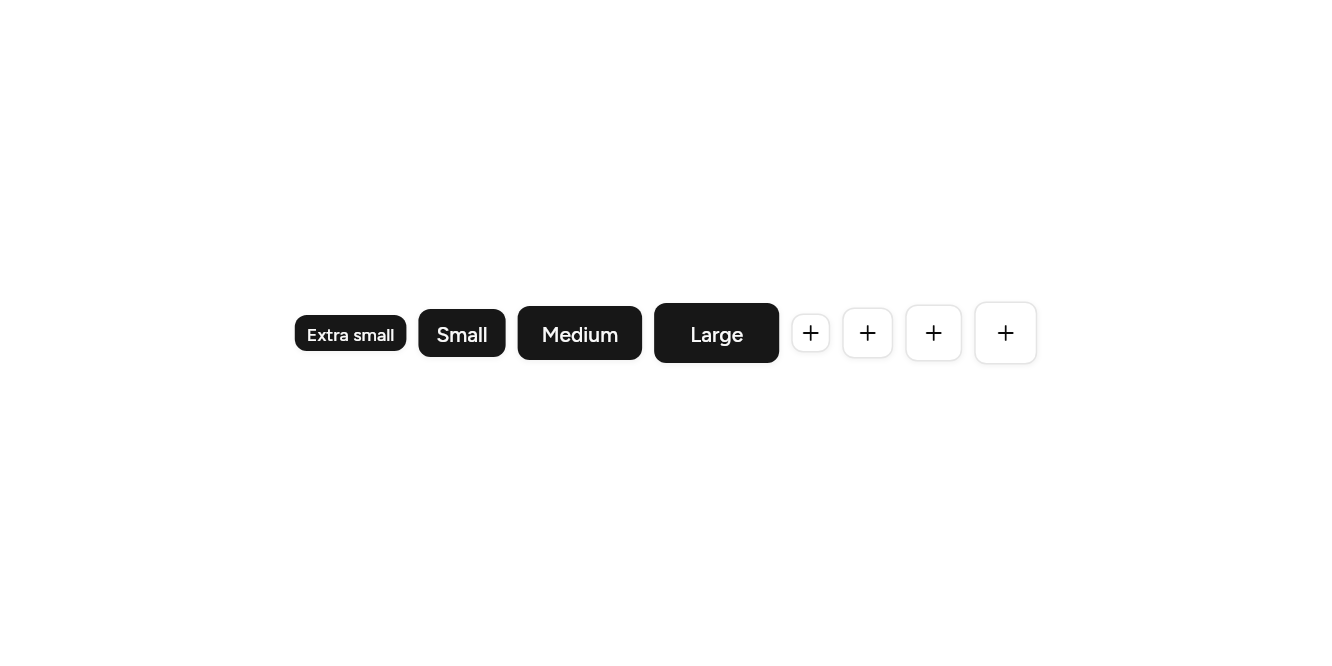
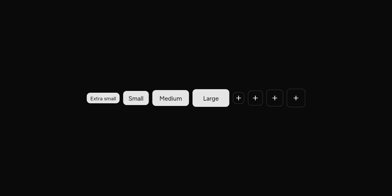
// Sizes: Extra small to large, and square ones for an icon alone.
import 'package:ashlar_icons/ashlar_icons.dart';
import 'package:flutter/widgets.dart';

import 'ui/button.dart';

class ButtonSizesExample extends StatelessWidget {
  const ButtonSizesExample({super.key});

  @override
  Widget build(BuildContext context) => Wrap(
    spacing: 8,
    runSpacing: 8,
    crossAxisAlignment: WrapCrossAlignment.center,
    children: [
      Button(size: ButtonSize.xs, onPressed: () {}, child: const Text('Extra small')),
      Button(size: ButtonSize.sm, onPressed: () {}, child: const Text('Small')),
      Button(onPressed: () {}, child: const Text('Medium')),
      Button(size: ButtonSize.lg, onPressed: () {}, child: const Text('Large')),
      for (final size in [ButtonSize.iconXs, ButtonSize.iconSm, ButtonSize.icon, ButtonSize.iconLg])
        Button(
          size: size,
          variant: ButtonVariant.outline,
          semanticLabel: 'Add',
          onPressed: () {},
          child: const AshlarIcon(AshlarIconsRoundedStroke.plus),
        ),
    ],
  );
}
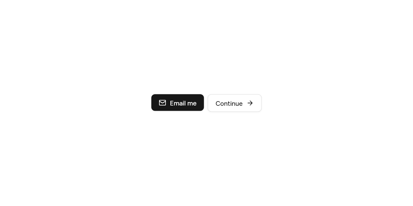
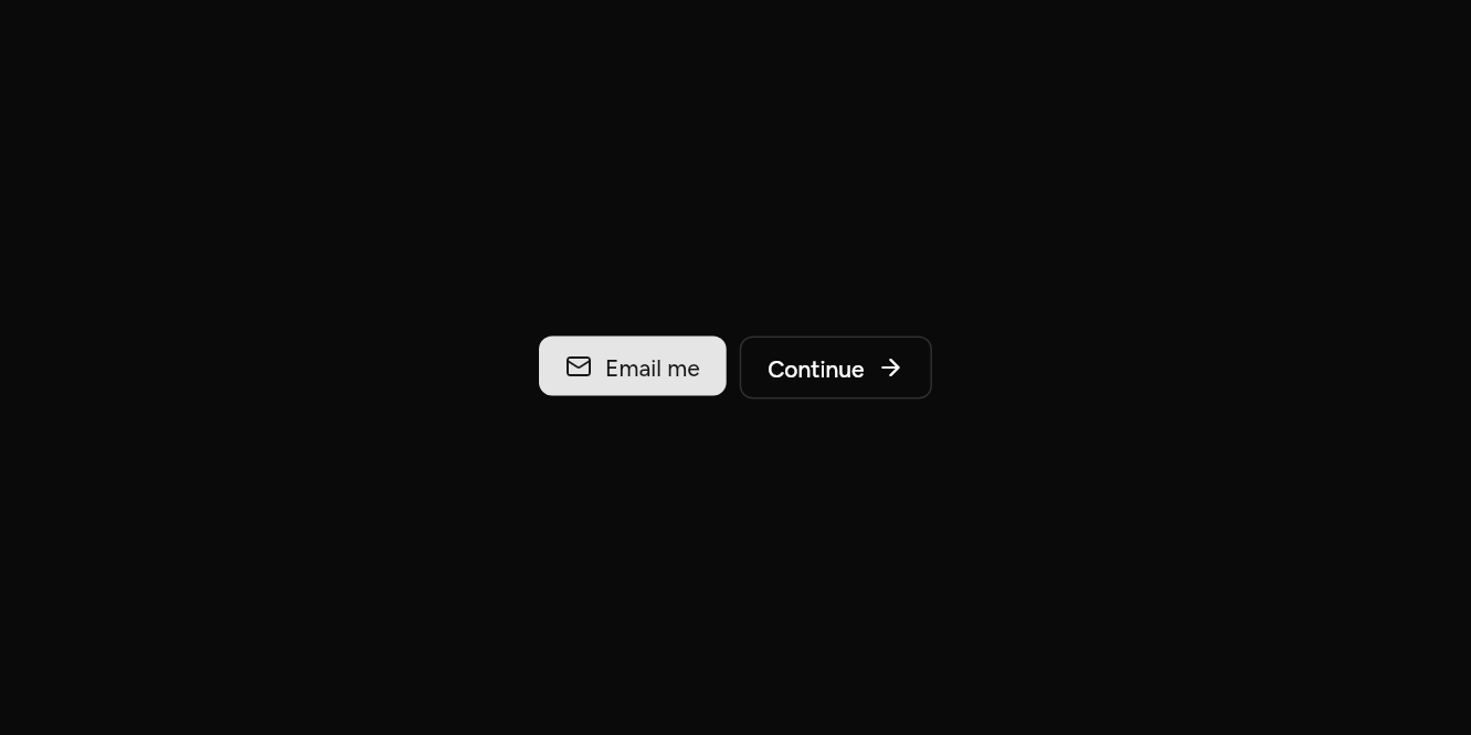
With icons
An icon before or after the label.
// With icons: An icon before or after the label.
import 'package:ashlar_icons/ashlar_icons.dart';
import 'package:flutter/widgets.dart';

import 'ui/button.dart';

class ButtonIconsExample extends StatelessWidget {
  const ButtonIconsExample({super.key});

  @override
  Widget build(BuildContext context) => Wrap(
    spacing: 8,
    children: [
      Button(
        leading: const AshlarIcon(AshlarIconsRoundedStroke.mail),
        onPressed: () {},
        child: const Text('Email me'),
      ),
      Button(
        variant: ButtonVariant.outline,
        trailing: const AshlarIcon(AshlarIconsRoundedStroke.arrowRight),
        onPressed: () {},
        child: const Text('Continue'),
      ),
    ],
  );
}
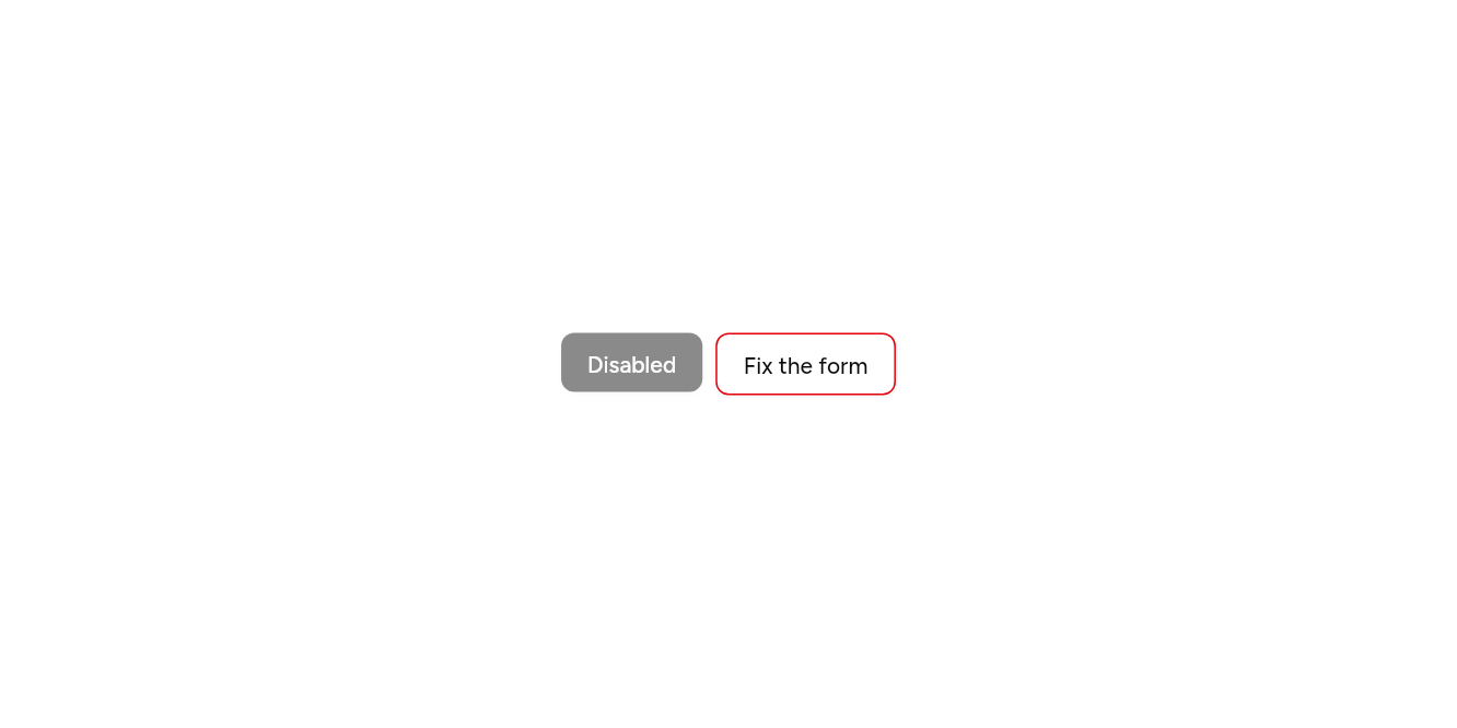
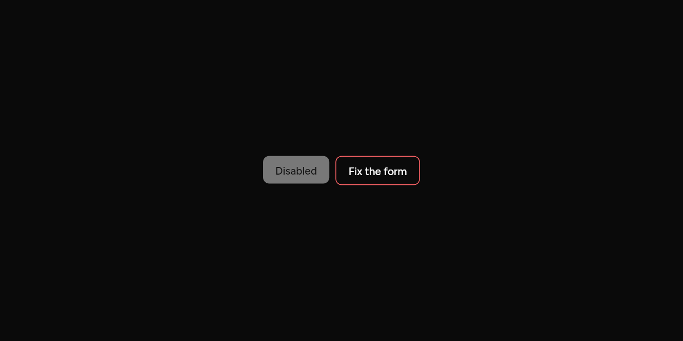
Disabled and wrong
Null onPressed disables it; error marks it.
// Disabled and wrong: Null onPressed disables it; error marks it.
import 'package:flutter/widgets.dart';

import 'ui/button.dart';

class ButtonStatesExample extends StatelessWidget {
  const ButtonStatesExample({super.key});

  @override
  Widget build(BuildContext context) => Wrap(
    spacing: 8,
    children: [
      const Button(onPressed: null, child: Text('Disabled')),
      Button(variant: ButtonVariant.outline, error: true, onPressed: () {}, child: const Text('Fix the form')),
    ],
  );
}
API
Read from the source above: each parameter with its type, its default, and what it is for.
ButtonVariantenum
| Value | What it is for |
|---|---|
primary | The main action on a screen. |
secondary | A quieter action beside the main one. |
outline | An action with a border and no fill. |
ghost |
An action with no border or fill until it is hovered: toolbars, menus. |
destructive | An action that deletes or cannot be undone. |
link | Text that acts like a link. |
ButtonSizeenum
| Value | What it is for |
|---|---|
sm | 32 tall. |
md | 36 tall. |
lg | 40 tall. |
icon | A 36 square for one icon: give it a semanticLabel. |
xs | 24 tall, for dense rows. |
iconXs | Squares for one icon: 24, 32 and 40. |
iconSm | |
iconLg |
Buttonclass
A button. child is usually a Text; leading and trailing an icon each side.
| Parameter | Type | Default | What it is for |
|---|---|---|---|
onPressedrequired |
VoidCallback? |
Null disables the button. | |
childrequired |
Widget |
What it shows: usually a Text, an icon, or both. | |
variant |
ButtonVariant |
ButtonVariant.primary |
Its fill: primary for the main action, then secondary, outline, ghost, destructive or link. |
size |
ButtonSize |
ButtonSize.md |
Its height and room, or a square for an icon alone. |
leading |
Widget? |
Before the label: usually an icon. | |
trailing |
Widget? |
After the label: usually an icon. | |
focusNode |
FocusNode? |
Its focus node, to move focus to it or follow it from outside; one is made when not given. | |
autofocus |
bool |
false |
Takes the keyboard's focus when it first appears. |
semanticLabel |
String? |
What a screen reader calls it when its visible text does not say, as for an icon alone. | |
expand |
bool |
false |
Fills the width it is given. |
error |
bool |
false |
Draws it as invalid: a destructive border and ring, as on a field. |
Source
What lands in your app. It is yours from then on: change it as you would your own code, and ashlar add
will not write over it.
lib/ui/button.dart 233 lines
// Ashlar UI: Button. Copied into your app by `ashlar add button`; it is yours to change.

import 'package:flutter/widgets.dart';

import 'group.dart';
import 'pressable.dart';
import 'theme.dart';

enum ButtonVariant {
  /// The main action on a screen.
  primary,

  /// A quieter action beside the main one.
  secondary,

  /// An action with a border and no fill.
  outline,

  /// An action with no border or fill until it is hovered: toolbars, menus.
  ghost,

  /// An action that deletes or cannot be undone.
  destructive,

  /// Text that acts like a link.
  link,
}

enum ButtonSize {
  /// 32 tall.
  sm,

  /// 36 tall.
  md,

  /// 40 tall.
  lg,

  /// A 36 square for one icon: give it a semanticLabel.
  icon,

  /// 24 tall, for dense rows.
  xs,

  /// Squares for one icon: 24, 32 and 40.
  iconXs,
  iconSm,
  iconLg,
}

/// A button. [child] is usually a Text; [leading] and [trailing] an icon each side.
///
/// ```dart
/// Button(onPressed: save, child: Text('Save'))
/// Button(variant: ButtonVariant.outline, leading: AshlarIcon(AshlarIconsRoundedStroke.plus), onPressed: add, child: Text('Add'))
/// Button(size: ButtonSize.icon, semanticLabel: 'Settings', onPressed: open, child: AshlarIcon(AshlarIconsRoundedStroke.settings))
/// ```
class Button extends StatelessWidget {
  const Button({
    super.key,
    required this.onPressed,
    required this.child,
    this.variant = ButtonVariant.primary,
    this.size = ButtonSize.md,
    this.leading,
    this.trailing,
    this.focusNode,
    this.autofocus = false,
    this.semanticLabel,
    this.expand = false,
    this.error = false,
  });

  /// Null disables the button.
  final VoidCallback? onPressed;

  /// What it shows: usually a Text, an icon, or both.
  final Widget child;

  /// Its fill: primary for the main action, then secondary, outline, ghost, destructive
  /// or link.
  final ButtonVariant variant;

  /// Its height and room, or a square for an icon alone.
  final ButtonSize size;

  /// Before the label: usually an icon.
  final Widget? leading;

  /// After the label: usually an icon.
  final Widget? trailing;

  /// Its focus node, to move focus to it or follow it from outside; one is made when not
  /// given.
  final FocusNode? focusNode;

  /// Takes the keyboard's focus when it first appears.
  final bool autofocus;

  /// What a screen reader calls it when its visible text does not say, as for an icon
  /// alone.
  final String? semanticLabel;

  /// Fills the width it is given.
  final bool expand;

  /// Draws it as invalid: a destructive border and ring, as on a field.
  final bool error;

  bool get _square =>
      size == ButtonSize.icon ||
      size == ButtonSize.iconXs ||
      size == ButtonSize.iconSm ||
      size == ButtonSize.iconLg;

  @override
  Widget build(BuildContext context) {
    final t = AshlarTheme.of(context);
    final c = t.colors;
    return Pressable(
      onPressed: onPressed,
      focusNode: focusNode,
      autofocus: autofocus,
      semanticLabel: semanticLabel,
      builder: (context, state) {
        final (Color bg, Color fg, Color? border) = switch (variant) {
          ButtonVariant.primary => (
            state.hovered ? c.primary.withValues(alpha: .9) : c.primary,
            c.primaryForeground,
            null,
          ),
          ButtonVariant.secondary => (
            state.hovered ? c.secondary.withValues(alpha: .8) : c.secondary,
            c.secondaryForeground,
            null,
          ),
          ButtonVariant.destructive => (
            state.hovered ? c.destructive.withValues(alpha: .9) : c.destructive,
            c.destructiveForeground,
            null,
          ),
          ButtonVariant.outline => (
            state.hovered ? c.accent : c.background,
            state.hovered ? c.accentForeground : c.foreground,
            c.input,
          ),
          ButtonVariant.ghost => (
            state.hovered ? c.accent : c.accent.withValues(alpha: 0),
            state.hovered ? c.accentForeground : c.foreground,
            null,
          ),
          ButtonVariant.link => (const Color(0x00000000), c.primary, null),
        };
        final (double standard, double padding, double gap) = switch (size) {
          ButtonSize.sm => (32.0, 12.0, 6.0),
          ButtonSize.md => (36.0, 16.0, 8.0),
          ButtonSize.lg => (40.0, 24.0, 8.0),
          ButtonSize.icon => (36.0, 0.0, 0.0),
          ButtonSize.xs => (24.0, 8.0, 4.0),
          ButtonSize.iconXs => (24.0, 0.0, 0.0),
          ButtonSize.iconSm => (32.0, 0.0, 0.0),
          ButtonSize.iconLg => (40.0, 0.0, 0.0),
        };
        // Taller or shorter with the theme's density.
        final height = t.control(standard);
        final label = DefaultTextStyle.merge(
          style: (size == ButtonSize.xs ? t.text.xs : t.text.sm).copyWith(
            color: fg,
            fontWeight: FontWeight.w500,
            decoration: variant == ButtonVariant.link && state.hovered
                ? TextDecoration.underline
                : null,
            decorationColor: fg,
          ),
          maxLines: 1,
          overflow: TextOverflow.ellipsis,
          child: IconTheme.merge(
            data: IconThemeData(color: fg, size: 16),
            // The row sets the height and centres in it; the button hugs it unless [expand].
            // A height at least: larger text makes it taller rather than being cut off.
            child: ConstrainedBox(
              constraints: BoxConstraints(
                minHeight: height,
                minWidth: _square ? height : 0,
                maxWidth: _square ? height : double.infinity,
              ),
              child: Row(
                mainAxisSize: expand ? MainAxisSize.max : MainAxisSize.min,
                mainAxisAlignment: MainAxisAlignment.center,
                children: [
                  if (leading != null) ...[leading!, SizedBox(width: gap)],
                  Flexible(child: child),
                  if (trailing != null) ...[SizedBox(width: gap), trailing!],
                ],
              ),
            ),
          ),
        );
        return Opacity(
          opacity: state.enabled ? 1 : .5,
          child: AnimatedContainer(
            duration: t.duration,
            padding: EdgeInsets.symmetric(horizontal: padding),
            decoration: BoxDecoration(
              color: bg,
              borderRadius: joinedRadius(context, t.radiusMd),
              border: error
                  ? joinedBorder(context, c.destructive)
                  : border == null
                  ? null
                  : joinedBorder(context, state.focused ? c.ring : border),
              boxShadow: [
                if (state.focused)
                  error
                      ? BoxShadow(
                          color: c.destructive.withValues(alpha: .2),
                          spreadRadius: 3,
                        )
                      : t.focusRing.first,
                if (variant == ButtonVariant.outline ||
                    variant == ButtonVariant.primary ||
                    variant == ButtonVariant.secondary ||
                    variant == ButtonVariant.destructive)
                  ...t.shadowXs,
              ],
            ),
            child: label,
          ),
        );
      },
    );
  }
}