

Combobox
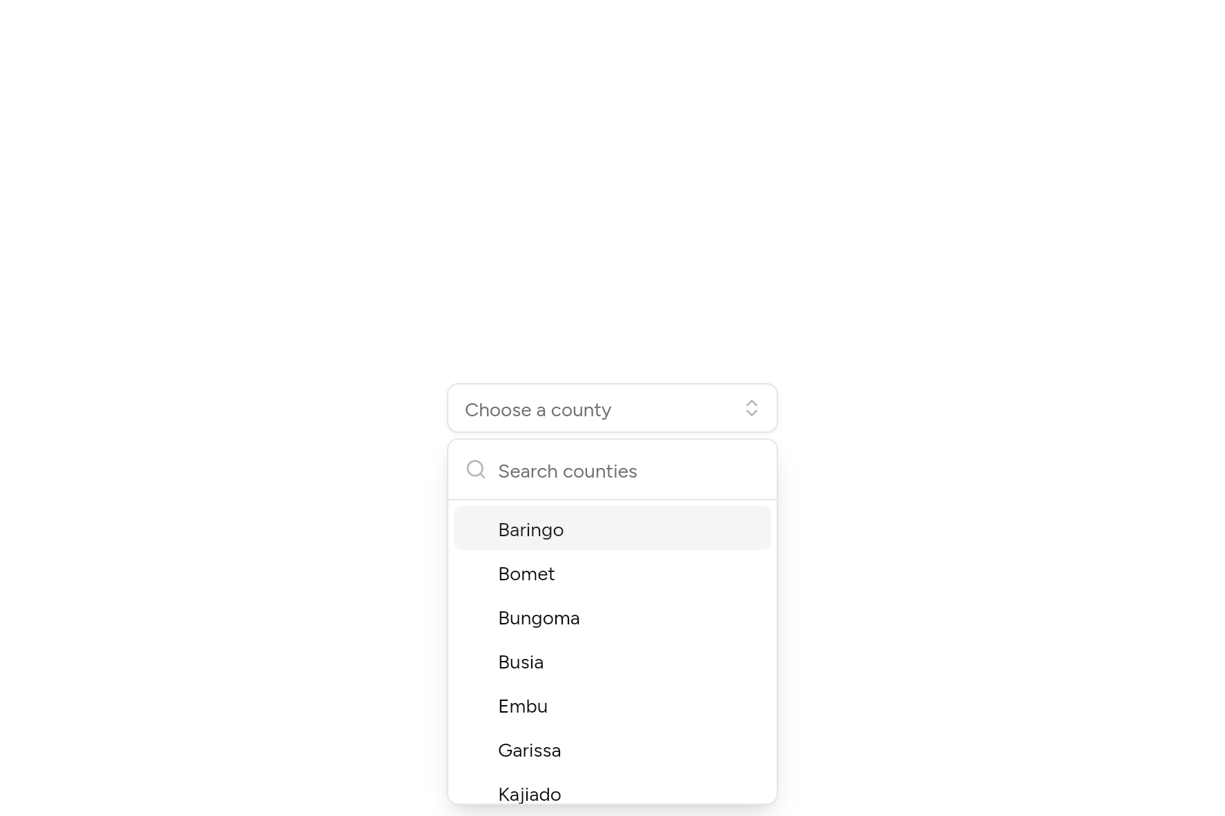
A select you can search: one pick or several as chips, groups, clearing.
import 'package:flutter/widgets.dart';

import 'ui/combobox.dart';

class ComboboxDemo extends StatefulWidget {
  const ComboboxDemo({super.key});

  @override
  State<ComboboxDemo> createState() => _ComboboxDemoState();
}

class _ComboboxDemoState extends State<ComboboxDemo> {
  String? county;

  static const counties = [
    'Baringo', 'Bomet', 'Bungoma', 'Busia', 'Embu', 'Garissa', 'Kajiado', 'Kakamega', 'Kericho', 'Kiambu', //
    'Kilifi', 'Kisii', 'Kisumu', 'Kitui', 'Lamu', 'Machakos', 'Meru', 'Mombasa', 'Nairobi', 'Nakuru', 'Nyeri',
  ];

  @override
  Widget build(BuildContext context) => SizedBox(
    width: 240,
    child: Combobox<String>(
      value: county,
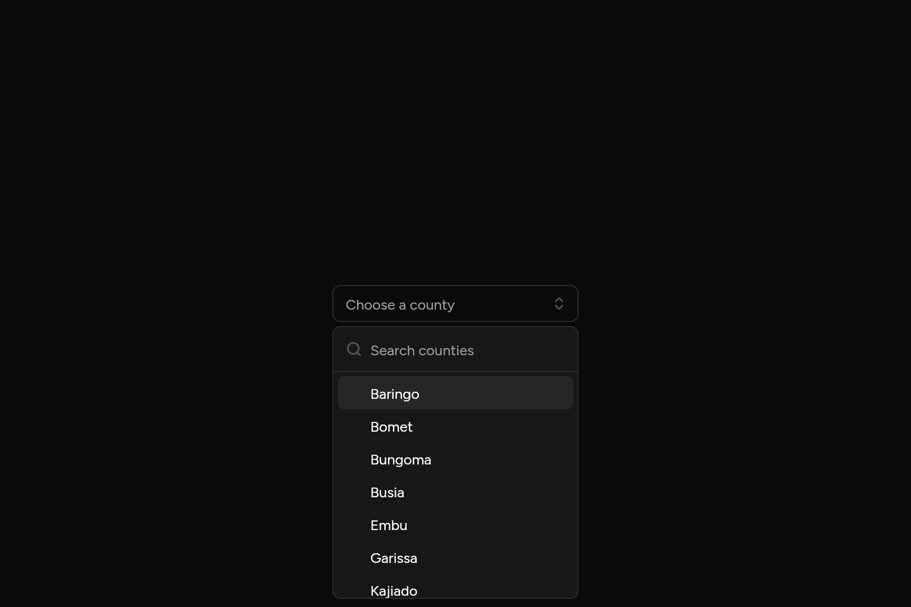
      placeholder: 'Choose a county',
      searchPlaceholder: 'Search counties',
      semanticLabel: 'County',
      options: [for (final c in counties) ComboboxOption(c, c)],
      onChanged: (v) => setState(() => county = v),
    ),
  );
}
Try its options
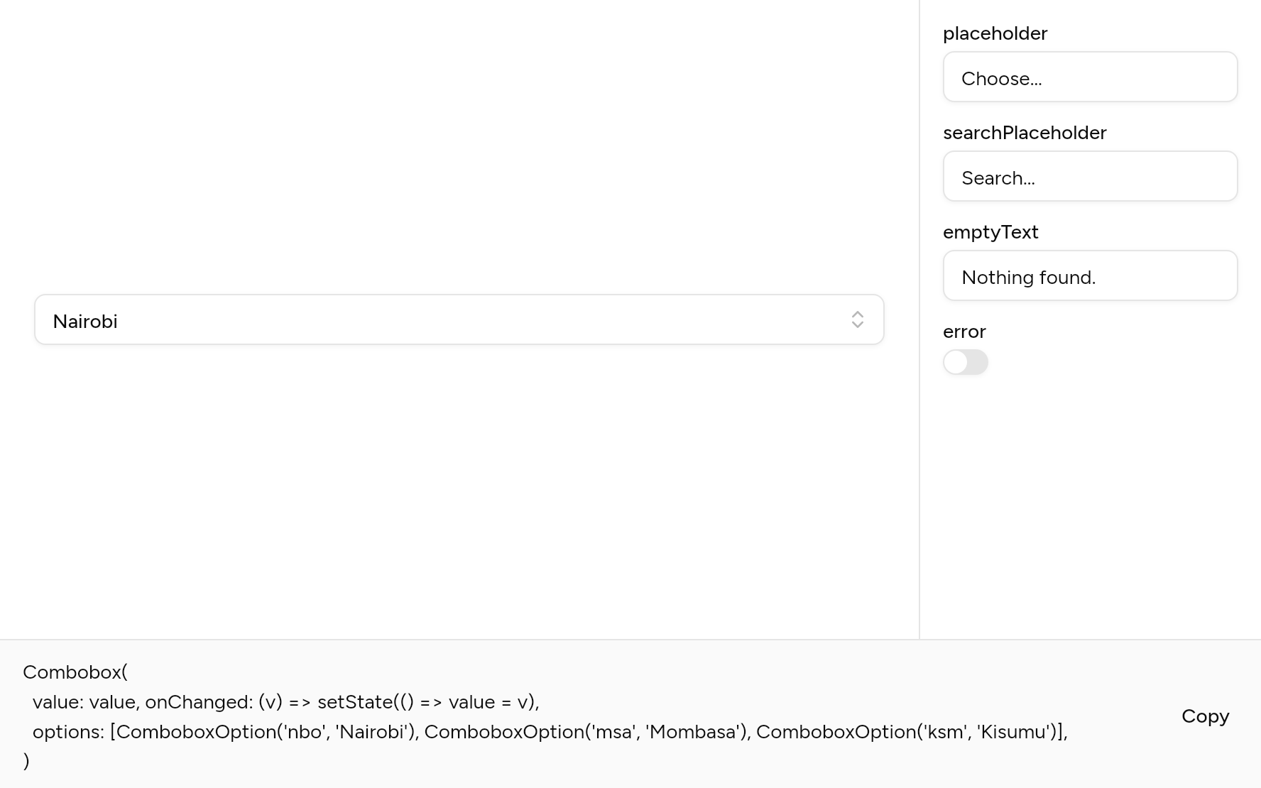
Each option its constructor takes, to change and see; the code below it is what you chose, to copy.
Add it
In your Flutter project:
ashlar add combobox
It writes theme.dart, palette.dart, group.dart, pressable.dart, popover.dart, selection.dart, input.dart, button.dart, dialog.dart, command.dart and combobox.dart into lib/ui, keeping any you already have, and adds ashlar_icons to pubspec.yaml. It needs pressable, popover, command and ashlar_icons, which come with it.
Examples
Other ways to use it, each running live, with its code.
Several
Picks as chips, each with a remove button.
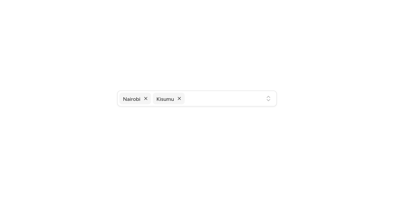
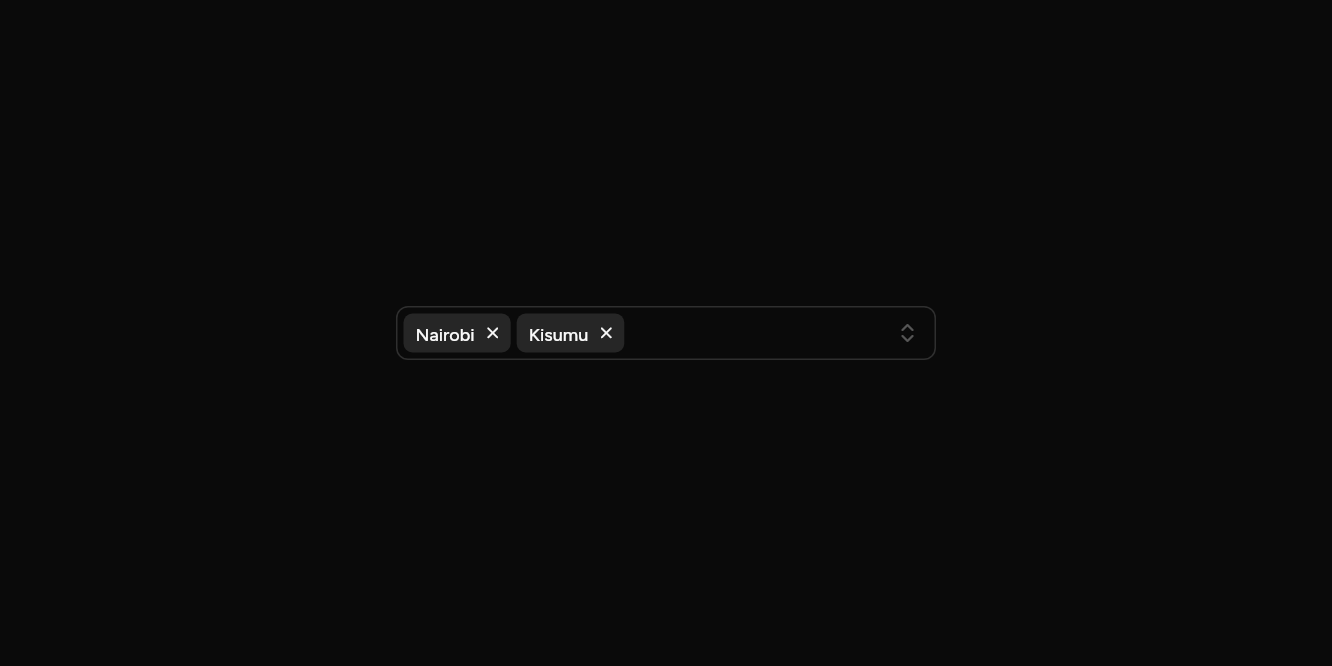
// Several: Picks as chips, each with a remove button.
import 'package:flutter/widgets.dart';

import 'ui/combobox.dart';

class ComboboxMultipleExample extends StatefulWidget {
  const ComboboxMultipleExample({super.key});

  @override
  State<ComboboxMultipleExample> createState() => _ComboboxMultipleExampleState();
}

class _ComboboxMultipleExampleState extends State<ComboboxMultipleExample> {
  var picked = {'nairobi', 'kisumu'};

  @override
  Widget build(BuildContext context) => SizedBox(
    width: 360,
    child: Combobox<String>.multiple(
      values: picked,
      placeholder: 'Add counties',
      onValuesChanged: (v) => setState(() => picked = v),
      options: const [
        ComboboxOption('nairobi', 'Nairobi'),
        ComboboxOption('mombasa', 'Mombasa'),
        ComboboxOption('kisumu', 'Kisumu'),
        ComboboxOption('nakuru', 'Nakuru'),
      ],
    ),
  );
}
Clearable, in groups
A clear button, and options under headings.
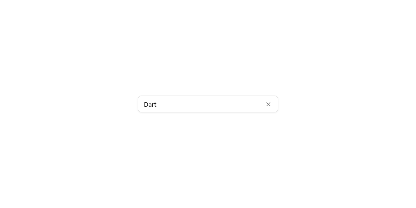
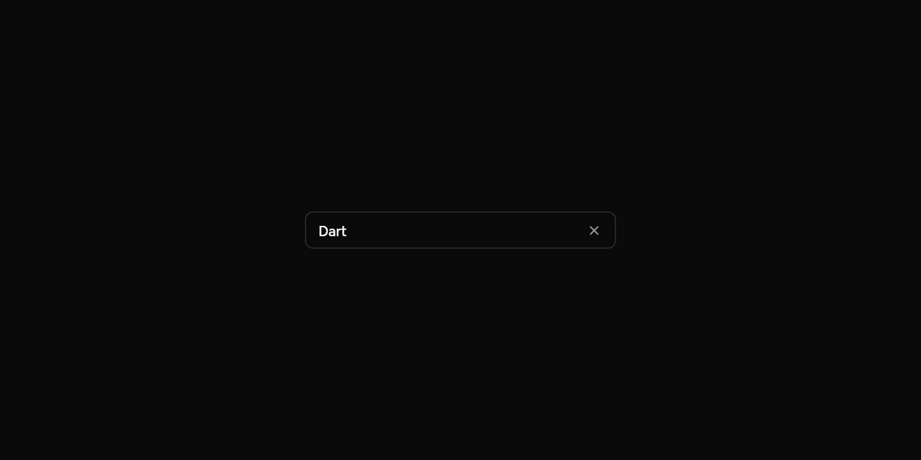
// Clearable, in groups: A clear button, and options under headings.
import 'package:flutter/widgets.dart';

import 'ui/combobox.dart';

class ComboboxClearExample extends StatefulWidget {
  const ComboboxClearExample({super.key});

  @override
  State<ComboboxClearExample> createState() => _ComboboxClearExampleState();
}

class _ComboboxClearExampleState extends State<ComboboxClearExample> {
  String? lang = 'dart';

  @override
  Widget build(BuildContext context) => SizedBox(
    width: 300,
    child: Combobox<String>(
      value: lang,
      onChanged: (v) => setState(() => lang = v),
      onCleared: () => setState(() => lang = null),
      options: const [
        ComboboxOption('dart', 'Dart', group: 'Apps'),
        ComboboxOption('kotlin', 'Kotlin', group: 'Apps'),
        ComboboxOption('go', 'Go', group: 'Servers'),
        ComboboxOption('rust', 'Rust', group: 'Servers', keywords: ['cargo']),
      ],
    ),
  );
}
API
Read from the source above: each parameter with its type, its default, and what it is for.
ComboboxOptionclass
One choice in a Combobox. Options with the same group are listed together under it.
| Parameter | Type | Default | What it is for |
|---|---|---|---|
valuepositional |
T |
The value it stands for. | |
labelpositional |
String |
What the option says. | |
keywords |
List<String> |
const [] |
Other words that find it when typed. |
enabled |
bool |
true |
False fades it and stops it being picked. |
group | String? | The heading it sits under. | |
icon | Widget? | Before the label. |
Comboboxclass
A Select you can search: it opens a list with a search box, for more options than fit a plain list. Combobox.multiple picks several, shown as chips that a tap removes.
Combobox(…)
| Parameter | Type | Default | What it is for |
|---|---|---|---|
valuerequired |
T? |
The value chosen, or null. | |
optionsrequired |
List<ComboboxOption<T>> |
What can be chosen, in order. | |
onChangedrequired |
ValueChanged<T>? |
Null disables it. | |
onCleared |
VoidCallback? |
Shows a button that clears the choice, and is called by it. | |
placeholder |
String |
'Choose…' |
Faint text shown while it is empty. |
searchPlaceholder |
String |
'Search…' |
Faint text in the search field. |
emptyText |
String |
'Nothing found.' |
Shown when nothing matches what was typed. |
error |
bool |
false |
Draws it as invalid. |
semanticLabel |
String? |
What a screen reader calls it when its visible text does not say, as for an icon alone. |
Combobox.multiple(…)
| Parameter | Type | Default | What it is for |
|---|---|---|---|
valuesrequired |
Set<T> |
The values chosen, for a combobox that takes several. | |
optionsrequired |
List<ComboboxOption<T>> |
What can be chosen, in order. | |
onValuesChangedrequired |
ValueChanged<Set<T>>? |
Told the new values whenever one changes. | |
placeholder |
String |
'Choose…' |
Faint text shown while it is empty. |
searchPlaceholder |
String |
'Search…' |
Faint text in the search field. |
emptyText |
String |
'Nothing found.' |
Shown when nothing matches what was typed. |
error |
bool |
false |
Draws it as invalid. |
semanticLabel |
String? |
What a screen reader calls it when its visible text does not say, as for an icon alone. |
Source
What lands in your app. It is yours from then on: change it as you would your own code, and ashlar add
will not write over it.
lib/ui/combobox.dart 389 lines
// Ashlar UI: Combobox. Copied into your app by `ashlar add combobox`; it is yours to change.

import 'package:ashlar_icons/ashlar_icons.dart';
import 'package:flutter/widgets.dart';

import 'command.dart';
import 'popover.dart';
import 'pressable.dart';
import 'theme.dart';

/// One choice in a [Combobox]. Options with the same [group] are listed together under it.
@immutable
class ComboboxOption<T> {
  const ComboboxOption(
    this.value,
    this.label, {
    this.keywords = const [],
    this.enabled = true,
    this.group,
    this.icon,
  });

  /// The value it stands for.
  final T value;

  /// What the option says.
  final String label;

  /// Other words that find it when typed.
  final List<String> keywords;

  /// False fades it and stops it being picked.
  final bool enabled;

  /// The heading it sits under.
  final String? group;

  /// Before the label.
  final Widget? icon;
}

/// A Select you can search: it opens a list with a search box, for more options than fit a
/// plain list. [Combobox.multiple] picks several, shown as chips that a tap removes.
///
/// ```dart
/// Combobox<String>(
///   value: county,
///   placeholder: 'Choose a county',
///   options: [for (final c in counties) ComboboxOption(c.code, c.name)],
///   onChanged: (v) => setState(() => county = v),
///   onCleared: () => setState(() => county = null),
/// )
/// Combobox<String>.multiple(values: tags, options: allTags, onValuesChanged: (v) => setState(() => tags = v))
/// ```
class Combobox<T> extends StatefulWidget {
  const Combobox({
    super.key,
    required this.value,
    required this.options,
    required this.onChanged,
    this.onCleared,
    this.placeholder = 'Choose…',
    this.searchPlaceholder = 'Search…',
    this.emptyText = 'Nothing found.',
    this.error = false,
    this.semanticLabel,
  }) : values = null,
       onValuesChanged = null;

  const Combobox.multiple({
    super.key,
    required Set<T> this.values,
    required this.options,
    required this.onValuesChanged,
    this.placeholder = 'Choose…',
    this.searchPlaceholder = 'Search…',
    this.emptyText = 'Nothing found.',
    this.error = false,
    this.semanticLabel,
  }) : value = null,
       onChanged = null,
       onCleared = null;

  /// The value chosen, or null.
  final T? value;

  /// The values chosen, for a combobox that takes several.
  final Set<T>? values;

  /// What can be chosen, in order.
  final List<ComboboxOption<T>> options;

  /// Null disables it.
  final ValueChanged<T>? onChanged;

  /// Told the new values whenever one changes.
  final ValueChanged<Set<T>>? onValuesChanged;

  /// Shows a button that clears the choice, and is called by it.
  final VoidCallback? onCleared;

  /// Faint text shown while it is empty.
  final String placeholder;

  /// Faint text in the search field.
  final String searchPlaceholder;

  /// Shown when nothing matches what was typed.
  final String emptyText;

  /// Draws it as invalid.
  final bool error;

  /// What a screen reader calls it when its visible text does not say, as for an icon
  /// alone.
  final String? semanticLabel;

  @override
  State<Combobox<T>> createState() => _ComboboxState<T>();
}

class _ComboboxState<T> extends State<Combobox<T>> {
  final _menu = MenuController();
  final _focus = FocusNode();

  bool get _many => widget.values != null;
  bool get _enabled =>
      _many ? widget.onValuesChanged != null : widget.onChanged != null;

  @override
  void dispose() {
    _focus.dispose();
    super.dispose();
  }

  void _toggle(T v) {
    final next = {...widget.values!};
    next.contains(v) ? next.remove(v) : next.add(v);
    widget.onValuesChanged?.call(next);
  }

  List<CommandGroup> get _groups {
    final groups = <String?, List<ComboboxOption<T>>>{};
    for (final o in widget.options) {
      (groups[o.group] ??= []).add(o);
    }
    bool chosen(T v) => _many ? widget.values!.contains(v) : widget.value == v;
    return [
      for (final MapEntry(key: heading, value: options) in groups.entries)
        CommandGroup(heading: heading, [
          for (final o in options)
            CommandItem(
              o.label,
              keywords: o.keywords,
              enabled: o.enabled,
              leading: Row(
                mainAxisSize: MainAxisSize.min,
                children: [
                  SizedBox(
                    width: 16,
                    child: chosen(o.value)
                        ? const AshlarIcon(AshlarIconsRoundedStroke.check)
                        : null,
                  ),
                  if (o.icon != null) ...[const SizedBox(width: 8), o.icon!],
                ],
              ),
              onSelected: () {
                if (_many) {
                  // Several are picked in one go: the list stays open.
                  _toggle(o.value);
                } else {
                  _menu.close();
                  widget.onChanged?.call(o.value);
                }
              },
            ),
        ]),
    ];
  }

  @override
  Widget build(BuildContext context) {
    final t = AshlarTheme.of(context);
    final c = t.colors;
    final chosen = _many
        ? [
            for (final o in widget.options)
              if (widget.values!.contains(o.value)) o,
          ]
        : [
            for (final o in widget.options)
              if (o.value == widget.value) o,
          ];
    final shown = chosen.isEmpty
        ? widget.placeholder
        : chosen.map((o) => o.label).join(', ');
    return RawMenuAnchor(
      controller: _menu,
      childFocusNode: _focus,
      onClose: _focus.requestFocus,
      overlayBuilder: (context, info) => PopoverPanel(
        info: info,
        // The search field takes all the width it is given, so the width is set: the
        // trigger's, and never narrower than 200.
        width: info.anchorRect.width < 200 ? 200 : info.anchorRect.width,
        child: Command(
          placeholder: widget.searchPlaceholder,
          emptyText: widget.emptyText,
          groups: _groups,
        ),
      ),
      child: Pressable(
        focusNode: _focus,
        onPressed: _enabled
            ? () => _menu.isOpen ? _menu.close() : _menu.open()
            : null,
        semanticLabel: widget.semanticLabel,
        semanticValue: widget.semanticLabel == null ? null : shown,
        builder: (context, state) {
          final ring = widget.error ? c.destructive : c.ring;
          return Opacity(
            opacity: state.enabled ? 1 : .5,
            child: AnimatedContainer(
              duration: t.duration,
              constraints: BoxConstraints(minHeight: t.control(36)),
              padding: EdgeInsetsDirectional.only(
                start: _many && chosen.isNotEmpty ? 4 : 12,
                end: 10,
                top: 3,
                bottom: 3,
              ),
              decoration: BoxDecoration(
                color: state.hovered && !_many ? c.accent : c.background,
                borderRadius: BorderRadius.circular(t.radiusMd),
                border: Border.all(
                  color: widget.error
                      ? c.destructive
                      : (state.focused ? c.ring : c.input),
                ),
                boxShadow: [
                  if (state.focused)
                    BoxShadow(
                      color: ring.withValues(alpha: widget.error ? .2 : .5),
                      spreadRadius: 3,
                    ),
                  ...t.shadowXs,
                ],
              ),
              child: Row(
                children: [
                  Expanded(
                    child: _many && chosen.isNotEmpty
                        ? Wrap(
                            spacing: 4,
                            runSpacing: 4,
                            children: [
                              for (final o in chosen)
                                _Chip(
                                  label: o.label,
                                  onRemove: _enabled
                                      ? () => _toggle(o.value)
                                      : null,
                                ),
                            ],
                          )
                        : Text(
                            shown,
                            maxLines: 1,
                            overflow: TextOverflow.ellipsis,
                            style: t.text.sm.copyWith(
                              color: chosen.isEmpty
                                  ? c.mutedForeground
                                  : c.foreground,
                              fontWeight: chosen.isEmpty
                                  ? null
                                  : FontWeight.w500,
                            ),
                          ),
                  ),
                  const SizedBox(width: 8),
                  if (widget.onCleared != null &&
                      widget.value != null &&
                      _enabled)
                    _Clear(onPressed: widget.onCleared!)
                  else
                    AshlarIcon(
                      AshlarIconsRoundedStroke.chevronsUpDown,
                      size: 16,
                      color: c.mutedForeground.withValues(alpha: .5),
                    ),
                ],
              ),
            ),
          );
        },
      ),
    );
  }
}

/// One picked option in a multiple combobox, with a button that removes it.
class _Chip extends StatelessWidget {
  const _Chip({required this.label, required this.onRemove});

  final String label;
  final VoidCallback? onRemove;

  @override
  Widget build(BuildContext context) {
    final t = AshlarTheme.of(context);
    final c = t.colors;
    return Container(
      // A height at least: larger text makes it taller rather than being cut off.
      constraints: const BoxConstraints(minHeight: 26),
      padding: const EdgeInsetsDirectional.only(start: 8, end: 2),
      decoration: BoxDecoration(
        color: c.secondary,
        borderRadius: BorderRadius.circular(t.radiusSm),
      ),
      child: Row(
        mainAxisSize: MainAxisSize.min,
        children: [
          Text(
            label,
            style: t.text.xs.copyWith(
              color: c.secondaryForeground,
              fontWeight: FontWeight.w500,
            ),
          ),
          if (onRemove != null)
            Pressable(
              onPressed: onRemove,
              semanticLabel: 'Remove $label',
              builder: (context, state) => Container(
                width: 20,
                height: 20,
                margin: const EdgeInsetsDirectional.only(start: 2),
                alignment: Alignment.center,
                decoration: BoxDecoration(
                  color: state.hovered
                      ? c.background.withValues(alpha: .6)
                      : c.background.withValues(alpha: 0),
                  borderRadius: BorderRadius.circular(t.radiusSm),
                ),
                child: AshlarIcon(
                  AshlarIconsRoundedStroke.x,
                  size: 12,
                  color: c.secondaryForeground,
                ),
              ),
            )
          else
            const SizedBox(width: 6),
        ],
      ),
    );
  }
}

class _Clear extends StatelessWidget {
  const _Clear({required this.onPressed});

  final VoidCallback onPressed;

  @override
  Widget build(BuildContext context) {
    final t = AshlarTheme.of(context);
    final c = t.colors;
    return Pressable(
      onPressed: onPressed,
      semanticLabel: 'Clear',
      builder: (context, state) => Container(
        width: 20,
        height: 20,
        alignment: Alignment.center,
        decoration: BoxDecoration(
          color: state.hovered ? c.accent : c.accent.withValues(alpha: 0),
          borderRadius: BorderRadius.circular(t.radiusSm),
        ),
        child: AshlarIcon(
          AshlarIconsRoundedStroke.x,
          size: 14,
          color: c.mutedForeground,
        ),
      ),
    );
  }
}