

Input Group
A text field with text, buttons or a toolbar inside its border.
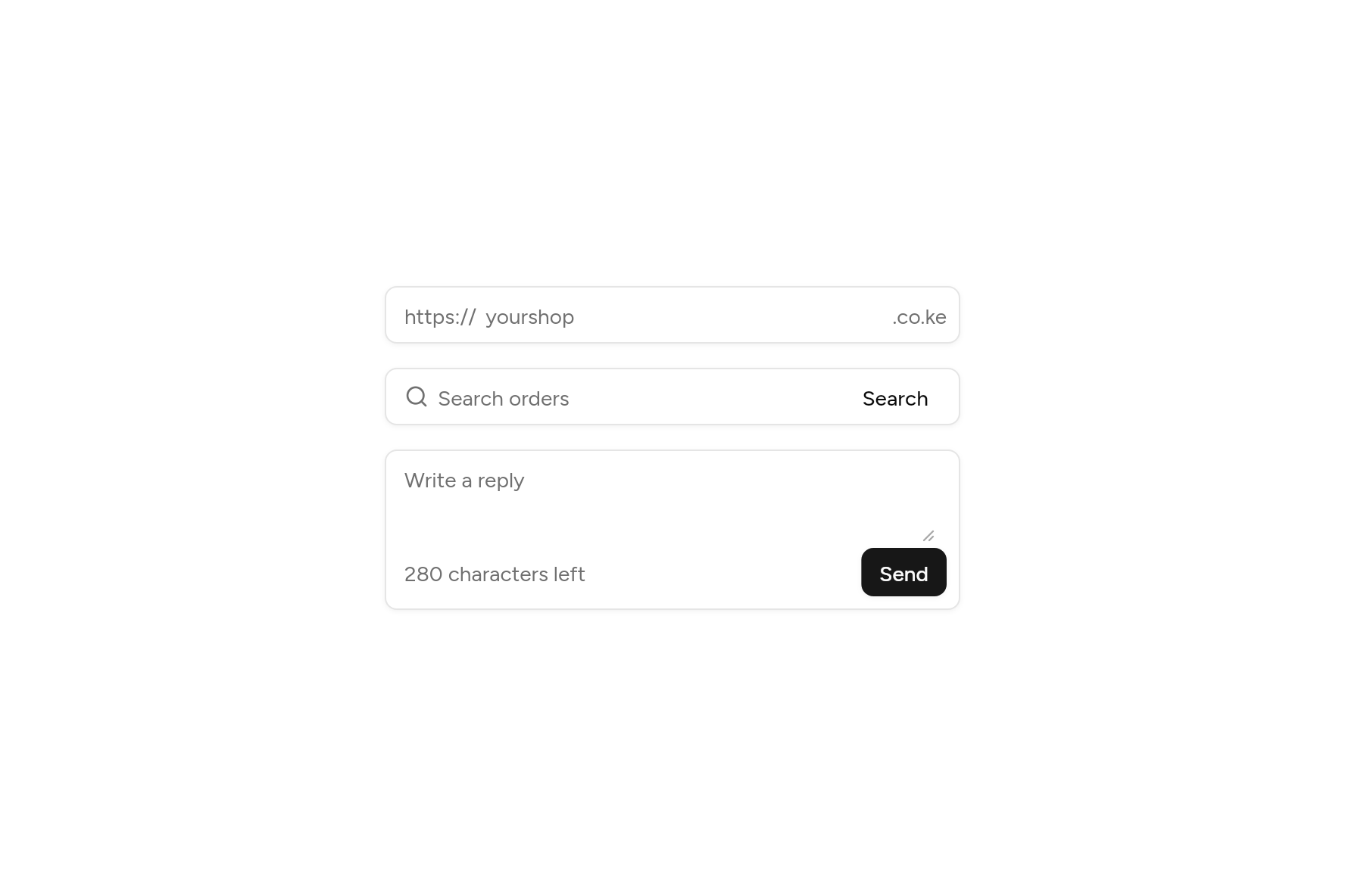
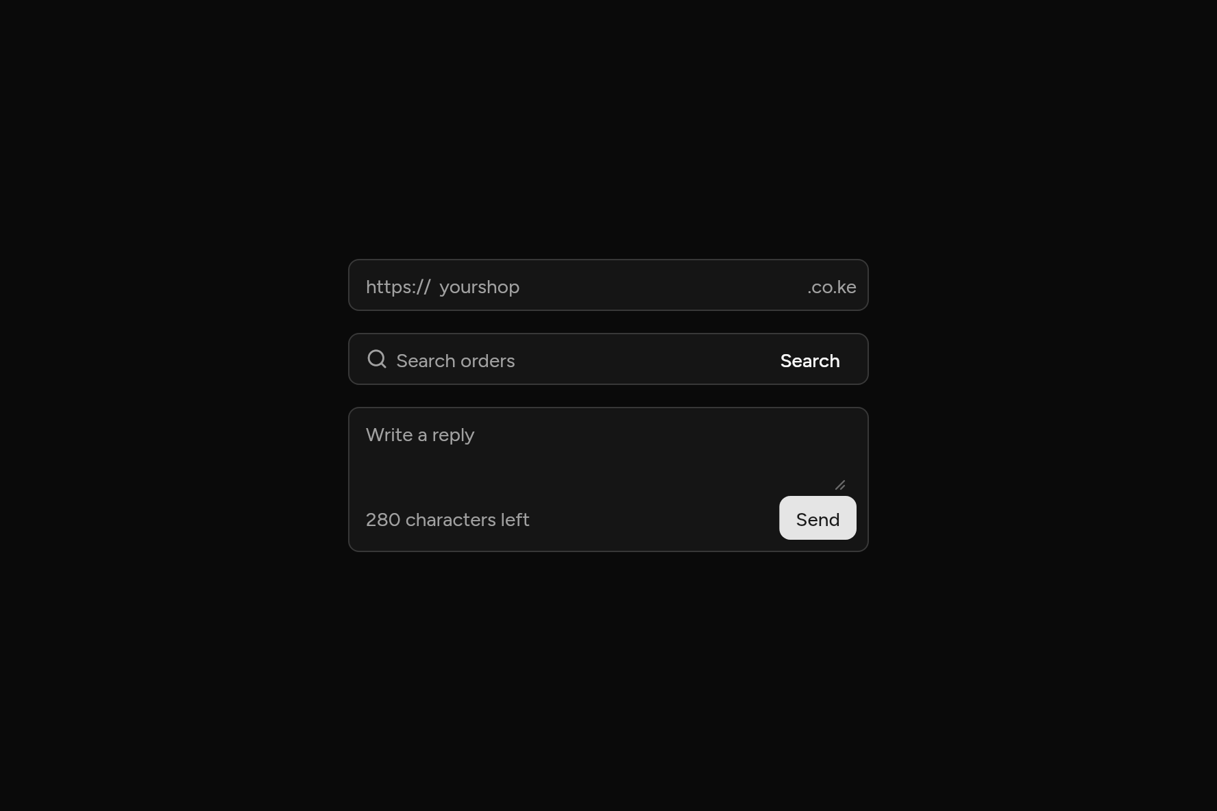
import 'package:ashlar_icons/ashlar_icons.dart';
import 'package:flutter/widgets.dart';

import 'ui/button.dart';
import 'ui/input.dart';
import 'ui/input_group.dart';
import 'ui/textarea.dart';

class InputGroupDemo extends StatelessWidget {
  const InputGroupDemo({super.key});

  @override
  Widget build(BuildContext context) => SizedBox(
    width: 380,
    child: Column(
      mainAxisSize: MainAxisSize.min,
      children: [
        const InputGroup(
          start: Text('https://'),
          end: Text('.co.ke'),
          child: Input(decorated: false, placeholder: 'yourshop'),
        ),
        const SizedBox(height: 16),
        InputGroup(
          start: const AshlarIcon(AshlarIconsRoundedStroke.search),
          end: Button(variant: ButtonVariant.ghost, size: ButtonSize.sm, onPressed: () {}, child: const Text('Search')),
          child: const Input(decorated: false, placeholder: 'Search orders'),
        ),
        const SizedBox(height: 16),
        InputGroup(
          bottom: Row(
            children: [
              const Text('280 characters left'),
              const Spacer(),
              Button(size: ButtonSize.sm, onPressed: () {}, child: const Text('Send')),
            ],
          ),
          child: const Textarea(decorated: false, placeholder: 'Write a reply', minLines: 2),
        ),
      ],
    ),
  );
}
Try its options
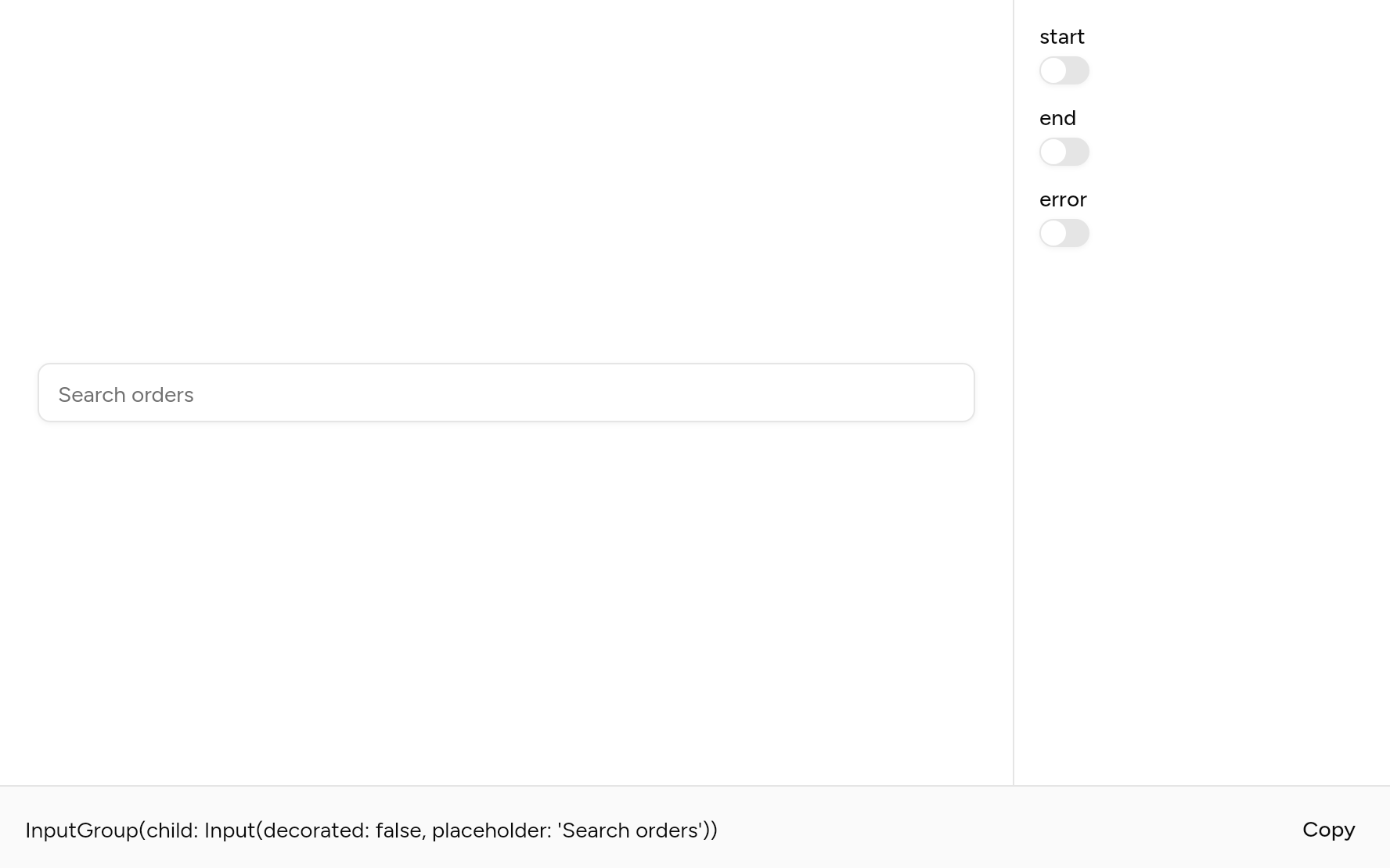
Each option its constructor takes, to change and see; the code below it is what you chose, to copy.
Add it
In your Flutter project:
ashlar add input-group
It writes theme.dart, palette.dart, selection.dart, input.dart and input_group.dart into lib/ui, keeping any you already have. It needs input, which come with it.
Examples
Other ways to use it, each running live, with its code.
Before and after
Words fixed at either end.
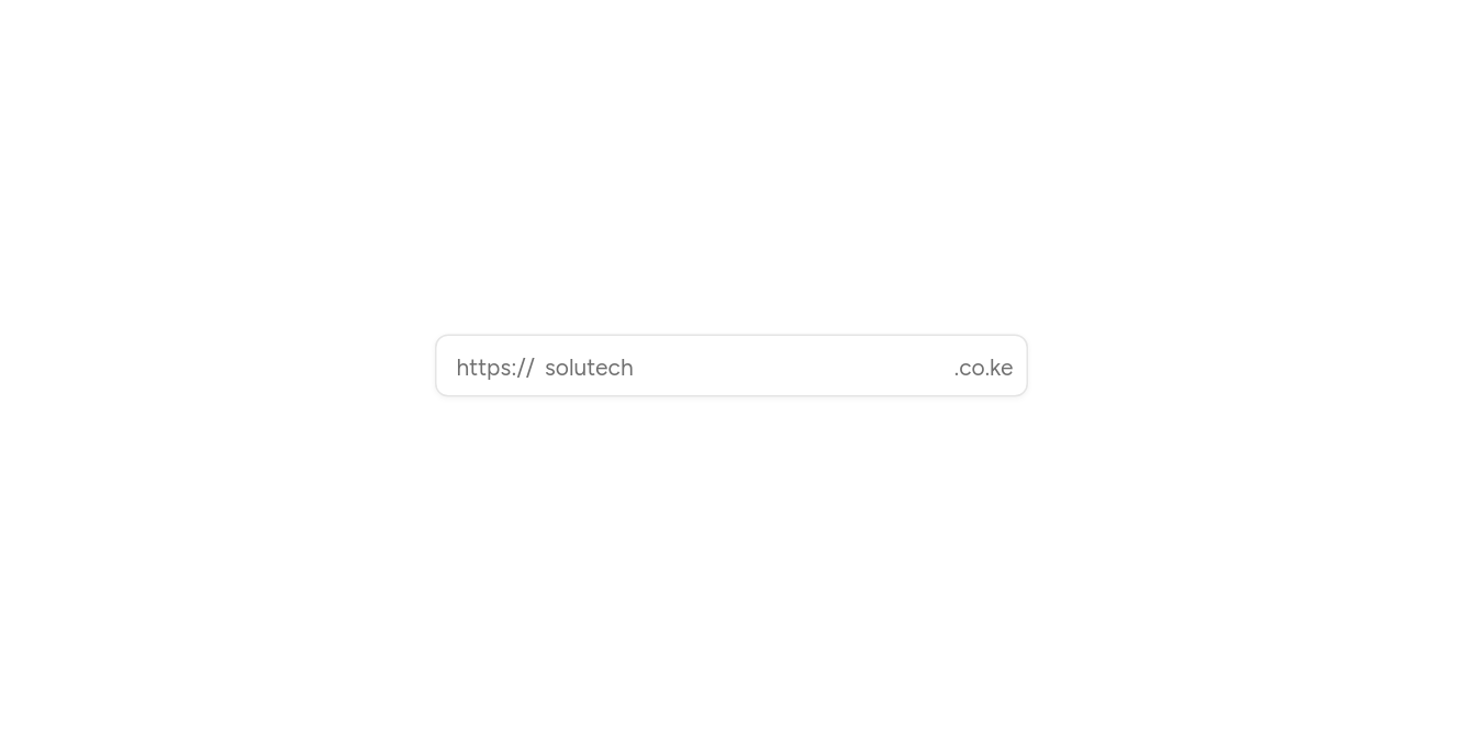
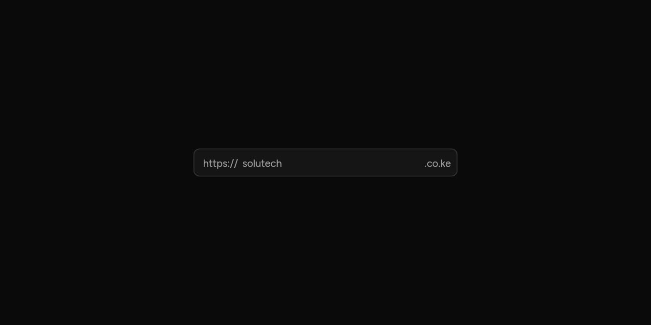
// Before and after: Words fixed at either end.
import 'package:flutter/widgets.dart';

import 'ui/input.dart';
import 'ui/input_group.dart';

class InputGroupAddonsExample extends StatelessWidget {
  const InputGroupAddonsExample({super.key});

  @override
  Widget build(BuildContext context) => const SizedBox(
    width: 360,
    child: InputGroup(
      start: Text('https://'),
      end: Text('.co.ke'),
      child: Input(placeholder: 'solutech', decorated: false, semanticLabel: 'Address'),
    ),
  );
}
With a row below
A count and a button under the field.
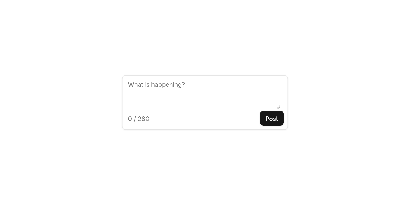
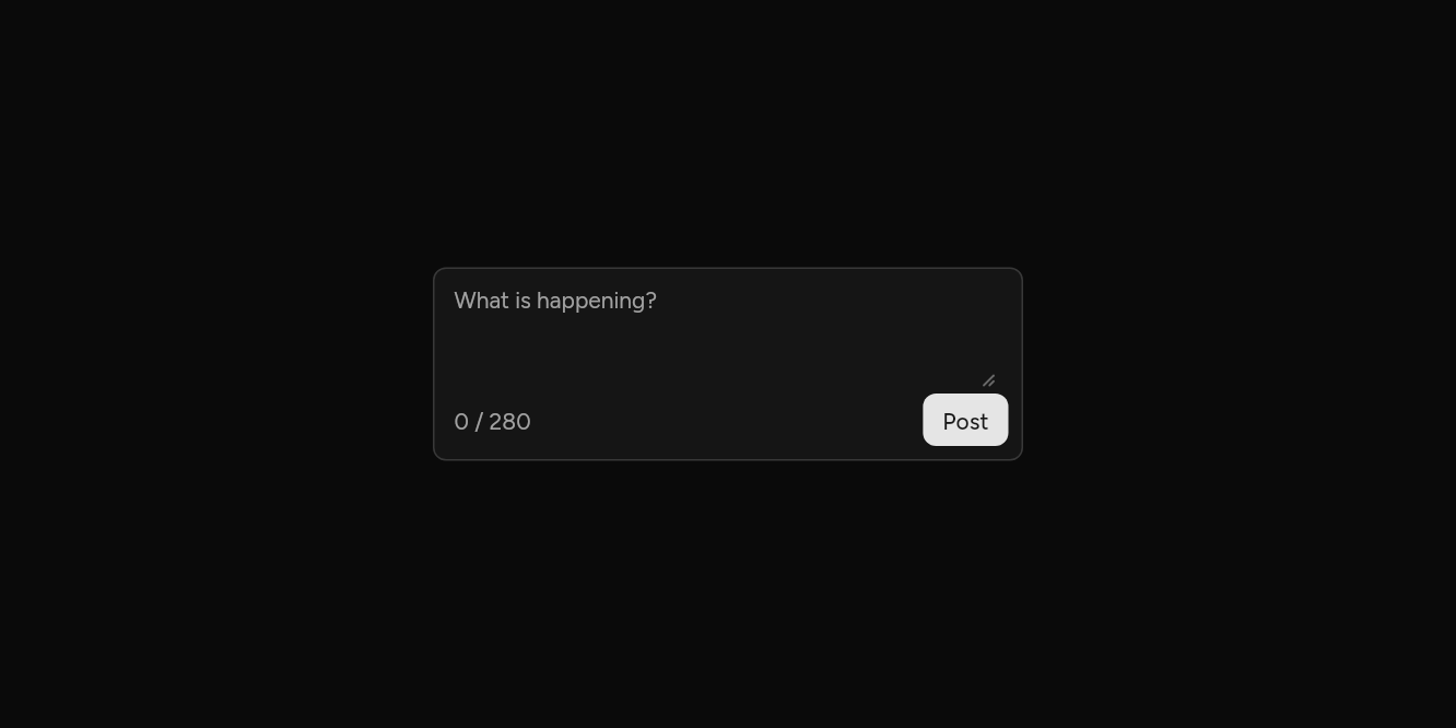
// With a row below: A count and a button under the field.
import 'package:flutter/widgets.dart';

import 'ui/button.dart';
import 'ui/input_group.dart';
import 'ui/textarea.dart';

class InputGroupBottomExample extends StatelessWidget {
  const InputGroupBottomExample({super.key});

  @override
  Widget build(BuildContext context) => SizedBox(
    width: 360,
    child: InputGroup(
      bottom: Row(
        children: [
          const Text('0 / 280'),
          const Spacer(),
          Button(size: ButtonSize.sm, onPressed: () {}, child: const Text('Post')),
        ],
      ),
      child: const Textarea(placeholder: 'What is happening?', decorated: false, semanticLabel: 'Post'),
    ),
  );
}
API
Read from the source above: each parameter with its type, its default, and what it is for.
InputGroupclass
A text field and the things that belong with it inside one border: text before it ("https://"), a button after it, a toolbar under a text area. Give it an Input or a Textarea with decorated: false; the group draws the border, the fill and the focus ring round them all.
| Parameter | Type | Default | What it is for |
|---|---|---|---|
childrequired |
Widget |
The field: an Input with its decoration off, or a Textarea. | |
start |
Widget? |
Before the field and after it, on its line. | |
end |
Widget? |
Before the field and after it, on its line. | |
top |
Widget? |
Above the field and under it, across the whole width. | |
bottom |
Widget? |
Above the field and under it, across the whole width. | |
error |
bool |
false |
Draws the group as invalid. |
Source
What lands in your app. It is yours from then on: change it as you would your own code, and ashlar add
will not write over it.
lib/ui/input_group.dart 135 lines
// Ashlar UI: Input Group. Copied into your app by `ashlar add input-group`; it is yours to
// change.

import 'package:flutter/widgets.dart';

import 'theme.dart';

/// A text field and the things that belong with it inside one border: text before it
/// ("https://"), a button after it, a toolbar under a text area. Give it an Input or a
/// Textarea with `decorated: false`; the group draws the border, the fill and the focus
/// ring round them all.
///
/// ```dart
/// InputGroup(
///   start: Text('https://'),
///   end: Text('.co.ke'),
///   child: Input(decorated: false, placeholder: 'example'),
/// )
/// InputGroup(
///   bottom: Row(children: [Text('120 characters left'), Spacer(), Button(size: ButtonSize.sm, onPressed: send, child: Text('Send'))]),
///   child: Textarea(decorated: false, placeholder: 'Write a reply'),
/// )
/// ```
class InputGroup extends StatefulWidget {
  const InputGroup({
    super.key,
    required this.child,
    this.start,
    this.end,
    this.top,
    this.bottom,
    this.error = false,
  });

  /// The field: an Input with its decoration off, or a Textarea.
  final Widget child;

  /// Before the field and after it, on its line.
  final Widget? start, end;

  /// Above the field and under it, across the whole width.
  final Widget? top, bottom;

  /// Draws the group as invalid.
  final bool error;

  @override
  State<InputGroup> createState() => _InputGroupState();
}

class _InputGroupState extends State<InputGroup> {
  bool _focused = false;

  @override
  Widget build(BuildContext context) {
    final t = AshlarTheme.of(context);
    final c = t.colors;
    Widget addon(Widget w, EdgeInsetsGeometry padding) => Padding(
      padding: padding,
      child: DefaultTextStyle.merge(
        style: t.text.sm.copyWith(color: c.mutedForeground),
        child: IconTheme.merge(
          data: IconThemeData(color: c.mutedForeground, size: 16),
          child: w,
        ),
      ),
    );
    final ring = widget.error ? c.destructive : c.ring;
    return Focus(
      canRequestFocus: false,
      skipTraversal: true,
      // The ring shows while the field, or anything in the group, has focus.
      onFocusChange: (f) => setState(() => _focused = f),
      child: AnimatedContainer(
        duration: t.duration,
        decoration: BoxDecoration(
          color: t.brightness == Brightness.dark
              ? Color.alphaBlend(
                  c.input.withValues(alpha: c.input.a * .3),
                  c.background,
                )
              : c.background,
          borderRadius: BorderRadius.circular(t.radiusMd),
          border: Border.all(
            color: widget.error ? c.destructive : (_focused ? c.ring : c.input),
          ),
          boxShadow: [
            if (_focused)
              BoxShadow(
                color: ring.withValues(alpha: widget.error ? .2 : .5),
                spreadRadius: 3,
              ),
            ...t.shadowXs,
          ],
        ),
        child: Column(
          mainAxisSize: MainAxisSize.min,
          crossAxisAlignment: CrossAxisAlignment.stretch,
          children: [
            if (widget.top != null)
              addon(widget.top!, const EdgeInsets.fromLTRB(12, 10, 12, 0)),
            Row(
              children: [
                if (widget.start != null)
                  addon(
                    widget.start!,
                    const EdgeInsetsDirectional.only(start: 12, end: 2),
                  ),
                Expanded(
                  child: Padding(
                    padding: EdgeInsetsDirectional.only(
                      start: widget.start == null ? 12 : 4,
                      end: widget.end == null ? 12 : 4,
                    ),
                    child: widget.child,
                  ),
                ),
                if (widget.end != null)
                  addon(
                    widget.end!,
                    const EdgeInsetsDirectional.only(start: 2, end: 8),
                  ),
              ],
            ),
            if (widget.bottom != null)
              addon(
                widget.bottom!,
                const EdgeInsetsDirectional.fromSTEB(12, 0, 8, 8),
              ),
          ],
        ),
      ),
    );
  }
}