

Input
A text field with selection handles and a cut, copy and paste menu.
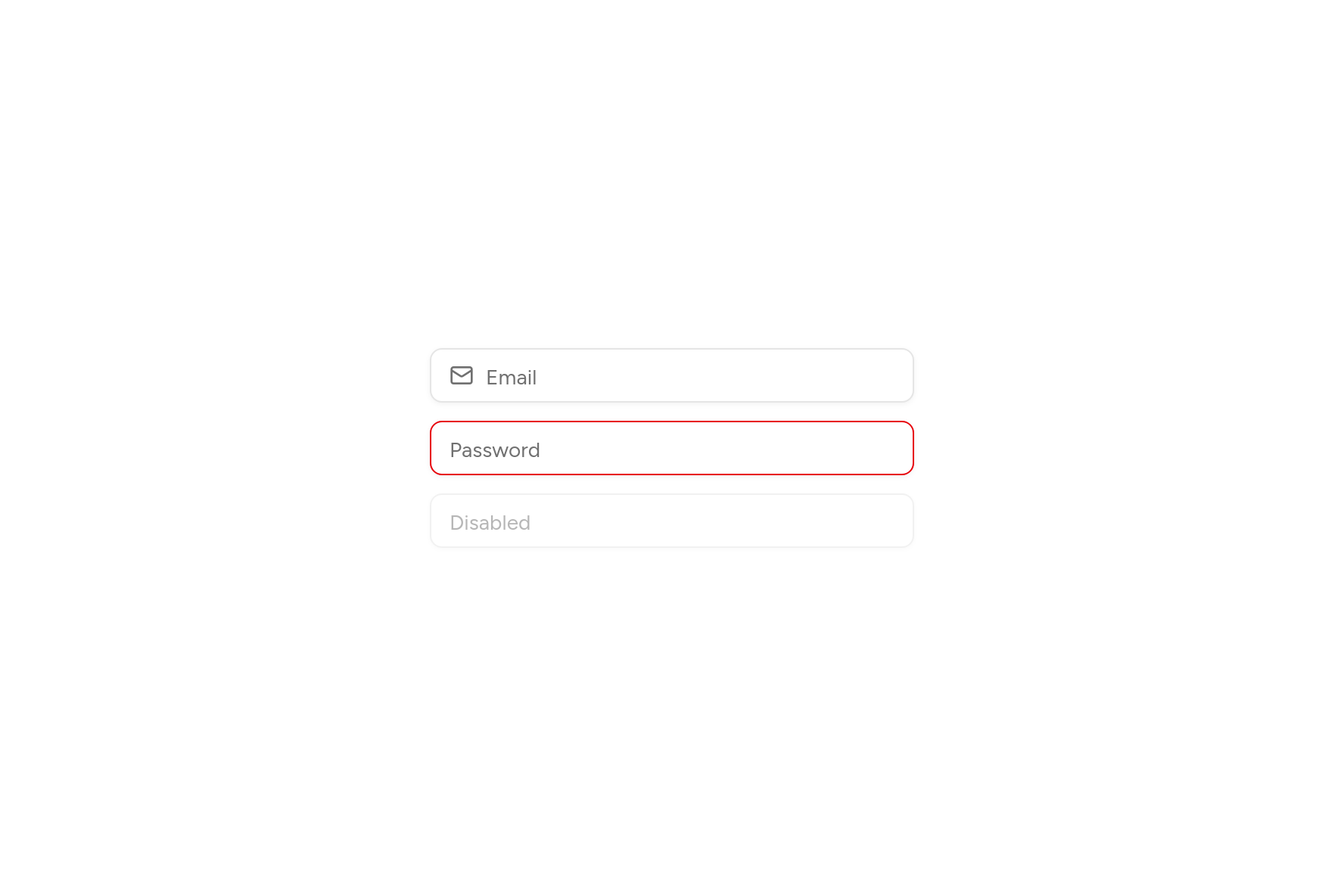
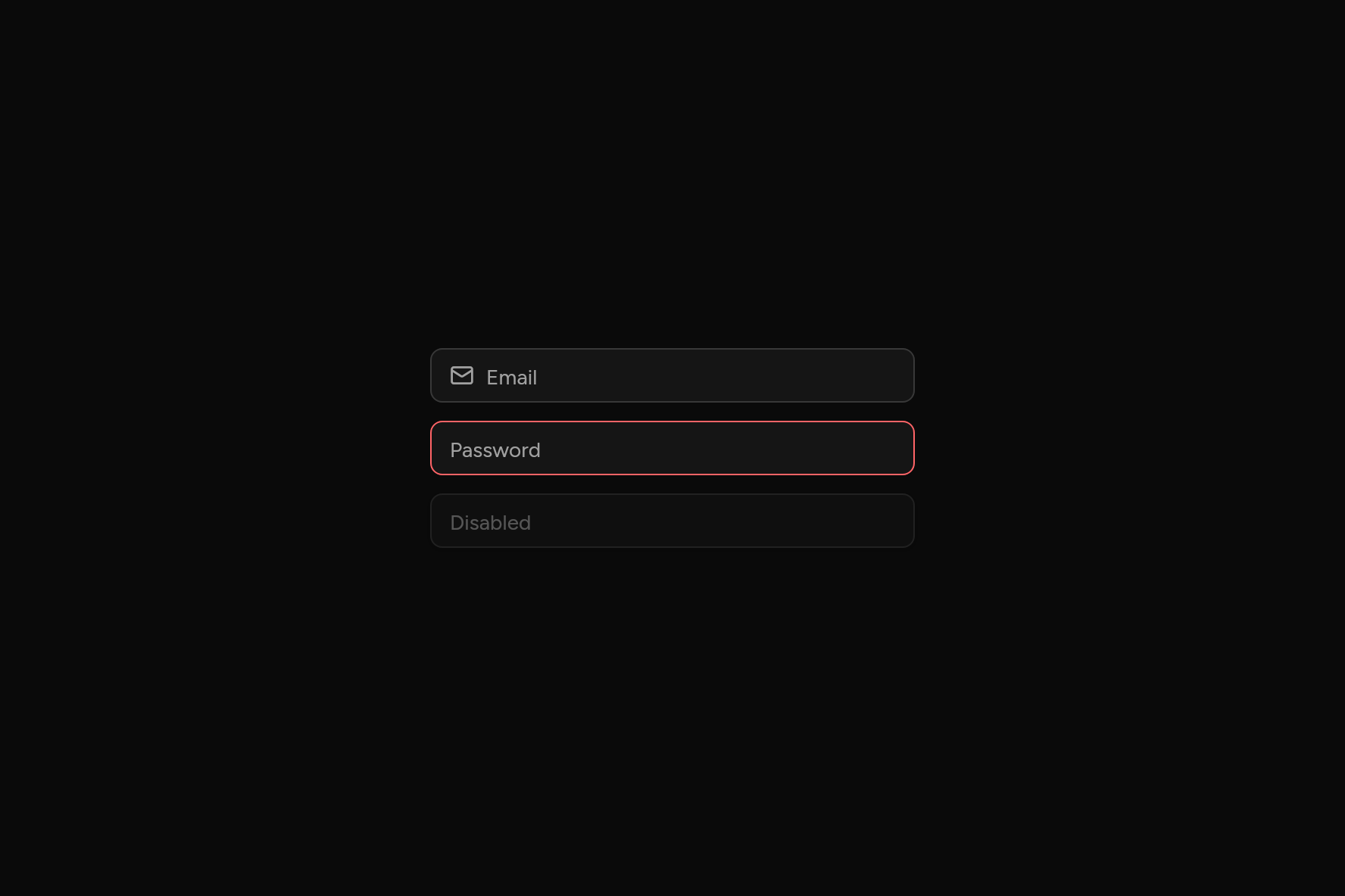
import 'package:ashlar_icons/ashlar_icons.dart';
import 'package:flutter/widgets.dart';

import 'ui/input.dart';

class InputDemo extends StatelessWidget {
  const InputDemo({super.key});

  @override
  Widget build(BuildContext context) => const SizedBox(
    width: 320,
    child: Column(
      mainAxisSize: MainAxisSize.min,
      children: [
        Input(
          placeholder: 'Email',
          keyboardType: TextInputType.emailAddress,
          leading: AshlarIcon(AshlarIconsRoundedStroke.mail),
        ),
        SizedBox(height: 12),
        Input(placeholder: 'Password', obscureText: true, error: true),
        SizedBox(height: 12),
        Input(placeholder: 'Disabled', enabled: false),
      ],
    ),
  );
}
Try its options
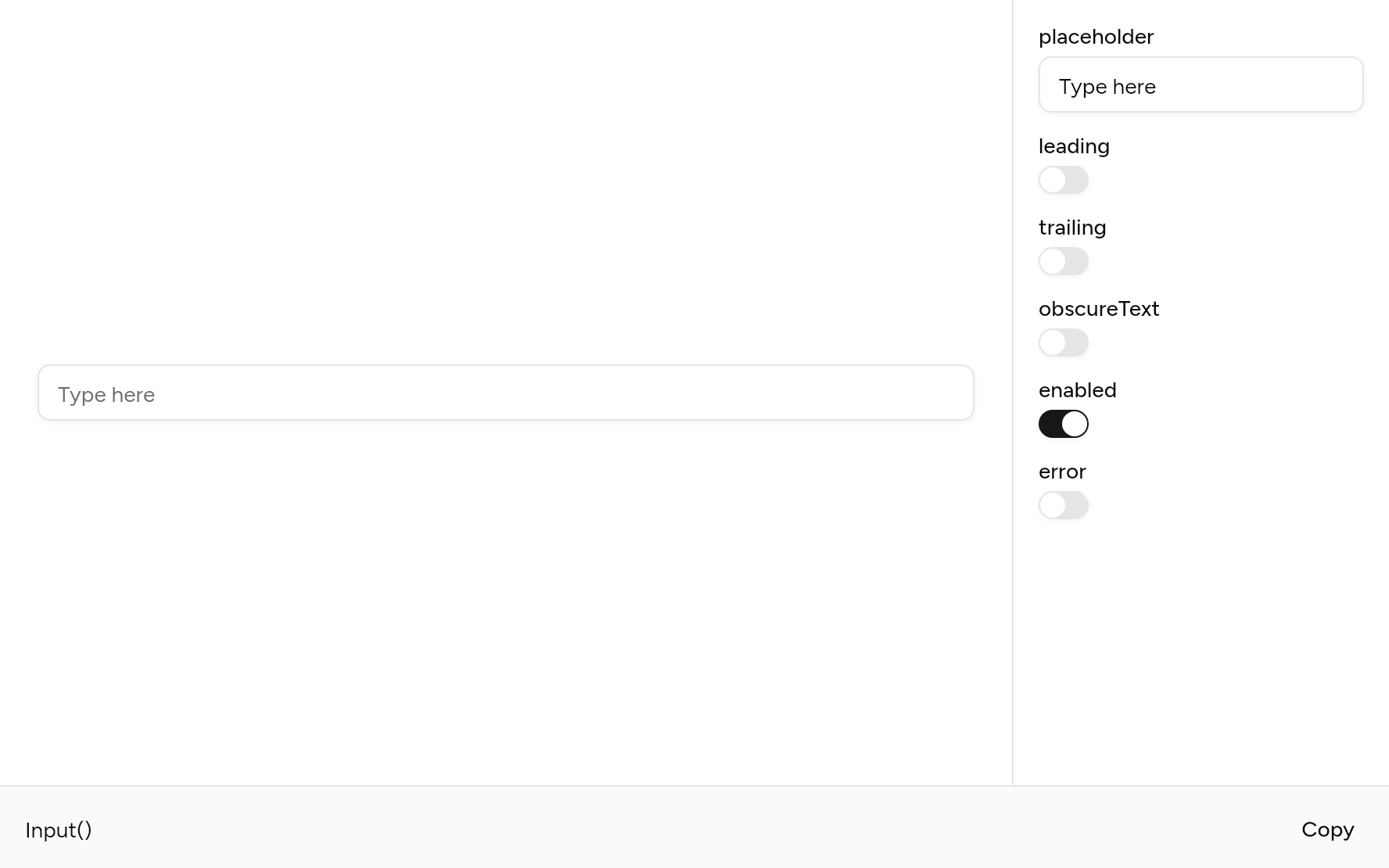
Each option its constructor takes, to change and see; the code below it is what you chose, to copy.
Add it
In your Flutter project:
ashlar add input
It writes theme.dart, palette.dart, selection.dart and input.dart into lib/ui, keeping any you already have. It needs selection, which come with it.
Examples
Other ways to use it, each running live, with its code.
With icons
An icon before, a button after.
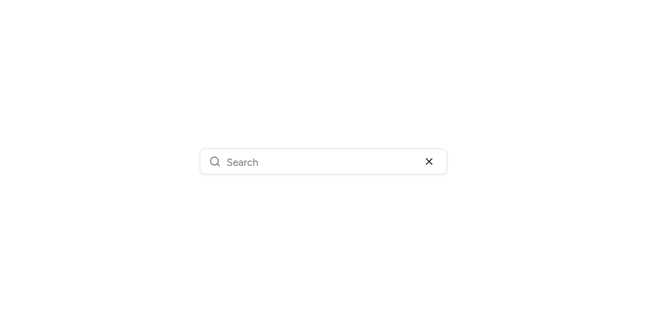
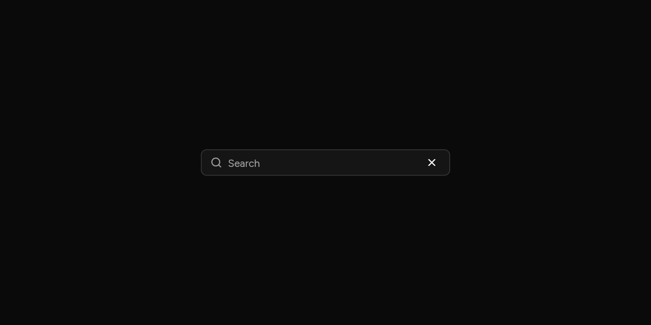
// With icons: An icon before, a button after.
import 'package:ashlar_icons/ashlar_icons.dart';
import 'package:flutter/widgets.dart';

import 'ui/button.dart';
import 'ui/input.dart';

class InputIconsExample extends StatelessWidget {
  const InputIconsExample({super.key});

  @override
  Widget build(BuildContext context) => SizedBox(
    width: 340,
    child: Input(
      placeholder: 'Search',
      semanticLabel: 'Search',
      leading: const AshlarIcon(AshlarIconsRoundedStroke.search),
      trailing: Button(
        variant: ButtonVariant.ghost,
        size: ButtonSize.iconXs,
        semanticLabel: 'Clear',
        onPressed: () {},
        child: const AshlarIcon(AshlarIconsRoundedStroke.x),
      ),
    ),
  );
}
States
Disabled, read only, and wrong.
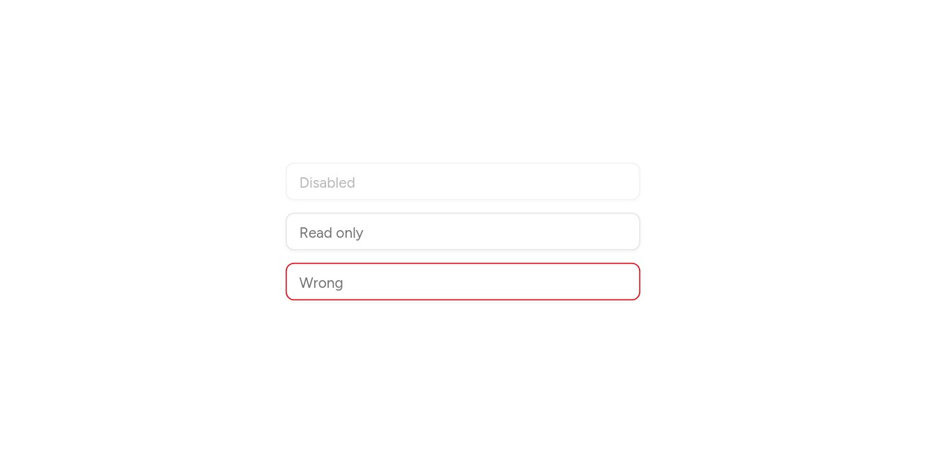
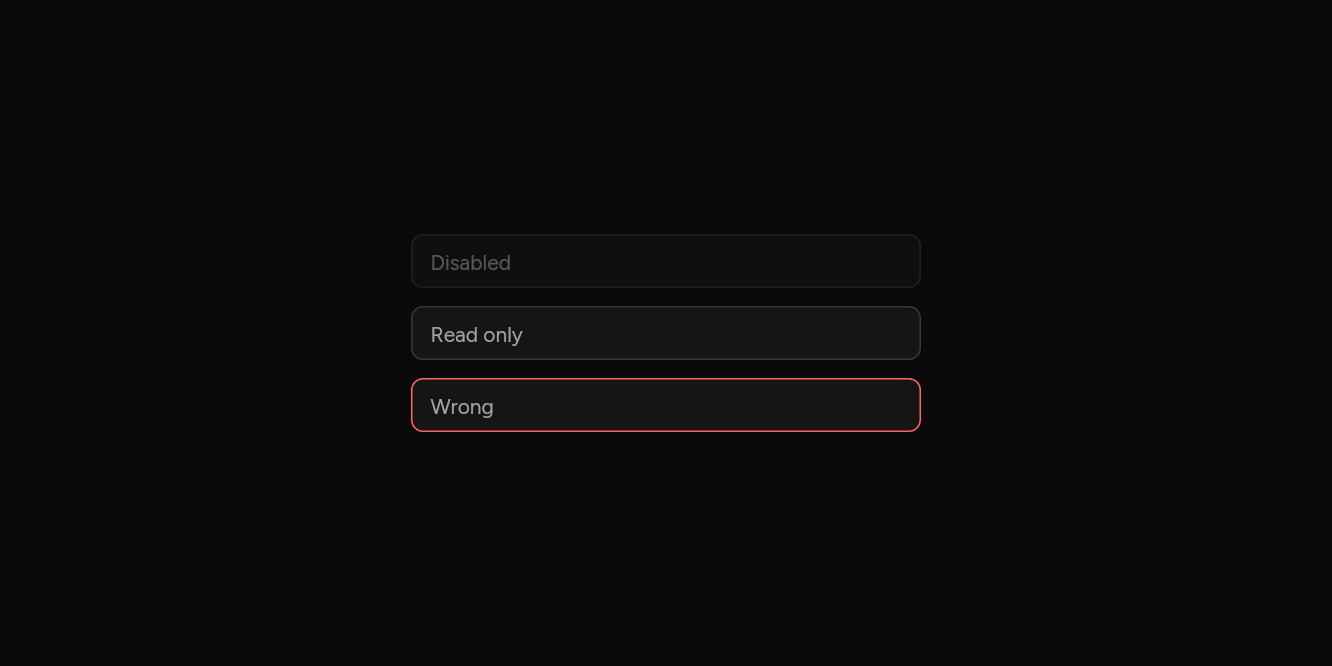
// States: Disabled, read only, and wrong.
import 'package:flutter/widgets.dart';

import 'ui/input.dart';

class InputStatesExample extends StatelessWidget {
  const InputStatesExample({super.key});

  @override
  Widget build(BuildContext context) => const SizedBox(
    width: 340,
    child: Column(
      mainAxisSize: MainAxisSize.min,
      children: [
        Input(placeholder: 'Disabled', enabled: false),
        SizedBox(height: 12),
        Input(placeholder: 'Read only', readOnly: true),
        SizedBox(height: 12),
        Input(placeholder: 'Wrong', error: true),
      ],
    ),
  );
}
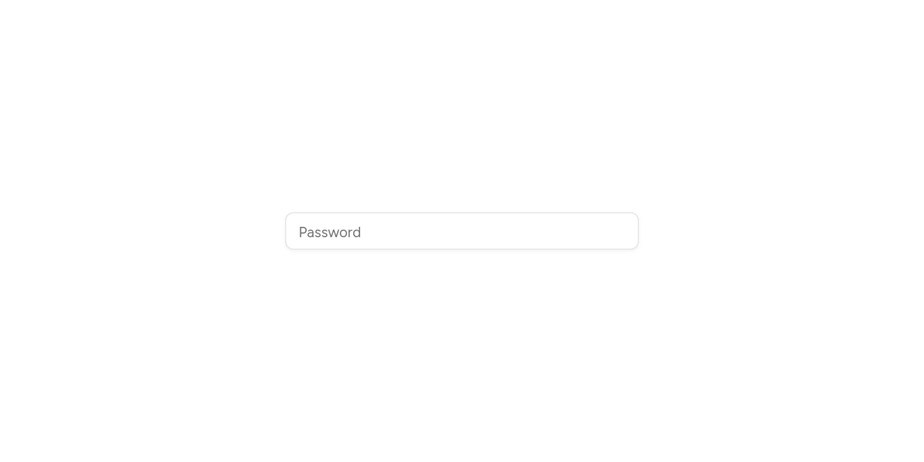
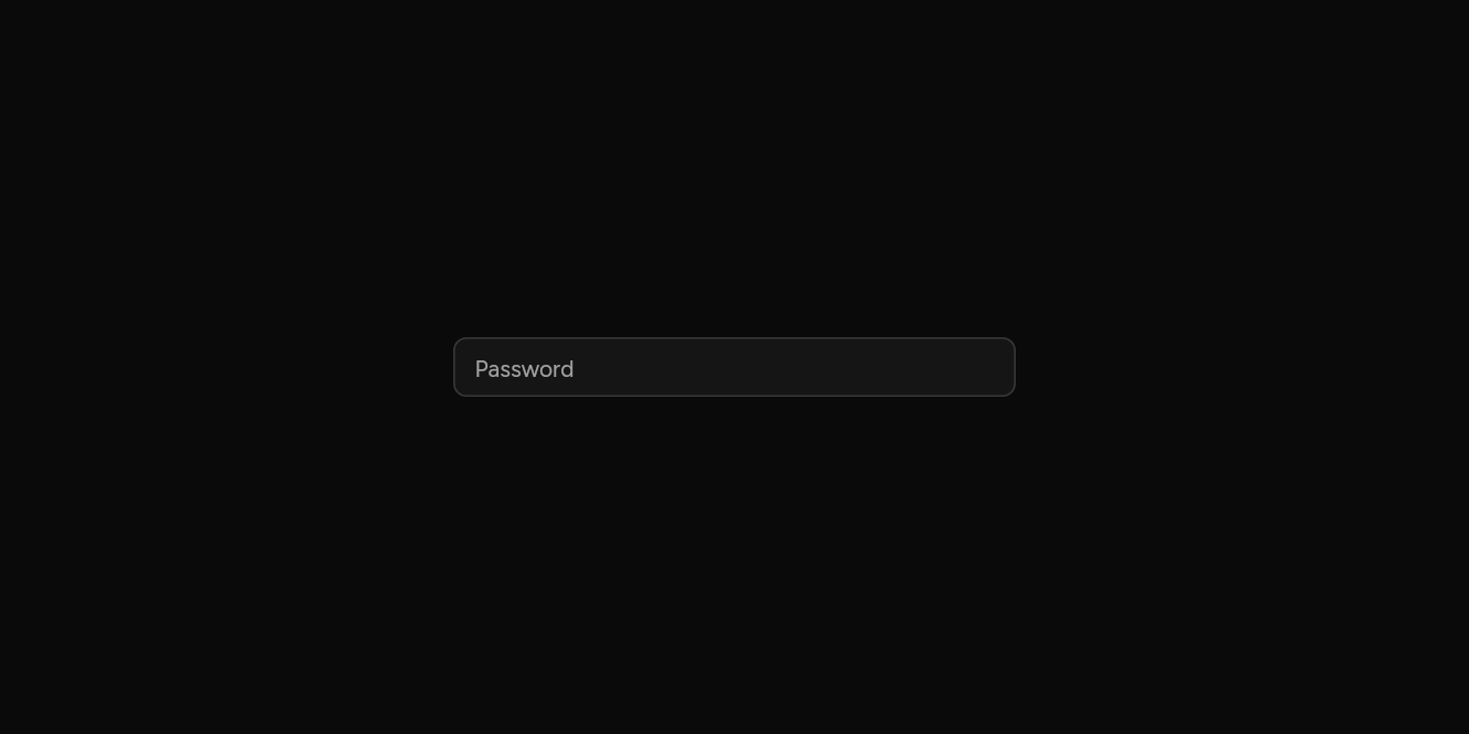
Password
Hidden as it is typed.
// Password: Hidden as it is typed.
import 'package:flutter/widgets.dart';

import 'ui/input.dart';

class InputPasswordExample extends StatelessWidget {
  const InputPasswordExample({super.key});

  @override
  Widget build(BuildContext context) => const SizedBox(
    width: 340,
    child: Input(placeholder: 'Password', obscureText: true, semanticLabel: 'Password'),
  );
}
API
Read from the source above: each parameter with its type, its default, and what it is for.
Inputclass
A one-line text field (or more, with maxLines), with a placeholder, focus ring and error state, and selection, handles and a cut, copy and paste menu on every platform.
| Parameter | Type | Default | What it is for |
|---|---|---|---|
controller |
TextEditingController? |
Its text, to read and set from outside; one is made when not given. | |
focusNode |
FocusNode? |
Its focus node, to move focus to it or follow it from outside; one is made when not given. | |
placeholder |
String? |
Faint text shown while it is empty. | |
leading |
Widget? |
An icon or text before the text, inside the field. | |
trailing |
Widget? |
An icon or button after the text, inside the field. | |
obscureText |
bool |
false |
Hides what is typed, as for a password. |
enabled |
bool |
true |
False fades it and stops it taking focus or typing. |
readOnly |
bool |
false |
Shows its text, selectable, but takes no typing. |
error |
bool |
false |
Draws the field as invalid. |
autofocus |
bool |
false |
Takes the keyboard's focus when it first appears. |
maxLines |
int |
1 |
More than 1 makes a text area that grows to that many lines. |
minLines |
int? |
How tall a text area starts, in lines. Defaults to maxLines, up to 3. |
|
keyboardType |
TextInputType? |
The on-screen keyboard to show: numbers, an email address, a phone number. | |
textInputAction |
TextInputAction? |
What the on-screen keyboard's action key says and does: next, done, search. | |
autofillHints |
Iterable<String>? |
What the platform may fill in here from saved details: an email, a password. | |
inputFormatters |
List<TextInputFormatter>? |
Rules for what can be typed, such as digits only. | |
onChanged |
ValueChanged<String>? |
Told the text as it changes. | |
onSubmitted |
ValueChanged<String>? |
Told the text when the keyboard's action key is pressed. | |
semanticLabel |
String? |
Read out by screen readers; defaults to the placeholder. | |
decorated |
bool |
true |
False draws the bare text, with no border, fill or ring: for an InputGroup, which draws those round the field and its addons together. |
Source
What lands in your app. It is yours from then on: change it as you would your own code, and ashlar add
will not write over it.
lib/ui/input.dart 308 lines
// Ashlar UI: Input. Copied into your app by `ashlar add input`; it is yours to change.
//
// The widgets layer gives EditableText and no field around it: no selection handles, no
// cut and paste menu, no tap to place the cursor. This file and selection.dart supply them.

import 'package:flutter/services.dart';
import 'package:flutter/widgets.dart';

import 'selection.dart';
import 'theme.dart';

/// A one-line text field (or more, with [maxLines]), with a placeholder, focus ring and
/// error state, and selection, handles and a cut, copy and paste menu on every platform.
///
/// ```dart
/// Input(placeholder: 'Email', keyboardType: TextInputType.emailAddress, onChanged: (v) => email = v)
/// Input(controller: password, placeholder: 'Password', obscureText: true, error: wrong)
/// ```
class Input extends StatefulWidget {
  const Input({
    super.key,
    this.controller,
    this.focusNode,
    this.placeholder,
    this.leading,
    this.trailing,
    this.obscureText = false,
    this.enabled = true,
    this.readOnly = false,
    this.error = false,
    this.autofocus = false,
    this.maxLines = 1,
    this.minLines,
    this.keyboardType,
    this.textInputAction,
    this.autofillHints,
    this.inputFormatters,
    this.onChanged,
    this.onSubmitted,
    this.semanticLabel,
    this.decorated = true,
  });

  /// Its text, to read and set from outside; one is made when not given.
  final TextEditingController? controller;

  /// Its focus node, to move focus to it or follow it from outside; one is made when not
  /// given.
  final FocusNode? focusNode;

  /// Faint text shown while it is empty.
  final String? placeholder;

  /// An icon or text before the text, inside the field.
  final Widget? leading;

  /// An icon or button after the text, inside the field.
  final Widget? trailing;

  /// Hides what is typed, as for a password.
  final bool obscureText;

  /// False fades it and stops it taking focus or typing.
  final bool enabled;

  /// Shows its text, selectable, but takes no typing.
  final bool readOnly;

  /// Draws the field as invalid.
  final bool error;

  /// Takes the keyboard's focus when it first appears.
  final bool autofocus;

  /// More than 1 makes a text area that grows to that many lines.
  final int maxLines;

  /// How tall a text area starts, in lines. Defaults to [maxLines], up to 3.
  final int? minLines;

  /// The on-screen keyboard to show: numbers, an email address, a phone number.
  final TextInputType? keyboardType;

  /// What the on-screen keyboard's action key says and does: next, done, search.
  final TextInputAction? textInputAction;

  /// What the platform may fill in here from saved details: an email, a password.
  final Iterable<String>? autofillHints;

  /// Rules for what can be typed, such as digits only.
  final List<TextInputFormatter>? inputFormatters;

  /// Told the text as it changes.
  final ValueChanged<String>? onChanged;

  /// Told the text when the keyboard's action key is pressed.
  final ValueChanged<String>? onSubmitted;

  /// Read out by screen readers; defaults to the placeholder.
  final String? semanticLabel;

  /// False draws the bare text, with no border, fill or ring: for an InputGroup, which
  /// draws those round the field and its addons together.
  final bool decorated;

  @override
  State<Input> createState() => _InputState();
}

class _InputState extends State<Input>
    implements TextSelectionGestureDetectorBuilderDelegate {
  TextEditingController? _ownController;
  FocusNode? _ownFocus;
  TextEditingController get _controller =>
      widget.controller ?? (_ownController ??= TextEditingController());
  FocusNode get _focus => widget.focusNode ?? (_ownFocus ??= FocusNode());
  late final _gestures = TextSelectionGestureDetectorBuilder(delegate: this);
  bool _hovered = false;

  @override
  final GlobalKey<EditableTextState> editableTextKey =
      GlobalKey<EditableTextState>();

  @override
  bool get forcePressEnabled => false;

  @override
  bool get selectionEnabled => widget.enabled;

  @override
  void initState() {
    super.initState();
    _focus.addListener(_refresh);
    _controller.addListener(_refresh);
  }

  void _refresh() => setState(() {});

  @override
  void dispose() {
    _focus.removeListener(_refresh);
    _controller.removeListener(_refresh);
    _ownController?.dispose();
    _ownFocus?.dispose();
    super.dispose();
  }

  @override
  Widget build(BuildContext context) {
    final t = AshlarTheme.of(context);
    final c = t.colors;
    final focused = _focus.hasFocus;
    final style = t.text.sm.copyWith(color: c.foreground);
    final multiline = widget.maxLines > 1;
    final editable = EditableText(
      key: editableTextKey,
      controller: _controller,
      focusNode: _focus,
      readOnly: widget.readOnly || !widget.enabled,
      obscureText: widget.obscureText,
      autofocus: widget.autofocus,
      style: style,
      cursorColor: c.foreground,
      backgroundCursorColor: c.mutedForeground,
      cursorWidth: 1.5,
      cursorRadius: const Radius.circular(1),
      selectionColor: c.ring.withValues(alpha: .35),
      selectionControls: AshlarSelectionControls(c.foreground),
      contextMenuBuilder: (context, state) => AshlarSelectionMenu(
        anchors: state.contextMenuAnchors,
        items: state.contextMenuButtonItems,
      ),
      maxLines: widget.maxLines,
      minLines: multiline
          ? (widget.minLines ?? widget.maxLines.clamp(1, 3))
          : null,
      keyboardType:
          widget.keyboardType ??
          (multiline ? TextInputType.multiline : TextInputType.text),
      textInputAction: widget.textInputAction,
      autofillHints: widget.autofillHints,
      inputFormatters: widget.inputFormatters,
      onChanged: widget.onChanged,
      onSubmitted: widget.onSubmitted,
      rendererIgnoresPointer: true,
      enableInteractiveSelection: widget.enabled,
      mouseCursor: widget.enabled
          ? SystemMouseCursors.text
          : SystemMouseCursors.basic,
    );
    final ringColor = widget.error ? c.destructive : c.ring;
    return Opacity(
      opacity: widget.enabled ? 1 : .5,
      child: MouseRegion(
        cursor: widget.enabled
            ? SystemMouseCursors.text
            : SystemMouseCursors.forbidden,
        onEnter: (_) => setState(() => _hovered = true),
        onExit: (_) => setState(() => _hovered = false),
        child: TextFieldTapRegion(
          child: _gestures.buildGestureDetector(
            behavior: HitTestBehavior.translucent,
            child: AnimatedContainer(
              duration: t.duration,
              constraints: BoxConstraints(
                minHeight: multiline ? 64 : t.control(36),
              ),
              padding: EdgeInsets.symmetric(
                horizontal: widget.decorated ? 12 : 0,
                vertical: multiline ? 8 : 0,
              ),
              decoration: !widget.decorated
                  ? null
                  : BoxDecoration(
                      // Opaque, so the shadow beneath does not show through.
                      color: t.brightness == Brightness.dark
                          ? Color.alphaBlend(
                              c.input.withValues(alpha: c.input.a * .3),
                              c.background,
                            )
                          : c.background,
                      borderRadius: BorderRadius.circular(t.radiusMd),
                      border: Border.all(
                        color: widget.error
                            ? c.destructive
                            : (focused
                                  ? c.ring
                                  : (_hovered
                                        ? c.ring.withValues(alpha: .6)
                                        : c.input)),
                      ),
                      boxShadow: [
                        if (focused)
                          BoxShadow(
                            color: ringColor.withValues(
                              alpha: widget.error ? .2 : .5,
                            ),
                            spreadRadius: 3,
                          ),
                        ...t.shadowXs,
                      ],
                    ),
              child: IconTheme.merge(
                data: IconThemeData(color: c.mutedForeground, size: 16),
                child: Row(
                  crossAxisAlignment: multiline
                      ? CrossAxisAlignment.start
                      : CrossAxisAlignment.center,
                  children: [
                    if (widget.leading != null) ...[
                      widget.leading!,
                      const SizedBox(width: 8),
                    ],
                    Expanded(
                      child: Stack(
                        alignment: multiline
                            ? AlignmentDirectional.topStart
                            : AlignmentDirectional.centerStart,
                        children: [
                          if (_controller.text.isEmpty &&
                              widget.placeholder != null)
                            // The field announces the placeholder as its name, once.
                            ExcludeSemantics(
                              child: IgnorePointer(
                                child: Text(
                                  widget.placeholder!,
                                  style: style.copyWith(
                                    color: c.mutedForeground,
                                  ),
                                  maxLines: widget.maxLines,
                                  overflow: TextOverflow.ellipsis,
                                ),
                              ),
                            ),
                          // The name goes on the node a screen reader focuses: the text itself.
                          MergeSemantics(
                            child: Semantics(
                              label: widget.semanticLabel ?? widget.placeholder,
                              enabled: widget.enabled,
                              // A screen reader opens a field by tapping it: then it takes
                              // focus and the keyboard comes up, as Flutter's own field does.
                              onTap: widget.enabled && !widget.readOnly
                                  ? () {
                                      _focus.requestFocus();
                                      editableTextKey.currentState
                                          ?.requestKeyboard();
                                    }
                                  : null,
                              child: editable,
                            ),
                          ),
                        ],
                      ),
                    ),
                    if (widget.trailing != null) ...[
                      const SizedBox(width: 8),
                      widget.trailing!,
                    ],
                  ],
                ),
              ),
            ),
          ),
        ),
      ),
    );
  }
}