

Dropdown Menu
A menu of actions from a trigger: checkbox and radio items, groups and submenus.
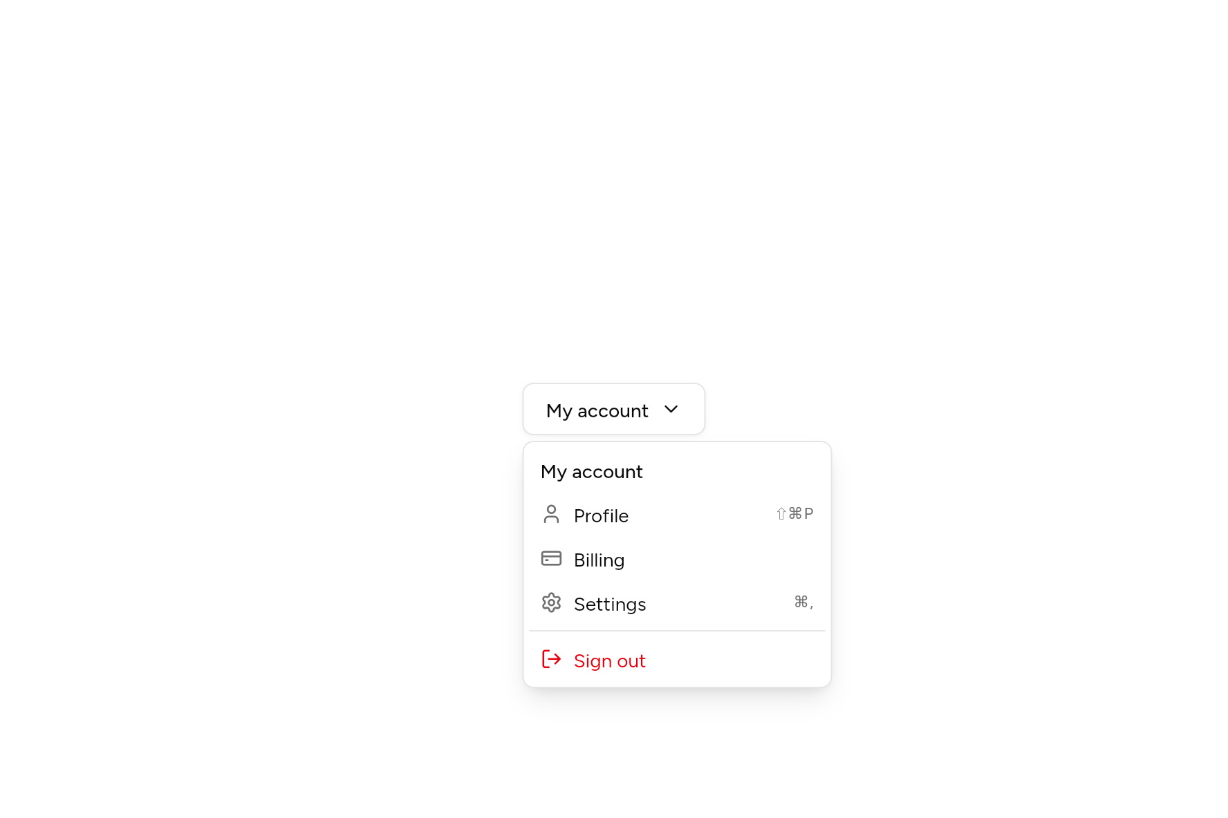
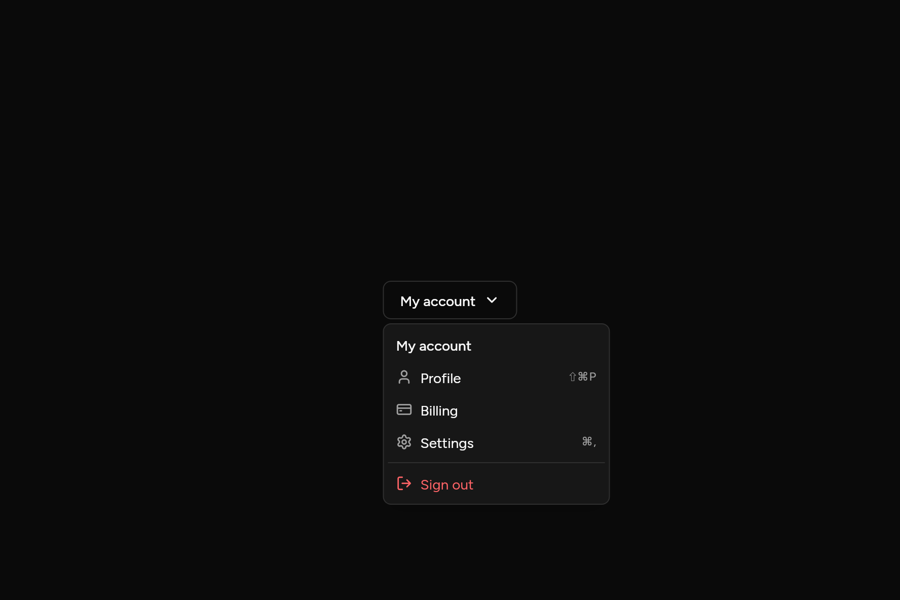
import 'package:ashlar_icons/ashlar_icons.dart';
import 'package:flutter/widgets.dart';

import 'ui/button.dart';
import 'ui/dropdown_menu.dart';

class DropdownMenuDemo extends StatelessWidget {
  const DropdownMenuDemo({super.key});

  @override
  Widget build(BuildContext context) => DropdownMenu(
    width: 224,
    builder: (context, menu) => Button(
      variant: ButtonVariant.outline,
      trailing: const AshlarIcon(AshlarIconsRoundedStroke.chevronDown),
      onPressed: () => menu.isOpen ? menu.close() : menu.open(),
      child: const Text('My account'),
    ),
    items: [
      const MenuLabel(child: Text('My account')),
      MenuItem(
        leading: const AshlarIcon(AshlarIconsRoundedStroke.user),
        shortcut: const Text('⇧⌘P'),
        onPressed: () {},
        child: const Text('Profile'),
      ),
      MenuItem(
        leading: const AshlarIcon(AshlarIconsRoundedStroke.creditCard),
        onPressed: () {},
        child: const Text('Billing'),
      ),
      MenuItem(
        leading: const AshlarIcon(AshlarIconsRoundedStroke.settings),
        shortcut: const Text('⌘,'),
        onPressed: () {},
        child: const Text('Settings'),
      ),
      const MenuSeparator(),
      MenuItem(
        leading: const AshlarIcon(AshlarIconsRoundedStroke.logOut),
        destructive: true,
        onPressed: () {},
        child: const Text('Sign out'),
      ),
    ],
  );
}
Add it
In your Flutter project:
ashlar add dropdown-menu
It writes theme.dart, palette.dart, group.dart, pressable.dart, popover.dart and dropdown_menu.dart into lib/ui, keeping any you already have, and adds ashlar_icons to pubspec.yaml. It needs pressable, popover and ashlar_icons, which come with it.
Examples
Other ways to use it, each running live, with its code.
Checkbox items
Things to show or hide, the menu staying open.
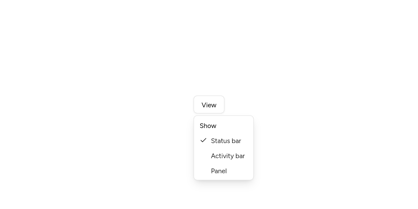
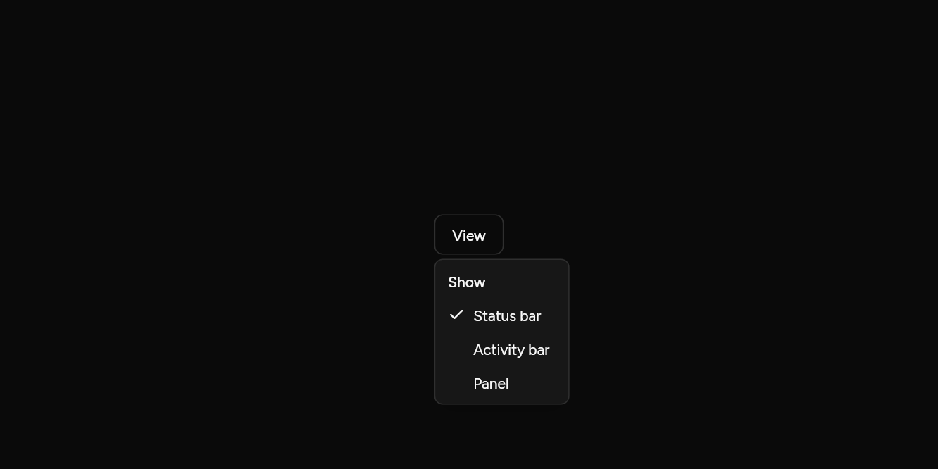
// Checkbox items: Things to show or hide, the menu staying open.
import 'package:flutter/widgets.dart';

import 'ui/button.dart';
import 'ui/dropdown_menu.dart';

class DropdownMenuCheckboxesExample extends StatefulWidget {
  const DropdownMenuCheckboxesExample({super.key});

  @override
  State<DropdownMenuCheckboxesExample> createState() => _DropdownMenuCheckboxesExampleState();
}

class _DropdownMenuCheckboxesExampleState extends State<DropdownMenuCheckboxesExample> {
  final shown = {'Status bar'};

  @override
  Widget build(BuildContext context) => DropdownMenu(
    builder: (context, menu) => Button(variant: ButtonVariant.outline, onPressed: menu.open, child: const Text('View')),
    items: [
      const MenuLabel(child: Text('Show')),
      for (final name in ['Status bar', 'Activity bar', 'Panel'])
        MenuCheckboxItem(
          checked: shown.contains(name),
          closeOnPress: false,
          onChanged: (v) => setState(() => v ? shown.add(name) : shown.remove(name)),
          child: Text(name),
        ),
    ],
  );
}
Radio items
One choice of several.
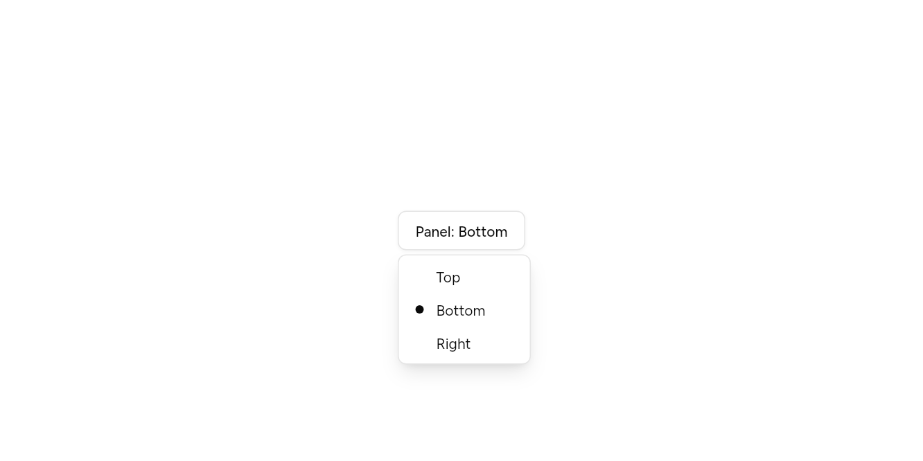
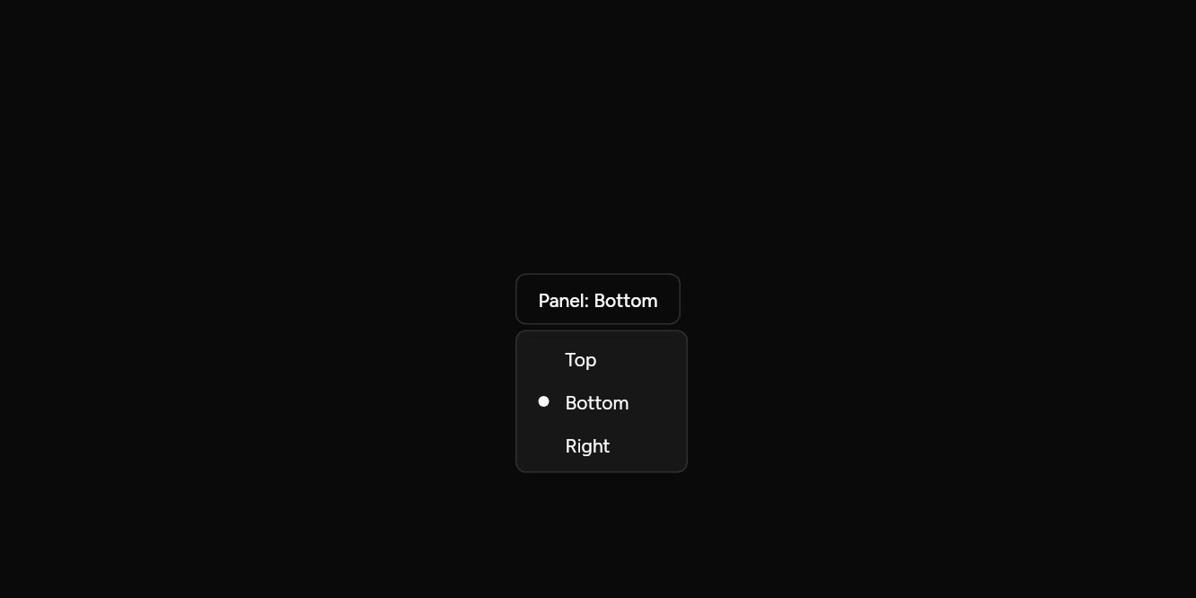
// Radio items: One choice of several.
import 'package:flutter/widgets.dart';

import 'ui/button.dart';
import 'ui/dropdown_menu.dart';

class DropdownMenuRadioExample extends StatefulWidget {
  const DropdownMenuRadioExample({super.key});

  @override
  State<DropdownMenuRadioExample> createState() => _DropdownMenuRadioExampleState();
}

class _DropdownMenuRadioExampleState extends State<DropdownMenuRadioExample> {
  var side = 'Bottom';

  @override
  Widget build(BuildContext context) => DropdownMenu(
    builder: (context, menu) =>
        Button(variant: ButtonVariant.outline, onPressed: menu.open, child: Text('Panel: $side')),
    items: [
      MenuRadioGroup<String>(
        value: side,
        onChanged: (v) => setState(() => side = v),
        children: const [
          MenuRadioItem(value: 'Top', child: Text('Top')),
          MenuRadioItem(value: 'Bottom', child: Text('Bottom')),
          MenuRadioItem(value: 'Right', child: Text('Right')),
        ],
      ),
    ],
  );
}
Submenus
A row that opens a menu of its own.
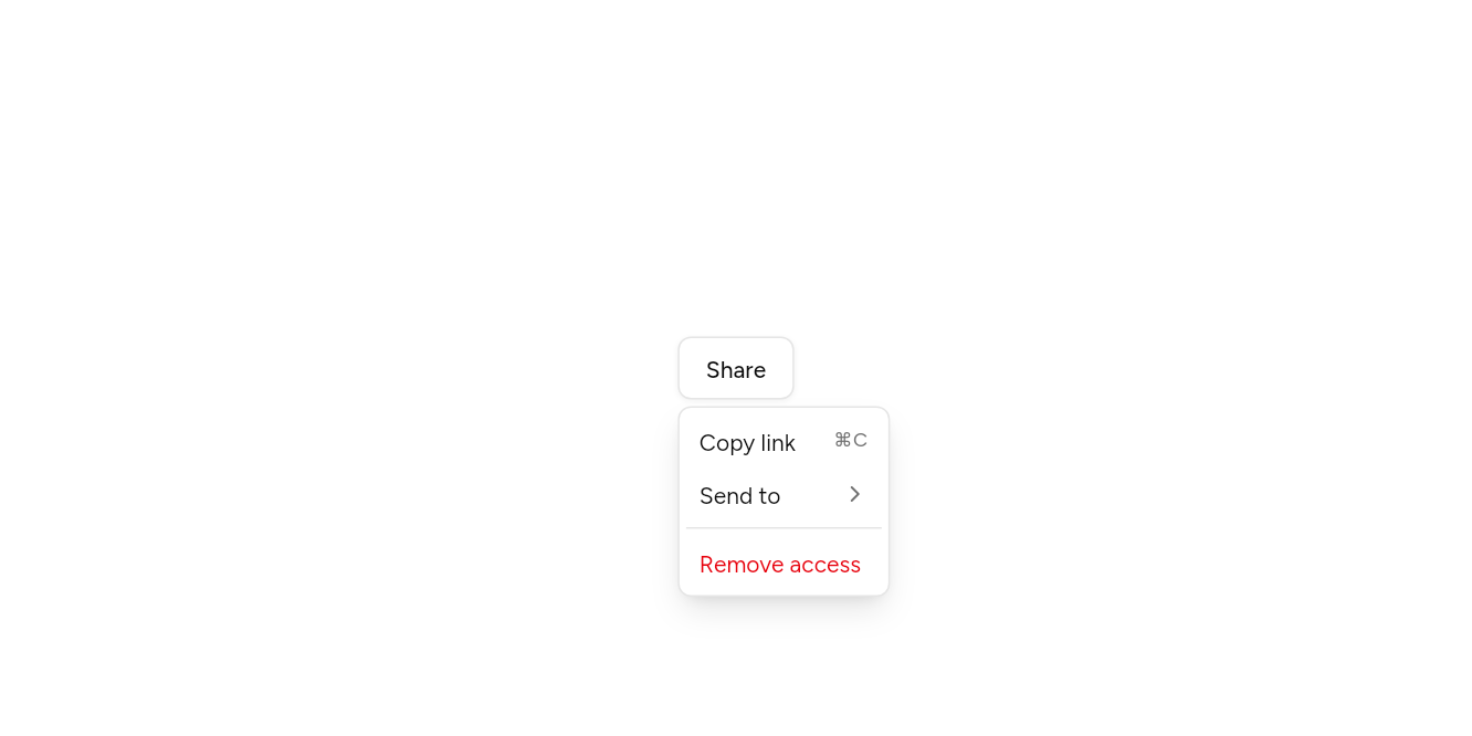
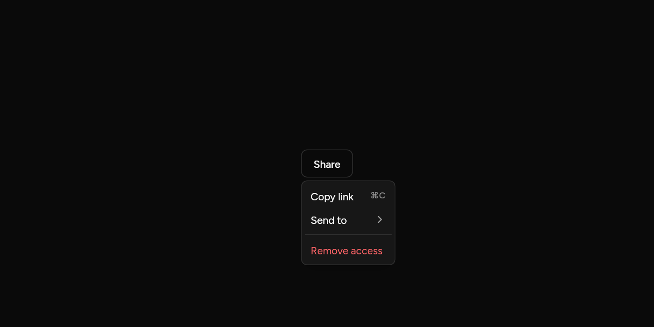
// Submenus: A row that opens a menu of its own.
import 'package:flutter/widgets.dart';

import 'ui/button.dart';
import 'ui/dropdown_menu.dart';

class DropdownMenuSubmenuExample extends StatelessWidget {
  const DropdownMenuSubmenuExample({super.key});

  @override
  Widget build(BuildContext context) => DropdownMenu(
    builder: (context, menu) =>
        Button(variant: ButtonVariant.outline, onPressed: menu.open, child: const Text('Share')),
    items: [
      MenuItem(onPressed: () {}, shortcut: const Text('⌘C'), child: const Text('Copy link')),
      MenuSub(
        items: [
          MenuItem(onPressed: () {}, child: const Text('Email')),
          MenuItem(onPressed: () {}, child: const Text('Message')),
        ],
        child: const Text('Send to'),
      ),
      const MenuSeparator(),
      MenuItem(destructive: true, onPressed: () {}, child: const Text('Remove access')),
    ],
  );
}
API
Read from the source above: each parameter with its type, its default, and what it is for.
DropdownMenuclass
A list of actions that opens from a trigger. builder draws the trigger and gets the controller that opens it. The arrow keys move through the items, Enter picks one and Escape closes the menu.
| Parameter | Type | Default | What it is for |
|---|---|---|---|
builderrequired |
Widget Function(BuildContext context, MenuController controller) |
Builds what opens it, given a controller to open and close it with. | |
itemsrequired |
List<Widget> |
MenuItem, MenuLabel and MenuSeparator, in order. |
|
controller |
MenuController? |
Opens and closes it from outside; one is made when not given. | |
side |
PopoverSide |
PopoverSide.bottom |
Which side it opens on. It moves to the other side when there is no room. |
align |
PopoverAlign |
PopoverAlign.start |
How it lines up along that side: at the start, the centre or the end. |
width |
double? |
Null sizes the menu to its widest item. |
MenuListclass
The items of an open menu, in a scrolling column: focus starts on the list, and the arrow keys, Home and End move through the items. A Select uses it too.
| Parameter | Type | Default | What it is for |
|---|---|---|---|
childrenrequired |
List<Widget> |
The menu's rows. | |
focusFirst |
bool |
false |
Puts focus on the first item as it opens, as a submenu does. |
MenuItemclass
An action in a menu. Picking it closes the menu, then calls onPressed.
| Parameter | Type | Default | What it is for |
|---|---|---|---|
childrequired |
Widget |
Its label. | |
onPressedrequired |
VoidCallback? |
Null disables the item. | |
leading |
Widget? |
A 16px icon before the label. | |
trailing |
Widget? |
An icon after the label, at the end of the row. | |
shortcut |
Widget? |
A key combination, shown faint at the end of the row: Text('⌘S'). | |
destructive |
bool |
false |
Drawn in the destructive colour: delete, sign out. |
selected |
bool? |
For a menu of choices: announced as chosen. | |
inset |
bool |
false |
Set in, to line up with checkbox and radio items beside it. |
autofocus |
bool |
false |
Takes the keyboard's focus when it first appears. |
MenuCheckboxItemclass
An item that is on or off: a setting shown in the menu. Picking it flips it and closes the menu.
| Parameter | Type | Default | What it is for |
|---|---|---|---|
checkedrequired |
bool |
Whether it is ticked. | |
onChangedrequired |
ValueChanged<bool>? |
Null disables the item. | |
childrequired |
Widget |
Its label. | |
shortcut |
Widget? |
A key combination, shown faint at the end: Text('⌘K'). | |
closeOnPress |
bool |
true |
False keeps the menu open, for setting several in a row. |
MenuRadioGroupclass
The items of a menu of which one is chosen, by value. Put MenuRadioItems in it.
| Parameter | Type | Default | What it is for |
|---|---|---|---|
valuerequired |
T? |
The value chosen, or null. | |
onChangedrequired |
ValueChanged<T>? |
Told each new value as it changes. | |
childrenrequired |
List<Widget> |
The radio items. |
MenuRadioItemclass
One choice in a MenuRadioGroup, marked with a dot when it is the one chosen.
| Parameter | Type | Default | What it is for |
|---|---|---|---|
valuerequired |
T |
The value it stands for. | |
childrequired |
Widget |
Its label. | |
enabled |
bool |
true |
False fades it and stops it taking presses and focus. |
MenuGroupclass
Items that belong together, read out as a group.
| Parameter | Type | Default | What it is for |
|---|---|---|---|
childrenrequired |
List<Widget> |
The group's rows. |
MenuSubclass
A row that opens a further menu beside it: on hover, a click, Enter or the right arrow. The left arrow and Escape close it again.
| Parameter | Type | Default | What it is for |
|---|---|---|---|
childrequired |
Widget |
Its label. | |
itemsrequired |
List<Widget> |
The submenu's rows. | |
leading |
Widget? |
Before the label: usually an icon. | |
inset |
bool |
false |
Lines its label up with items that have a mark before them. |
enabled |
bool |
true |
False fades it and stops it taking presses and focus. |
MenuLabelclass
A heading over a group of items.
| Parameter | Type | Default | What it is for |
|---|---|---|---|
childrequired |
Widget |
The label's words. | |
inset |
bool |
false |
Set in, to line up with checkbox and radio items under it. |
MenuSeparatorclass
A line between groups of items.
Source
What lands in your app. It is yours from then on: change it as you would your own code, and ashlar add
will not write over it.
lib/ui/dropdown_menu.dart 738 lines
// Ashlar UI: Dropdown Menu. Copied into your app by `ashlar add dropdown-menu`; it is
// yours to change.

import 'dart:async';
import 'dart:ui' show SemanticsRole;

import 'package:ashlar_icons/ashlar_icons.dart';
import 'package:flutter/services.dart';
import 'package:flutter/widgets.dart';

import 'popover.dart';
import 'pressable.dart';
import 'theme.dart';

/// A list of actions that opens from a trigger. [builder] draws the trigger and gets the
/// controller that opens it. The arrow keys move through the items, Enter picks one and
/// Escape closes the menu.
///
/// ```dart
/// DropdownMenu(
///   builder: (context, menu) => Button(variant: ButtonVariant.outline, onPressed: menu.open, child: Text('Open')),
///   items: [
///     MenuLabel(child: Text('My account')),
///     MenuItem(leading: AshlarIcon(AshlarIconsRoundedStroke.user), onPressed: profile, child: Text('Profile')),
///     MenuSeparator(),
///     MenuItem(destructive: true, onPressed: signOut, child: Text('Sign out')),
///   ],
/// )
/// ```
class DropdownMenu extends StatefulWidget {
  const DropdownMenu({
    super.key,
    required this.builder,
    required this.items,
    this.controller,
    this.side = PopoverSide.bottom,
    this.align = PopoverAlign.start,
    this.width,
  });

  /// Builds what opens it, given a controller to open and close it with.
  final Widget Function(BuildContext context, MenuController controller)
  builder;

  /// [MenuItem], [MenuLabel] and [MenuSeparator], in order.
  final List<Widget> items;

  /// Opens and closes it from outside; one is made when not given.
  final MenuController? controller;

  /// Which side it opens on. It moves to the other side when there is no room.
  final PopoverSide side;

  /// How it lines up along that side: at the start, the centre or the end.
  final PopoverAlign align;

  /// Null sizes the menu to its widest item.
  final double? width;

  @override
  State<DropdownMenu> createState() => _DropdownMenuState();
}

class _DropdownMenuState extends State<DropdownMenu> {
  final _own = MenuController();

  @override
  Widget build(BuildContext context) => RawMenuAnchor(
    controller: widget.controller ?? _own,
    builder: (context, controller, _) => widget.builder(context, controller),
    overlayBuilder: (context, info) => PopoverPanel(
      info: info,
      side: widget.side,
      align: widget.align,
      width: widget.width,
      child: MenuList(children: widget.items),
    ),
  );
}

/// The items of an open menu, in a scrolling column: focus starts on the list, and the
/// arrow keys, Home and End move through the items. A Select uses it too.
class MenuList extends StatefulWidget {
  const MenuList({super.key, required this.children, this.focusFirst = false});

  /// The menu's rows.
  final List<Widget> children;

  /// Puts focus on the first item as it opens, as a submenu does.
  final bool focusFirst;

  @override
  State<MenuList> createState() => _MenuListState();
}

class _MenuListState extends State<MenuList> {
  final _scope = FocusScopeNode(debugLabel: 'Menu');

  @override
  void initState() {
    super.initState();
    if (widget.focusFirst) {
      WidgetsBinding.instance.addPostFrameCallback((_) {
        final first = _scope.traversalDescendants
            .where((n) => n.canRequestFocus && !n.skipTraversal)
            .firstOrNull;
        first?.requestFocus();
      });
    }
  }

  @override
  void dispose() {
    _scope.dispose();
    super.dispose();
  }

  @override
  Widget build(BuildContext context) {
    final list = _list(context);
    // The first menu opened is the root; a submenu's list sits inside it.
    if (context.dependOnInheritedWidgetOfExactType<_MenuRoot>() != null) {
      return list;
    }
    return _MenuRoot(controller: MenuController.maybeOf(context), child: list);
  }

  Widget _list(BuildContext context) => Semantics(
    role: SemanticsRole.menu,
    container: true,
    explicitChildNodes: true,
    child: Shortcuts(
      shortcuts: const {
        SingleActivator(LogicalKeyboardKey.arrowDown): NextFocusIntent(),
        SingleActivator(LogicalKeyboardKey.arrowUp): PreviousFocusIntent(),
        SingleActivator(LogicalKeyboardKey.home): _EdgeIntent(first: true),
        SingleActivator(LogicalKeyboardKey.end): _EdgeIntent(first: false),
      },
      child: FocusScope(
        node: _scope,
        autofocus: true,
        child: Builder(
          builder: (context) => Actions(
            actions: {
              _EdgeIntent: CallbackAction<_EdgeIntent>(
                onInvoke: (i) {
                  final scope = FocusScope.of(context);
                  final items = scope.traversalDescendants.toList();
                  if (items.isEmpty) return null;
                  (i.first ? items.first : items.last).requestFocus();
                  return null;
                },
              ),
            },
            child: IntrinsicWidth(
              child: SingleChildScrollView(
                padding: const EdgeInsets.all(4),
                child: Column(
                  crossAxisAlignment: CrossAxisAlignment.stretch,
                  children: widget.children,
                ),
              ),
            ),
          ),
        ),
      ),
    ),
  );
}

/// The outermost menu, so picking an item in a submenu closes all of them.
class _MenuRoot extends InheritedWidget {
  const _MenuRoot({required this.controller, required super.child});

  final MenuController? controller;

  static MenuController? of(BuildContext context) =>
      context.dependOnInheritedWidgetOfExactType<_MenuRoot>()?.controller;

  @override
  bool updateShouldNotify(_MenuRoot old) => old.controller != controller;
}

class _EdgeIntent extends Intent {
  const _EdgeIntent({required this.first});

  final bool first;
}

/// An action in a menu. Picking it closes the menu, then calls [onPressed].
class MenuItem extends StatelessWidget {
  const MenuItem({
    super.key,
    required this.child,
    required this.onPressed,
    this.leading,
    this.trailing,
    this.shortcut,
    this.destructive = false,
    this.selected,
    this.inset = false,
    this.autofocus = false,
  });

  /// Its label.
  final Widget child;

  /// Null disables the item.
  final VoidCallback? onPressed;

  /// A 16px icon before the label.
  final Widget? leading;

  /// An icon after the label, at the end of the row.
  final Widget? trailing;

  /// A key combination, shown faint at the end of the row: Text('⌘S').
  final Widget? shortcut;

  /// Drawn in the destructive colour: delete, sign out.
  final bool destructive;

  /// For a menu of choices: announced as chosen.
  final bool? selected;

  /// Set in, to line up with checkbox and radio items beside it.
  final bool inset;

  /// Takes the keyboard's focus when it first appears.
  final bool autofocus;

  @override
  Widget build(BuildContext context) => _MenuRow(
    onPressed: onPressed,
    leading: leading,
    trailing: trailing,
    shortcut: shortcut,
    destructive: destructive,
    selected: selected,
    inset: inset,
    autofocus: autofocus,
    role: SemanticsRole.menuItem,
    child: child,
  );
}

/// An item that is on or off: a setting shown in the menu. Picking it flips it and closes
/// the menu.
///
/// ```dart
/// MenuCheckboxItem(checked: showStatusBar, onChanged: (v) => setState(() => showStatusBar = v), child: Text('Status bar'))
/// ```
class MenuCheckboxItem extends StatelessWidget {
  const MenuCheckboxItem({
    super.key,
    required this.checked,
    required this.onChanged,
    required this.child,
    this.shortcut,
    this.closeOnPress = true,
  });

  /// Whether it is ticked.
  final bool checked;

  /// Null disables the item.
  final ValueChanged<bool>? onChanged;

  /// Its label.
  final Widget child;

  /// A key combination, shown faint at the end: Text('⌘K').
  final Widget? shortcut;

  /// False keeps the menu open, for setting several in a row.
  final bool closeOnPress;

  @override
  Widget build(BuildContext context) => _MenuRow(
    onPressed: onChanged == null ? null : () => onChanged!(!checked),
    checked: checked,
    closeOnPress: closeOnPress,
    shortcut: shortcut,
    role: SemanticsRole.menuItemCheckbox,
    indicator: checked
        ? const AshlarIcon(AshlarIconsRoundedStroke.check)
        : null,
    inset: true,
    child: child,
  );
}

/// The items of a menu of which one is chosen, by [value]. Put [MenuRadioItem]s in it.
///
/// ```dart
/// MenuRadioGroup<String>(value: position, onChanged: (v) => setState(() => position = v), children: [
///   MenuRadioItem(value: 'top', child: Text('Top')),
///   MenuRadioItem(value: 'bottom', child: Text('Bottom')),
/// ])
/// ```
class MenuRadioGroup<T> extends StatelessWidget {
  const MenuRadioGroup({
    super.key,
    required this.value,
    required this.onChanged,
    required this.children,
  });

  /// The value chosen, or null.
  final T? value;

  /// Told each new value as it changes.
  final ValueChanged<T>? onChanged;

  /// The radio items.
  final List<Widget> children;

  @override
  Widget build(BuildContext context) => _RadioScope<T>(
    value: value,
    onChanged: onChanged,
    child: MenuGroup(children: children),
  );
}

class _RadioScope<T> extends InheritedWidget {
  const _RadioScope({
    required this.value,
    required this.onChanged,
    required super.child,
  });

  final T? value;
  final ValueChanged<T>? onChanged;

  @override
  bool updateShouldNotify(_RadioScope<T> old) =>
      old.value != value || old.onChanged != onChanged;
}

/// One choice in a [MenuRadioGroup], marked with a dot when it is the one chosen.
class MenuRadioItem<T> extends StatelessWidget {
  const MenuRadioItem({
    super.key,
    required this.value,
    required this.child,
    this.enabled = true,
  });

  /// The value it stands for.
  final T value;

  /// Its label.
  final Widget child;

  /// False fades it and stops it taking presses and focus.
  final bool enabled;

  @override
  Widget build(BuildContext context) {
    final group = context.dependOnInheritedWidgetOfExactType<_RadioScope<T>>();
    final chosen = group?.value == value;
    return _MenuRow(
      onPressed: !enabled || group?.onChanged == null
          ? null
          : () => group!.onChanged!(value),
      checked: chosen,
      role: SemanticsRole.menuItemRadio,
      indicator: chosen
          ? Container(
              width: 8,
              height: 8,
              decoration: BoxDecoration(
                color: AshlarTheme.of(context).colors.popoverForeground,
                shape: BoxShape.circle,
              ),
            )
          : null,
      inset: true,
      child: child,
    );
  }
}

/// Items that belong together, read out as a group.
class MenuGroup extends StatelessWidget {
  const MenuGroup({super.key, required this.children});

  /// The group's rows.
  final List<Widget> children;

  @override
  Widget build(BuildContext context) => Semantics(
    container: true,
    explicitChildNodes: true,
    child: Column(
      crossAxisAlignment: CrossAxisAlignment.stretch,
      children: children,
    ),
  );
}

/// A row that opens a further menu beside it: on hover, a click, Enter or the right arrow.
/// The left arrow and Escape close it again.
///
/// ```dart
/// MenuSub(child: Text('Share'), items: [MenuItem(onPressed: email, child: Text('Email')), ...])
/// ```
class MenuSub extends StatefulWidget {
  const MenuSub({
    super.key,
    required this.child,
    required this.items,
    this.leading,
    this.inset = false,
    this.enabled = true,
  });

  /// Its label.
  final Widget child;

  /// The submenu's rows.
  final List<Widget> items;

  /// Before the label: usually an icon.
  final Widget? leading;

  /// Lines its label up with items that have a mark before them.
  final bool inset;

  /// False fades it and stops it taking presses and focus.
  final bool enabled;

  @override
  State<MenuSub> createState() => _MenuSubState();
}

class _MenuSubState extends State<MenuSub> {
  final _menu = MenuController();
  final _focus = FocusNode();
  Timer? _hover;
  bool _open = false;

  @override
  void dispose() {
    _hover?.cancel();
    _focus.dispose();
    super.dispose();
  }

  void _show() {
    _hover?.cancel();
    if (!_menu.isOpen) _menu.open();
  }

  void _back() {
    _menu.close();
    _focus.requestFocus();
  }

  @override
  Widget build(BuildContext context) => RawMenuAnchor(
    controller: _menu,
    childFocusNode: _focus,
    onOpen: () => setState(() => _open = true),
    onClose: () => setState(() => _open = false),
    overlayBuilder: (context, info) => PopoverPanel(
      info: info,
      side: isRtl(context) ? PopoverSide.left : PopoverSide.right,
      align: PopoverAlign.start,
      gap: -4,
      child: CallbackShortcuts(
        bindings: {
          SingleActivator(
            isRtl(context)
                ? LogicalKeyboardKey.arrowRight
                : LogicalKeyboardKey.arrowLeft,
          ): _back,
        },
        child: MenuList(focusFirst: true, children: widget.items),
      ),
    ),
    child: _MenuRow(
      focusNode: _focus,
      onPressed: widget.enabled ? _show : null,
      closeOnPress: false,
      lit: _open,
      expanded: _open,
      leading: widget.leading,
      inset: widget.inset,
      role: SemanticsRole.menuItem,
      onHover: () {
        // A moment's rest opens it, so passing over on the way down does not.
        _hover?.cancel();
        _hover = Timer(
          const Duration(milliseconds: 120),
          () => mounted ? _show() : null,
        );
      },
      keys: {
        SingleActivator(
          isRtl(context)
              ? LogicalKeyboardKey.arrowLeft
              : LogicalKeyboardKey.arrowRight,
        ): _show,
      },
      trailing: AshlarIcon(
        isRtl(context)
            ? AshlarIconsRoundedStroke.chevronLeft
            : AshlarIconsRoundedStroke.chevronRight,
      ),
      child: widget.child,
    ),
  );
}

/// The row every kind of menu item draws: an indicator slot for checks and dots, an icon,
/// the label, a shortcut and a trailing icon; lit under the pointer or the keyboard.
class _MenuRow extends StatefulWidget {
  const _MenuRow({
    required this.child,
    required this.onPressed,
    required this.role,
    this.leading,
    this.trailing,
    this.shortcut,
    this.destructive = false,
    this.selected,
    this.checked,
    this.expanded,
    this.indicator,
    this.inset = false,
    this.autofocus = false,
    this.closeOnPress = true,
    this.lit = false,
    this.focusNode,
    this.onHover,
    this.keys = const {},
  });

  final Widget child;
  final VoidCallback? onPressed;
  final SemanticsRole role;
  final Widget? leading, trailing, shortcut, indicator;
  final bool destructive, inset, autofocus, closeOnPress, lit;
  final bool? selected, checked, expanded;
  final FocusNode? focusNode;
  final VoidCallback? onHover;
  final Map<ShortcutActivator, VoidCallback> keys;

  @override
  State<_MenuRow> createState() => _MenuRowState();
}

class _MenuRowState extends State<_MenuRow> {
  FocusNode? _own;
  FocusNode get _focus => widget.focusNode ?? (_own ??= FocusNode());

  @override
  void dispose() {
    _own?.dispose();
    super.dispose();
  }

  @override
  Widget build(BuildContext context) {
    final t = AshlarTheme.of(context);
    final c = t.colors;
    final menu = MenuController.maybeOf(context);
    return MouseRegion(
      // The pointer and the keyboard share one highlight, as in a native menu; moving to
      // another row closes a submenu left open beside this menu.
      onEnter: (_) {
        if (widget.onPressed == null) return;
        _focus.requestFocus();
        if (widget.onHover != null) {
          widget.onHover!();
        } else {
          menu?.closeChildren();
        }
      },
      child: Focus(
        canRequestFocus: false,
        skipTraversal: true,
        onFocusChange: (_) => setState(() {}),
        child: CallbackShortcuts(
          bindings: widget.keys,
          child: Pressable(
            focusNode: _focus,
            autofocus: widget.autofocus,
            role: widget.role,
            selected: widget.selected,
            checked: widget.checked,
            expanded: widget.expanded,
            onPressed: widget.onPressed == null
                ? null
                : () {
                    if (widget.closeOnPress) {
                      (_MenuRoot.of(context) ?? menu)?.close();
                    }
                    widget.onPressed!();
                  },
            builder: (context, state) {
              final lit =
                  state.enabled &&
                  (widget.lit || state.hovered || _focus.hasFocus);
              final fg = widget.destructive
                  ? c.destructive
                  : (lit ? c.accentForeground : c.popoverForeground);
              final bg = lit
                  ? (widget.destructive
                        ? c.destructive.withValues(alpha: .1)
                        : c.accent)
                  : (widget.destructive ? c.destructive : c.accent).withValues(
                      alpha: 0,
                    );
              return Opacity(
                opacity: state.enabled ? 1 : .5,
                child: Container(
                  padding: EdgeInsetsDirectional.only(
                    start: widget.inset ? 32 : 8,
                    end: 8,
                    top: 6,
                    bottom: 6,
                  ),
                  decoration: BoxDecoration(
                    color: bg,
                    borderRadius: BorderRadius.circular(t.radiusSm),
                  ),
                  child: DefaultTextStyle.merge(
                    style: t.text.sm.copyWith(color: fg),
                    maxLines: 1,
                    overflow: TextOverflow.ellipsis,
                    child: IconTheme.merge(
                      data: IconThemeData(
                        color: widget.destructive
                            ? c.destructive
                            : c.mutedForeground,
                        size: 16,
                      ),
                      child: Stack(
                        clipBehavior: Clip.none,
                        alignment: AlignmentDirectional.centerStart,
                        children: [
                          // Checks and dots sit in the inset, in the item's own colour.
                          if (widget.indicator != null)
                            PositionedDirectional(
                              start: -24,
                              child: SizedBox(
                                width: 16,
                                child: Center(
                                  child: IconTheme.merge(
                                    data: IconThemeData(color: fg),
                                    child: widget.indicator!,
                                  ),
                                ),
                              ),
                            ),
                          Row(
                            children: [
                              if (widget.leading != null) ...[
                                widget.leading!,
                                const SizedBox(width: 8),
                              ],
                              Expanded(child: widget.child),
                              if (widget.shortcut != null) ...[
                                const SizedBox(width: 16),
                                DefaultTextStyle.merge(
                                  style: t.text.xs.copyWith(
                                    color: c.mutedForeground,
                                    letterSpacing: 1.2,
                                  ),
                                  child: widget.shortcut!,
                                ),
                              ],
                              if (widget.trailing != null) ...[
                                const SizedBox(width: 8),
                                widget.trailing!,
                              ],
                            ],
                          ),
                        ],
                      ),
                    ),
                  ),
                ),
              );
            },
          ),
        ),
      ),
    );
  }
}

/// A heading over a group of items.
class MenuLabel extends StatelessWidget {
  const MenuLabel({super.key, required this.child, this.inset = false});

  /// The label's words.
  final Widget child;

  /// Set in, to line up with checkbox and radio items under it.
  final bool inset;

  @override
  Widget build(BuildContext context) {
    final t = AshlarTheme.of(context);
    return Padding(
      padding: EdgeInsetsDirectional.only(
        start: inset ? 32 : 8,
        end: 8,
        top: 6,
        bottom: 6,
      ),
      child: DefaultTextStyle.merge(
        style: t.text.sm.copyWith(
          color: t.colors.popoverForeground,
          fontWeight: FontWeight.w500,
        ),
        child: Semantics(header: true, child: child),
      ),
    );
  }
}

/// A line between groups of items.
class MenuSeparator extends StatelessWidget {
  const MenuSeparator({super.key});

  @override
  Widget build(BuildContext context) => Container(
    height: 1,
    margin: const EdgeInsets.symmetric(vertical: 4),
    transform: Matrix4.translationValues(0, 0, 0),
    color: AshlarTheme.of(context).colors.border,
  );
}